

Anatomy
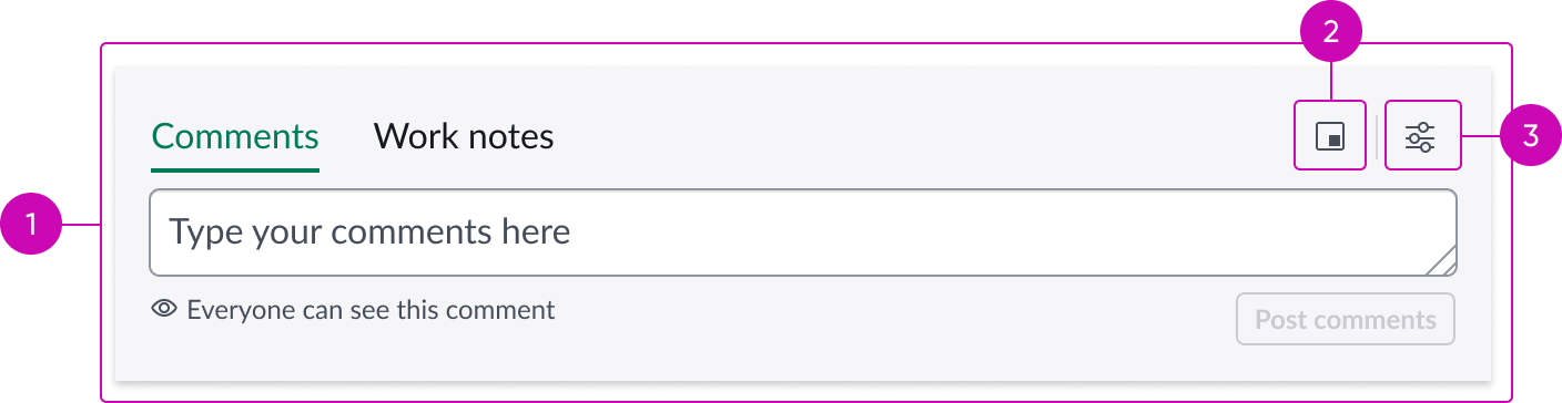
- Activity Stream Compose: Compose experience with modeless dialog option; refer to Activity Stream Compose usage guidelines to view anatomy details.
- Open in modeless view: Button for opening modeless dialog.
- Settings menu: Buton for opening a menu of permission managed features.
Usage
The Activity stream compose with modeless dialog bundle adds modeless dialog functionality to the Activity Stream Compose experience. Admin users can replace the Activity Stream Compose component with this component bundle to quickly enable the modeless dialog experience, without requiring complex configurations.
See the Activity Stream Compose usage guidelines for more information about using the Activity Stream Compose component.
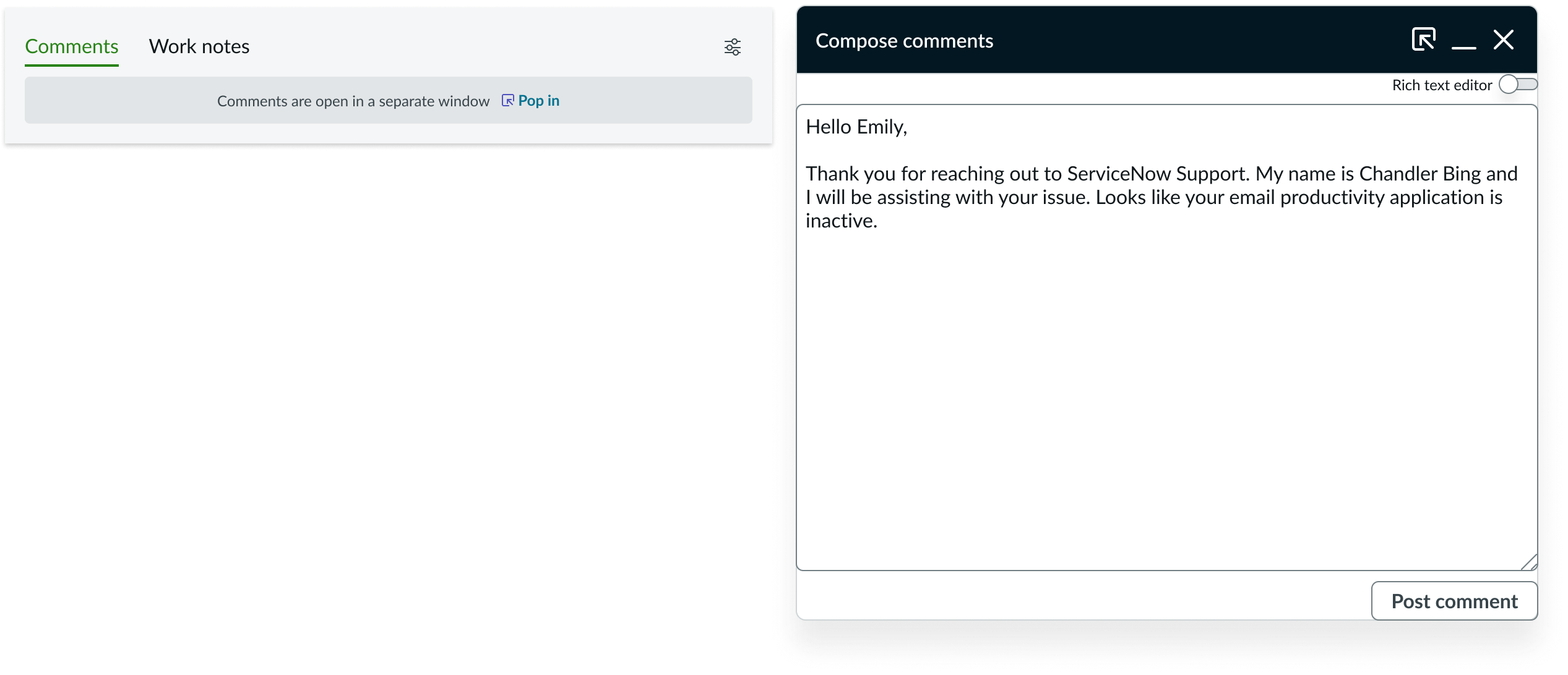
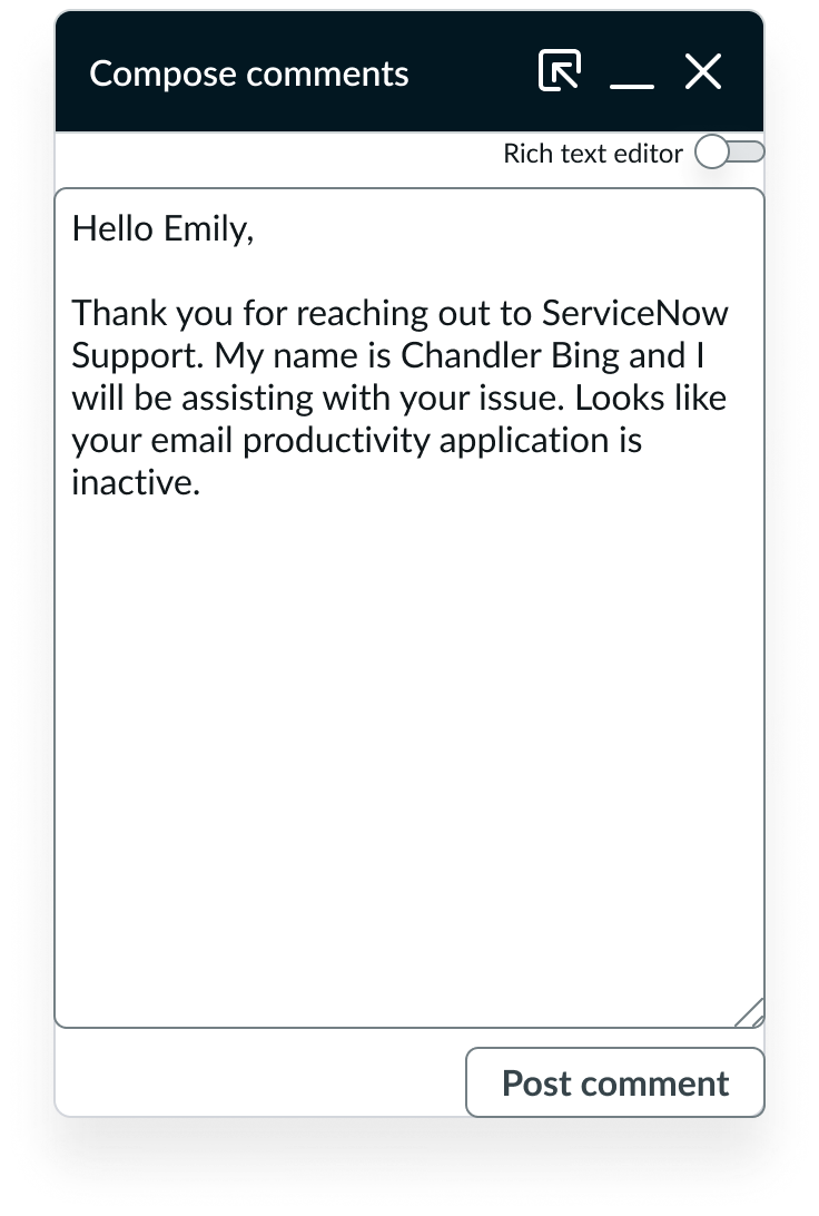
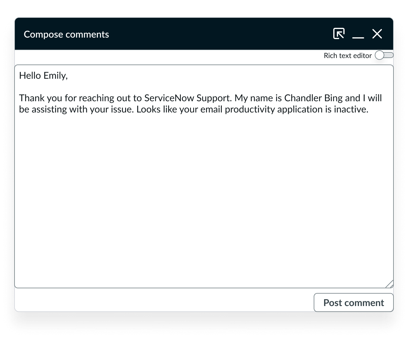
Example of modeless dialog compose experience
Presets and controllers
This component has a preset configuration that sets properties and event handlers, making it ready for use. You can override preset values with a custom configuration if needed. Preset values won’t upgrade with updates. To avoid using presets, configure manually. One preset can apply to a single component instance. See presets for more info.
A preset is linked to a controller, which serves as a data resource. Controllers provide configuration data and event bindings for the component. Selecting a preset adds the required controller to the page, allowing new components to use its preset. For more on controllers, see controllers. For default presets, see view properties and events in the controller API.
Modeless dialog
Learn how the Modeless Dialog component is configured and behaves in the Activity stream compose with modeless dialog bundle.
See the Modeless Dialog usage guidelines for more information about using the Modeless Dialog component.
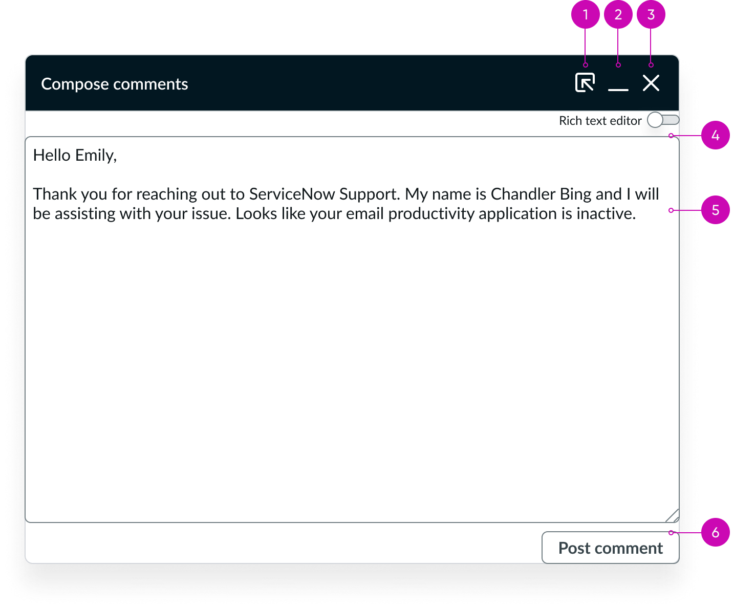
Anatomy
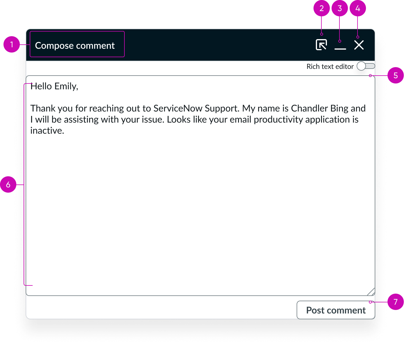
- Header: Title of the dialog; communicates the purpose of the dialog, in this case, composing a comment.
- Pop-in control: Pops dialog back into activity stream compose.
- Minimize button: Minimizes the dialog to the dock area; helps temporarily hide the dialog without closing it.
- Close button: Closes the dialog; discards the comment unless it's saved or autosaved.
- Rich text toggle: Enables or disables rich text formatting; lets users to switch between plain text and rich text modes.
- Comment text area: Main input area where the user composes their message; supports text entry and formatting.
- Post comment button: Posts the written comment.
Configuration
The Modeless dialog component provides preset property values that are intended to satisfy most use cases. You can override any preset value to suit your needs, but overridden properties aren’t updated during an upgrade and may not provide the desired functionality.
Behavior
Learn how Modeless dialog behaves when the display changes or a user interacts with the component.
States
Modeless dialog has the following states:
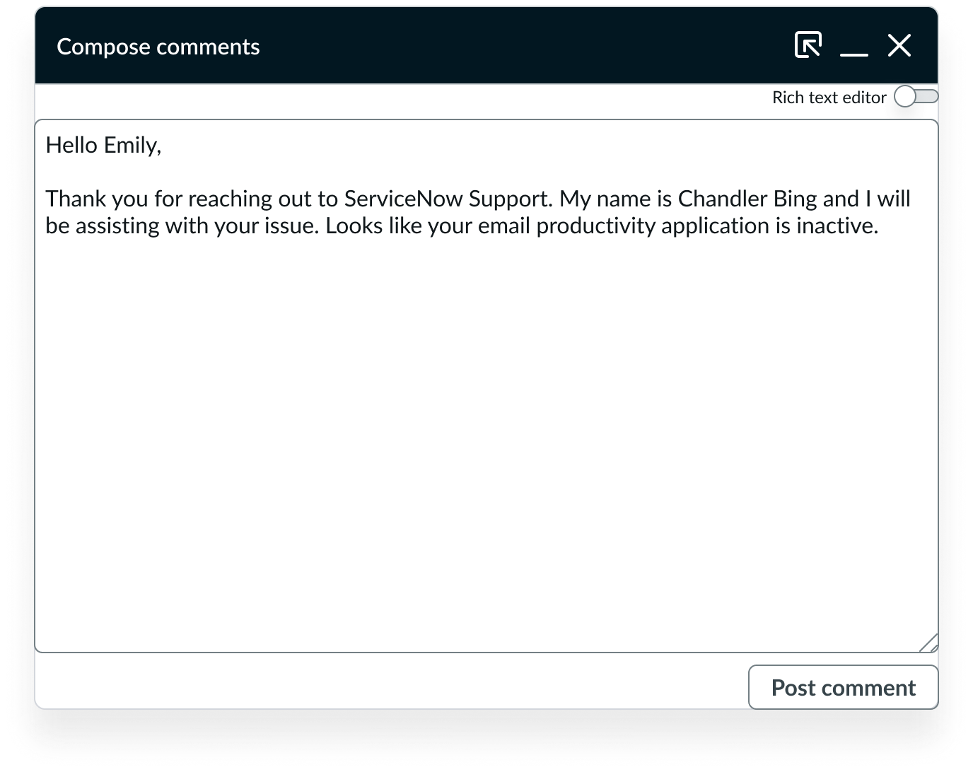
Default
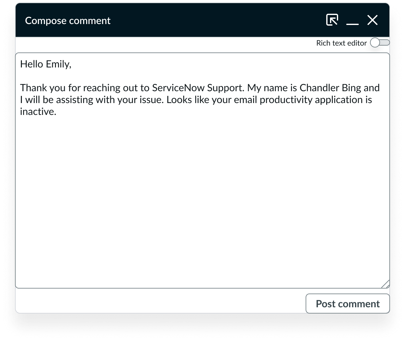
Modeless dialog default state
Responsive behaviors
Learn how Modeless dialog responds to changes in a container or display.
320px width
For 320px width, modeless dialog maintains vertical stacking.
Modeless dialog 320px width
640px width
For 640px width, modeless dialog maintains vertical stacking. For broader widths, the component continues the same layout of elements.
Modeless dialog 640px width
Interactions
Learn how Modeless dialog responds when a user interacts with it.
Enable pop-out experience
Admins can add the component bundle Activity stream compose with modeless dialog to a page. This component displays a pop-out button for Comments, Work notes, and Email.
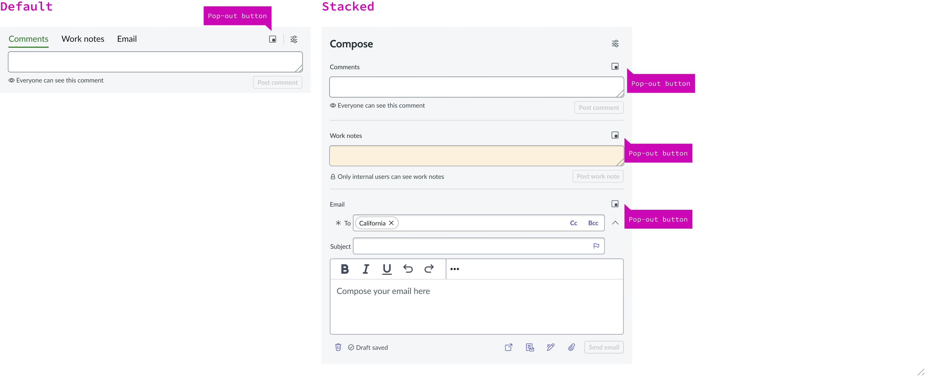
Compose pop-out button
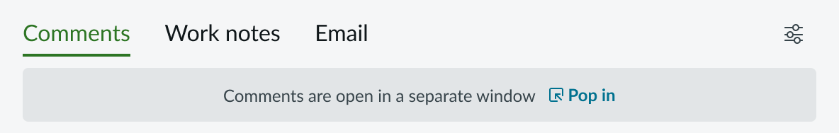
When a section (for example, Comments) is popped out, the thin compose view for that section is disabled, grayed out, and shows a message: “Comments are open in a separate window,” along with a pop-in button to restore it. While Comments are popped out, only the comments tab is disabled in thin compose; work notes and email remain accessible. The same interaction applies when popping out work notes or email.
Compose area when modeless dialog is popped out
Pop-in modeless dialog
When a user selects the pop-in (move-link-left arrow) button in the window menu while in the popped-out compose experience, the modeless dialog closes and the content returns to the thin compose view.

The leftmost button in the window menu pops content back in activity stream compose
Minimize modeless dialog
Users can select the minimize button (-) to place the modeless dialog in the tray.
Minimize button in menu bar
Email pop-out experience
When a user pops out modeless dialog while composing an email, the contents of the draft entry are maintained in the modeless dialog. The draft contents are also maintained when a user pops the modeless dialog back into the regular thin compose experience.
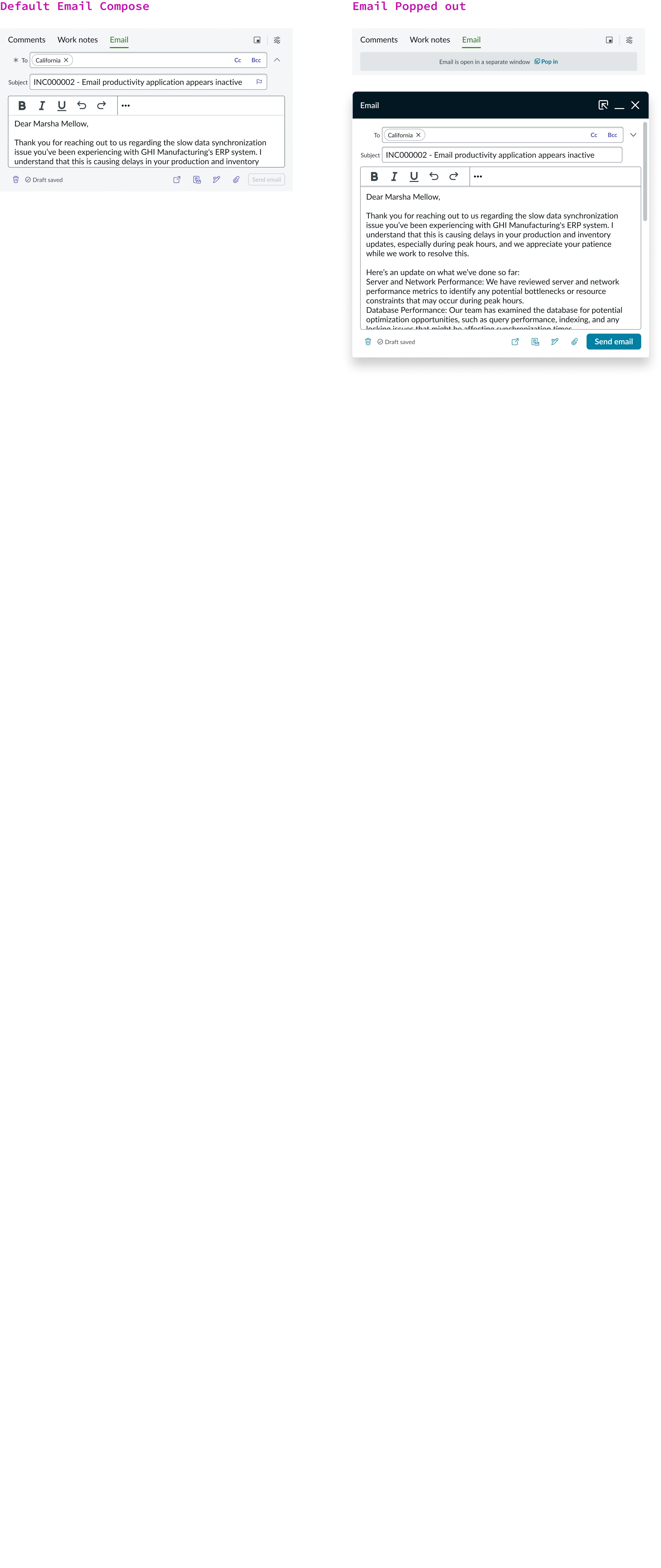
Email compose with modeless dialog popped out
Usability
Activity stream compose with modeless dialog complies with all internationalization and accessibility requirements.
Internationalization
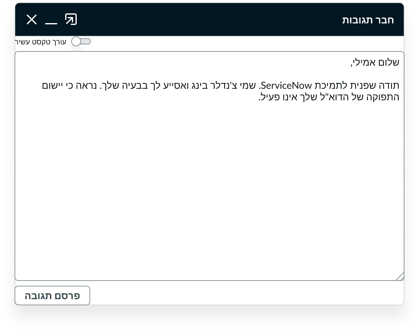
When the display translates to a right-to-left (RTL) language, interactive buttons align to the left and compose text aligns to the right.
Accessibility
Learn how to access the actionable elements of the Modeless dialog through keyboard interactions and screen readers.
Keyboard interactions
You can access the actionable elements of Modeless Dialog with these keyboard keys:
- Tab: Moves focus through the Modeless Dialog in the following tab order.
- Shift + Tab: Moves focus backward through Modeless Dialog in the reverse tab order.
- Enter: Activates the selected action.
Tab order
Screen readers
When you apply ARIA labels to a component, screen readers announce the controls and content of pagination control in the prescribed tab order.
- Use aria-label to identify the navigation region
- Assign role navigation to the pagination control
- Ensure the current page has aria-current set to “true”
- Use aria-disabled if a page link is disabled