

Anatomy
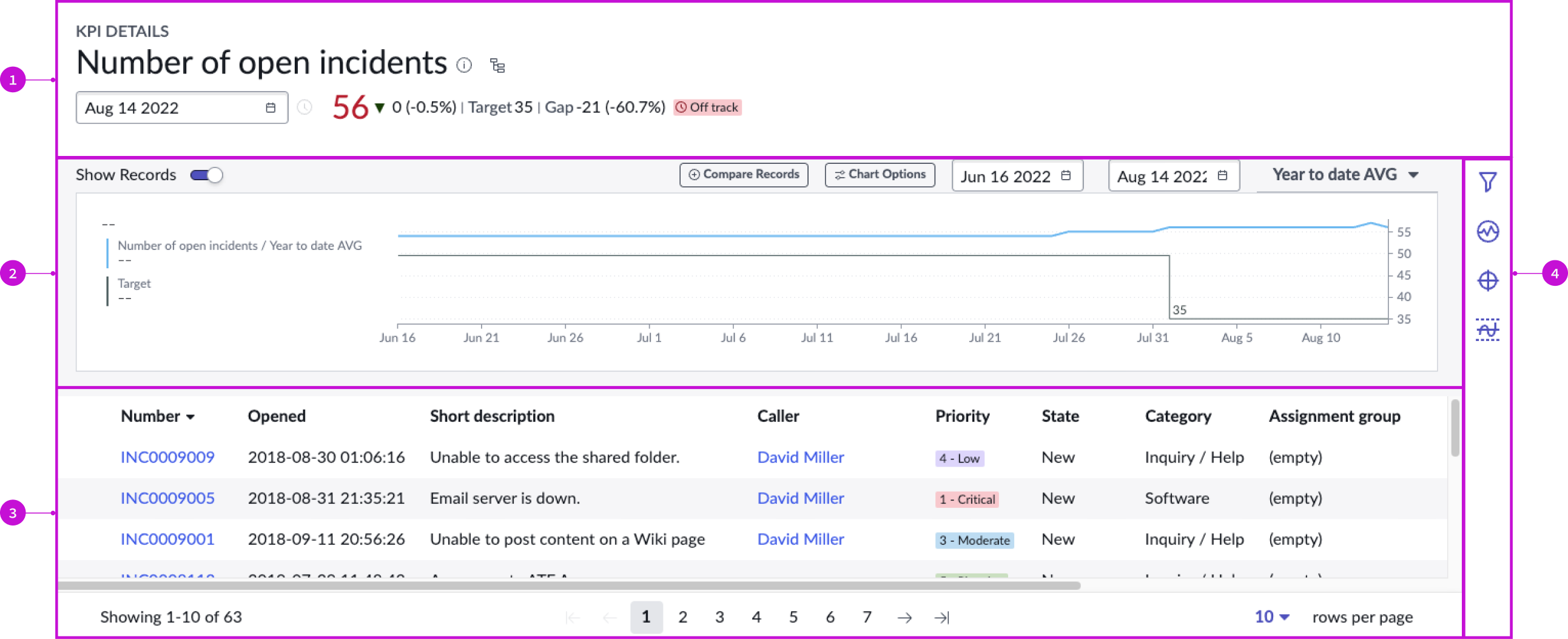
- Header: Provides the KPI name, information and score, and target summary for the latest collected score and entry point for the process optimization workbench
- Chart: Depicts the KPI information over time
- Records panel: Shows all records for a single date selected in the chart or through the date picker in the header
- Contextual side panel: Provides buttons for tools to analyze the KPI
Usage
The KPI details page template helps users explore KPI performance and related records and manage KPI signals, targets, and thresholds. Its advantage as a page template is that the default behaviors are appropriate for many common use cases, making configuration unnecessary.
Users can access the page by selecting the "performance analytics visualization" chart on a dashboard or by selecting a KPI from a list on the analytics center home page. For more information see the product documentation for KPI.
Components
The KPI details page template is a viewport application of the Next Experience KPI details component. The behavior of this component as a page template is no different than its behavior as an independent component in an experience. The only difference is that its properties are pre-configured. For details, see the KPI details usage guidelines.
Configurations
The KPI details page template is intended to be used as-is in your experience and provides default functionality that fits most use cases. The page is created from a template that is updated automatically. If you copy the template in UI Builder and customize the page, you won’t receive template updates, and your page might not function properly after an upgrade.
Usability
The KPI details page template complies with all internationalization and accessibility requirements.
Internationalization
When this page template is used in an instance configured for a right-to-left (RTL) language, the individual components have their own behaviors. See the usage guidelines for the components used in the page for details.
Accessibility
For accessibility behaviors of specific components, see the usage guidelines for those components.
Keyboard interactions
Each component used in the KPI details page template has its own tab order and keyboard interactions. See the usage guidelines for details.
Screen readers
When you apply ARIA labels to a component, screen readers announce the controls and content of each component in the prescribed tab order.