

Anatomy
Learn about the individual parts of KPI details.
Main anatomy
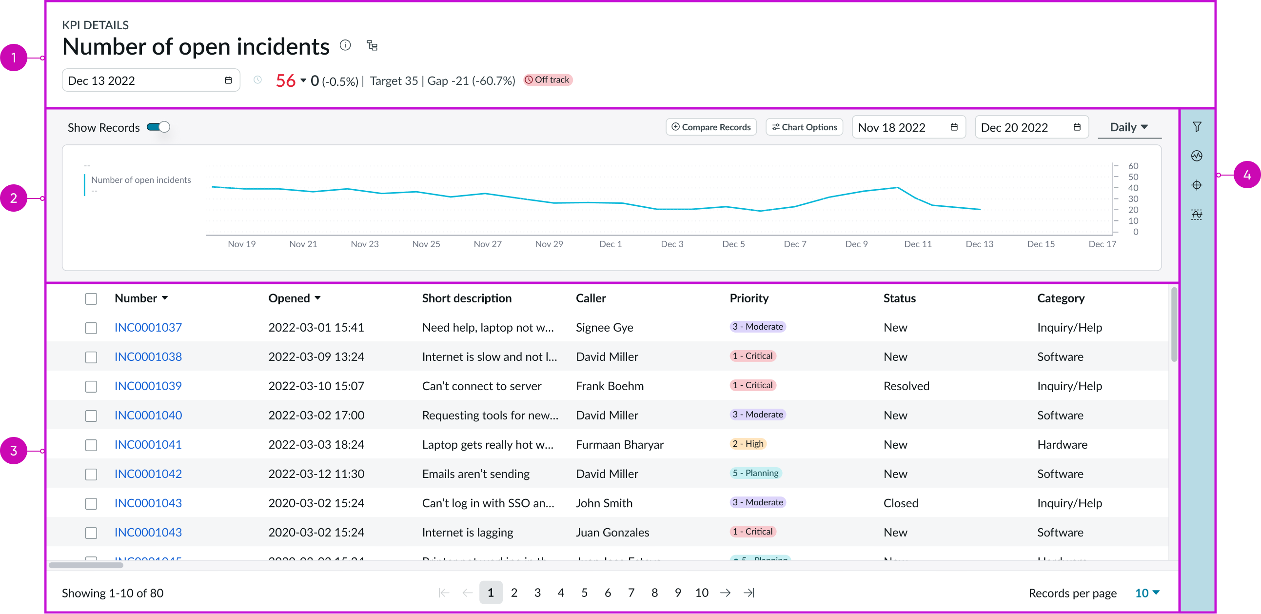
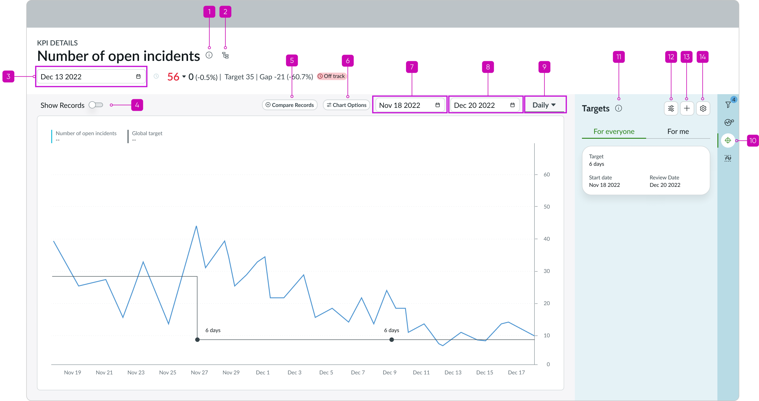
- Header: Provides the KPI name, information and score, and target summary for the latest collected score and entry point for the process optimization workbench
- Chart: Depicts the KPI information over time
- Records panel: Shows all records for a single date selected in the chart or through the date picker in the header
- Contextual side panel: Provides buttons that open tools to analyze the KPI
Header anatomy
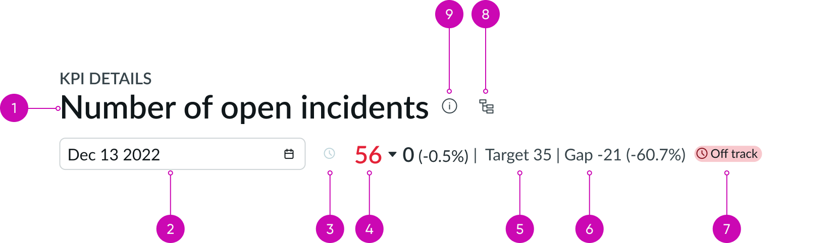
- Title: Provides the name of the KPI
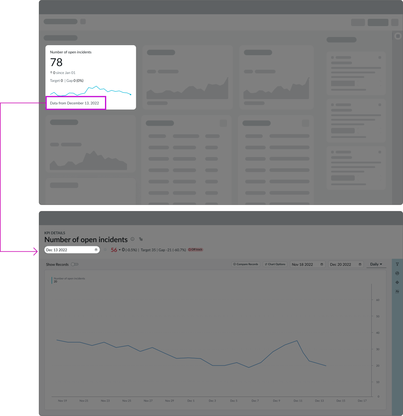
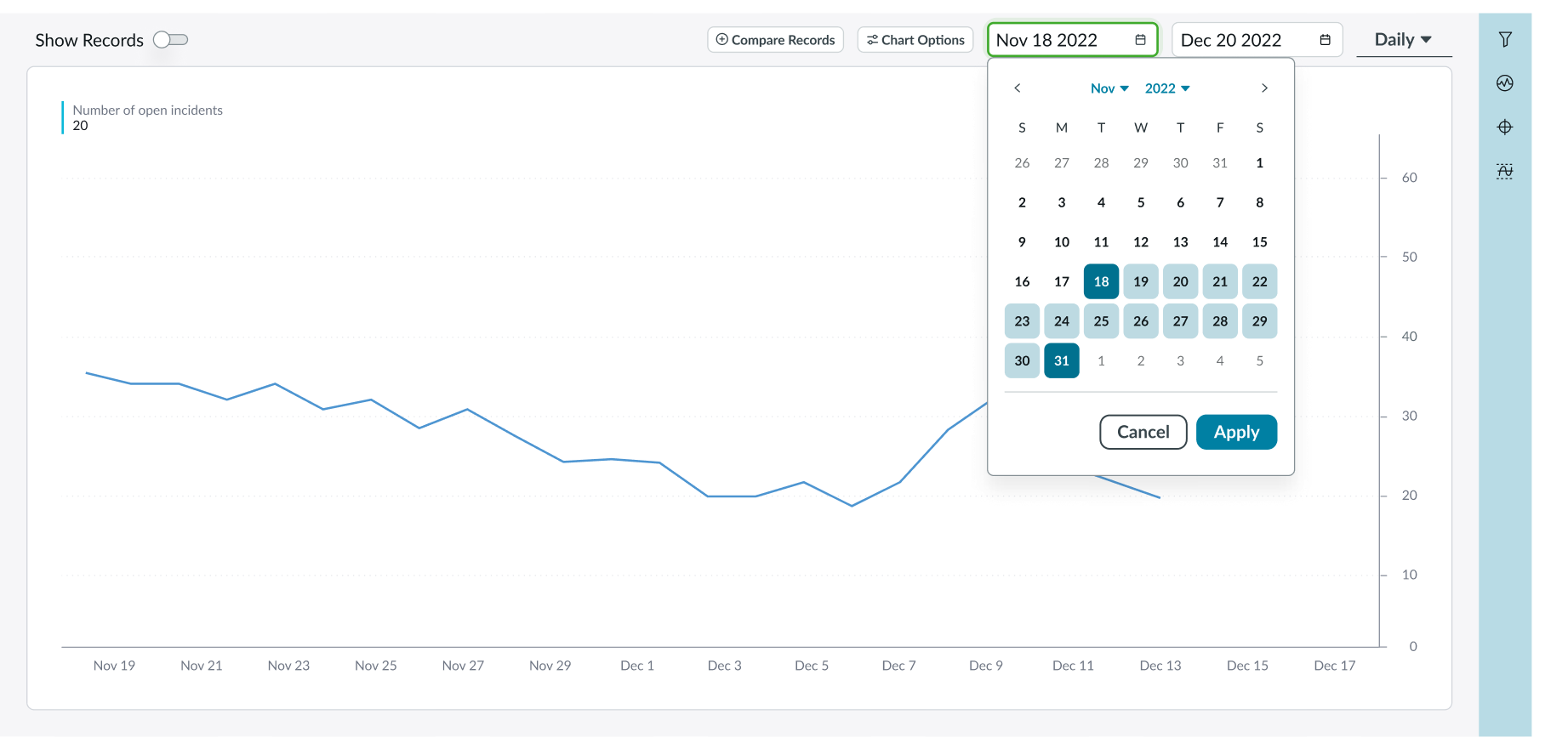
- Date picker: Chooses a date for which scores have been collected; by default, shows the date for the last collected score
- Real-time score control: Control that toggles between the current (real-time) score and the score for the date selected in the date picker; this control is not available when a time aggregation is applied
- Score: Displays the value of the KPI on a date selected in a date picker
- Target: Cites a desired score on a selected date; displayed only if a target is configured in the sidebar
- Gap: Shows the difference between a score and target on a selected date; displayed only if a target is configured
- Status badge: Badge indicating the status of the target value for the selected date, relative to the actual or forecasted KPI score on the target review date; for more information about target status, see Indicator targets in KPI Details
- Process optimization button: Opens the process optimization workbench for the KPI; the button is available only when the Process Optimization Core plugin in activated on the instance
- Info button: Opens a popover with basic info about the KPI (description, frequency, direction, tags, or formula for the KPI formula indicator)
Chart anatomy
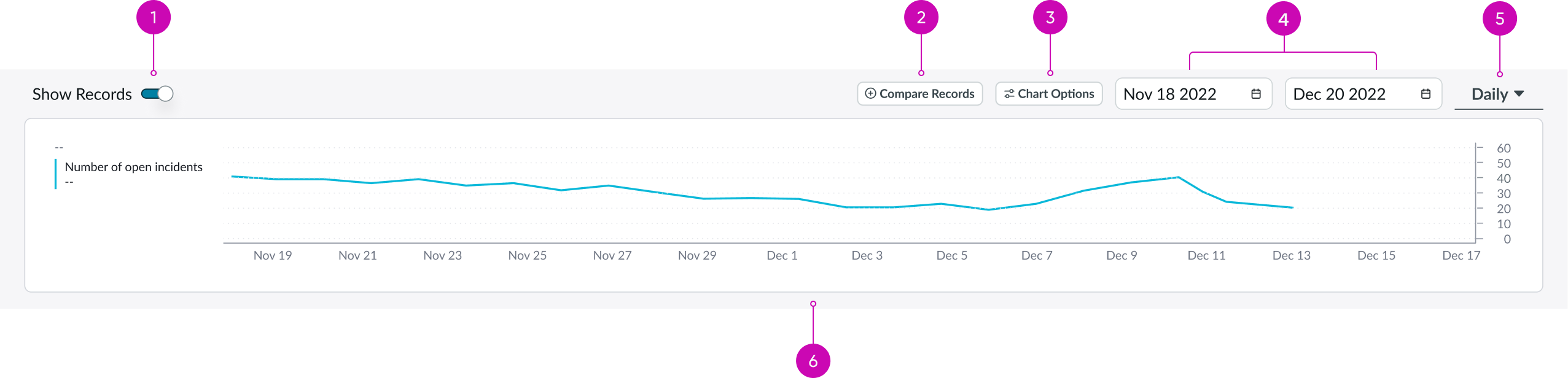
Chart anatomy with show records toggle on
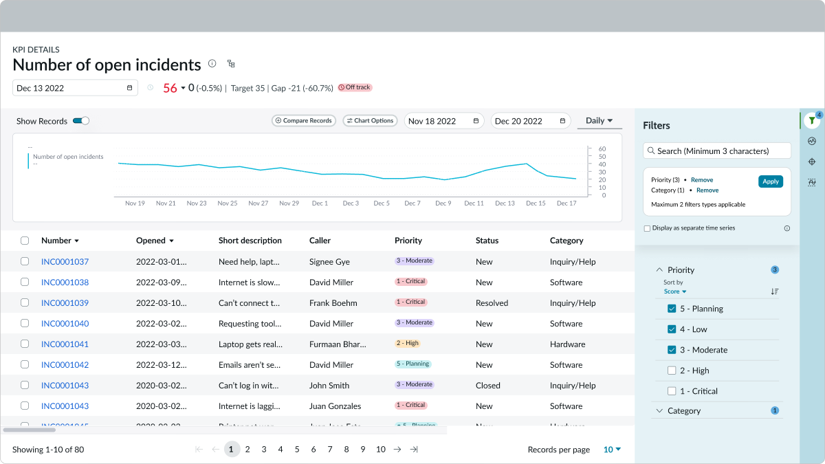
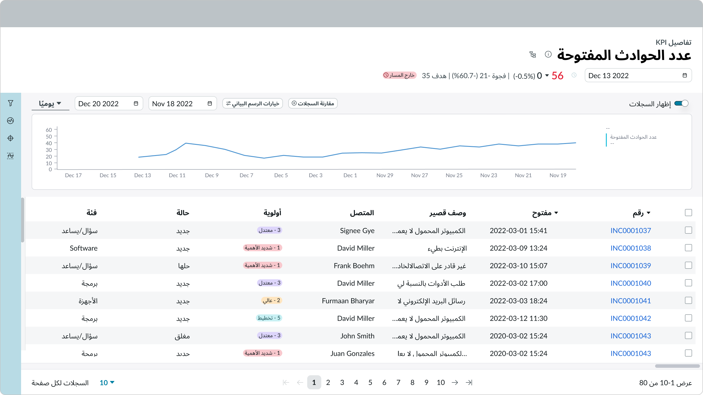
- Show records toggle: Minimizes the chart and displays a list of records below the chart for a selected date in the header; available only for automated indicators
- Compare records button: Compares the state of the selected indicator for two dates; available only for automated indicators
- Chart options button: Opens a popover with chart options that can be switched on and off
- Date range picker: Picks the date range for the information shown in the chart
- Time aggregation picker: Picks the period of time for chart aggregation, measured in days
- Chart timeseries: Shows the KPI scores over time
Records panel
The records panel is visible only when the "Show records toggle" is turned on.
Contextual side panel anatomy
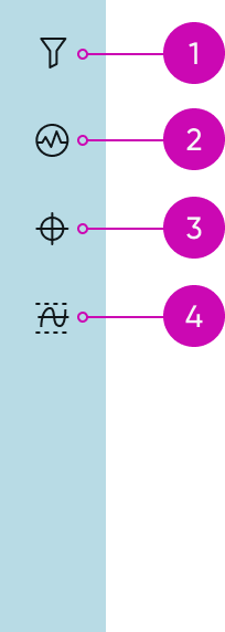
Contextual side bar with four buttons
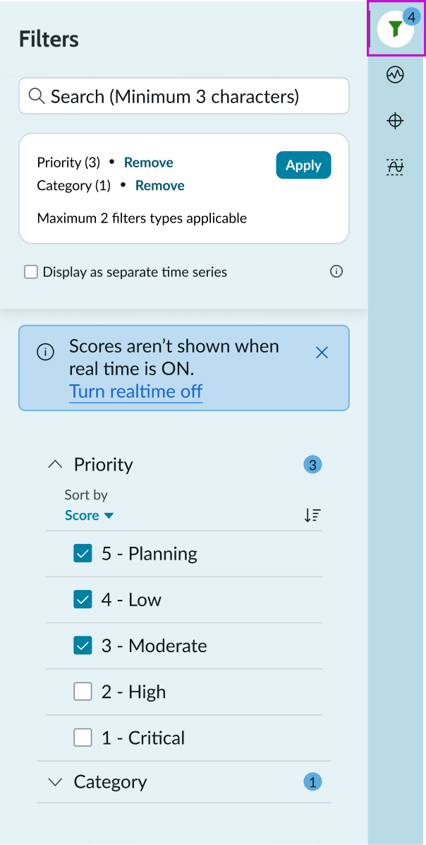
- Filters button: Opens a contextual side panel with filters (breakdowns) configured for the KPI
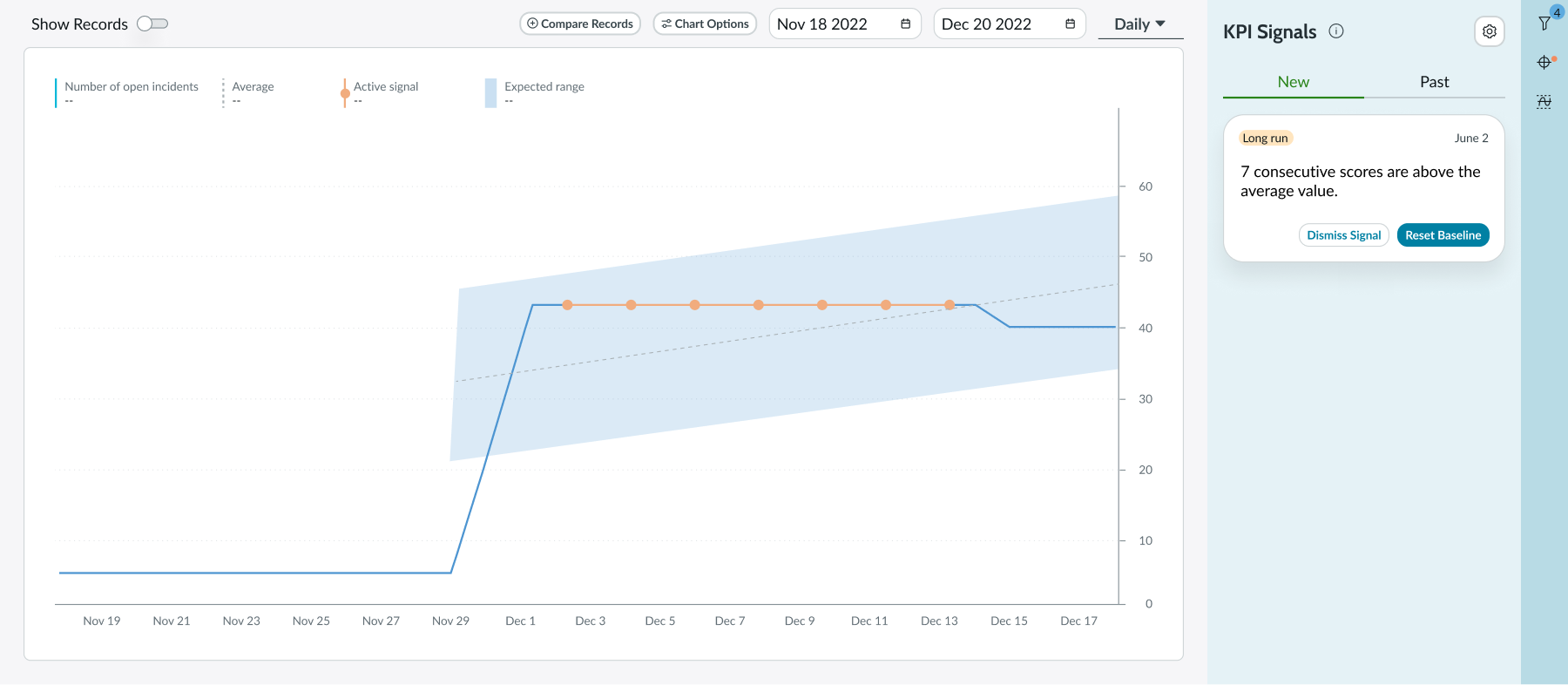
- KPI signals button (optional): Opens a contextual side panel with the KPI signal and transforms the chart timeseries and baseline (average) for the KPI and expected range of values
- Targets button: Opens a contextual side panel with a list of existing targets and an option to create new ones
- Thresholds button: Opens a contextual side panel with a list of existing thresholds and an option to create new ones
Subcomponents
See usage guidance for chart timeseries
See usage guidance for now-record-list-connected
See usage guidance for data visualization
See usage guidelines for accordion
See usage guidelines for KPI targets
Usage
The KPI details component helps users explore KPI performance and related records, and manage KPI signals, targets, and thresholds. Component access is through clicking the "performance analytics visualization" chart on a dashboard or selecting a KPI from a list on the analytics center home page. For more information, see the product documentation for KPI.
Configurations
Learn how to customize KPI details by configuring the available properties.
Filters
When you choose a KPI to display in a component, your KPI can be configured as prefiltered. You can choose one or more filters through the filter icon in the contextual side panel. The filter icon includes a badge subcomponent with a count of applied filters.
For monitoring and reporting of current data and indicators, you can use a data visualization component for a broad range of visualizations.
For example, the Score date property allows passing a date parameter to the KPI details component by clicking the "performance analytics visualization" chart on a dashboard. The date selected is passed on to the KPI details component.
The Score date and Domain properties are part of UI Builder configurations. The score date determines which date is preselected in the KPI details header when a user navigates from a chart timeseries component. The domain configuration helps keep the user in the existing domain when navigating from another product documentation.
Design recommendations
Learn how to apply the KPI details component in your design.
Behavior
Learn how the KPI details component behaves when the display changes or a user interacts with the component.
States
KPI Details has the following states: Default, Hover, and Selected.
Default
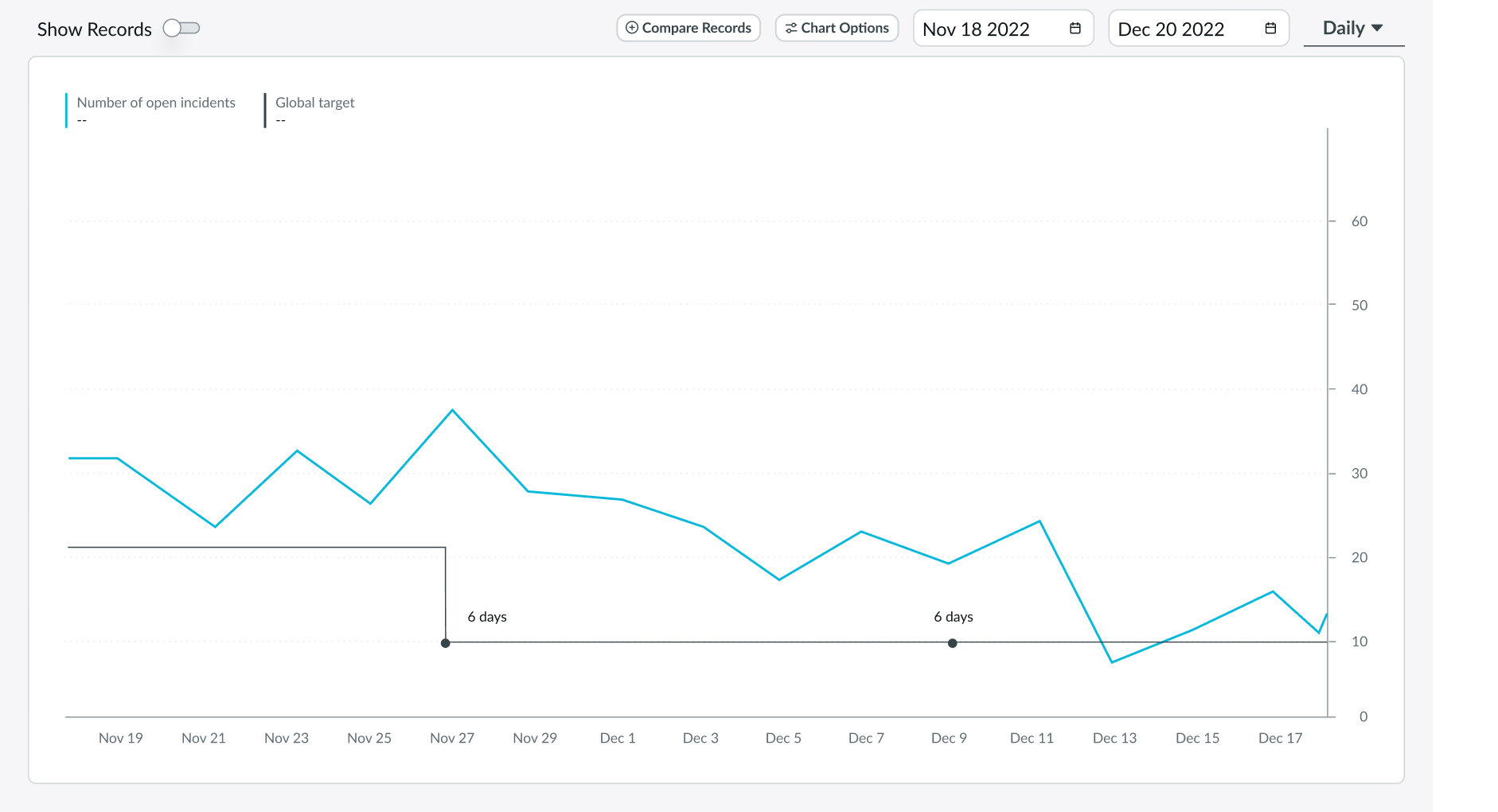
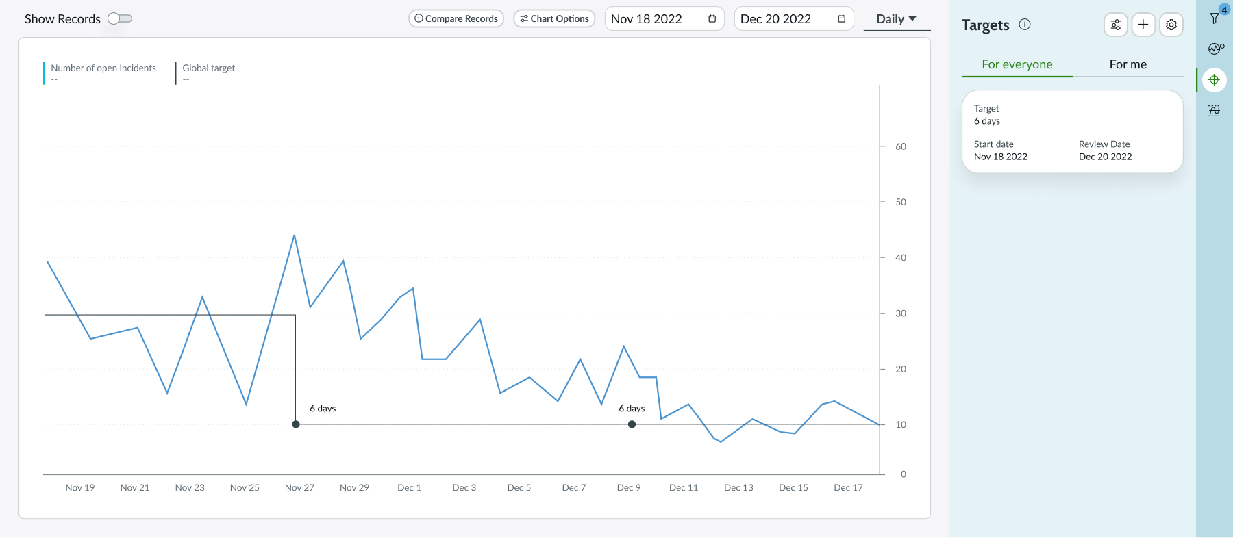
Chart's default view with a target set for everyone
Hover
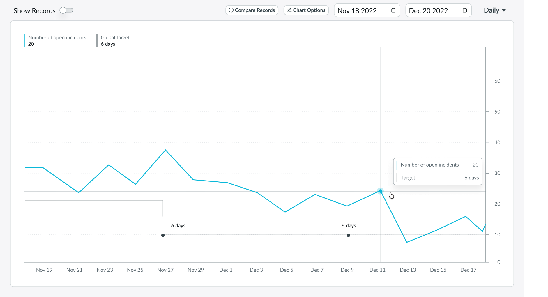
Chart being hovered in which values are shown on the pop-over and the legend
Selected
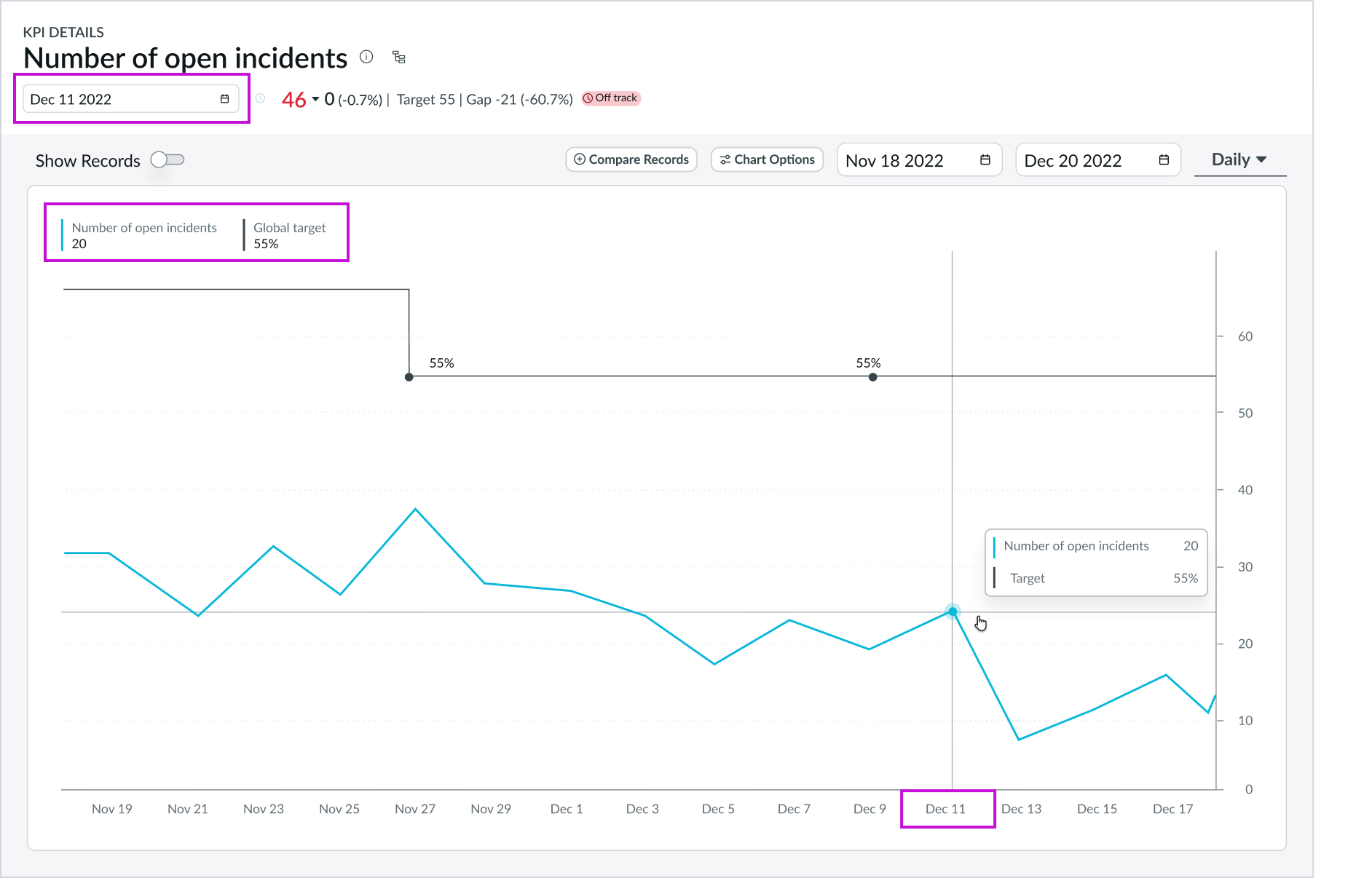
Chart with a data point selected; the values are shown on the pop-over and legend with the date picker in the header automatically following the date of the selected data point which generates the score on the side
Interactions
Learn how the KPI details component responds when a user interacts with it.
KPI information
The info button in the header opens a popover that provides basic KPI information, including a description, frequency, direction, and tags (as well as formula in the case of formula indicators). If the indicator is a formula indicator, the user can navigate to that indicator by selecting it.
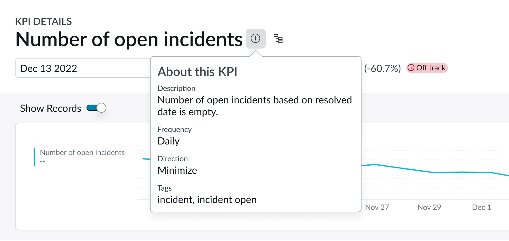
Info icon pop-over showing information regarding the KPI
Displaying the process optimization workspace
Users can open the process optimization workspace from within KPI details from a button in the header. This integration is available when the Process Optimization Core plugin is active on the instance.
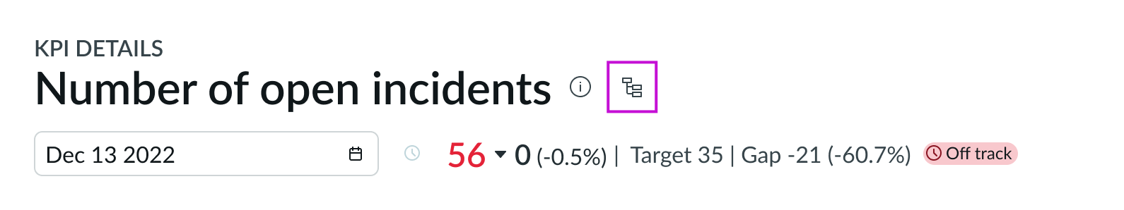
Process optimization button in the KPI header
The process optimization workspace for the KPI contains an interactive process map, exploration filter panel, and prebuilt performance metrics. The workspace opens in a new browser tab.
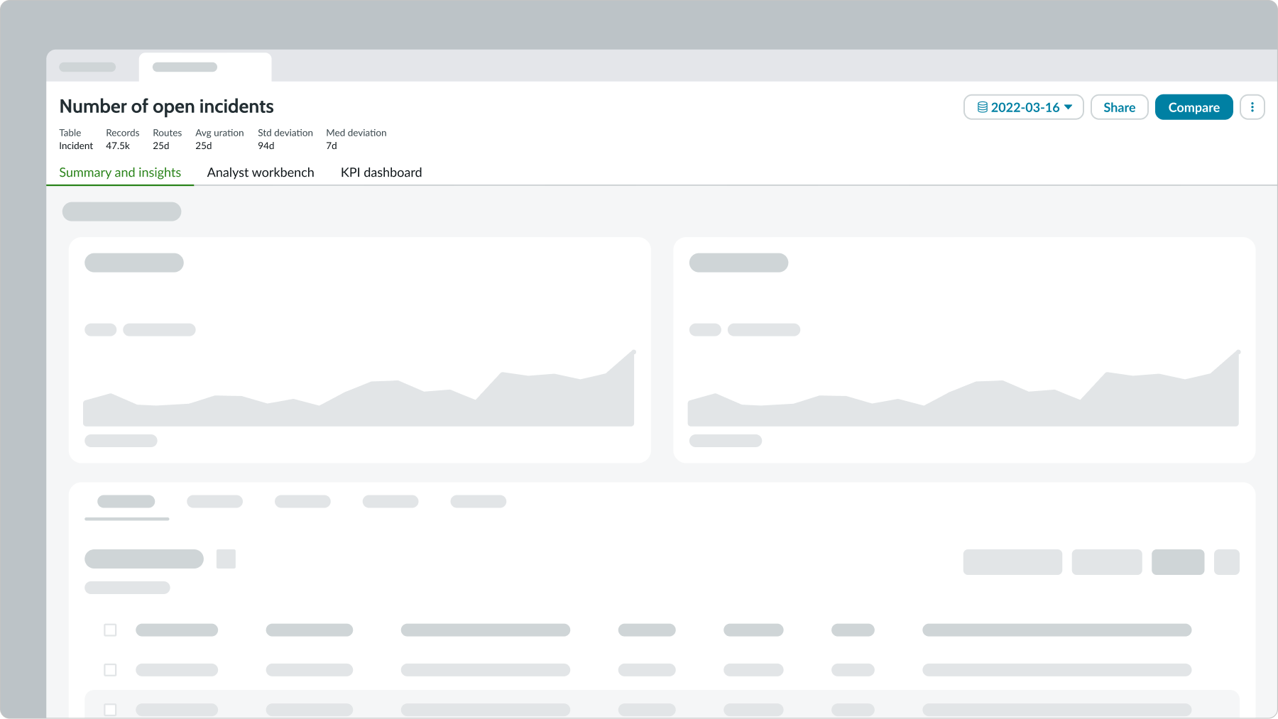
Sample process optimization page, which opens in a new tab
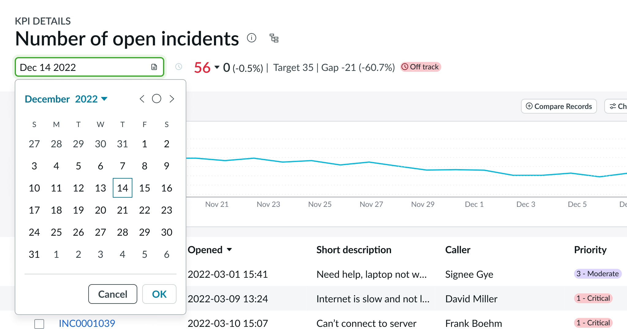
Date picker
Changing a date in the date picker also updates the score, change, and trend information indicated in the header. When the user toggles Show Records, the records for the selected date display below the chart. Date picker is only available for automated indicators.
Viewing records
Users can show or hide the records in the panel with the Show Records toggle switch. In this example, the records are shown.
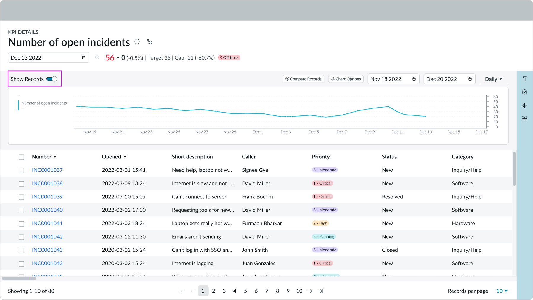
This example is showing the records below the chart after the show records was toggled on
Chart options
KPI details provides these three chart options a user can select: Analysis, Time Series, and Chart type.
Analysis
The analysis chart options provide these views of a time series chart:
- Targets: Desired scores for the KPI in the chart
- Thresholds: Constants in the chart; subscribers are notified when a score crosses a threshold
- Forecast: Range of predicted values for future scores
- Trend: Trend line calculated for the visible portion of the chart
- Comments: Annotations for individual data points in the chart
- Labels: Numerical values for individual data points in the chart
- Statistics: Displays label value pairs of statistics that match the date range, time aggregation, and function configured
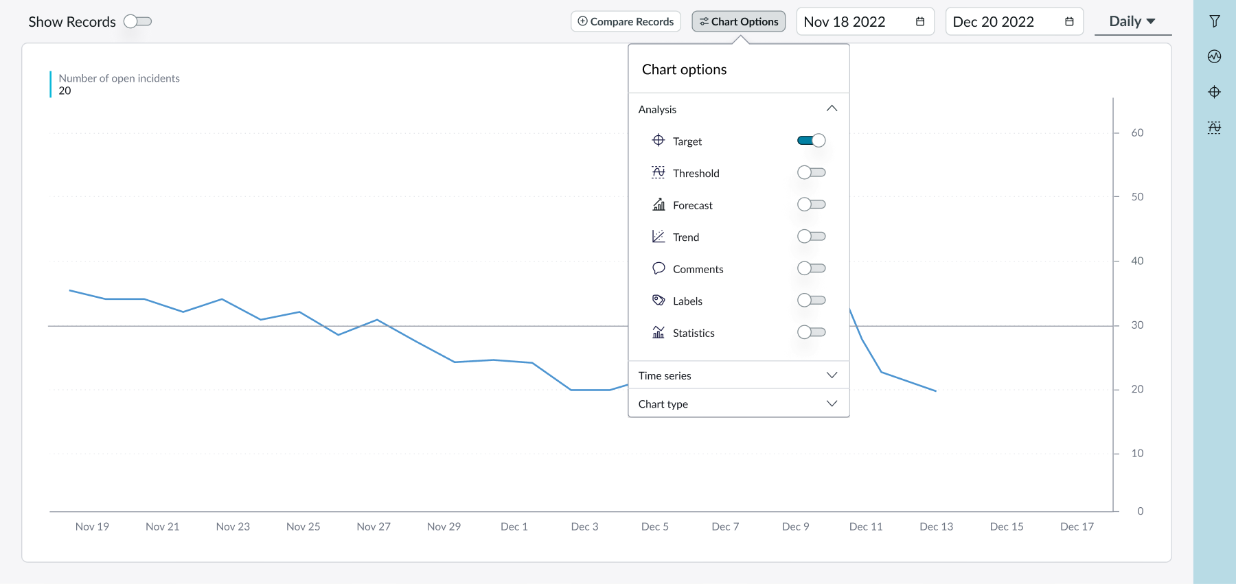
Chart options pop over open showing the analysis section
Statistics display in a strip beside the chart and show summary details of the date range and aggregation selected.
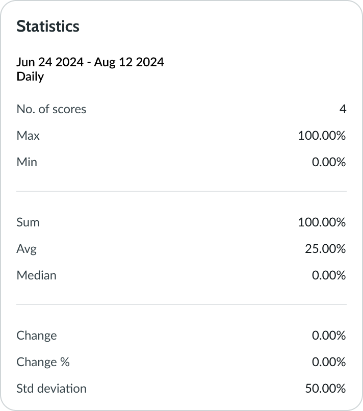
This image is an example of statistics that appear beside the chart after user toggle it on
Time Series
The time series chart options enables users to visualize the changes in the indicator values, expressed as a number or as a percentage.
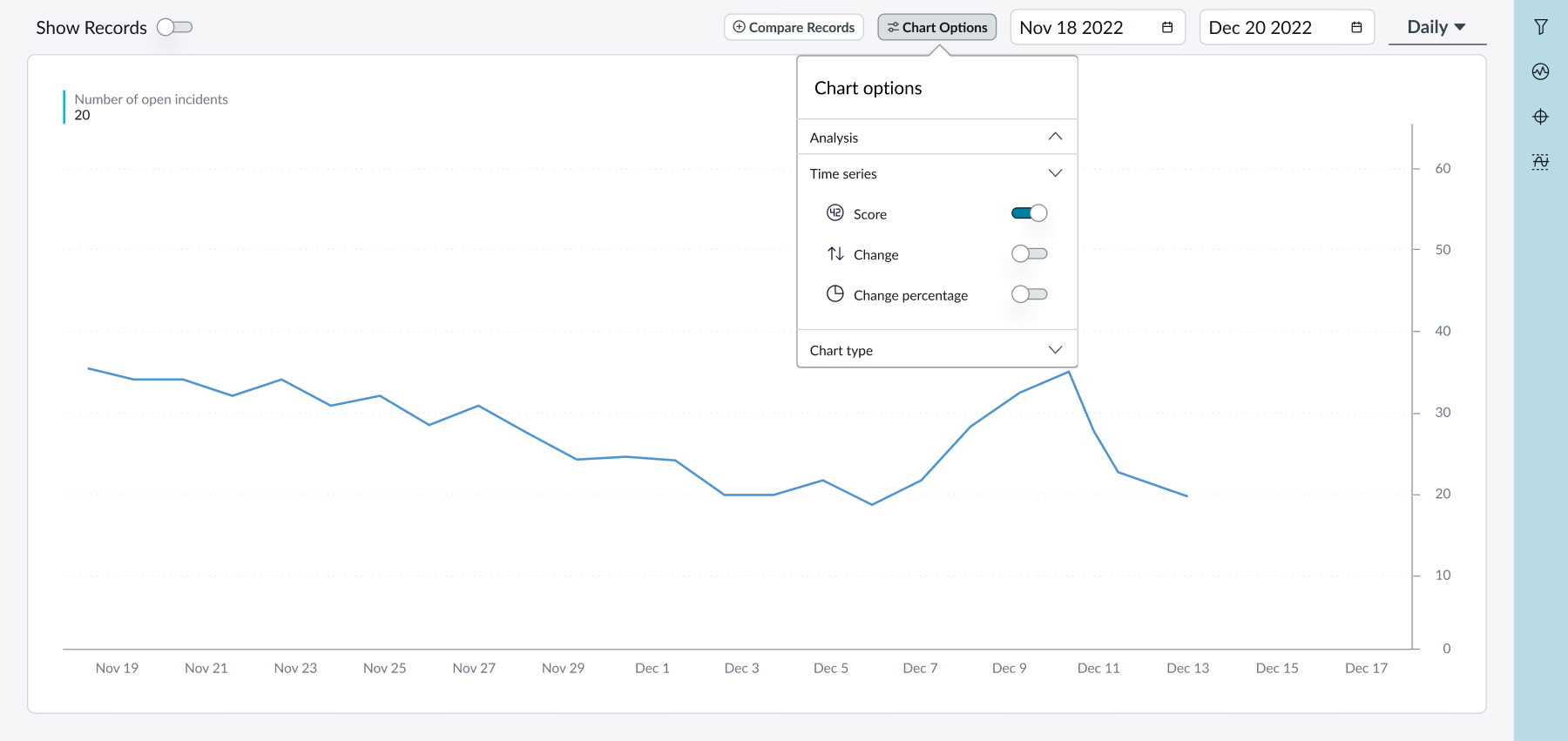
Chart options pop over open showing the time series section
Chart type
The chart type chart option enables users to view the data using different time series chart types, such as area and column charts.
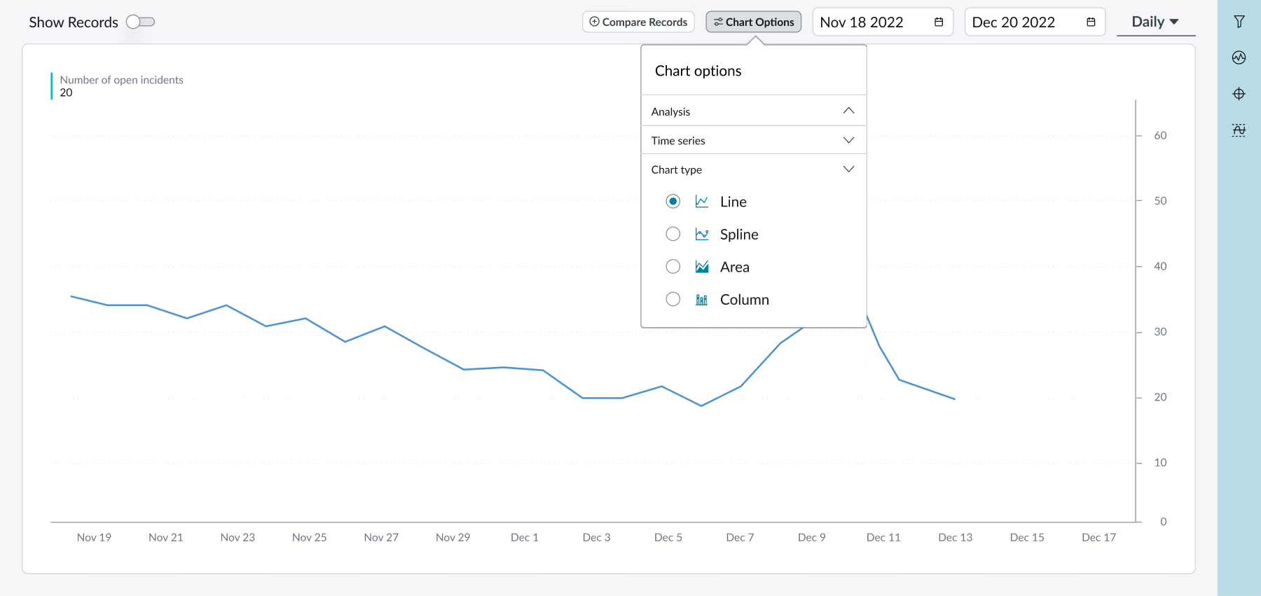
Chart options pop over open showing the chart type section
Date range picker
The date range picker determines a specific period of information shown in the chart.
Filters
Selecting the filter button from the contextual side panel opens a sidebar with all breakdowns configured for the specific KPI. Users can search for a filter by name or by exploring a selection of filters in an accordion subcomponent.
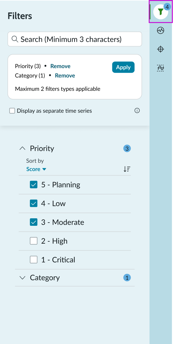
Filters side panel open
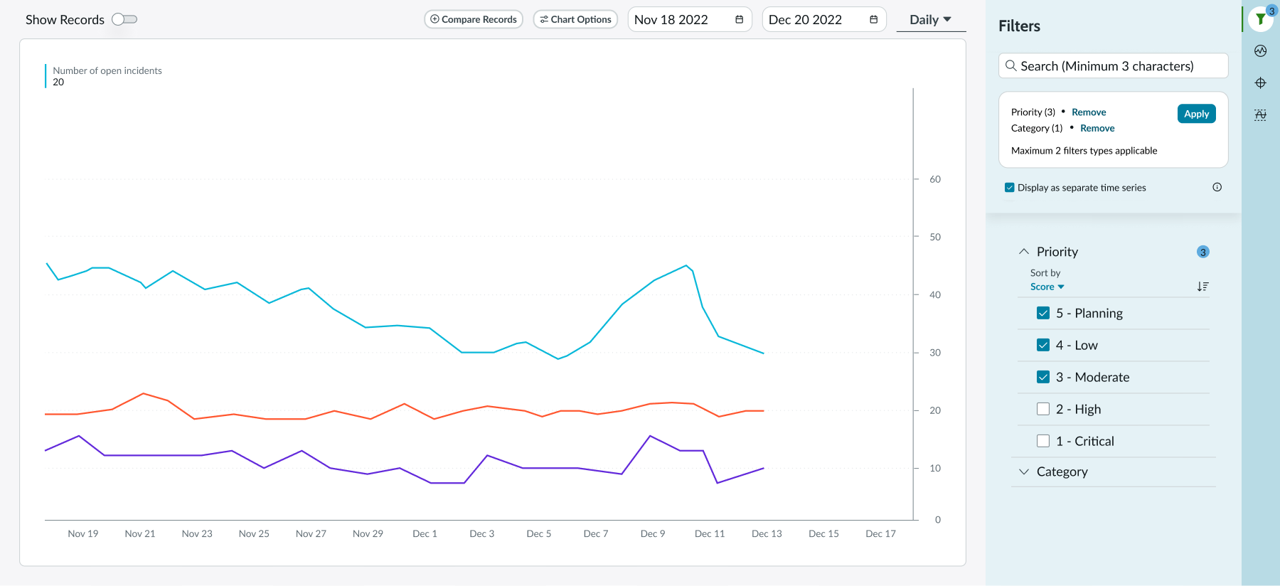
Applying multiple filters with the Display as separate timeseries option selected results in multiple line charts in the same chart view.
KPI signals
Selecting the KPI signals button from the contextual side panel opens a sidebar that allows the KPI details component to adjust to KPI signals in 3 ways:
- The score summary in the component header is replaced with a description
- Most chart options are not available
- Chart timeseries changes into the process control chart, which shows the KPI signals in the context of average value and range of expected values
Targets
Selecting the targets button from the contextual side panel opens a sidebar that displays a list of targets. Targets from the sidebar are also visible in the chart, if the target option is toggled on in the chart options.
The sidebar includes an option to create new targets and displays a list of global and personal targets for past, current, and future time periods.
Thresholds
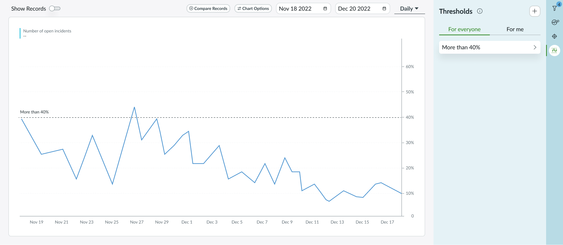
Selecting the thresholds button from the contextual side panel opens a sidebar with a list of thresholds. Thresholds are visualized in the chart if the corresponding option is toggled on in the chart options. The sidebar also includes an option to create new thresholds and displays a list of existing global and personal thresholds for past, current, and future time periods.
Usability
The KPI details component complies with all internationalization and accessibility requirements.
Internationalization
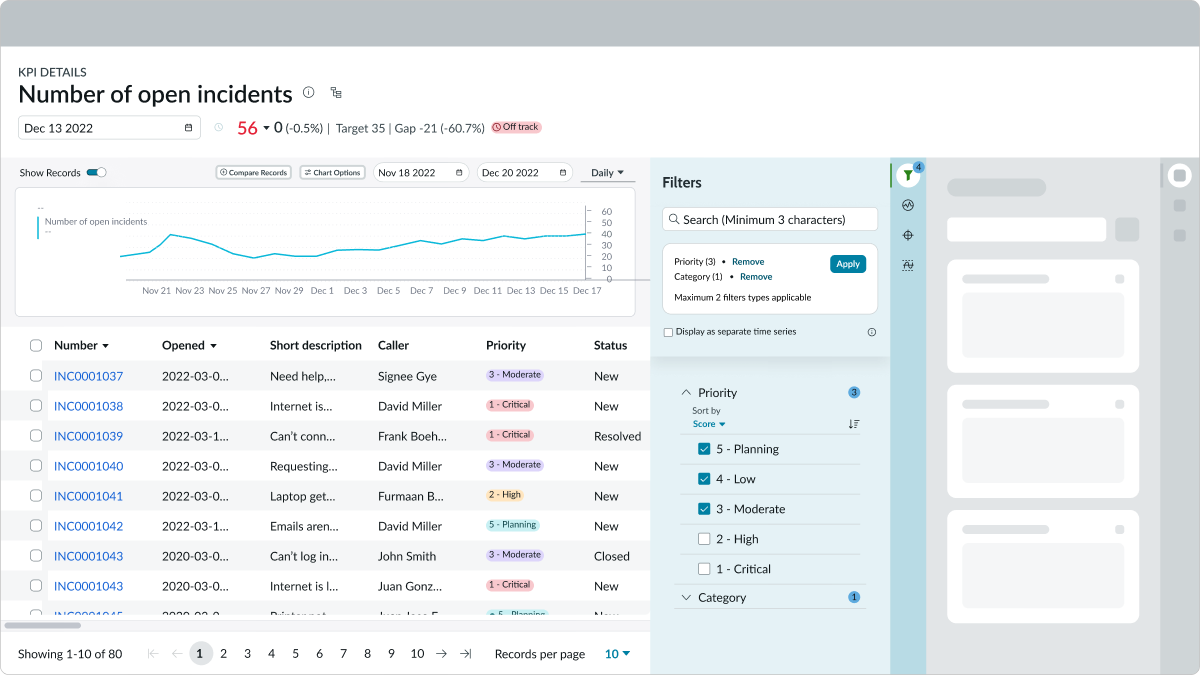
When the display translates to a right-to-left (RTL) language, the layout of the KPI details component and all of its subcomponents change to a RTL direction.
Accessibility
Learn how to access the actionable elements of the KPI details component through keyboard interactions and screen readers.
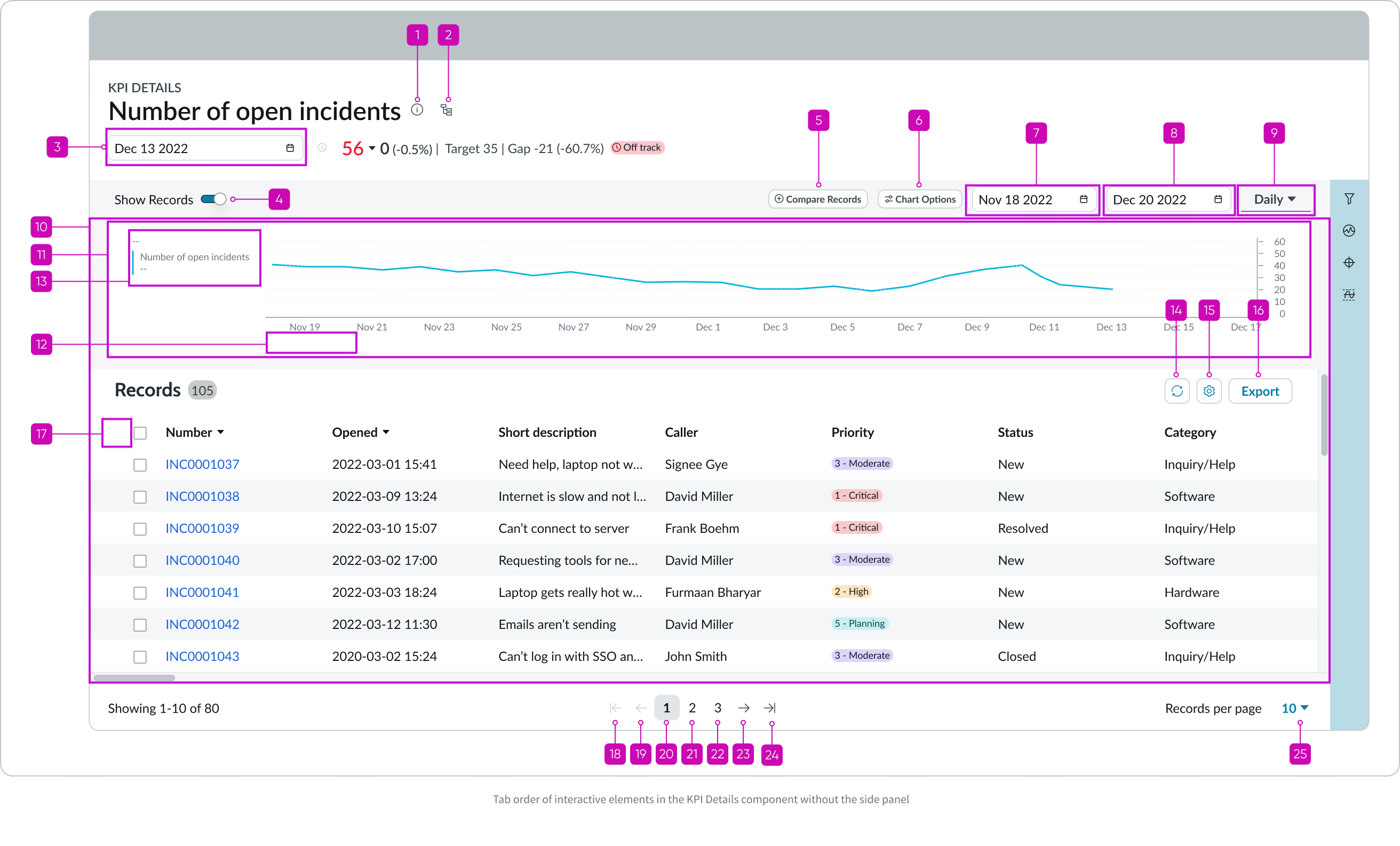
KPI Details tab order
This is the high-level tab order for KPI Details.
Tab order with side panel
Tab order of interactive elements in the KPI Details component with the side panel
Tab order without side panel
Keyboard interactions
You can access the actionable elements of KPI details component with these keyboard keys:
- Tab or Shift+Tab: Moves focus through interactive elements of the KPI details component in the order annotated in the image below
- Space or Enter: Triggers an action associated with an interactive element when in focus
- Arrow Up and Down: Moves focus through all available buttons, when focus is in the Contextual Sidebar
Screen readers
When you apply ARIA labels to a component, screen readers announce the controls and content of the KPI details component in the prescribed tab order.