

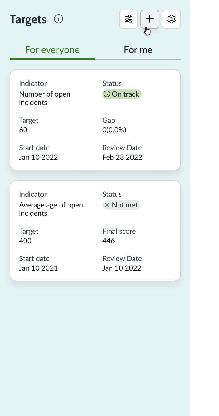
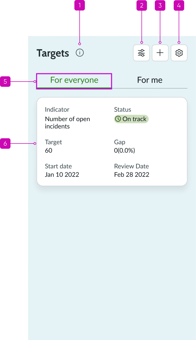
Anatomy
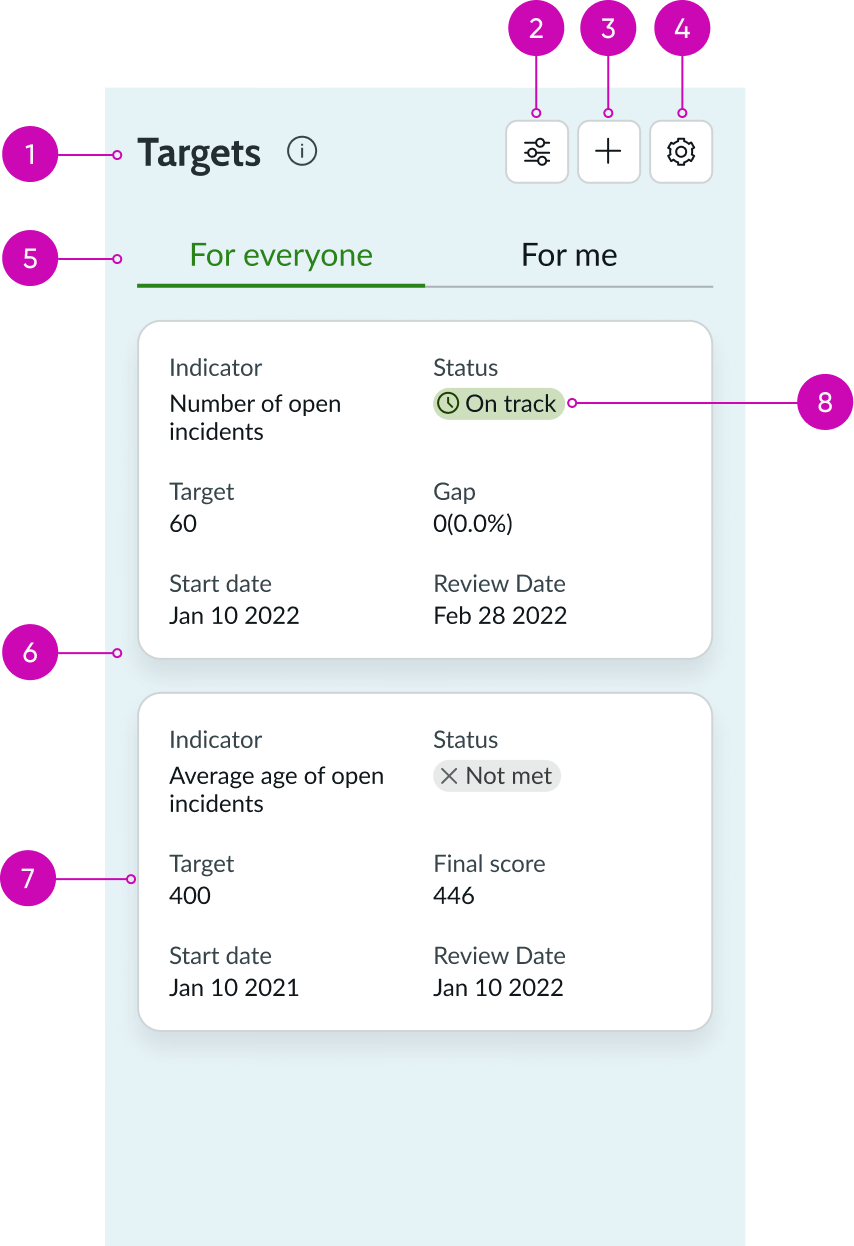
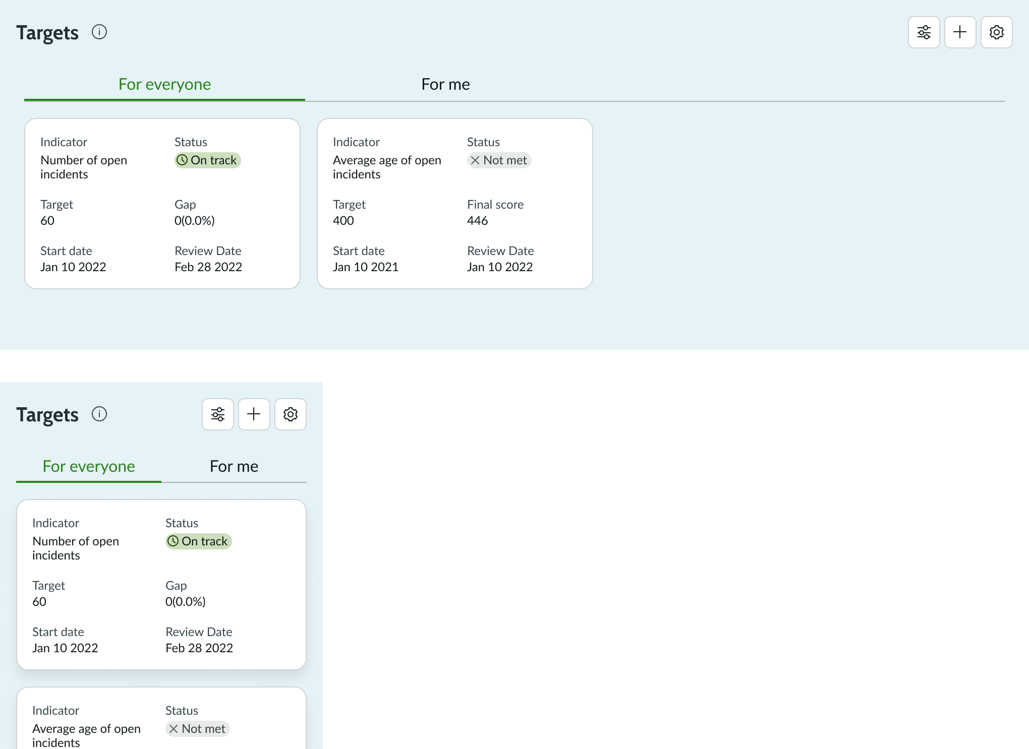
- Header: The target list title created by the user
- Settings button (optional): A button that allows the user to determine whether past, present, or future targets are displayed on the card
- Add button (optional): A button that opens a form to add a new target to the list
- Target Configuration button: A button that allows users to configure existing target calculations or add targets to breakdowns
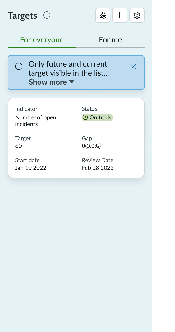
- Target visibility tabs (optional): Used to toggle between “For everyone” and “For me” targets; “For everyone” targets (“Global” targets previously) are visible to all users, while “For me” targets are named personal targets that are only visible to the user who created them
- Target list: List of target cards; organized from newest targets (top) to oldest targets (bottom)
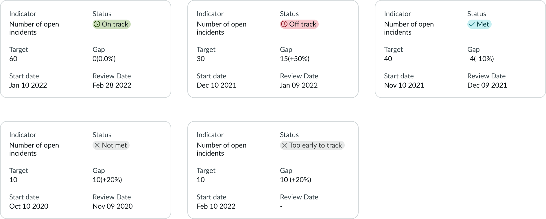
- Target card: A card that holds target information; includes target value, start date, review date, target status badge, and card title to distinguish targets by their respective KPI (optional)
- Target status badge: A colored badge that informs about the target status. The available status are on track, off track, met, and not met
Usage
Use the KPI targets component to display target values, set targets, or modify existing targets. You can configure the component to enable users to perform these tasks:
- Display target types in the list (For everyone (Global), For me (Personal), or All)
- Filter the list by time to show present, past, or future targets
- Edit or create targets
- Create custom titles for target lists
Variants
Learn about the attributes of KPI targets.
Sizes
KPI targets don’t have predefined sizes. Instead, KPI targets automatically resize with its container.
Configurations
Learn how to customize KPI targets lists by configuring the available properties.
Target visibility tabs
By default, target visibility tabs are present to allow the user to toggle between global targets (For everyone) and personal targets (For me). Global targets are visible to all team members while personal targets are only visible to the user who created them.
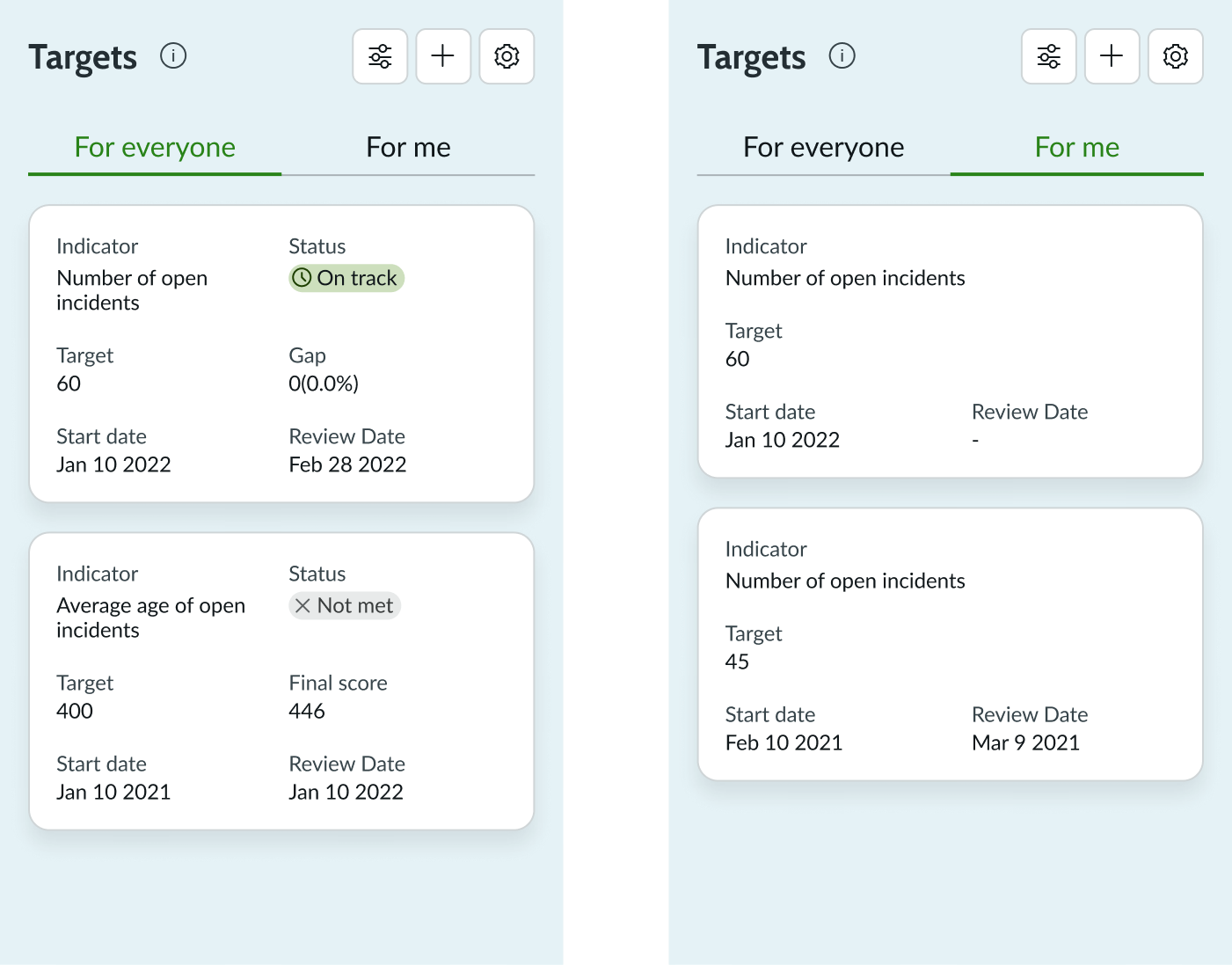
Target visibility tabs can be removed when only one type of target is sufficient, or when it’s not necessary to separate targets based on their visibility.
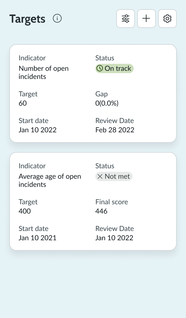
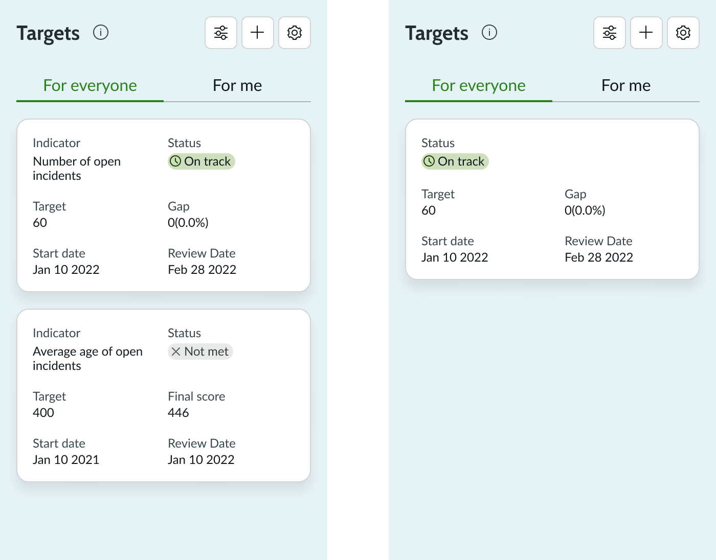
Card titles
Card titles are reserved for KPI names and can be included to distinguish targets belonging to different KPIs. When KPI targets are used in the context of only one KPI, it is not necessary to include card titles.
Target status badge
Target status badge shows whether the indicator is on track, as of the current date, to meet the target on the due date. For target values in the past, it shows the status Met or Not met.
- On track: Given the score on the current date, the target is expected to be met by the Review date
- Off track: Given the score on the current date, the target is not expected to be met by the Review date
- Met: The target was met on the review date
- Not met: The target was not met on the review date
- Too early to track: There is no status to display as there’s not enough data collected yet
Design recommendations
Learn how to apply KPI targets in your design.
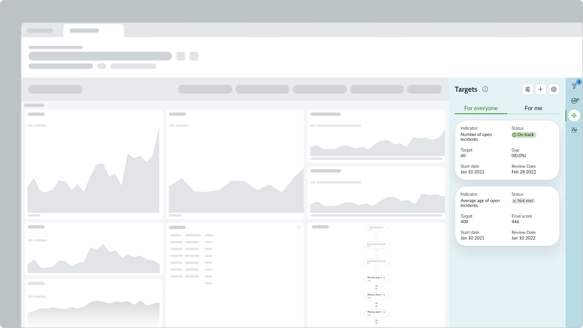
When the page contains other components, KPI targets should be placed in the sidebar. This keeps target cards in one column and preserves the chronological card order.
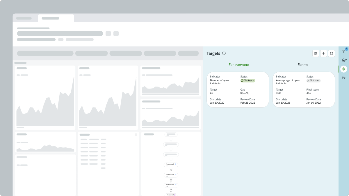
When the page contains other components, KPI targets should not be in a container so wide that it allows for more than one column of target cards. This can make it difficult for the user to read targets in chronological order.
Alignment and positioning
When used on a page with other components, KPI targets should be positioned in the sidebar to supplement the page’s main content.
Behavior
Learn how KPI targets behave when the display changes or a user interacts with the component.
Responsive behaviors
KPI targets automatically resize to fit the container.
Interactions
Learn how KPI targets respond when a user interacts with it.
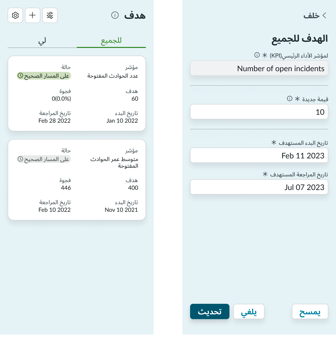
Creating a new target
Users can create a new target by selecting the add button and completing the new target form. Any user can create a personal target, but only users in an admin role can create global targets. Additionally, users assigned to specific indicators can also set global targets for those indicators. In the new target form, required fields are indicated with an asterisk and must be completed to create a new target card.
Select the Add button to create target
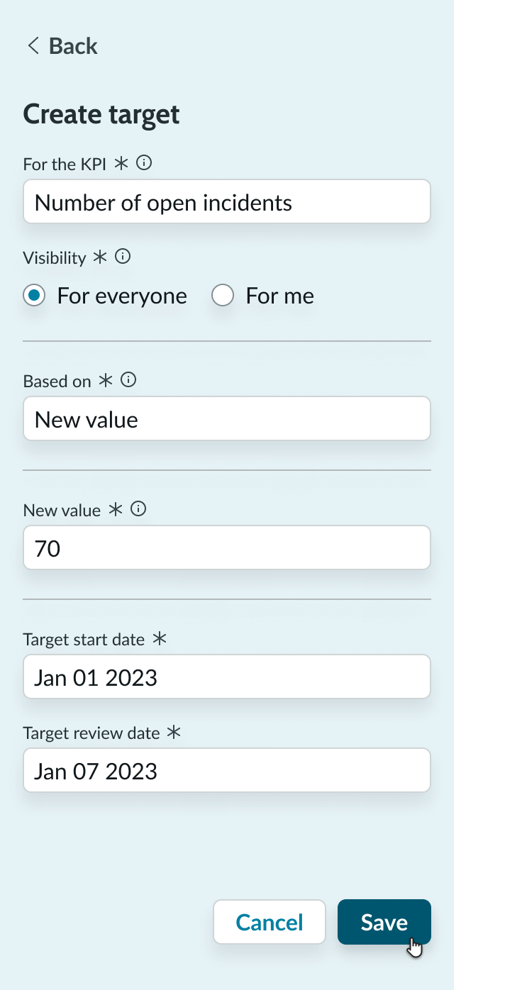
Complete the target form and select Save
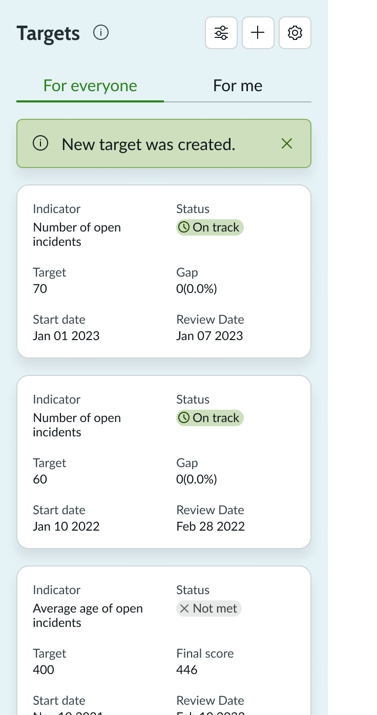
See alert of the new target created
Target list settings
A user can select the settings button to choose which targets (past, current, future) are displayed in the target list. In the settings menu, at least one option must be selected. To display past, current, and future targets, the user can select all options.
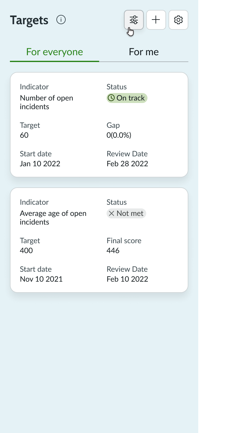
Select the Target settings button to open the settings menu
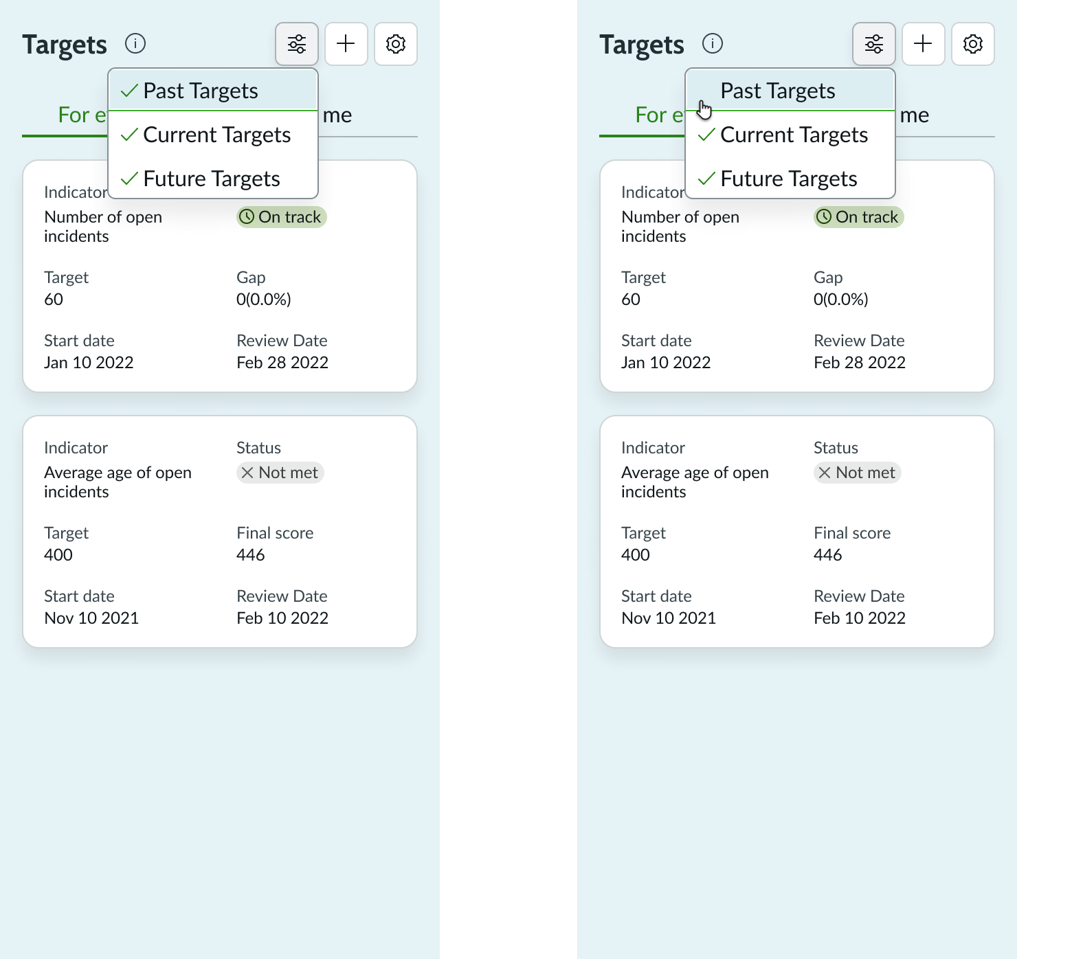
Select or unselect targets
Targets are displayed based on the selection
Editing existing targets
A user can select any existing target card to open an editable form for that target. In the form, the user can change any existing values and then select the update button to save the new changes.
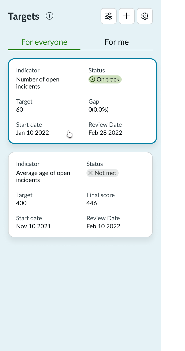
Select the target card to edit
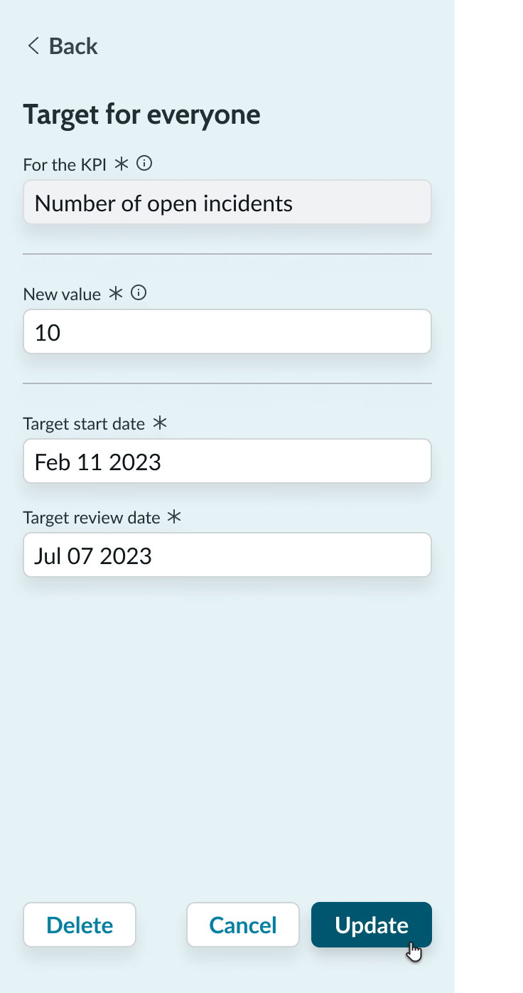
Edit the target details and select Update
Usability
KPI targets complies with all internationalization and accessibility requirements.
Internationalization
When this component is used in a platform configured for a right-to-left (RTL) language, the contents of KPI targets will flip sides. This includes buttons, icons, and text.
Accessibility
Learn how to access the actionable elements of KPI targets through keyboard interactions and screen readers.
KPI Targets tab order
This is the tab order for KPI targets
Keyboard interactions
You can access the actionable elements of KPI targets with these keyboard keys:
- Tab or Shift + Tab: Focus moves through interactive elements of target cards and editing forms
- Space or Enter: Executes the action associated with the interactive element in focus
- Arrow up and Arrow down: Moves through the list of cards
- Arrow left and Arrow right: Switches between tabs
Screen readers
When you apply ARIA labels to a component, screen readers announce the controls and content of KPI targets in the prescribed tab order.