

Anatomy
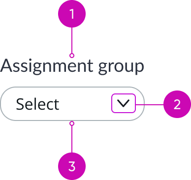
- Filter label: Text that shows the name of the filter
- Caret icon: Visual representation for the action that occurs after the user interacts with the filter; the entire component is selectable, and not just the icon
- Container: Contains all elements of the filter
Subcomponents
See the usage guidance for pill.
See the usage guidance for dropdown.
Usage
Use filters to create an area on a page, where the user can filter data visualizations in a dashboard. You can configure pills that enable users to select filter values in dropdown lists or date ranges in a calendar. True/false values can be filtered using radio buttons.
When you include different data visualization charts, make sure that all filters apply to the charts. If a chart doesn't have the data represented by a filter, the data visualization won't change.
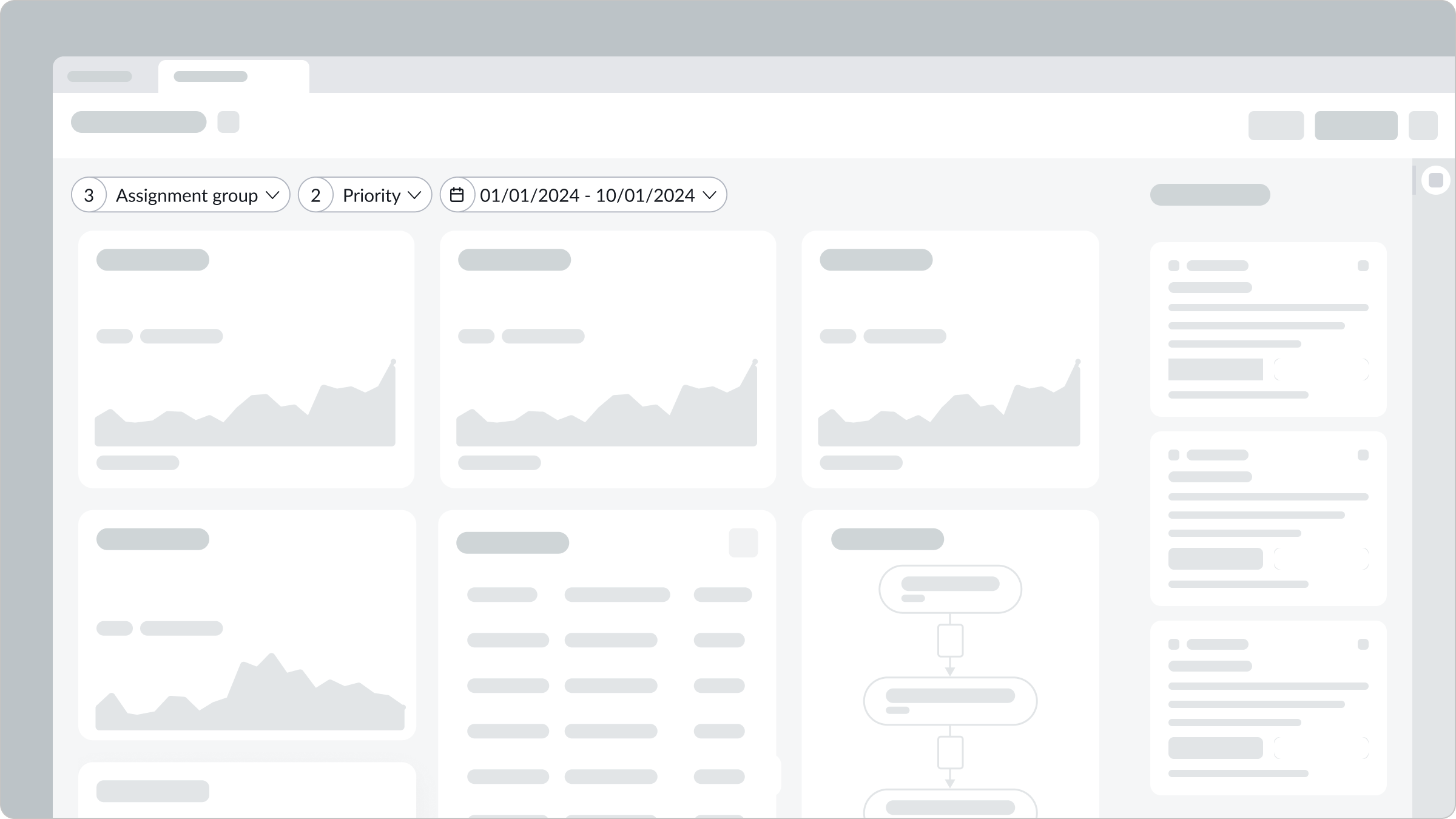
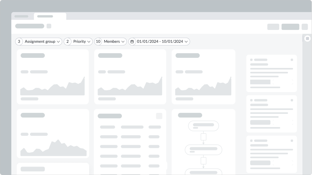
In this example, the available filters use pills for single and multi-select dropdown lists and a date range.
Variants
Learn about filter and find out how to use it in your design.
Types
Filters have 3 types: list selection , true/false, and date. Filter pills can display popovers & dropdown lists for selecting items or calendars for defining date ranges. Radio buttons are used as alternate UI for single select list selection, checkboxes are used as alternate UI for multi select list section.
Selection
Selection filters enable the user to select one or more options from a dropdown list in a pill. No icon is displayed for selections from single-select filter lists. However, pills for multi-select filter lists display the total number of filters applied from that list. The text label in the pill shows the values selected in that filter. Values are truncated if they overflow the width of the pill.
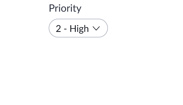
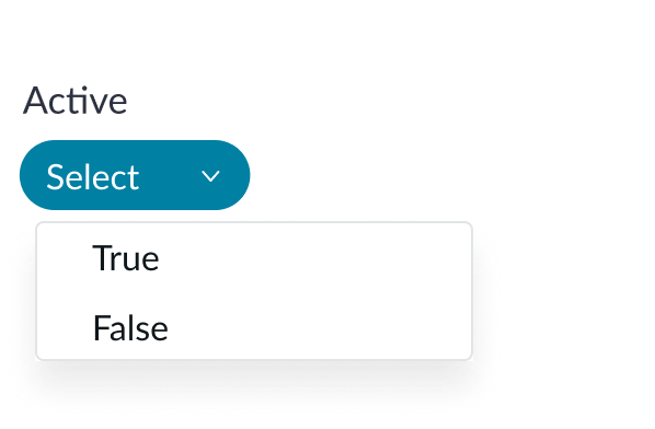
True/false
The true/false filter allows users to choose between two boolean values. The pill shows the selected value.
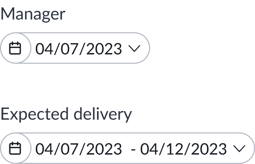
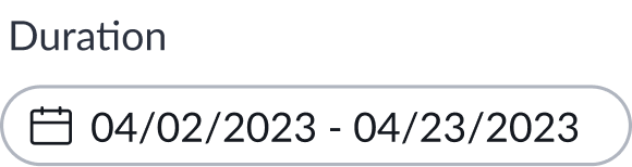
Date
Date filters can filter on fixed dates or date ranges. In the selected state, a calendar icon appears in the filter pill, and the content shows the selected date or date range.
Configurations
You can configure the label that appears for each type of data label. However, you can't configure what indicator appears in the filter. These indicators are tied to the filter types and can't be changed.
Design recommendations
Learn how to apply filters in your design.
Use filters in the same area to create a defined filter area.
Don't apply filters in different areas of the page. This can confuse the user as to which filters apply to which content.

Add only relevant filters that relate to the visuals and other components on the page. A single line can fit approximately 5 to 7 filters (depending on their labels).
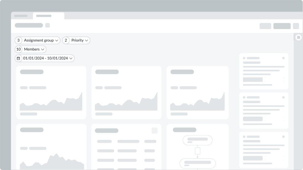
Don't add more than 1 line of filters on the page. Multiple lines of filters can overlap one another when the user selects and opens a filter.
Configure only 1 filter for the same table. For example, the filter "Priority" is inclusive of the "Incident" and "Problem" data sources.
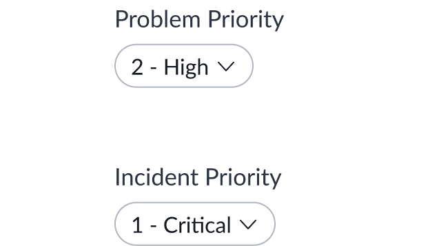
Avoid configuring specific filters for the same value from different tables.

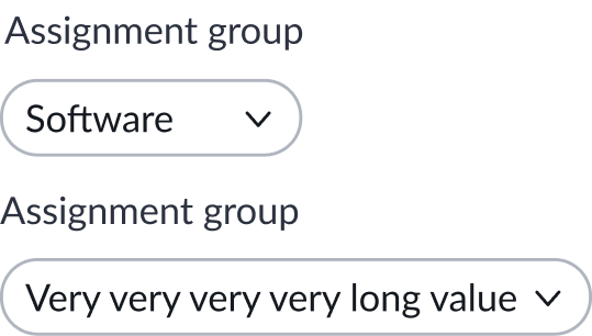
Keep labels informative and short to increase readability and scanning.

Avoid using long filter labels, as they take up too much space and are more difficult to understand.
Alignment and positioning
Keep filters together in an easily scanable form either at the top of the page in a single, horizontal line or in a side panel. The placement of the filters should be adjacent to the related content.
UI text guidelines
These are some recommendations for using text within filter:
- Use sentence case for all titles, labels, and column headers.
- Capitalize only the first letter and any proper nouns in a string of text.
- Ensure content is contextual and specific.
- Create a clear and distinguishable label for any empty fields.
Behavior
Learn how filter behaves when the display changes or a user interacts with the component.
States
Filter pills have three states: default, pressed, and selected.
| State | Appearance |
|---|---|
| Default |  |
| Pressed |  |
| Selected |  |
Responsive behaviors
Learn how Filter responds to changes in a container or display.
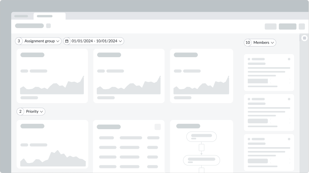
Wrapping
When the display decreases in width, a single row of filter pills wraps into two rows.

In this example, the filters stack in 2 rows as the display gets smaller.
Flexbox
The pills grow to fit the length of the content with respect to either the label or the selected value.
Interactions
Learn how filter responds when a user interacts with it.
Applying a filter
When the user selects a filter to open it, a popover appears with filter options. For more information, see the usage guidance for popover.
For data selection filters, the number of columns in the popover depends on whether the user can select one or multiple filters. For date filters, the user can select a predefined or custom date range. If they choose a custom date range, it appears within the filter label. The filter changes once the user applies the filters. For data filters, the total number of filters appears. For date filters, either the predefined date range name or the custom date range appears.
Single-select filters
With single-select filters, the user can select only one item from the list that appears after they select the pill. Their selection appears in the pill, and the popover closes.
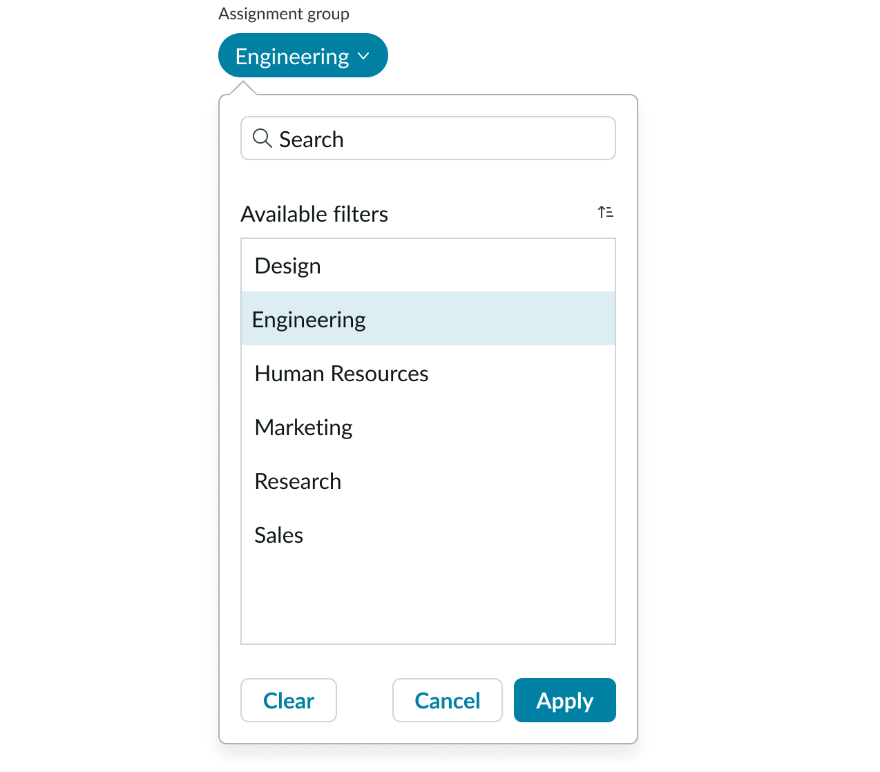
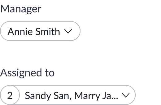
Multi-select filter
The multi-select filter list uses a two panel List selector component to display available items and selected items. The user selects items by moving them from the available filters list to the panel on the right using the arrow icons.
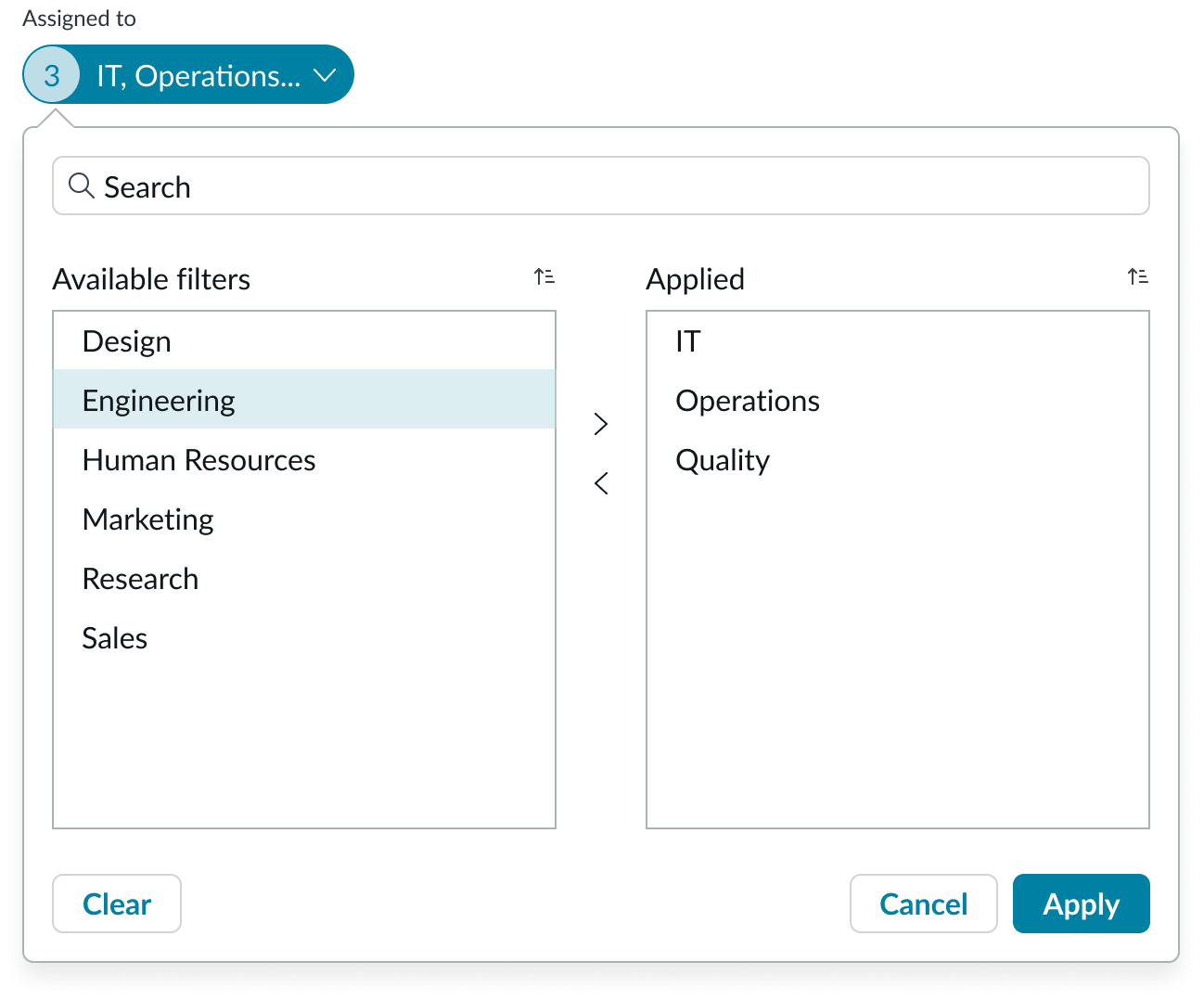
When the user has selected all the appropriate filters, they select Apply to save their selections and close the popover. The filter pill displays the total number of values selected and lists them in the pill.

Date filters
If the filter is a date filter, the user can select a predefined date range or choose a custom date range using the calendar months.
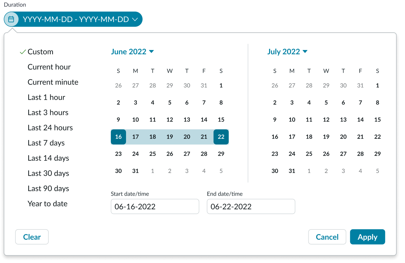
In this example, the user has selected a custom date range to define the duration of a task.
When the user has selected all the appropriate dates, they select Apply to save their calendar selections and close the popover. The filter pill displays the selected date range in the pill.
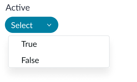
True/False filters
If the filter is a true/false filter, the user has the option to select between true or false values you have configured. Clicking the pill opens a dropdown that displays the boolean values.
Truncation
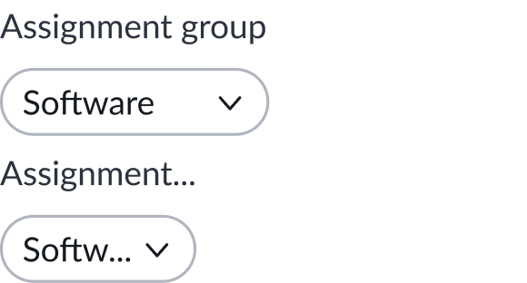
When the container shrinks, the label and selected value in a filter pill truncates.
Usability
Filter complies with all internationalization and accessibility requirements.
Internationalization
When the display translates to a right-to-left (RTL) language, the indicator appears on the right and the label appears to the left of the indicator. The caret icon appears on the left of the filter.

Accessibility
Learn how to access the actionable elements of filter through keyboard interactions and screen readers.
Keyboard interactions
You can access the actionable elements of filter with these keyboard keys:
- Tab: Moves focus to the first filter
- Arrow down or Arrow up: Moves focus to the next or previous row of filters
- Arrow right or Arrow left: Moves focus to the next or previous element within the filter
- Enter: Opens the filter popover
- Delete: Clears the filter in focus
Screen readers
Filter has the same screen reader considerations as the pill component.