

Anatomy
Learn about the individual parts of list - simple.
Simple list

- Header: Area that contains a title that describes the contents of the list
- Body: Column headers and rows that organize the list item
Header

- Title: Title of the list
- Badge with record count: Displays the total number of records in the data result set
- Refresh time: Text indicating how long ago the list last refreshed
- Refresh button (optional): Refreshes the list on demand with the latest data from the data source
Body

- Column headers: Labels that identify the table data in the column; users can sort records by clicking on the column header
- List item: Individual item within the list body that contains filterable data
- Links: Reference fields and URLs that appear as links in the list, providing user access to web pages and records; links can be disabled and made read-only
- Empty state image: Image that displays when there is no data in the list
Footer

- Show all button: Button that display all records in a full page list
Subcomponents
See usage guidance for button bare
See usage guidance for dropdown
See usage guidance for highlighted value
See usage guidance for pagination control
See usage guidance for popover
See usage guidance for split button
See usage guidance for text link
See the usage guidance for list menu
Usage
Learn about list - simple and find out how to use it in your design. List - simple is meant to be used as a widget component on a landing page or dashboard that has drill-down functionality. This list type offers limited actions and functions as a "snapshot" of table data.
Configurations
Learn how to customize list -simple by configuring the available properties.
Presets and controllers
This component has a preset configuration that sets properties and event handlers, making it ready for use. You can override preset values with a custom configuration if needed. Preset values won’t upgrade with updates. To avoid using presets, configure manually. One preset can apply to a single component instance. See presets for more info.
A preset is linked to a controller, which serves as a data resource. Controllers provide configuration data and event bindings for the component. Selecting a preset adds the required controller to the page, allowing new components to use its preset. For more on controllers, see controllers. For default presets, see view properties and events in the controller API.
Header
You can show or hide every subcomponent or element within the header, including the header itself.
Badge
The badge shows the total number of records in the system. A plus (+) sign indicates more records are available. You can hide the badge.
Table data
Select the table from which the records in the list are drawn, select the columns from that table to display, and create an initial filter for the data. You can configure the number of rows to display and the number of data columns.
Filters
Filters you create show up in the Filter panel. By default, the user can delete, edit, or create filters, unless you hide these capabilities. If you want to add a read-only filter to the simple list, create a “fixed filter.”
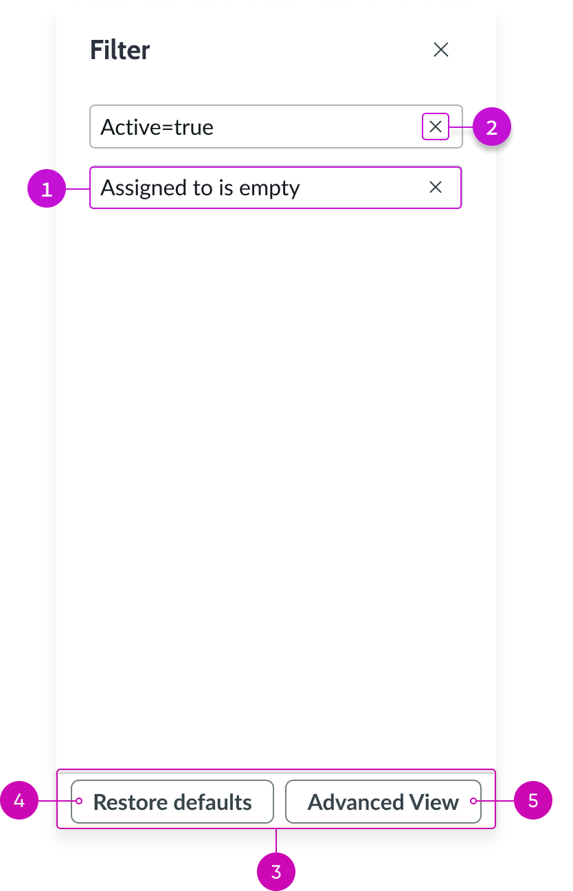
- Filter conditions: Conditions set for the filter in the advanced view
- Delete condition button: Deletes a filter condition
- Panel footer: Contains action buttons for managing filters
- Restore defaults button: Replaces user’s current list of filters with the filters you create
- Advanced view button: Accesses the condition builder, enabling users to create filters

- Use existing filter dropdown: Displays a list of saved filters; users can save commonly used filters to reuse as is or as building blocks for new filters
- Save filter button: Saves a filter to the list of existing filters for reuse
- Refresh icon: Returns an accurate count of the number of records that match the filter conditions but doesn’t save a filter
- Condition set: Enables users to add or remove a filter condition from a set of conditions
- New condition set button: Adds an “or” condition group to the existing condition group
- Primary action button: Runs the filter with the current conditions
Creating filters
By default, users can filter a simple list by creating new filters and updating existing ones. You can limit what users can do with filters by removing the abilty to access the condition builder, delete a filter, and restore the default filters.
Note: Fixed filters take precedence over regular filters. All fixed filters are resolved first, and then any regular filters are run against the results.
Heading Large (emphasis)
Users can’t delete or modify fixed filters that you create. For example, you can create a fixed filter for a list that only shows the user’s assigned work on a dashboard. The user can’t view another user’s records in that list on their dashboard.
List body
Column sorting is always enabled in a simple list. You can define the number of rows and columns and configure the table data that displays to your users.
Word wrap
You can enable or disable word wrap for column entries. If word wrap is set to true, it's enabled in the list, regardless of the user preferred setting.
Footer
The only footer option available by default is the View All action, which can be hidden.