

Anatomy
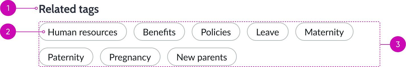
- Heading: Short, descriptive name for this set of pills; this may describe either what this set represents or can provide brief instructions to help the user understand how to interact with the pills themselves
- Pill: Pill component that contains the attributed metadata
- Container: Area that contains the list of pills
Subcomponents
See usage guidance for heading
Usage
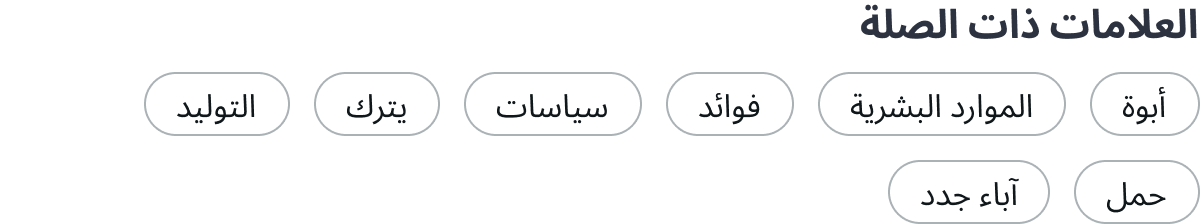
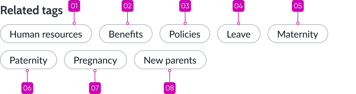
Use pill list to present visually distinctive and interactive metadata categories or "tags" to the user. These pills can provide links to data that may be trending, popular, or relevant to a specific user or group of users. If the user is interested in a specific tag, they can select it to show all content related to that tag.
Variants
Learn about the variants of pill list.
Sizes
Pill list is available in two sizes: medium (default) and small and is dependent on the width of the bounding container.
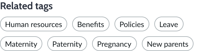
Small pill list
For containers that are less than 375px wide, the small size is used. The small size uses these subcomponents: the tertiary variant of heading and the small pill.
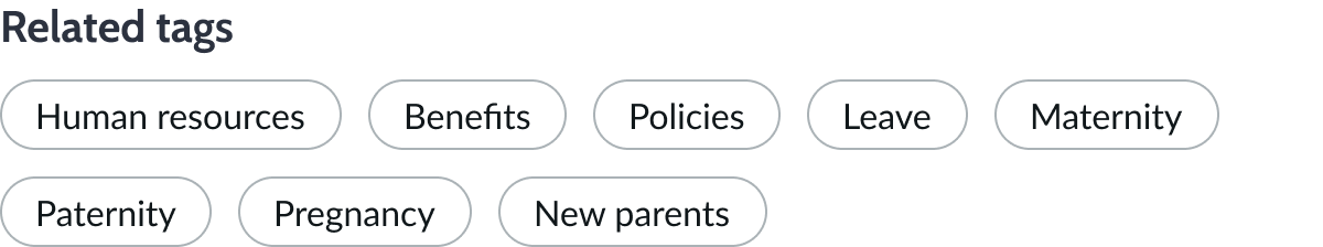
Medium pill list
The medium size is used for containers wider than 375px. The medium size uses these subcomponents: the secondary variant of heading and the medium pill.
Design recommendations
Learn how to apply pill list in your design.

Use common language, acronyms, or concise terms that are contextually appropriate and keep the labels short.
Avoid using unnecessarily long labels when creating metadata tags, because they can affect readability of the pills.
UI text guidelines
These are some recommendations for using text within pill list:
- Avoid long pill labels that cause truncation
- Use concise labels and abbreviations to improve readability
Behavior
Learn how pill list behaves when the display changes or a user interacts with the component.
Responsive behaviors
As the container resizes for different displays, pill list wraps and arranges the pills in rows. For smaller containers, the size automatically adjusts to the more appropriate small pill list size.
Interactions
The user selects a pill in the list to view information associated with the content of the page.
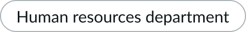
Truncation
Pill list doesn't truncate. However, the pill subcomponent does truncate and provides a tooltip to display hidden content.

Usability
Pill list complies with all internationalization and accessibility requirements.
Internationalization
When this component is used in a platform configured for a right-to-left (RTL) language, the heading and tag pills align to the right of the container.
Accessibility
Learn how to access the actionable elements of pill list through keyboard interactions and screen readers.
Pill list tab order
Tab order moves from the left to the right for left-to-right languages. If the list contains multiple rows, the tab key moves focus from the last pill in a row to the first pill in the next row.
Keyboard interactions
- Tab: Shifts focus between pills
- Enter: Selects the pill in focus and initiates a search
Screen readers
When you apply ARIA labels to a component, screen readers announce the controls and content of pill list in the prescribed tab order.