

Anatomy
Learn about the individual parts of email quick messages. Email quick messages is a container component that displays message content using card subcomponents.
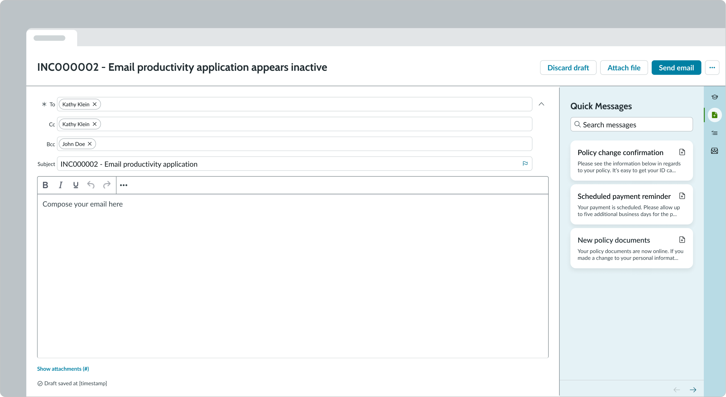
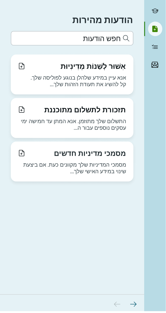
Quick messages list
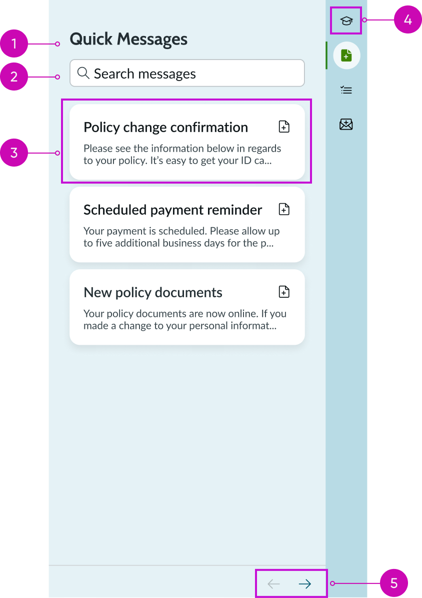
- Title: Text that describes the component area
- Search field: Field for user to enter a query and search for quick messages
- Card: Shows the title and a preview of the quick message
- Iconic button: Control in the side panel that opens the component
- Pagination arrows: Icons for navigating the list of quick messages cards
Quick message
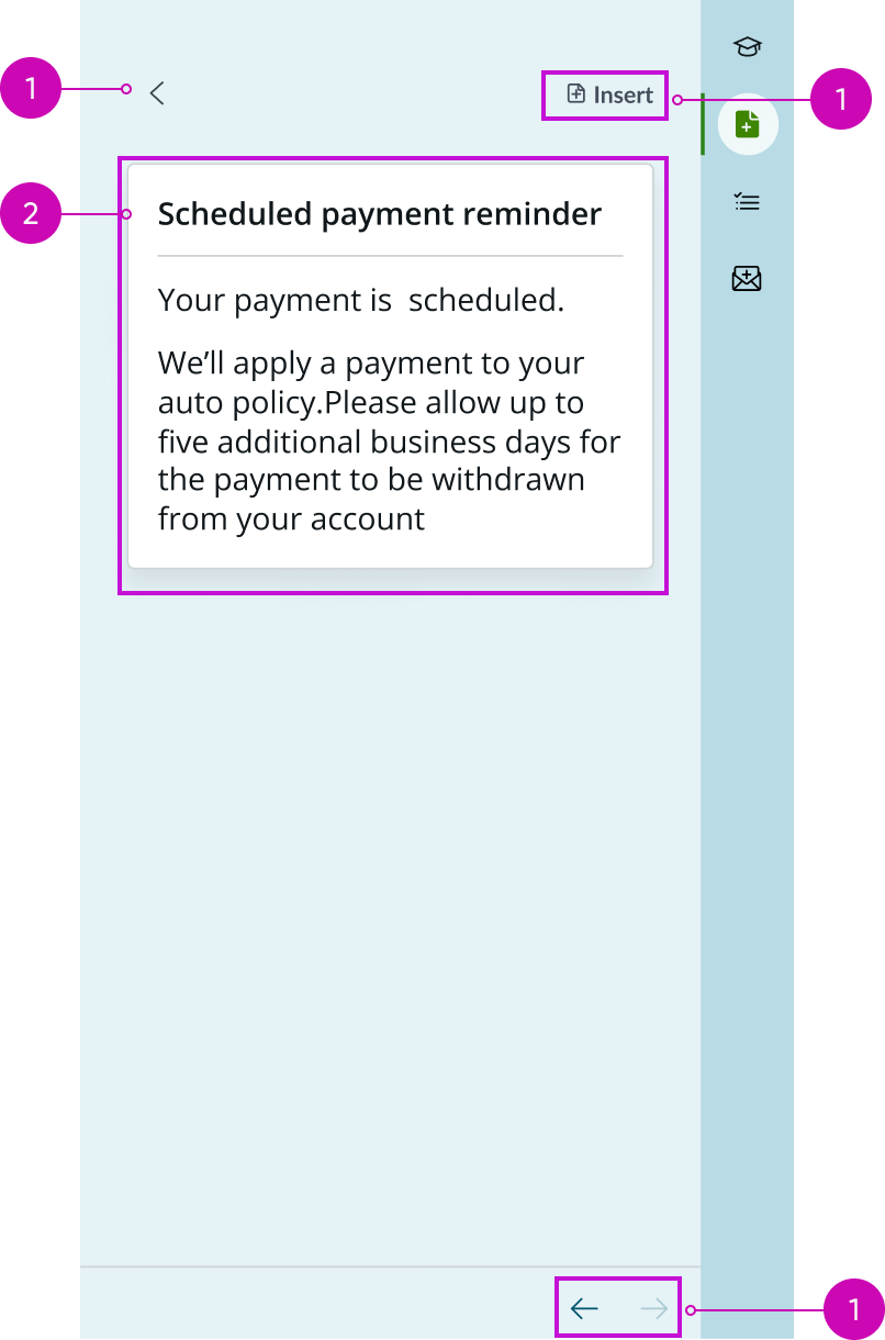
- Back button: Chevron icon for returning to the list view
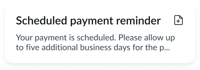
- Quick message title: Title of this quick message
- Quick message content: Body of the quick message
- “Insert” button: Adds the quick message to the content area in the rich text editor
- Pagination arrows: Icons for navigating to the previous or next quick message
Subcomponents
See usage guidance for bare button
See usage guidance for iconic button
See usage guidance for typeahead
See usage guidance for email composer
See usage guidance for agent assist
Usage
Quick messages enable a user to quickly compose an email message within an experience. With quick messages, a user can insert common email responses into the email composer instead of rewriting the same messages.
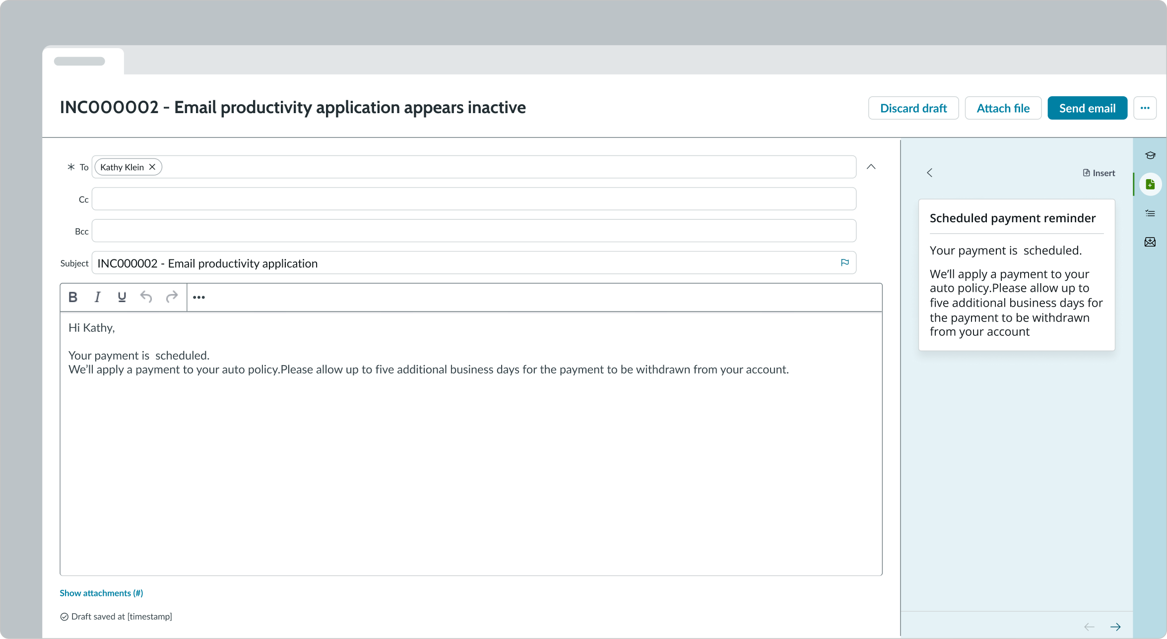
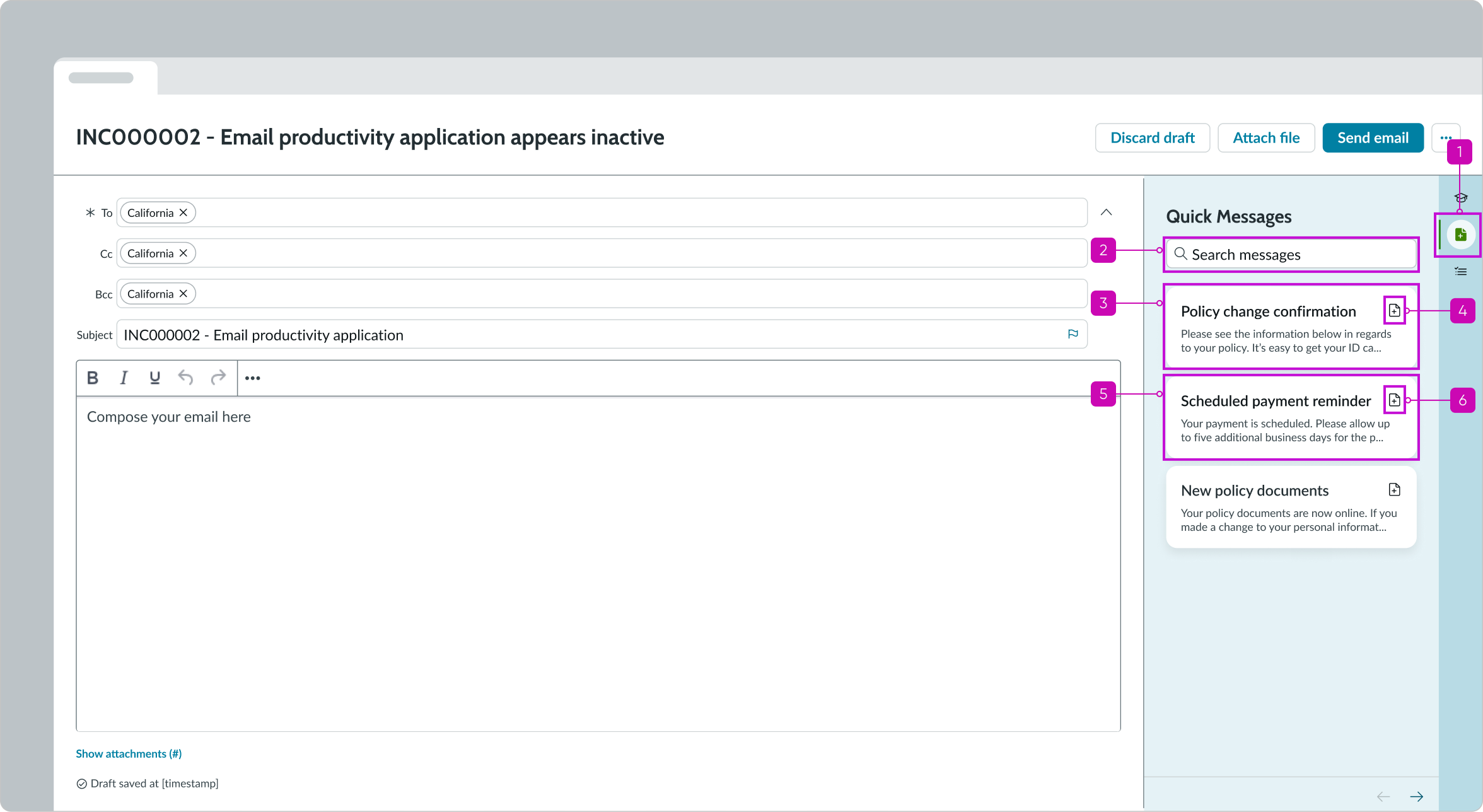
In this example, the quick messages component was opened from the sidebar. The message was inserted into the body of the email.
Configurations
Learn how to customize email quick messages by configuring the available properties.
Quick messages
The individual quick message templates are created on Platform by the system administrator and can be assigned to specific users and user groups.
Design recommendations
Learn how to apply email quick messages in your design.
Alignment and positioning
Always position the email quick messages icon within the sidebar and show the component in the panel when a user has an email open.
In this example, the quick messages icon in the sidebar enables the user to open the list of quick messages.
Behavior
Learn how email quick messages behaves when the display changes or a user interacts with the component.
States
Email quick messages has an empty state when no quick messages are available.
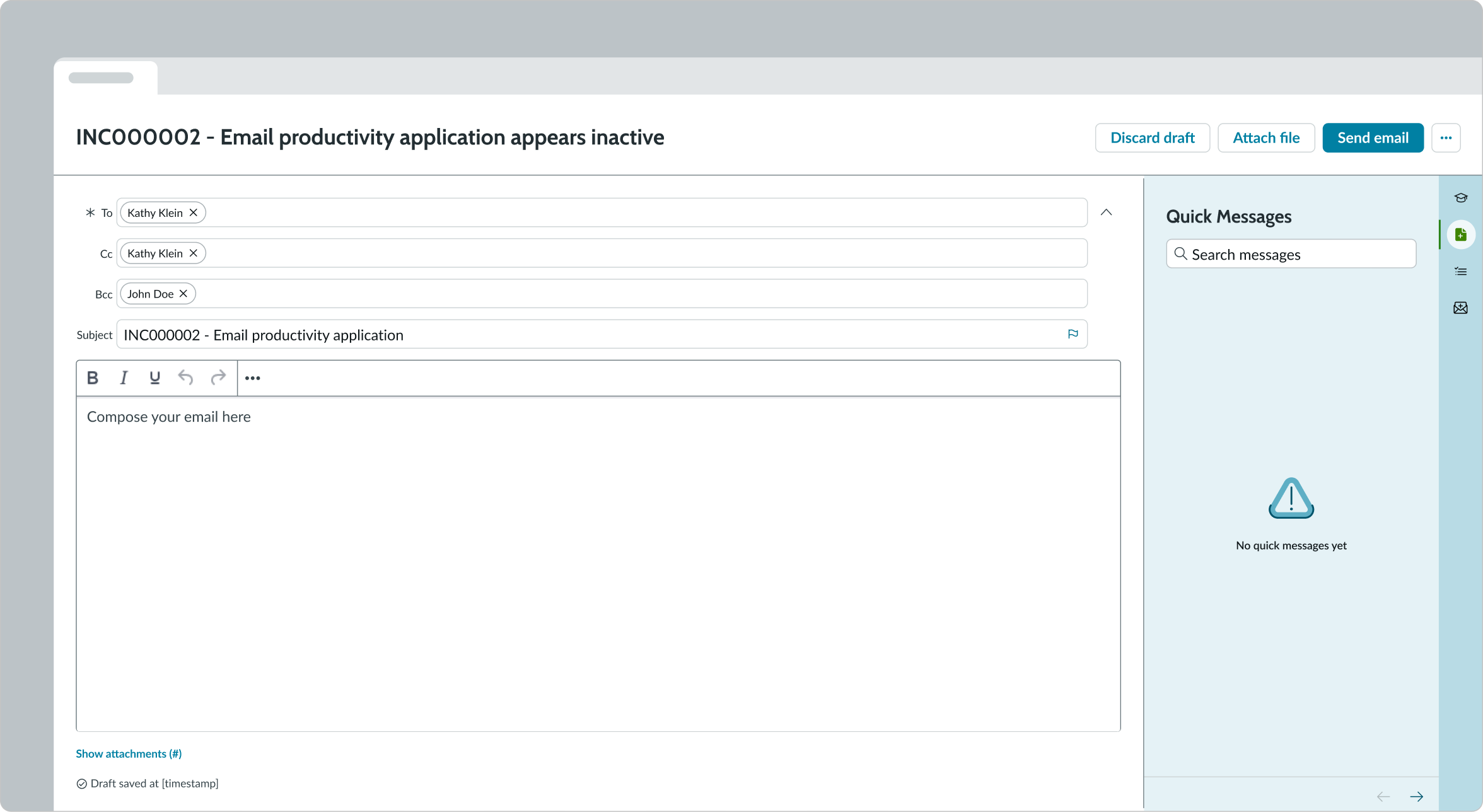
In this example, the empty state image and message appear, indicating that there are no quick messages to display in the list.
Responsive behaviors
Email quick messages automatically resizes to fit the container.
Interactions
Learn how email quick messages responds when a user interacts with it.
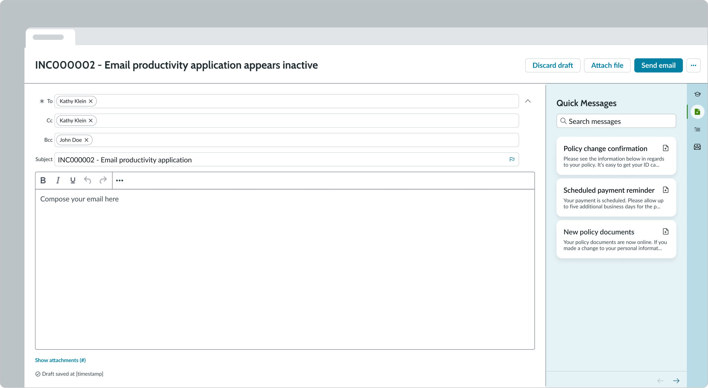
Opening the component
The user can open the email quick messages component using the document icon in the sidebar.
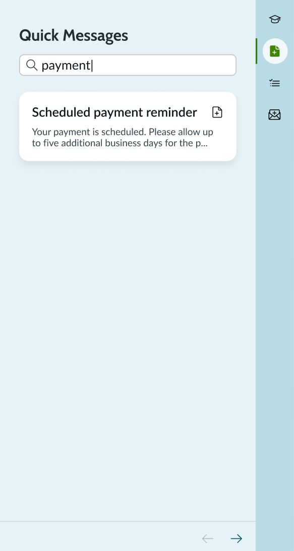
Searching for a quick message
The user can search for a specific quick message by using the search field within the component.
Inserting a quick message
The user can insert a quick message by opening the panel and selecting one of the cards from the quick messages list. They can view the entire quick message or navigate to the next quick message using the pagination arrows.
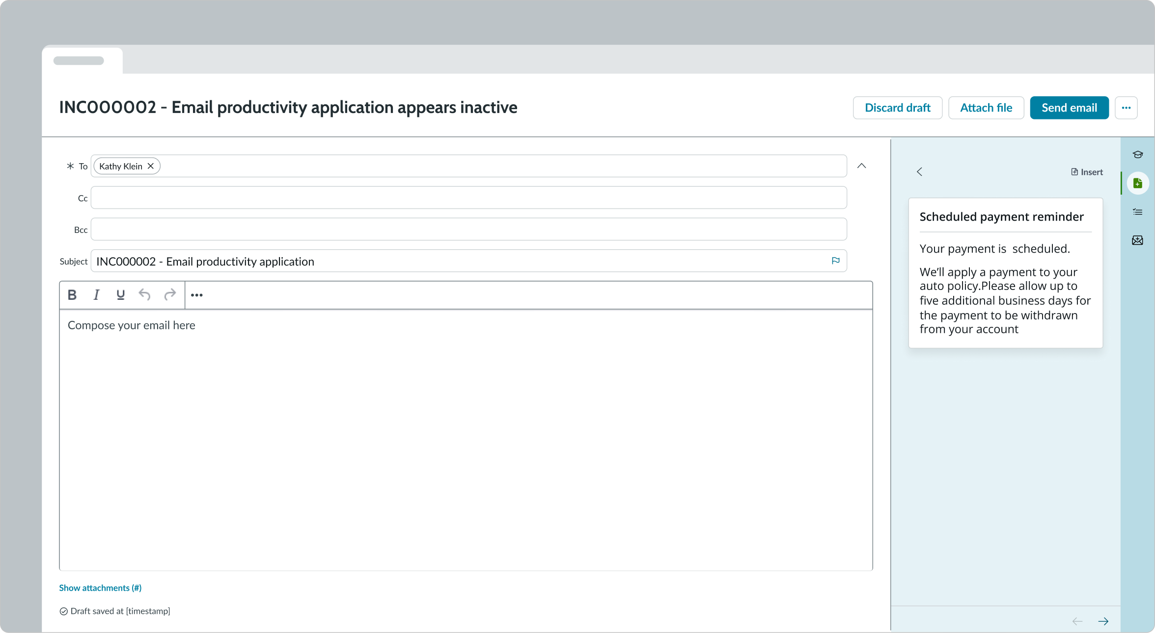
In this example, the user has selected a quick messages card to view the full message.
When the user decides on the quick message they want, they can select the “Insert” button to add it to the body of their email.

In this example, the user has selected the “Insert” button and the message appears in the content area of the rich text editor.
Truncation
When text in the quick message exceeds the width of the card in the list, the text truncates with an ellipsis, and a tooltip shows the full content on hover.
In this example, the title and message wrap to two lines and then truncate with ellipses.
Viewing contact details
Users can select a pill in the email recipient fields (To, CC, BCC) to display a contact card with more information, including job title, contact details, and profile picture.

Usability
Email quick messages complies with all internationalization and accessibility requirements.
Internationalization
When this component is used in a platform configured for a right-to-left (RTL) language, the title and card contents of the component align on the right.
Accessibility
Learn how to access the actionable elements of email quick messages through keyboard interactions and screen readers.
Keyboard interactions
You can access the actionable elements of email quick messages with these keyboard keys.
- Tab: Moves focus to the next action
- Space or Enter: Performs the selected action
Tab order for keyboard interactions in email quick messages.
Screen readers
When you apply ARIA labels to a component, screen readers announce the controls and content of email quick messages in the prescribed tab order.