

Anatomy
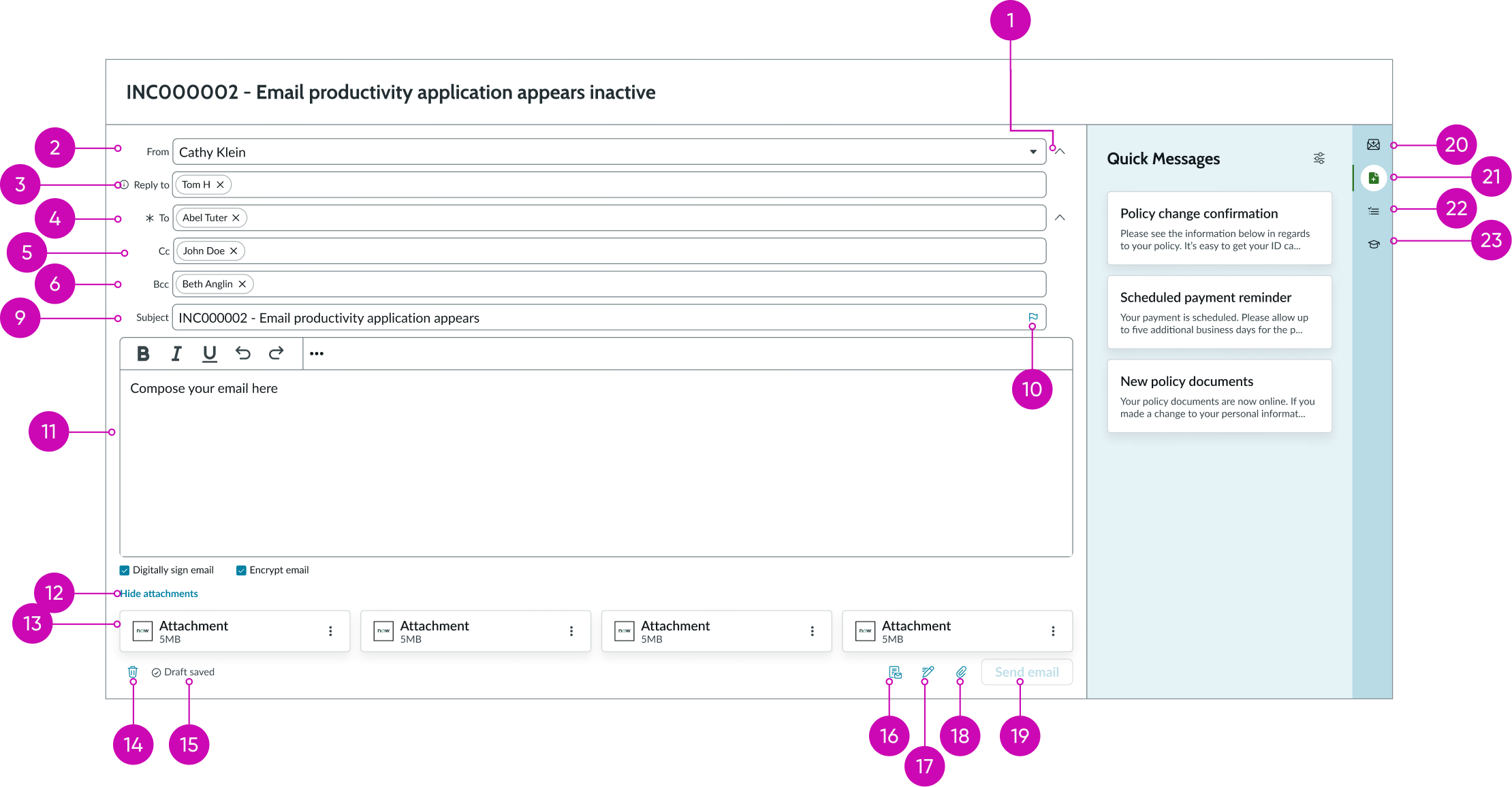
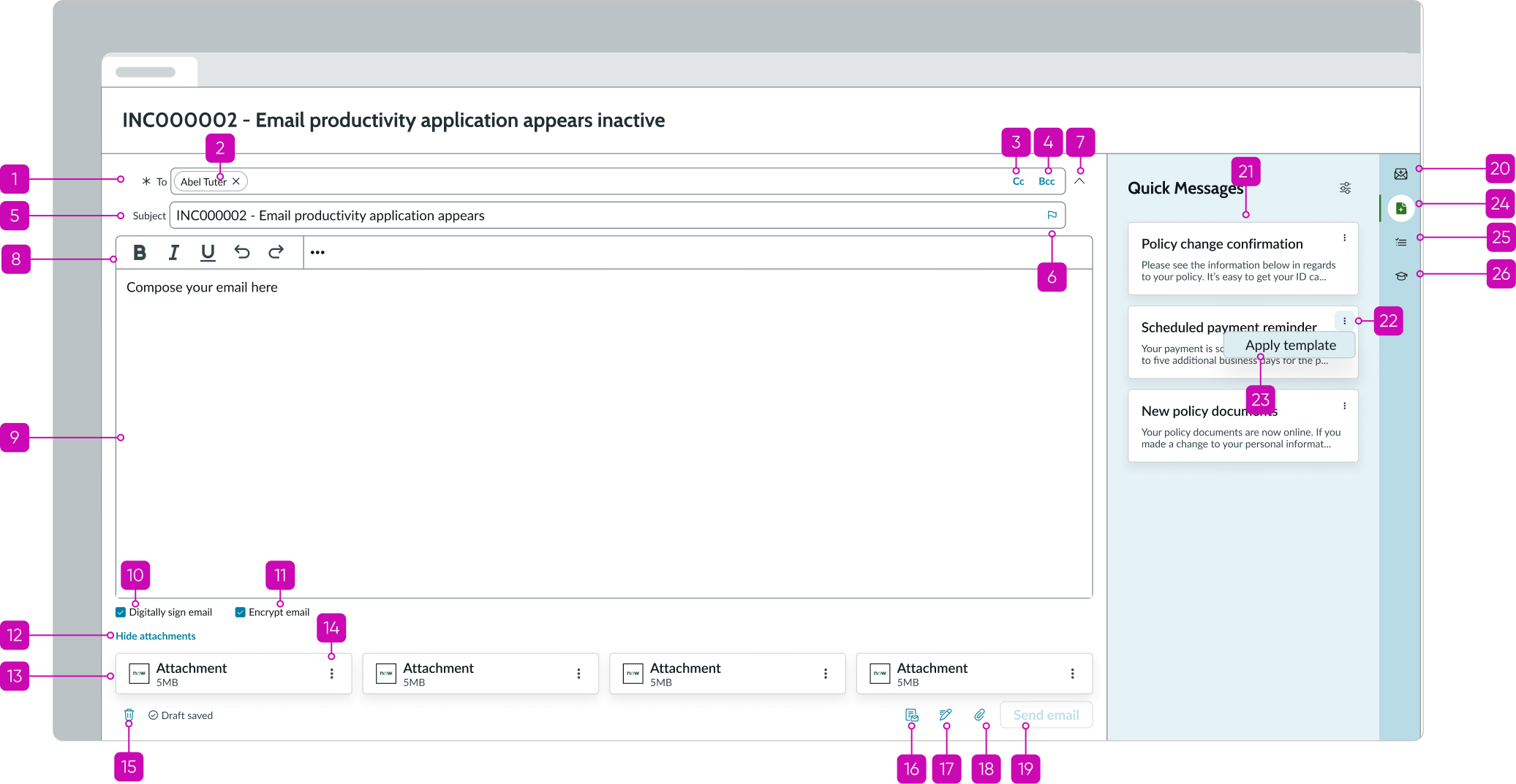
- “Show/hide email header” button: Toggle button for expanding/collapsing all input fields above the rich text editor.
- “From” field: Configurable input field for email sender
- "Reply to" field: Configurable input field for the recipients that the email is replying to
- “To” field: Required input field for the recipients of the email being sent
- "Cc" button: Button for displaying the “Cc” field
- “Bcc” button: Button for displaying the “Bcc” field
- “Cc” field: Input field for additional recipients of the email
- "Bcc" field: Input field additional recipients of the email being sent; recipients added to this field won't appear to the email recipient
- "Subject" field: Required input field for text that describes the subject of the email
- Priority flag: Marks an email as high priority
- Rich text editor: Component for writing the contents of the email being sent
- Hide attachments button: Toggle button for displaying or hiding the attachment cards; show button contains a numerical value that indicates the number of attachments being added to the email
- Attachment cards: Component for viewing and taking actions on the attachments added to the email
- “Discard draft” button: Button for discarding the current email draft
- Auto-saving message: Hint message that indicates saved status every 1 minute during user activity and 3 to 30 seconds (depending on configuration) after user inactivity, and hides after showing for 5 seconds.
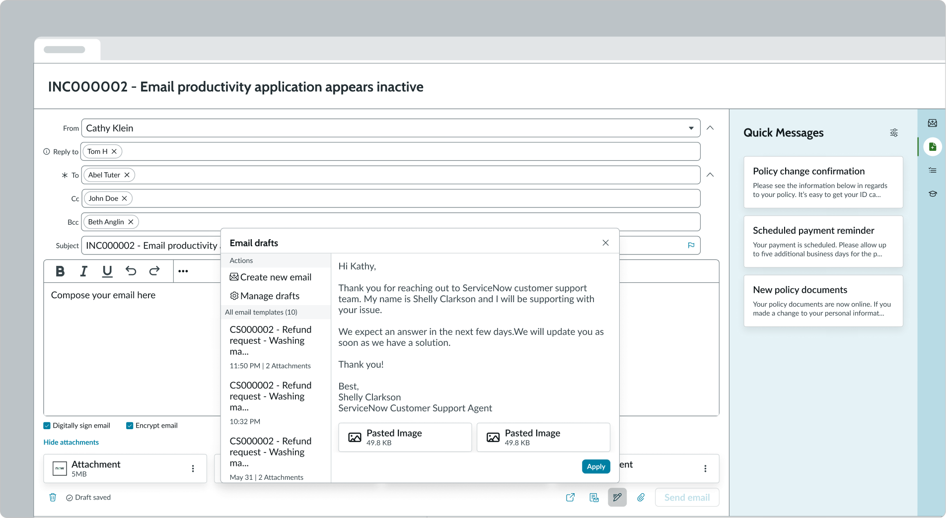
- Apply Template: Enables the user to search and select the template to be applied on the email
- Manage Drafts: Enables the users to view previously saved drafts
- “Attach file” button: Button for adding attachment files to the email being sent
- "Send email" button: Primary action button for sending the composed email to the email addresses listed; optionally, can be set as a secondary action button
- Email Templates tab: Button that opens Email Templates tab in the side panel which allows users to insert a previously configured email template into the email (includes recipient fields, subject, and email body)
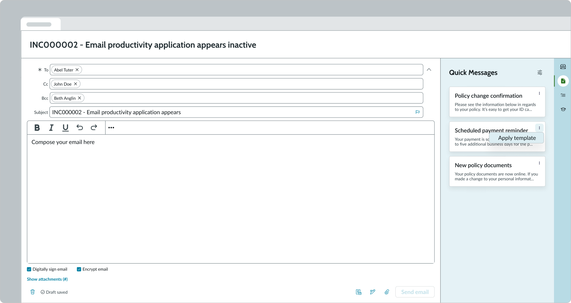
- Quick Messages tab: Button that opens Quick Messages tab in the side panel which allows users to insert a template of commonly used content into the body of the email
- Response Templates tab: Button that opens Response Templates tab in the side panel which allows users to copy a template and paste it into the body of an email
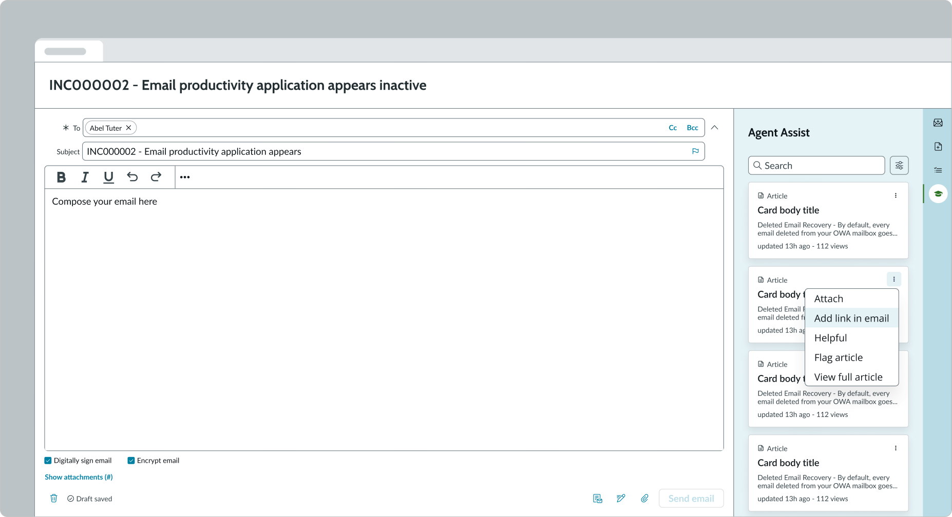
- Agent Assist tab: Button that opens Agent Assist tab in the side panel which allows users to search for articles and attach a link to that article in the body of the email
Subcomponents
See usage guidance for input field
See usage guidance for text link
See usage guidance for iconic button
See usage guidance for bare button
See usage guidance for alert list
Usage
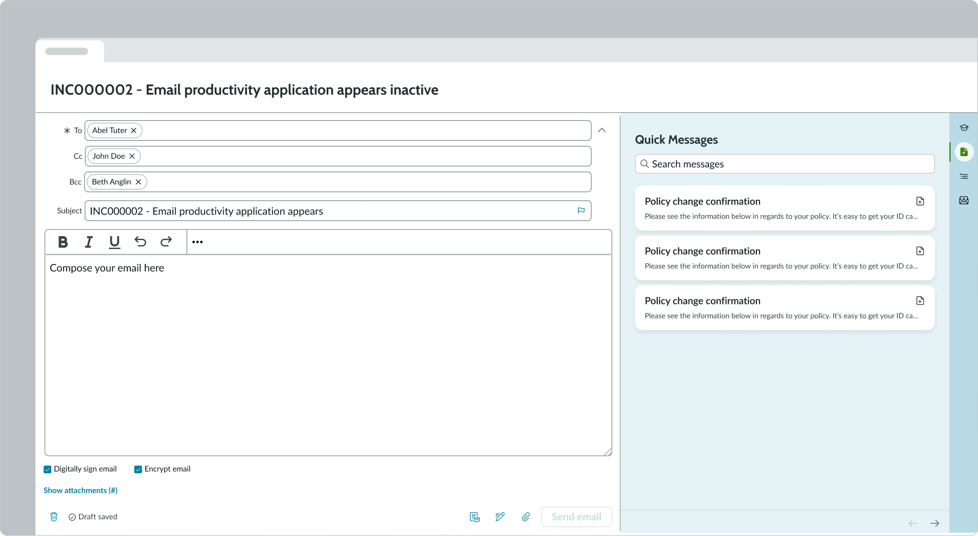
Use email composer to enable an agent to communicate with customers regarding records with which the agent is engaged. For example, an agent can compose an email to a customer to gather information about the customer's case.
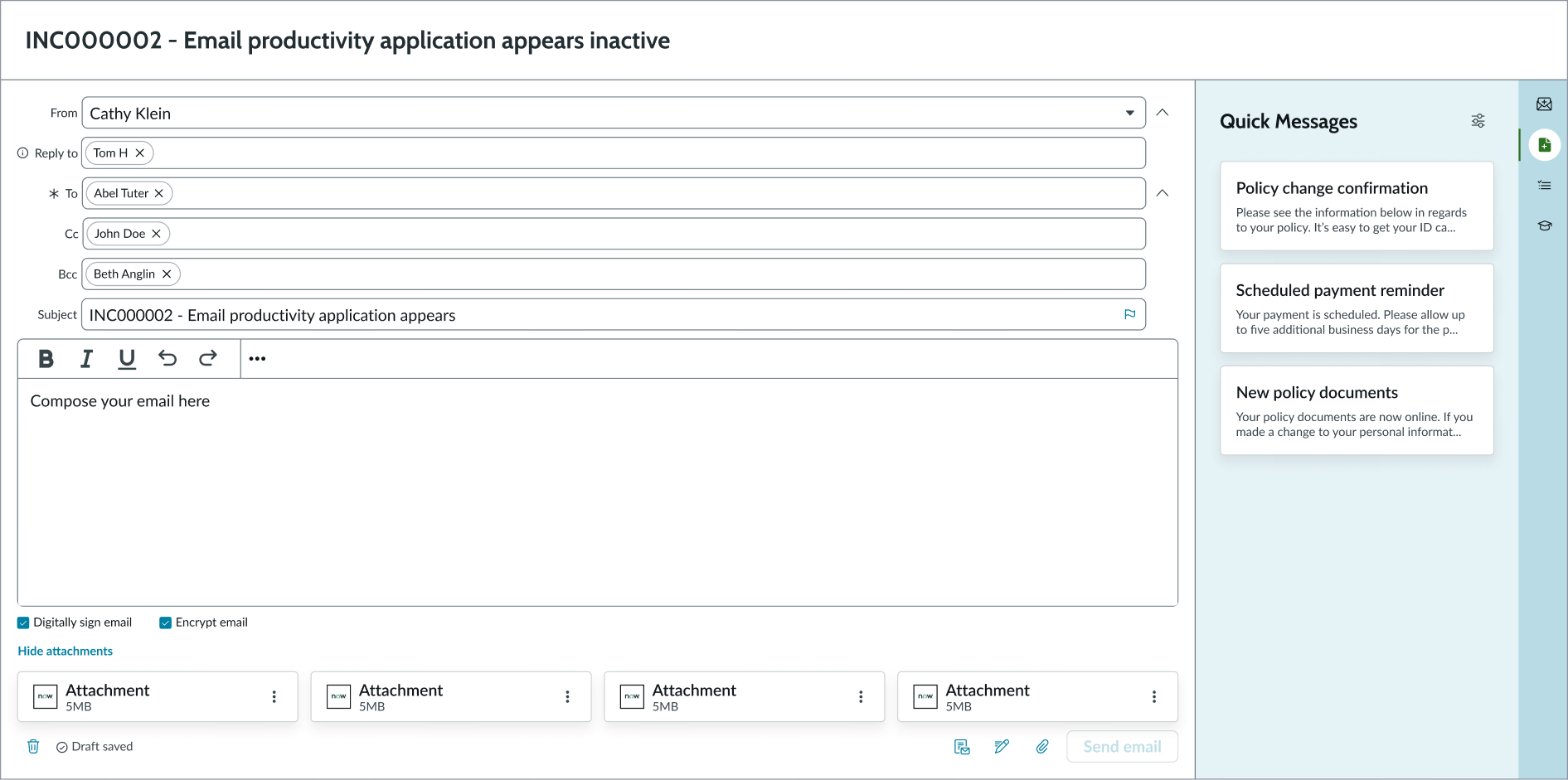
In this example, the user is sending an email about access privileges.
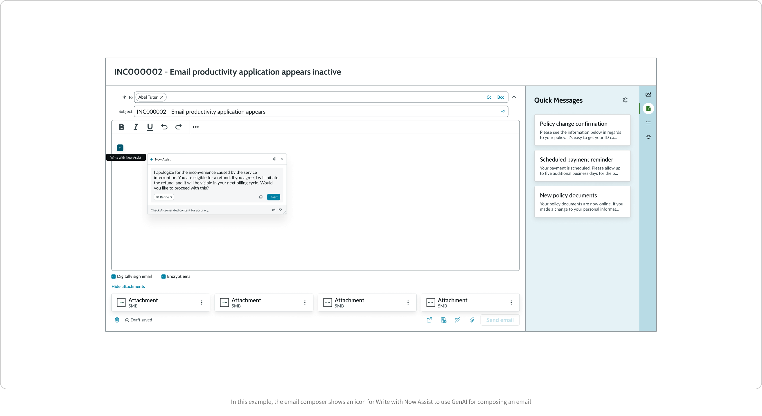
Now Assist AI recommendations
Use Now Assist’s Gen AI capability to select templates, compose a new email, or compose an email response. To use AI for email content, start writing the email and select the Now Assist icon to generate the email content.
To use AI recommendations for templates, select the Apply templates button. In the modal that opens, select the Email templates, Response templates, or Quick messages tab. Depending on the tab you select, you see the AI-recommended templates in the Found by Now Assist section from the available templates. Select a template to preview it, and then select Apply to use it in your email.
Note: Response templates and Quick messages will only appear if they have been configured in your settings. For more information on configuration, refer to:
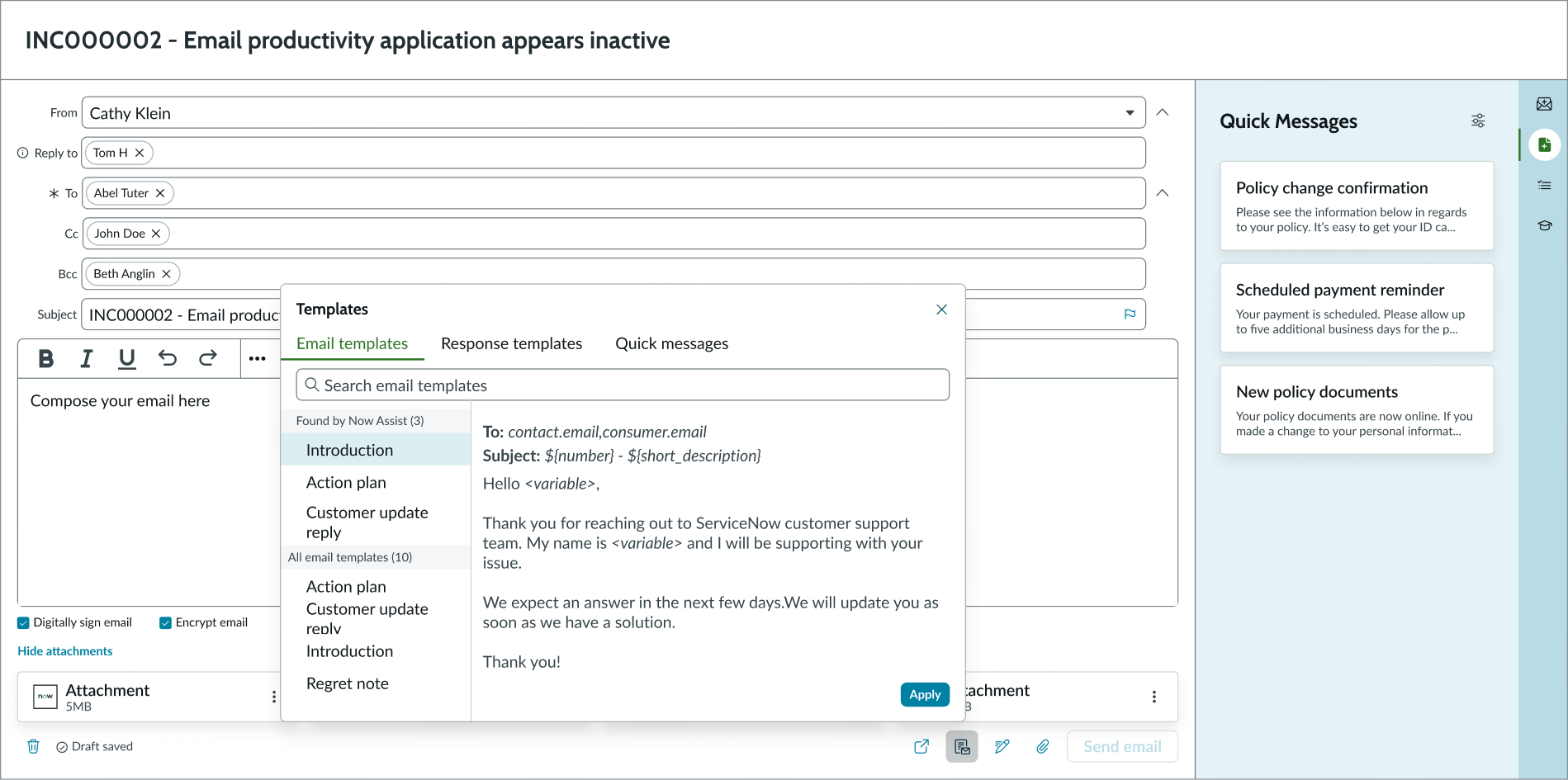
In this example, the email composer shows the apply templates function along with recommended templates generated by AI
Note: AI recommendations are based on the Now Assist email configuration by your administrator. For more information about Now Assist email configuration, see Now Assist Admin console.
Configurations
Learn how to customize email composer by configuring the available properties.
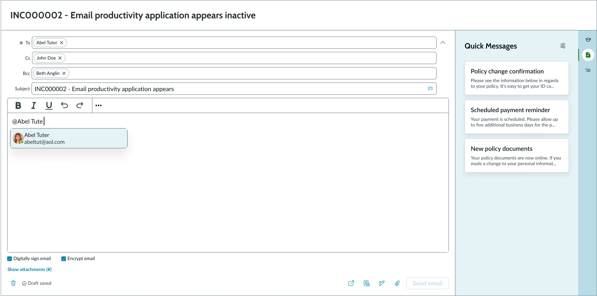
User mentions
You can enable user mentions in the compose area. Once enabled, users can type “@” followed by a name to display a list of suggestions. Selecting a name adds a user to the To field. Press Escape to remove the suggestions. This option is enabled by default.
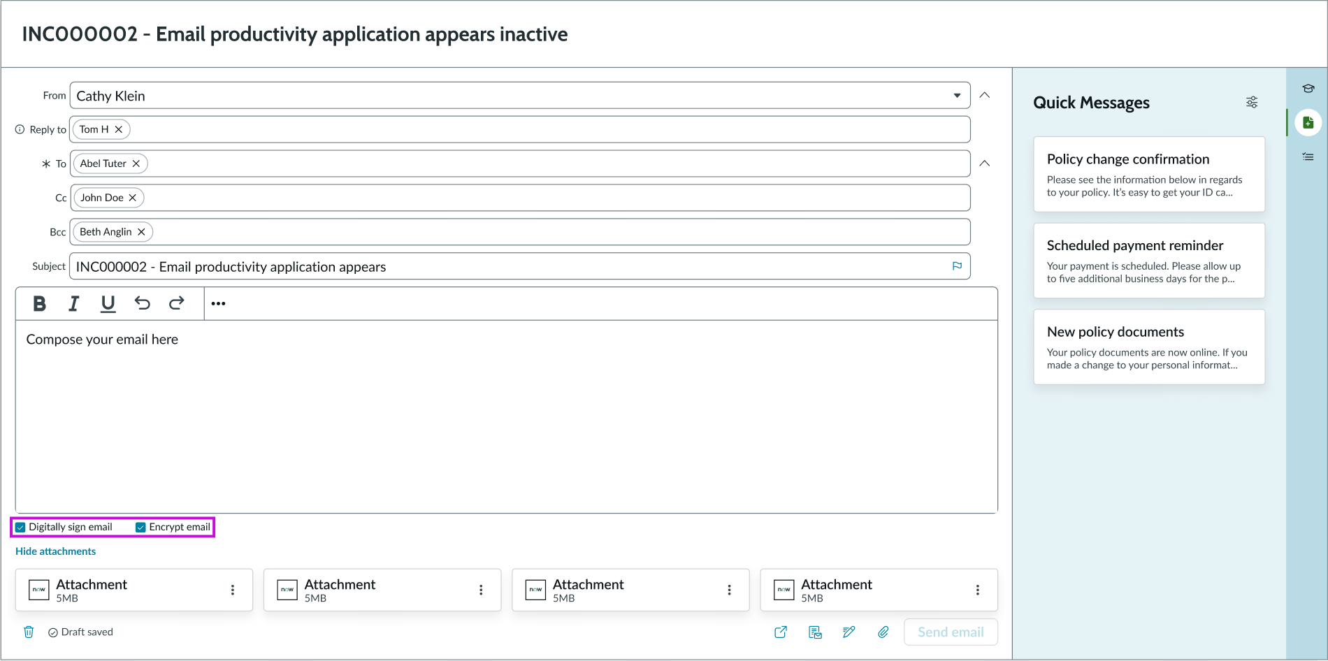
Digital signature and encryption
You can enable users to digitally sign and encrypt emails in the composer footer. When encrypting, the system validates recipient certificates before sending the email. If a certificate is invalid, the user can continue editing or skip that recipient. When signing, the system checks the sender’s certificate and displays an inline error if it is invalid. Both options require valid certificates to send the email.
Show email details
You can configure the toggle button that displays the email details, including the To, CC, and BCC fields. The default option is off, which keeps these fields in view. Consider turning this button on when the component has less space in the display and you want to consolidate information.
Load latest draft
You can enable the option to automatically apply the latest saved draft to new emails. When this option is enabled, the user’s most recent unsent draft automatically loads whenever they open a new composer message. This option is disabled by default.
Modeless Dialog
When using email composer with modeless dialog, the compose window floats as an overlay on top of the main page content. There are many options available for customizing the modeless dialog to make it look and feel more like an email dialog. For more information, see usage guidelines for Modeless Dialog.
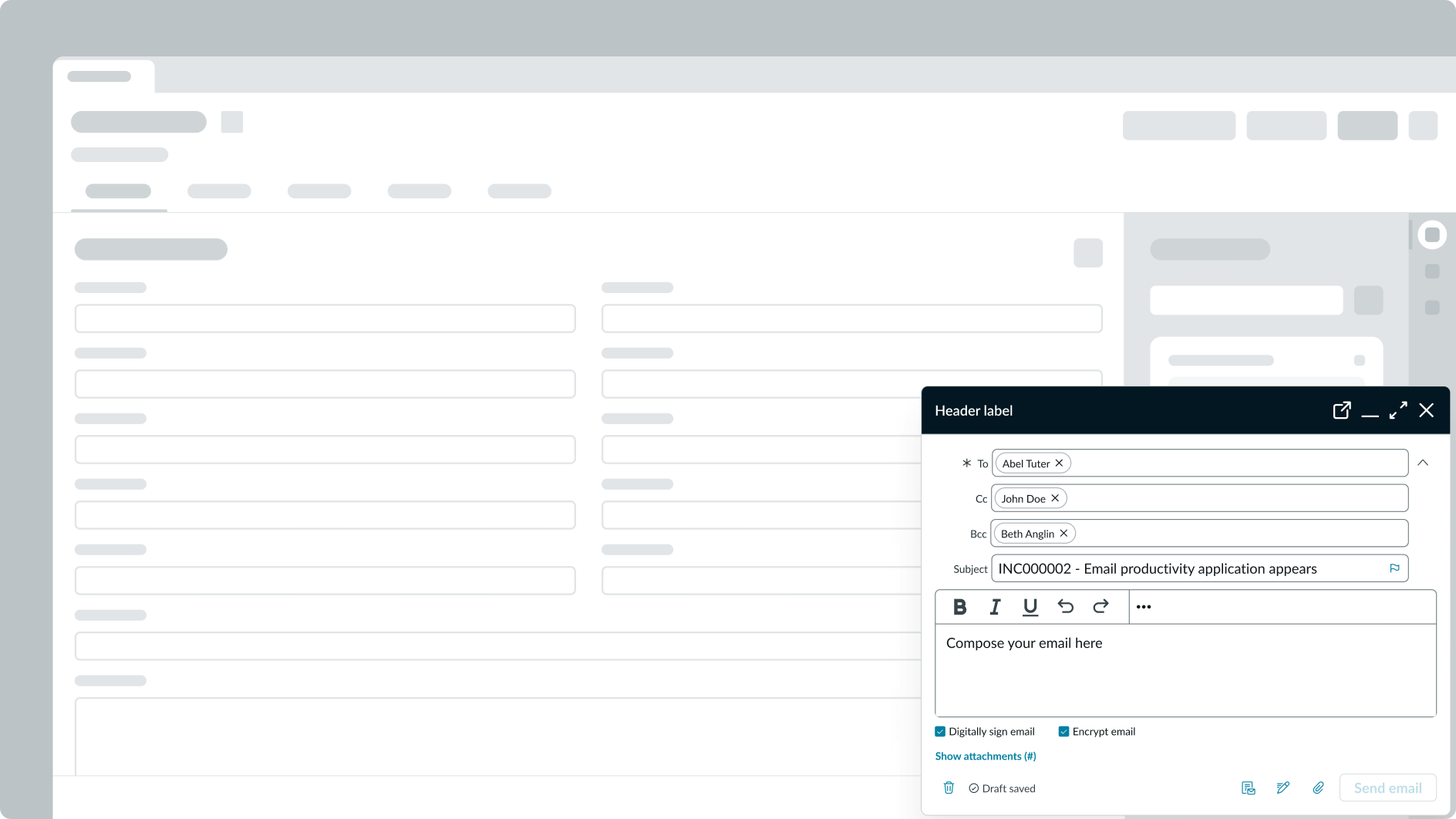
Email composer in modeless dialog
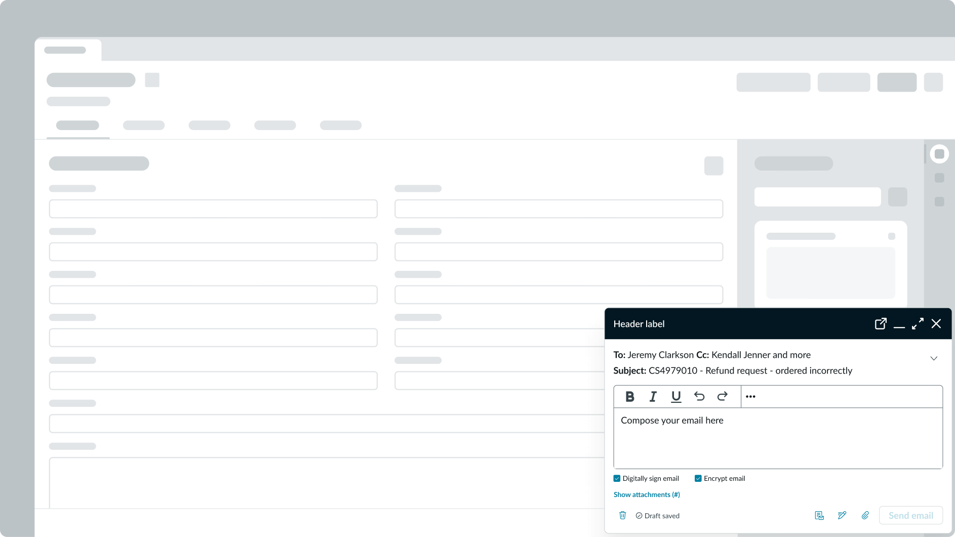
Email composer in modeless dialog with collapsed recipient lists
Pane resizing
Users can resize the pane for the email composer by dragging the divider, or configure the resizable panes for a fixed size ratio. You can also set the default divider position when the email composer displays to restrict the right pane to a minimum width.
Email full composer with pane resizing
Compact mode
You can configure the component to display by defaut in the compact mode.
Design recommendations
Learn how to apply email composer in your design.
Alignment and positioning
It should be clear to the user that they are composing an email based on the record in which they are working. You can do this by nesting the component within the record page.
UI text guidelines
These are some recommendations for using text within email composer:
- Use sentence case for all titles, labels, and column headers
- Keep all text labels informative and short to increase readability and scanning
- Keep content concise and purposeful to help a user understand options and actions, and move successfully through tasks to achieve their goals
- Button text should be concise, actionable, and clearly state what happens when a user makes the selection
Behavior
Learn how email composer behaves when the display changes or a user interacts with the component.
States
Email composer has states: loading and an error state.
Loading state
If the email composer component is taking a long time to load, you can use the lazy loading state. This state loads other content and components on the page before the email composer component. The lazy loading state informs the user that content is loading and the space is intentionally empty.
In this example, the email composer portion of the experience is still loading.
Error state
An error state appears when the user doesn't fill out all the required fields and tries to send the email. Upon selecting the primary button on the form, an error message displays in an alert list. Additionally, each field or component that isn't completed or is incorrectly formatted shows an error state.
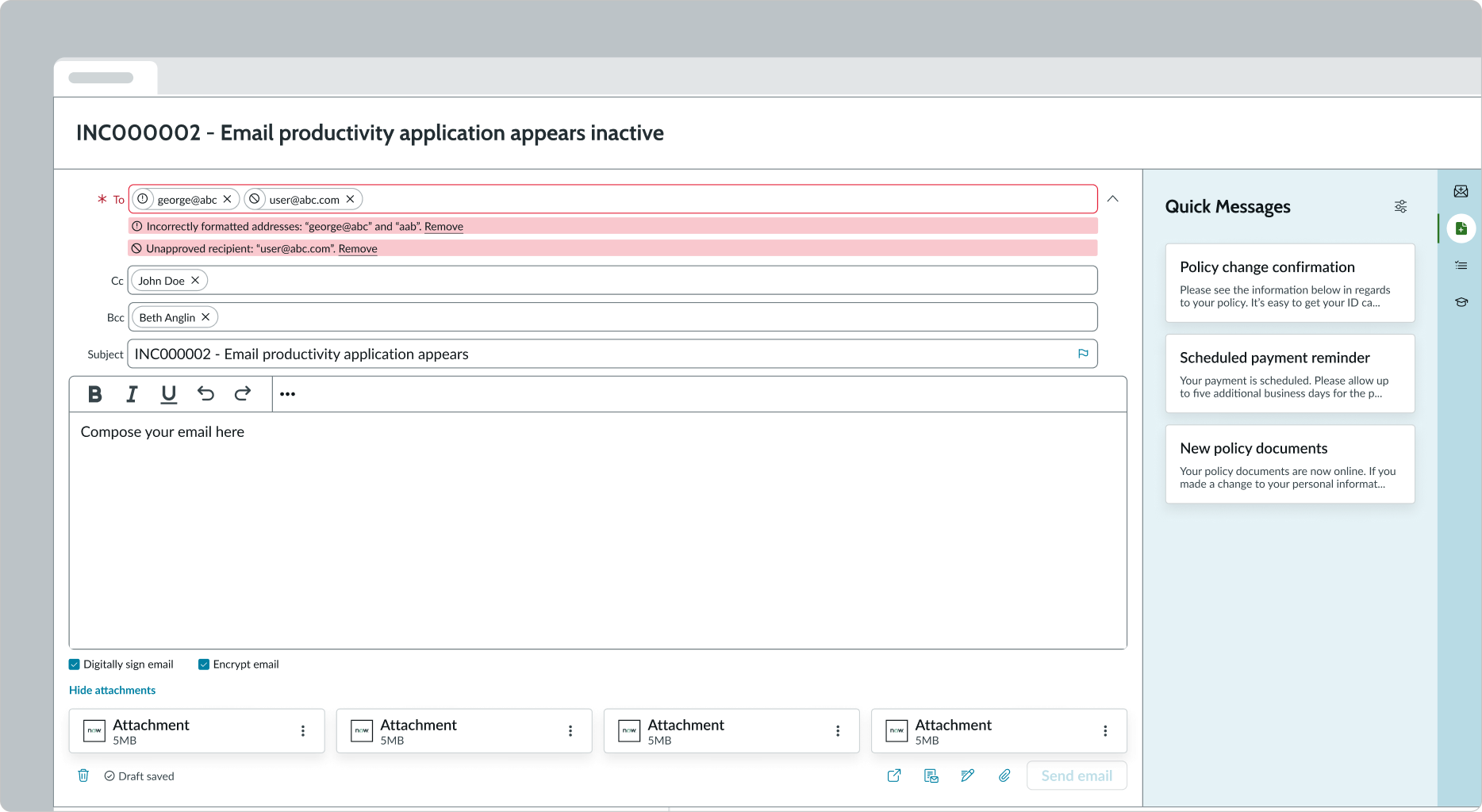
In this example, the email composer error state occurs because the user did not complete the required "To" field. The alert list notifies the user what they must complete to continue.
Responsive behaviors
Email composer automatically resizes to fit the container. Any subcomponents within email composer respond according to changes in the display. The size of the email component when the display changes is determined by the ratio configured for the resizable panes. The email composer can have a minimum width, which prevents the size of the pane from going below a certain ratio threshold.
Interactions
Learn how email composer responds when a user interacts with it.
Inputting info
The text fields each have respective interaction states. Users can select each field to enter in text and symbols. Use the rich text editor to enter text and format it with the tools provided. Users can also add images and tables with the rich text editor.
Saving email as a draft
Instead of sending the email, the user can choose to save their email as a draft to edit and send at a later time. Draft emails show the email subject in addition to the date and time the email draft was created. Drafts save automatically during composition and unused drafts can be deleted from either the list view or compose view.
Apply quick messages
Instead of composing a full email or rewriting generic responses, the user can use the quick messages component (if configured and available). The user accesses quick messages by selecting the option in the contextual side panel, where they can select one of the preformatted messages they have created. This feature helps the user expedite the email creation process and stay consistent in formatting their emails.
Attaching Knowledge Base articles
Users can insert a Knowledge Base (KB) article inline from Agent Assist by selecting the vertical ellipses button in the top right of the cards and selecting the “Add link in email” option. The link automatically inserts at the end of the email body and the link text displays the article title. Links can be inserted into either an existing draft or a new email. This functionality is available by default in full compose view and must be configured by an admin on record page Agent Assist view and modeless dialog view.
Resizing the panes
If configured, the user can drag the divider in the resizable panes to change the size of the pane containing the email composer. The amount the user can change the pane size is limited by a minimum width you configure.
Viewing contact details
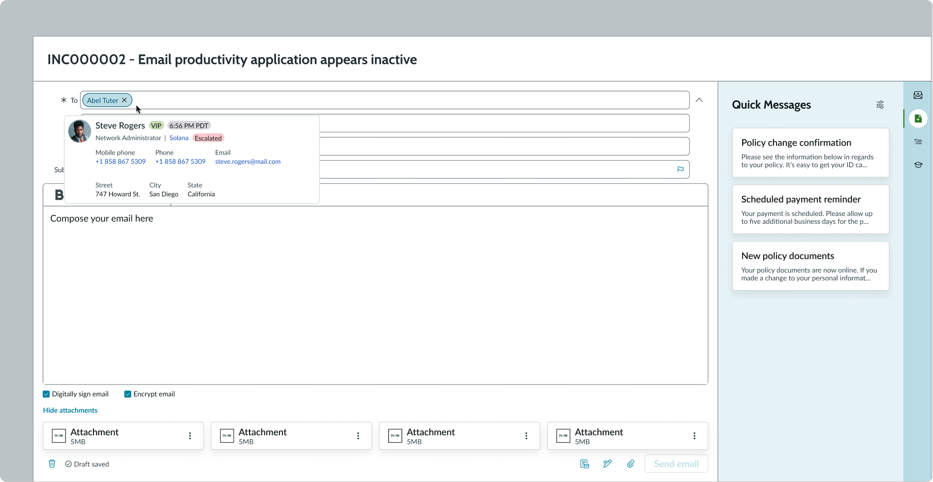
Users can select a pill in the email recipient fields (To, CC, BCC) to display a contact card with more information, including job title, contact details, and profile picture.
Usability
Email composer complies with all internationalization and accessibility requirements.
Internationalization
When the display translates to a right-to-left (RTL) language, the fields and button sets align on the right. Any proper nouns that can't be translated appear left-to-right (LTR).
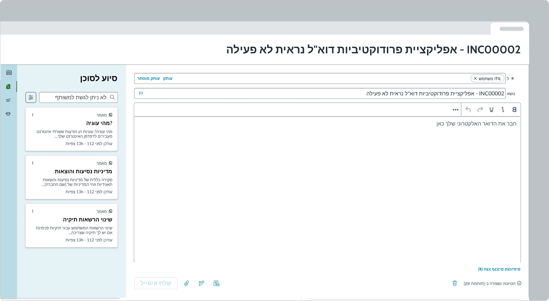
In this example, the email composer form appears in a right-to-left (RTL) language.
Accessibility
Learn how to access the actionable elements of email composer through keyboard interactions and screen readers.
Email composer tab order
Keyboard interactions
You can access the actionable elements of email composer with these keyboard keys:
- Tab: Navigates through the component in the specified tab order (top to bottom, left to right)
- Space or Enter: Initiates the link or button action
- / + r: Shows recommended response templates. Requires Now Assist email admin configuration.
Screen readers
Screen readers follow the standard tab order. For left-to-right (LTR) and right-to-left (RTL) languages, tab order begins with the first link in the first comment.