

Anatomy
Learn about the individual parts of the color picker component.

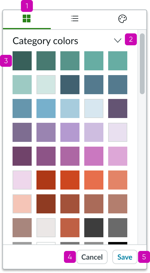
- Color picker container: Contains the color picker component
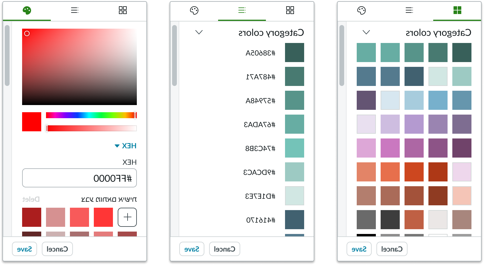
- Tab bar (optional): If more than one view type or custom colors is configured, a tab bar will be will be available at the top of the color picker to navigate between different views
- View container: Contains all content from the selected view type
- Confirmation buttons (optional): Enables the user to confirm or reject the color selection
Subcomponents
Usage
Use the color picker to select standard colors for your design or to create and save your own custom colors. You can display colors in different views, enabling you to identify colors in different formats, such as in hexadecimal or RGBA values.
Configurations
Learn how to customize the color picker by configuring the available properties.
Views
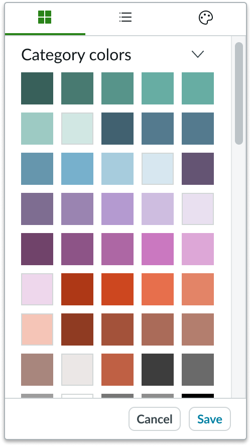
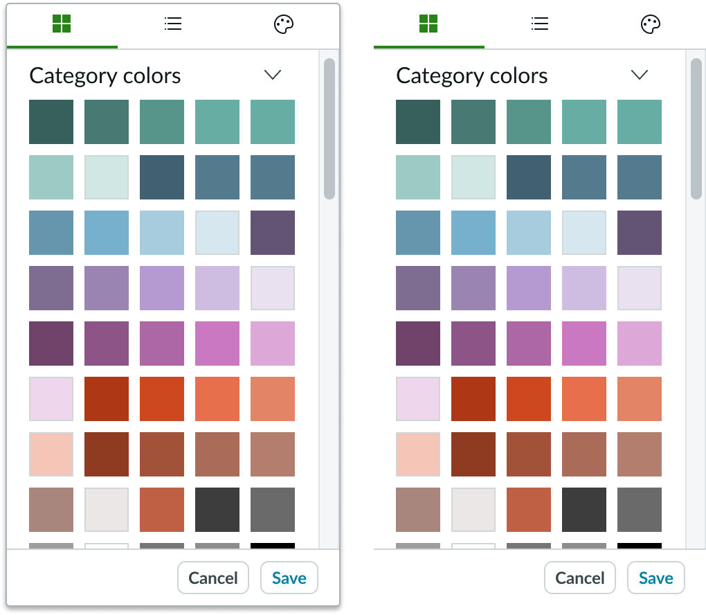
Swatch view, list view, and palette view are available by default. The user accesses these views using the tab bar at the top of the component. You can configure which tabs are shown and the order in which they appear in the tab bar. Swatch view provides a grid of swatches.
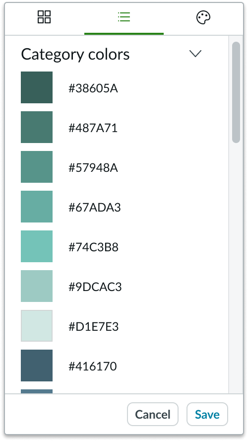
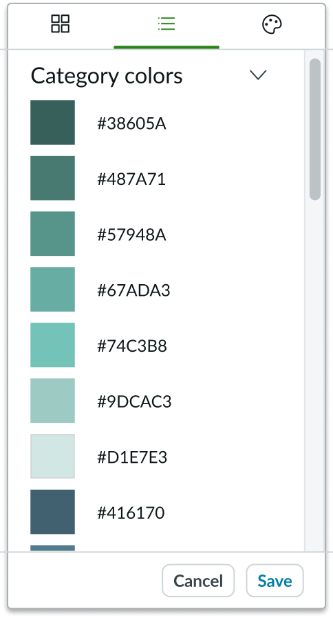
List view provides a list of colors with their color names or HEX values, if color names are not used.
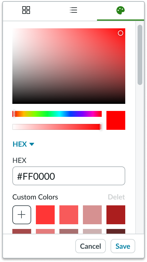
Palette view provides a color palette, inputs for RGBA or HEX values, and a "Custom Colors" list to save colors.
Action buttons
The action buttons "Save" and "Cancel" are available by default; however, they can be removed so that a color is automatically confirmed when the user selects it.
Default color swatch
You can configure color picker to have a default color swatch such that an assigned color swatch will default to a selected state when the user opens the color picker. If no selected color is provided or if an invalid color is selected, then no swatch will be automatically selected.
Container border
You can configure the container border to be shown or hidden.
Show custom colors
You can configure color picker to allow the user to save and reuse custom colors.
Default view
You can define the default view if more than one view is enabled.
Predefined libraries and colors
You can determine which colors are provided in the swatch view and the list view. You can also configure the names of your colors in list view.
Design recommendations
Learn how to apply color picker in your design.
Be consistent with color naming conventions.
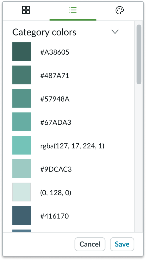
Don't use different color naming conventions. In this example, a combination of HTML color names, HEX color codes, and RGBA color values are used.
UI text guidelines
When naming colors, choose names that are concise and logical, and be consistent with naming conventions.
Behavior
Learn how color picker behaves when the display changes or when a user interacts with the component.
States
Swatches have 4 states: default, hover, focus, selected.
| State | Example |
|---|---|
| Default |  |
| Hover |  |
| Press/focus | 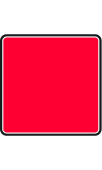 |
| Selected |  |
Responsive behaviors
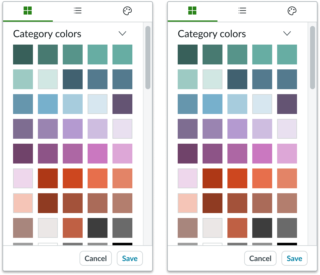
Color picker inherits the width of its container and resizes with the container.
Overflow
If a color library's content exceeds the height of the display container, a scrollbar appears.
Interactions
In swatch view and list view, the user selects a color from a predefined color library.
In palette view, the user can select any color by using the palette or by providing RGBA values. In addition, users can save their colors under an editable list called "Custom Colors." To save a custom color, the user selects a color from the palette and then selects the "add" button.
Truncation
When the text in the color swatch label exceeds the width of the container or content area, the text is truncated with an ellipsis, and a tooltip then shows the full content on hover.
Usability
Color picker complies with all internationalization and accessibility requirements.
Internationalization
When the display translates to a right-to-left (RTL) language, the contents of color picker will flip sides. This reverses the order of the viewing tabs.
Accessibility
Learn how to access the actionable elements of color picker through keyboard interactions and screen readers.
Color picker tab order
This is the high level tab order for the color picker.
Keyboard interactions
Tab moves focus between all interactive elements in the color picker in the standard tab order.
When the focus is in the tab bar, arrow left and arrow right move focus between tabs.
When the focus is inside the view container:
- Tab + Enter or Tab + spacebar: Selects and activates the color palette in palette view
- Arrow keys: Moves focus between colors
- Enter or spacebar: Selects a color; you can repeat this keyboard interaction to deselect the color
Screen readers
When you apply ARIA labels to color picker, screen readers announce the controls and content of the color picker in the prescribed tab order.