

Anatomy
Learn about the individual parts of animation.
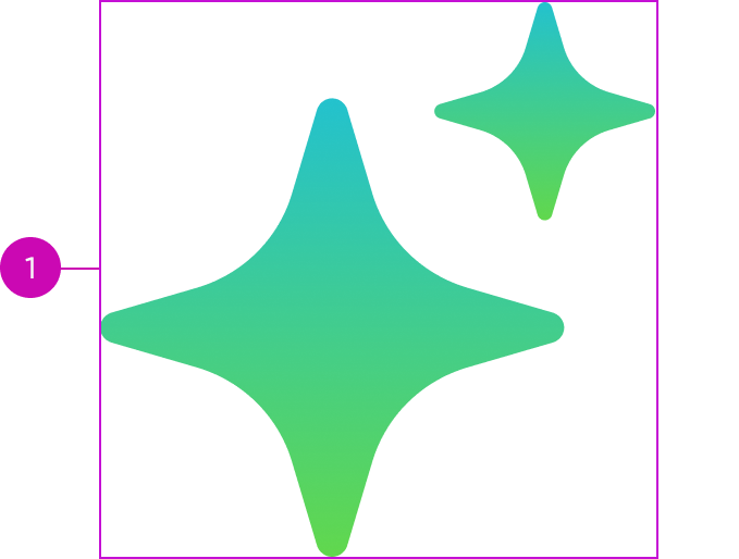
- Container: Holds the animation; the container takes on the size of the Lottie animation file
Usage
Learn about how to use animation to satisfy different use cases. Animation can be added to the custom loader component to reinforce the responsive behaviors. For more information, see usage guidance for now-loader-custom component.
Configurations
Learn how to customize animation by configuring the available properties.
Animation source path
Path to the animation Lottie JSON file.
Token ID
To create a style design token that contains the animation Lottie JSON, add a unique key suffix to “now-animation-custom.” The token ID always takes precedence over the animation source path.
Autoplay
You can set the animation to start playing automatically when it’s loaded. By default, it doesn’t automatically play.
Loop
By default when triggered, the animation plays once. You can set the animation to repeat continuously “loop.”
Design recommendations
- Display animations at their intended aspect ratio to avoid distortion
- Size the animation so that it doesn’t appear blurry or pixelated
- Be sensitive to load times. Keep resolutions minimal when possible
- Provide alt text or a caption to ensure accessibility
- Use context-relevant animations
- Provide a focal point and avoid animations that require the user to search for the meaning
Behavior
Learn how the container behaves when the animation changes.
Responsive behaviors
Note that animation doesn’t respond to changes in the container; the container resizes in response to the size of the animation.
Usability
Animation complies with all internationalization and accessibility requirements.
Accessibility
Learn how to access the actionable elements of animation through keyboard interactions and screen readers.
Keyboard interactions
Arrow up, Arrow down, Arrow left, Arrow right: Use to access and read the ALT text attached to the animation when the screen reader is in browse or read mode.
Note: Because the animation component doesn’t have any actionable elements in it, the Tab key can’t select the component.
Screen readers
Animation has no elements that a screen reader can announce.