

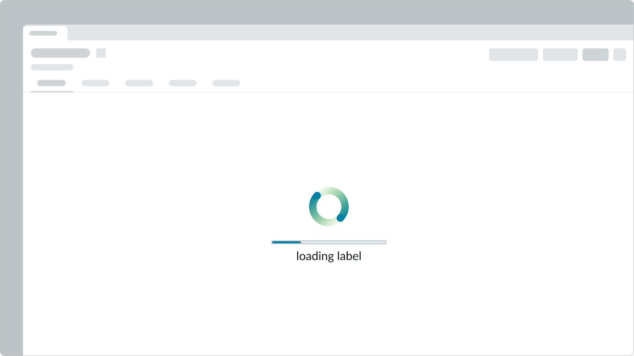
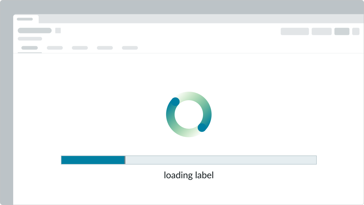
Anatomy
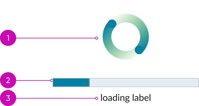
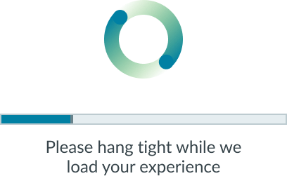
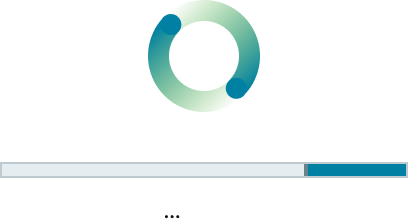
- Loading animation (URL): Primary and required element for the loader display; the loading icon is paired with a Lottie animation in JSON format referenced through an image URL.
- Progress bar (optional): A linear indicator that provides feedback on the progress of the loading process.
- Label (optional): A short description of the actions being performed during the loading state.
Subcomponent
See the usage guidelines for progress bar.
Usage
Use loader custom to provide visual feedback for ongoing processes. Unlike loader, which offers the default spinner, loader custom supports any Lottie animation in JSON format and includes an optional progress bar. The size of the loader is dictated by the width of the animation, so choose an animation that fits the intended space. Follow the animation guidelines on best practices in order to maintain consistency.
See the usage guidelines for animation.
Variants
Learn about the variants of loader custom.
Types
Learn about the different types of loaders to use in your animation.
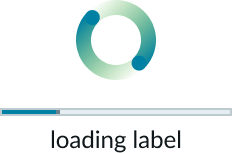
Default loader
The default loader animation comes in the following sizes: small (sm), medium (md), and large (lg). Use the default loader for page or block loading.

GenAI loader
The GenAI loader animation comes in the following icon sizes: extra extra small (xxs) and extra small (xs), and the following page-level sizes: small (sm), medium (md), and large (lg).

Sizes
Loader custom offers the following sizes for the progress bar and label: small (sm), medium (md), and large (lg). The width of the progress bar and the height of the overall loader are determined by the dimensions of the selected animation.
Small
Medium
Large
Configurations
Learn how to customize loader custom by configuring the available properties.
Sizes
This setting affects the size of the progress bar and label to complement the animation. The size of the animation itself is not affected by this setting; instead, select the loader size and ensure the corresponding JSON and URL for the animation match the size you’ve chosen.
Progress bar
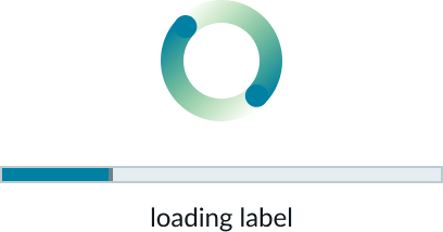
You can include a progress bar to show how much of the process is complete.
Determinate vs. indeterminate
Progress bars can be determinate or indeterminate. A determinate progress bar shows the exact percentage of a task completed. An indeterminate progress bar indicates that a task is in progress without specifying how much has been completed. The distinction between determinate and indeterminate is set by configuring the Value and Max properties.
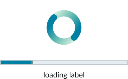
In this example, the determinate progress bar shows the task is 25% complete. The Value property is set to 25, while the Max property is set to 100, representing the full extent of the task.
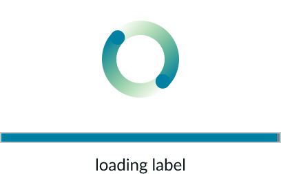
In this example, the determinate progress bar shows that the task is 100% complete. The Value property has reached 100, matching the Max property, indicating that the entire task has been finished.
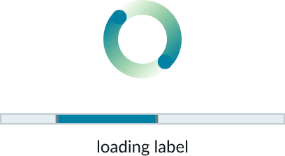
In this example, the indeterminate progress bar indicates that a task is in progress. Unlike the determinate bar, the Value and Max properties are not used to show a specific percentage, but rather to convey that the task is ongoing.
Label
You can include a label to describe the loading state or process.

Design recommendations
Learn how to apply loader custom in your design.
Select an animation with appropriate dimensions to ensure that the progress bar, which spans the width of the animation, remains proportional to the rest of the page.
Avoid using animations that are too large, as the loader can overwhelm the page and detract from the user experience.
Behavior
Learn how loader custom behaves when the display changes or a user interacts with the component.
Responsive behaviors
Learn how loader custom responds to changes in a container or display.
Text wrapping
When a label is set, it wraps to the next line if it exceeds the width of the animation. Wrapped text is center-aligned.
Usability
Loader custom complies with all internationalization and accessibility requirements.
Internationalization
When the display translates to a right-to-left (RTL) language, the orientation of the label and progress bar is reversed to match the language’s direction.
Accessibility
Learn how to access the actionable elements of loader custom through keyboard interactions and screen readers.
Keyboard interactions
Loader custom isn’t accessible from the keyboard.
Screen readers
If a label is not provided, the component automatically adds an aria-label=’Loading’ to the animation.