

Anatomy
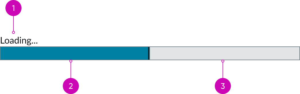
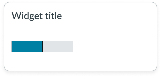
- Label: Identifies the operation in progress; labels can he hidden or displayed above or below the Progress bar
- Path: An indicator that displays progress by animating along the length of a fixed, visible track
- Track: A set value that determines the length of the path
Usage
Use a Progress bar to show the length of a process and track its progression toward completion. Progress bars help the user identify whether a process is ongoing or complete by tracking the data input. The total progress may or may not depend on the user's input. For example, a user's progression through a course is dependent on the user's input, but uploading a photo is dependent on factors outside of the user's control.
Used as a subcomponent
When a process is tied to a specific component, use a Progress bar within that component. An example could be the process of downloading a document.
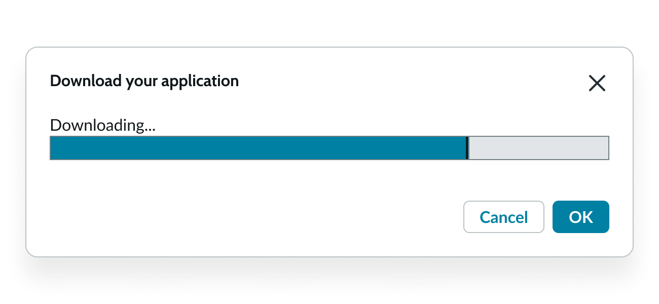
How a Progress bar appears within a modal.
Progress bar vs. loader
Progress bars and loaders are similar components, but when and where you use them is significantly different. Use a Progress bar only when you know the endpoint of the process. When you can't calculate an endpoint (or it's unknown), use a loader instead of a Progress bar.
- Use a progress bar for file uploads.
- Use a progress bar for an onboarding process.
- Use a loader when refreshing a page.
Variants
Learn about the variants of Progress bar.
Sizes
The Progress bar is available in 4 sizes: extra small (xs), small (sm), medium (md), and large (lg). Choose the size that makes the most sense for your design and use case.
Extra small
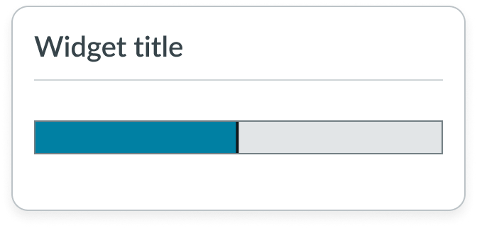
Use the extra-small size in widgets, containers, and cards.

Small
Use the small size in widgets, containers, and cards.
Whether you choose a small size or extra small size depends on the surrounding content and components.

Medium
Use the medium size in individual content sections.
Note: Medium is the default size for the Progress bar.

Large
Use the large size when the user's progression is the main focus of the display.

Configurations
Learn how to customize Progress bar by configuring the available properties.
Label
You can configure a label to identify the operation shown by the Progress bar. Labels can appear above or below the bar or can be hidden.

Style
Select a style for your Progress bar that gives the user a visual clue to the status of an operation. Each style displays a different color in the Progress bar that you can configure to tell users how things are progressing.
| Style | Color |
|---|---|
| Initial |  |
| Positive |  |
| Alert |  |
| Error |  |
| Inactive |  |
| Pink |  |
| Green |  |
| Orange |  |
| Gray |  |
Design recommendations
Learn how to apply Progress bar in your design.

When the Progress bar fills the container, the user can identify its relationship to the content.

An incorrectly sized Progress bar looks disconnected from the surrounding content.
Correctly size the Progress bar to fit within the width of the container.
If you override the default width settings, you risk creating a Progress bar that appears broken and out of place.
Alignment and positioning
The following factors determine where you place the Progress bar in your design:
- Total space available
- Progress duration
- Length of path
- Type of process
UI text guidelines
These are some recommendations for using text with a progress bar:
- When writing the label for the progress bar, consider the state of the progress bar and what type of information the person needs to know at that point
- If the progress bar encounters an error, use the label to tell the person what happened and why. Avoid blaming the person for the error and tell them what they can do next to fix the error.
- For example, the text could be, “Failed to upload. Try uploading a smaller file.”
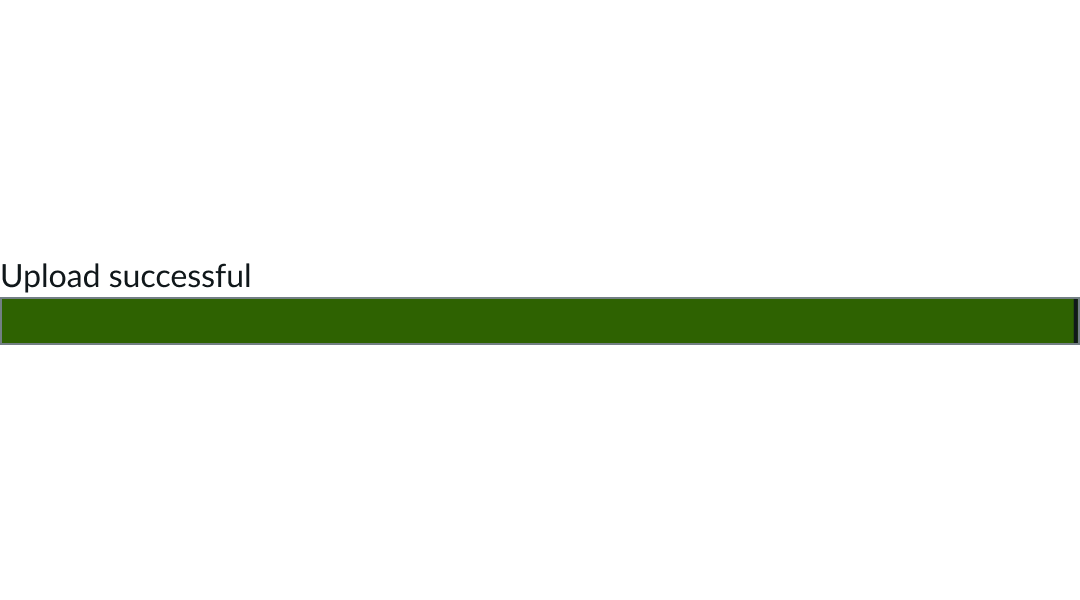
- If the progress bar has finished, use the label to tell the person it was successful and any information about what will happen next.
- For example, the text could be, “File uploaded. Now you can submit your request.”
Behavior
Learn how Progress bar behaves when the display changes or a user interacts with the component.
Responsive behaviors
Learn how Progress bar responds to changes in a container or display.
Container space
The Progress bar occupies 35% of the available container space, which makes it adaptable to any container or component size.
Animation
The Progress bar animates at different speeds between changing values. The bar starts slowly, speeds up, and then slows down again as it approaches the new value. This animation is disabled if the user sets the reduced motion preference on the OS.
Usability
Progress bar complies with all internationalization and accessibility requirements.
Internationalization
When the display translates to a right-to-left (RTL) language, Progress bars that track progression over time still display from left to right. However, Progress bars that track other types of information will flip.
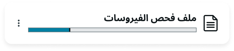
Because uploading a document doesn't track time, the Progress bar flips its orientation.
Accessibility
Learn how to access the actionable elements of progress bar using a screen reader.
Reduced motion
The end user can prevent animation in the Progress bar by selecting the Reduce Motion option in the user preferences menu. This option displays a static progress bar, set at 25% completion, until the process ends.
Screen readers
Screen readers will announce progress updates as they occur. Use the following ARIA attributes for progress bar:
- For determinate values, provide values for aria-valuenow, aria-valuemin, and aria-valuemax
- For indeterminate values, omit the aria-valuenow, aria-valuemin, and aria-valuemax attributes
- Update these values when the visual progress indicator is updated
- If progressbar describes the loading progress of a particular region of a page, use aria-describedby to point to the status and set the aria-busy attribute to true on the region until it is finished loading
- It's not possible for the user to alter the value of a progressbar because it’s always readonly
The Progress bar requires configuration of either the label or aria-label attribute in the configAria property to be accessible using a screen reader.