

Anatomy
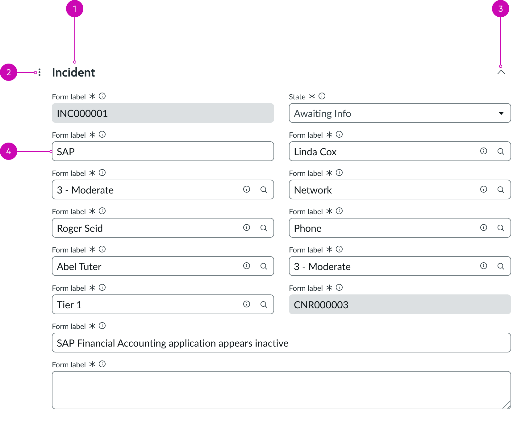
- Section header: Text that summarizes the group input fields in a part of the form
- Navigation menu (optional): Option for navigating to sections within the form
- Disclosure control (optional): Shows and hides the form fields in that section
- Input field: Component that allows for a user response in the form
Subcomponents
Usage
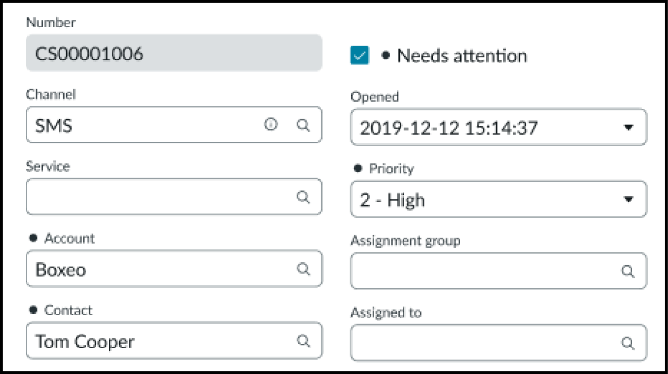
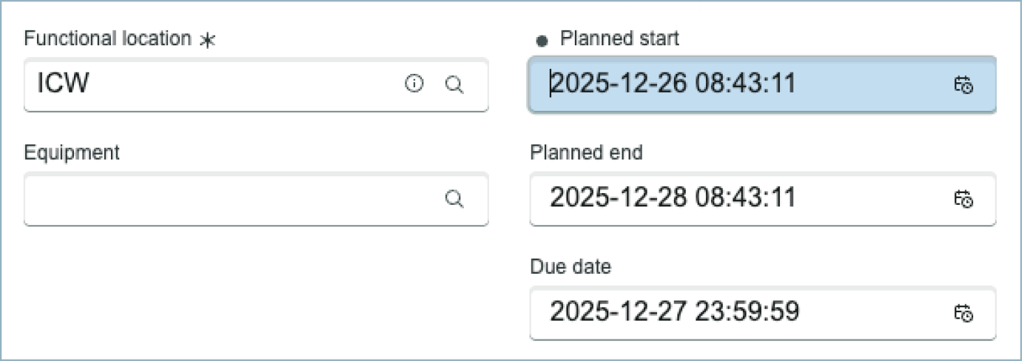
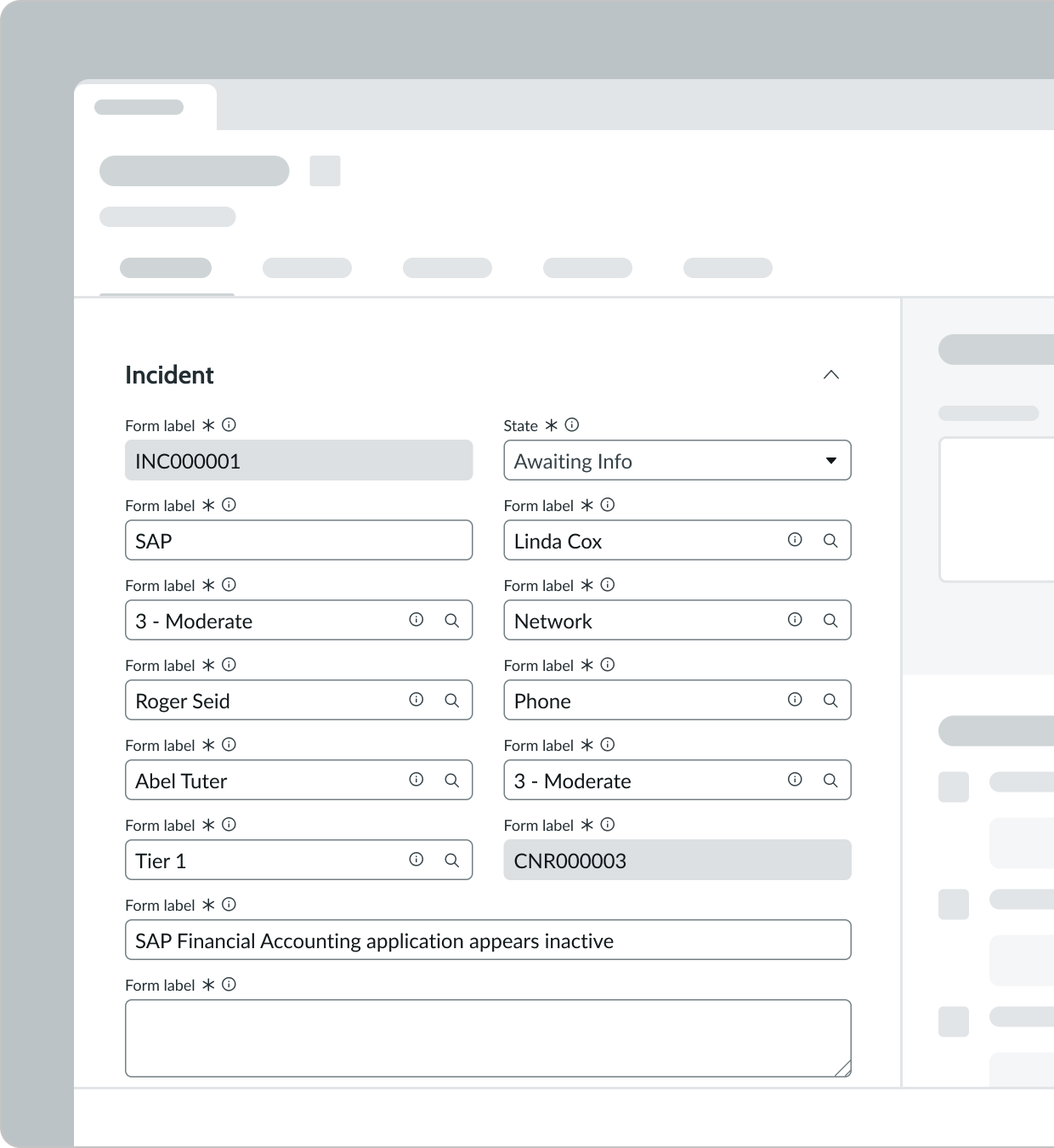
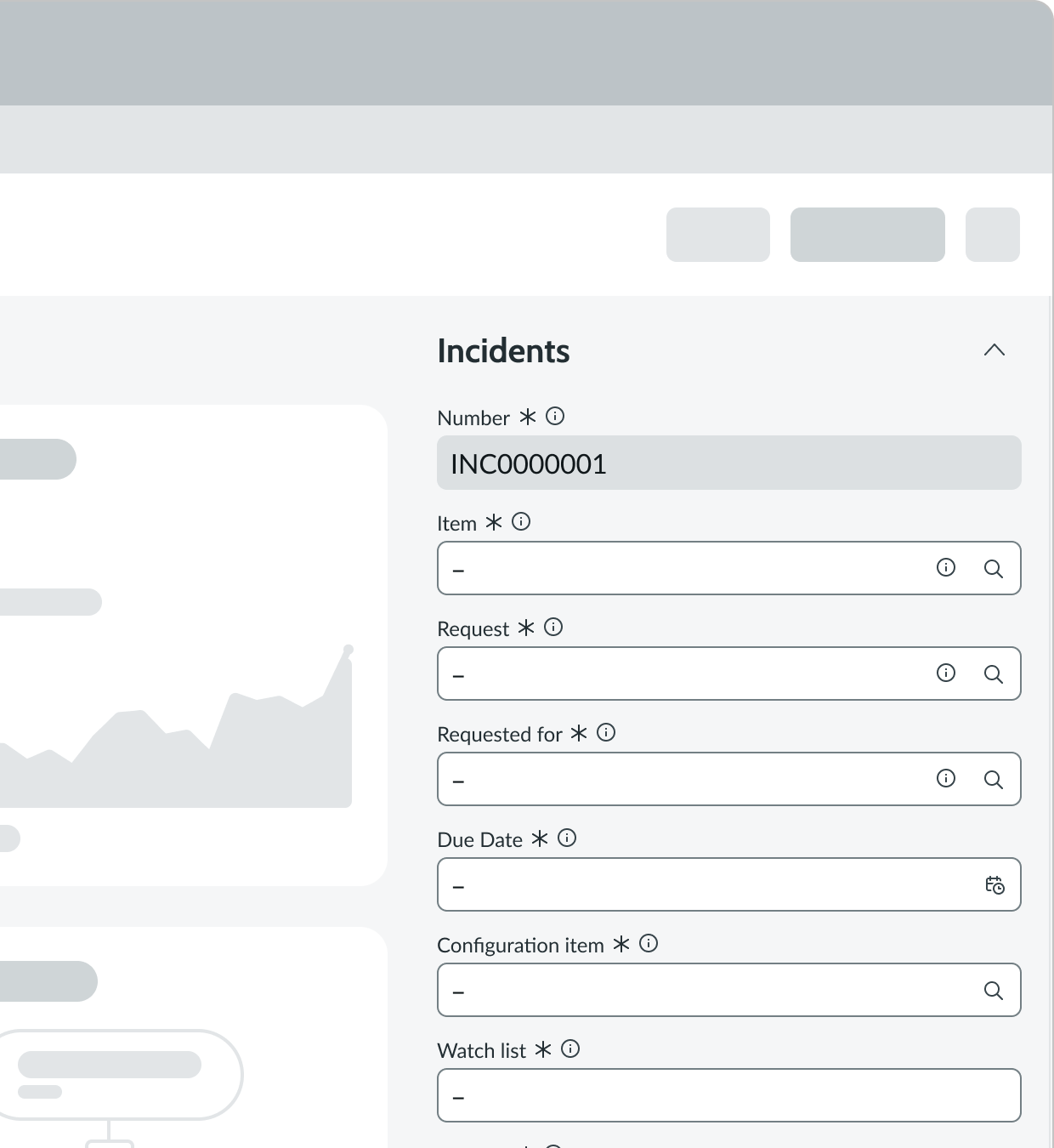
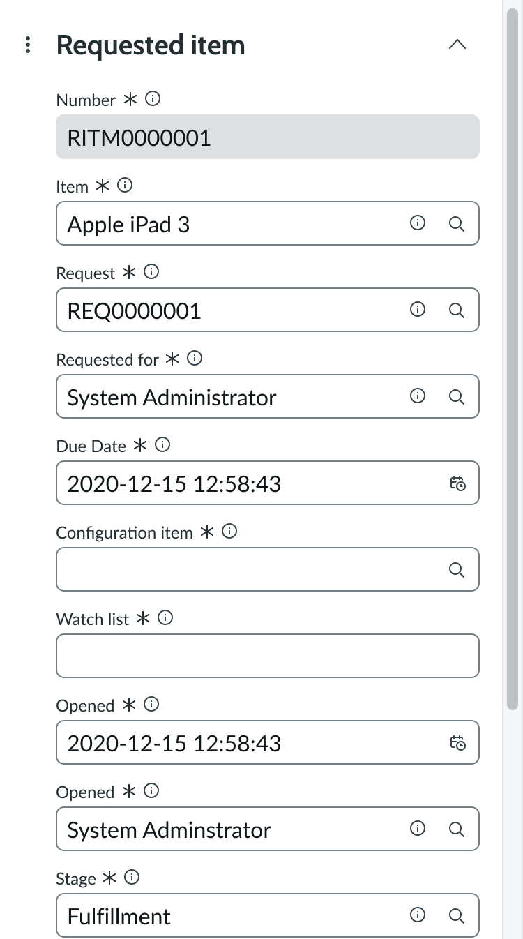
The form is connected to records and is used to show details of a record type (like case, incident, problem, or change) in a simple layout. It also enables a user to either complete or update a record using the inputs.
Configurations
Learn how to customize a form by configuring the available properties.
Presets and controllers
This component has a preset configuration that sets properties and event handlers, making it ready for use. You can override preset values with a custom configuration if needed. Preset values won’t upgrade with updates. To avoid using presets, configure manually. One preset can apply to a single component instance. See presets for more info.
A preset is linked to a controller, which serves as a data resource. Controllers provide configuration data and event bindings for the component. Selecting a preset adds the required controller to the page, allowing new components to use its preset. For more on controllers, see controllers. For default presets, see view properties and events in the controller API.
Section headers
The records associated with the form populate the section headers which are read-only in UI Builder.
Form fields
The records associated with the form populate the form fields, including the field label and input types (like phone number, URL, and others). To configure what fields or field types appear in the form, hover over the form on the UI Builder workspace and select Edit to access the Form Builder.
Navigation menu
You can show or hide the navigation menu next to the section header. The navigation menu enables users to see all sections on the form and navigate to them.
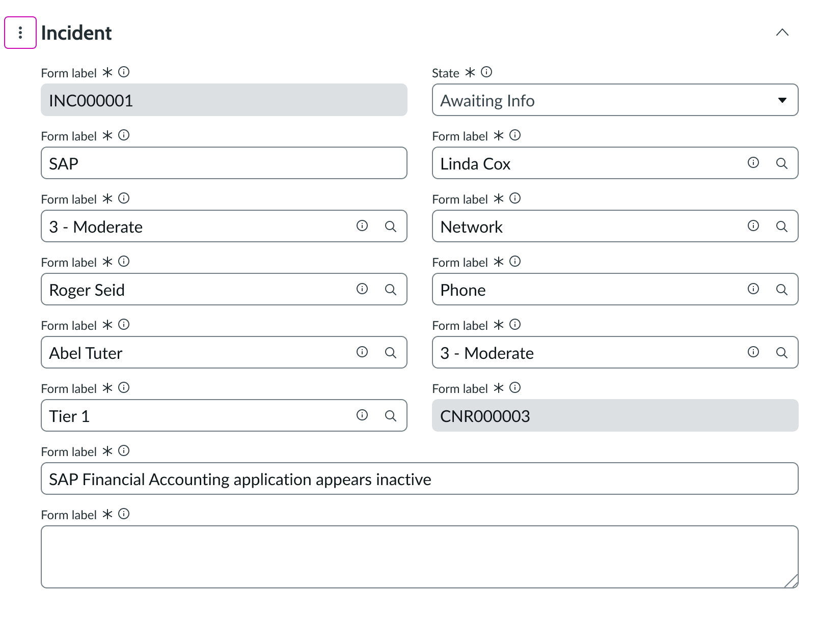
Disclosure control
The control is on by default, but you can turn it off when configuring the form. Consider turning off this control for forms with smaller data sets or sections.
Unsaved field indicator
By default, fields a user updates display a black dot next to the field name making updated fields distinguishable from other fields.
Unsaved field indicator background
When the field indicator dot is enabled (by default), you can enable the background color indicator that displays a background color to fields that have unsaved changes.
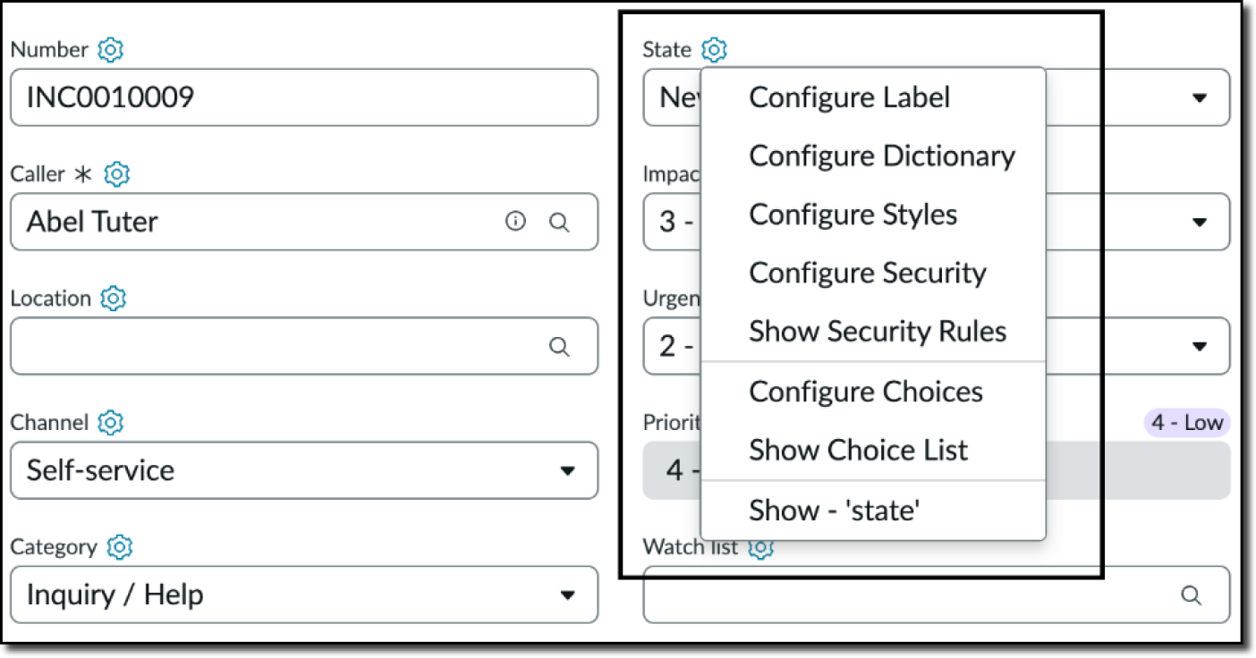
Hide the Field context menu
By default, the field context menu that enables admins to configure several field options is hidden. However, you can provide admins access to these options.
Label wrapping limit
By default, when field labels on a form exceed their container width, they truncate. If you prefer, you can have the field labels wrap instead and you can set a width value in pixels. When the label reaches the width limit, the text wraps.
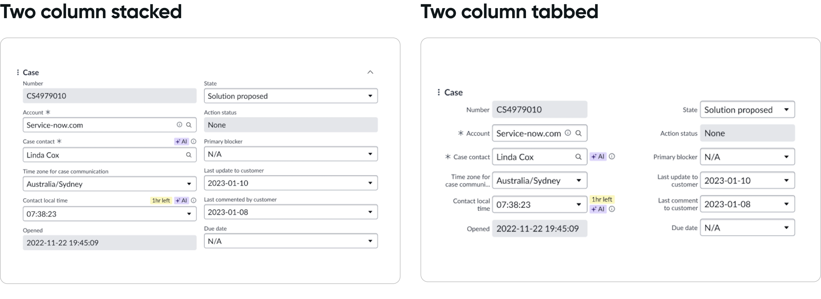
Field layout
By default, the form field layout is “Stacked” (vertical) and the field labels display above each input field. For single column and 2 column layout, the “Tabbed” (horizontal) layout option is available. The tabbed layout places each label in line with the input field and adjacent to other labels.
The tabbed layout can better utilize available space in the form, reduce white space, and display more fields on the record page.
Design recommendations
Learn how to apply the form in your design.
Always place a form in a record.
Avoid placing a form component outside of a record. If it is outside of a record, no data would show in the form and it would show the user errors.
Alignment and positioning
Make sure to position a form within a record.
UI text guidelines
These are some recommendations for using text within form:
- Use sentence case for all titles, labels, and column headers
- Keep all text labels informative and short to increase readability and scanning
- Keep content concise and purposeful to help a user understand options and actions, and move successfully through tasks to achieve their goals
Behavior
Learn how a form component behaves when the display changes or a user interacts with the component.
Responsive behaviors
Form automatically resizes to fit the container. If the form contains 2 columns of inputs, the inputs stack on top of one another and appear in 1 column for smaller displays.
In this example, the form appears in a constrained view. All form fields appear on top of each other.
If the contents of a section extend beyond the current view, the section header scrolls with the content and adopts a shadow border to distinguish it from the form content.
In this example, the 'Incident' section header stays fixed at the top of the form as the user scrolls down the long form.
Interactions
Learn how the form responds when a user interacts with it.
Navigating between sections
The user can select the navigation button to see all sections of the form. Selecting a section automatically relocates the user to that section of the form. This allows the user to move more quickly between the sections of the form and is especially helpful for longer forms.
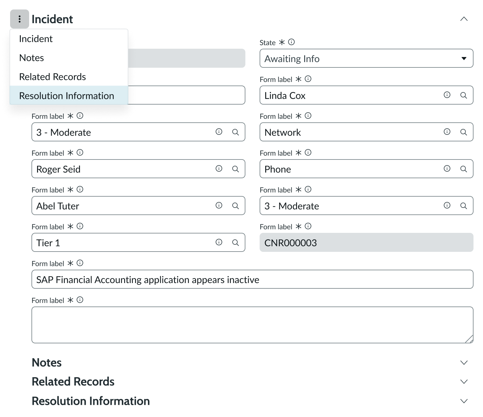
In this example, the user opens the navigation button to view all sections within the form. The user is hovering over the 'Resolution Information' section.
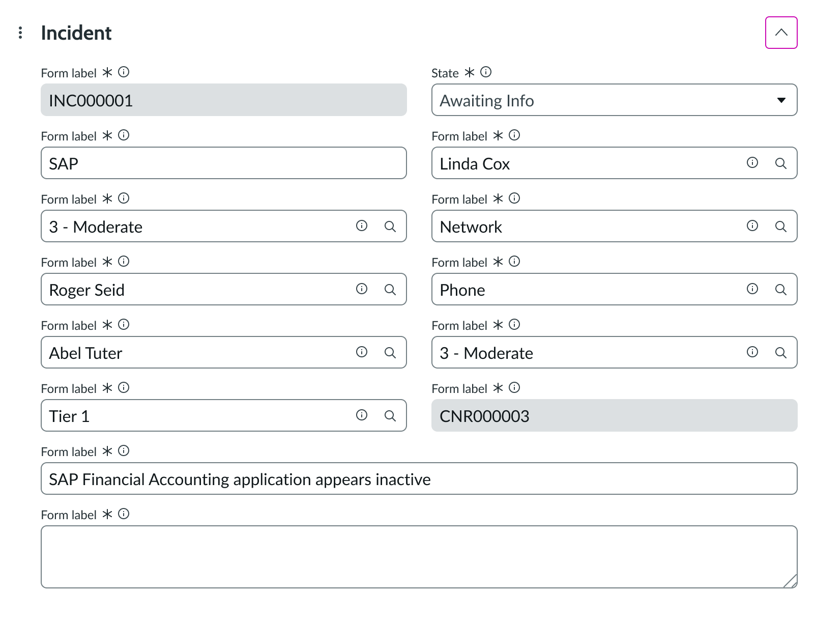
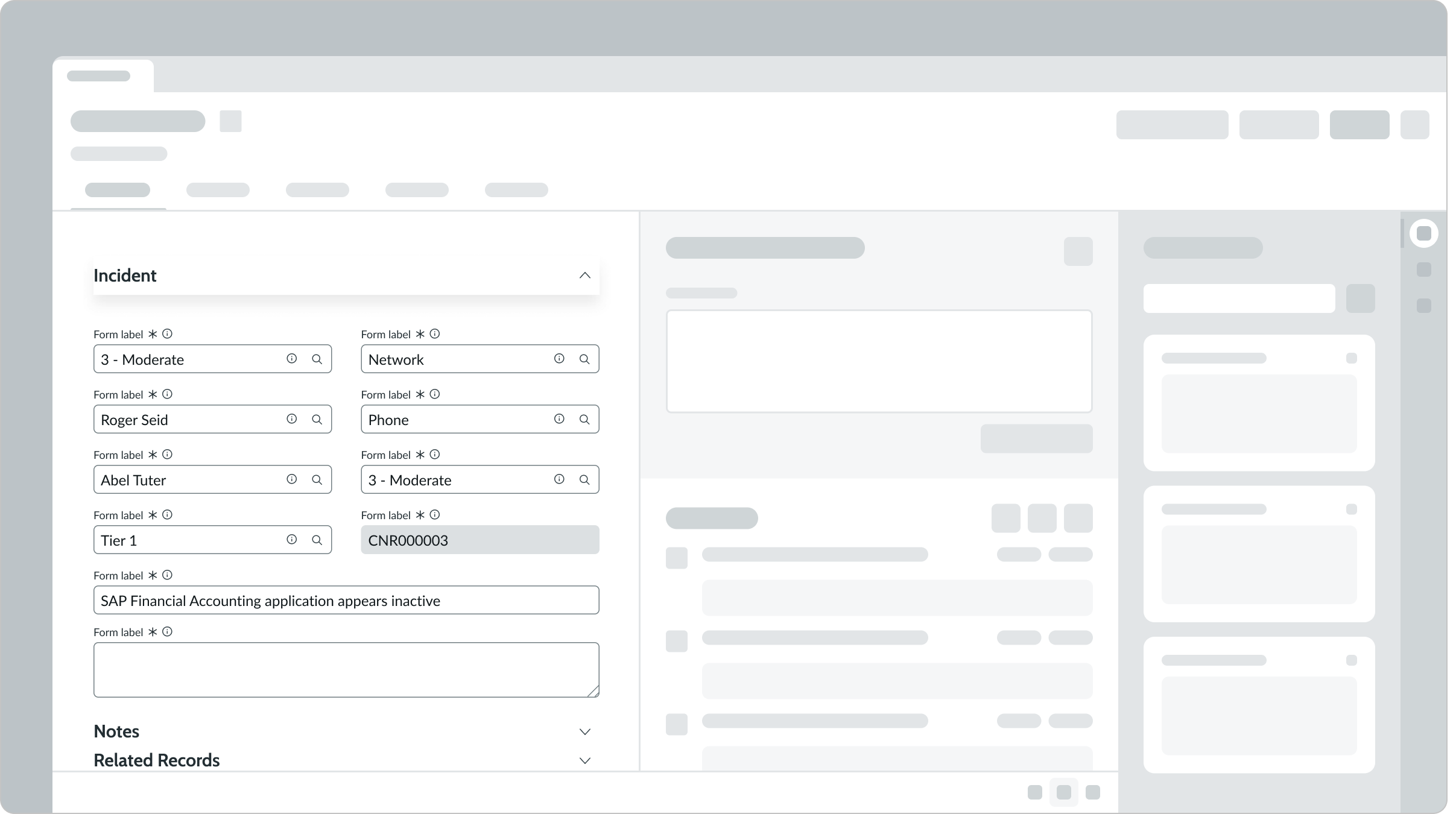
Showing or hiding a section
The user can show or hide sections within the form by selecting the chevron at the end of a section header. When selected, it collapses the section to create a more concise view of the form content.
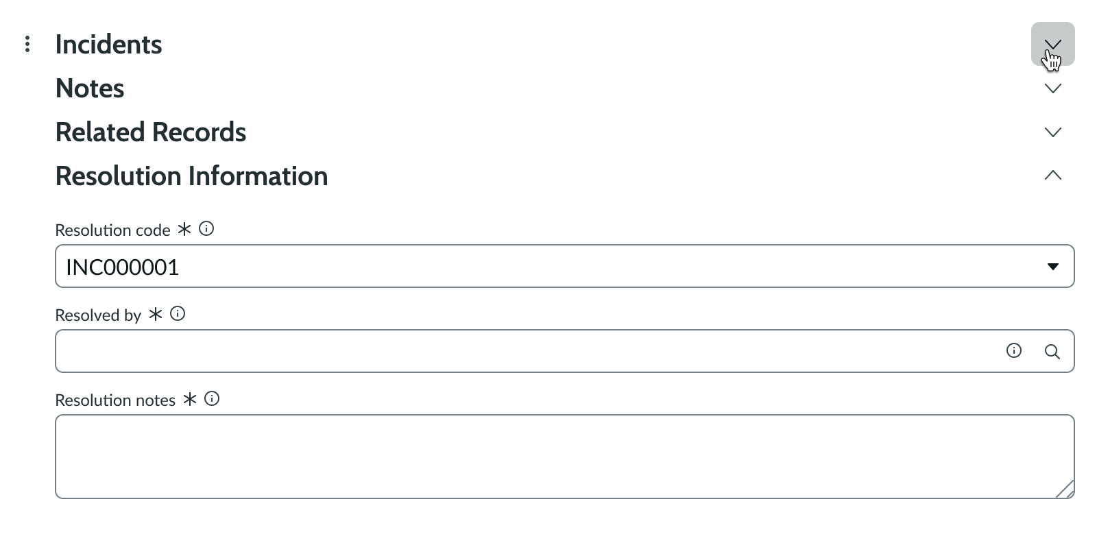
In this example, the user has collapsed the 'Incident' and 'Related Records' sections.
Completing a field
There are a few ways that a user can complete a field depending on the input type.
- If the field includes a dropdown, the user can select the dropdown trigger to show all available options, then select a list item.
- If the field is an open text field, the user can enter a query in the field.
- If the field includes a magnifying glass icon, the user can search based on the query they entered in the field.
User inputs aren't automatically saved. This requires the user to take an action on the record (outside of the form).
Truncation
The section header text within form truncates if it's wider than the form container. An ellipsis appears, and a tooltip with the full text is available on hover.
Usability
Form complies with all internationalization and accessibility requirements.
Internationalization
When the display translates to a right-to-left (RTL) language, the fields and navigation button align on the right, while the disclosure control appears on the left. Any proper nouns that can't be translated appear left-to-right (LTR).
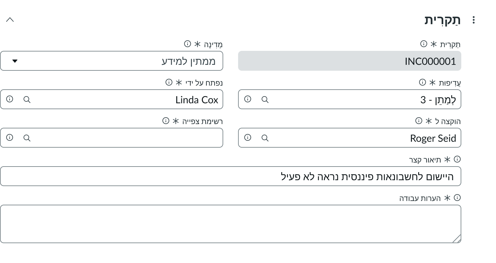
In this example, the form appears in a right-to-left language.
Accessibility
Learn how to access the actionable elements of form through keyboard interactions and screen readers.
Keyboard interactions
You can access the actionable elements of form with these keyboard keys:
- Tab: Moves focus to the next element on the form that has an available interaction
- Shift + Tab: Moves to the previous element in the tab order
- Space or Enter: Selects an interactive element within the form
- Arrow keys: Moves focus up and down through content
Screen readers
When you apply ARIA labels to a component, screen readers announce the controls and content of a form in the prescribed tab order.
Color Contrast
Ensure that there is sufficient contrast between text and background colors to improve readability for users with visual impairments.
Text Resizing
Users should be able to resize text without loss of content or functionality, typically up to 200%.
Semantic HTML
Using semantic HTML elements helps screen readers to convey the meaning and structure of content more effectively.
Focus Management
Properly manage focus within your application to provide a clear navigation path for users relying on keyboard navigation.
Alt Text for Images
All images should include descriptive alternative text to ensure that users who rely on screen readers can understand the content.
Keyboard Shortcuts
Implement keyboard shortcuts for frequently used actions to improve efficiency for power users.
Form Validation
Provide clear and accessible error messages for form validation, so users know how to correct their input.
Accessible Charts
Use ARIA attributes to make data visualizations understandable to users with disabilities.
Skip Navigation Links
Include 'skip navigation' links to allow users to bypass repetitive content.
Responsive Design
Ensure that your design is fluid and adapts to various screen sizes for an accessible experience on all devices.
Descriptive Link Text
Links should have descriptive text that clearly indicates where the link will take the user.
Consistent Navigation
Maintain a consistent navigation structure throughout your application to help users familiarize themselves quickly.
Accessible Audio Content
Provide transcripts for audio content to accommodate users with hearing impairments.
Accessible Video Content
Include captions and subtitles for video content to enhance accessibility for all users.
User Feedback
Collect user feedback from individuals with disabilities to identify areas for improvement.
Clear Language
Use plain language and avoid jargon to enhance understanding for all users.
Focus Indicators
Ensure that focus indicators are visible for all interactive elements to aid keyboard navigation.
Accessible Forms
Label all form fields clearly, and ensure that they are programmatically associated with their respective inputs.
Error Prevention
Allow users to review and confirm their input before final submission to avoid accidental errors.
Time Limits
Provide options to adjust or remove time limits for tasks to assist users who may need more time.
Customizable UI
Allow users to customize the user interface to suit their individual needs and preferences.
Accessible Modal Windows
Make sure that modal dialogs are fully accessible, including keyboard navigation and focus trapping.
Inclusive Testing
Incorporate users with disabilities into your testing processes to identify real-world accessibility issues.
Layout and Design
Design layouts that are easy to navigate, with clear headings and logical structure.
Error Messages
Error messages should be clear, concise, and provide guidance on how to fix the issue.
Screen Reader Compatibility
Regularly test your site with various screen readers to ensure compatibility and usability.
Language Identification
Specify the language of your content in the HTML to help screen readers pronounce text correctly.
Contrast Ratios
Follow established contrast ratio guidelines to ensure text is easily readable against backgrounds.
Accessible PDF Documents
Ensure that PDF documents are accessible and contain tags for screen reader compatibility.
Visual Indicators
Use visual indicators, such as icons or color changes, to signal important information or actions.
Accessible Data Tables
Provide header labels and summary information for data tables to improve understanding.