

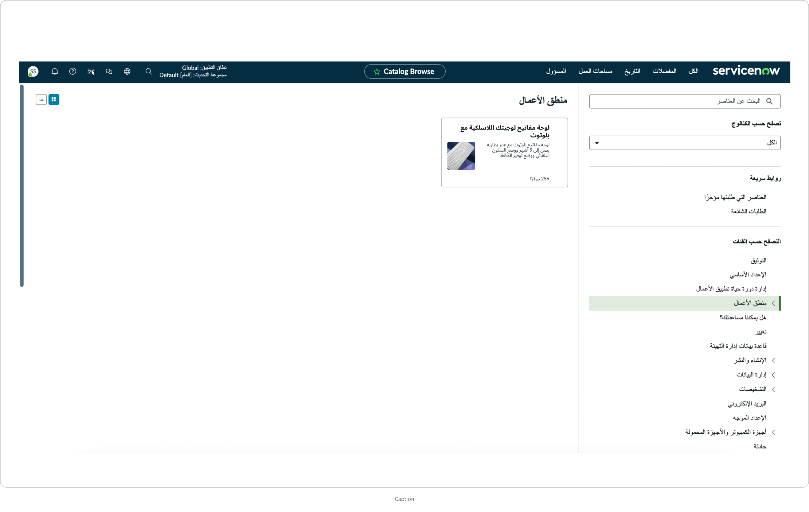
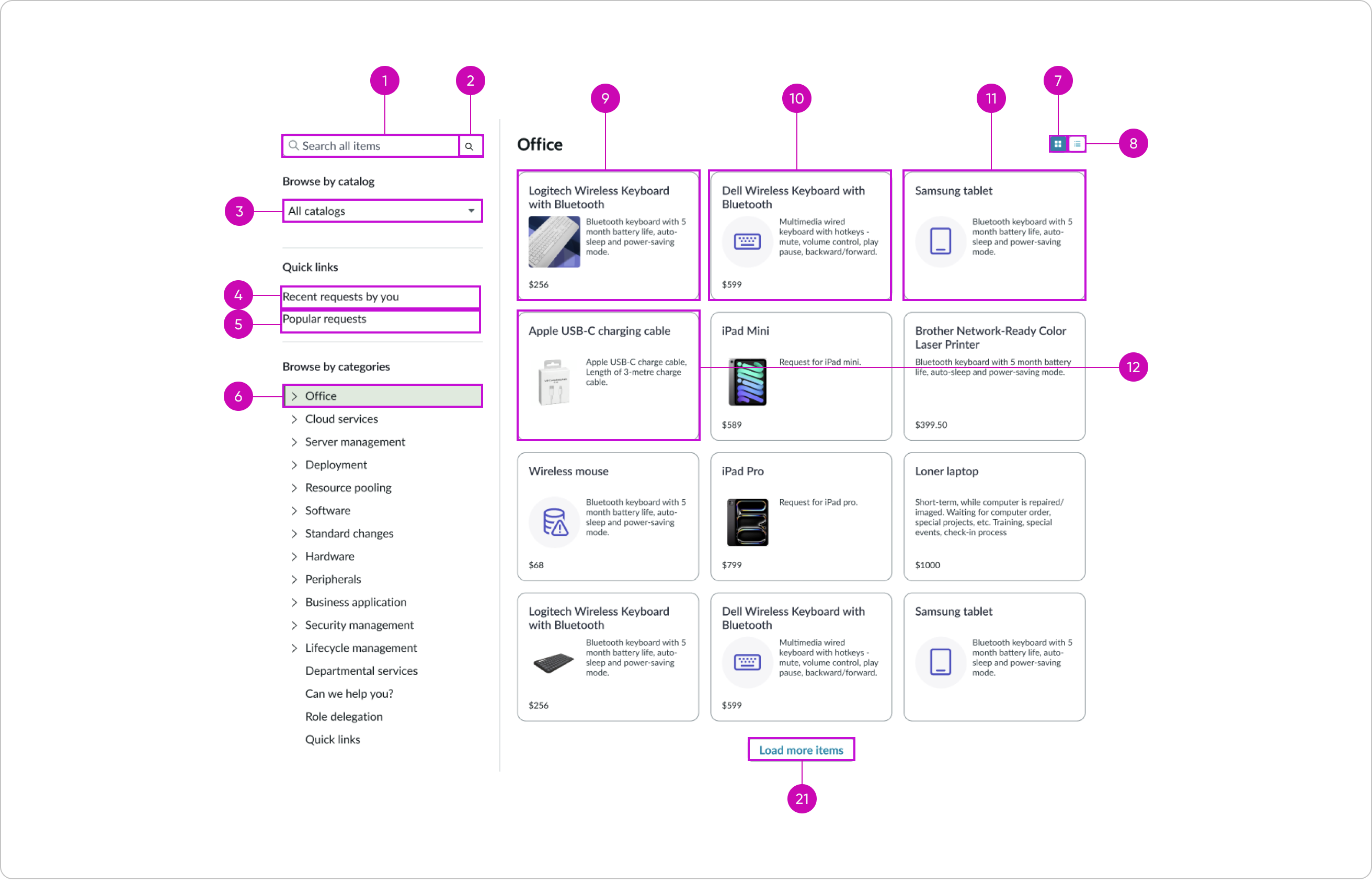
Anatomy
Learn about the individual parts of catalog browse.
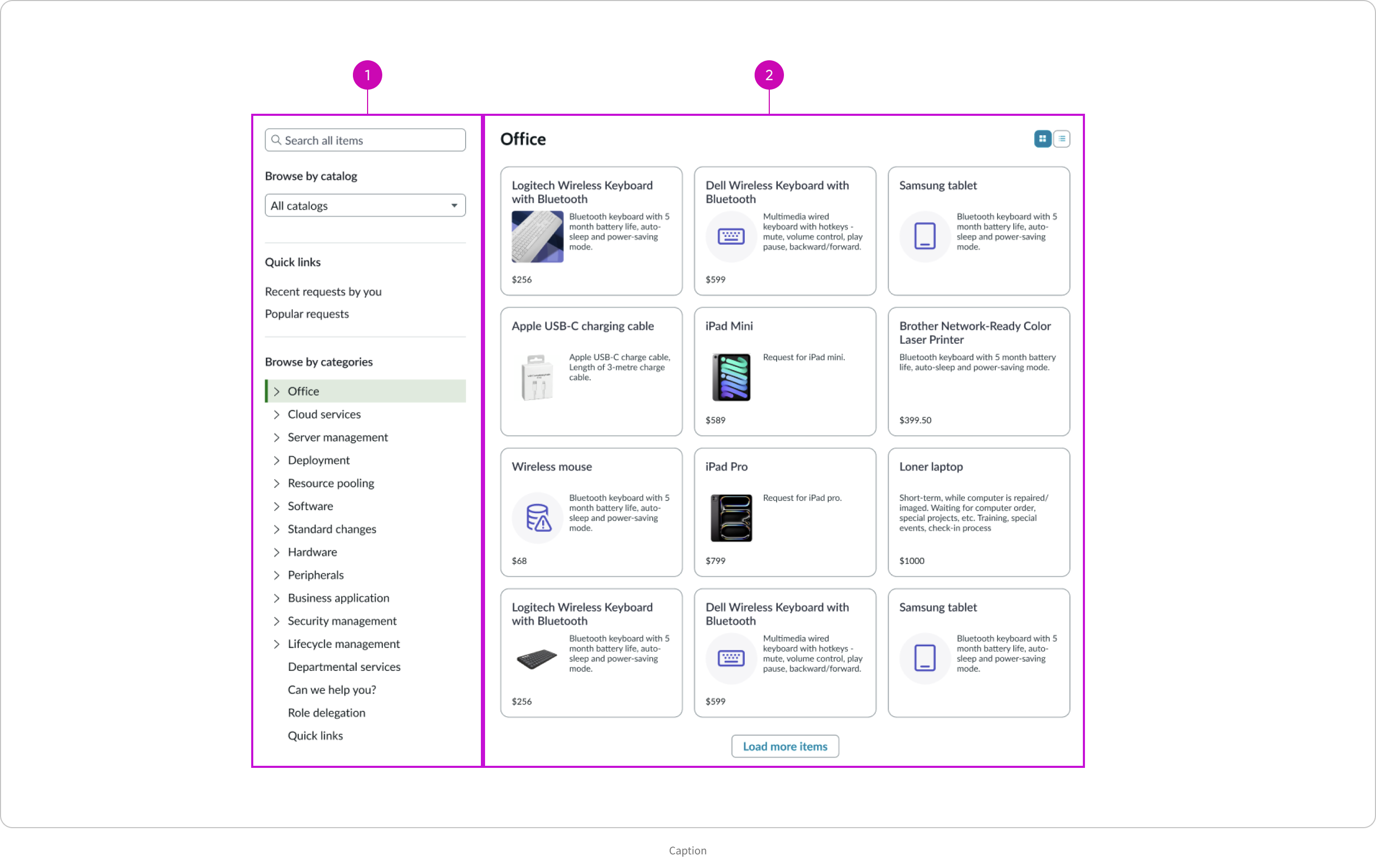
- Left panel: Displays a search field, catalog dropdown listing available catalogs, quick links, and a list of categories within the selected catalog
- Main display area: Displays the selected catalog’s available items in cards from which the user can make a selection
Main display area (grid view) anatomy
- Title: Catalog category title
- Grid view selector: Grid view of cards access button
- List view selector: List view of cards access button
- Cards: Each item available in the catalog category appears in a card that lists the item name, short description, icon or image, and the item price, or a subset of this info
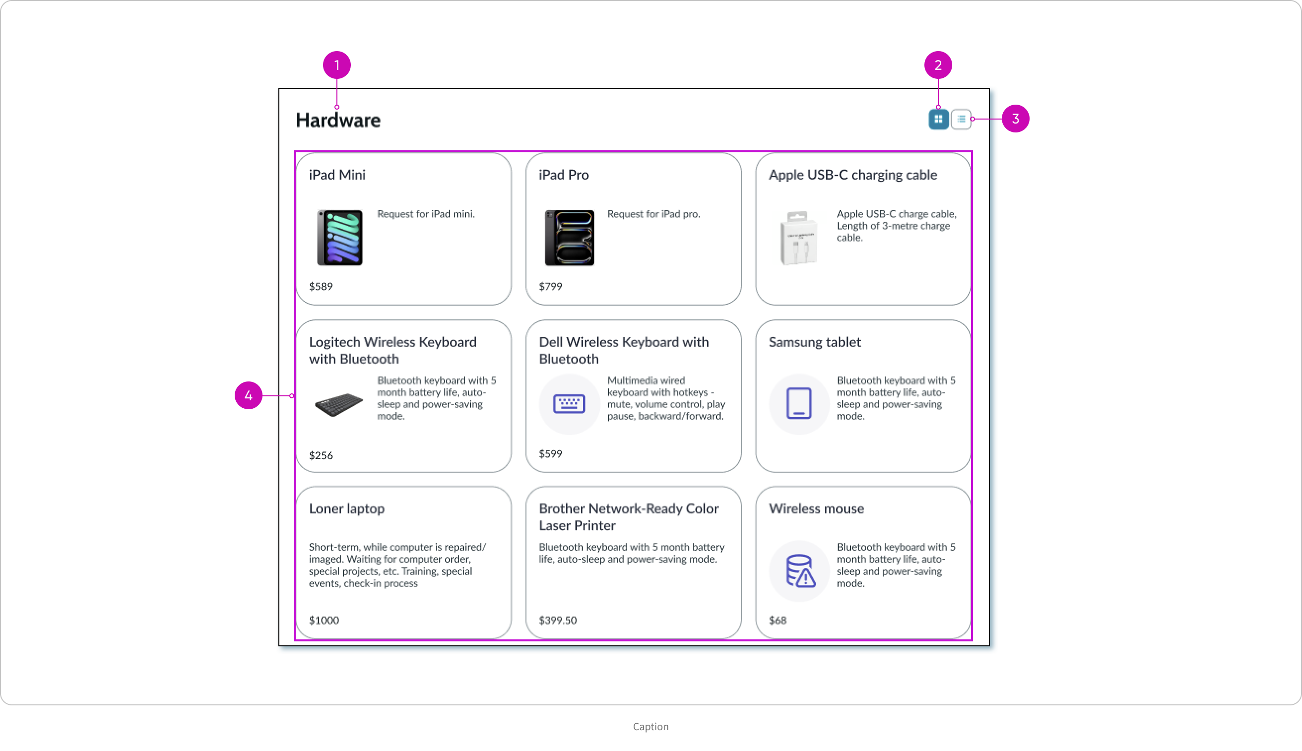
Grid view card anatomy

- Card title: Item name that truncates after 2 lines
- Card image or icon: When available, displays an image first, or an icon, and if neither is available, no visual is shown
- Short description: Multi-line text that truncates after 5 lines
- Price: When available, displays the item price; optionally you can hide the price
List view card anatomy
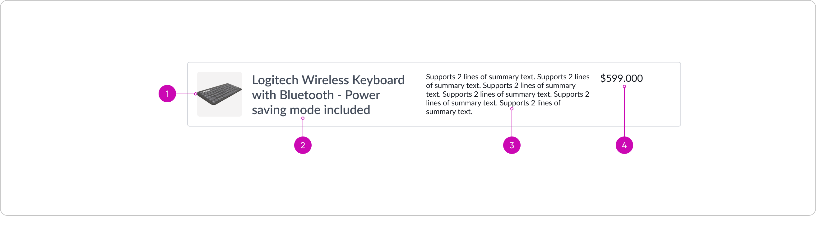
- Card image or icon: When available, displays an image first, or an icon, and if neither is available, no visual is shown
- Title: Item name that truncates after 2 lines of text
- Description: Multi-line text that truncates after 5 lines
- Price: When available, displays the item price; optionally you can hide the price
Left panel anatomy
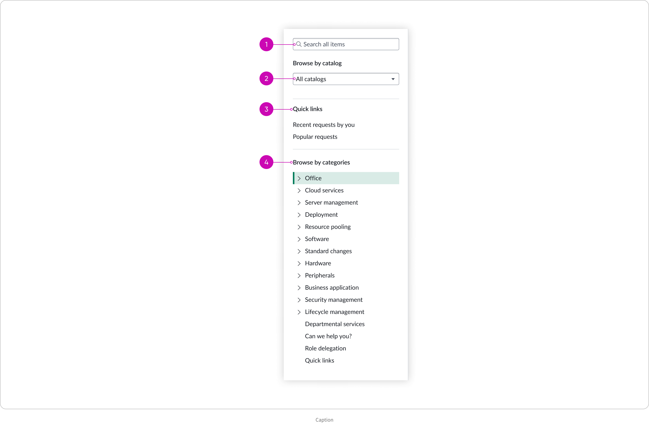
- Search bar: Search functionality built into the component
- Catalog or Category selector: Drop down for the user to select from either a list of catalogs or categories as specified by you
- Quick links: Used to quickly access items recently requested by the user and the most popular requests; optionally you can hide the Quick links
- Categories selector: Used to browse and select a sub category of a catalog
Subcomponents
If there are any subcomponents used in this component, put them in separate text elements and link them to the latest versions of those subcomponents.
See the usage guidelines for search input.
See the usage guidelines for dropdown.
See the usage guidelines for content tree.
See the usage guidelines for card base container.
Usage
Catalog browse is typically used when services need to be organized in a way that makes them easy to browse and request by different user groups.
For example:
- An employee opens the self-service page, browses the "Hardware" category, and submits a request for a new laptop.
- A new hire explores the "Onboarding" section to request badge access, equipment, and HR forms.
Configurations
Learn how to customize catalog browse by configuring the available properties.
Selection type
The selection type defines how the items are organized for the user. You can configure the catalog browse selection type to be “Catalog” or “Category.”
Catalog
If you choose the selection type “Catalog”, enter the sys_ids of the catalogs to include in catalog browse.
Category
If you choose the selection type “Category”, enter the sys_ids of the categories to include in catalog browse.
Price
When available, the price of an item displays in the item card. You can configure the price to hide from users for all cards.
Navigation panel
By default, the navigation panel appears on the side. You can configure the navigation panel to hide from users. For example, when you have all items in a single catalog and there is no need for the user to select from multiple catalogs.
Quick links
By default, links appear for the user to quickly access items they recently accessed and popular requests. The corresponding cards appear on the main display area.
Popular requests
You can configure this quick link to hide from users.
Recent requests
You can configure this quick link to hide from users.
Design recommendations
Learn how to apply catalog browse in your design.
Behavior
Learn how catalog browse behaves when the display changes or a user interacts with the component.
States
Catalog browse has the following states.
| State | Example |
|---|---|
| Default | 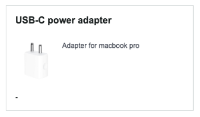 |
| Hover | 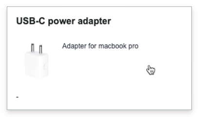 |
| Focus | 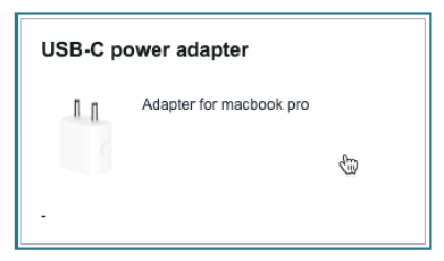 |
Responsive behaviors
Learn how catalog browse responds to changes in a container or display.
Truncation
In the card grid view, when the title text in a card exceeds 2 lines, the text truncates with an ellipsis and a tooltip shows the full content on hover.The same occurs when the short description in a card exceeds 5 lines.
In the card list view, for the title and the description in a card, when the text exceeds 3 lines, it truncates with an ellipsis and a tooltip shows the full content on hover.
Text wrap
In the left navigation panel, when a category name is longer that the available space, the text wraps.
Card width
While the card height is fixed, the width of the cards responds to the screen size. The cards resize automatically when the width of the screen space changes.
Usability
Catalog browse complies with all internationalization and accessibility requirements.
Internationalization
When this component is used in a platform configured for a right-to-left (RTL) language, the content and sub components flip and align on the right. Any names or proper nouns, however, display left-to-right (LTR).
Accessibility
Learn how to access the actionable elements of catalog browse through keyboard interactions and screen readers.
Catalog browse tab order
This is the tab order for catalog browse.
Note: For tab stop information about sub components of catalog browse, see the individual component usage guidelines.
Keyboard interactions
Users can interact with catalog browse using the keyboard.
You can access the actionable elements of catalog browse with these keyboard keys:
- Tab: Moves focus to the next element in catalog browse
- Shift + Tab: Moves focus to the previous element
- Enter/return: Triggers element action
When the focus is on a left side panel category. :
- Up or down arrow: Moves focus to the next or previous category
Screen readers
When you apply ARIA labels to a component, screen readers announce the controls and content of catalog browse in the prescribed tab order.