
Overview
Contrast refers to the difference in luminance or color between text and its background. High contrast makes content easier to read and interact with, especially for users with visual impairments. Contrast is an essential aspect of accessibility in mobile design:
- On mobile devices, users often encounter varying lighting conditions, including bright sunlight or low-light environments. High contrast ensures that content remains legible and usable across different lighting conditions.
- Mobile users may have smaller screen sizes compared to desktops, making it essential to maximize the legibility of text and interface elements. High contrast enhances readability, especially on small screens.
- Users frequently interact with mobile applications on the go, where distractions are common. Clear contrast between text and background helps users quickly identify and comprehend content, even in distracting environments.
Contrast principles
Understanding contrast involves recognizing the importance of clear distinctions between text and background colors. By ensuring sufficient contrast, we enhance readability and usability for all users. Our design standards adhere to WCAG guidelines, ensuring that text and interface elements meet accessibility standards.
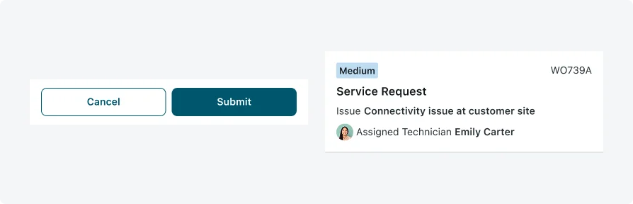
Examples of high contrast implementation in our mobile applications showcase our commitment to accessibility. Clear distinctions between text and background colors improve legibility and user experience, ensuring that content is perceivable to all users.
Testing
Testing contrast is an integral part of ensuring accessibility in our mobile applications. By verifying that text and interface elements have sufficient differentiation from their backgrounds, we enhance readability and usability for all users, especially those with visual impairments. Our testing protocols include:
Visual Inspections
Our testing team conducts visual inspections to assess the clarity and legibility of text and interface elements. This manual review process helps identify any instances where contrast may be insufficient or inconsistent.
Contrast Ratio Verification
We use tools such as the WebAIM Contrast Checker to verify that the color contrast ratio between text and background meets accessibility standards. This ensures that content is perceivable to users with varying levels of vision
Accessibility Testing Tools
We leverage accessibility testing tools such as Axe and WAVE to identify and address any contrast-related issues in our mobile applications. These tools provide detailed reports and recommendations for improving accessibility.