
Overview
Tappable area refers to the portion of the screen a user can press or tap to perform an action. Ensuring these areas are of adequate size and appropriately spaced is essential to prevent input errors and enhance user experience, particularly for users with motor challenges. Tappable area is an essential aspect of accessibility in mobile design, here are a few practical benefits of it:
- Properly sized and spaced tappable areas are essential to ensure that all users, regardless of their ability to execute precise movements, can navigate and interact with the app smoothly and efficiently.
- Mobile devices are often used in transit, where quick and easy interaction is necessary. Clear, well-defined tappable areas support efficient use in these dynamic environments, enabling users to achieve their goals without unnecessary delays or mistakes.
Principles
Creating accessible tappable areas requires attention to two key principals - size and spacing. The goal of this criterion is to make sure interactive elements are big enough to be easily used, particularly when navigating on small mobile screens, or by users who find it challenging to tap small areas. In ServiceNow, we aim to comply with the AA compliance level.

WCAG (Web accessibility standard) Success Criterion 2.5.8 for Target Size
WCAG (Web accessibility standard) Success Criterion 2.5.5 for Target Size
- All interactive targets (such as buttons or links) should take up at least 24x24 CSS pixels of space, which can include white space around the target.
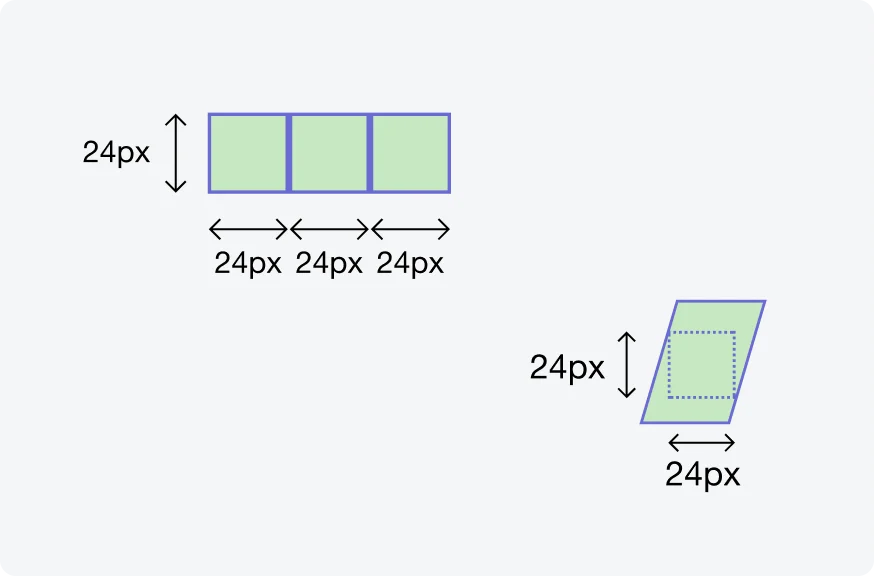
An element needs to fit within a 24x24 pixel square, not exceeding its boundaries.
An element can still meet the requirements if it's surrounded by enough clear space (Exception: spacing)
- An enhanced compliance criterion specifies that targets should be at least 44 by 44 CSS pixels, unless one of these exceptions apply: Equivalent (2), Inline (3), User Agent Control (4), Essential (5).
Guidelines
The target size criterion defines a minimum size and, if this can't be met, a minimum spacing. Undersized can still comply with this criterion, if they meet the requirements of one of the described exceptions. However, larger targets are generally easier to use for everyone. As a recommended approach, it is advised to at least meet the minimum size requirement of the Success Criterion, regardless of spacing.
Exceptions
Read below to understand the exceptions for WCAG 2.5.8: Target Size - Minimum (AA).
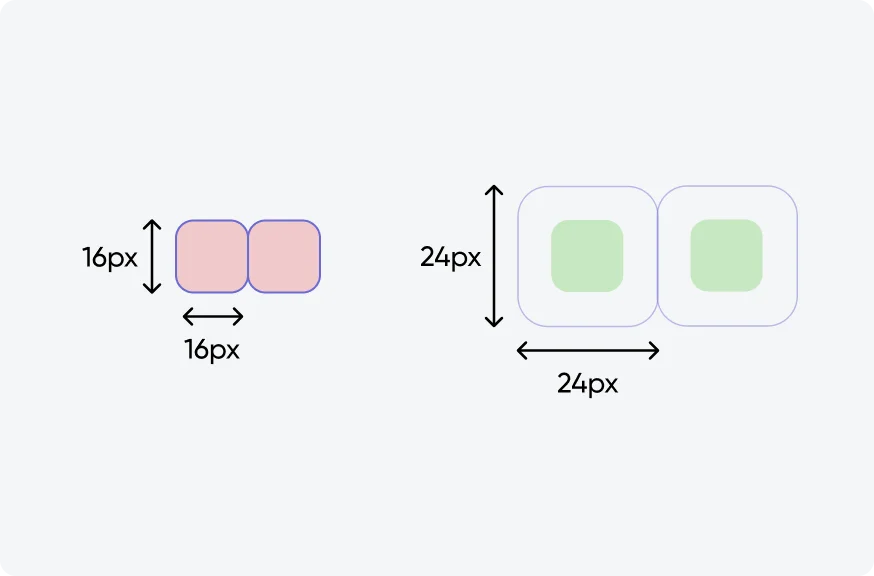
1. Spacing
Consider each interactive element as being enclosed within an invisible boundary. If an element is smaller than the recommended 24x24 pixels, it's essential they're surrounded by enough empty space so that its boundary is at least 24x24 pixels and doesn't intersect with another element’s boundary.
Illustrating two ways of meeting this Success Criterion (source: W3C).
Illustrating two ways of failing this Success Criterion (source: W3C).
2. Equivalent
In scenarios where there are multiple ways to achieve the same action, it's permissible for smaller targets to exist alongside their larger, more accessible counterparts. If an alternative control on the same page meets the size requirements and offers the same function, this flexibility allows for design variation without compromising accessibility.
3. Inline
Interactive elements that are integrated into lines of text (for example: links), do not require a minimum target size of 24x24 CSS pixels. Adjusting these to meet size standards could disrupt the flow and readability of text. Thus, maintaining the integrity of textual content takes precedence.
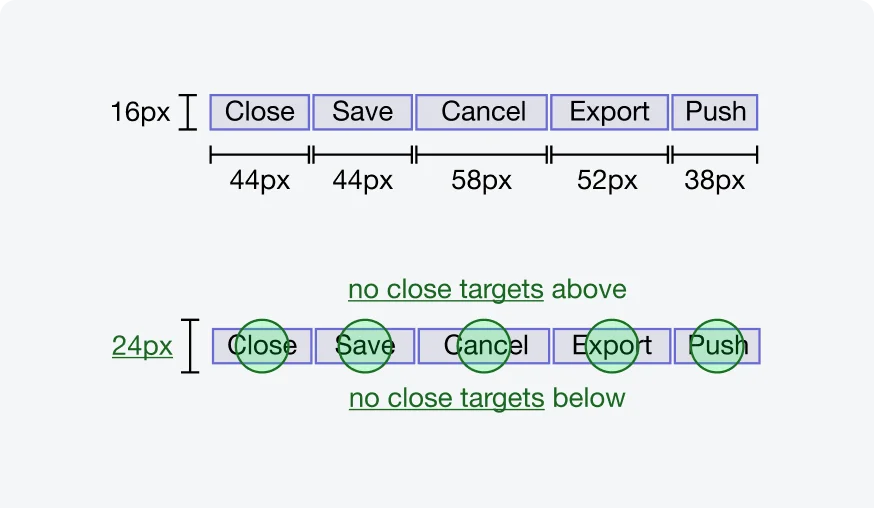
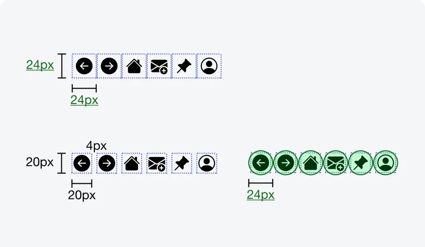
While the height of the targets is only 16 CSS pixels, the lack of adjacent targets above and below means that the targets pass this Success Criterion (source: W3C).
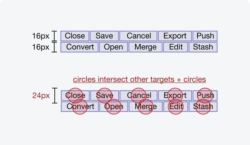
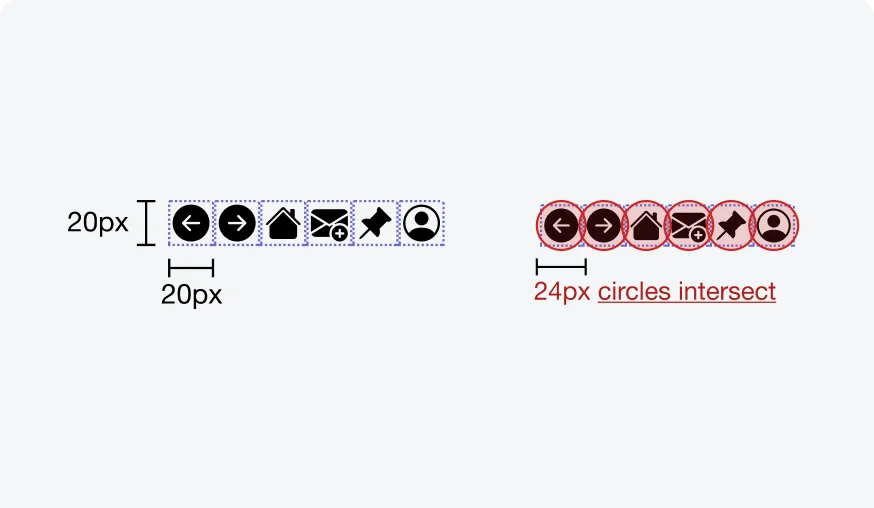
Two rows of buttons, both with a height of only 16 CSS pixels. The rows are close, with only a 1 CSS pixel gap between them. This means that the 24 CSS pixel spacing circles of the targets in one row will intersect the targets in the other line, thus failing the Success Criterion (source: W3C).
4. User Agent Control
When the dimensions of an interactive element are determined by the user agent (browser or device) and are not modified by the author, these elements are exempt from the minimum size criteria. This acknowledges the constraints designers face with elements outside their control while still encouraging adherence to accessibility principles where possible.
5. Essential
Targets requiring a specific size for essential information conveyance or legal obligations are exempt from the minimum size requirement.
Testing
Testing tappable areas is an integral part of ensuring accessibility in our mobile applications. By verifying that all of the interactive elements are easily tappable and have sufficient size and spacing, we enhance usability and user experfience for all users, especially those with motor impairments. Our testing protocols include:
Visual Inspections
Our testing team conducts visual inspections to verify that tappable areas meet minimum size and spacing requirements. This manual review helps identify elements that may be difficult to interact with, particularly for users with motor impairments.