
Overview
The focus order refers to the sequence in which interactive elements on a mobile interface receive keyboard or touch focus, allowing users to navigate content and activate controls. Mobile operating systems and their integrated tools, like screen readers, provide robust support for focus order. Beyond the assistive technology integration, focus order also has broader mobile-specific considerations around logical layout, content hierarchy, and keyboard/touch control, which designers must carefully craft to deliver accessible experiences that meet the needs of all users.
Principles
Maintain Logical Flow: Ensure the focus order aligns with the visual layout and reading order of the content, allowing users to navigate the interface intuitively.
Appropriate Focus Indicators: Provide clear visual focus indicators (e.g., a visible outline or highlight) to make it evident which element currently has keyboard focus. This helps users track their position and understand where their actions will be directed.
Consistent Focus Management: Maintain consistent focus management when users interact with different UI components, such as opening and closing modals, expanding/collapsing sections, or navigating between screens. The focus should be set to the appropriate element after each interaction.
Guidelines
1. Follow the logical flow
Ensure that the focus order follows a logical flow that mirrors the expected sequence of user interaction.
- For left-to-right languages (e.g., English, French, German), the focus order should go from top-left to bottom-right.
- For right-to-left languages (e.g., Arabic, Hebrew), the focus order should go from top-right to bottom-left.
In some cases, you may need to deviate from the standard order to enhance usability by following the Reading Order. For example, in multi-column layouts, it may make sense to move from top to bottom within each column, and then from left to right when navigating to the next column.
2. Provide clear visual feedback
Our mobile applications ensure that focused elements are clearly distinguished visually, using cues such as color changes or outlines to indicate selection status and guide users through the interface seamlessly.
On iOS devices, it is also possible to modify the color and increase the contrast of the indicator using the system settings.
Clearly communicate the focused group and focused area.
Do not rely on subtle or missing visual cues that make it unclear which element is focused or which group the focus belongs to.
3. Ensure full visibility of focused item
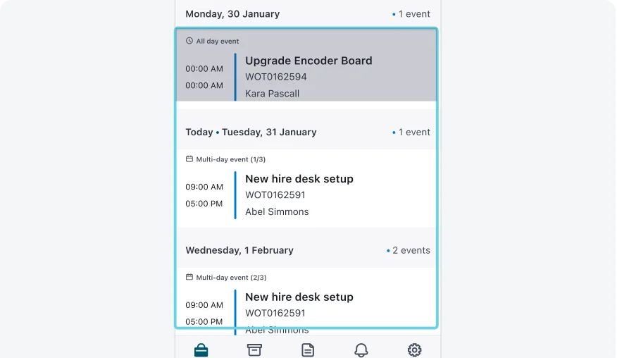
Verify that the item currently in focus is fully visible on the screen, avoiding situations where focused elements are obscured or partially hidden from view.
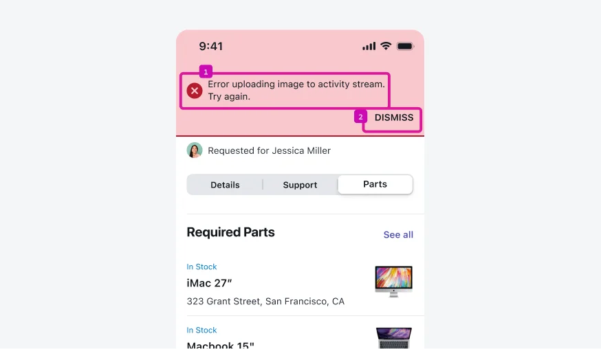
Ensure the focused item is fully visible and not covered by system messages or other UI elements.
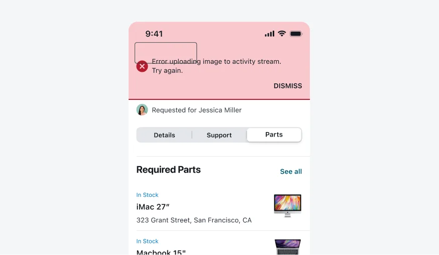
Do not allow the focused element to be obscured or partially hidden while it has focus.
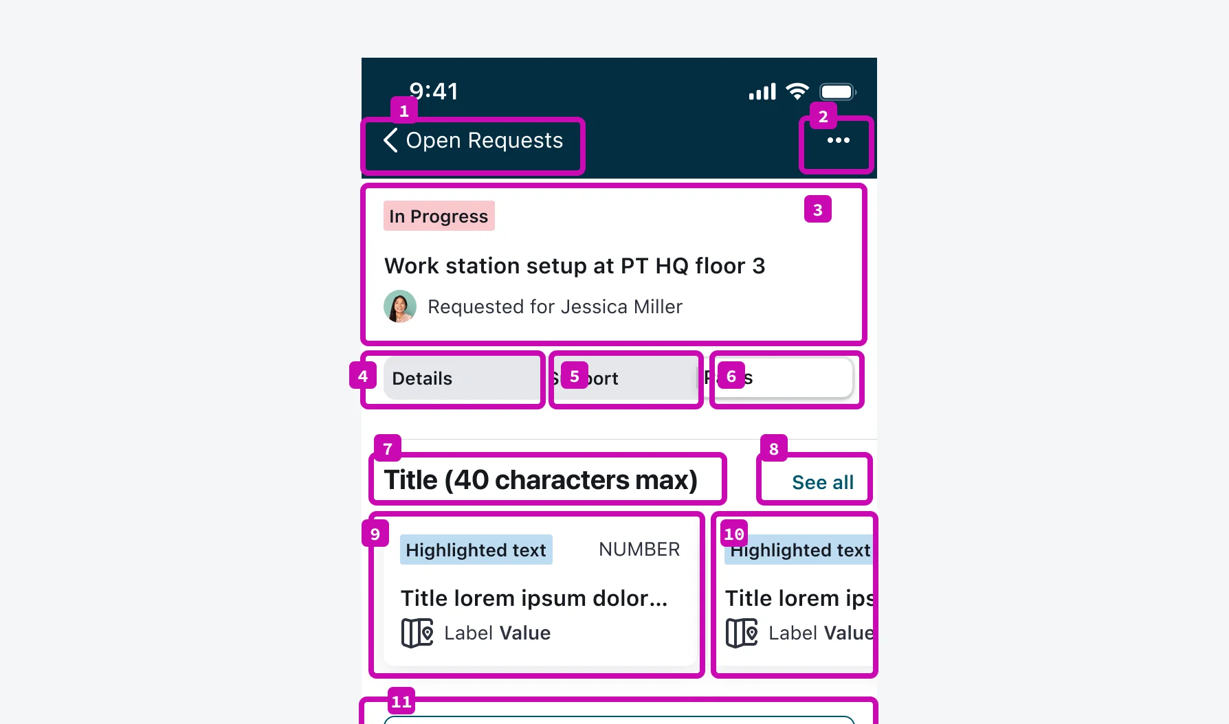
4. Group related content together
Interactive elements that are visually or functionally connected should be kept in close proximity within both the reading order and focus order. For example, form fields and their associated labels should be grouped together.
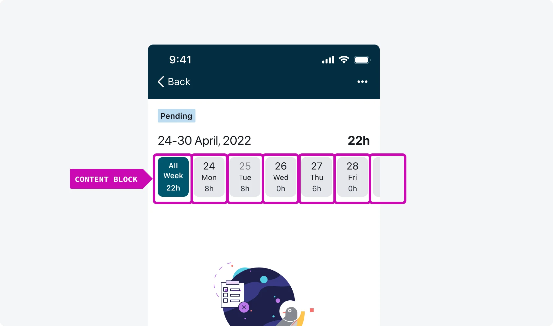
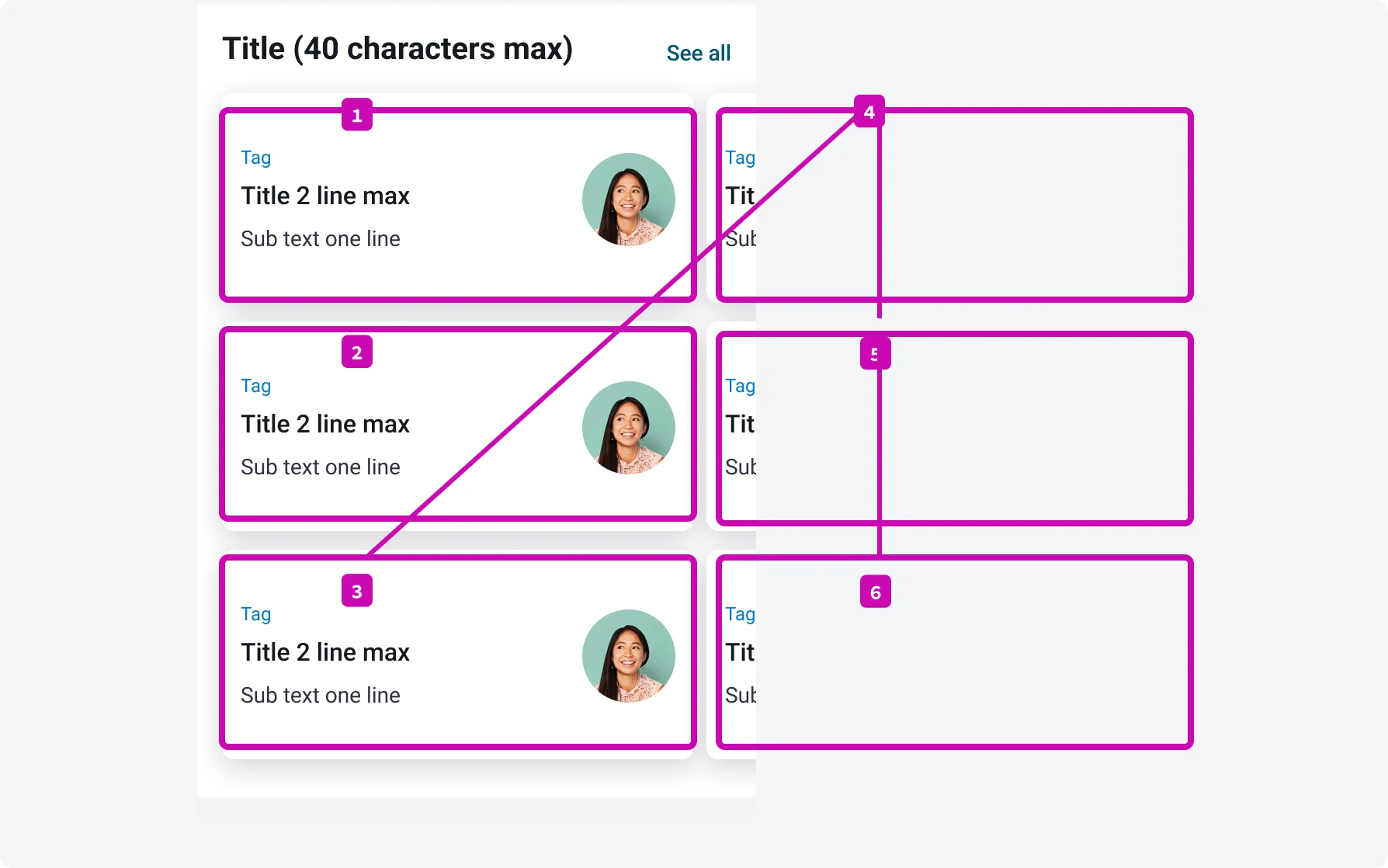
Days that are related or part of the same week are grouped together and presented in a clear, meaningful order.
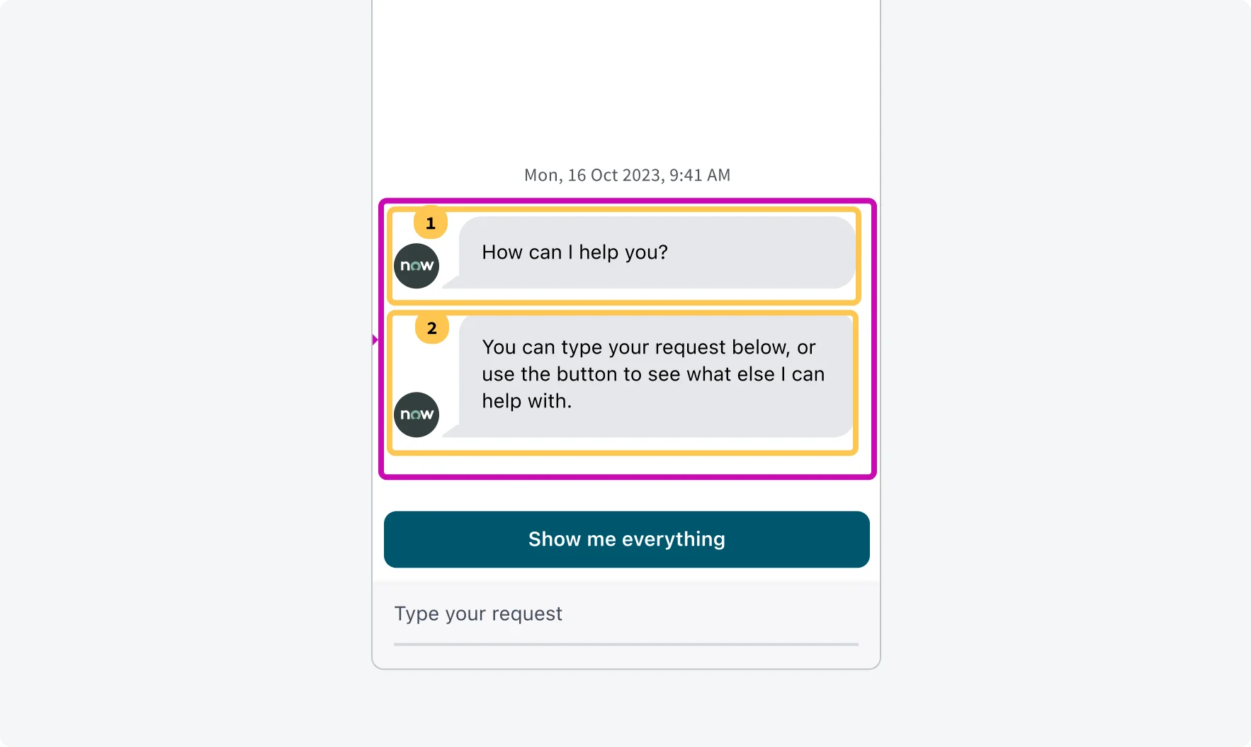
Multiple messages from one source will be grouped contextually and will be read in a meaningful reading order.
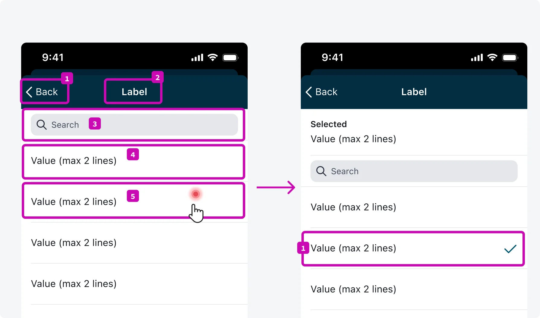
5. Maintain focus after selection
When an item is selected, ensure that the focus remains on the selected item. Examples include tab bar, pin pad, and selection input.
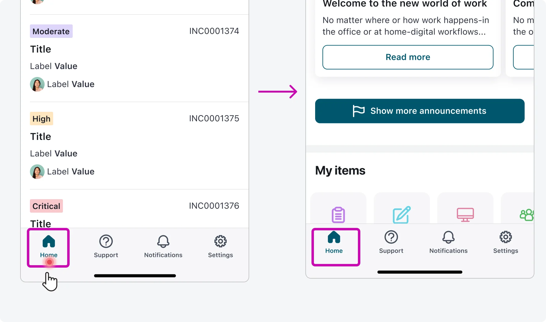
After navigating to Tab home screen focus remains on the tab. User can navigate to the first item on top using special VoiceOver gestures.
Focus remains on the selected item after user make the selection.
6. Simplify interactions for grouped items
Minimize the need for excessive tapping or interaction gestures within defined boundaries, such as elements within cards or containers, to streamline user interaction and improve usability.
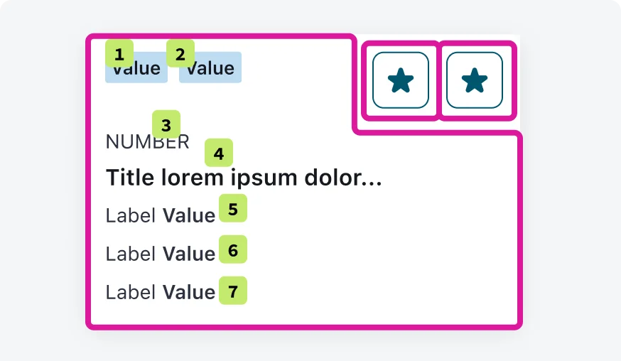
All green items 1-7 inside the content block on the card are read one after the other without requiring users' tapping or swiping.
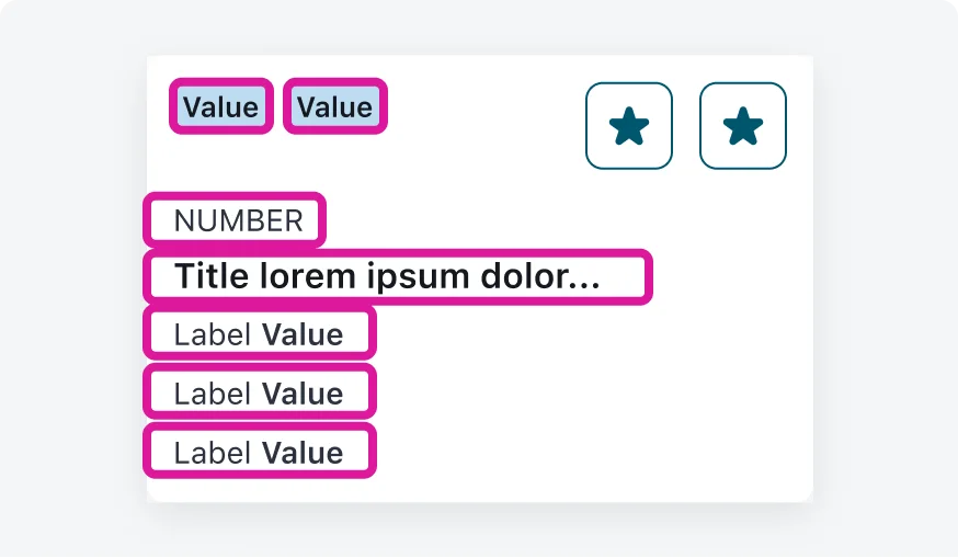
Don’t require users to tap or swipe between individual items within the same content block in order to read or interact with them.
Testing
Testing focus order is an important part of ensuring accessibility in our mobile applications. By verifying that focus moves through the interface in a logical and predictable order, we improve navigation and usability for users who rely on keyboard or assistive technologies. Our testing protocols include:
Manual inspections
Our testing team performs manual testing by navigating through the app's key user flows and observing the focus behavior.
