
Overview
The input form screen allows users to enter structured data through a mobile interface. It supports a wide range of input types and configurations, enabling everything from simple submissions to advanced workflows. Input form screens support offline use and are fully integrated with the ServiceNow platform from the Utah release onward. This is the recommended method for collecting inputs on mobile.

Conceptual and configuration guidance

Figma library with components for designing Native Mobile.
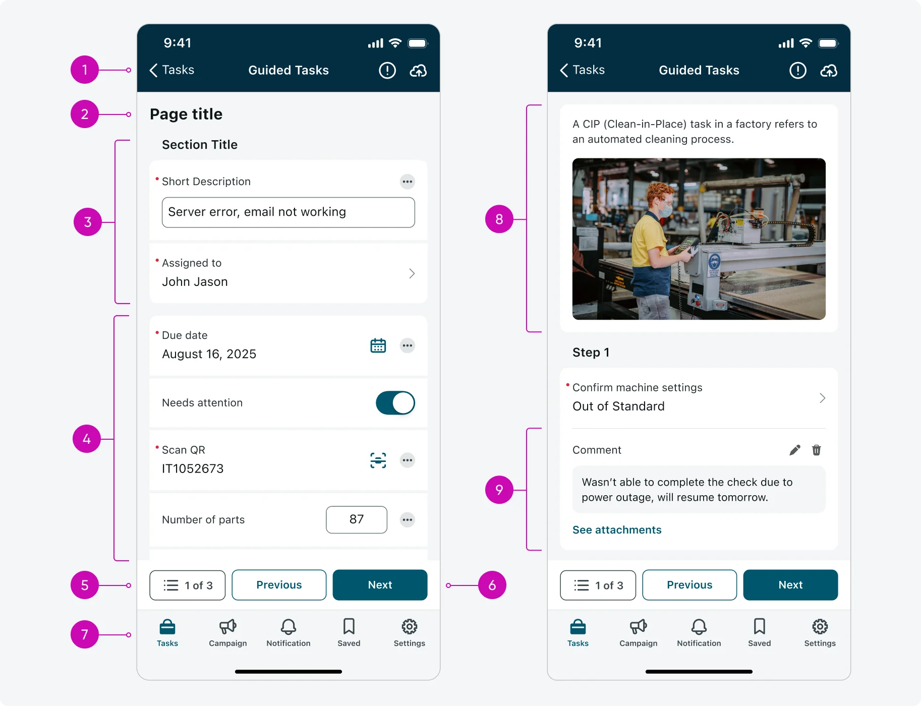
- Top navigation bar: includes the following elements:
- The form’s title
- A button to go back to the previous screen.
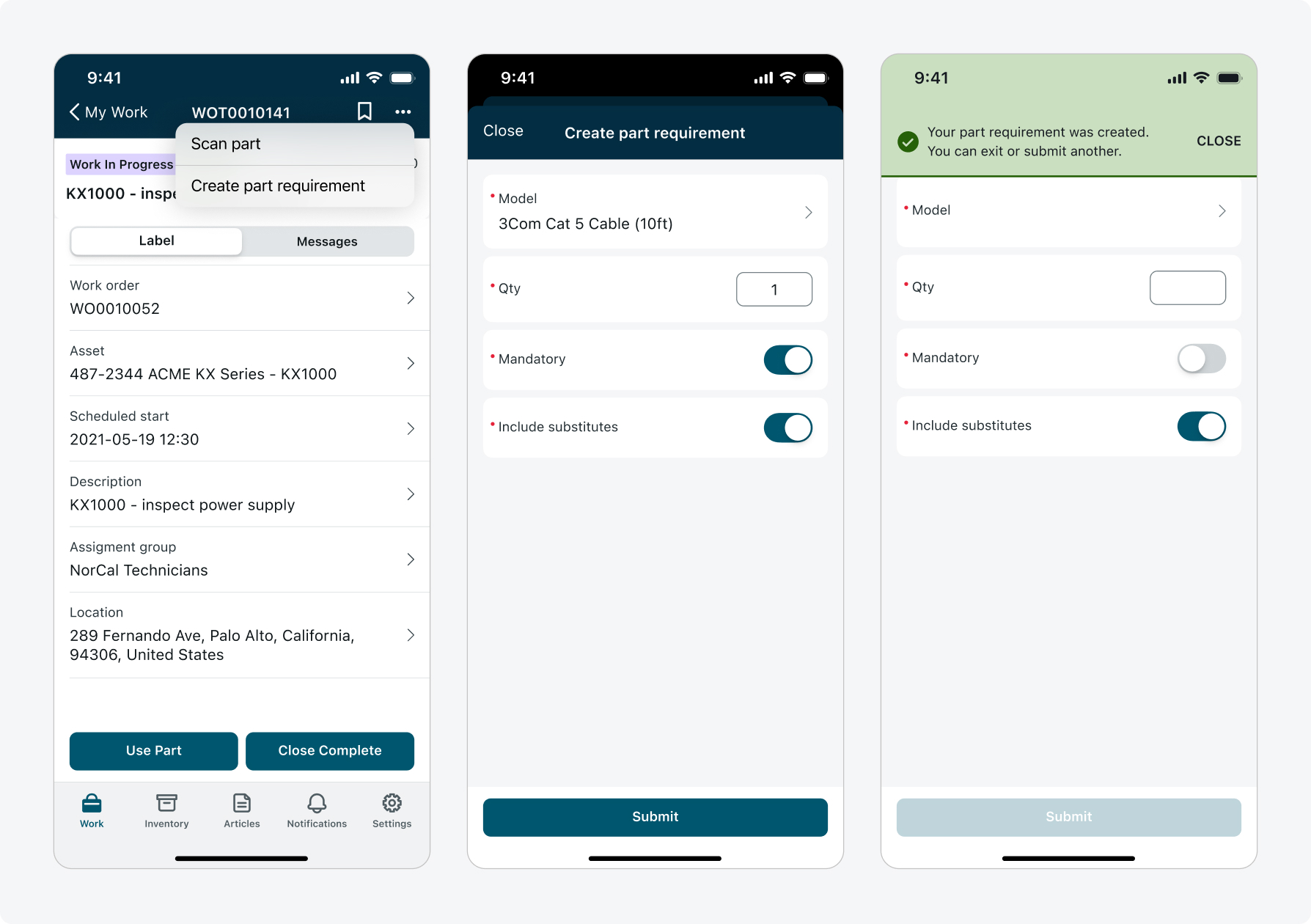
- An Updates Button: The button is displayed when there are active informational or error messages. These messages appear if the user taps the “save” or “submit” buttons with incorrect or missing information. Tapping the Updates button will direct the user to the Updates screen, where the messages are displayed. The button will remain visible as long as there is at least one message in the Updates screen. (The button is shown by default, but the admin can choose to hide it).
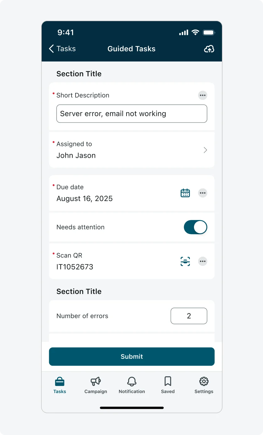
- A “save” button. Tapping the “save” button will save all the current entered data to the cloud before submission. The Save option can be placed directly in the top bar or inside an ellipsis menu.
- Page title: Optional and recommended when the form has multiple pages. Keep titles short and clear to help users orient themselves.
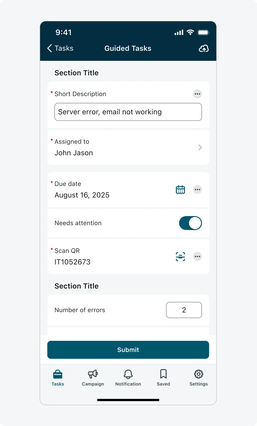
- Sections: Inputs can be grouped into sections for better readability and organization. Section titles are optional but useful for context.
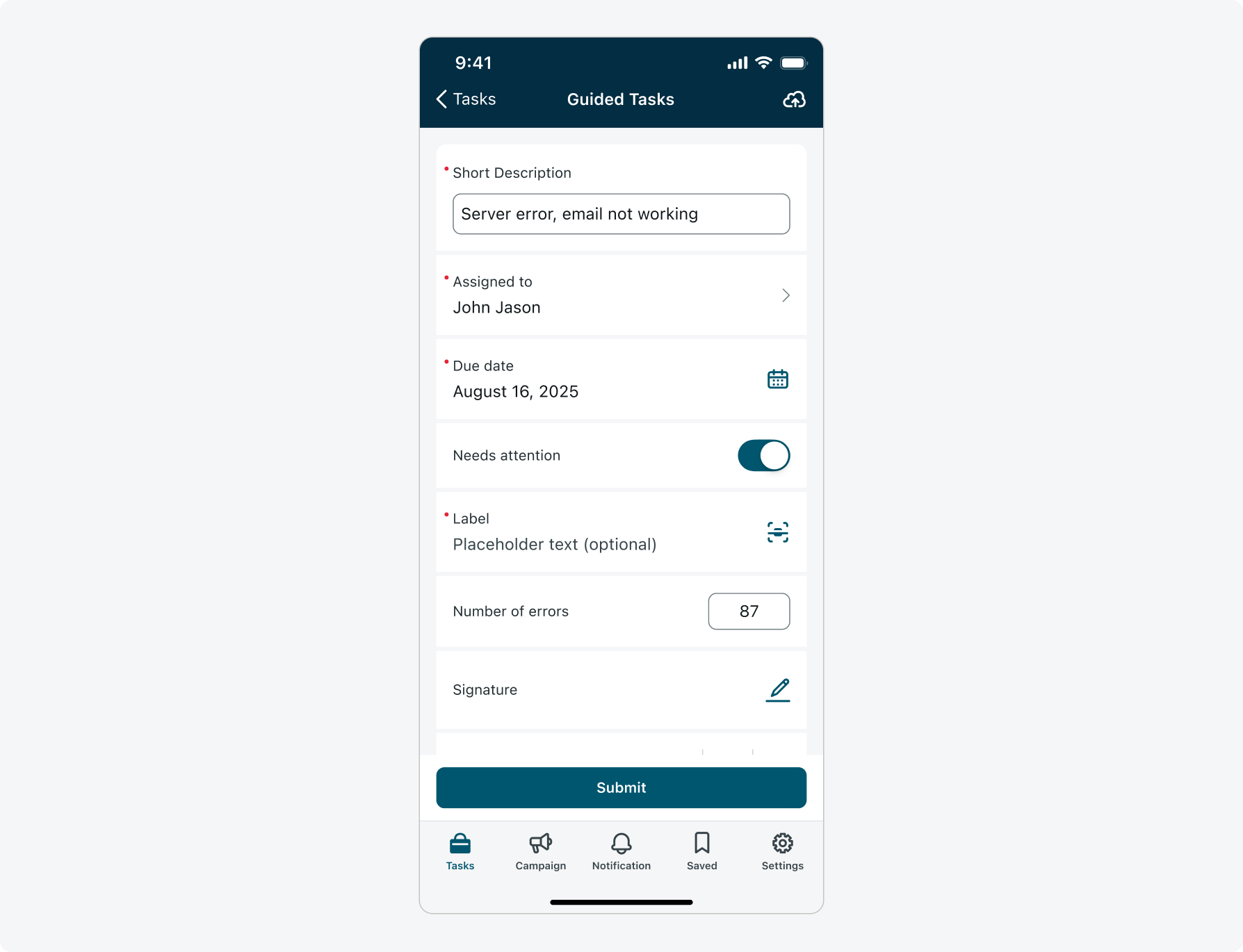
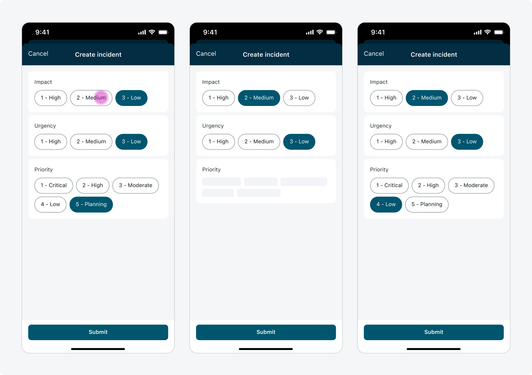
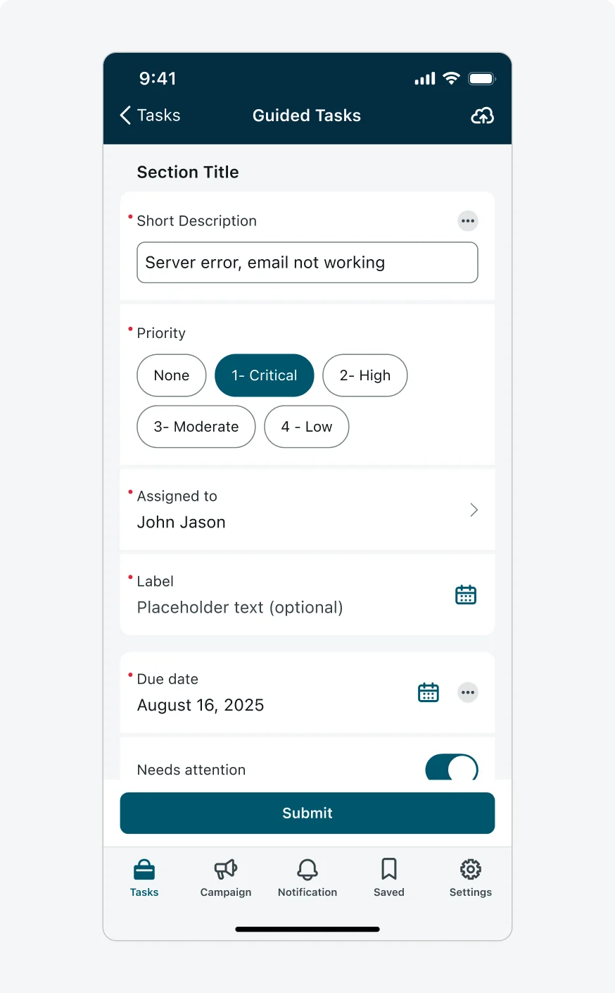
- Input types: There are many types of inputs on the input form screen. Inputs are used to collect information from users, and the type of input chosen depends on the kind of information being collected. Admins can configure each input using various attributes to fit use cases.
- Available Input Types:
- Attachment - for uploading documents, images, or videos.
- Barcode - for capturing and scanning Barcodes and QR codes.
- Boolean - for true/false or yes/no toggles, can be configured as a toggle or checkbox.
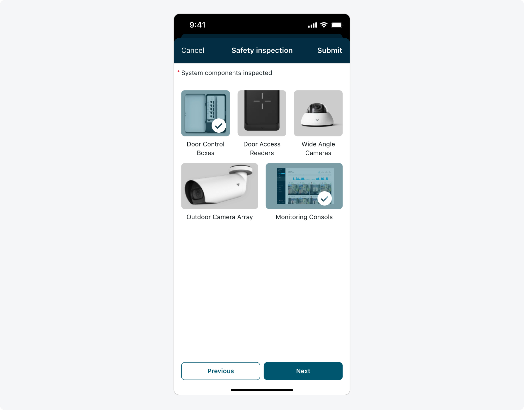
- Choice - for selecting one or multiple options from predefined choices.
- Custom map - for interacting with a map, such as selecting a location or viewing geolocation data.
- Date/time - for entering a date, or date and time.
- Number - for numeric input, can be configured as box or line.
- Numeric single slider - for selecting a numeric value using a slider, with optional manual entry in a numeric field. It supports a range of configurations - such as color-coded ranges, visual steps, and reference points.
- Ranking - for ranking items in a list based on preference or priority.
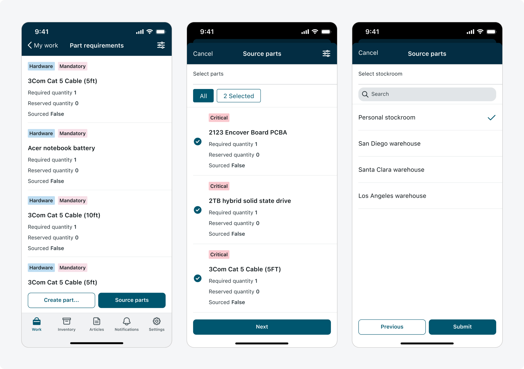
- Reference - for selecting data from other tables.
- Signature - for signing using touch or keyboard.
- String - for entering plain text (single or multi-line).
- Screen - for using a list screen as a multi-select input.
- Available Input Types:
- Menu button: Opens the Navigation menu sheet, allowing users to move between form pages and view information about the fields on each page. (The Menu button appears only when there are more than two pages).
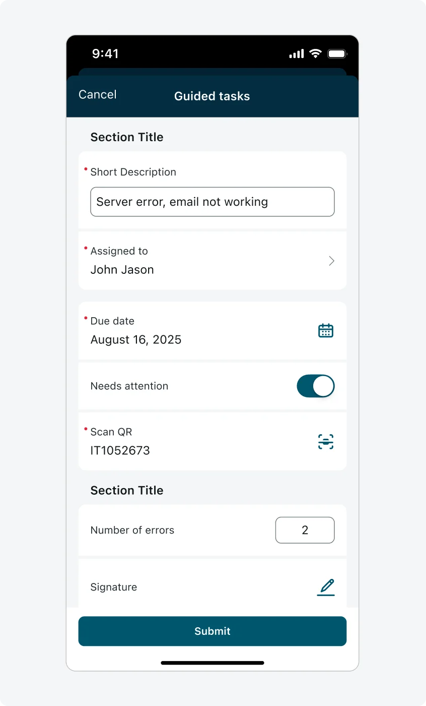
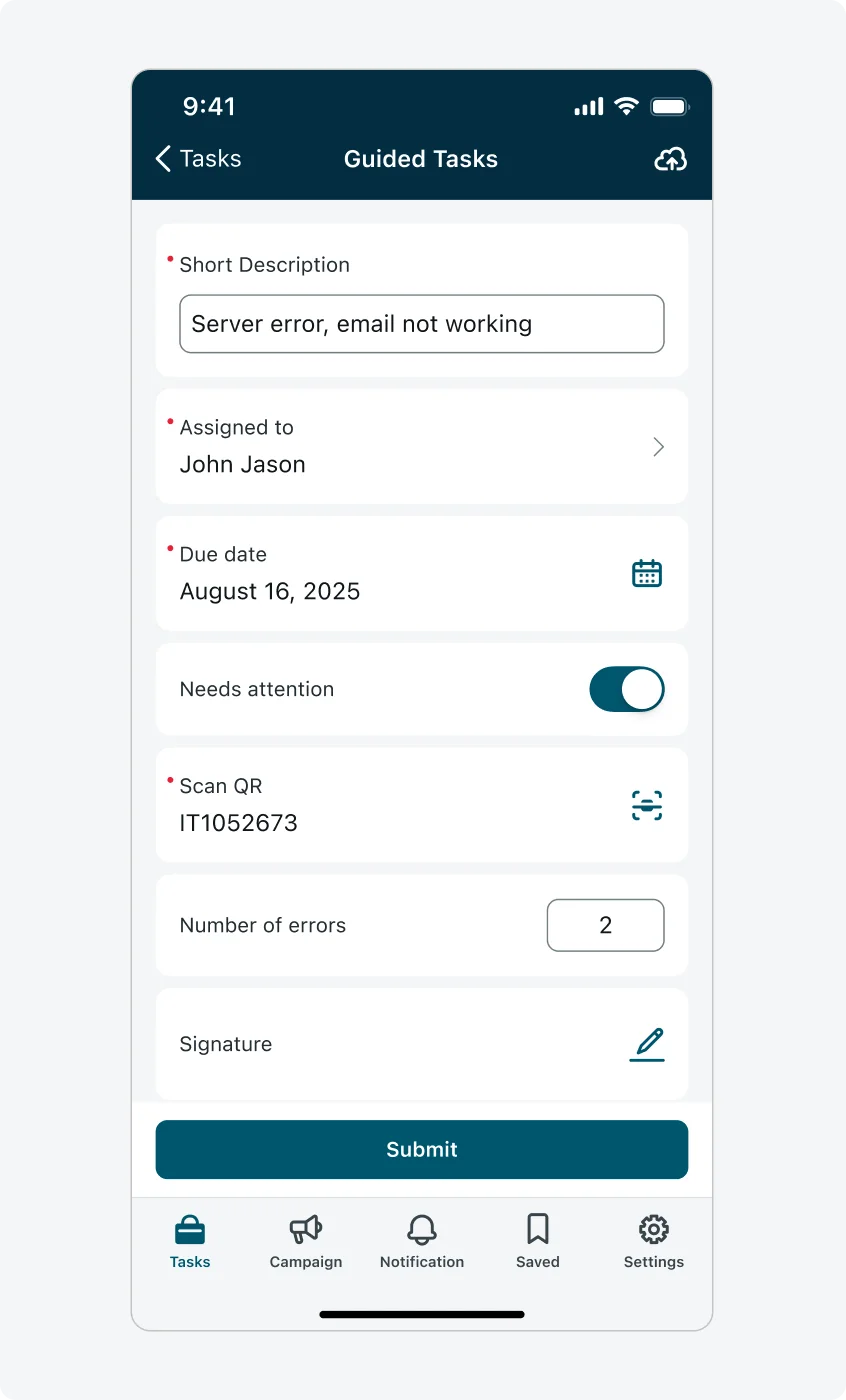
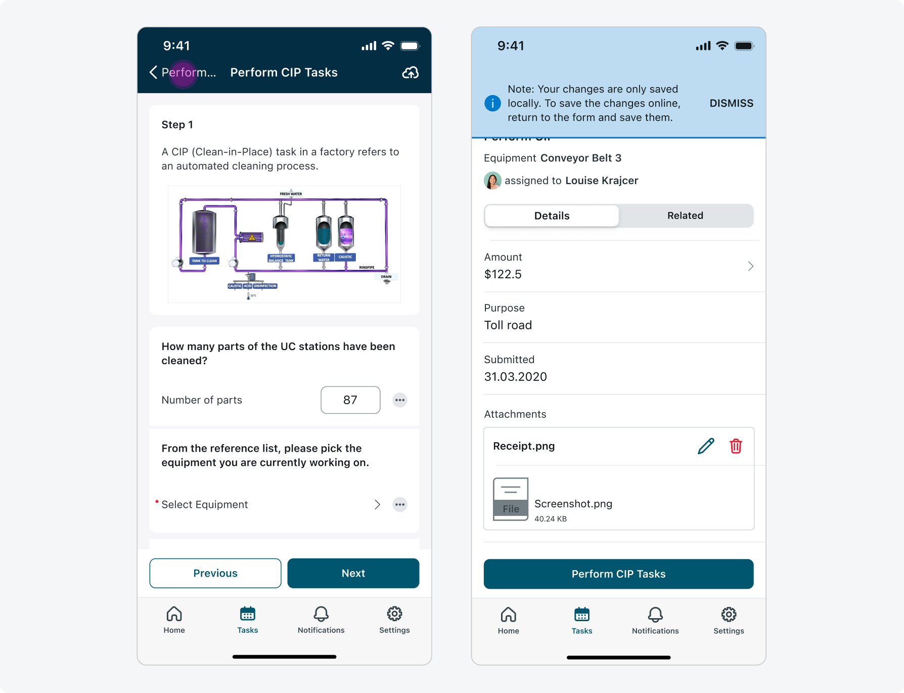
- Footer actions: Let users move between form pages (Previous / Next) or submit the form, button labels can be configured to match the context. Currently admins can configure the following footer buttons:
- Submit
- Previous & Next
- Previous & Submit
- Tab bar (Navigation bar) The navigation bar, located at the bottom of the mobile app, allows users to access screen launchers or navigate to other screens. By default, input forms open in a “Modal” view. However, you can change the presentation style to “Screen” to display the navigation tabs, enabling users to switch between tabs while interacting with the input form.
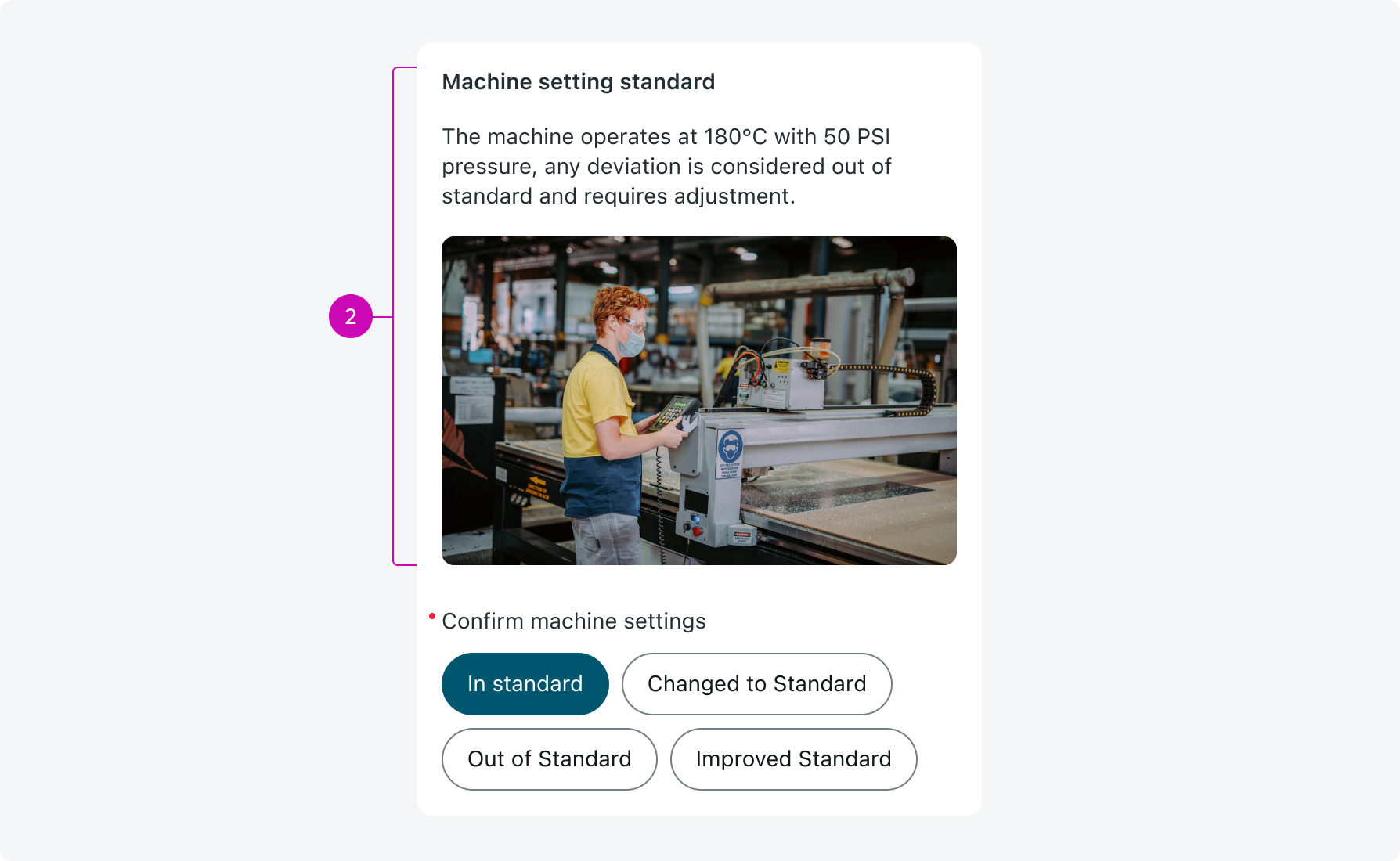
- Descriptive elements: Used to guide users by providing contextual information or guidance on input form screens. These can include plain text, rich text, and images, and may appear either at the top of the page, top of a section or mapped to specific inputs.
- Input actions: Allow users to perform secondary actions related to an input - like adding a comment, multiple attachments, or navigating to a screen. These actions are admin-configurable and tailored to support common workflows.
Usage
Use the input form screen to let users create or edit records, complete surveys, scan items, or perform any task that requires structured input. Offline support is available, ensuring usability in low-connectivity environments - but not all capabilities are supported in offline mode.
Configurations
Learn how to customize The Input form screen by configuring the available properties.
Modal vs Screen
Input form screen can be configured as a screen or a modal.
- Modal: This is the default configuration and is recommended for simple, quick tasks that users submit immediately. Modal view does not support input actions or form actions (such as save to cloud).
- Screen: Offers more flexibility and is recommended for more advanced workflows, such as forms with multiple pages or many inputs. This configuration supports input actions, which are actions that can be configured per input (such as adding comments, attachments etc) or form actions (such as save to cloud) .
Screen
Modal
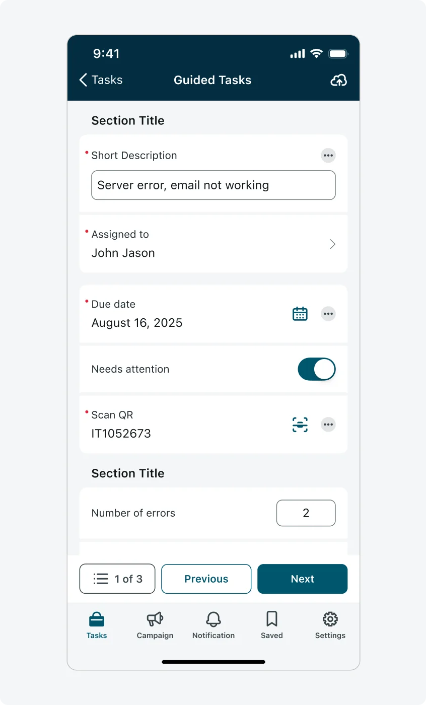
Default vs Sections layout
Use different layouts to control the structure of inputs, choosing the right layout helps users focus on what matters and improves form readability. The input form screen supports two layouts - “Default” and “Sections” layout
Default layout (no sections)
- All inputs appear in a single hierarchy, with 8px spacing between each input.
- This layout is simple and works well for short forms.
Sections layout
- Inputs can be grouped into sections, with 16px spacing between each section.
- Grouping related inputs into sections helps create hierarchy and a clear and organized experience.
- Each section can be configured an optional title and a standalone descriptive element (not combined with any input) that will appear at the top of the section.
- Inputs not assigned to a section are treated as standalone sections.
- A sections layout also allows the admin to configure one standalone descriptive element above all sections, positioned at the top of the screen.
Default layout (no sections)
Sections layout
Compact layout
Use this layout when screen space is limited and reducing scrolling is a priority. The compact layout is a version of the sections layout that contains a single section grouping all inputs together. This approach minimizes spacing and maximizes the number of visible inputs on the screen at once. If your goal is to display as many inputs on screen as possible and sections are unnecessary, the compact layout is the recommended choice.
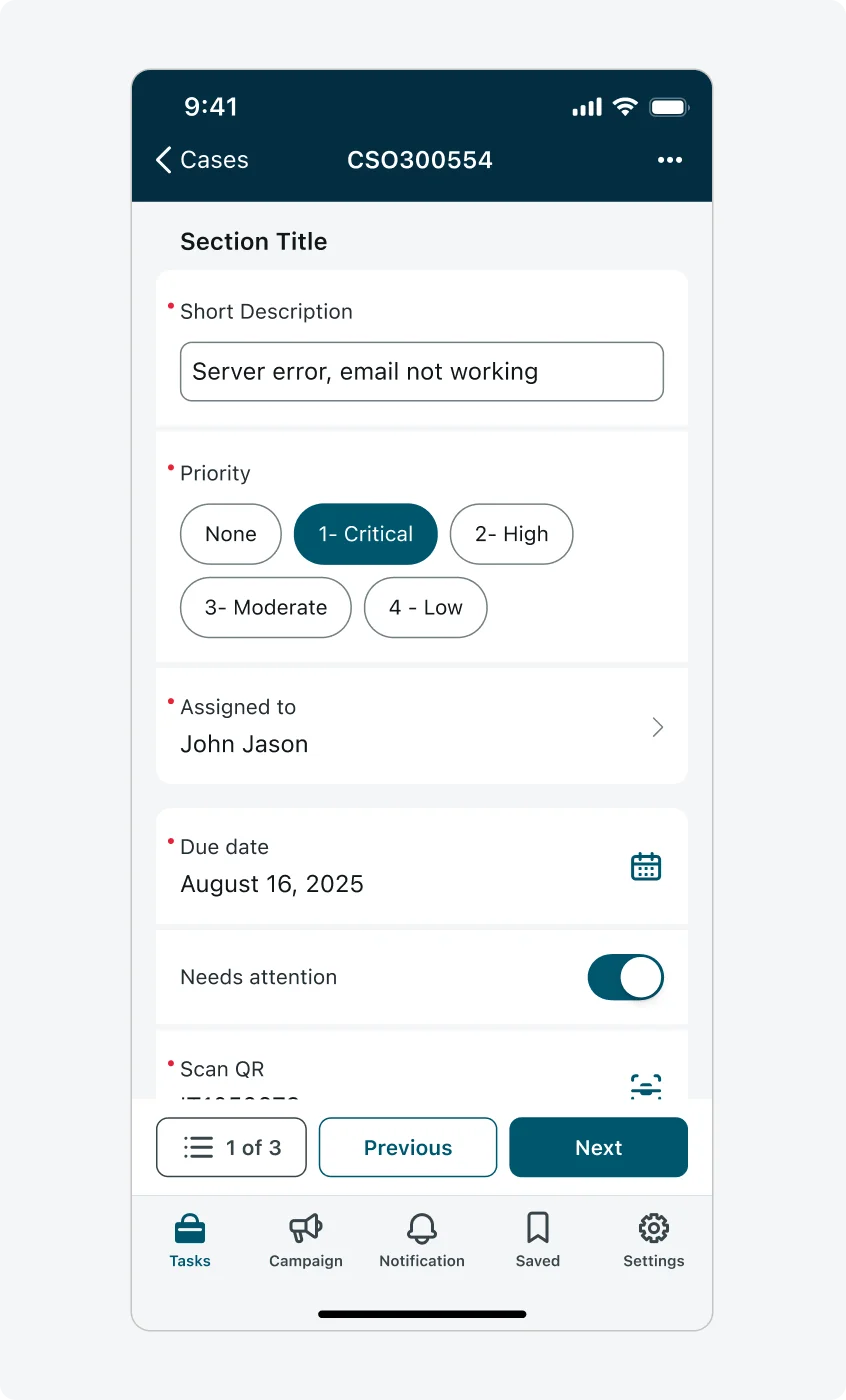
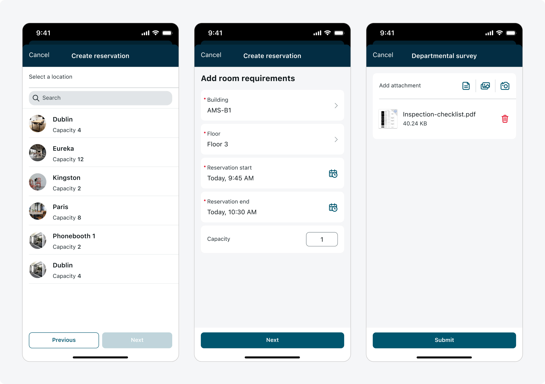
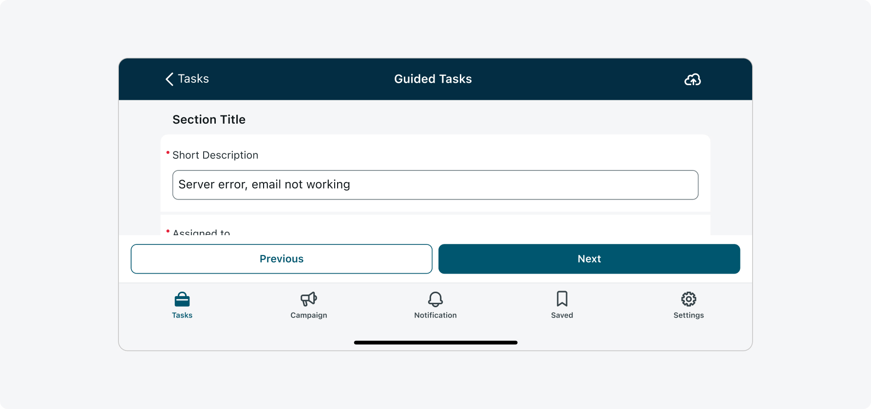
One page vs Multi page
Choose between a single scrollable page or dividing your form into multiple pages, depending on the complexity and number of inputs.
- One page:
- All inputs appear in one scrollable view.
- This layout works well for short or simple forms and minimizes navigation effort.
- Multi-page:
- Inputs are divided across multiple pages.
- Use this when the form is long, has distinct separation into pages, or would benefit from a guided step-by-step experience.
- Navigation between pages is handled using footer actions such as Previous and Next, or by tapping the Menu button located beside them, which opens the Navigation menu.
- Note: the Menu button appears only when more than two pages are configured. It is enabled by default but can be disabled through configuration.
One page
Multi page
Save progress to cloud
Save to cloud is a capability developed in Y to allows users to save their filled information to the cloud before they submit the form. Aside from the footer actions that appear at the bottom of the screen, the save action will appear on the right of the top navigation, either as a standalone icon or inside a context menu that is opened from the ellipsis menu icon on right of the top navigation. To save, the user has to tap the action, the form doesn’t save automatically.
It is recommended to place the save icon as a standalone icon in the top navigation to allow quick access. Ellipsis menu is only recommended to use if additional actions are introduced. Currently only save to cloud is supported.
Standalone icon
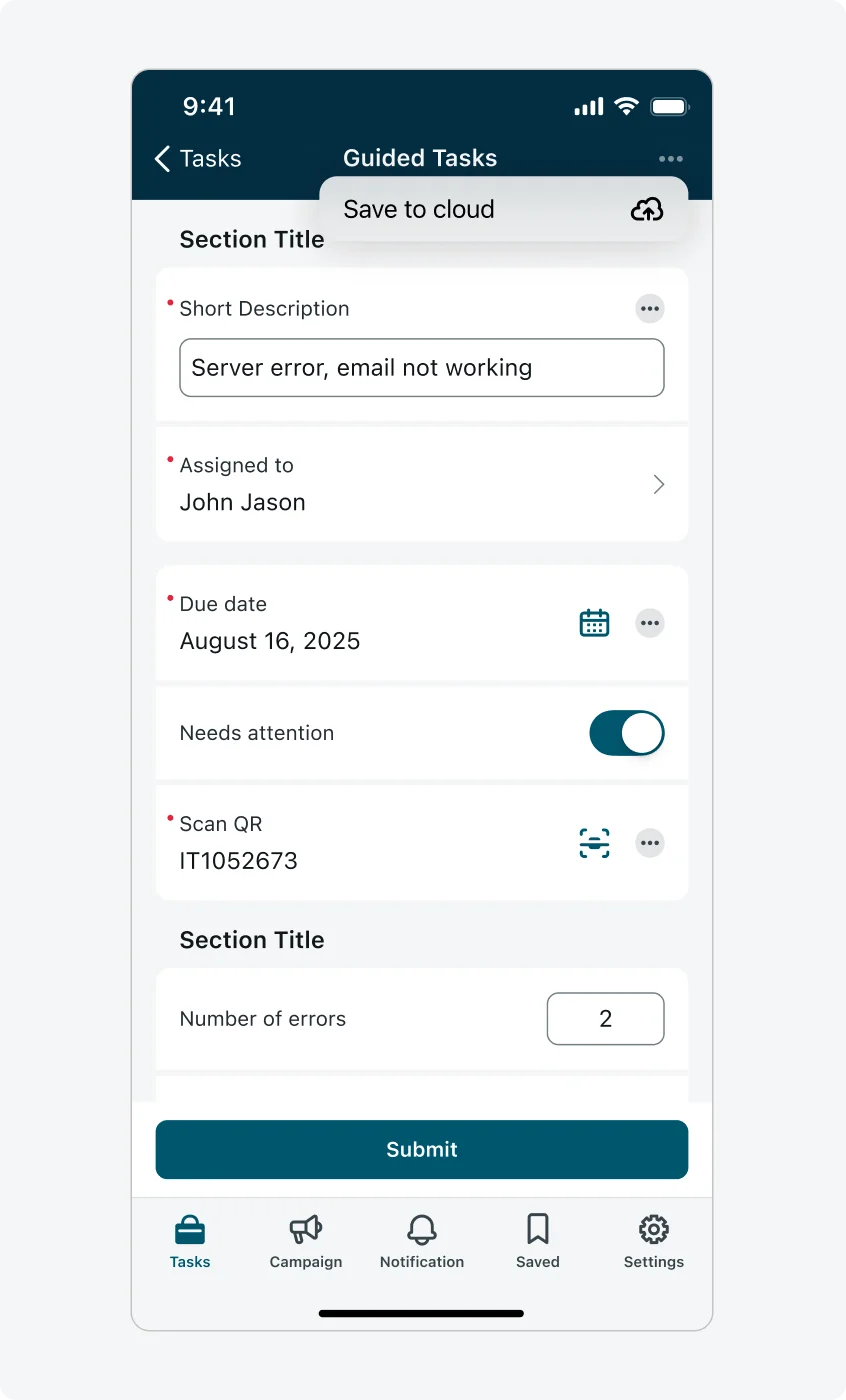
Ellipsis menu
"Resume from local device"
This is an optional configuration that the admin can enable. When turned on, it automatically saves any data the user has entered in the input form screen upon exit or closure. Unlike the cloud save functionality, this saves the data locally on the user's device, allowing the user to close and reopen the form without losing progress.
"Warning Message on Unsaved Changes"
The input form monitors changes in fields, including associated comments and attachments, and prompts the user for confirmation before proceeding with an action that might discard the changes made in the form. It is recommended to enable "Warning Message on Unsaved Changes" so the user is notified when an action they are about to perform will cause in data loss.
Closing the input form by tapping “back” when "Resume from local device" is enabled
Auto-fill inputs
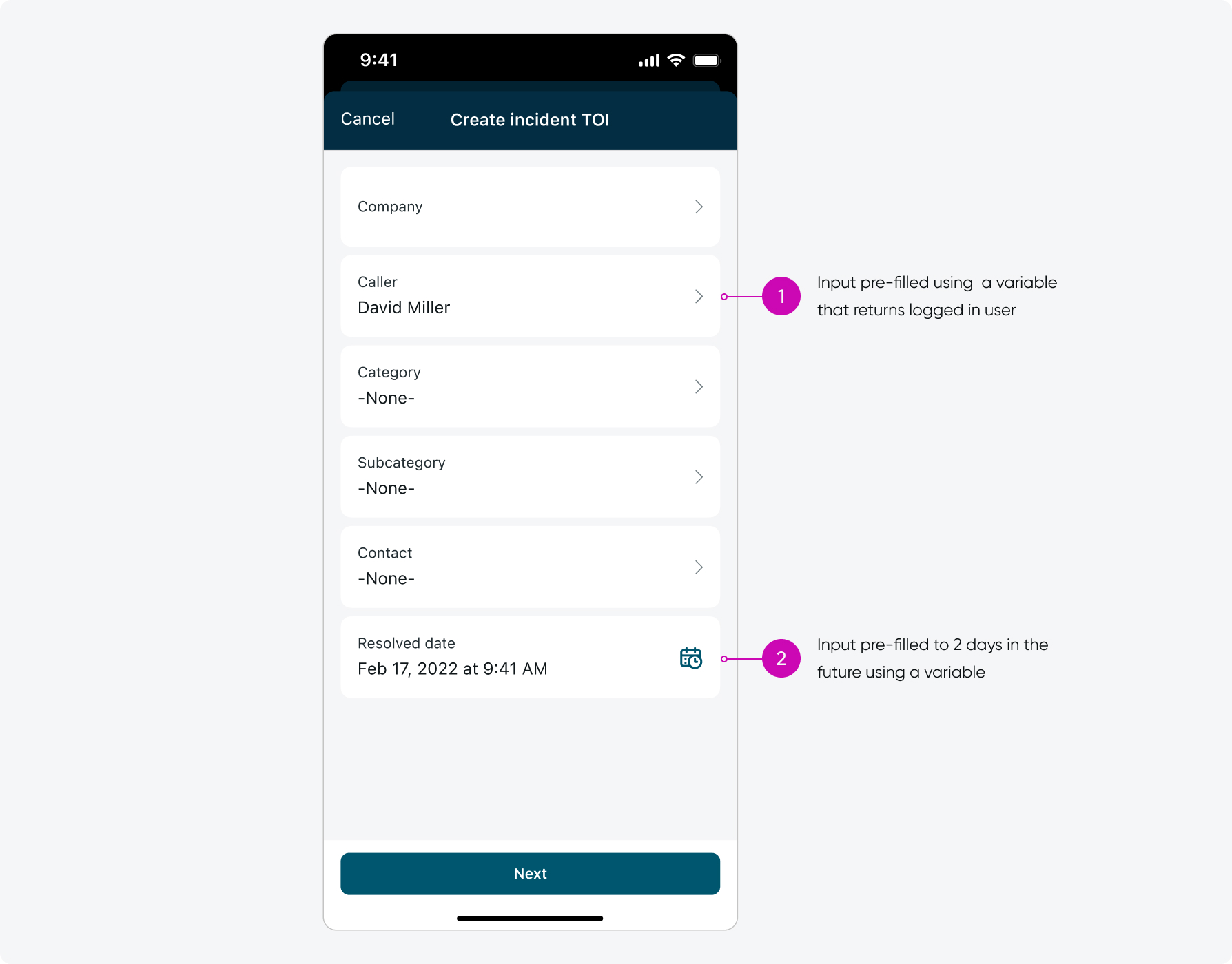
Using variables to pre-fill input with data
When opening actions that require specific input from the end user, the inputs can already be pre-filled with relevant information which saves time and avoids end-user errors. To pre-fill inputs into input form screens, scripted variables must be leveraged.
Client scripting
- Simplify form filling by autofilling the value of one or many inputs based on the user inputs of one or many inputs. This can be achieved by client scripts locally or retrieving them from server by mobile callable script includes.
- Consider performing form field validations by using scripted Messages that can configured by admin in the script. This can be displayed to the user dynamically on input form.
- Consider to show a shimmering effect in the UI when the inputs are loaded or getting autofilled. Inputs affected by the script can be given a special treatment in the UI
General input configurations
Each input on the input form screen shares a set of common configuration options. These attributes apply to all input types and help provide clarity, context, or extended functionality to users.
1. Description
Add a short description to any input type to provide users with helpful context or guidance. This is ideal for simple instructional text.

2. Descriptive elements
Use descriptive elements combined with inputs to offer additional visual or textual guidance above an input. These can include plain text, rich text, or images. Learn more about descriptive elements.
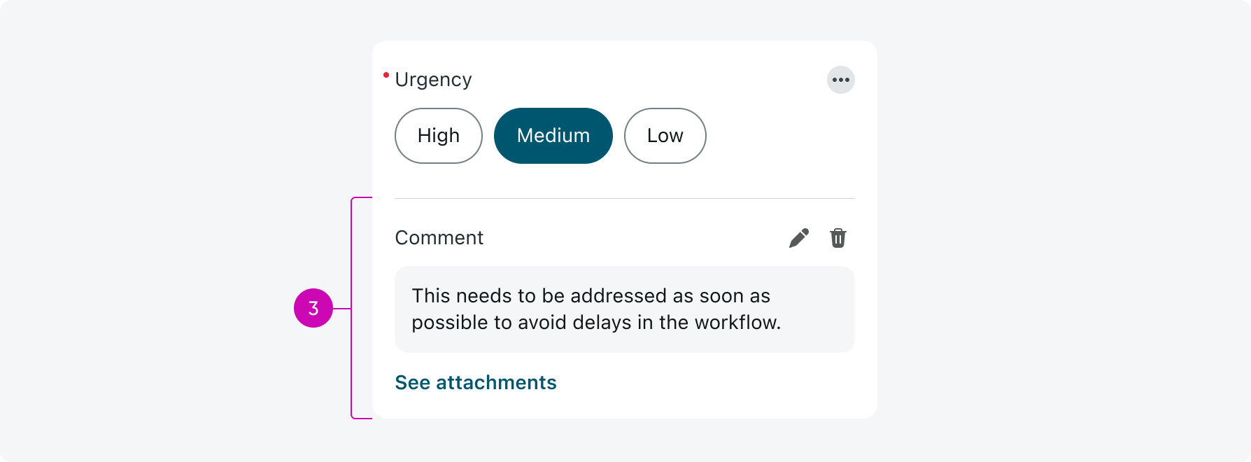
3. Input actions
Add an actions menu to any input to allow users to perform tasks like adding a comment, attaching multiple images, or navigating to other screens. Input actions are only available when the form is configured as a screen (not modal). Learn more about Input actions.

Here's an example of an input where a user added a comment and multiple attachments:
Use sections to combine related inputs and minimize the space between them.

Don’t remove the default spacing between inputs. This capability is only intended for combining descriptive elements with inputs.
Best practices: Configuring forms
- Consider using the Reset after Submit option, which returns the input form screen entries to its default state after actions are submitted by the user.
- Place mandatory inputs before non-mandatory inputs.
- Group inputs into sections and assign a page to each section or input.
- When configuring inputs and choice items, always enter an order number to avoid any errors.
- Use Descriptive elements or a Description field on an input to provide context or instructions for users entering data.
- Users can attach files and photos when creating a record using an input form screen in a single flow.
- For a complete experience, consider configuring success messages, confirmation messages, and action completions for users who work with the input form screen.
- Modify the label of the action based on the use case. Consider using labels such as Apply, Submit, Save, and Done.
- When possible, map more than one table value in your reference lists to make searching easier. For example, when searching a person include the user’s name, title, and image.
- Consider how you can improve your workflow and user experience by moving existing actions using UI parameters, to the new input form screen.
- Consider using the screen input as a selectable list input on an input form screen. This method carries the filters applied from the parent list screen.
Creating a survey experience
- A survey-like experience is supported, where a survey can be divided according to input sections or individual inputs. Users navigate in the survey with “Next” and “Previous” buttons. These labels are configurable.
- Use mobile UI rules to show/hide inputs or make inputs mandatory, based on other input values. For example, if a user answers the first question a certain way, you can make the next question mandatory, or hide it completely.
Responsive behaviors
The input form screen stretches across the full width of the screen and adjusts responsively to different device sizes and orientations. This ensures consistent usability whether the form is viewed in portrait or landscape mode.
In upcoming releases, layout improvements are planned to better utilize available screen space on larger devices like tablets and iPads.
Landscape mode
This is how the Input form screen looks like in landscape mode:
iPad and Tablet
On larger screens such as tablets and iPads, the Input Form Screen limits the width of the form content to maintain readability and prevent overly long line lengths. This ensures forms remain easy to scan and complete, even in landscape orientation.
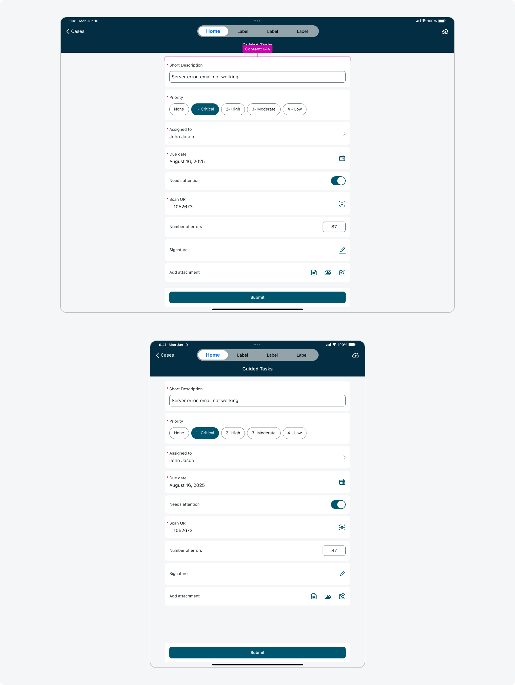
iOS (iPad)
Maximum content width: 644pt On iPad, the Input Form Screen follows Apple’s readableContentGuide from UIKit. This guide defines a maximum readable width based on research into optimal line lengths for reading comfort on large screens. When the available screen width exceeds this value, the form content is centered and constrained to 644 pt, with flexible margins on both sides.
Edge case – single input forms When a page contains a single input, the input stretches edge-to-edge across the screen. This applies both when the input is displayed directly on the page and when it is opened in a popup.his is how the Input form screen looks like on an iPad/Tablet screen:
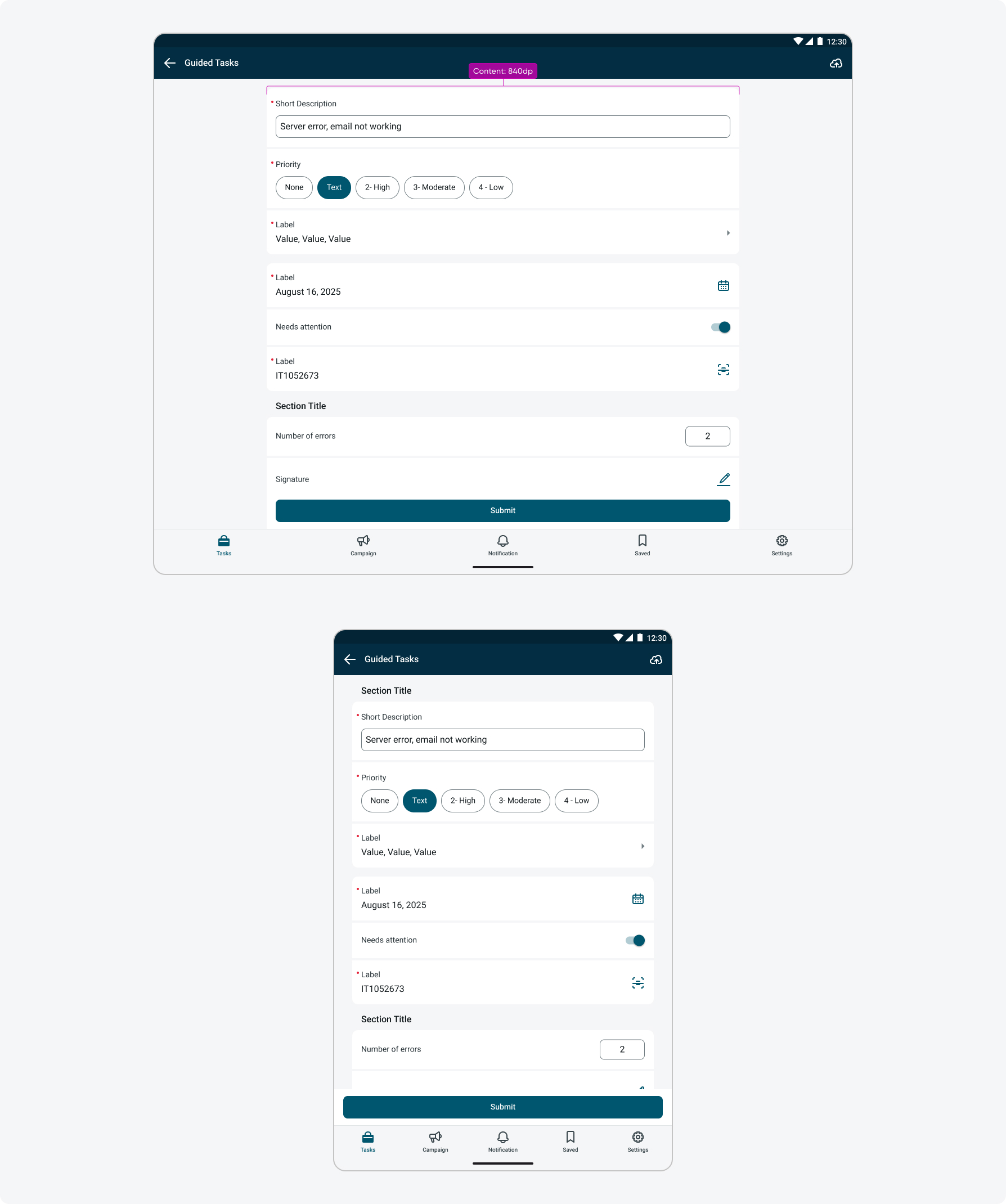
Android (tablets)
Maximum content width: 840dp On Android tablets, the Input Form Screen limits the maximum width of the form content to 840 dp to maintain comfortable line lengths and predictable scanning on large screens. These layout values are based on Material Design 2’s layout grid guidelines, which remain relevant for defining readable, structured content areas. While Material Design 3 does not provide fixed content width breakpoints and instead encourages flexible layouts through window size classes, capping the form width at 840 dp with fluid margins ensures optimal readability and usability. Once this maximum width is reached, the content remains fixed and is centered within the available screen space using flexible margins
The responsive behavior is defined as follows:
- 0–599 dp (phones): Content is flexible with a fixed 16 dp margin on each side.
- 600–904 dp (tablets): Margins increase to 32 dp, while content width remains flexible.
- 905–1239 dp (large tablets): Content expands until it reaches 840 dp. Beyond this point, the content width remains fixed and the margins become flexible.
Edge case – single input in a form When a single input appears on a page, it follows the same layout rules as multiple inputs: it respects the defined margins and remains centered within the content area. However, when a single input is opened as a popup, it stretches edge-to-edge across the screen.
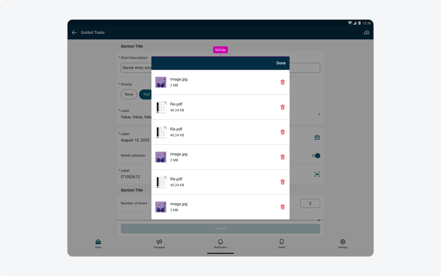
Attachment Input Modal (Android/Tablets)
When interacting with the Attachment input while it contains multiple attachments, attachments open in a modal. On iOS, this follows native system behavior, where modals on iPad are centered and constrained to a readable width by default. On Android, modal behavior is custom defined to prevent dialogs from stretching edge to edge on larger screens.
On compact window sizes (< 600 dp), attachments open in a “Full-screen dialog” (this is including mobile landscape).
On medium and large window sizes (≥ 600 dp), attachments open in a “Basic/simple dialog”, which is a centered dialog with a constrained width, ensuring readability and usability across tablet sizes and orientations.
Size specs: On Android tablets, attachment dialogs follow Material guidelines for readable dialog sizing. The dialog container is constrained to a maximum readable width of 560 dp, maintaining minimum 80 dp margins on the left and right. Height is dynamic and grows based on content, with a minimum 80 dp spacing from the top and bottom edges of the screen, and 24 dp clearance from the on-screen keyboard when active. Scrolling is enabled when content exceeds the available viewport to ensure all attachments remain accessible (these constraints follow M2 dialog guidance, as M3 does not currently define top and bottom margin behavior for tablet dialogs).
Note: on mobile phone devices in landscape orientation modals are still displayed as full screen.
On mobile phone devices in landscape orientation modals are still displayed as full screen.
Internationalization
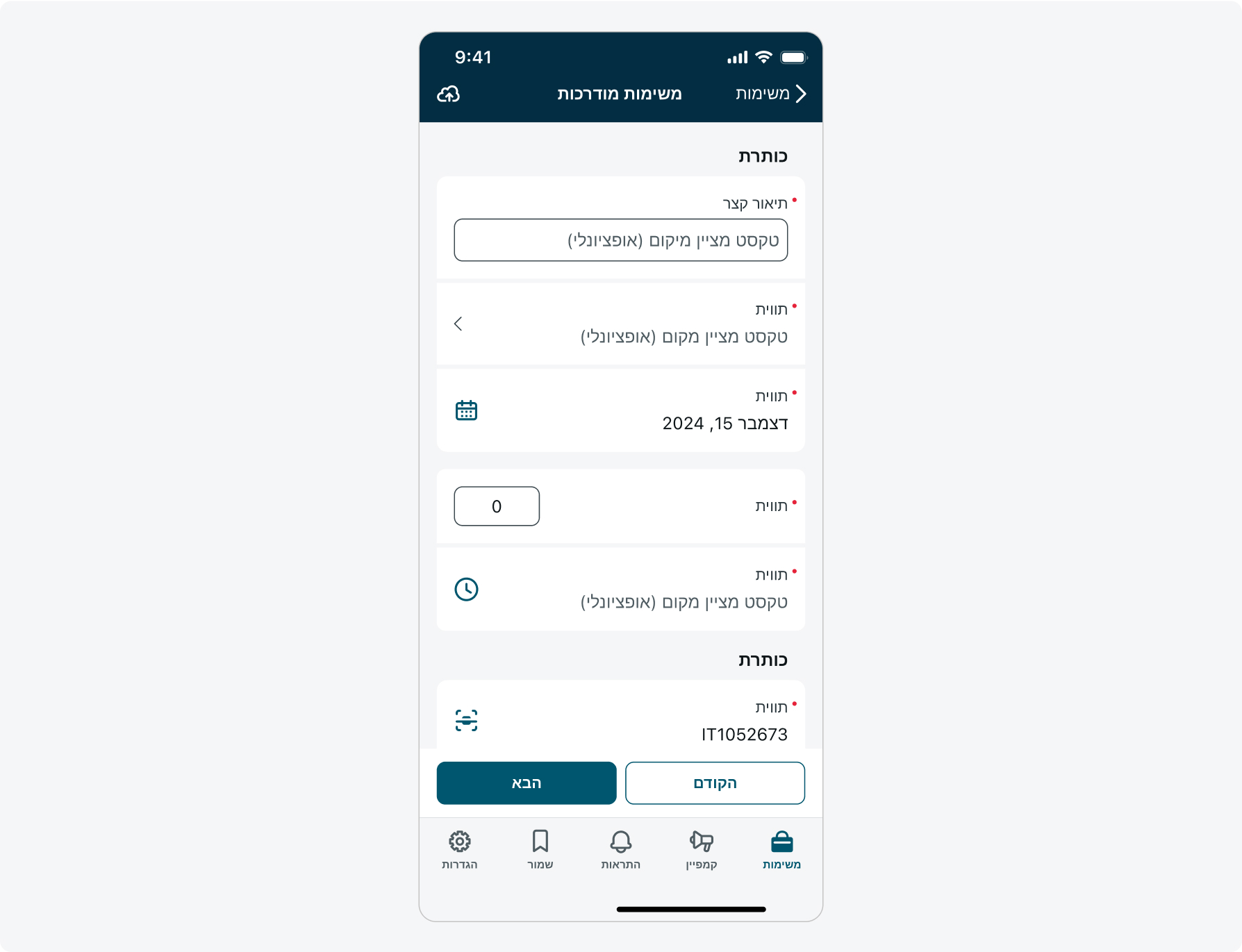
This is how the Input form screen looks like when configured for a right-to-left (RTL) language:
Access control
You can restrict access to the Input form Screen for specific users by assigning user roles. Learn more about user roles.