Conceptual and configuration guidance

Figma library with components for designing Native Mobile.
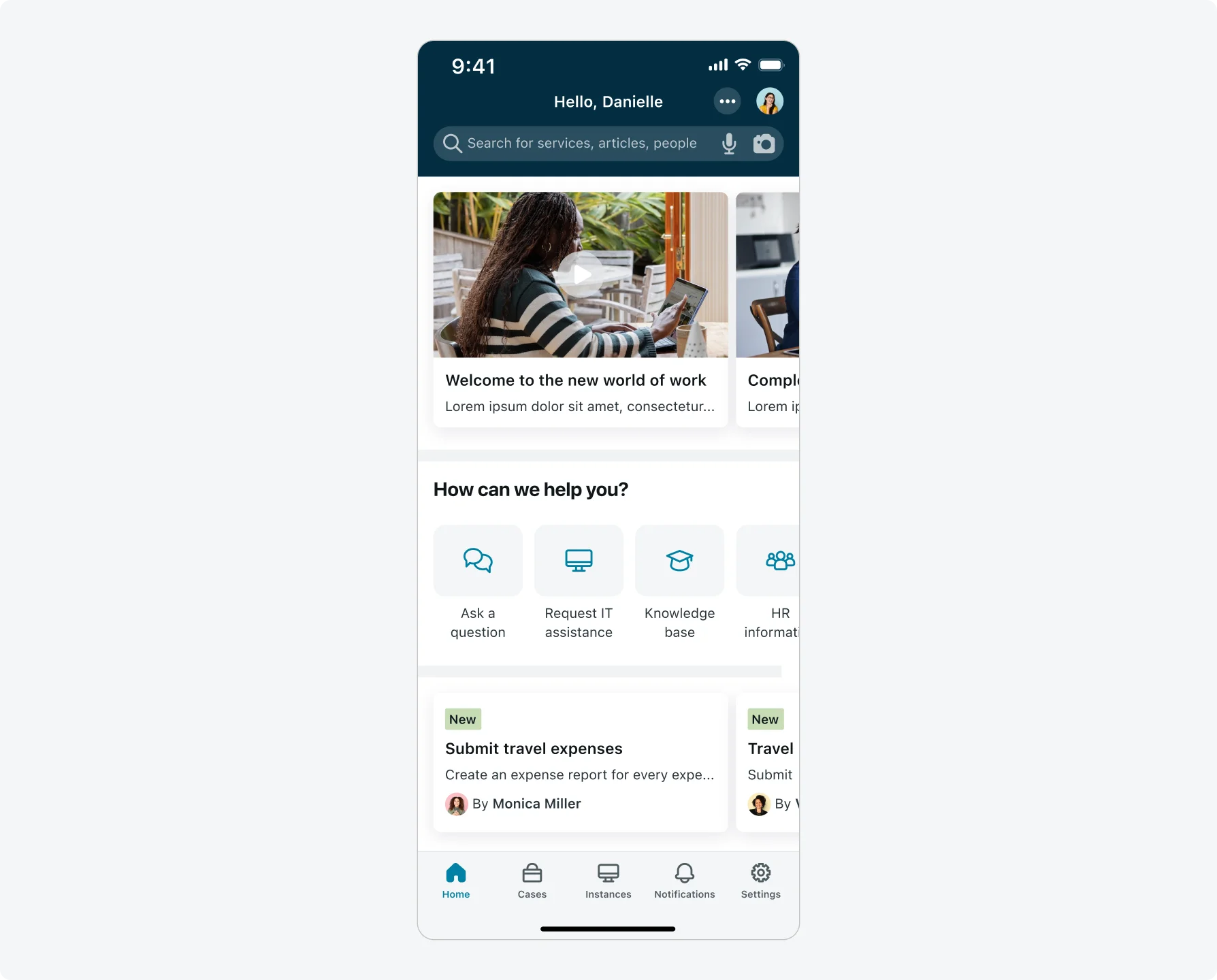
Launcher screen concept
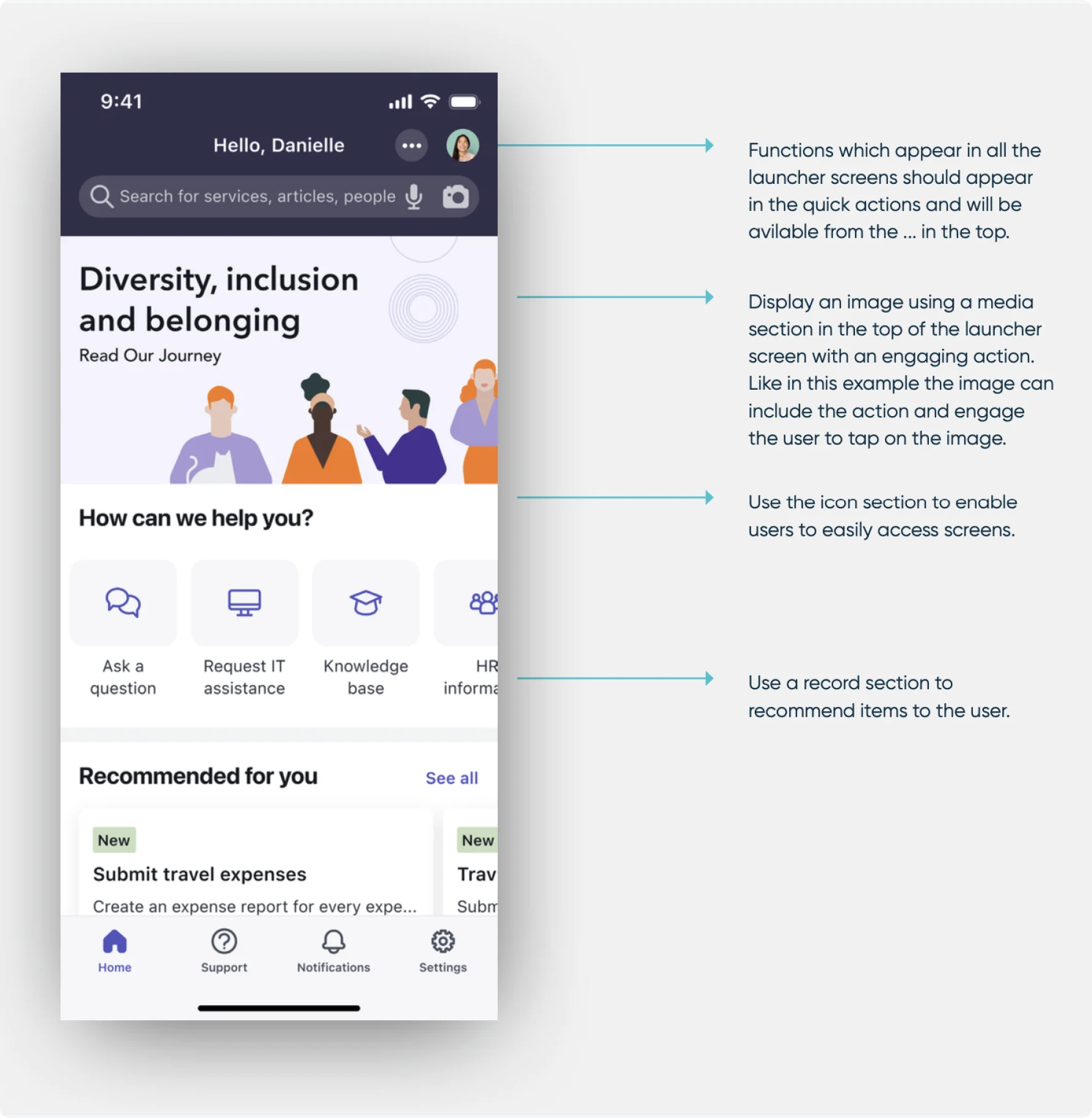
With a launcher screen, users can access screens in a variety of formats, as well as search, do quick actions, and find user information. A launcher screen can be accessed at the bottom of the app or through a navigation button.
A launcher screen can be defined based on context for example – FSM, ITSM, Finance, Timesheet etc. or to be divided to smaller use cases for example My work, My Inventory, My cases.
Design your launcher screens to provide information and direct your users to other screens where they perform their work. The launcher screen should not be where users perform most of their tasks.
Launcher screen structure
Launcher screens contain a configurable header, and sections to provide access to screens in several formats.
**Note: ** Screen space is limited on mobile devices. Try to limit the information displayed to what your users will need while working remotely. Also consider placing the most used information towards the top of the launcher screen, so your users can find what they need most often without needing to scroll down. Order your sections according to how frequently they are used. Place high usage and important information left to right and top to bottom.
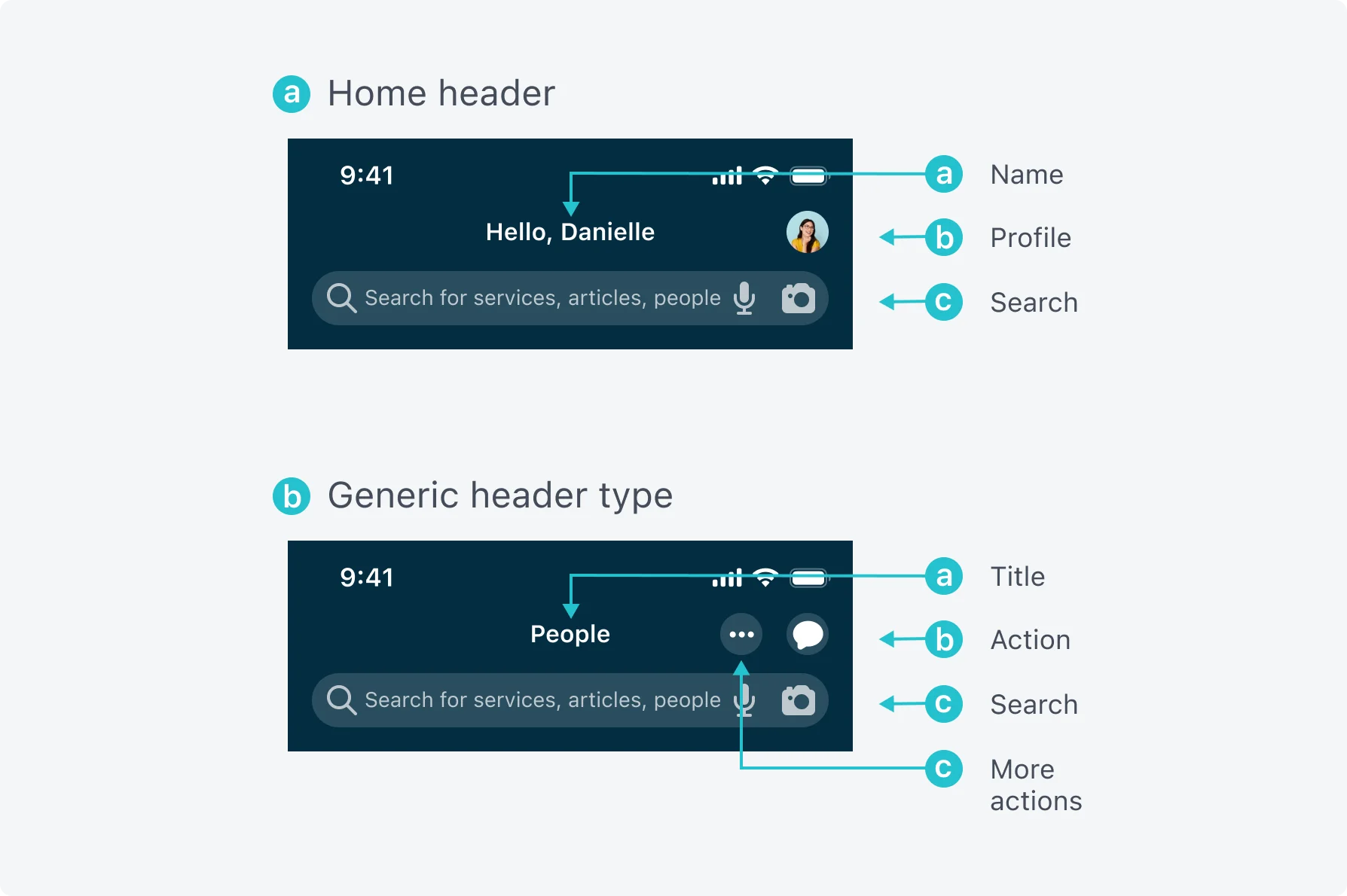
Launcher screen header
The header of the launcher screen defines how the title of the screen appears and what information is shown in the header. The available header types are Home and Generic. Review the two header types to determine which best suits the content you want to present to your users.
The header may include a header function. For example, in the first tab if the header type is Home you can add a user profile image and show the users profile. If the header type is Generic for example a store you can add a shopping cart icon and navigate to the shopping cart.
Home header
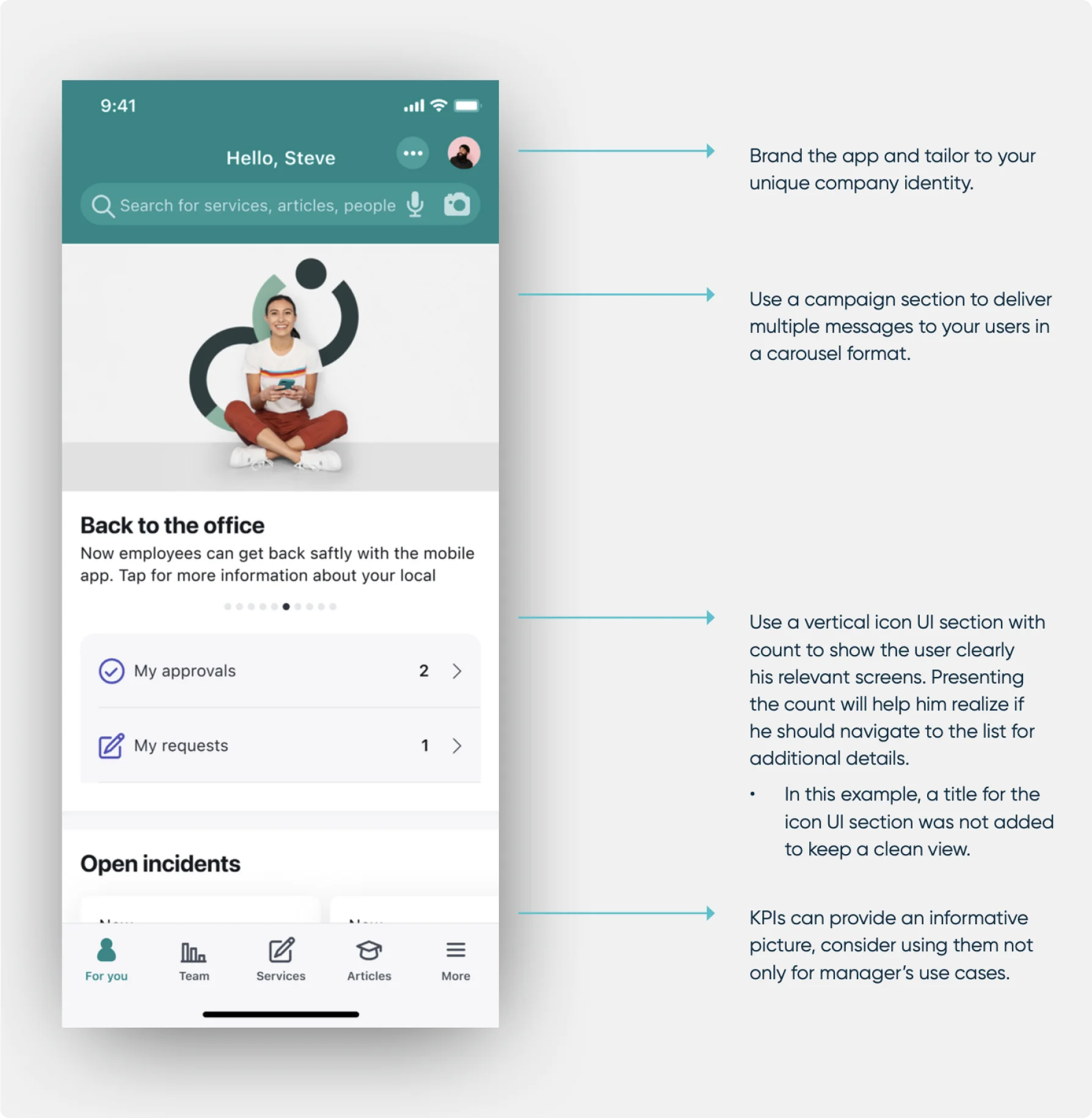
Use the Home Header type for the first launcher a user sees when logging into an app. The title of the home header is customizable and can include the full or partial name of your user. You can combine a static string together with the name. For example, Hello John or Welcome John Smith.
Generic header type
Generic launcher screen is a static string that you define. For example, My Work, People, Knowledge.
Note: In New York and Orlando using the name variable will correlate with default name setting in your instance.
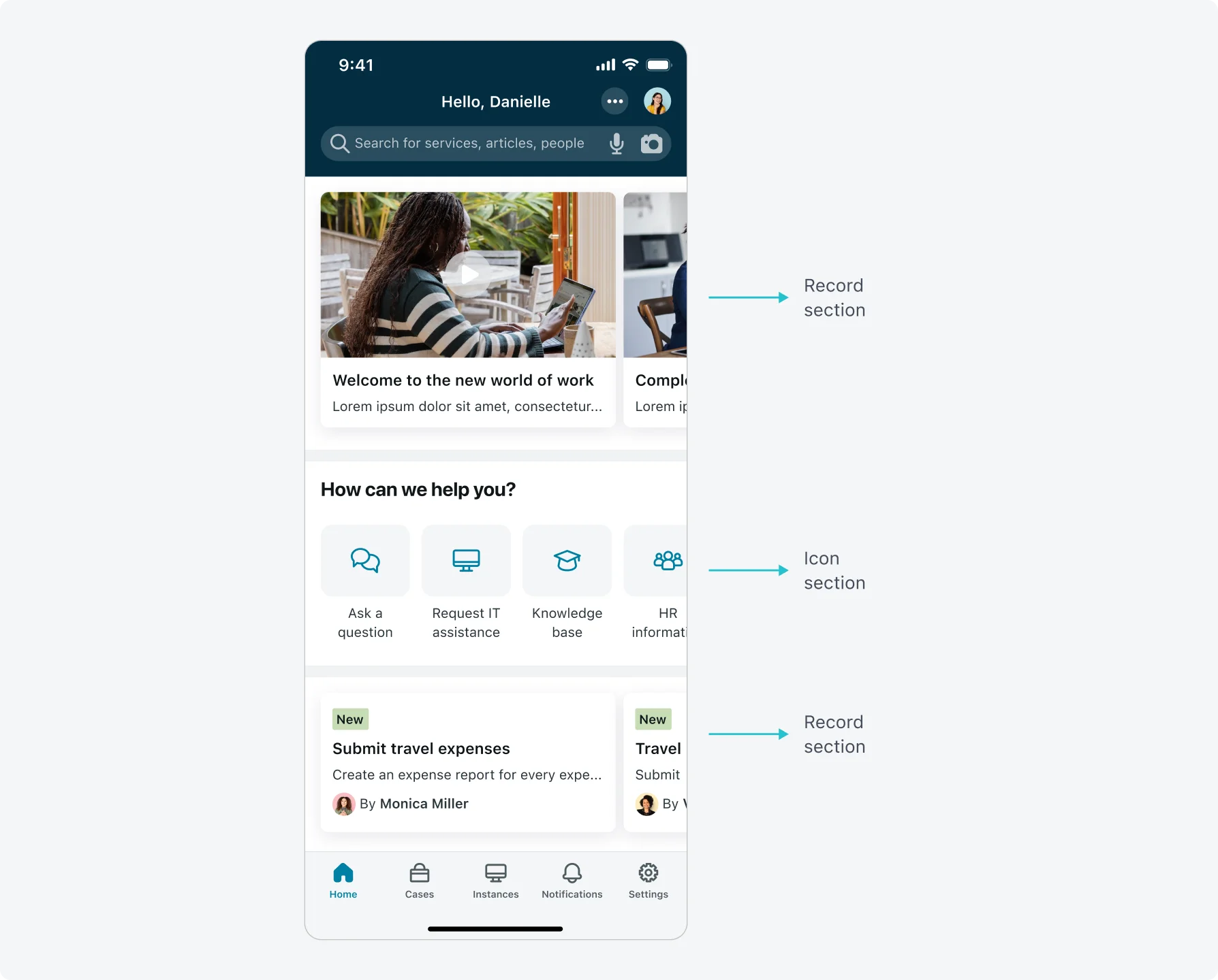
UI sections
UI sections display screens and record information on your launcher screen. The available UI section types are Analytics preview, Icon, Record, Media and Campaign.
- Keep consistency in how you use UI section types in your app. For example, if you use icon sections to access record information, do not use those icon sections to initiate functions. If you use horizontal item UI sections for functions, do not use those UI sections to show record information.
- Limit scrolling where possible. Prioritize the icons, and information yourusers need most and place those items towards the top of the screen.
- Group items within a UI section contextually. For example, icons relating to incident management are easier to find when placed in the same UI section.
- Configure your user’s most used functions as quick actions. These options are accessible at the bottom of the screen regardless of where in the launcher the user scrolls.
- Limit your launcher screen to 5 or fewer UI sections.
- Use a record section as the launching point of a workflow. If a record section has a significant number of records to scroll through, consider linking to a list of records instead.
- Configure your user’s most used functions as quick actions. These options are accessible at the bottom of the screen regardless of where in the launcher the user scrolls.
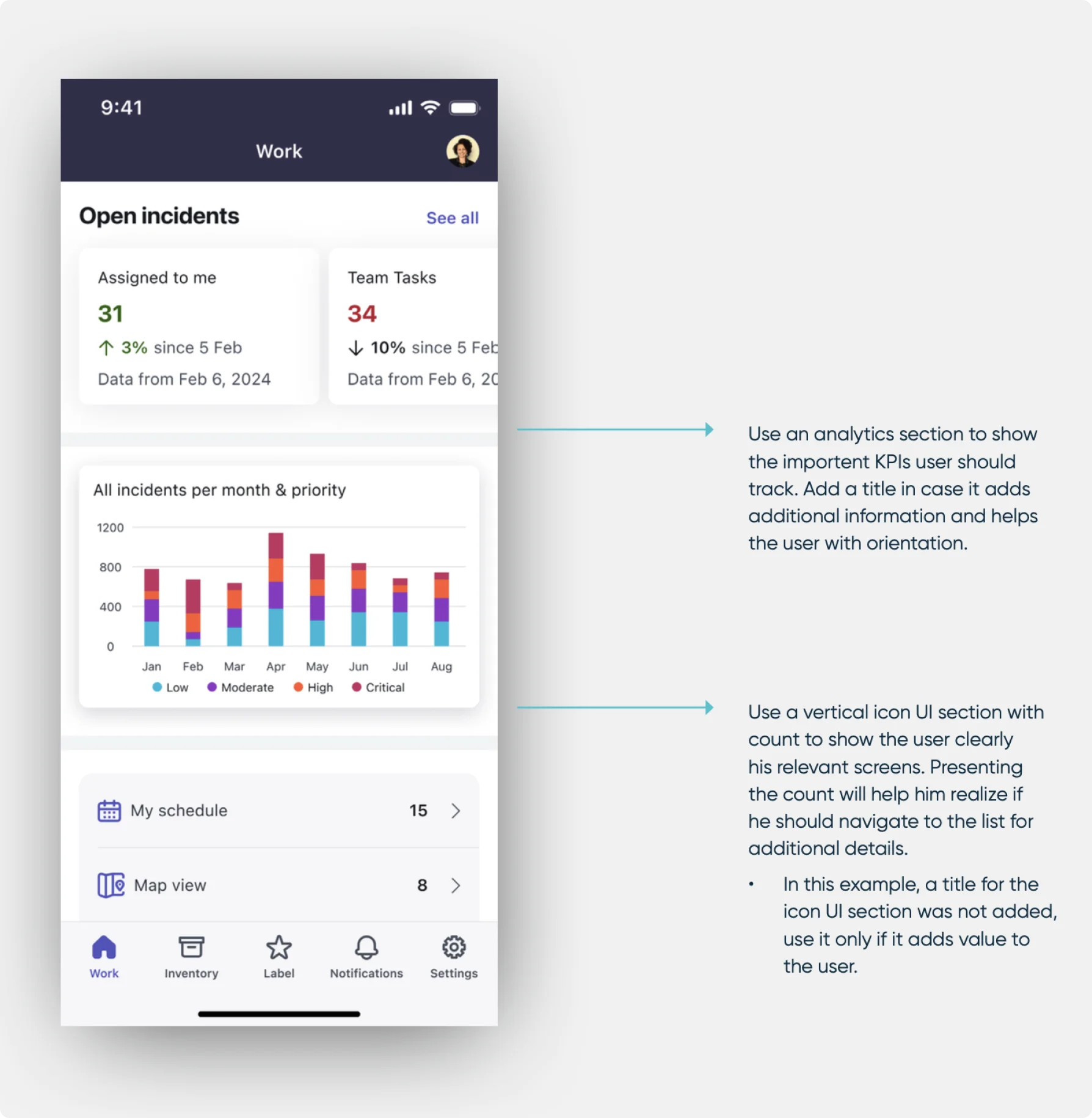
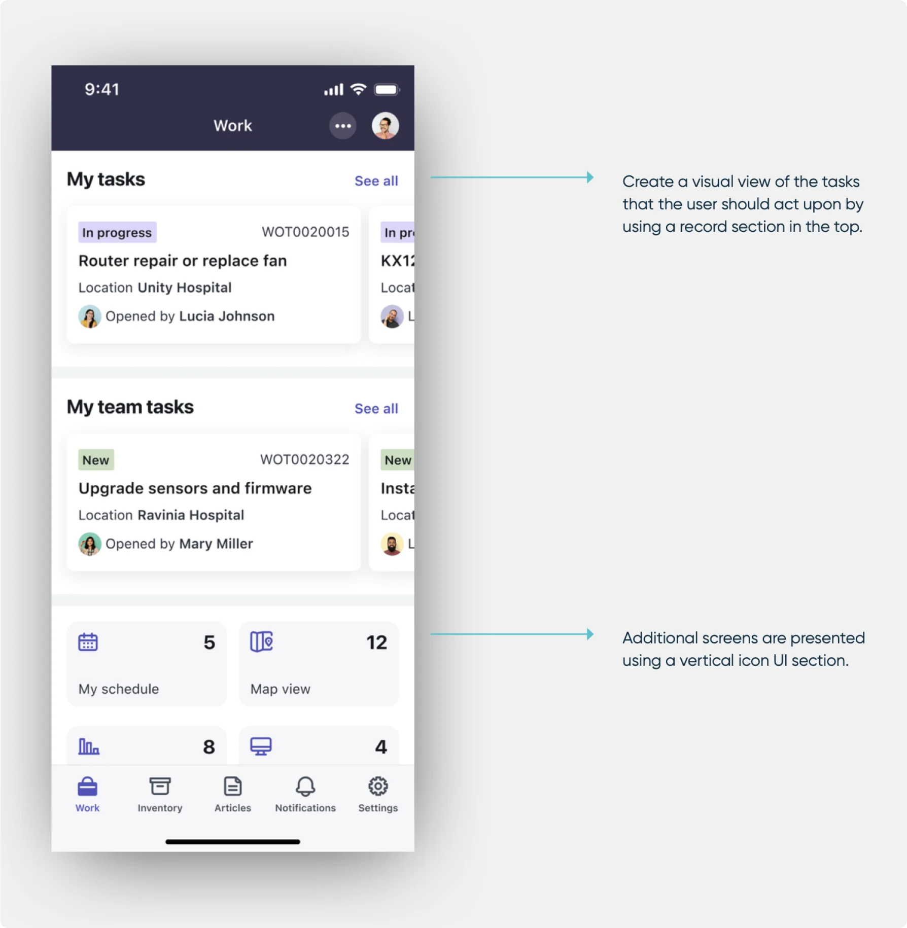
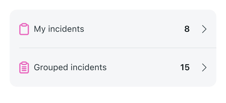
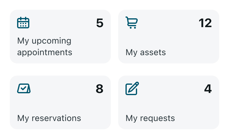
Icon section
Use the icon section to enable users to easily access screens, screen launchers and functions. Each icon section supports either a horizontal or vertical layout. Also, each icon section contains either an icon, image, or basic (text) display type.
Icon sections are the next generation of the legacy icon section. The legacy icon section supports only a subset of functionality. Legacy icon section, previously named icon section, supports navigations to screens and icon display type only.
- You can create a section header to give an indication of the types of actions within the section. If your screen names are self-explanatory, you can omit this header and save screen space.
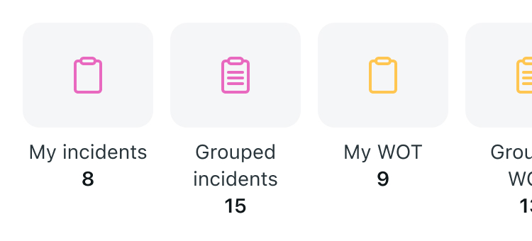
- If the data is actionable, take advantage of the “count” feature so the user knows how many records are in the drill down. It is great for task information as well as larger datasets. Count is supported in all layouts and with all display types.
- Use the most suitable display type for your use case. Display type is set in the section level.
- Use Icon when the icon gives a hint to the screen or action for the user will trigger.
- Use Image to create a more dynamic appearance within your app. You can include images here to emphasize your company brand. For best performance, the image weight should no more than 300KB.
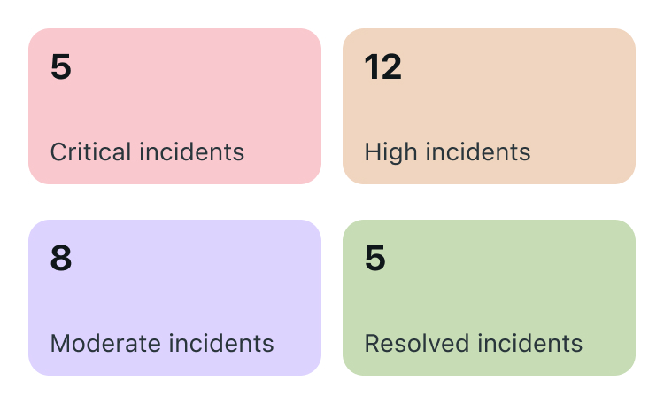
- Use Basic to emphasize text and focus on the count value. Basic is also used when the image or icon options are too distractive. Basic also supports configuring the card background color to add additional colors to your app.
You can restrict the access to the entire Icon Section for specific users by applying User Roles or User Criteria to the section. Additionally, you can control access to individual items within the section by assigning User Criteria to each item. Learn more here.
Horizontal
Vertical
Icon section - 2 columns and count
Basic - 2 columns and count
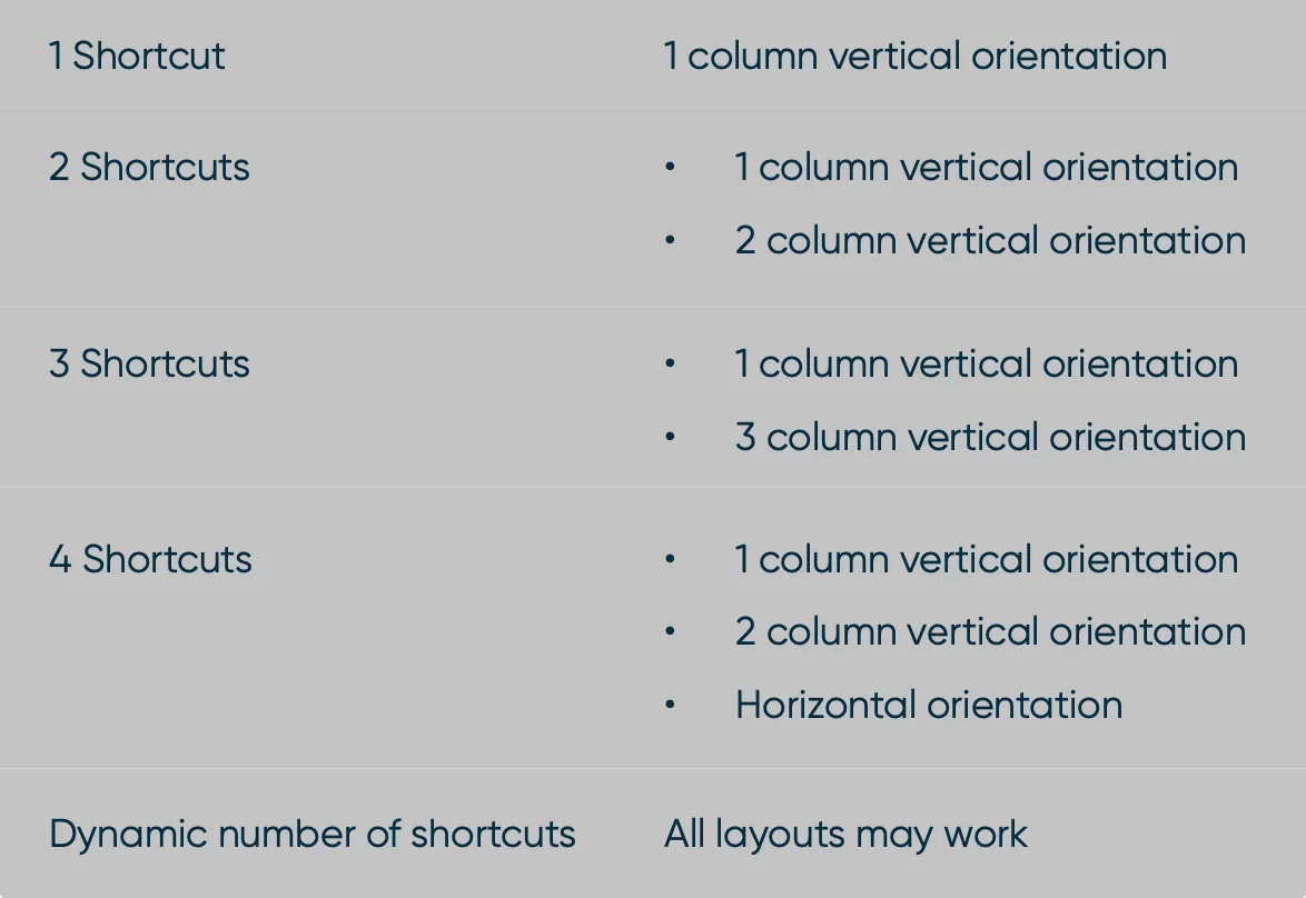
Vertical orientation
- Use this section orientation to display multiple shortcuts in a vertical view.
- This view supports a longer name character count than a horizontal orientation.
- Vertical orientation support 1,2, or 3 column counts. Optimize your orientation and layout based on the number of navigations shown to your users.
Horizontal orientation
- Use this section orientation to display multiple shortcuts in one horizontal view.
- Limit the shortcut name character count to 20 or fewer, so the name does not get cut off.
- If there are more shortcuts in a section than will fit on the screen, users can scroll horizontally to view all the shortcuts. Limit the number of shortcuts in a horizontal section to 4 or fewer to prevent users from needing to scroll.
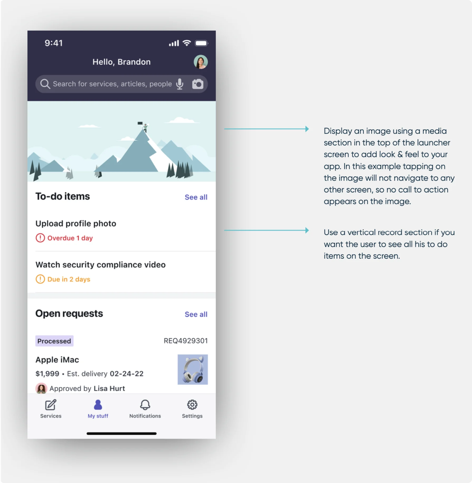
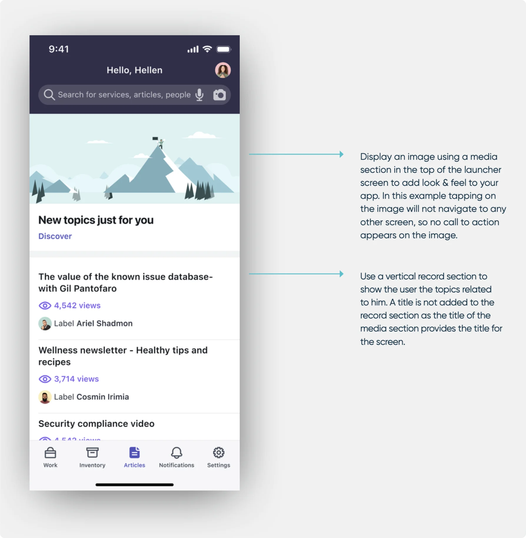
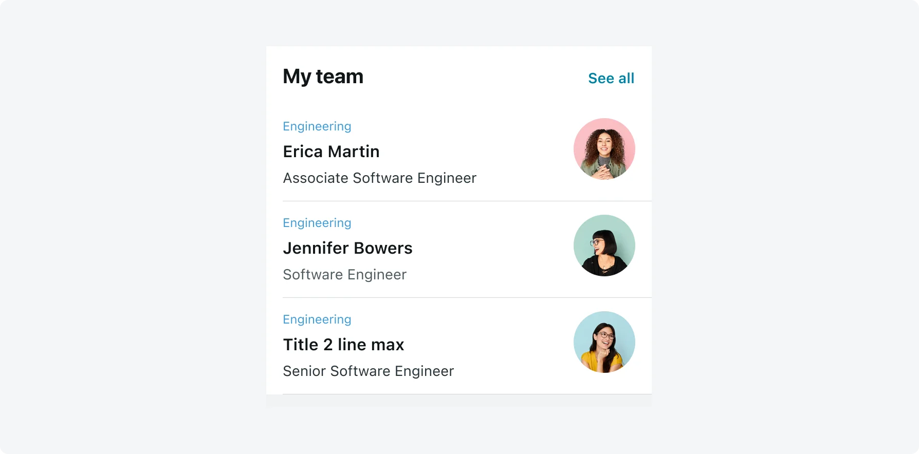
Record section
Record sections display records which require the user’s attention, such as high priority, overdue items, or unassigned tasks. Users tap on a record to see additional record information or to take action.
- Use the “Hide section when empty” option to hide sections when there is no information to display. However, in some cases you may want to show an empty section. Consider that missing sections may cause the user to lose context or not understand why a section doesn’t appear. For example, a to-do list.
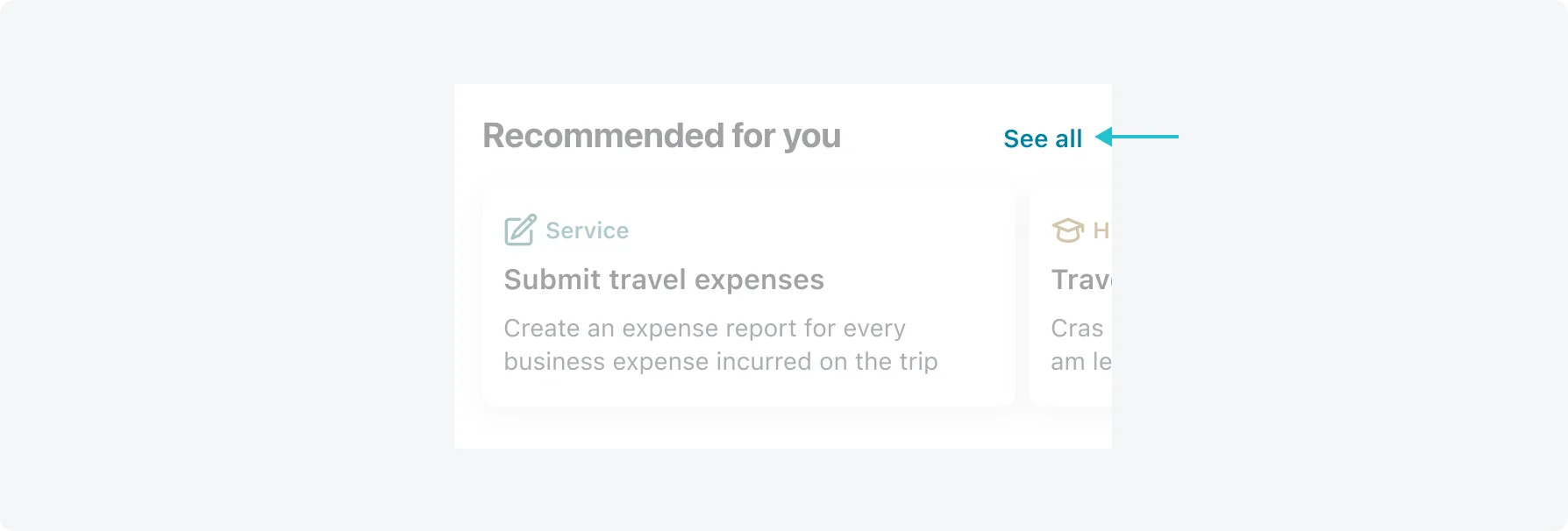
- Record sections can include a “See all” button, which opens a full list of records. The same card is used for the record section and list view. Make sure that the selected card is displayed correctly in both the section and the list.
You can restrict access to the Record Section for specific users by assigning User Roles / User Criteria to section. Click here to learn more.
Hide See all button option
- You can decide whether your end users view the “See all” button that appears to the far right of the section title. The visibility of the button can depend on the content that appears in your record section.
- If the “See all” button is hidden, an end user has no way to access the list screen from this section. All the functions and additional screen segments that exist behind this section become inaccessible. When making the decision to hide the “See all” button, consider if you want this information to be available or unavailable.
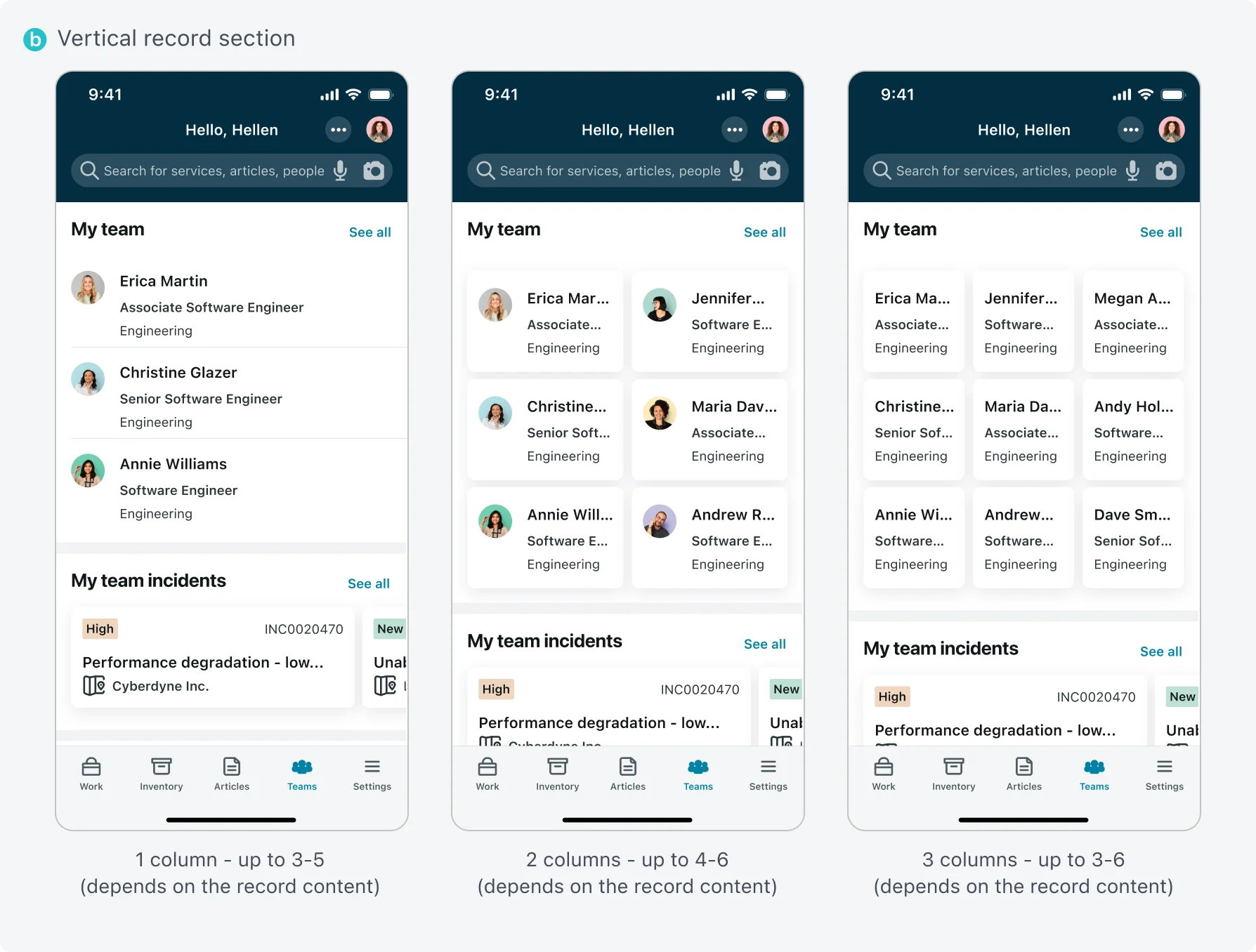
Vertical orientation
- Optimize the width of your cards based on their design and content. The width of the card is calculated automatically based on the device’s width. The custom card height is not calculated automatically based on the card’s content and should be defined.
- The vertical orientation for cards if from left to right. The number of rows is based on the number of displayed items. Consider updating the maximum item display count in a vertical record section, if multiple columns are configured. The default number is 3.
The following list is the suggested number of records to display per number of columns:
- 1 column: 3-5 items
- 2 columns: 4-6 items
- 3 columns: 3-6 items
Horizontal orientation
- Scrolling types - Horizontal orientation supports 2 scrolling types: free scrolling which is the default behavior and snap to start. Use snap to start for scrolling the cards one by one, this is especially recommended in cases where an inline video is used, or multiple rows exist in the card.
- Multiple rows support - Horizontal orientation supports 1 through 3 rows. The default is 1. Consider using multiple rows if you have more than 6 items and if the height of the cards is not so large that only 1 section is displayed.
- Horizontal orientation card order is from top to bottom. The number of columns is based on the number of displayed items. Consider updating the maximum item display count in horizontal record sections if multiple rows are configured.
The default is 15. The following list is the suggested number of records to display per number of rows:
- 1 row: up to 10 items
- 2 rows: up to 14 items (7 on each row)
- 3 rows: up to 15 items (5 on each row)
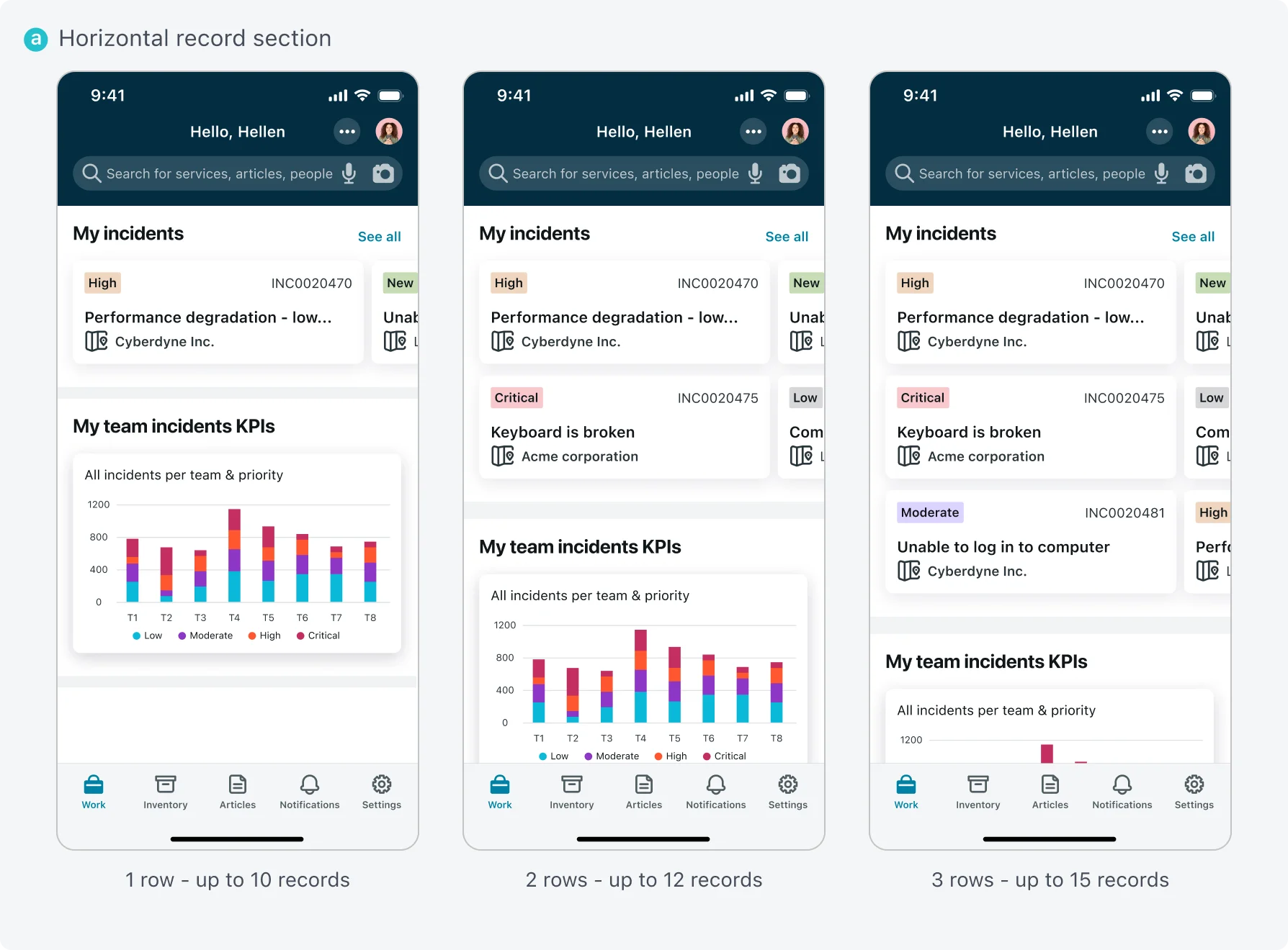
Horizontal record section
Vertical record section
Example of the catalog with images
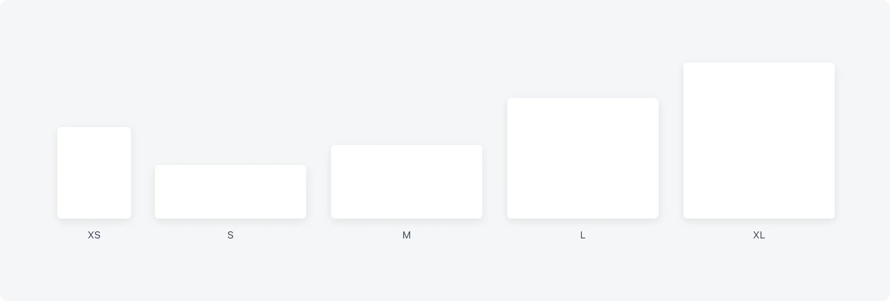
Card Size
- Optimize the size of your cards based on their design and content. Five predefined card sizes are supported – extra small, small, medium (default), large and extra-large. In addition, a custom size card is supported. To keep a consistent experience, consider not using multiple card sizes in different sections within the same screen. Use large or extra large cards when the cards’ content includes either many fields, a video, or card actions.
- The width of the card is calculated automatically based on the device’s width. The custom card height is not calculated automatically based on the card’s content and should be defined.
- Accessibility consideration - When text is enlarged, due to the accessibility requirements of the user, some of the content might be truncated. The card size does not change based on text size definition. To avoid a situation where part of the text is not visible, the content displayed in a record section card should be a subset of the overall content displayed in the navigated screen.
Record section functions
Add functions to the footer area of record sections to enable users to trigger actions within a record section and quickly perform repetitive processes such as adding a new record or navigating to a related screen. To enrich the user experience by reducing the number of taps required, define a function that creates a new record directly from the record section, rather than from the list screen that opens after tapping the “See All” link.
Add a navigation function to other screens, such as map and calendar screens to help the users visualize the data better. For example, in the case of data that contains a location, you can add a “View in map” function to navigate the user to the map screen. To experience the same look and feel of the cards in the record section and in the map screen, make sure to use the same list item configuration for both the record section and the map screen.
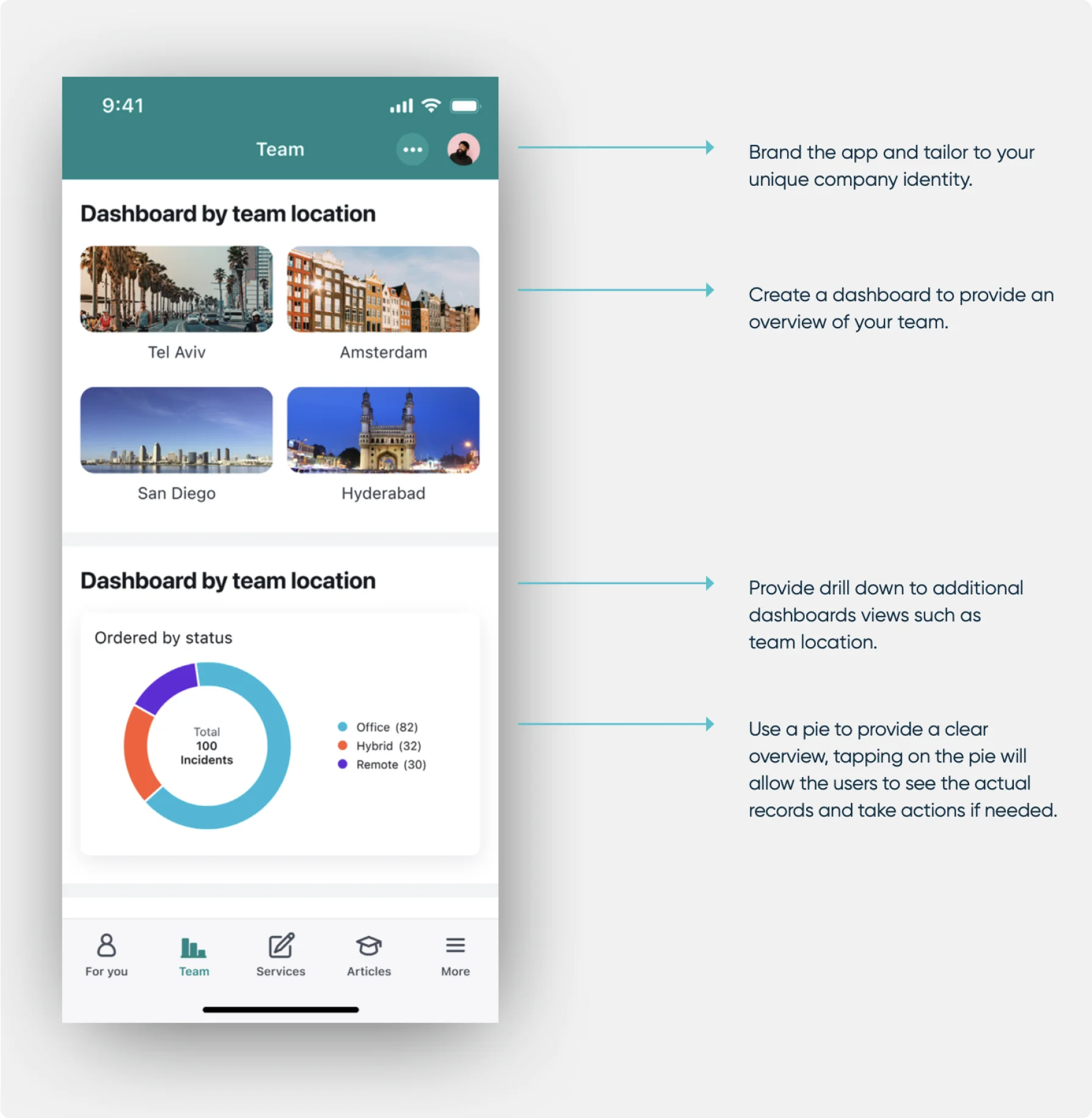
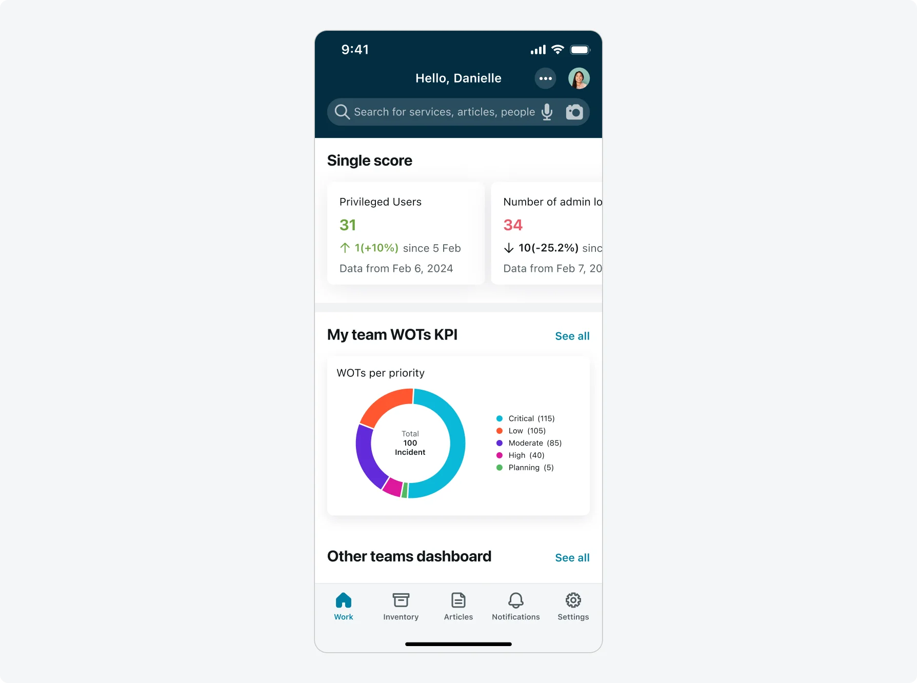
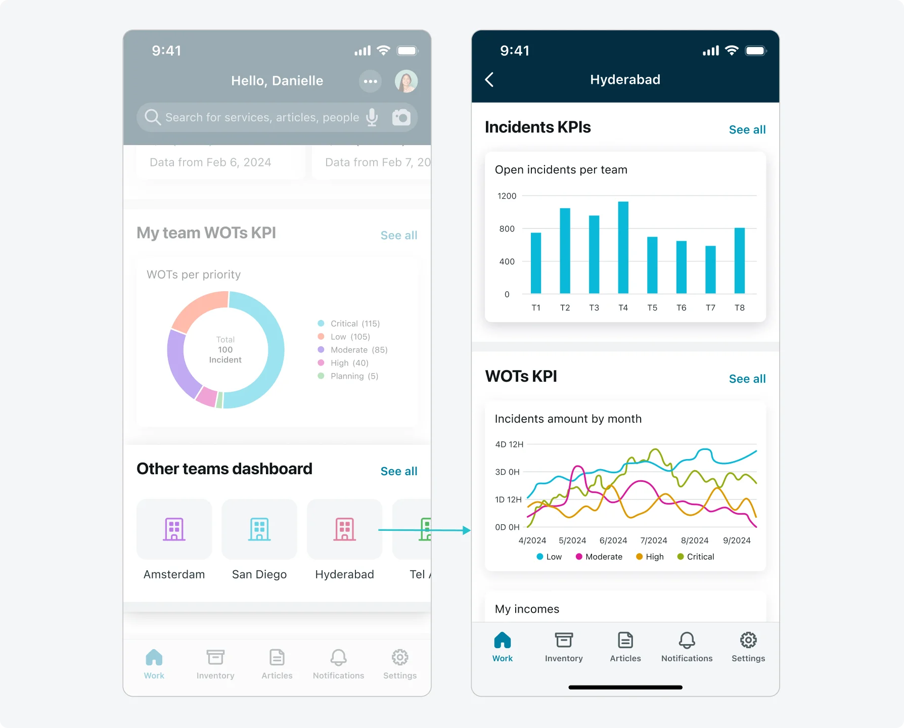
Analytics section
Utilize analytics sections to display various data visualization types on your mobile device, enabling users and managers to stay constantly updated and gain real insights quickly while on the go. There are two analytics section types:
1. Data visualization single score
- Use this type to display a score or show a score for indicator.
- Supported in horizontal and vertical view. Use a vertical view when you want all scores to be visible on the screen without the need to scroll, or when your titles or values are long. Horizontal views work best with score names and values short enough to fit on screen. Use a horizontal view when you want to display several scores in a scrollable section.
- Configure single scores so that once tapped it displays its records. From there, users can see more information and take action.
2. Data visualization chart
- Use this option to show a time series report, vertical bar chart, donut chart, or pie chart analytics preview.
- All the analytics previews in the launcher screen can be tapped to direct users to the chart screen where they can interact with the chart, perform drill-down actions, and apply filters.
- Optimize your dashboard by creating several analytics sections, each analytics section can contain up to six mobile data visualizations.
- Add a section title if the analytics previews are not self-explanatory or you need to group multiple analytics previews under a single title.
- Optimize your analytics section for viewing on phone or tablet devices. For example: -- Use horizontal sections to take advantage of screen space. -- Place multiple analytics previews in an analytics section. These analytics previews will appear side by side in wider format screens.
- Consider the number of reports presented on mobile. Present only the most used and useful reports to make navigation easier and avoid a cluttered screen.

- For better visibility and performance, consider limiting the time frame of the information and reducing the complication of the queries. Don’t overload with unnecessary information for mobile use cases.
- You can configure an icon UI section to navigate to launcher screens to show analytics sections.
You can restrict access to the Analytics Section for specific users by assigning User Roles / User Criteria to section. Click here to learn more.
Media section
Media sections display an image or video. Users can tap a media section to navigate to another screen.
- Add a media section to the top of your launcher screen or create a launcher screen specifically for multiple media sections.
- Use media sections to display welcome messages, or company messaging.
- Media sections can display a single line header, and up to two lines of additional text. You can define a navigation function and the text to appear on the navigation button.
- Media sections can display video from YouTube and Vimeo streaming services.
- Restrict visibility of your media sections by role, user, or conditions to ensure users only see what’s applies to them. For example, you could create an onboarding message that displays only for employees who just signed in. You could also create a “see you next week” message that displays a week before an employee’s start date.
- Media sections are also a way to add a static company logo to the top of your launcher screen if further branding is desired.
- Create images optimized for use in media sections by using a height of 160px and a width of 1366px. If your users primarily use iPhones, use a height of 160px and a width of 375px to 600px.
Note: Consider the record section as an alternative for achieving the desired functionality. The record section fully supports accessibility and offers enhanced flexibility compared to the media section, in terms of card size, height, and control over elements within the card. Explore further in the Link for more information.
You can restrict access to the Media Section for specific users by assigning User Roles / User Criteria to section. Click here to learn more.
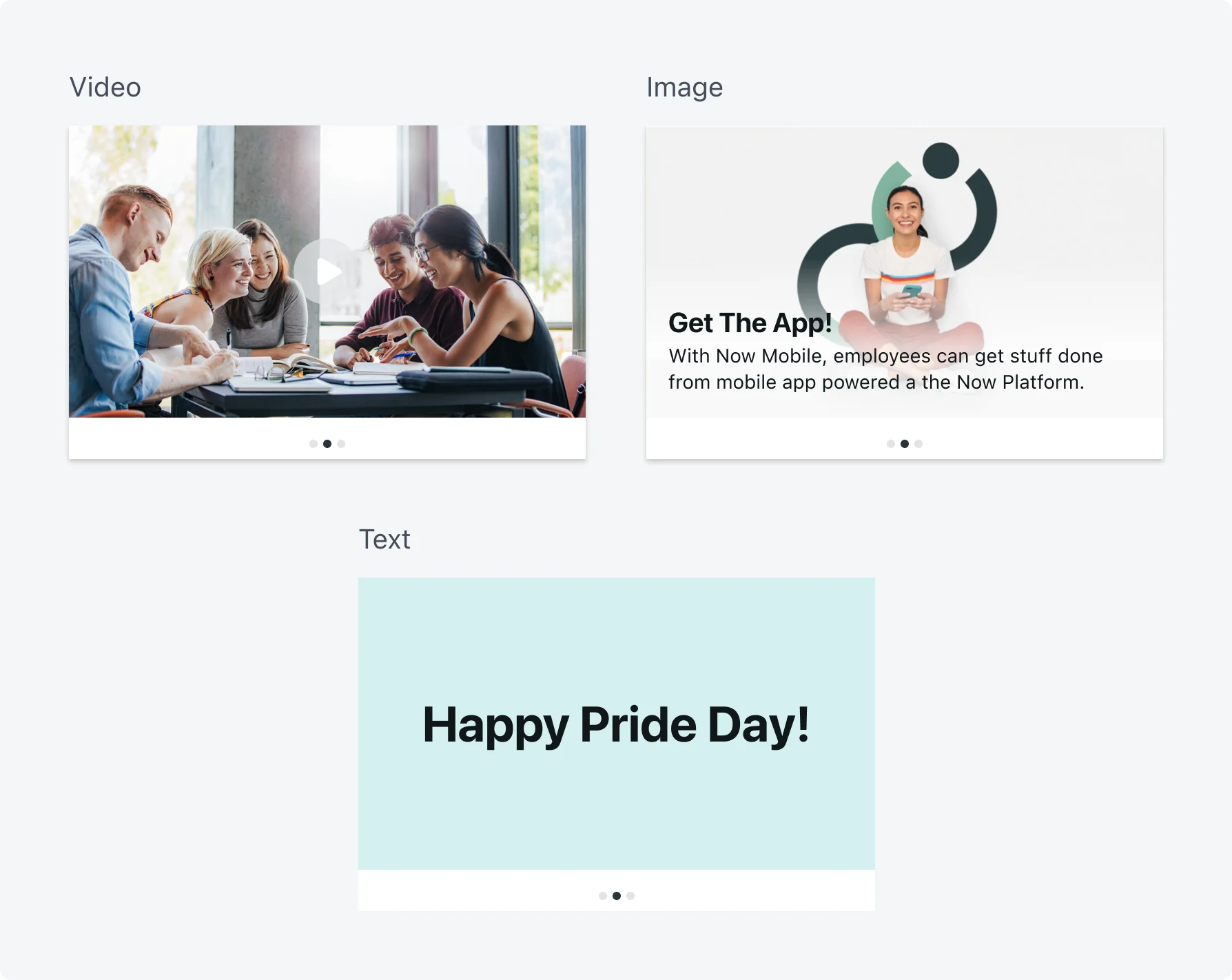
Campaigns
Use campaigns to deliver messages and important information to your users. Users can interact with the promotional displays by viewing videos, being redirected to web pages, or navigated to defined areas on their mobile device.
Mobile campaigns enable you to share curated content using a scrolling list of images in a carousel format. You can mix any of three card types in the carousel: video, image, and text. At the bottom of the carousel images, dots represent up to eight images and numbers more than eight images. You can choose for the mobile campaign to automatically scroll the cards or to manually scroll them yourself.
It is recommended to place the campaign component at the top of your first tab launcher screen, ideally present no more than 5-7 content cards and keep the card visualization within the same color theme to avoid users visual fatigue. Use campaigns when delivering multiple messages to your user. For other use cases like single messages, company branding consider using the Media section.
- Create images optimized for use in campaigns sections by using a height of 212px and a width of 375px or keep aspect ratio of 16:9.
Note: Consider the record section as an alternative for achieving the desired functionality. The record section fully supports accessibility and offers enhanced flexibility compared to the campaign section, in terms of card size, height, and control over elements within the card. Explore further in the Link for more information.
You can restrict access to the Campaign Section for specific users by assigning User Roles / User Criteria to section. Click here to learn more.
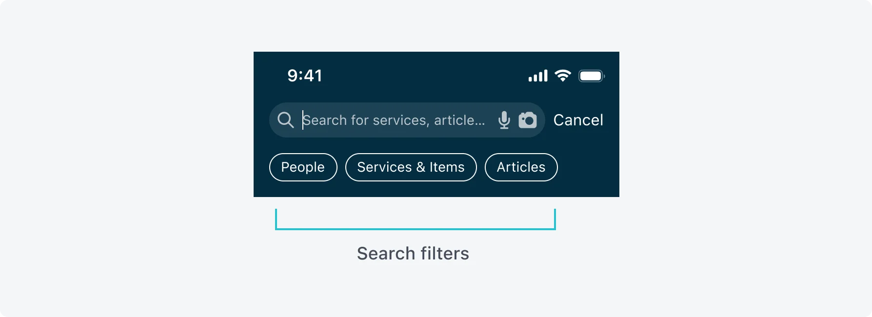
Global search
Configure your launcher screen with a global search bar to give your users the ability to quickly find people, catalog items, and knowledge base articles within your mobile applications. The search bar appears in the header of your launcher screen.
A search bar’s field can contain placeholder text. Keep this text short to ensure that the text does not exceed the length of the search bar.
Search engines
The mobile platform supports 2 search engines:
Zing – This search engine is included in the platform in New York and later releases. It allows users to search across different data sources. Admins add additional tables as data sources to be indexed. Zing will remain the only search option for the Agent app in Quebec.
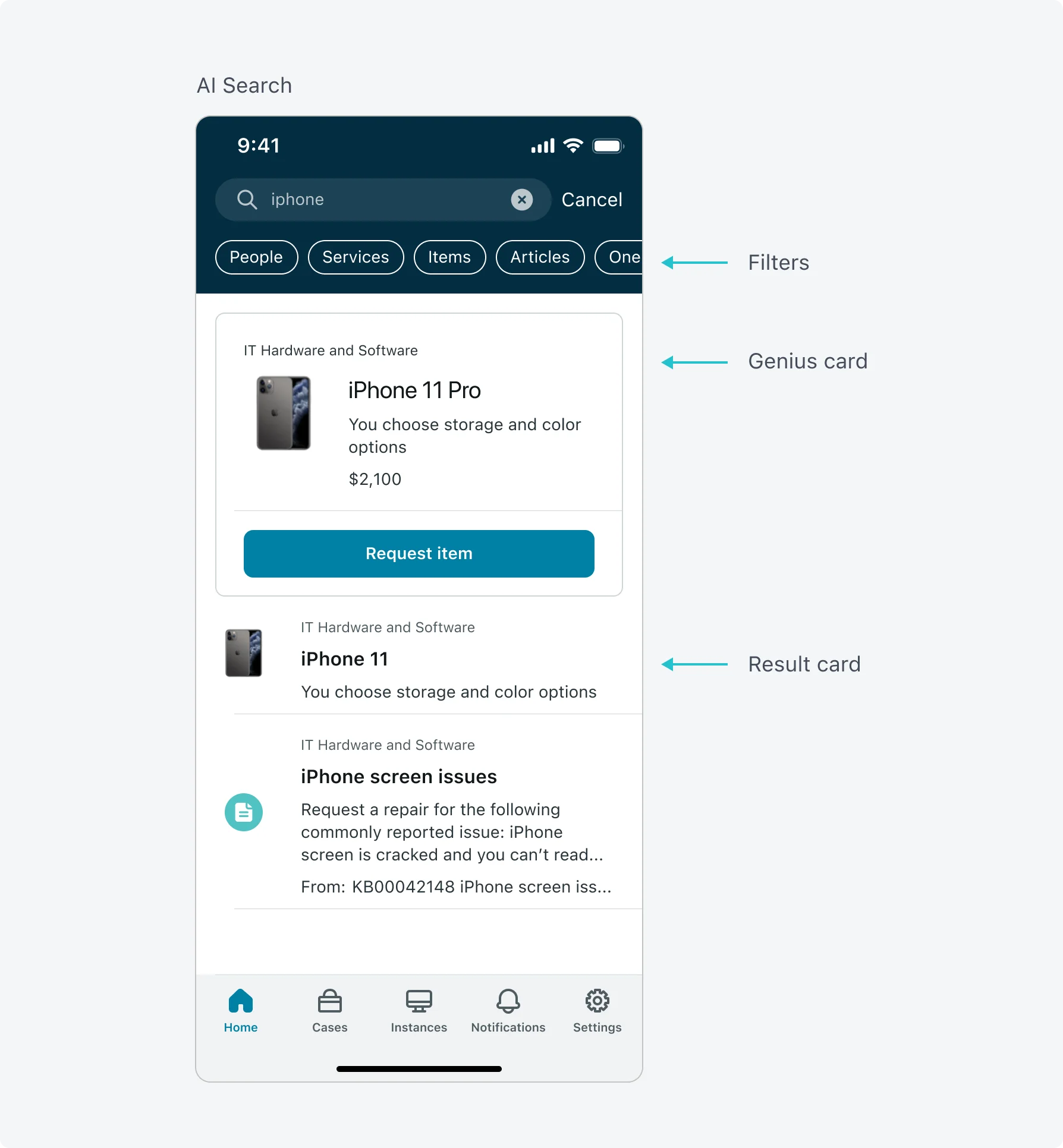
AI Search (AIS) – An AI based search engine that can be used for Now app in Quebec and later releases. This search engine provides machine learning search capabilities including the user context and intent, popular searches across other users and robust relevancy model. AI search in Quebec supports only the employee related data sources (people, catalog and knowledge) and can be opt in only for the Now client.
One of biggest benefits of Zing is its flexibility to add any additional data source to the search index, while AIS is limited (in Quebec) for the employee common data sources.
Now customers who are looking to gain AI based search capabilities can do so by opting into for AIS while looking into the following considerations:
- Customers should validate that there are no customized data sources configured in Zing which may not be supported by AIS (cases for example).
- In case non-supported data sources exist, customers can create a mixed search experience that on one hand use AIS for people, catalog and knowledge while keeping Zing for non-supported data sources.
- To support this mixed mode, we recommended app owners to create dedicated application launch pages for AIS non-supported data source and associate a Zing search bar to these application launch pages while keep the global search using AIS.
Additional configuration can be done both for AIS and Zing:
- In Zing, app owners can limit the number of search results shown to the user and the number of suggested results when the user start typing characters in the search bar.
- In AIS, the following configuration can be made: -- Control the number of search results – app owners can change the default search result entries (10) but should be aware that the engine will show the most relevant answers at the top of the list. -- Control the number of genius results – Customers can decide to present up to 3 cards. One for each data source type (people, catalog, and knowledge) if there are results for that data source. In many cases, a single genius card will provide the requires answer while keeping the screen from not being overloaded. -- Enable typo handling – Admins should be aware that that for most users, the device auto correct will still be working and correct text as it typed. -- Navigation bar tab labels – Admins can choose to use their company terminology and change the filter labels as needed (example: People to Employees or Users etc.).
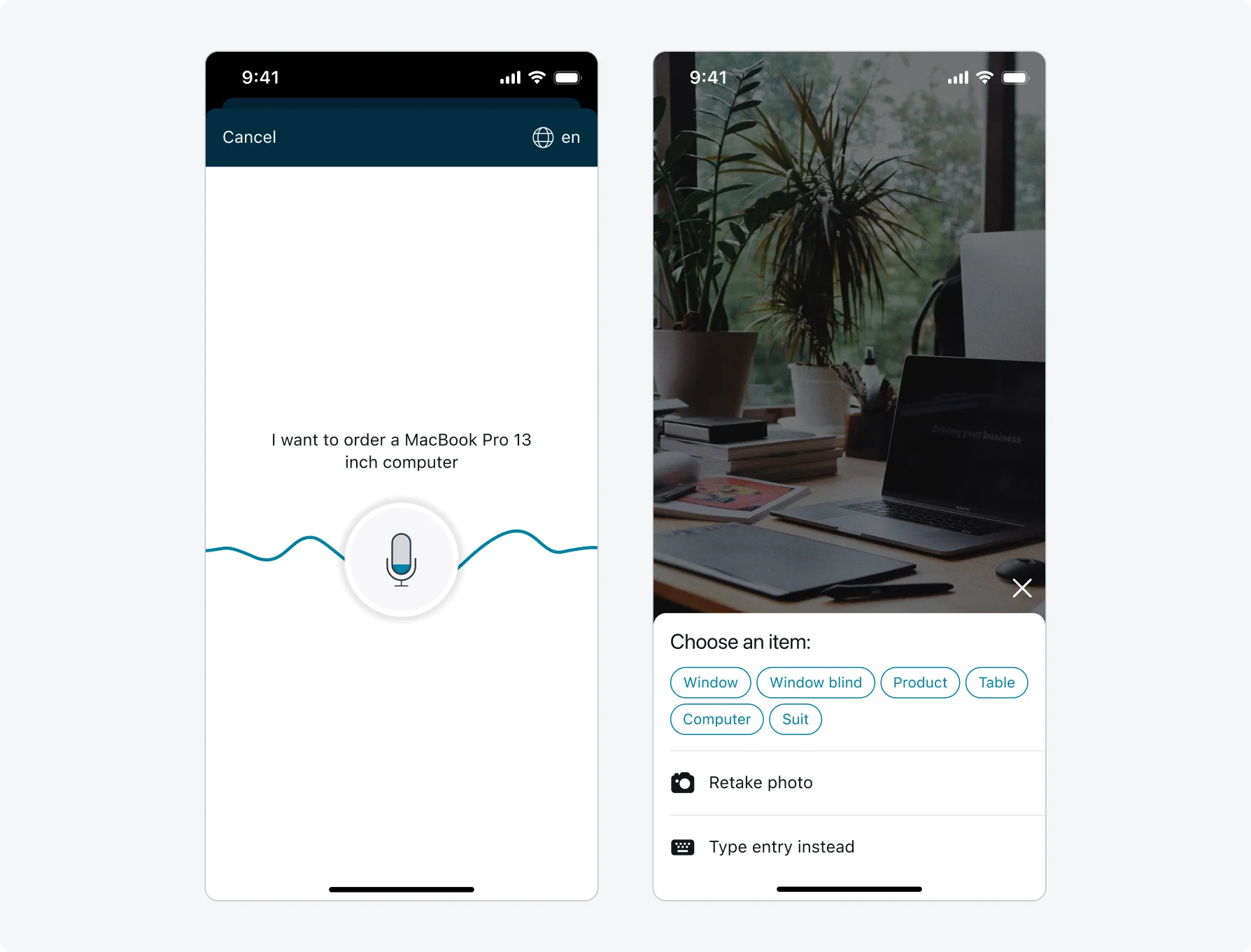
Voice search
You can also enable voice search, which uses a mobile device’s native speech recognition capability.
Depending on your mobile device’s operating system, the voice recordings you create with the voice search feature are sent to Google or Apple to be processed into a text query. ServiceNow does not have control of the recording once it has been sent.
Photo search
Configure photo search to give your users the ability to use their device’s camera to perform image-based searches using the objects around them.
To take advantage of image recognition in your mobile applications, you need a Firebase account with the Google Vision API enabled. Google Firebase account and the Google Vision API are third-party services that must be subscribed to separately.
Launcher screen quick actions
Quick actions provide your users with a shortcut to an item or action in your mobile apps. Quick actions are best used for tasks that users need to perform regularly.
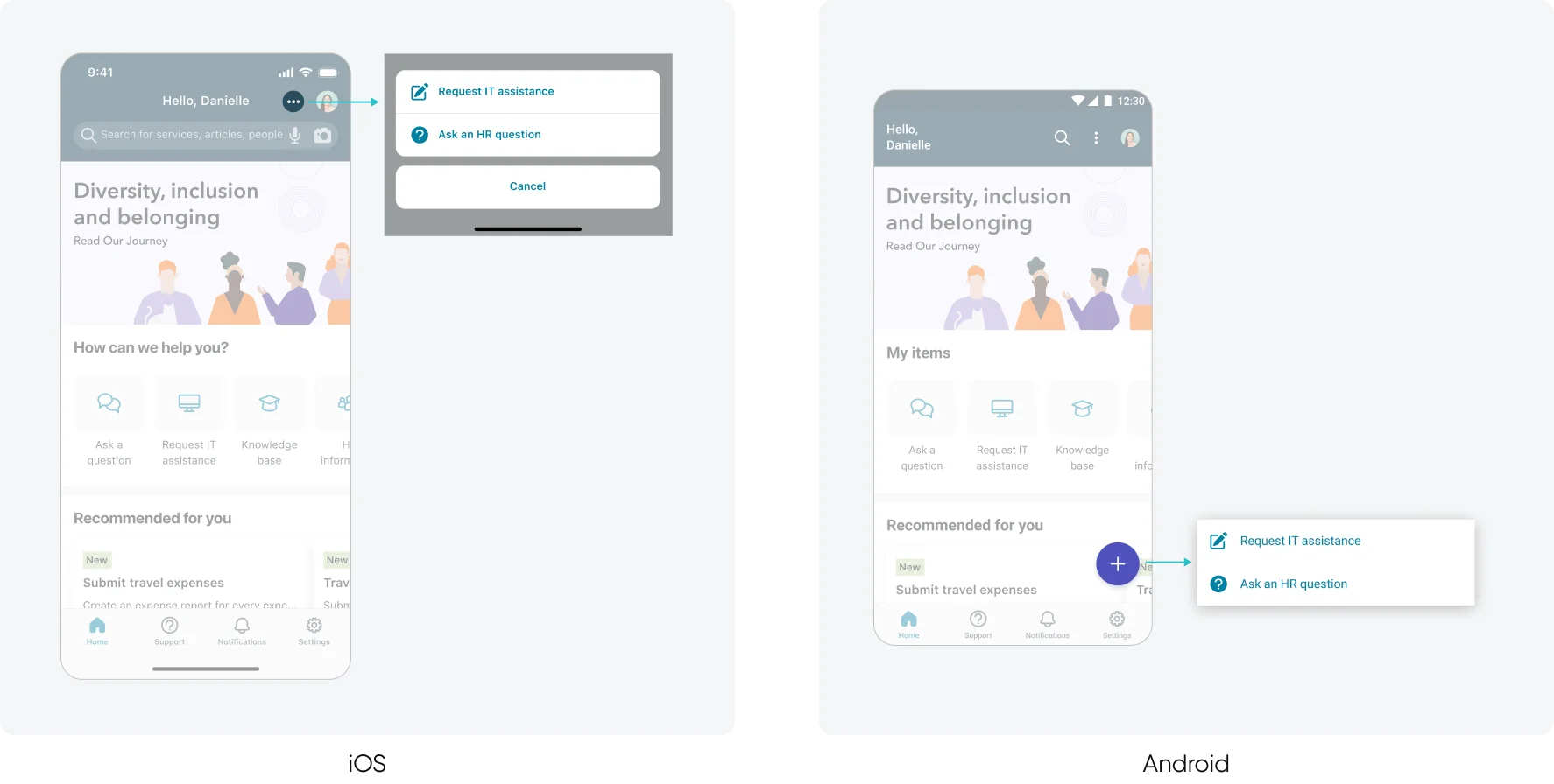
In Android, quick actions appear when the user selects the more icon at the bottom of the launcher screen page. The button remains on the bottom of the page regardless of where a user scrolls, to remain easily accessible.
In iOS, Quick actions appear when the user select the plus icon in the launcher screen header, near the header action.
- In cases where only one action is configured in the quick actions menu, you can define a specific icon to be displayed.
- Limit quick actions to required or frequently used actions based on the purpose of your launcher screen. Chat is a good example for using a quick action.
- Keep consistency of quick actions on your launcher screens.
Associate colors to your quick actions to indicate their function. Positive and destructive button emphasis are supported.