Overview
Icons appear in your navigation bar and screens to give your users a quick visual reference to the purpose of the screen or navigation tab. Find an icon image that best relates to the task that screen performs.

Screen icons
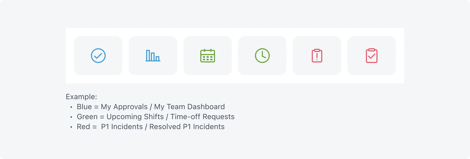
Consider using the same, or similar colors for related screens. For example, selecting blue for your incident-related screens and green for work order screens can help your users find related tasks quickly. Where text appears, ensure your text and background have a high level of contrast to accommodate both low vision and color-blind users.
Avoid using too many colors. Using fewer colors and selecting colors that work well with your application branding results in a cleaner, more accessible layout.

Navigation bar icons (Tab bar)
Navigation bar icon color is determined by your application’s theme. Select an icon that best represents the functions or information presented in that part of your application. Avoid using the same icon for more than one navigation so users can quickly find what they need.
For a reference guide to icons you can use in the navigator, see the mobile icons documentation on the ServiceNow doc site.