iOS
Android
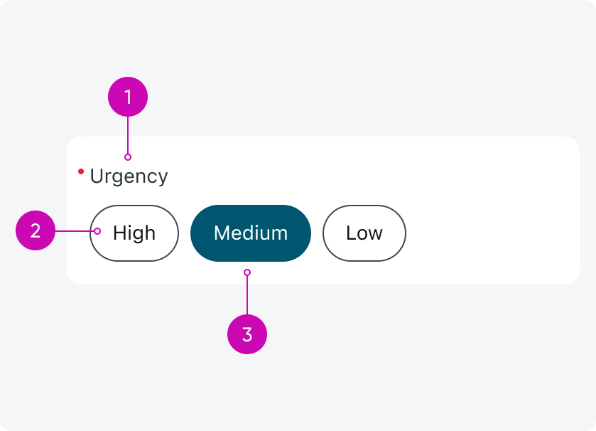
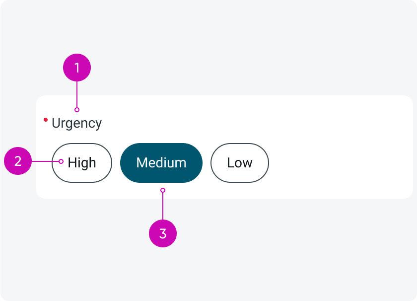
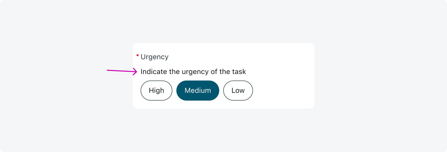
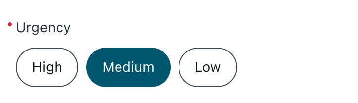
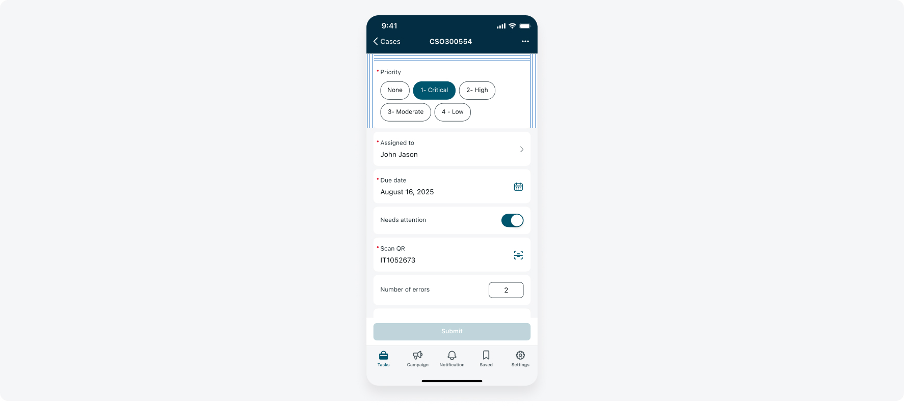
- Label: This is the title of the input, displayed above the choice field, explaining what the user should select in that field.
- Chip: Displays an option that the user can select.
- Selected chip: Indicates the selection that the user makes.
Variants
The choice input has 2 variants: Single select and multi-select.
Multi-select
Use the multi-select choice input when the user can choose multiple answers at once.
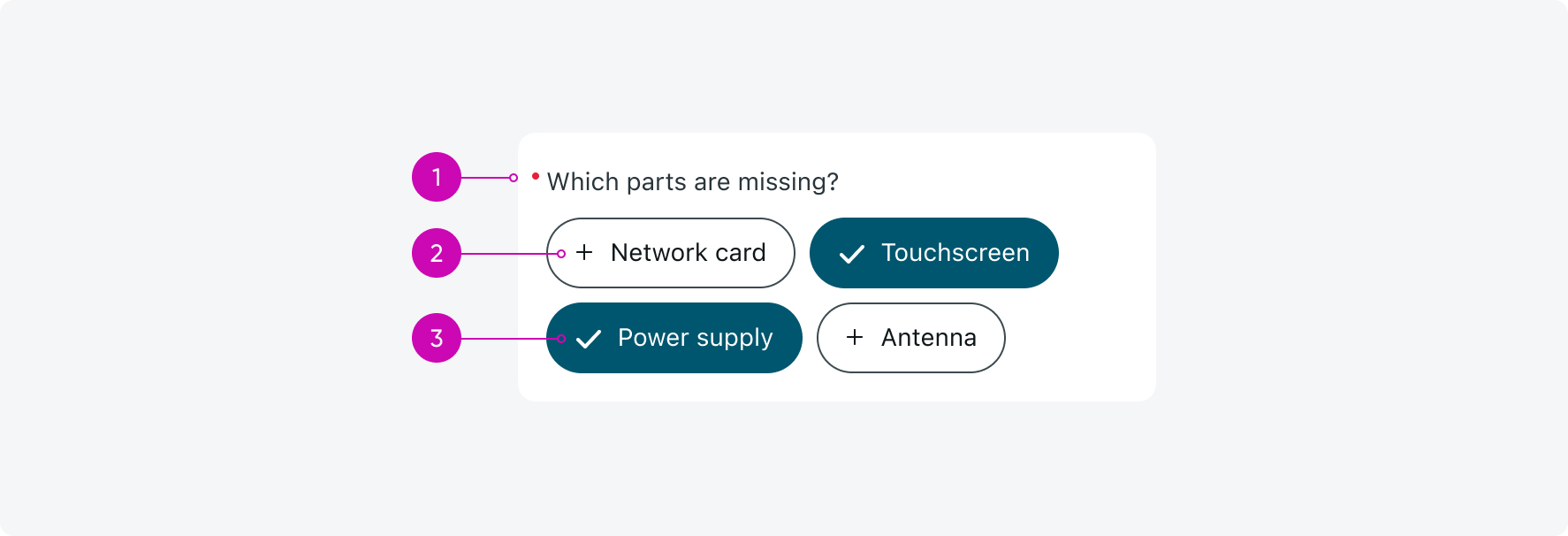
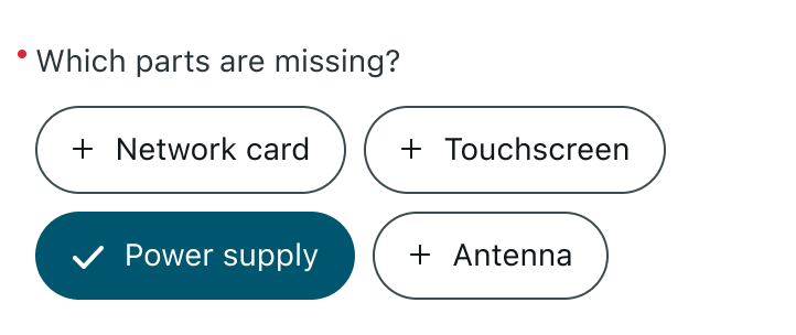
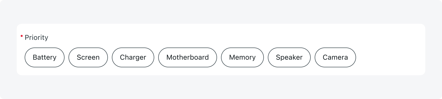
- Label: This is the title of the input, displayed above the choice field, explaining what the user should select in that field.
- Chip: Displays an option that the user can select. In the Multi-select choice, it is marked with a "+" sign on the chip.
- Selected chip: Indicates the selection that the user makes. In the Multi-select choice, it is marked with a "V" sign on the chip.
Configurations
Learn how to customize the choice input component by configuring the available properties.
1. Pre-selected chip
You can configure choice input to have a default pre-selected choice. The user can deselect the pre-selected chip by tapping on it or, for single-select choice inputs, selecting a different chip.
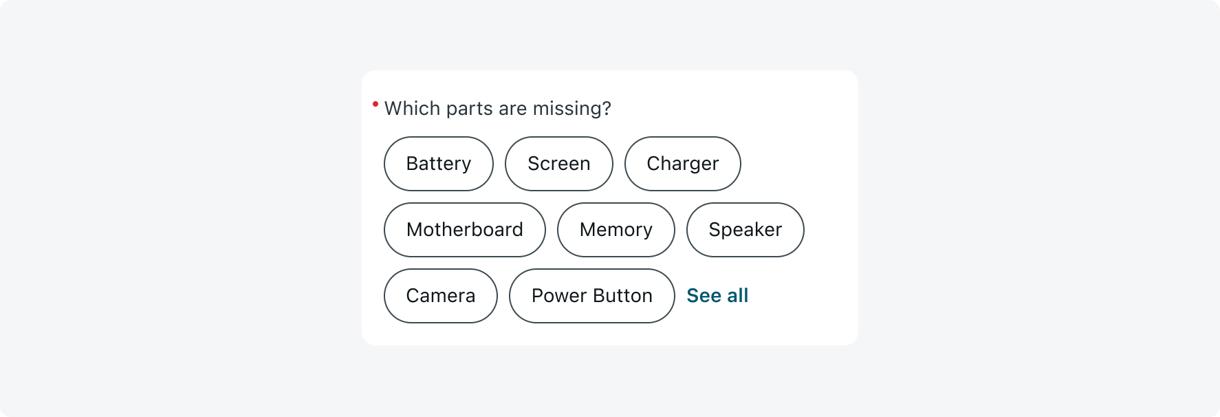
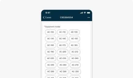
2. Maximum number of chips
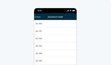
The default number of chips is 8. Once there are more than 8 chips, a "See all" button will appear, directing the user to a new screen to view all the options. You can adjust this number to any value that suits your needs.
A "See All" button is added
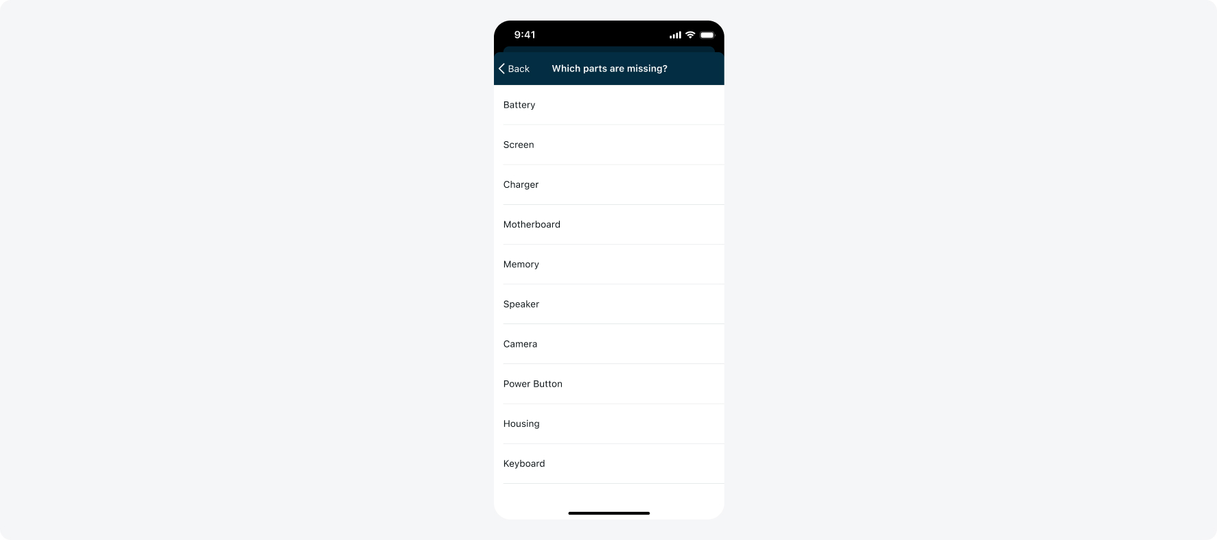
Tapping the "See All" button will take the user to a new screen where they can see all the options.
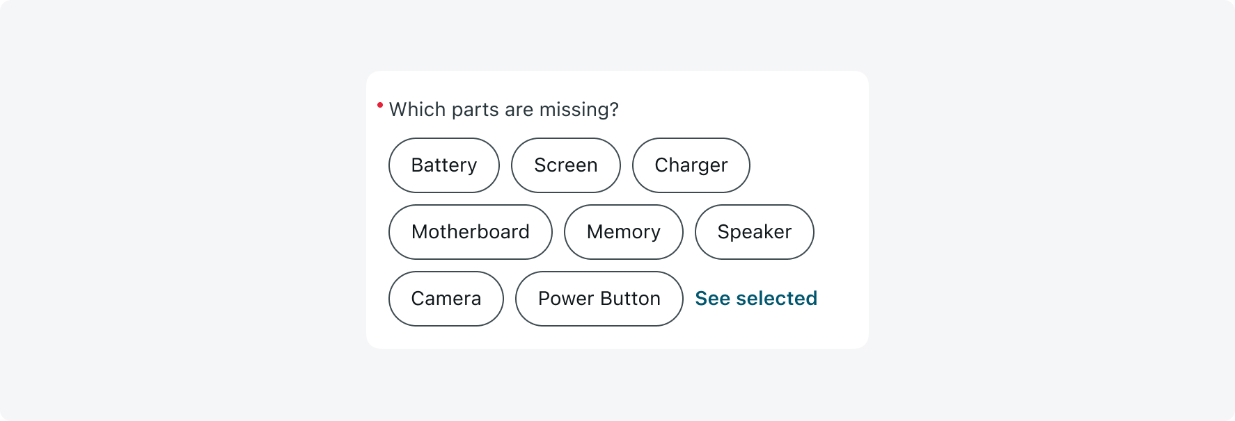
Once the user makes a selection on the new screen, the button’s microcopy that directs them to the screen will change to “See selected”:
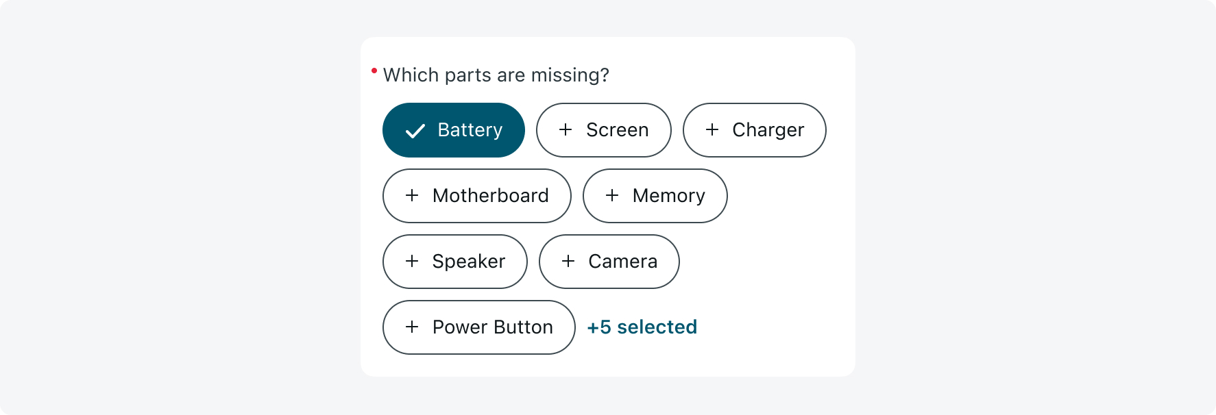
If it’s a multi-select choice input, the button will display the number of selected options:
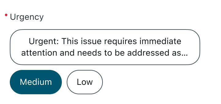
3. Description
Add a short description to the choice input to provide users with helpful context or guidance. This is ideal for simple instructional text.
4. Descriptive Element
Use descriptive elements combined with choice input to offer additional visual or textual guidance above an input. These can include plain text, rich text, or images.
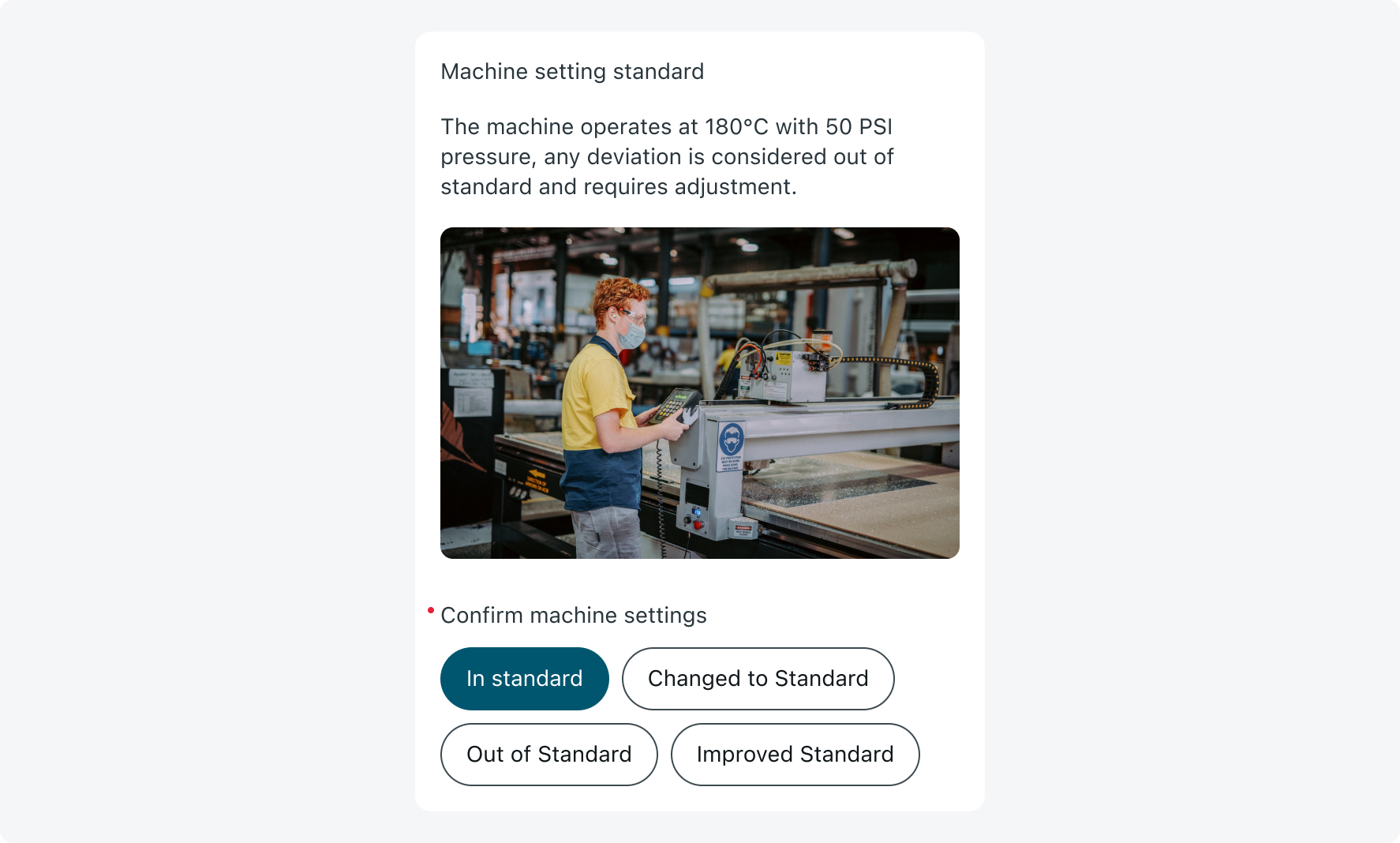
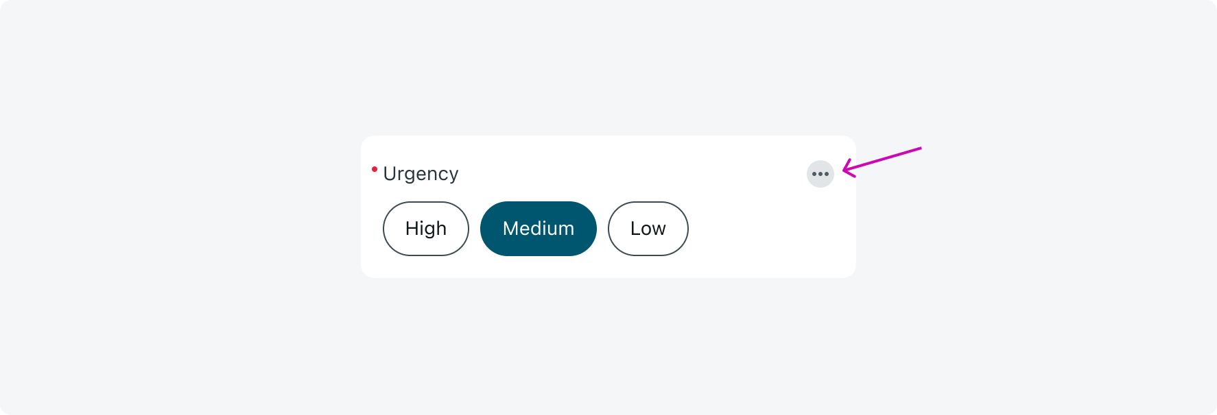
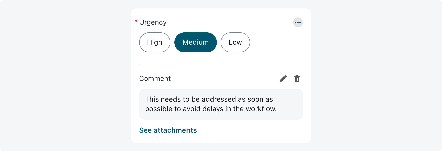
5. Input actions
Add an actions menu to the choice input to allow users to perform tasks like adding a comment, attaching multiple images, or navigating to other screens. Input actions are only available when the form is configured as a screen (not modal).
Here's an example of a choice input where a user added a comment and multiple attachments:
The chip text should be limited to a maximum of 2 lines
A chip with more than 2 lines of text will be truncated
- Avoid configuring the “None” option in a multi-select choice input, as it can lead to situations where the user selects “None” along with other options, which may cause confusion:
Multi-select choice input shouldn’t be configured with the “None” option
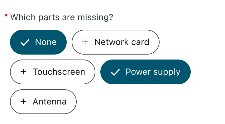
Configuring the “None” option in a multi-select Choice Input can result in conflicting selections that may cause confusion
- Configure dependent choices (where the content of the lower input depends on the selection in the upper one via a UI rule) by using a section. The section will group the two inputs together while maintaining adequate spacing between them to preserve a clear hierarchy and distinguish the two inputs.
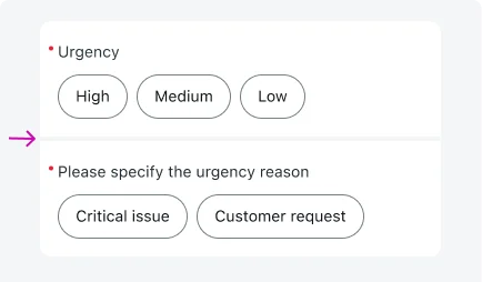
Using a section minimizes the space between the two fields and automatically adjusts their corner radius for a seamless look
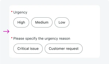
Configuring dependent choices without proper spacing can confuse users and cause unrelated fields to appear merged
- In cases where numerous choices need to be displayed together, it’s recommended to change the display type.
Although chips are the default display type, you can actively change the display from inline to new screen, so all choices are shown on a single screen.
Avoid setting a high maximum number of chips on one screen, as displaying too many may create an overwhelming experience for users.
Alignment and positioning
Align the input choice to the center of the screen, maintaining a 16 px margin from the screen edges and the Nav Bar.
States
The chip in the choice input has 5 states: Default, Disabled, Read-only, Long value, and Minimum value.
| State | Chip |
|---|---|
| Default |  |
| Read-only |  |
| Long value |  |
| Minimum value |  |
The choice input stretches in landscape orientation as the screen becomes wider.
Interactions
Learn how choice input responds when a user interacts with it.
Tapping on a chip
When a user taps on a selected chip, it will deselect it:

In a single-select choice input, tapping on a different chip will deselect the current choice and select the new one:

In a multi-select choice input, tapping on a different chip will add the new chip to the current selection: