
Overview
Screen reader gives audible descriptions of visible content, helping people get information and navigate when they can’t see the display. On mobile platforms, popular screen reader tools like VoiceOver on iOS and TalkBack on Android integrate deeply with the operating system. It is crucial for designers and developers to understand the nuances of these different screen reader implementations and ensure that the user interface and functionality work seamlessly for individuals relying on this assistive technology.
Principles
Here are some key principles for designing effective screen reader experiences on mobile devices:
- Enable Intuitive Navigation: Implement support for common screen reader gestures and keyboard shortcuts to allow users to easily explore the interface, activate controls, and move between different areas of the app or website.
- Maintain Contextual Awareness: Clearly communicate the user's current location, focus state, and overall context through the screen reader to help visually impaired users build a mental map of the interface.
- Optimize for Dynamic Content: Ensure that the screen reader can properly detect and announce changes to the interface, such as pop-ups, notifications, and updated information, to keep the user informed in real-time.
Guidelines
The general sequence for screen reader announcements follows this structure: State, Name, Value, Role, Property, Interaction/Hint.
Definitions
State:
The current status of the element, which informs users about its current condition.
For example, a button can be in an "active" or "inactive" state.
Some states, like "dimmed" or "disabled," may be announced after the element's properties.
Name:
Also known as the accessible name, this is the text by which the assistive technology identifies the element within the mobile content.
The name may be hidden and only exposed to the screen reader, whereas a label is presented to all users.
In many cases, the label and the name are the same.
Value:
This is the specific content or setting associated with the element, such as the text within an input field or the selected option in a dropdown.
Role:
This is the text or number that identifies the function of the element within the mobile content.
For example, a role could indicate whether an image functions as a hyperlink, a command button, or a checkbox.
Property:
This refers to the unique features or traits of an element. For example, a text input field could have a "required" property.
Interaction:
This describes what users can do to interact with the element and the resulting actions.
For example, "double tap to open" a list item. Interactions should comply with the system settings and, in most cases, do not require detailed specifications.
1. Clarify navigation and interactions
Make it easy for users to understand the current location within the overall app or website structure. For each element, clearly indicate the current focus and selection state and provide instructions for complex gestures or multi-step interactions.
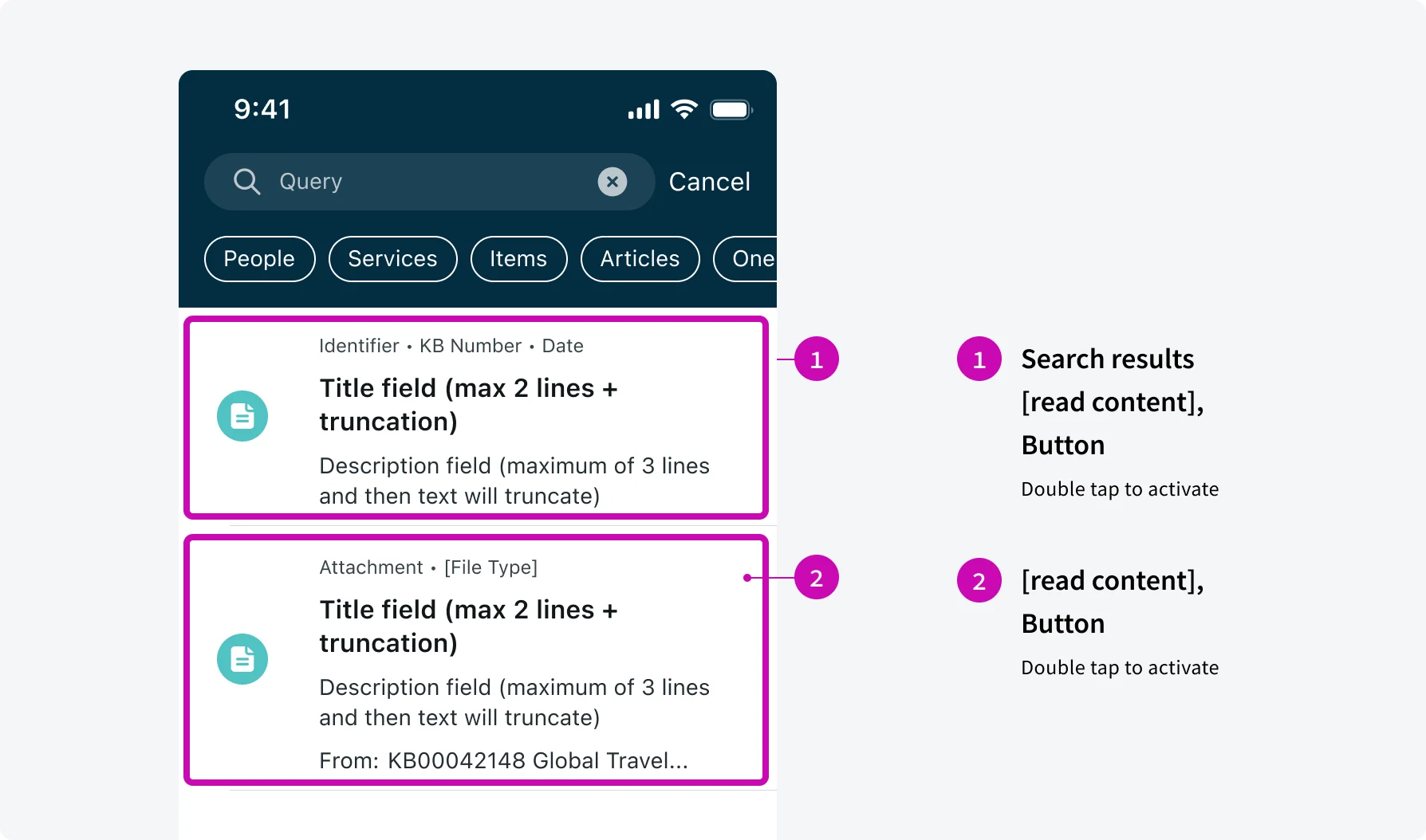
Announce “Search results” before the first item to indicate the search results.
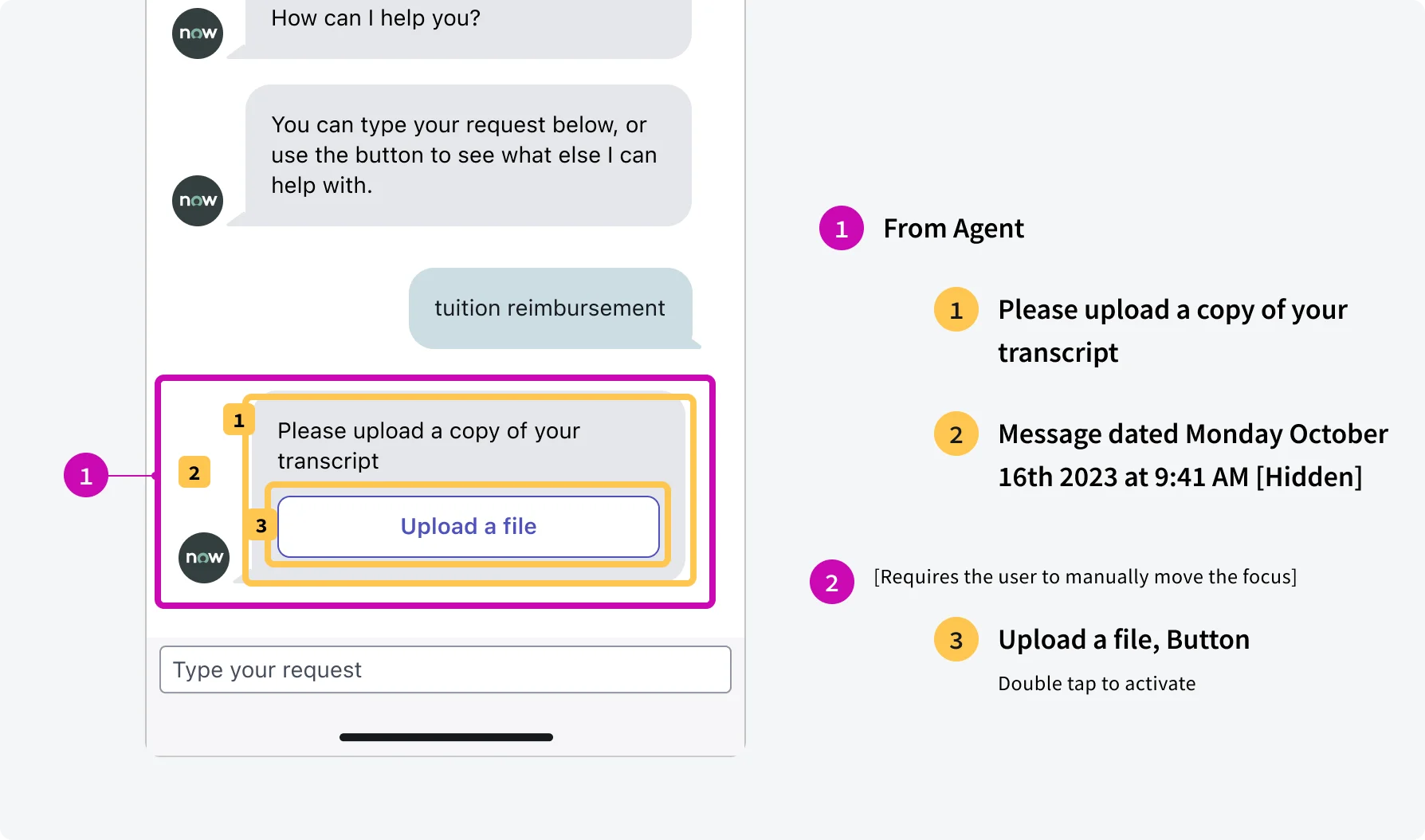
Add “From Agent” or “From you” to indicate the message author. If the message contains actions, require users to manually move the focus.
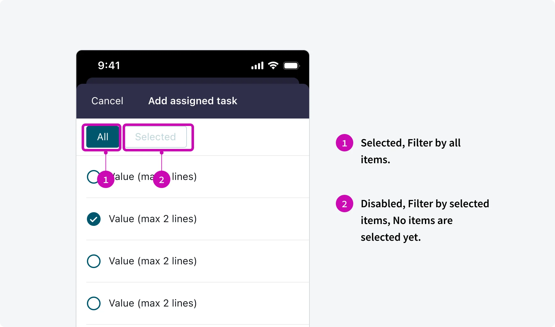
Indicate the “Selected” and ”Disabled” at the beginning of the screen reader announcement.
2. Optimize content structure
Break up content into logical, manageable chunks with appropriate spacing and formatting. Ensure lists, tables, and other structured content are properly marked up for screen readers.
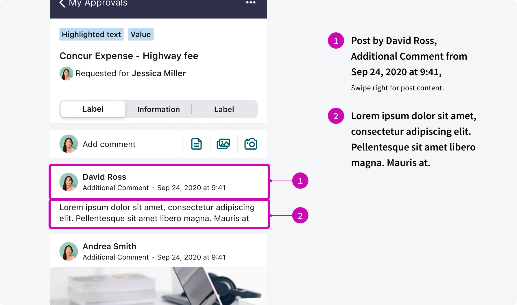
Separate the announcement of post details (author, timestamp, etc.) from the post content in an activity stream to enable screen reader users to efficiently navigate and selectively consume the information.
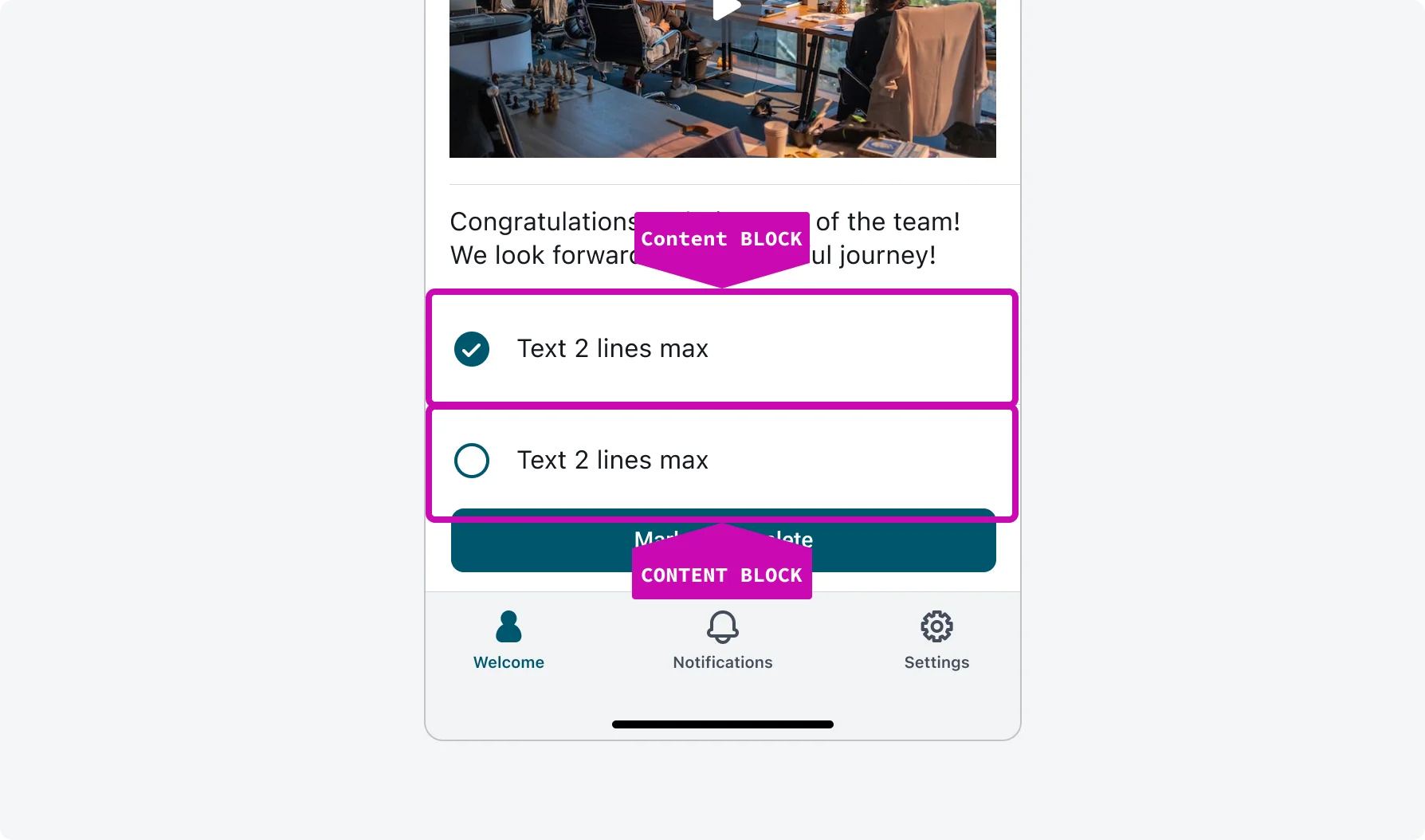
Break options into separate content blocks for better clarity.
3. Provide meaningful labels and names
Ensure all interactive elements have clear, descriptive labels or accessible names that convey their purpose. For icons or images without text, provide concise alternative text descriptions.
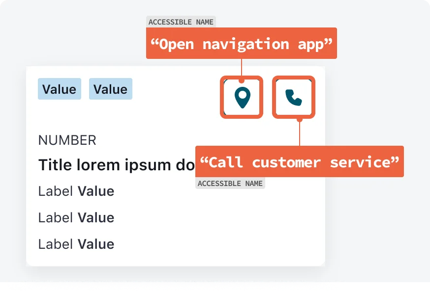
Announce “Open navigation app” for location icon and “Call customer service” for phone icon.
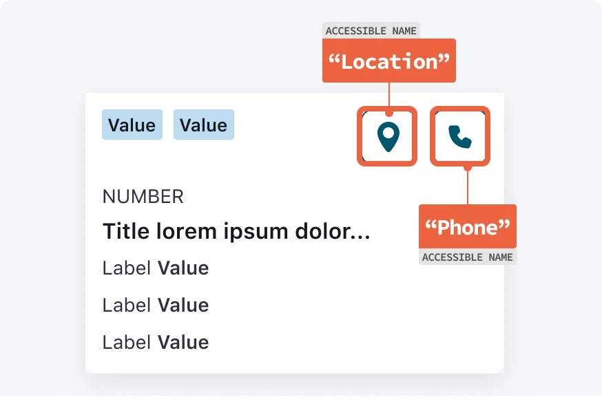
Announce the icon name instead of the action.
4. Communicate dynamic changes
Announce updates to the interface, such as new content, error messages, or status changes, so screen reader users are aware of the changes.
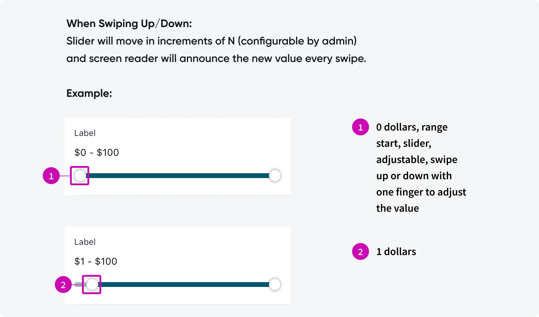
Announce the slider value when user manipulates it.
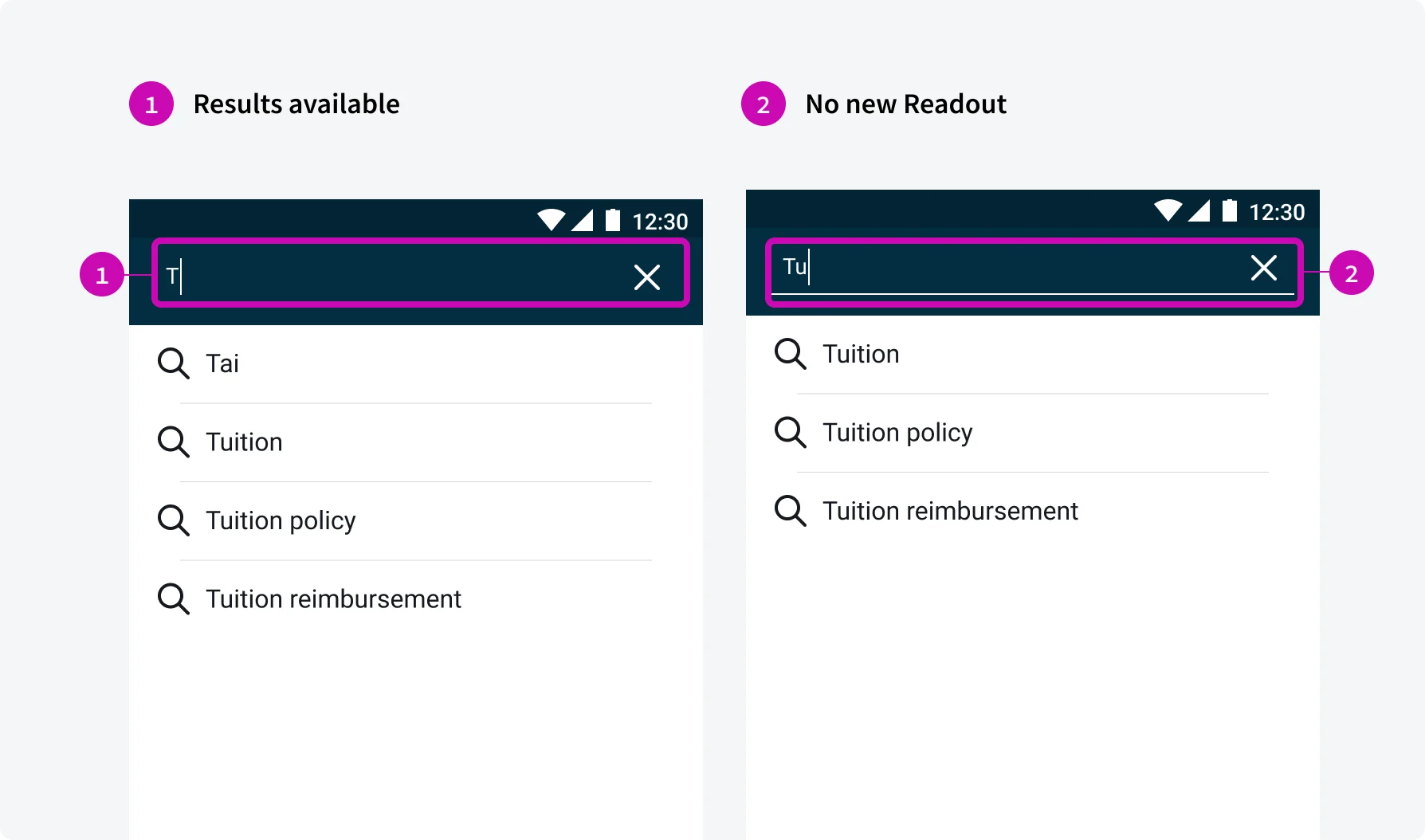
Inform users of results availability after users’ first type. Then no readout if the availability doesn’t change.
Testing
Testing screen reader support is a critical part of ensuring accessibility in our mobile applications. By verifying that content and interactive elements are properly announced, we ensure that users who rely on assistive technologies can navigate and understand the app effectively. Our testing protocols include:
Manual Inspections
Our testing team performs manual testing by navigating through the app's key user flows and observing the screen reader content.
