
Overview
Dynamic type sizes allow users to adjust text size to individual visual needs and preferences. This feature significantly enhances usability and readability, particularly for individuals with visual impairments or age-related vision changes. Distinct dynamic type scaling capabilities of iOS (Larger Accessibility Sizes) and Android (flexible font size controls) should be considered to ensure mobile interfaces with text content remain accessible and usable across a range of user preferences and visual abilities.
Principles
Maintain Readability: Ensure text remains legible and easy to consume even at the highest scaling levels, avoiding truncation or overlapping content.
Preserve Layout Integrity: Adapt the interface layout seamlessly as text size changes, maintaining the visual hierarchy and ensuring interactive elements remain accessible.
Provide Ample Spacing: Allow for generous spacing between UI components to account for increased text size, preventing crowding or unintended occlusions.
Guidelines
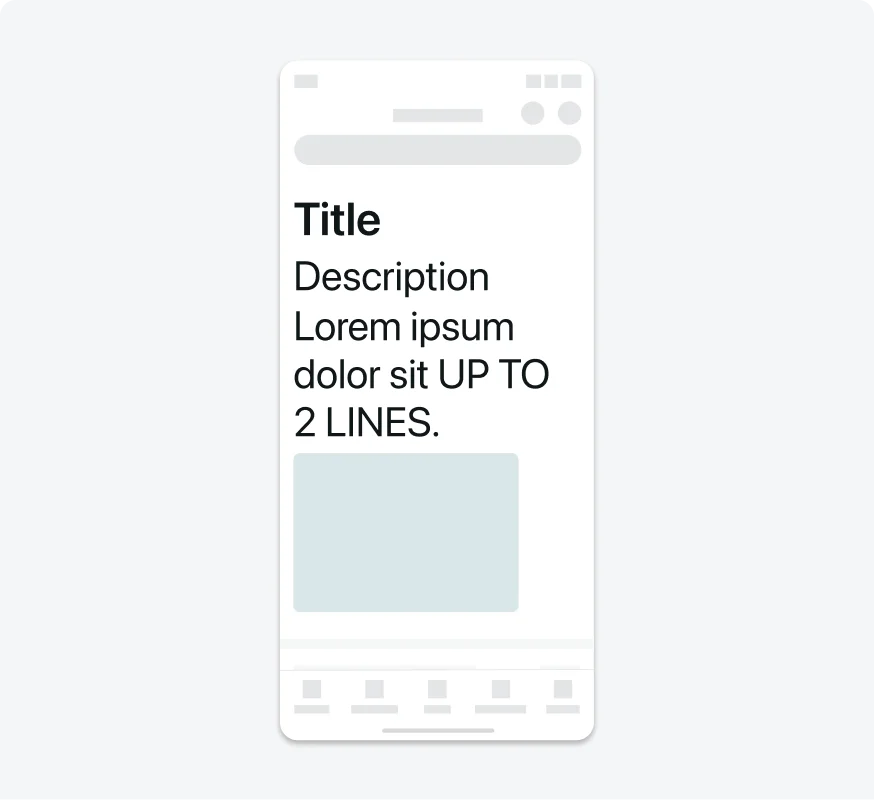
For each string of text, there are 3 dinamic text size implemation possible:
1. Full implementation:
In this case, the text size can support the largest accessibility text size. In iOS, this means increasing the text size up to 26pt, while in Android, it's increased by up to 200%.
2. Limited implementation:
This implementation is used when a design cannot support the ‘full implementation’. In this case, the text size can support only larges accessibility text size. In iOS, this means increasing the text size by up to 6pt, while in Android, it's may applied only for cards that their text can increased by up to 130%.
3. No change:
The text size remains the same. This should be used if the design simply cannot support limited or full implementation. Elements that typically require no change include tab bar labels on iOS and Android, segmented controls on iOS, item section labels, calendar components, footer buttons, and table headlines.
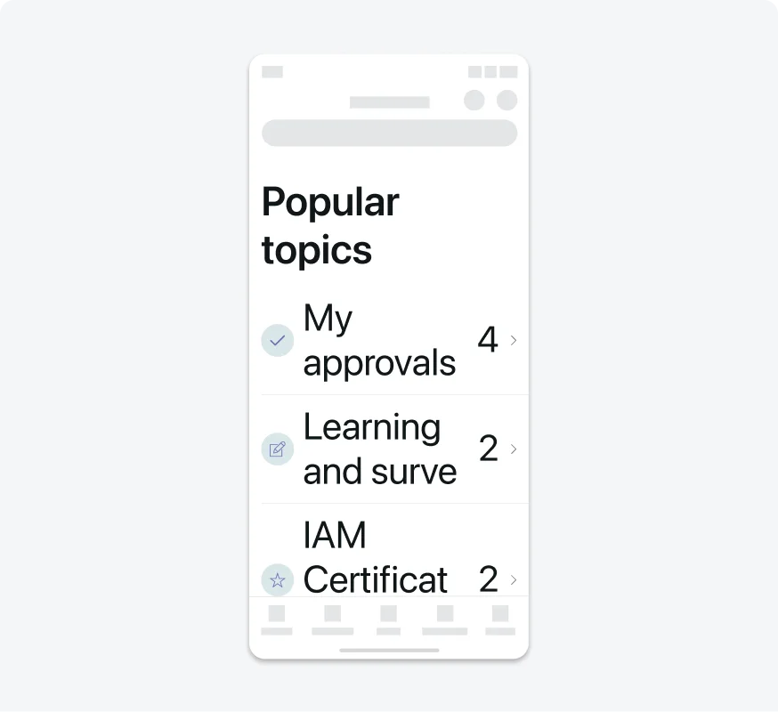
1. As font size increases, keep text truncation to a minimum
Focus on keeping text fully visible and avoiding unnecessary truncation as font sizes grow.
Allow text to expand naturally as font size increases, ensuring readability and preventing important content from being cut off.

Don’t cut off text in a way that hides important information or reduces readability.
2. Text should not be truncated without a way to view it all
Avoid truncating text in scrollable regions unless people can access the rest of the content in a separate view.

Ensure all text is fully visible, or provide a clear mechanism for users to expand and read the entire content.

Don’t truncate text in a way that hides important information without offering a way to view it fully.
3. Indicate when text is truncated
Use an ellipsis (…) to clearly show that text has been shortened.
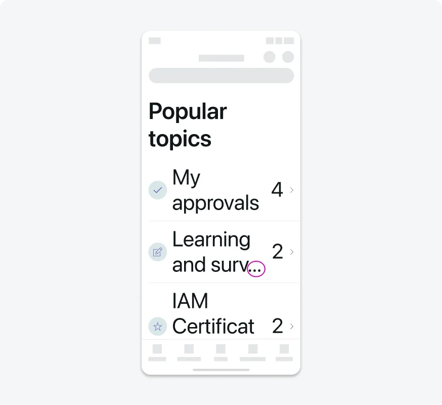
Add an ellipsis (…) whenever text is truncated to indicate missing content.
Don’t truncate text without using an ellipsis, leaving users unaware that part of the content is hidden.
4. Consider adjusting layout at large font sizes
Large font sizes in inline layouts can lead to truncation or overlapping text and secondary items. To address this, opt for a stacked layout with text positioned above secondary items. Similarly, with multiple text columns, reducing the number of columns as font size increases can prevent truncation and enhance readability.
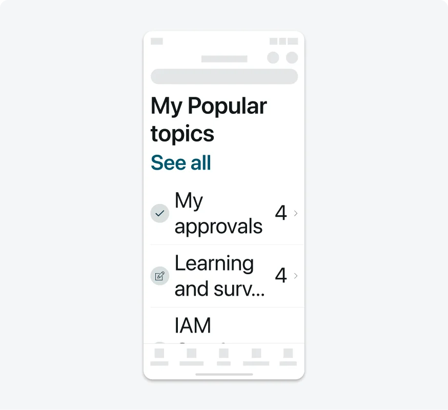
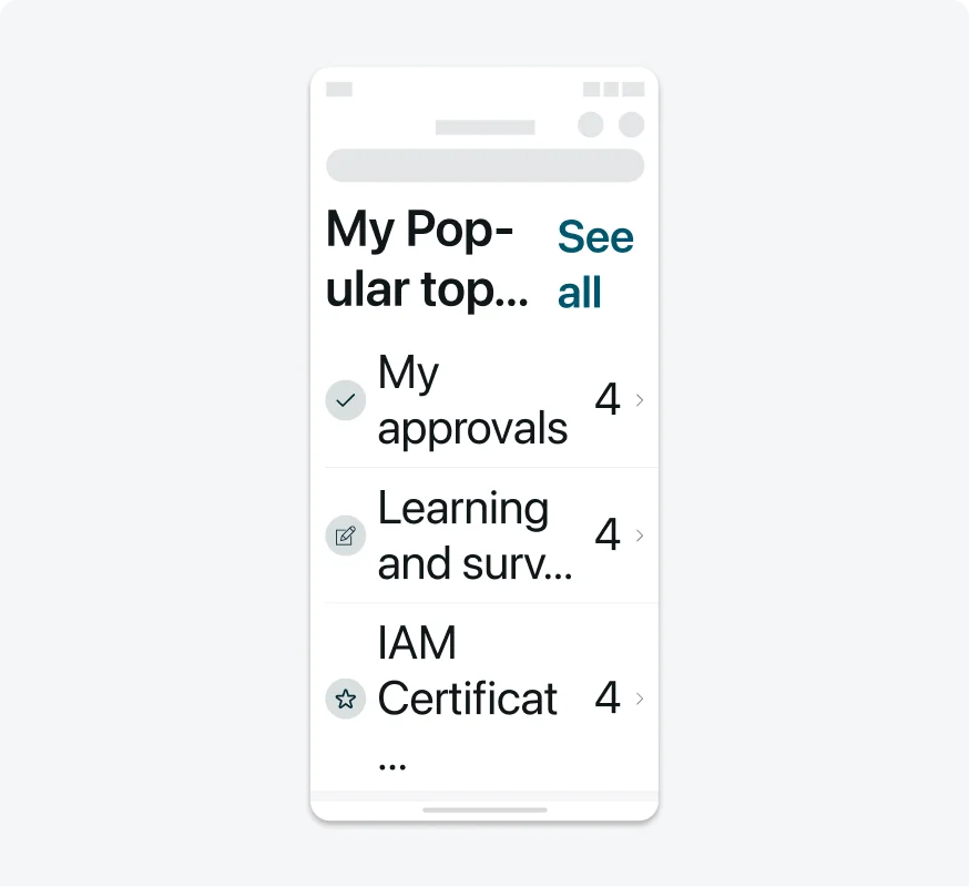
In portrait orientation, the “See all” button is stacked under the section title to avoid truncation.
In portrait orientation, the title truncates to maintain the inline layout under larger type size, preventing users from accessing the complete information.

In landscape orientation, the section title is inline to “See all” button to provide easy access.

In landscape orientation, a stacked layout makes it harder for user to access content.
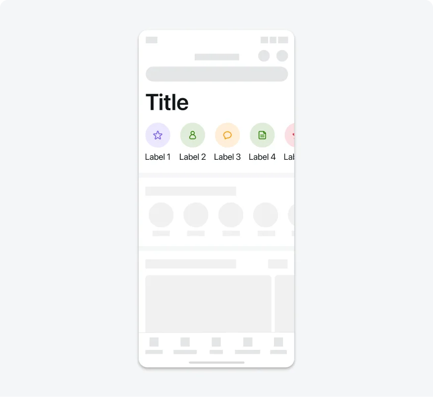
Label text is not increased to largest type size to maintain consistent information hierarchy.
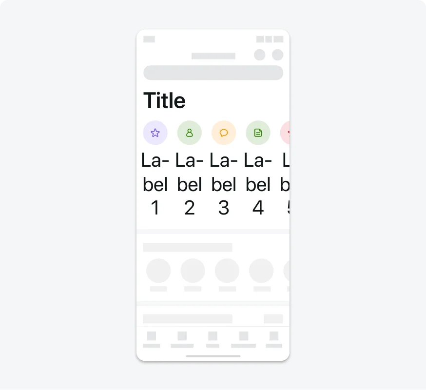
Label text is increased to largest type size, breaking the original hierarchy.
6. Perserve space when increasing type sizes
Make sure that enlarging sticky elements does not significantly reduced the the available space that left on the screen.
Keeping the inline layout of buttons when increasing the button type sizes saves space of the screen.
Stacking buttons takes too much space of the screen.
7. Consider enlarging elements that are related to the text
Scale up the size of essential interface icons with the font size increase. Ensure that interface icons used to convey critical information remain easily visible at larger font sizes.

When the font size increases, essential interface elements should also grow to maintain visual balance and legibility.
Don't keep icons small when text scales, as it creates a visual disconnect and reduces legibility.
Treatments for Specific Operating Systems
1. On both iOS and Android, mobile views content can be enlarged only to the large text (and not to the larger one).

Ensure content can be resized up to the designated large text size, maintaining readability.

Don’t allow content to exceed the largest size, as the card container does not adjust properly

Keep Segmented controls at a fixed size, independent of text size settings.

Don't Attempt to resize Segmented controls based on text size.
Nav Bar titles should always be displayed at 20 pt.
Don't display Nav Bar titles at any size other than 20 pt
The Tab Bar is always fixed.
Resizing the Tab Bar labels is restricted.
Testing
Testing dynamic type size is an essential part of ensuring accessibility in our mobile applications. By verifying that text scales correctly according to the user’s system settings, we improve readability and ensure a consistent experience for users with varying visual needs. Our testing protocols include:
Visual Inspections
Our testing team performs manual testing by navigating through the app's key user flows and observing the dynamic type scaling behavior.
