


iOS
Android
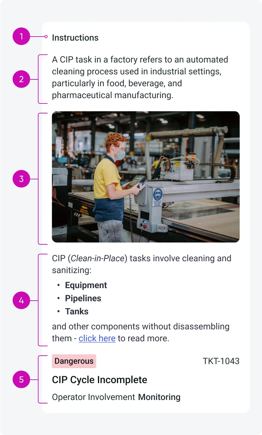
Descriptive elements can include:
- Label: The label can act like a title, it Identifies or summarizes the purpose of the descriptive content. It can be visible or hidden (configurable), each descriptive element can only have one label.
- Plain text: Provides straightforward, unformatted textual guidance or information.
- Media: (only images) Visual aids that help illustrate or clarify content for enhanced user understanding.
- Rich text: Enables formatted text that can include bold, italic, hyperlinks, and other formatting options to emphasize or clearly structure information.
- Mobile card: Displays additional data and information from multiple database tables.
Each descriptive element can appear independently or combined in any order, descriptive elements are fully configurable by the admin.
Configurations
As an admin, you can enhance the input form experience by adding descriptive elements such as plain text, rich text, or images. You can add descriptive elements to:
- Individual input fields - descriptive element that is mapped to an input
- Sections that contain input fields - standalone descriptive element in the top of a section with more inputs below
- Sections that contain only descriptive elements (no inputs) - single standalone descriptive element in a section
Supported descriptive element types
- Rich Text - Supports HTML formatting such as bold, italic, underline, bullet/numbered lists, and font color. Read more about configuring the HTML toolbar.
- Text - Plain text without formatting.
- Image - A single image to visually support the context.
- Mobile card -
- Data can be retrieved from multiple database tables.
- The card does not support images, videos, or buttons.
- The card’s background and text color can be customized based on predefined values.
- Only a single card can be included.
- Compatible with card builder templates 6, 7, 17, 19, and 20.
Configuration options
As the admin, you can configure the following for each descriptive element:
- Placement – Attach it to a specific input field or display it as a standalone element at the top of a section.
- Label Visibility – Choose whether to display a label above the descriptive element.
- Display Order – Define the order of the descriptive element relative to other elements in the section.
- Divider/Spacing – Enable or disable a visual divider (spacing) between the descriptive element and the element that follows (another descriptive element or an input).
These options allow you to structure your input forms in a way that improves clarity and user guidance.
Variants
Descriptive elements can either be single elements or combinations of multiple descriptive elements. A combined descriptive element is considered a single unit (combined means no spacing between each element). Descriptive elements can be added to either form sections or individual input fields, depending on the type of guidance or context you want to provide to users.
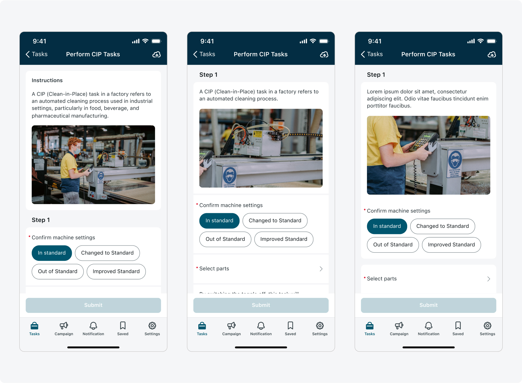
Standalone descriptive element - Mapped to section
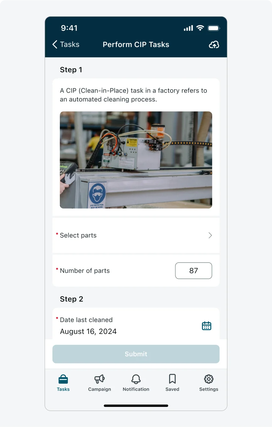
When a descriptive element is mapped to a section, it serves as standalone content that provides high-level guidance or contextual information relevant to the entire section or even the entire page (when the section appears at the top of the screen). When mapped to a section, descriptive elements are always displayed at the top of the section (their placement within the section is not configurable).
Example use cases:
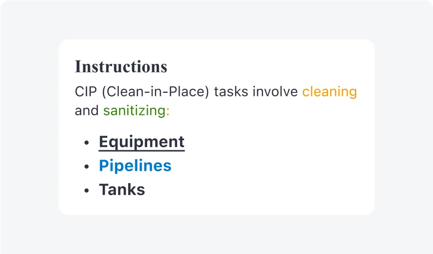
- A section-level text block explaining the purpose of a form step: "Please review the customer's site details and update the maintenance checklist accordingly."
- An image descriptive element at the beginning of a page that shows a floor plan - to orient the user before they begin answering location-related questions.
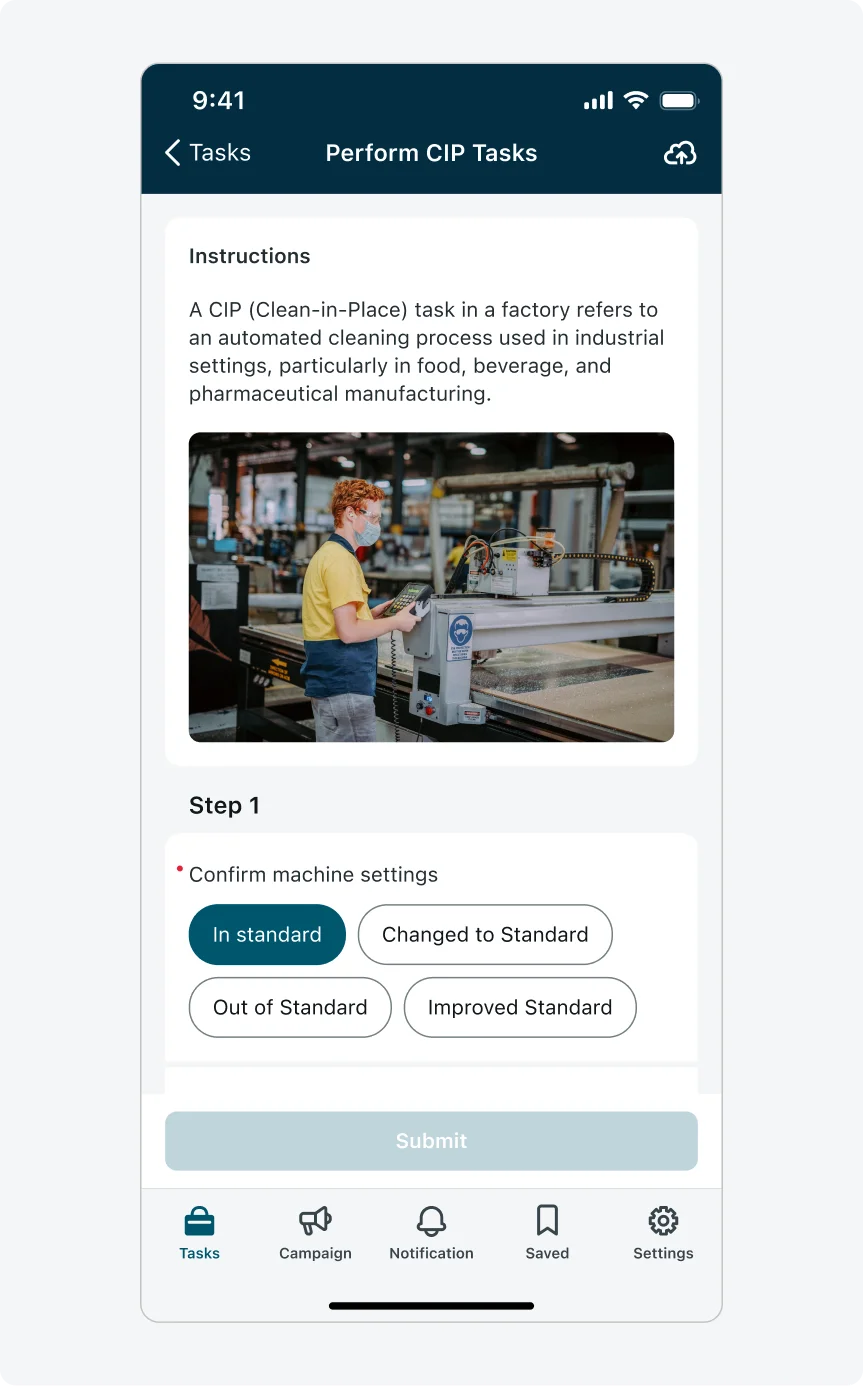
Mapped to a section: Serving as a guidance to the whole page
Mapped to a section: Serving as a guidance to the section
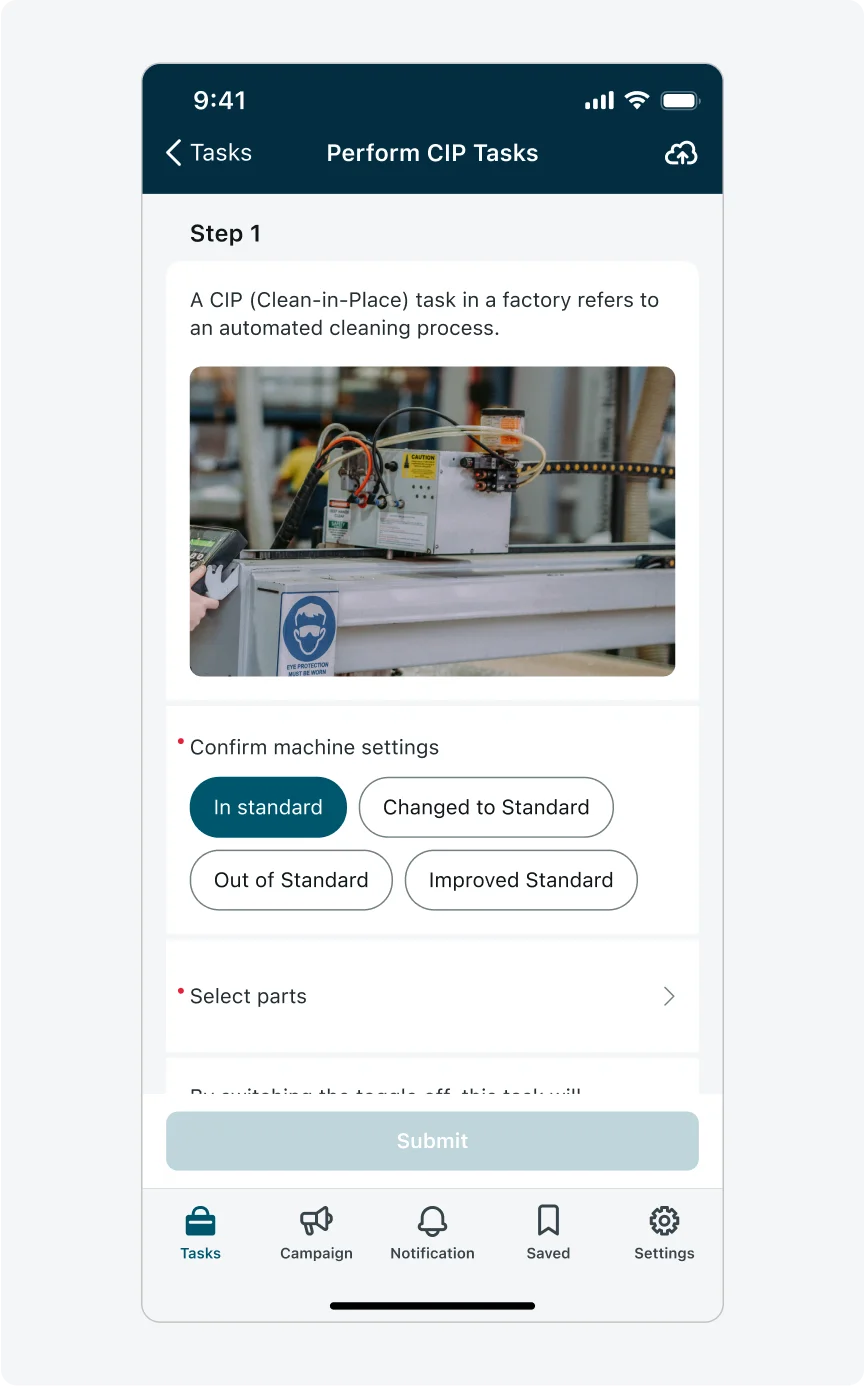
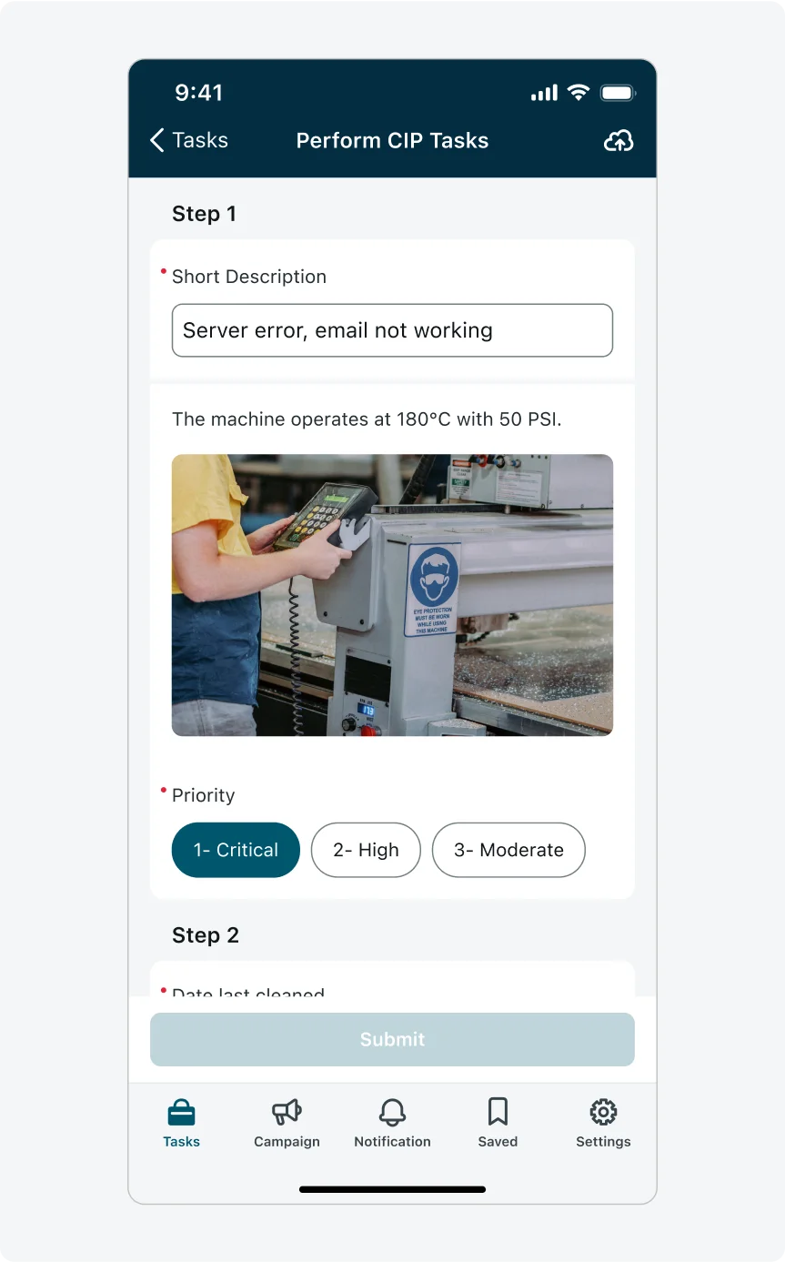
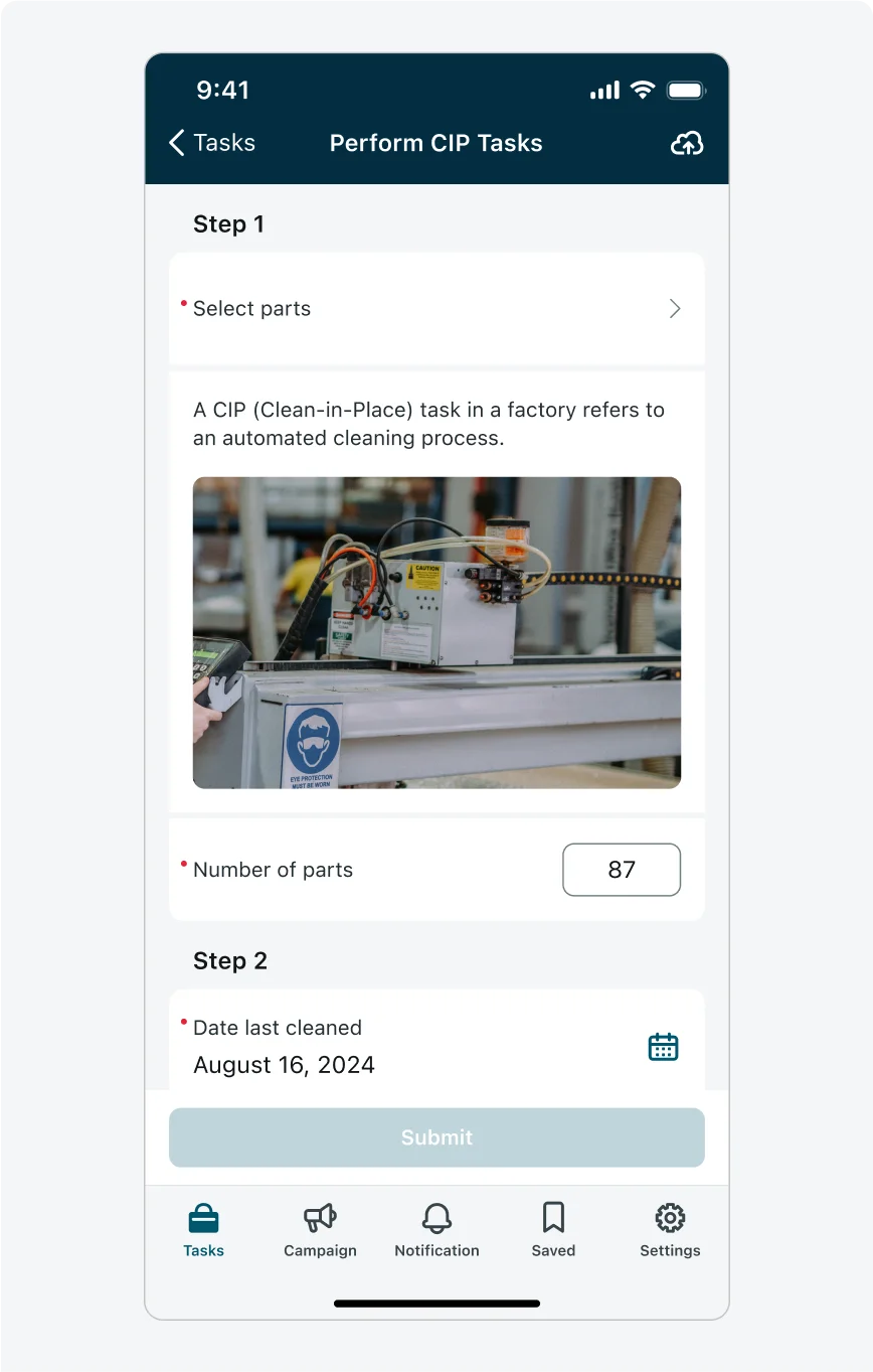
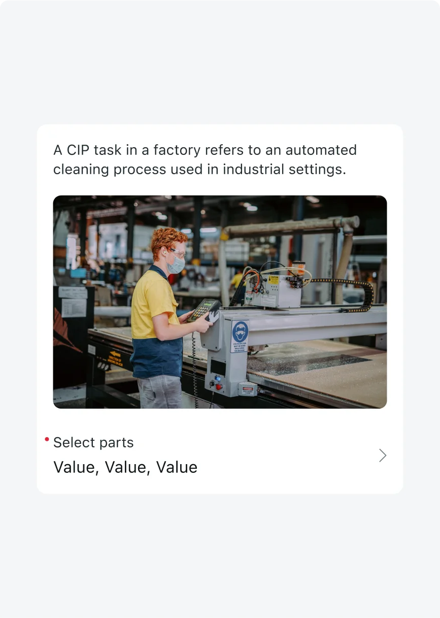
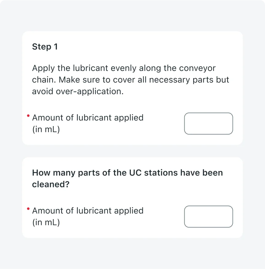
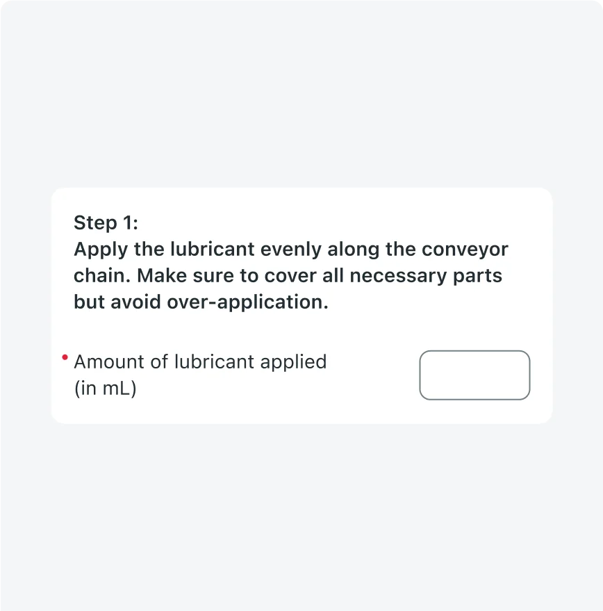
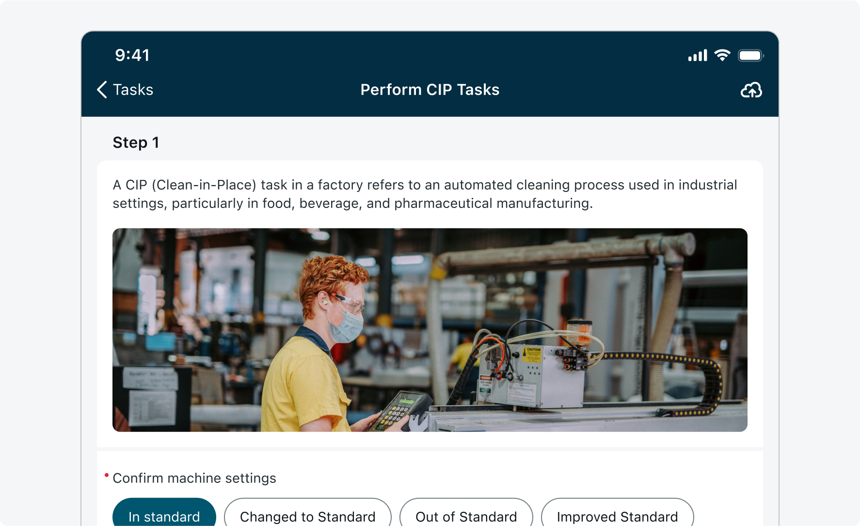
Descriptive element - Mapped to input
When a descriptive element is linked directly to an input, it offers specific guidance to help the user better understand how to fill in that input field. When mapped to an input, descriptive elements are always displayed above the associated input field, regardless of whether the input is inside a section or placed outside of any section.
Example use cases:
- A plain text note above a "Date of Visit" input: "Enter the actual date the inspection took place, not the date it was scheduled."
- A rich text block for a "Comments" field: "Please include any relevant details about the customer request, such as urgency level or previous service history. Bullet points are allowed."
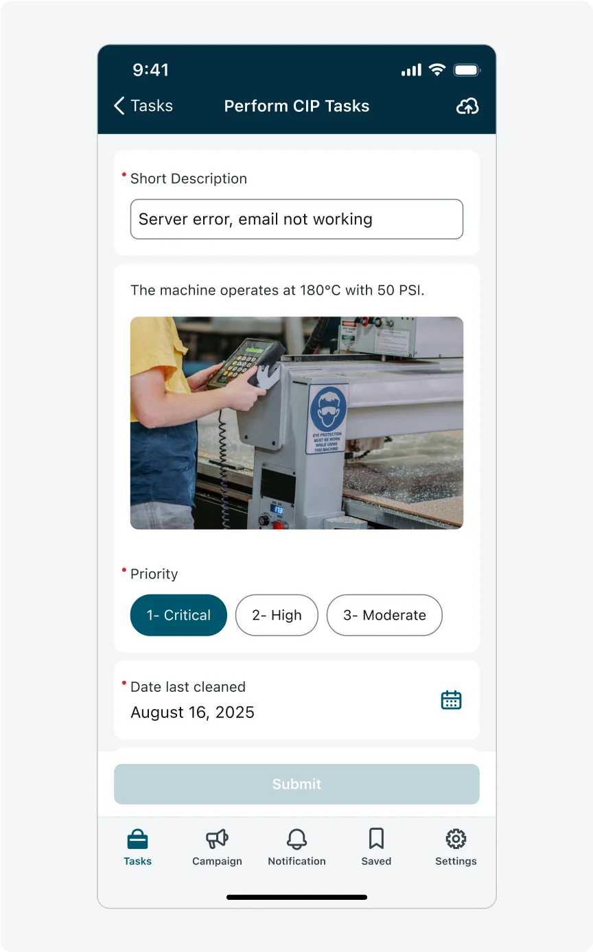
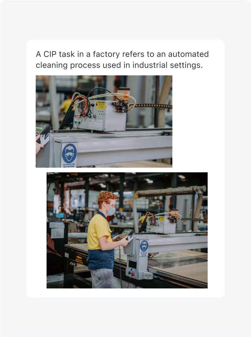
- An image showing an example of how to properly label equipment when filling in a "Label Photo Upload" input.
Mapped to input in sections layout
Mapped to input in no-sections layout
Place standalone descriptive elements at the top of a section. This is the only supported location for a standalone descriptive element that is not mapped to an input.
Don’t place standalone descriptive elements in the middle or end of a section. If you need a descriptive element to appear lower in the section, it must be mapped to an input.
2. Rich text usage
- Ensure rich text formatting enhances readability without overwhelming users.
- Only use rich text formatting if necessary; otherwise, always prefer the default plain text and label options.
- Use the label as the title and plain text for the primary content, employing bullet points, numbered lists, and bold formatting judiciously to highlight important information clearly.
- Avoid using rich text if possible, as it impacts accessibility and may cause the component to not be accessible. If you must use rich text, avoid changing colors and font styles excessively, as this may cause visual overload, create inconsistency within the overall UI, and negatively affect aesthetics.
- Ensure the colors you select are accessible and limit the number of colors you use. It is recommended to use colors already existing in your app’s theme.
- Limit the number of font sizes to a maximum of two to maintain readability and establish clear visual hierarchies.
3. Adding media

Add images by adding a media element and combining it with the other descriptive elements (in figma: toggle one of the “Image” properties in the descriptive template’s properties panel).
Avoid adding media inside of a rich text element, the rich text formatting allows adding media but it may not look consistent with other media through the form and cause accessibility issues.
4. Combining descriptive element with input
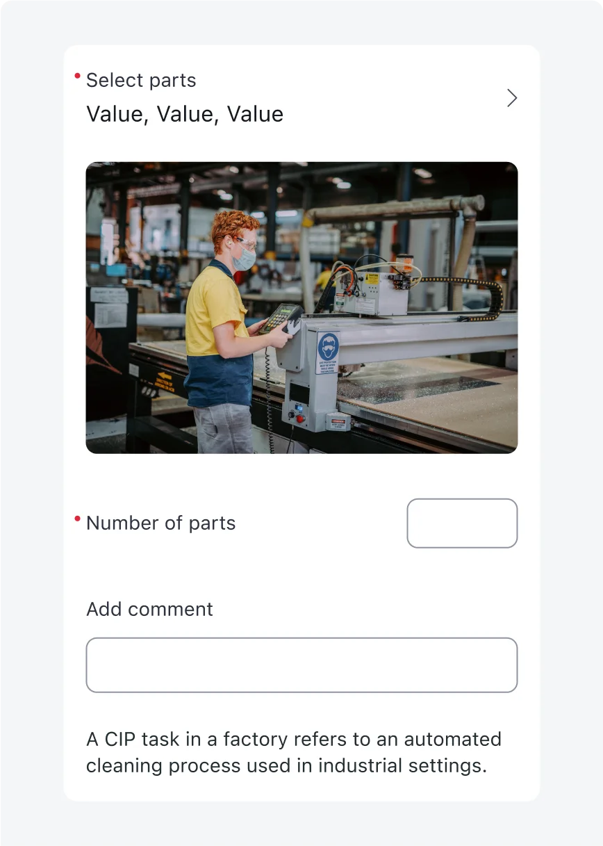
- Map a descriptive element to an input to provide information about that specific input.
- A mapped descriptive element will appear combined above and on a unified white background.
- To add it in your designs in figma, select any input and toggle on “🧩 Descriptive Element” in the properties panel.
- Don’t add mapped descriptive elements under inputs, that is not possible to develop.
- Avoid combining multiple inputs in this method, this breaks hierarchy and reduces readability. To combine and group inputs use sections.
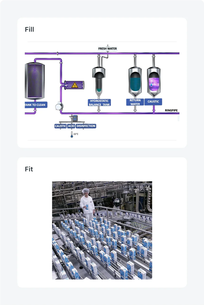
5. Media fill/fit
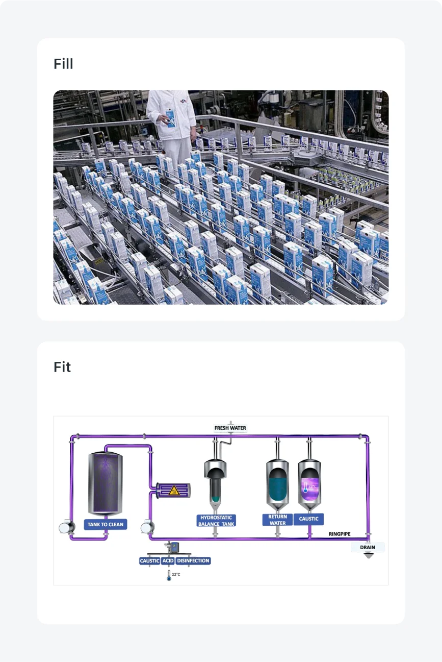
- For most images use “Fill” setting. In “Fill”, Images adjust to the configured height and get cropped to fit the dimensions.
- Use “Fit” setting for images with white background or no background. In “Fit”, the image adjusts itself to fit the proportions by adding white background.
- Avoid using fill if you don’t want the content of the image to be cropped.
- Avoid using fit for images with background.
6. Label as title
Use the label of the descriptive element as the title, and plain text for bigger amounts of content.
Avoid using the label to present large amounts of text.
Alignment and positioning
- Standalone descriptive elements should always appear at the very top of the screen or at the top of sections.
- Mapped descriptive elements should always appear directly above the associated input.
- Align the descriptive element to the center of the screen, maintaining a 16 px margin from the screen edges and the Nav Bar.
States
| State | Descriptive elements |
|---|---|
| Default (Standalone) | 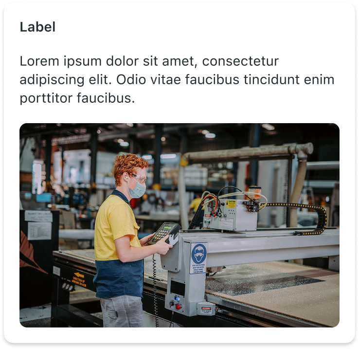 |
| Default (Mapped to input) |  |
| Loading/Shimmering |  |
| Error/Empty state |  |
Subcomponents states
| State | Descriptive element combinations |
|---|---|
| Label + Text |  |
| Label + Image |  |
| Label + Text + Image |  |
| Text + Image |  |
| Multiple Images | 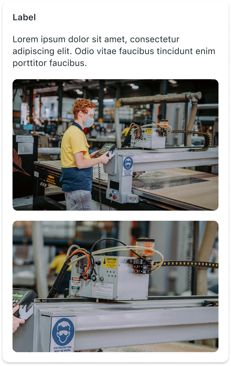 |
| Multiple text elements and images | 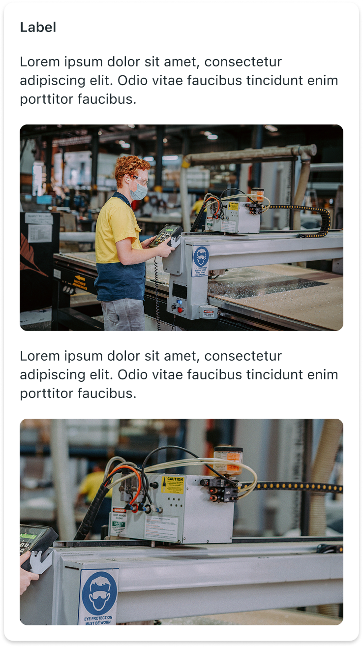 |
--
Responsive behaviors
Descriptive elements adapt responsively to different screen sizes and orientations by stretching to fit the width of the device.
Interactions
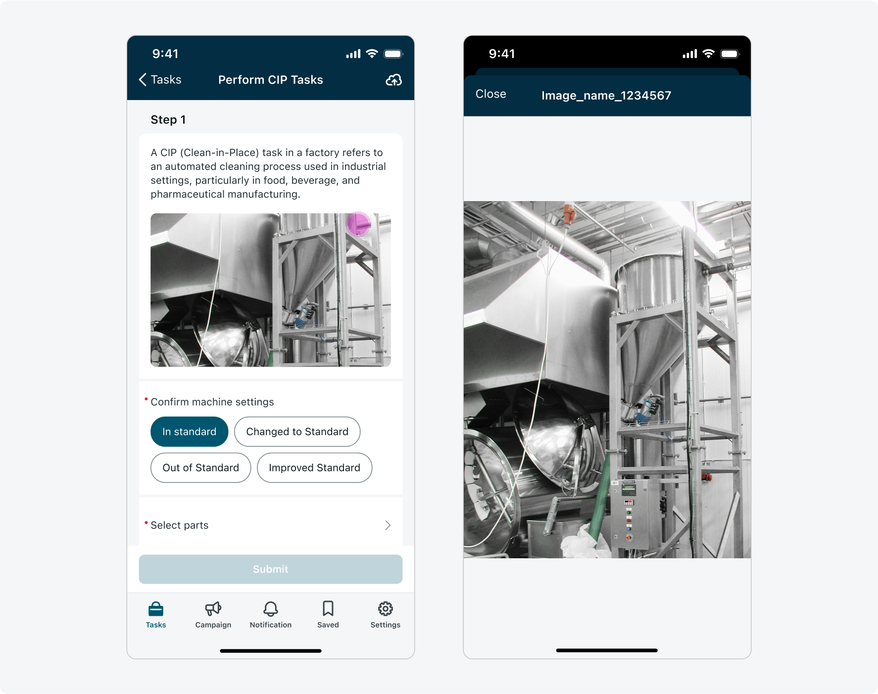
Descriptive elements are generally non-interactive and primarily provide informational context. However, media elements (images) can be tapped to view them in a full-screen preview.
Calendar screen
The FAB can appear on the calendar screen, guiding users to quick actions such as adding a new event.

For example: a FAB leading to multiple actions on the calendar screen.