Introduction
In Quebec and later releases, we support two methods to determine the formatting and appearance for fields in your screens. You can continue and use legacy cards which were supported since Madrid or use a mobile view (Combination of view template & card). However, we recommend using only cards as they better support accessibility and include additional enhancements.
For most places, you can choose between using legacy cards and cards. In some cases, like dynamic screen segment form headers, you must use cards, the same if you intend to have buttons in your cards.
Main differences between the new cards and legacy cards (These items are in addition to the existing differences):
- Text style configuration is supported only in cards.
- Video elements, background images, and opacity are supported only in cards.
- Image focus on face is supported only in cards.

Cards
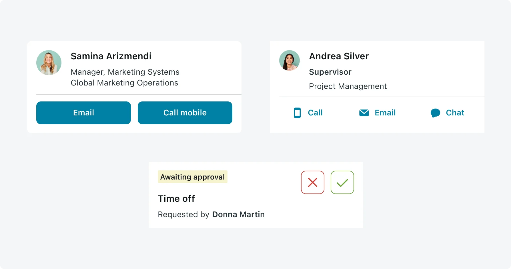
The new cards can be easily modified according to your needs using the Mobile Card Builder. Mobile Card Builder includes templates based on our recommendations. It is recommended to use our starter templates, existing templates modifications will be applied with no additional effort (for example, new text style support added in SD release). In case the starter templates do not match your needs, Mobile App Builder supports modifying existing templates and creating new templates from scratch.
- When using cards in a horizontal section or a vertical section with multiple columns, the section size is fixed. Verify your card is displayed correctly and all information is visible.
- In cases where a list is combined with different data sources, consider using the same card layout.
- The starter templates include a variety of cards some are best suitable for vertical section, horizontal section, different card sizes, as standalone, or only in screen context. Make sure the template chosen answers your use case.
- Text highlight – Consider using text highlight to help the user.
Cards support the following main components:
Text
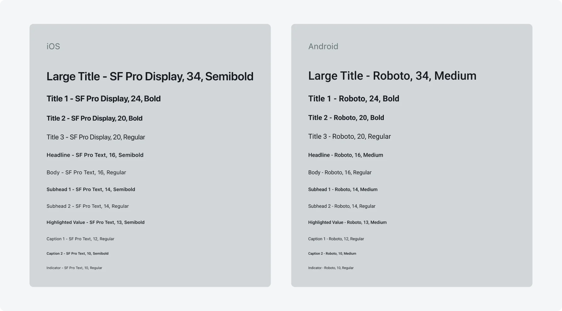
Accessibility support - Text style is supported in San Diego and above. Text style defines the font size and style and how it will behave in cases where the text is enlarged. Use the below supported text styles.

Image
- Consider using an image as the background for your card. When using an image as a card background, consider configuring background color with opacity for the text in order to make sure your card is accessible.
- Use Image focus on faces when your card includes images with faces, the image will be cropped and focus on areas where faces are detected.
Actions
- Use card actions as icons in cases where the icon is self-descriptive and the number of card actions is minimal.
- Use card actions text label in cases where there are no appropriate icons and it is important that the action is visible on the card without additional tap.
- Use a menu card actions in cases where you have multiple actions that you would like to show. Menu card actions increase the visibility of the actions.
- Be consistent in the way card actions are displayed on a screen. Do not combine both a menu and swipe actions or have a combination of cards in a list as icons while others are text labels.
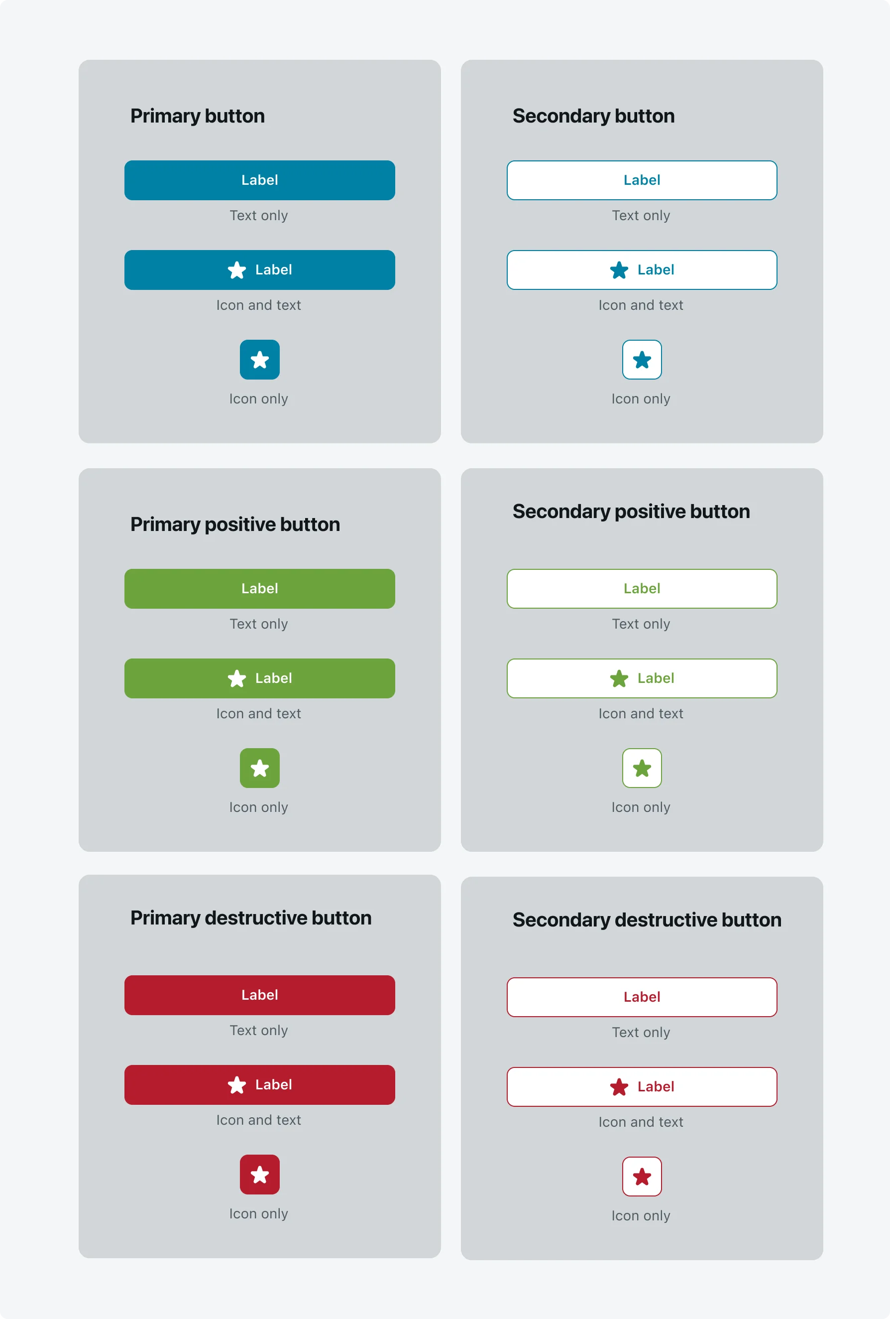
- Associate colors to your actions to indicate their function. You can associate brand, primary, secondary, positive, and destructive theme colors. Theme color association is supported with the button border, background, and text colors. View our recommended button styles here.

Video
- Video supports inline and full screen playback modes. The default playback mode is full screen. For inline videos we recommend configuring the video component to a ratio of 16:9, with 304 pixels wide and 171 pixels high.
- In case you want to add videos to small cards or in a video frame smaller than the above, it is recommended to use full screen playback mode.
- Video components support building rich and flexible cards. The video can be based on either a value from a field or a static URL. Cards can be used in different locations in the application such as record section, list, record screen header.


