iOS
Android
- Label - Describes the action.
- Icon - Visually represents the action.
Usage
To align with native platform guidelines and improve user experience, we are transitioning from custom action sheets (bottom sheets) to native context menus. This change is part of a wider effort to adopt native iOS and Android components and reduce reliance on custom-built solutions.
- Native context menus provide better performance, smoother animations, and a more intuitive user experience.
- Action sheets (bottom sheets) are no longer a standard iOS pattern and have largely been replaced by context menus - except in a few edge cases.
- Our current implementation of action sheets is custom and does not follow modern platform conventions.
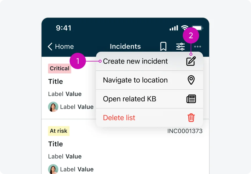
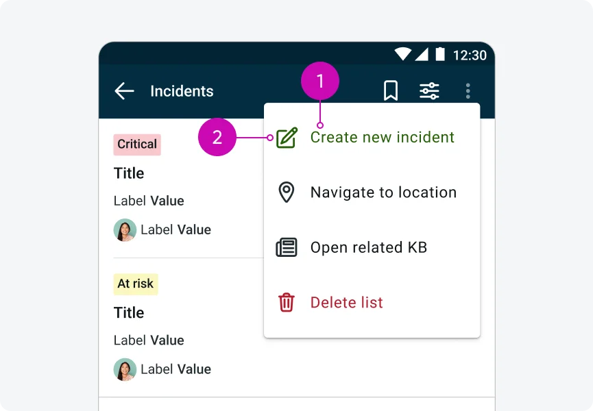
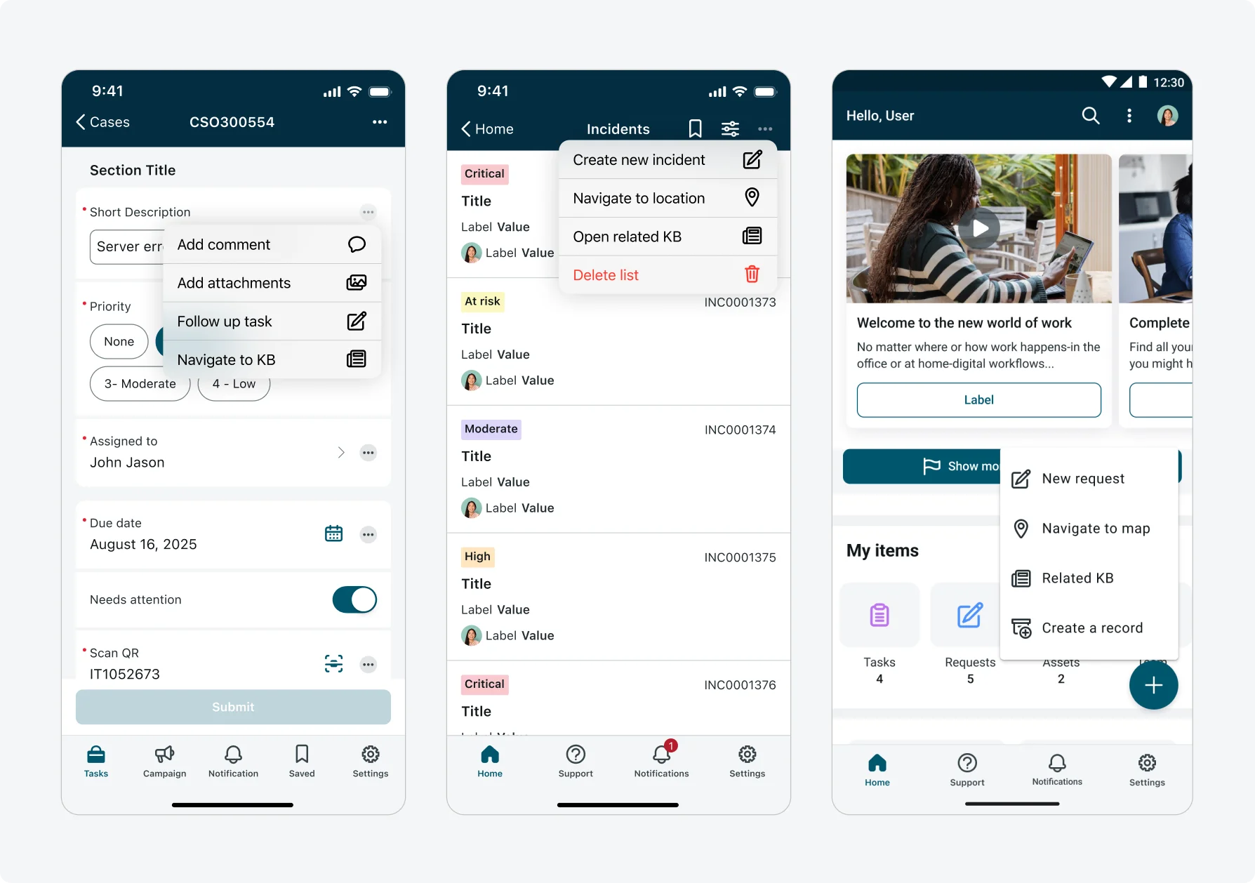
As of today, context menus are used in the following locations:
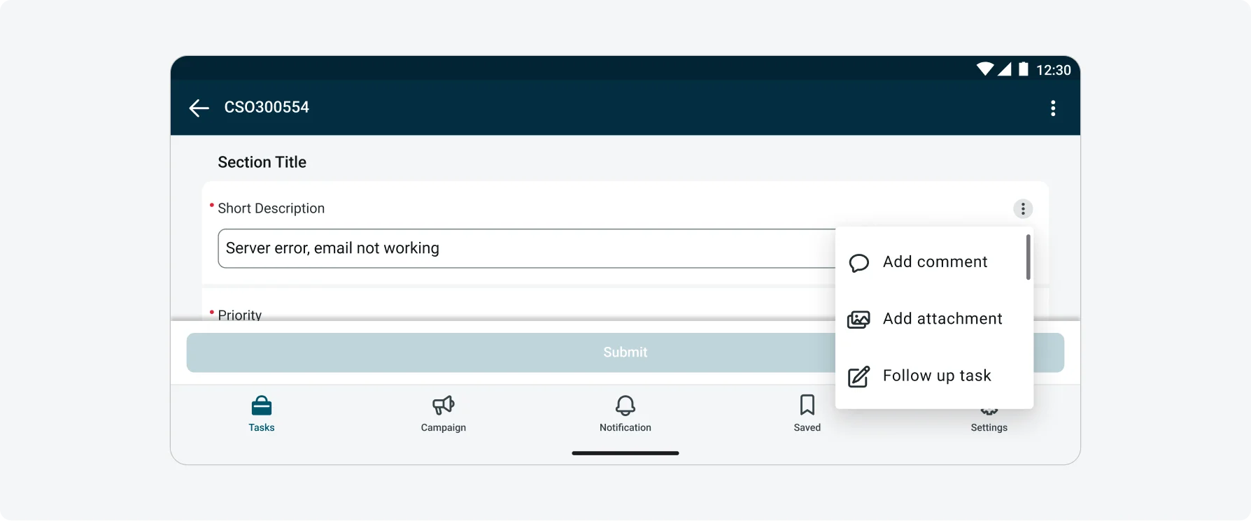
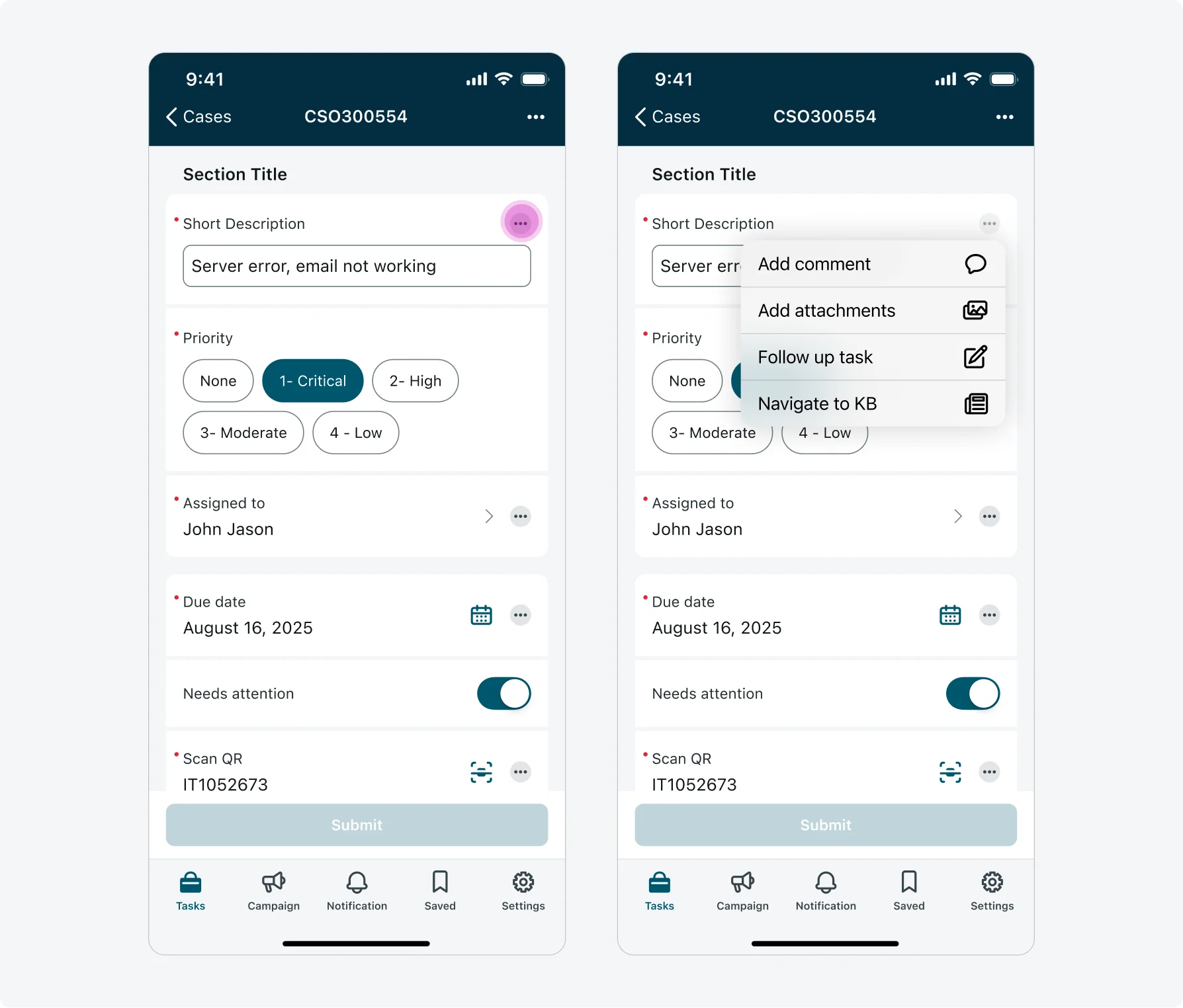
- Input actions menu (Input form screen)
- Quick actions (FAB for Android, top actions in ALP)
- Top actions across all screens, including: ALP quick actions (iOS), list screen, record screen, input form screen, map screen, indoor maps screen, calendar screen, chart screen, URL screen.
Note!
Context menus are generally preferred over action sheets for most actions. If you plan to introduce a context menu in a location where it has not yet been implemented, consider the required development effort and ensure the implementation follows the specifications and guidelines already defined.
Configurations
The Context Menu supports a limited set of configurations that vary by platform, based on native system capabilities.
iOS
On iOS, context menu are implemented fully out-of-the-box (OOB) using Apple’s native component. As a result, the following configurations are supported:
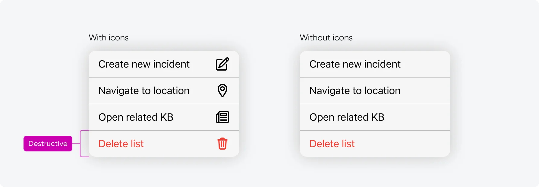
- Action types: Regular and destructive actions.
- Icons: Actions can be configured with or without icons.
iOS limitations
Due to the OOB native implementation, the following capabilities that were previously supported by custom action sheets are not available:
- Theming: Context menus use the system default color scheme, custom theming is not supported.
- Positive actions: Positive (green) actions are not supported in native iOS context menus.
Android
On Android, menus are implemented using a native component that allows for additional flexibility and customization. The following configurations are supported:
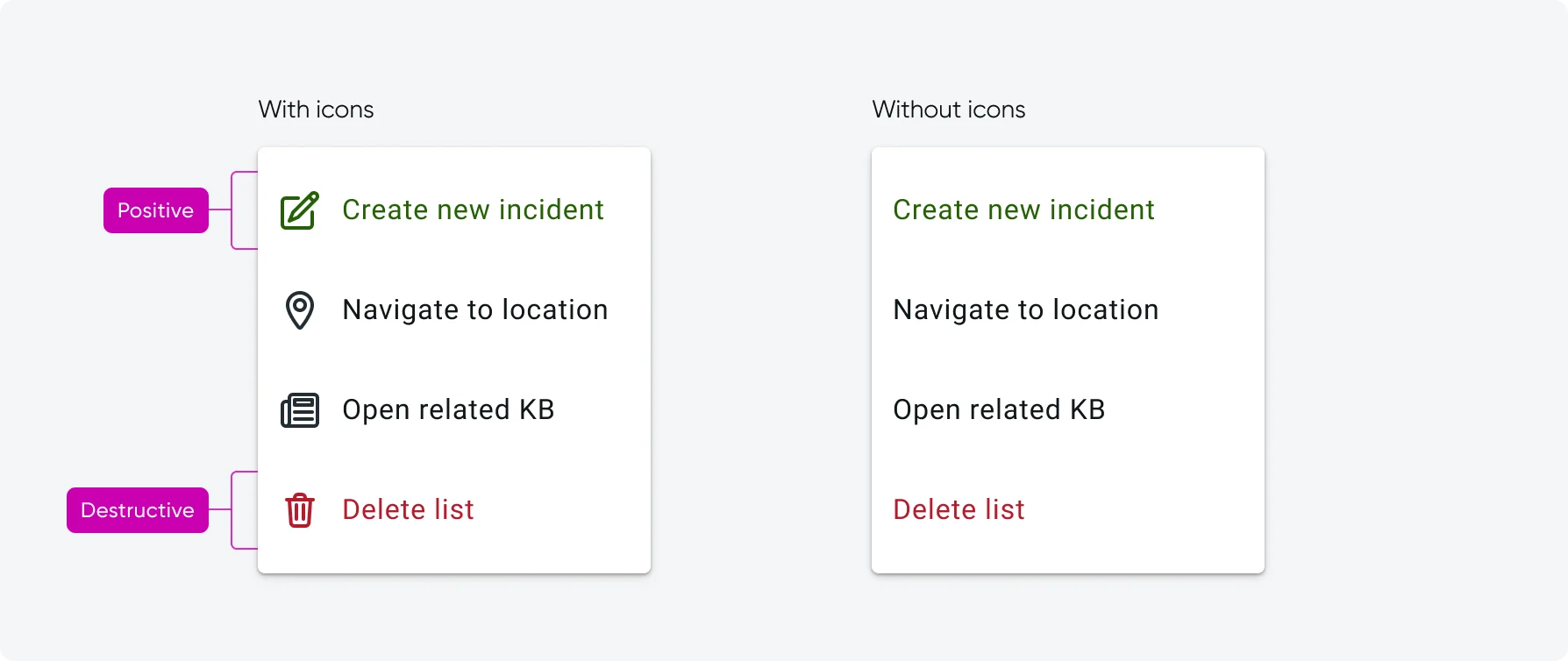
- Action types: Regular, destructive and positive actions.
- Icons: Actions can be configured with or without icons.
- Theming: Menu theming is supported and adapts to light and dark themes.
UI text guidelines
These are some recommendations for using text within context menus:
- Keep action labels short, clear, and concise.
- Avoid long or descriptive sentences to avoid truncation.
- Use verbs that clearly describe the action (for example: Edit, Manage, Add)
Subcomponent states
The menu item within the context menu component has 3 states states in iOS: Default, Disabled, Destructive. And 4 states in Android: Default, Disabled, Destructive, Positive.
| Heading 1 | Heading 2 | Heading 3 |
|---|---|---|
| Default |  |
 |
| Disabled |  |
 |
| Destructive |  |
 |
| Positive | None |  |
Responsive behaviors
The Context Menu adapts to different screen sizes and orientations by following native platform behavior.
- Menu width and positioning are handled by the system
- The menu remains anchored to the triggering element
- Content scales appropriately across phone and tablet screen sizes
Landscape mode
This is how the context menu looks in Landscape orientation:
Interactions
Users can interact with the context menu in the following ways:
- Tapping an overflow icon (ellipsis icon) opens the context menu.
- Tapping an action on the context menu closes the menu and immediately executes it.
- Tapping anywhere outside the context menu dismisses it
*Only one Context Menu can be open at a time.
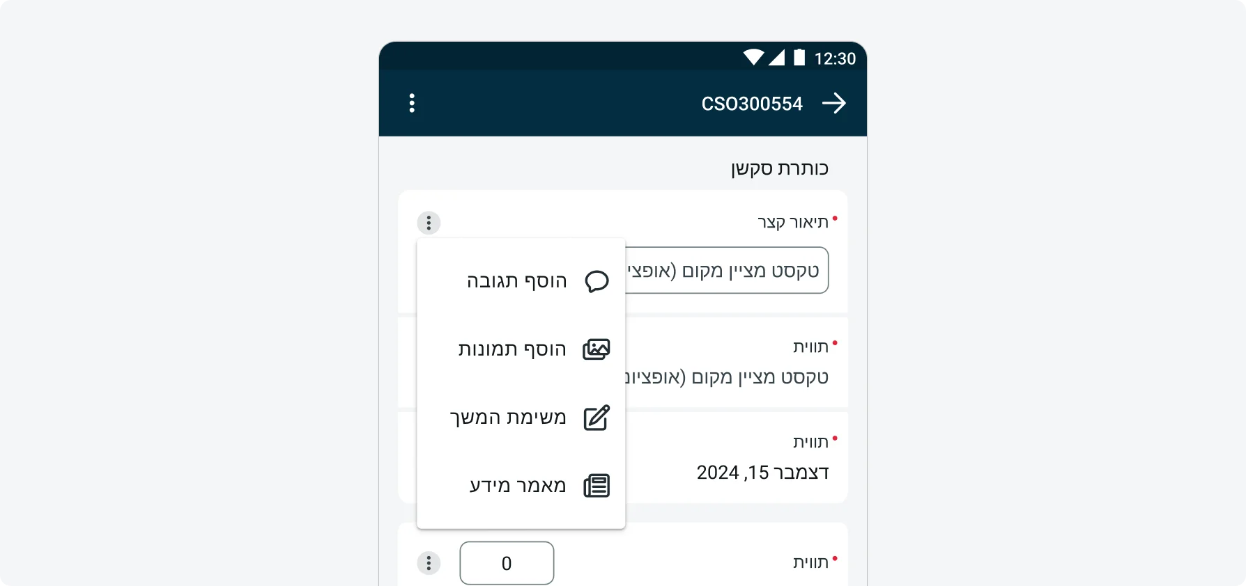
Internationalization
This is how the context menu looks like when configured for a right-to-left (RTL) language: