

Anatomy
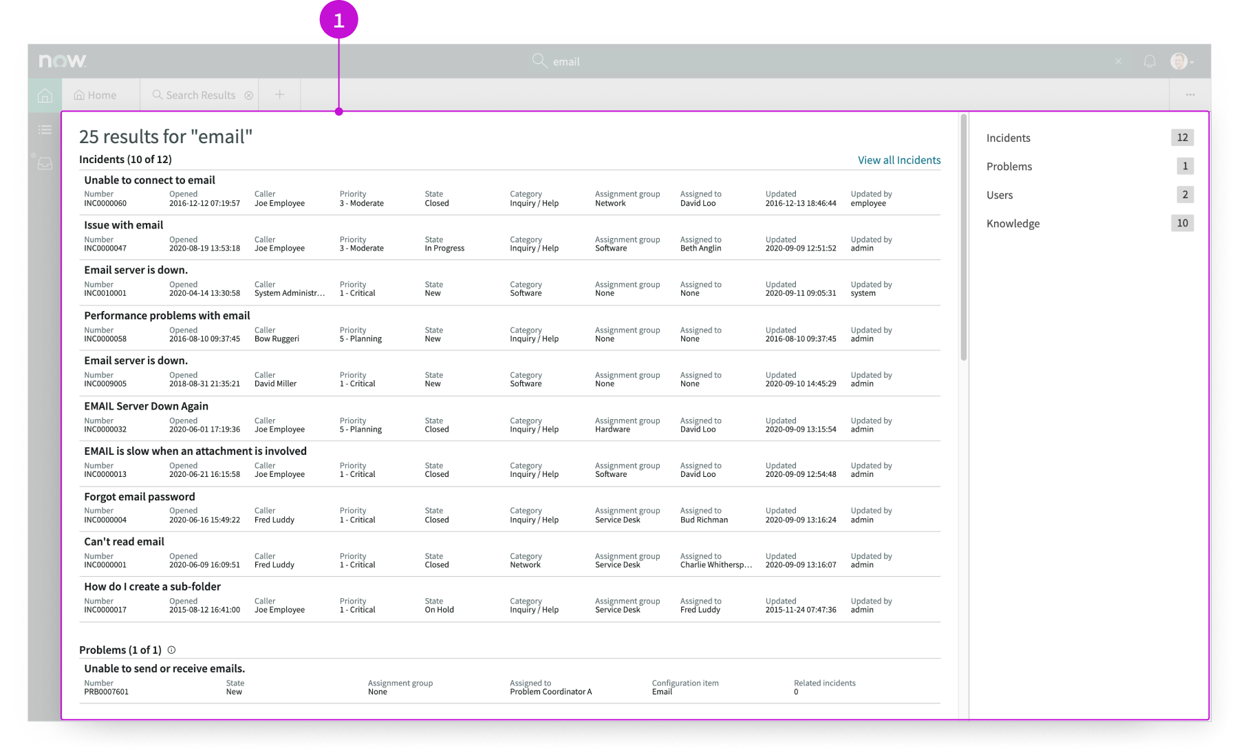
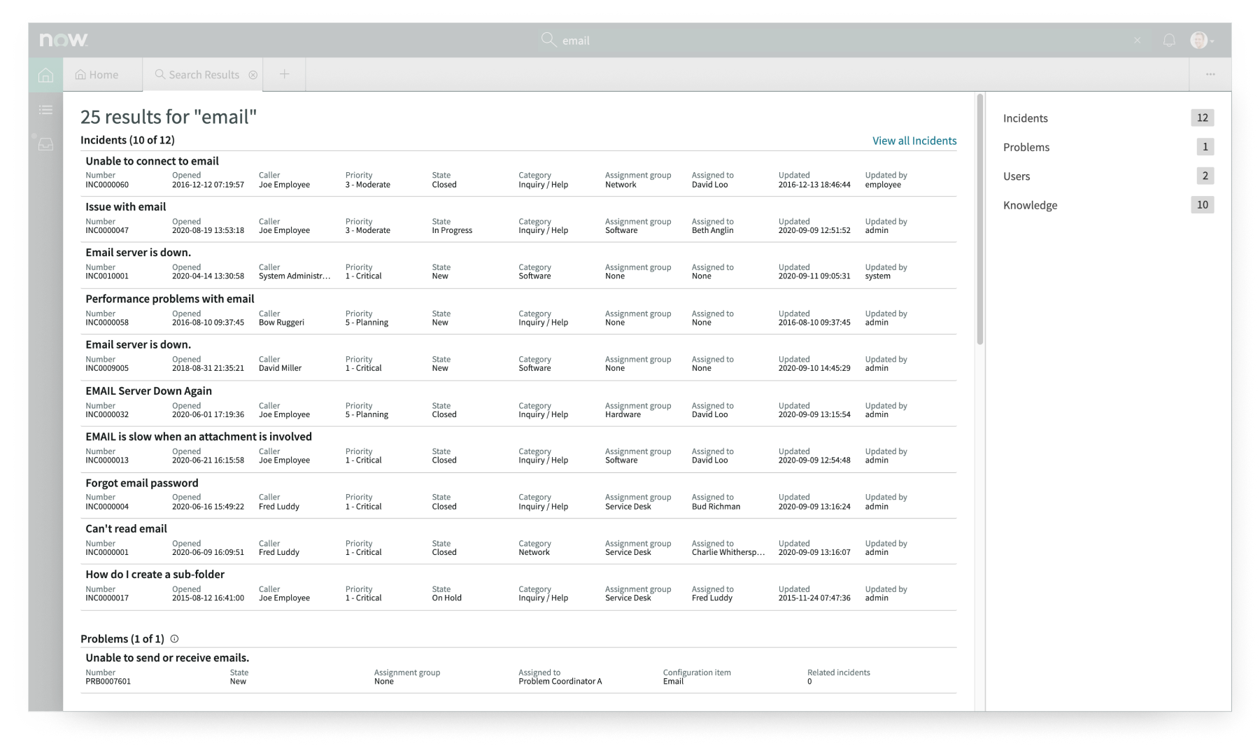
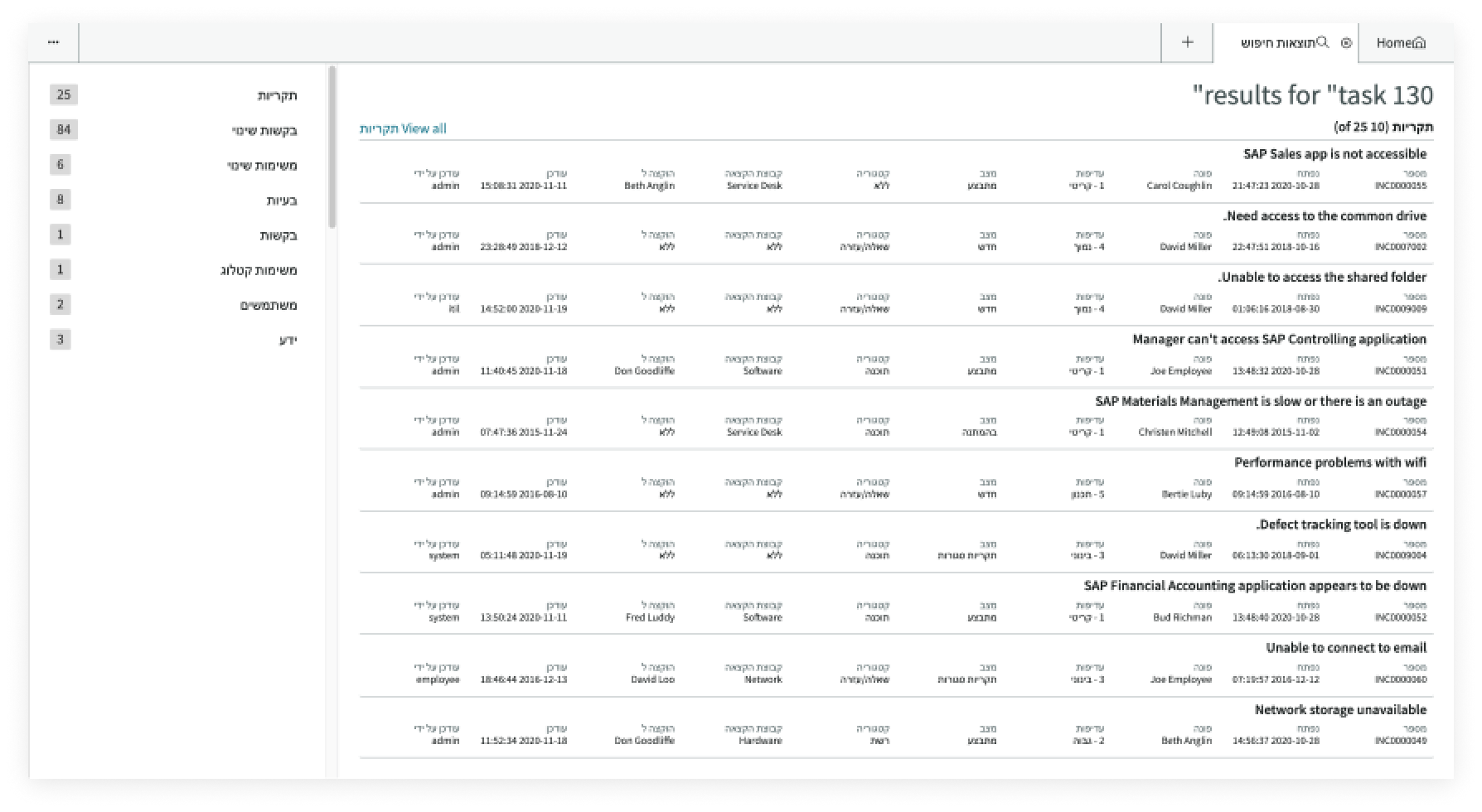
- Search results set: List of search results, displayed with cards; a category pane in the sidebar shows the number of results in each category and enables users to select a section in the results pane to view
Usage
The search results page template provides users with search results displayed with the card component. Results can include details of task records, articles, service catalog items, or contact information.
Users can use this page template to:
- Find existing information about an item to respond to a customer
- Navigate to results by category and see the result count for each category
- See the details of each record returned by the search
Components
Page templates are built with Horizon Design System components that have their own attributes, such as states, variants, and sizes. To learn about the individual components used in the search results page template, see these usage guidelines.
Workspace global search tab
The workspace global search tab component renders global search results for the user in sections, categorized by table. For more information, see the usage guidelines for workspace global search tab.
Interactions and behaviors
This is how the workspace global search tab component reacts to user interaction and changes to the container size when used in the search results page template.
- When a user selects a record, that record opens in a session tab.
- If a category contains more than 10 results the “View all [category]” link appears. Selecting this link displays the full set of results for that category.
- The user selects an item in the category panel to scroll the results list to that section.
- When the user hovers over the information icon beside a section label in the results pane, the filters associated with that table appear.
Defaults
By default the workspace global search tab component displays these attributes:
- Maximum number of search results returned for a specific category is 25.
- Maximum number of items that display in a search results category section is 10.
Configurations
The search results page template is intended to be used as-is in your experience and provides default functionality that fits most use cases. The page is created from a template that is updated automatically. If you copy the template in UI Builder and customize the page, you won’t receive template updates, and your page might not function properly after an upgrade.
Usability
The search results page template complies with all internationalization and accessibility requirements.
Internationalization
When this page template is used in an instance configured for a right-to-left (RTL) language, the search results component cards, the header, and the category menu all realign their content on the right.
Accessibility
For accessibility behaviors of specific components, see the usage guidelines for those components.
Keyboard interactions
Each component used in the search results page template has its own tab order and keyboard interactions. See the usage guidelines for details.
Screen readers
When you apply ARIA labels to a component, screen readers announce the controls and content of each component in the prescribed tab order. See the usage guidelines for details.