

Anatomy
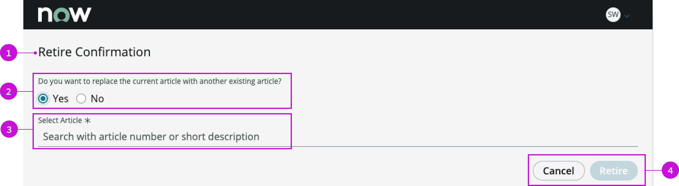
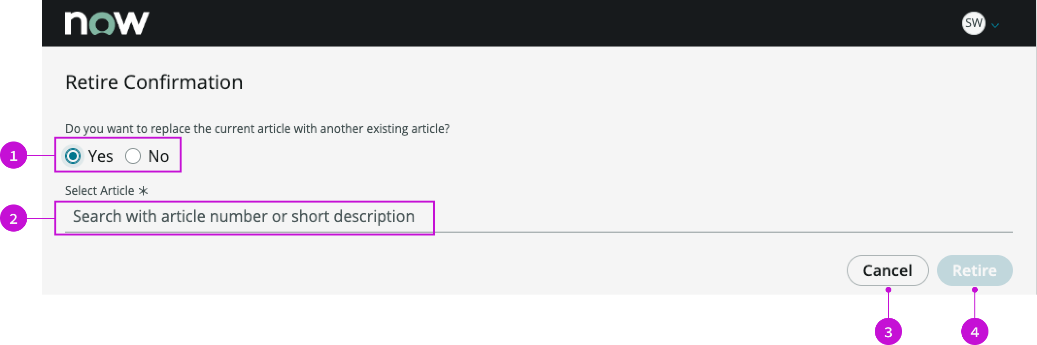
- Heading: Label for the modal
- Radio button group: Text explaining the choice and radio buttons enabling the user to retire or replace the article
- Replacement article: Search field for selecting a replacement article from the knowledge base
- Footer: Action buttons for retiring the article or cancelling the action; the “Retire” button is disabled during a search for a replacement article
Usage
WARNING: If you copy the template in UI Builder and customize the page, you won’t receive template updates, and your page might not function properly after an upgrade.
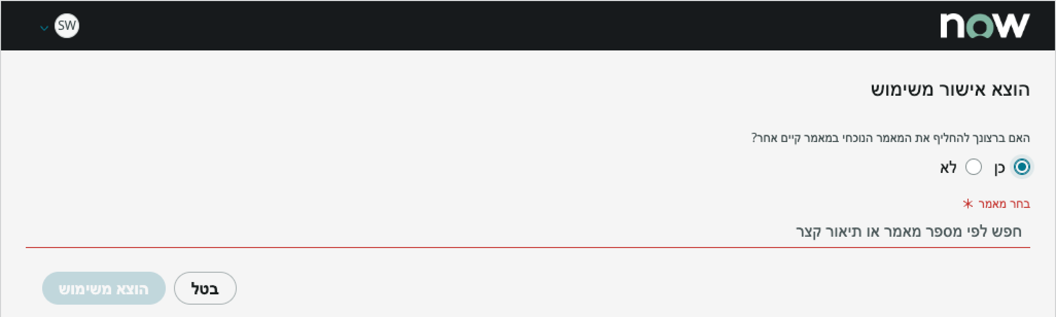
The retire confirmation modal presents a confirmation choice to a user when they select to retire a knowledge article. The user is given the opportunity to retire the article or replace it in the knowledge base with a more current or relevant article.
Components
The retire confirmation modal is built with Horizon Design System components that have their own attributes and interactions.
Heading
The heading provides a generic default title for the modal of“Retire Confirmation.”
Interactions and behaviors
The heading text wraps to a second line, allowing for a long title.
Default template values
By default the heading displays these attributes:
- A level 2 HTML heading that uses the header-teritary style
- Text wrap enabled
Radio button group
The radio button group contains text asking the user if they want to replace the article and provides radio buttons for confirming or denying the action.
Interactions and behaviors
The user selects “No” to retire the article without replacing it. If the user selects “Yes”, a search field appears enabling them to select a replacement article.
Default template values
By default, retire confirmation modal displays these attributes:
- The default value of the radio buttons is “No.”
- The search field is not visible
Replacement article
The replacement article element is a search field that enables the user to select a replacement article for the one being retired.
Interactions and behaviors
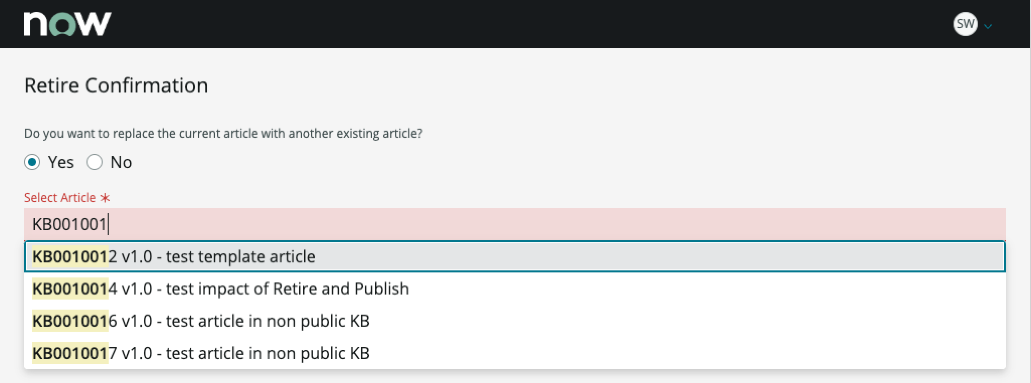
- The search field displays a required field indicator and is highlighted in red during the search process.
- The user can search on a knowledge article number or the short description of the article.
- As the user types, the results list shows selections that match the characters the user has entered. The matching characters are highlighted as the user types.
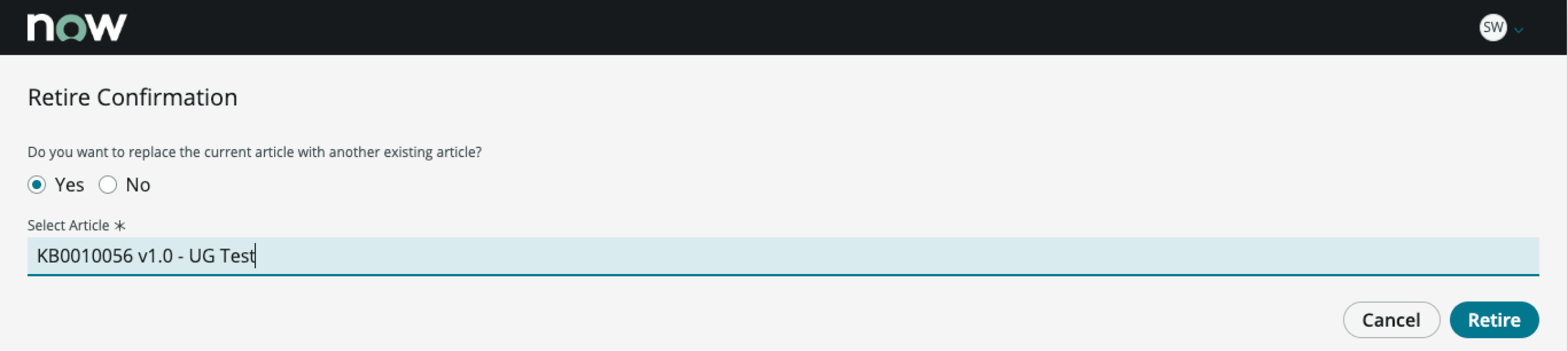
When the user selects an article from the results list, the article appears in the search field, and the highlighting changes to blue.
Default template values
The placeholder text in the search field instructs the user to “Search with article number or short description.”
Footer
The footer displays the buttons that cancel or confirm the selected action.
Interactions and behaviors
- The user selects the “Cancel” button to cancel the operation and close the modal.
- The user selects the “Retire” button to replace the article with another or to retire the article without replacing it.
- When the search field is active, the “Retire” button is disabled until a replacement article is selected.
Default template values
The action buttons have these attributes:
Cancel
- Label: Cancel
- Variant: Secondary
- Size: Medium
Retire
- Label: Retire
- Variant: Primary
- Size: Medium
Configurations
The retirement confirmation modal page template is intended to be used as-is in your experience and provides default functionality that fits most use cases. The page is created from a template that is updated automatically.
User preferences
Users can control specific behaviors and features of the page through the user preferences menu options. The selections that users make in this menu persist until the user’s next session. Examples of user preferences options offered in workspaces are:
- Wrapping text in lists
- Showing banners
- Showing a counter on badges
- Showing the ribbon
- Showing the sidebar
Usability
The retirement confirmation modal page template complies with all internationalization and accessibility requirements.
Internationalization
When this page template is used in an instance configured for a right-to-left (RTL) language, the text and radio buttons in the modal align on the right, and the control buttons in the footer align on the left.
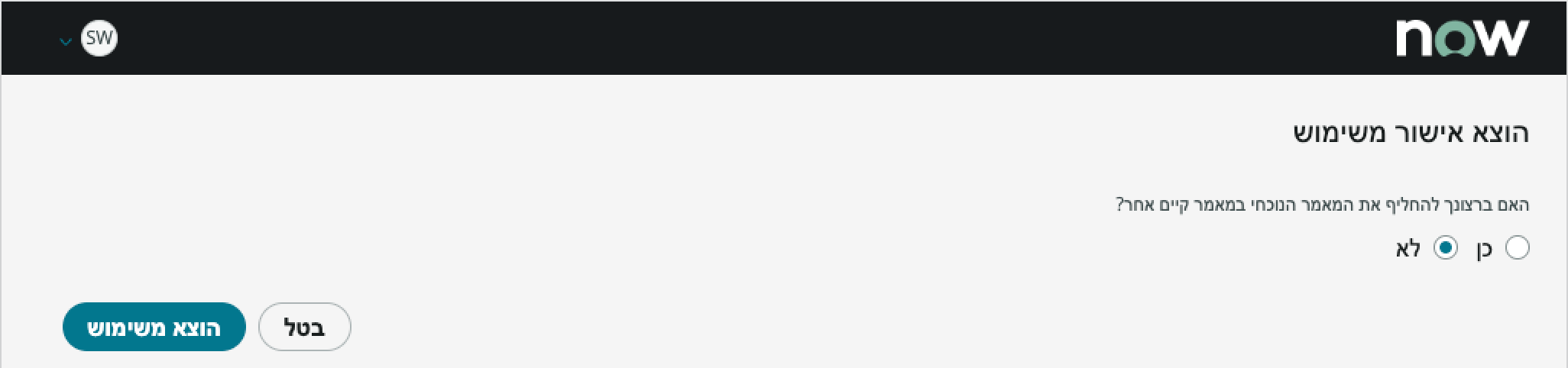
When the user elects to replace the article with another, the search field aligns on the right.
Accessibility
For accessibility behaviors of specific components, see the usage guidelines for those components.
Retire confirmation modal tab order
Keyboard interactions
You can access the actionable elements of retire confirmation modal with these keyboard keys:
When focus is in the modal:
- Tab: Moves focus through the components in the established tab order.
- Shift + Tab: Moves focus backwards in the established tab order.
- Space or Enter: Launches the actionable element in focus.
When focus is in the radio button group:
- Arrow left and Arrow right: Toggles between the “Yes” and “No” radio buttons. Focus on the “Yes” button displays the search field.
- Tab: Puts focus in the search field (when visible) and puts it into an editable state.
When focus is in the search results list:
- Arrow up and Arrow down: Moves focus between items in the search results list.
- Enter: Selects the item in focus from the search results list.
When focus is in the footer:
- Tab: Moves focus to the next button in the tab order.
- Shift + Tab: Moves focus to the previous button in the tab order.
- Space or Enter: Launches the action for the button in focus.
Screen readers
When you apply ARIA labels to a component, screen readers announce the controls and content of each component in the prescribed tab order. See the usage guidelines for details.