

Anatomy
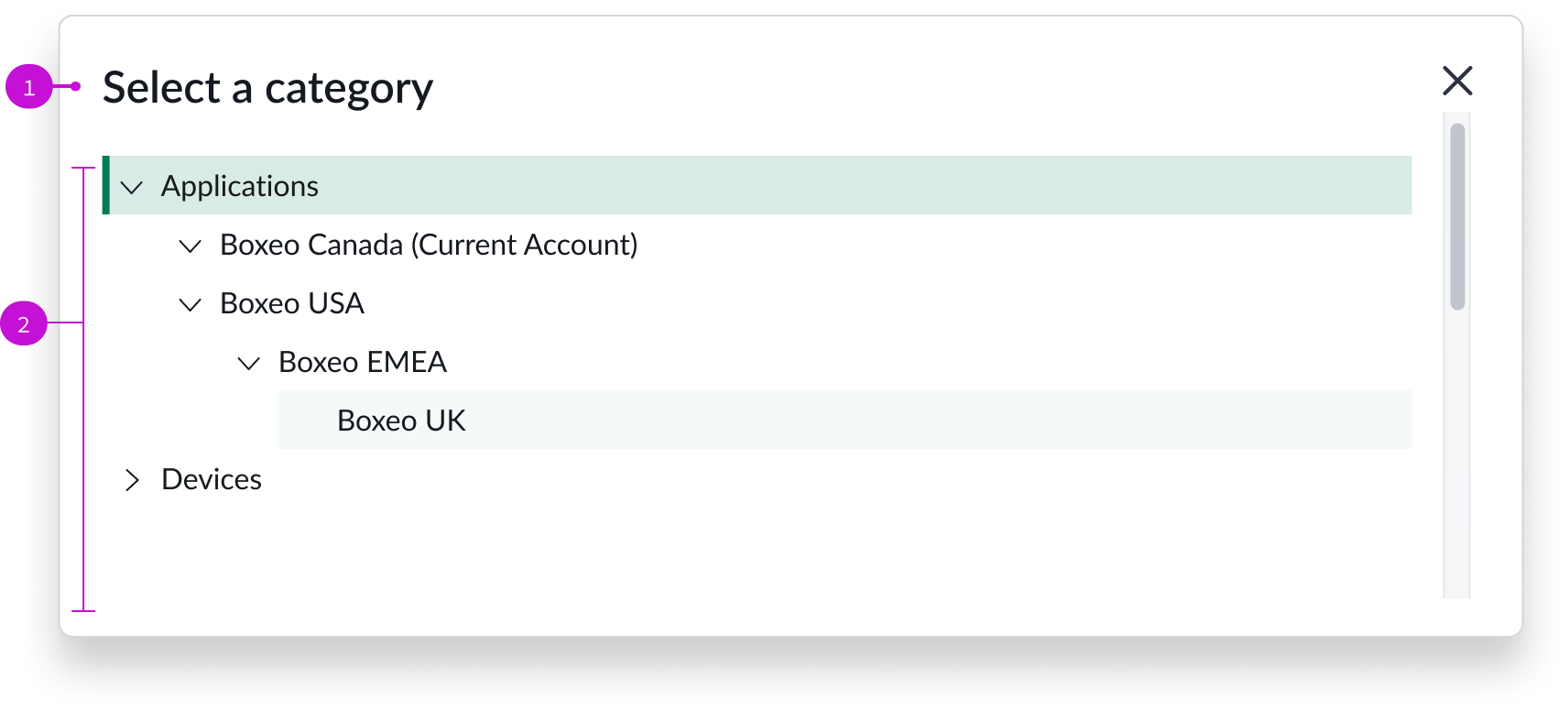
- Modal title: Title that describes the purpose of the modal
- Content tree: Collapsible hierarchy of knowledge categories; expand a category to locate an article to view
Usage
Authors use the knowledge category picker modal to select a category for their knowledge article.
Components
The knowledge category picker is built with Horizon Design System components that have their own attributes and interactions.
Content tree
The content tree component enables an author to navigate a collapsible parent-child hierarchy of pre-configured knowledge categories. Authors can scan the collapsed list for relevant categories before expanding the sections they want to view. For more information, see the usage guidelines for content tree.
In this example, the user has selected the Applications parent category and is hovering over the Boxeo UK child category.
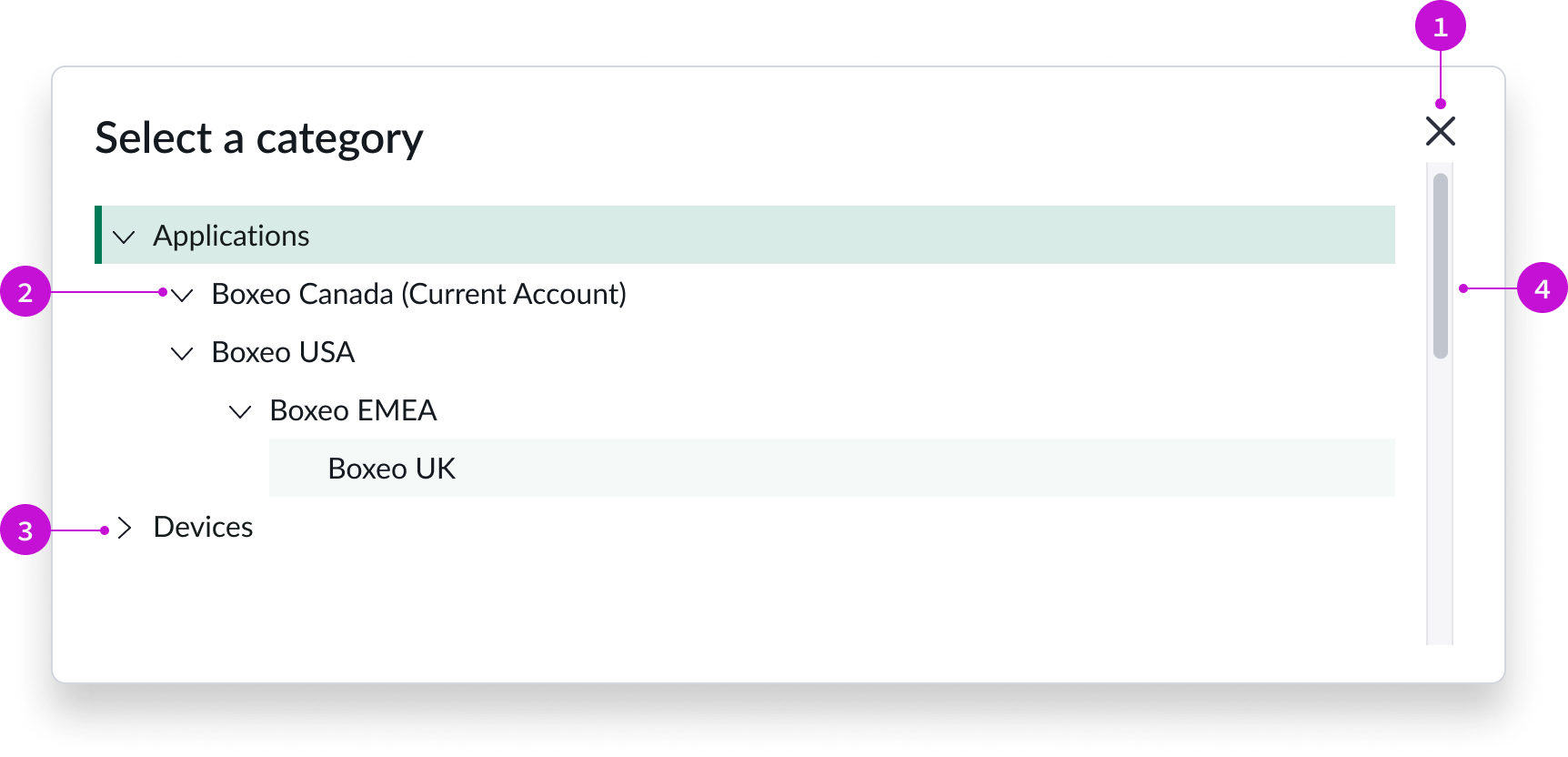
- Close icon: Iconic button for closing the modal
- Trigger icon (expanded): Trigger icon pointing down, indicating that the category is expanded
- Trigger icon: (collapsed): Trigger icon pointing right, indicating that the category is collapsed
- Scroll bar: Vertical scroll bar that appears when the category list exceeds the height of the modal
Interactions and behaviors
- Users select the chevron trigger to expand or collapse category sections. The chevron trigger icon points down when a category is expanded and to the right when a category section is collapsed.
- When the number of items in the content tree expand beyond the height of the modal, a vertical scroll bar appears.
- If a category label exceeds the width of the modal, a horizontal scroll bar appears. Category labels don’t truncate.
- Selecting an item selects that category and closes the modal.
- If the knowledge base doesn’t have any categories, an empty state message appears, stating that no cagetories were found.
- Users can select the close icon to close the modal without selecting a category.
Defaults
By default the knowledge category picker displays these attributes:
- The modal heading is “Select Category.”
- The trigger for expanding and collapsing content sections is the chevron icon and is positioned to the left of the category label. The trigger only appears on a category if there are child items.
- You can only select a single item in the content tree. Only the selected node is highlighted.
- Overflow creates scroll bars. Truncation and wrapping are not supported for long labels.
Configurations
The knowledge category picker page template is intended to be used as-is in your experience and provides default functionality that fits most use cases. The page is created from a template that is updated automatically. If you copy the template in UI Builder and customize the page, you won’t receive template updates, and your page might not function properly after an upgrade.
Usability
The knowledge category picker page template complies with all internationalization and accessibility requirements.
Internationalization
When this page template is used in an instance configured for a right-to-left (RTL) language, the individual components have their own behaviors. See the usage guidelines for the components used in the page for details.
Accessibility
For accessibility behaviors of specific components, see the usage guidelines for those components.
Keyboard interactions
Each component used in the knowledge category picker page template has its own tab order and keyboard interactions. See the usage guidelines for details.
Screen readers
When you apply ARIA labels to a component, screen readers announce the controls and content of each component in the prescribed tab order. See the usage guidelines for details.