

Anatomy
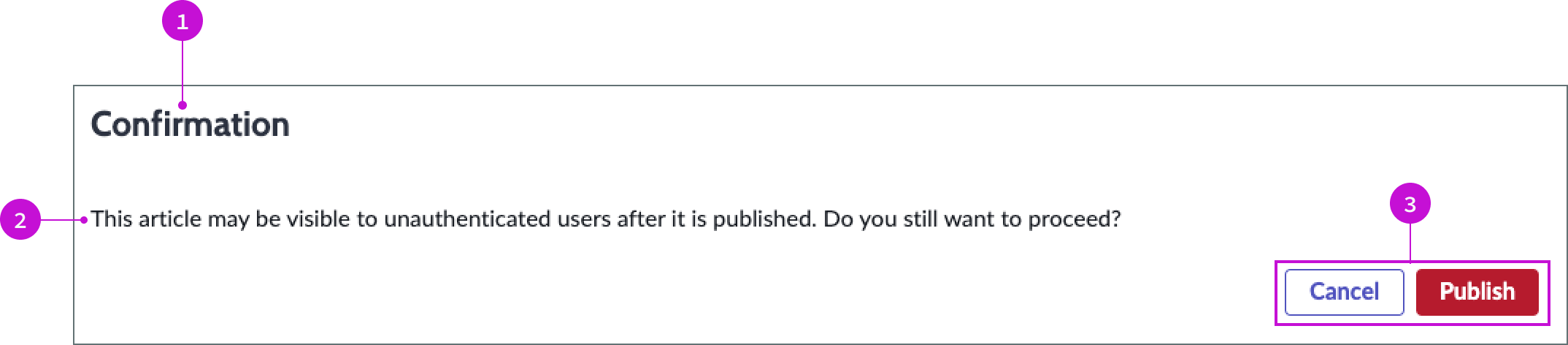
- Heading: Label for the modal
- Message: Configurable message advising the user of anything important they should know before publishing the article.
- Action buttons: Buttons that enable the user to cancel the operation or publish the article.
Usage
WARNING: If you copy the template in UI Builder and customize the page, you won’t receive template updates, and your page might not function properly after an upgrade.
The confirm publish modal presents a confirmation message to a user when they attempt to publish a knowledge article. This message can advise the user of possible issues from publishing the article and give them the
Components
The confirm publish modal is built with Horizon Design System components that have their own attributes and interactions.
Heading
The heading provides a generic default title for the modal of “Confirmation.”
Interactions and behaviors
The heading text wraps to a second line, allowing for a long title.
Default template values
By default the heading displays these attributes:
- A level 2 HTML heading that uses the header-secondary style
- Text wrap enabled
Message
The message advises the user on the consequences of their action to publish the article.
Interactions and behaviors
The static message has no behaviors or user interaction.
Default template values
The default message warns the users that unauthorized users might see the article if it is published. The text reads, “This article may be visible to unauthenticated users after it is published. Do you still want to proceed?”
Actions buttons
The action buttons in the confirm publish modal enable the user to publish the article or cancel the operation to avoid the issue cited in the warning message.
Interactions and behaviors
- The user clicks the Cancel button to cancel the operation and close the modal.
- The user clicks the Publish button to publish the article to the knowledge base and close the modal.
Default template values
By default the action buttons display these attributes:
Cancel:
- Label: Cancel
- Variant: Secondary
- Size: Medium
Publish:
- Label: Publish
- Variant: Negative Primary
- Size: Medium
Configurations
The confirm publish modal page template is intended to be used as-is in your experience and provides default functionality that fits most use cases. The page is created from a template that is updated automatically.
User preferences
Users can control specific behaviors and features of the page through the user preferences menu options. The selections that users make in this menu persist until the user’s next session. Examples of the user preferences options offered in workspaces are:
- Wrapping text in lists
- Showing banners
- Showing a counter on badges
- Showing the ribbon
- Showing the sidebar
Usability
The confirm publish modal page template complies with all internationalization and accessibility requirements.
Internationalization
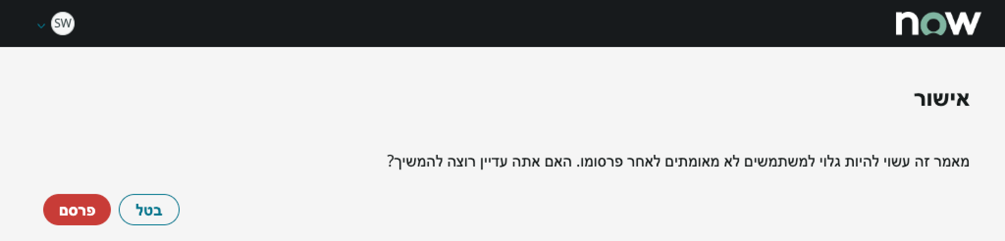
When this page template is used in an instance configured for a right-to-left (RTL) language, the text in the modal aligns on the right, and the control buttons align on the left.
Accessibility
For accessibility behaviors of specific components, see the usage guidelines for those components.
Keyboard interactions
You can access the actionable elements of confirm publish modal with these keyboard keys:
- Tab: moves focus from the “Publish” button to the “Cancel” button
- Shift + Tab: Moves focus from the “Cancel” button to the “Publish” button
- Space or Enter: Launches the button action
Screen readers
When you apply ARIA labels to a component, screen readers announce the controls and content of each component in the prescribed tab order. See the usage guidelines for specific components used in this page template for details.