Variants
Learn about the attributes of modal.
Modal buttons
For information about each type of button variant, review the button component usage guidelines.
Sizes
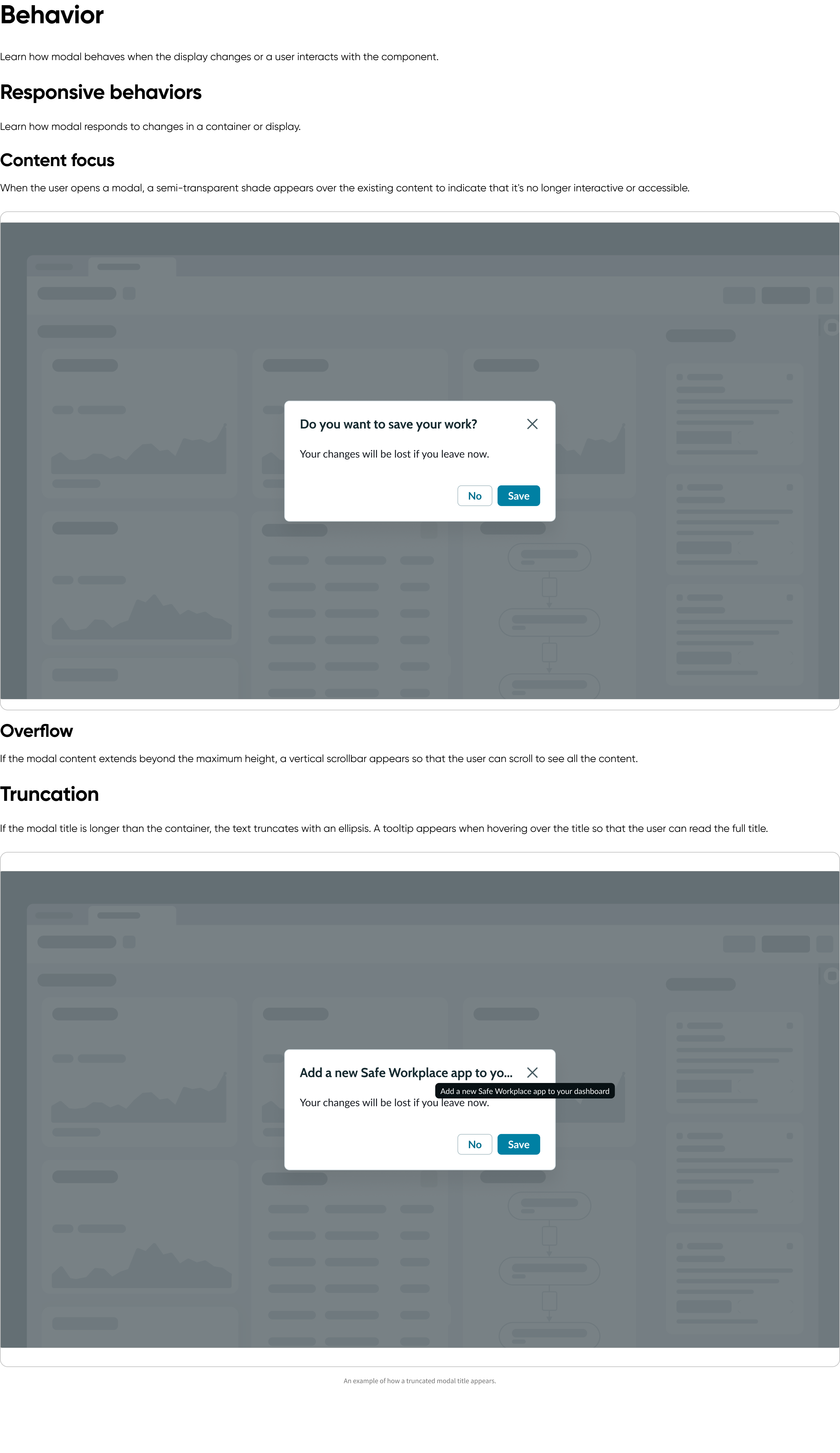
A modal is available in the following sizes: small (sm), medium (md), large (lg), full-screen, and custom. The small, medium, and large sizes have fixed widths as well as defined maximum and minimum heights. However, the full-screen modal size is relative to the size of the browser window. Custom size requires both the width and height to be specific.
Choose a size based on the layout of your display and the type of content you want to show.
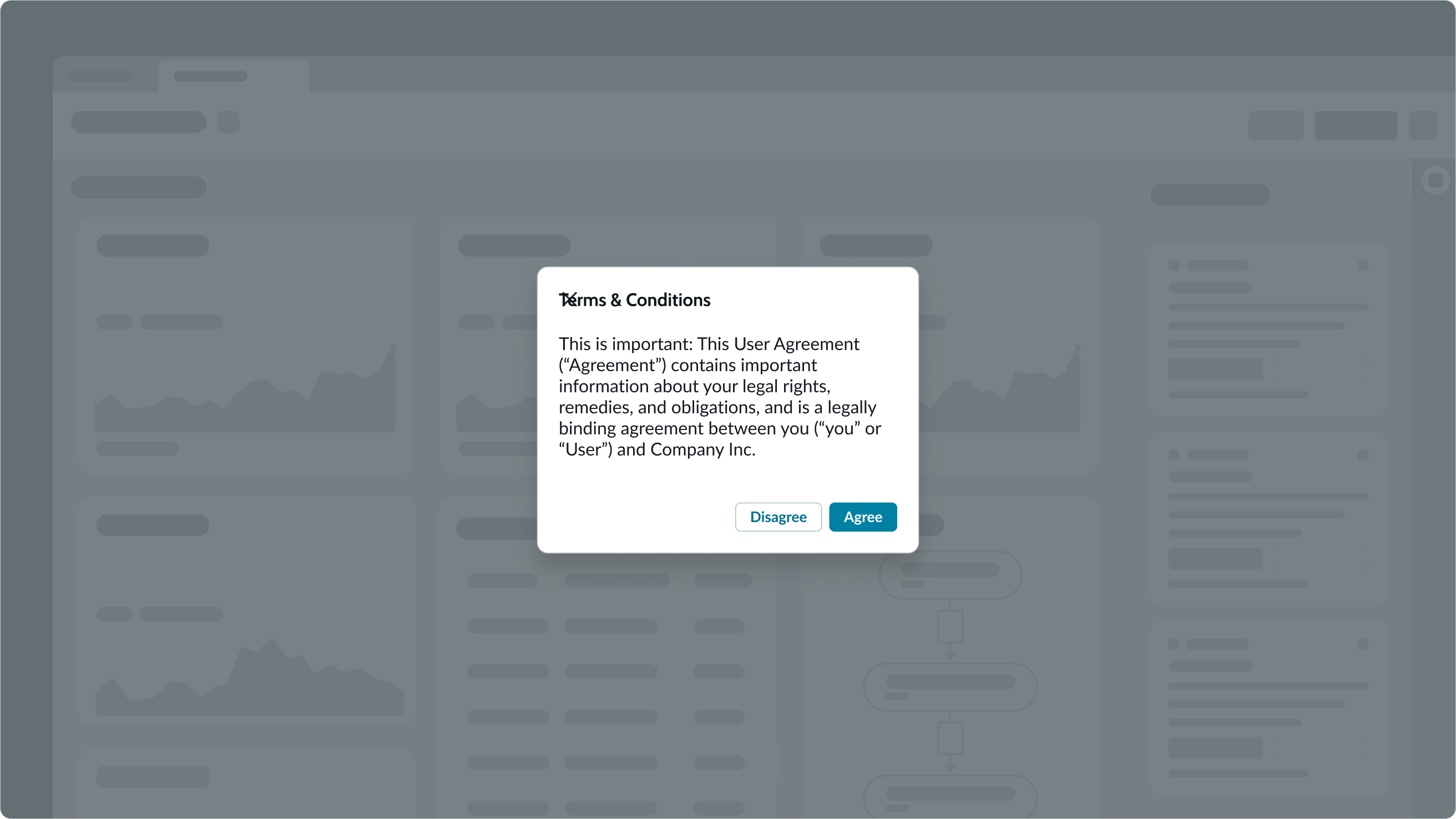
Small
For the small size modal, the minimum height is 133px, maximum height is 315px, and width is fixed at 420px.
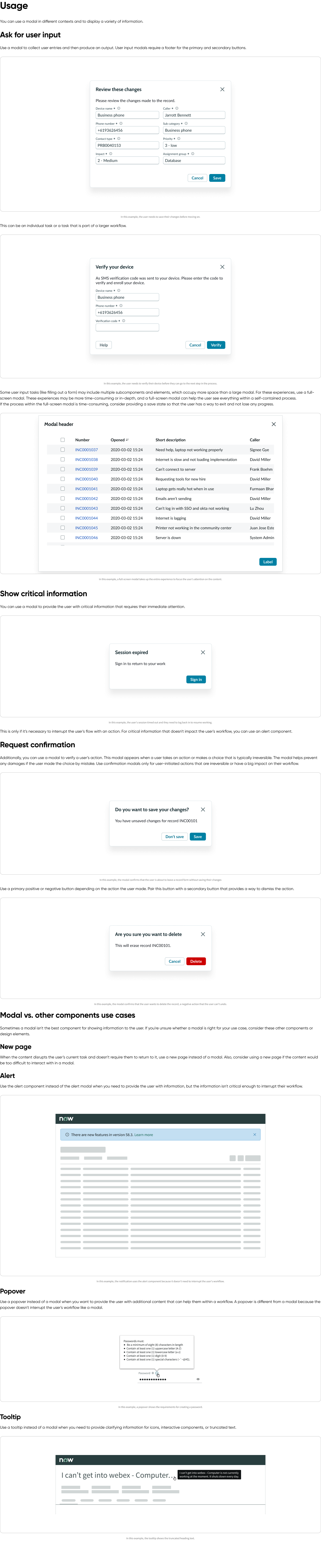
In this example, the notification uses the alert component because it doesn't need to interrupt the user's workflow.
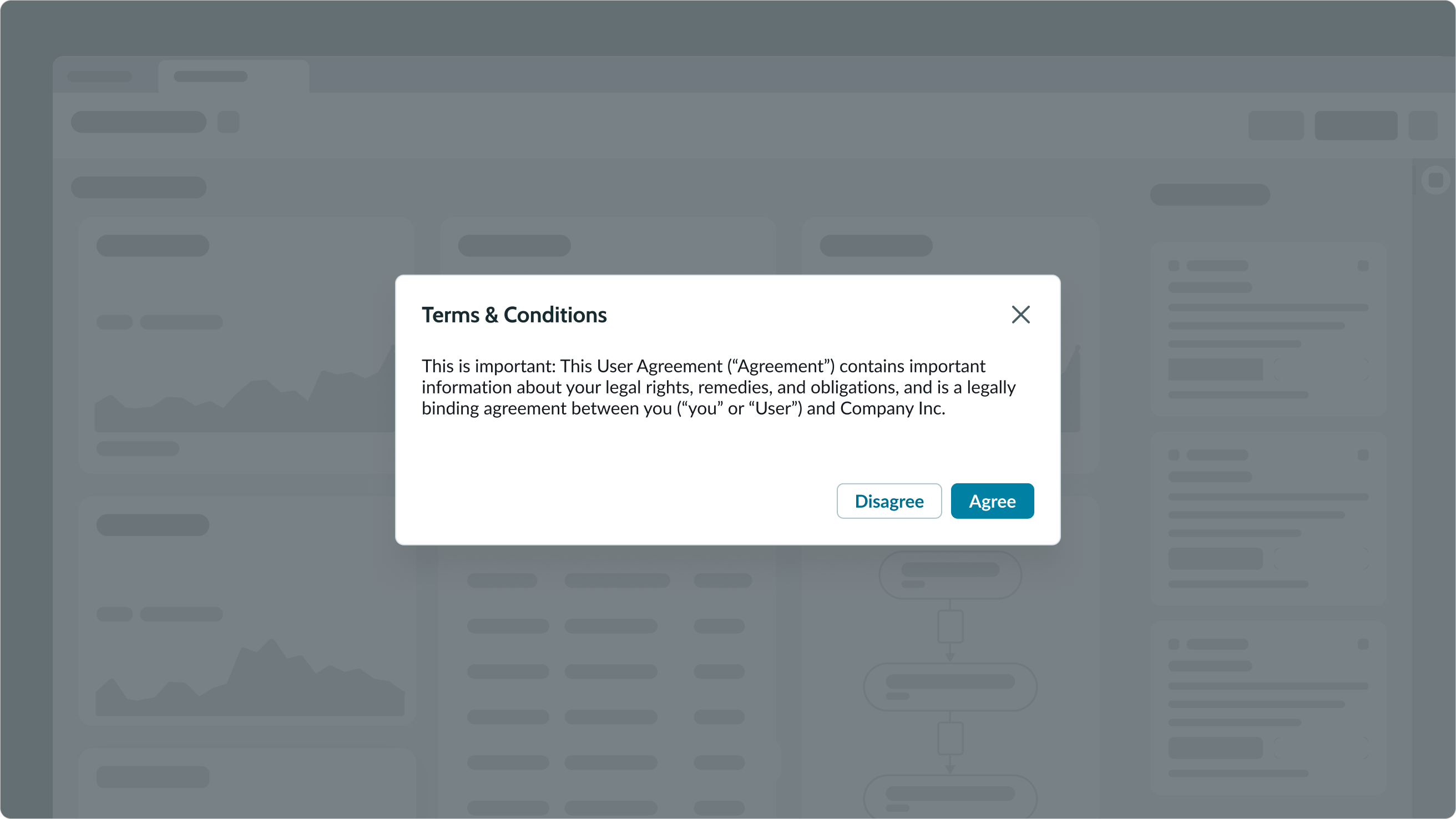
Medium
For the medium size modal, the minimum height is 190px, maximum height is 450px, and width is fixed at 600px.
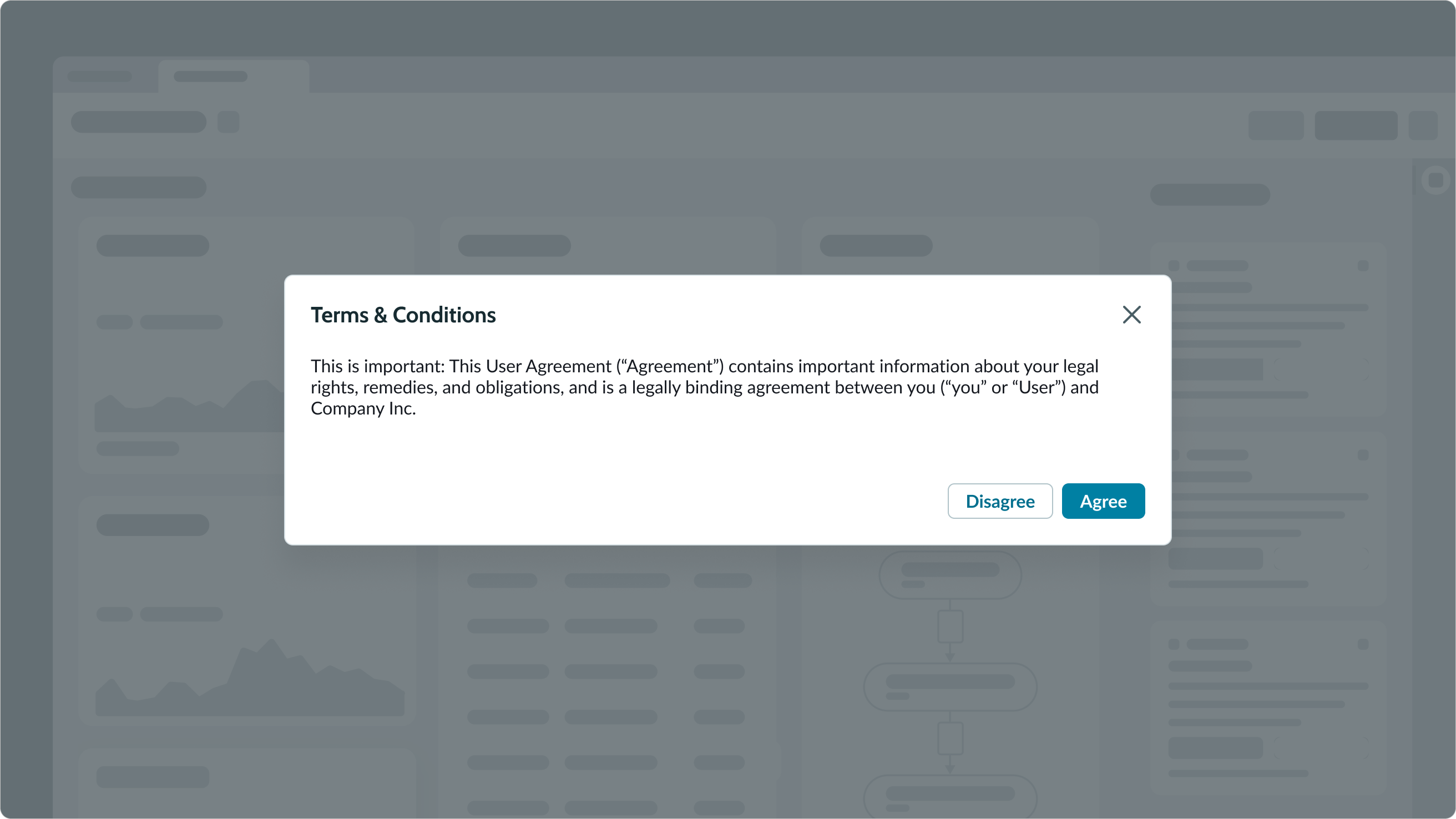
Large
For the large size modal, the minimum height is 254px, maximum height is 600px, and width is fixed at 800px.
Full-screen
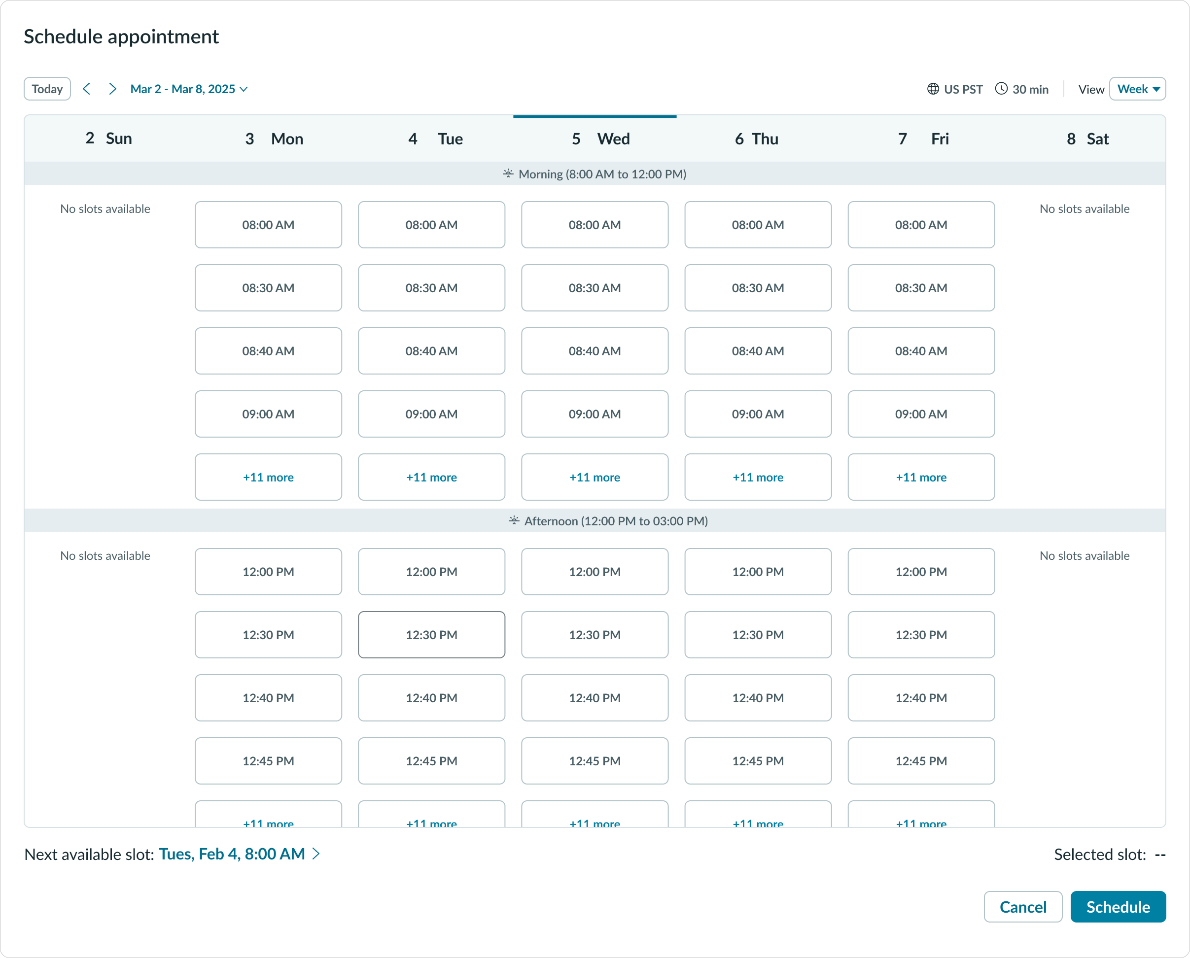
In the full-screen size, the modal occupies the entire screen (except for the navigation bar).
Configurations
You can configure the content and buttons depending on your use case.