

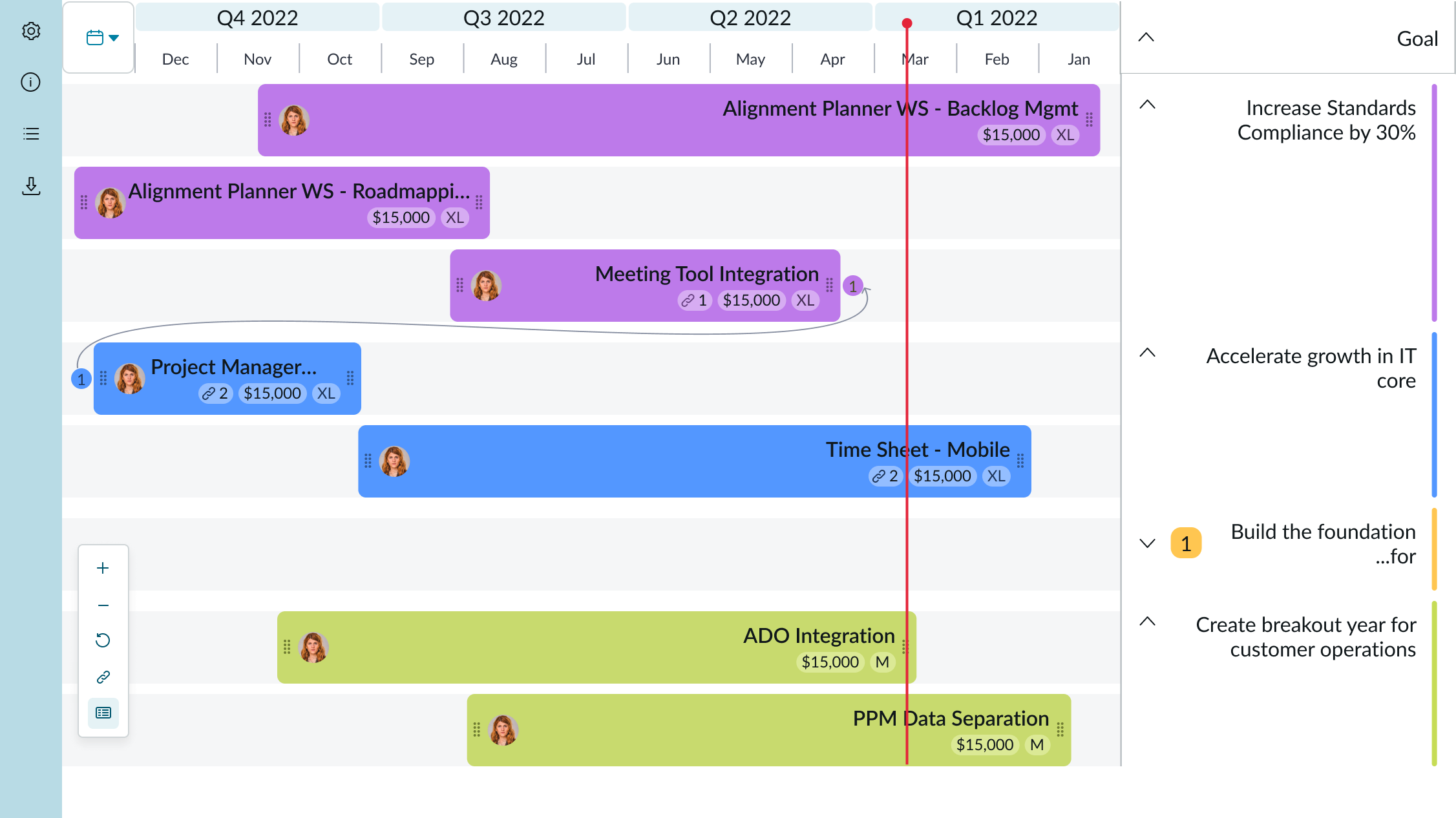
Anatomy
Learn about the individual parts of roadmap.
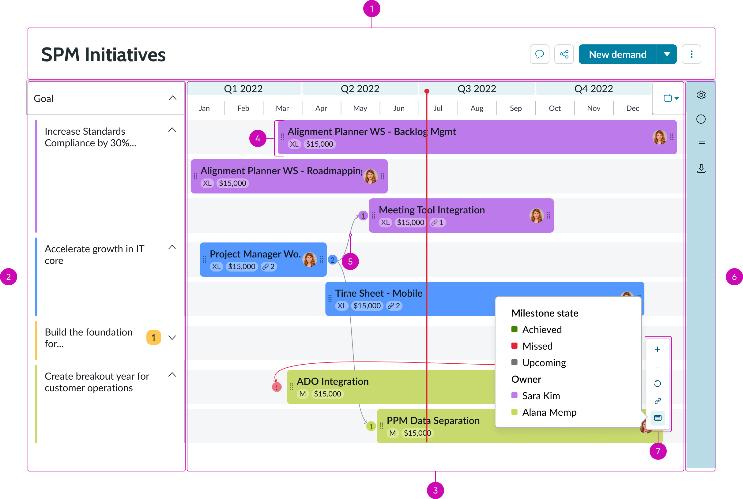
- Roadmap header (optional): A fully customizable header that sits above the timeline; it can hold a roadmap title as well as primary and secondary buttons
- Roadmap groups: Panel that appears when the user selects the “Group-by” feature in “Personalize” view
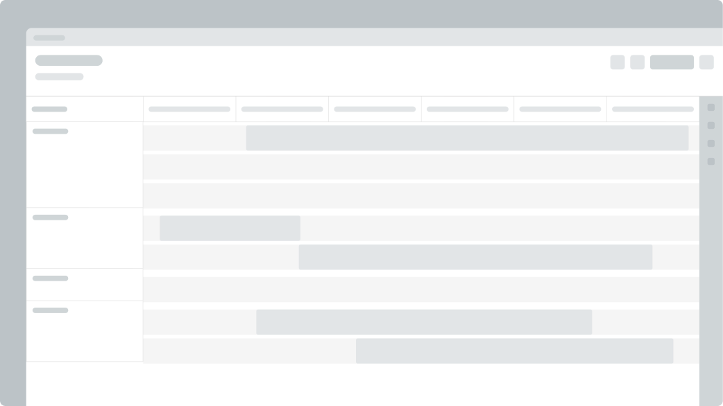
- Roadmap timeline: A calendar with rows that hold roadmap bars; bars can be grouped with an attribute and they can also be adjusted or moved from one row to another row
- Roadmap bar: A bar that represents an item such as a project on a team’s timeline
- Dependency: A line and and an annotation used to convey dependent relationships between roadmap bars
- Side bar: A configurable navigation bar containing actionable icons that open up side panels
- Action bar: An action bar with zoom options (zoom in, zoom out, refresh), a button to turn dependency lines on/off, and a legend that opens into a popover
Roadmap header (optional)

- Roadmap title: A heading that describes the contents of the roadmap
- Secondary buttons: Additional actions, such as an “add milestone” option
- Primary button: The roadmap’s main actionable item; this should perform the most important action for the roadmap’s use case
- Roadmap header container: Holds all roadmap header content
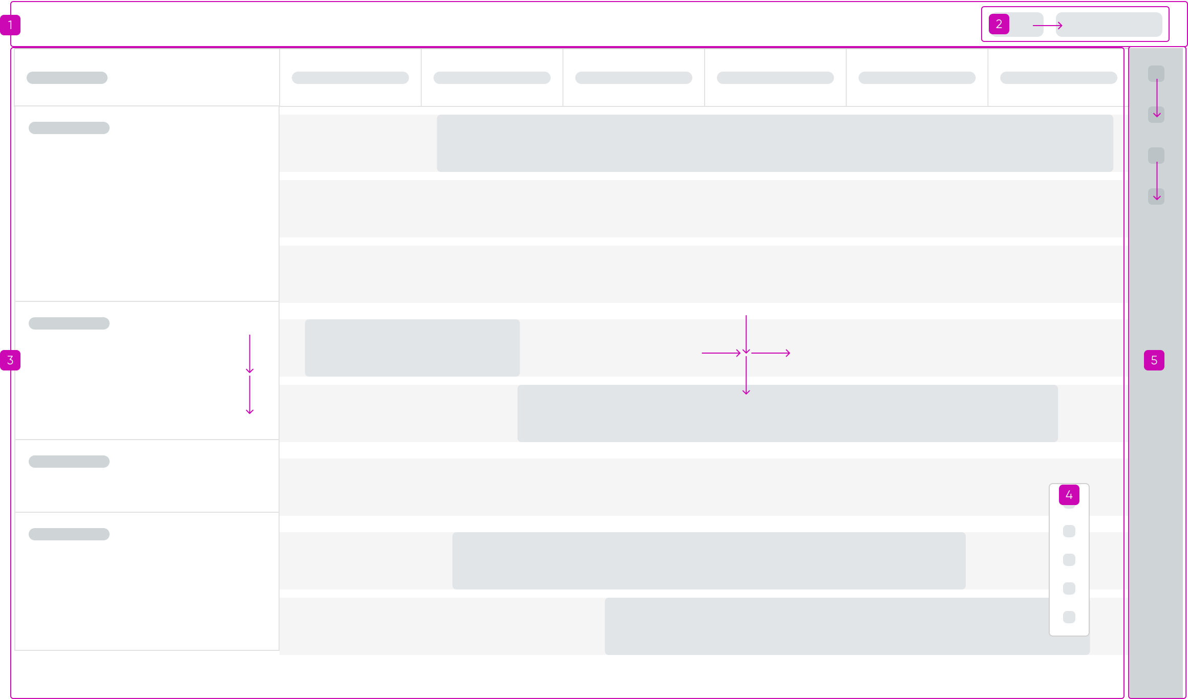
Side panel in personalize view
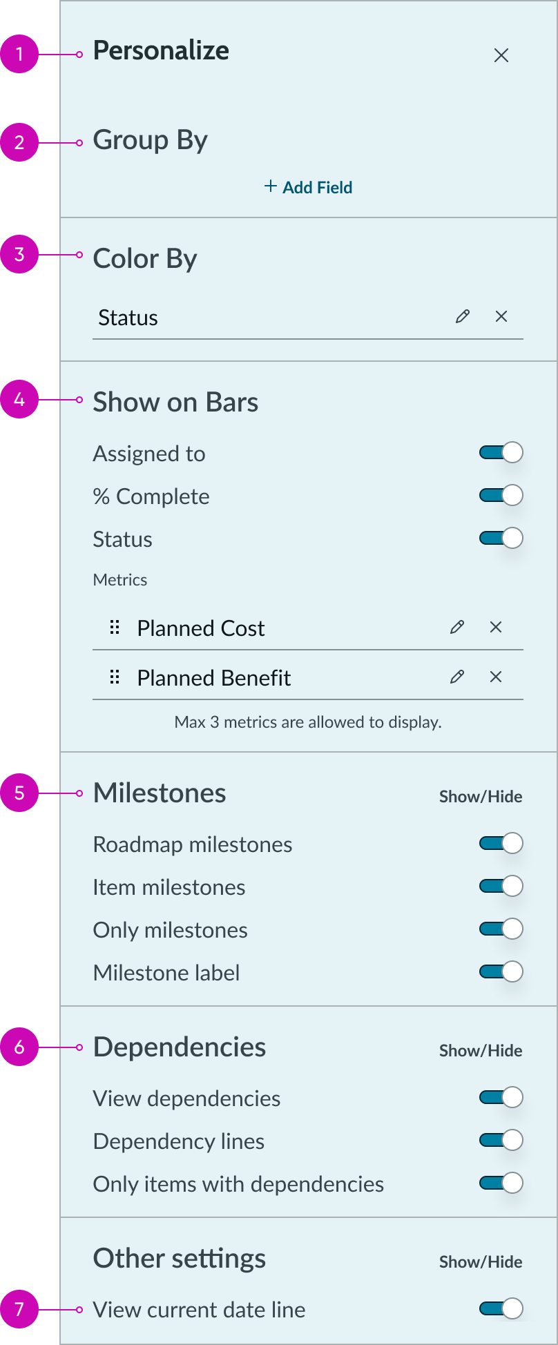
- Side panel header: The title of the actionable icon that the user selects from the side bar; identifies the contents of the side panel
- Group field: A select field that enables the user to group all bars on the board by selecting an attribute from the dropdown; two levels of grouping are allowed
- Color field: A select field that enables the user to assign colors to attribute values; if nothing is selected from the dropdown, all roadmap bars use the default color
- Bar display: A section that enables the user to display assigned contributor’s names and additional metrics on the roadmap bars; a maximum of 3 metrics can be displayed but the order can be edited by dragging and dropping the selections
- Milestones: A section that enables the user to configure milestone properties on the timeline
- Dependencies: A section that enables the user to configure dependency properties on the timeline
- Current date: Option to toggle the red “current date” line on the timeline on or off
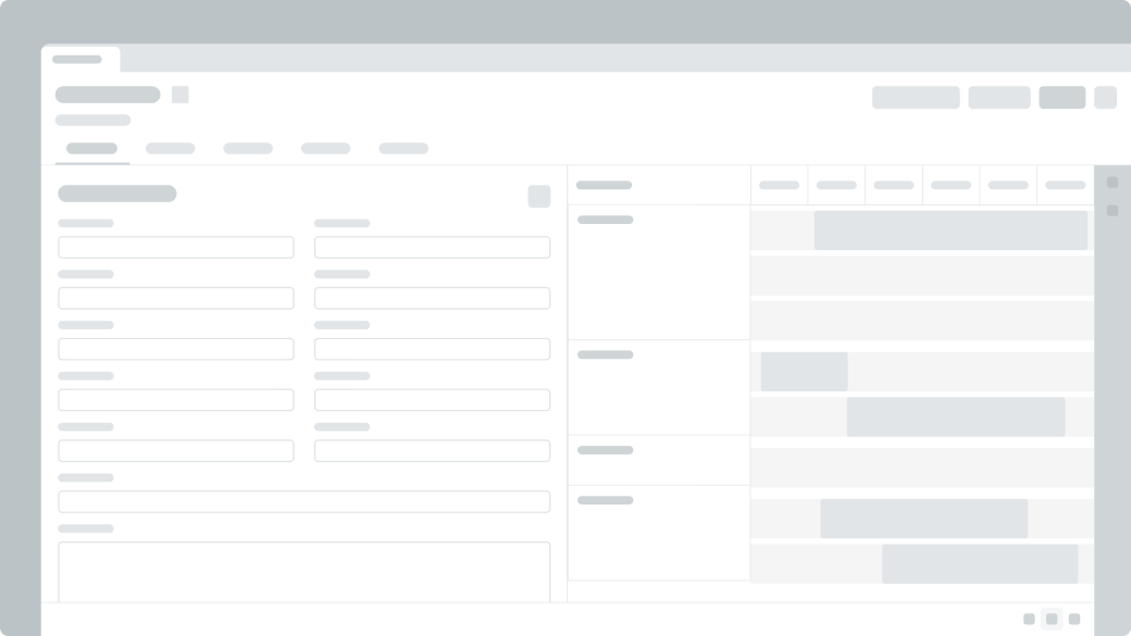
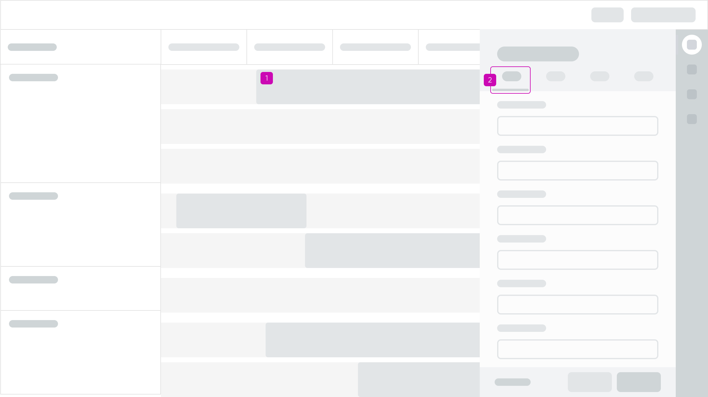
Item details panel
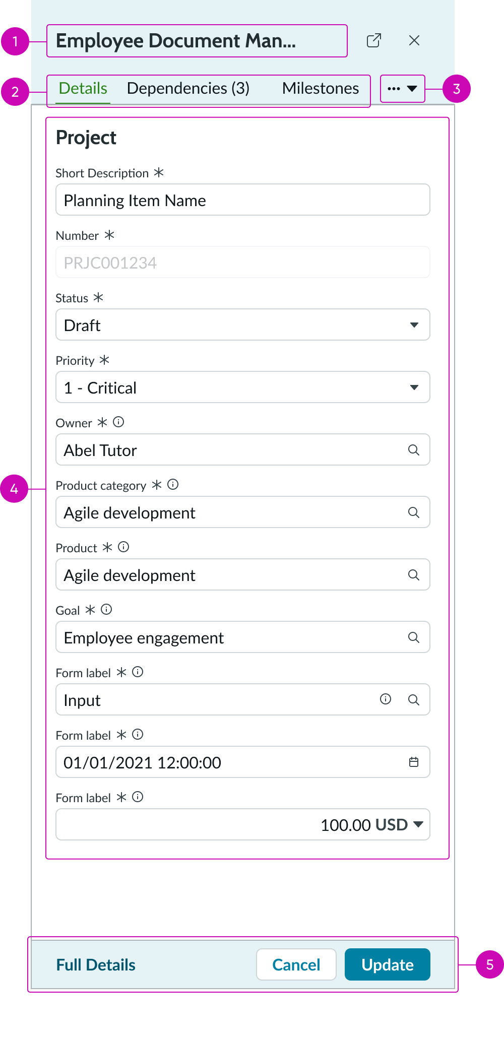
- Side panel header: Item details header; contains an arrow icon next to the title to open the record in a separate browser window
- Tabs: Tabs that enable the user to navigate between information on projects, dependencies, and milestones
- Additional actions: A dropdown that contains additional tabs for comments and attachments
- Form: A form that contains input fields used to customize the details of the selected item
- Footer: Container that holds “cancel” and “update” buttons for the details panel
Side panel in unscheduled items view
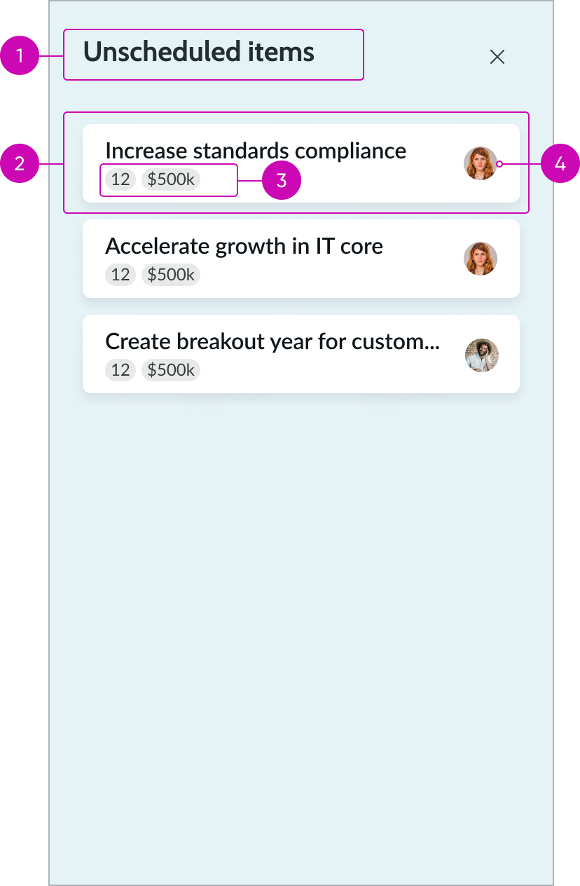
- Unscheduled items header: A title that identifies the contents of the side panel
- Unscheduled item: Roadmap bars that haven’t been assigned dates; users can select an unscheduled item to open the item details panel and schedule it by dragging and dropping it onto the timeline
- Unscheduled item metrics: Option to add an icon and label to provide metrics for the unscheduled item
- Avatar: User assigned to the unscheduled item
Subcomponents
See usage guidance for button bare
See usage guidance for button iconic
See usage guidance for button stateful
See usage guidance for popover
See usage guidance for input field
Usage
Learn about roadmap and find out how to use it in your design. Roadmap is meant to be used in a larger space like a full screen. It can be difficult to use in smaller screen.
Variants
Roadmap doesn’t have any specific variants. However, buttons within the header can have their own variants.
Roadmap header buttons
There are 3 button variants: primary, secondary, and tertiary. For further guidance on each variant, review the usage guidance for the button component.
Configurations
All roadmap configurations happen in UI builder.
Bar editing
You can configure roadmap such that the user is able to drag and drop and resize the bars.
Roadmap header
You can configure roadmap to display a header above the roadmap timeline. The header is completely customizable and can contain a roadmap title as well as primary and secondary buttons.
Timeline header
You can configure roadmap to include a timeline header by providing custom calendar timeline data.
Timeline parameters
Provide a start and end date to define the boundaries of your roadmap timeline.
Roadmap items
Configure roadmap items to track roadmap item fields and values in an array. The array is used to define field names and their purpose. For example, a field used for a project start date can be referred to as “Approved start date.”
Roadmap item metadata
You can configure roadmap metadata to track additional optional fields and values in an array. Your array can include the names and labels for grouping fields, color fields, metric fields, roadmap bars, and roadmap bar creators.
Current date line
You can configure roadmap to display the current date line in the timeline. Enabling this feature helps users orient themselves by indicating how far along they are in the calendar.
Side panel
You can configure roadmap to show the side panel. The result is that when the roadmap is loaded, the side panel will display as it were when it was last opened.
Side panel tabs
You can configure what tabs will display in the side panel.
Sidebar action items
You can configure your sidebar to include up to 6 action items in the sidebar. There are 4 primary buttons that are available by default: “Roadmap Details,” “Personalize,” “Item Details,” and “Unscheduled Items.” Additionally, there are 2 more slots reserved in the side bar for additional action items.
Personalize
You can configure settings to choose what fields appear in the settings side panel. For example, this can include fields to display the owner of the roadmap, all collaborators, the title of the roadmap, and the parameters of the roadmap timeline. The user can then use these fields to edit their roadmap.
Date format
Configure the date format to define the format in which roadmap item dates are displayed.
Locale
You should configure the locale to define the language used in your roadmap (for example, “en” for English).
Time zone
You can configure this property to enable time zones for roadmap dates to be displayed.
Default timescale
You can configure timescale to be selected by default when roadmap is loaded.
Design recommendations
Learn how to apply roadmap in your design.
Place roadmap on a full screen so that the user can see all information and controls easily.
Avoid placing roadmap in a small space because it can make it challenging for the user to access all items and controls.
Alignment and positioning
Roadmap doesn’t have any specific guidance on alignment or positioning.
UI text guidelines
These are some recommendations for using text within roadmap:
- If the roadmap header is configured, it is recommended that a roadmap title be included
- The title should be brief and descriptive of the roadmap’s purpose
- Titles for simple buttons in the header should be brief and appropriately named
Behavior
Learn how roadmap behaves when the user interacts with the component.
States
Roadmap has 4 states: default, pressed, hover, and overflow.
Roadmap bar states
Roadmap bars have 3 states: default, hover, and pressed.
| State | Example |
|---|---|
| Default |  |
| Hover | 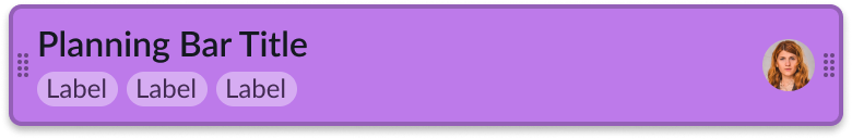 |
| Pressed | 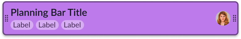 |
Milestone states
Roadmap milestones have 2 states: default and hover.
| State | Example |
|---|---|
| Default |  |
| Hover | 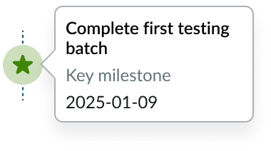 |
Roadmap bar milestone states
Roadmap milestones have 2 states: default and hover. Milestones on roadmap bars can also appear in clusters.
| State | Example |
|---|---|
| Default | 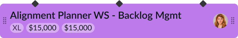 |
| Hover | 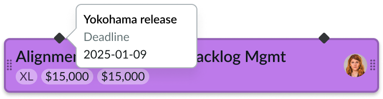 |
| Default (milestone cluster) |  |
| Hover (milestone cluster) | 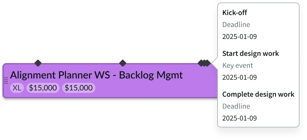 |
Overflow
If the start or end date of a roadmap bar is outside the planning window, then an arrow will appear on the left and right ends of the bar as overflow indicators.

Roadmap timeline states
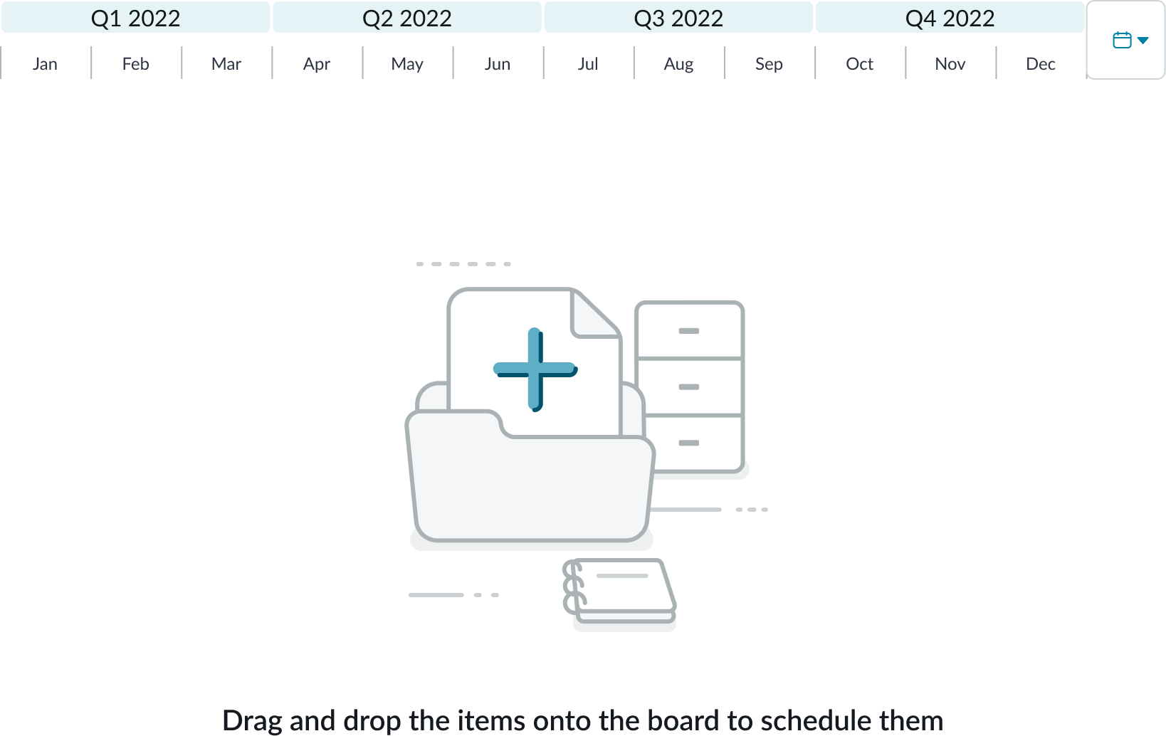
If there are no roadmap bars, roadmap will display an empty state illustration and message.
Interactions
Learn how roadmap responds when a user interacts with it.
Move bars
Users can reschedule the bar by dragging and dropping onto the board. If the user drags and drops one roadmap bar over a second roadmap bar, the first bar drops into the row and the second bar automatically shifts down to start a new row.
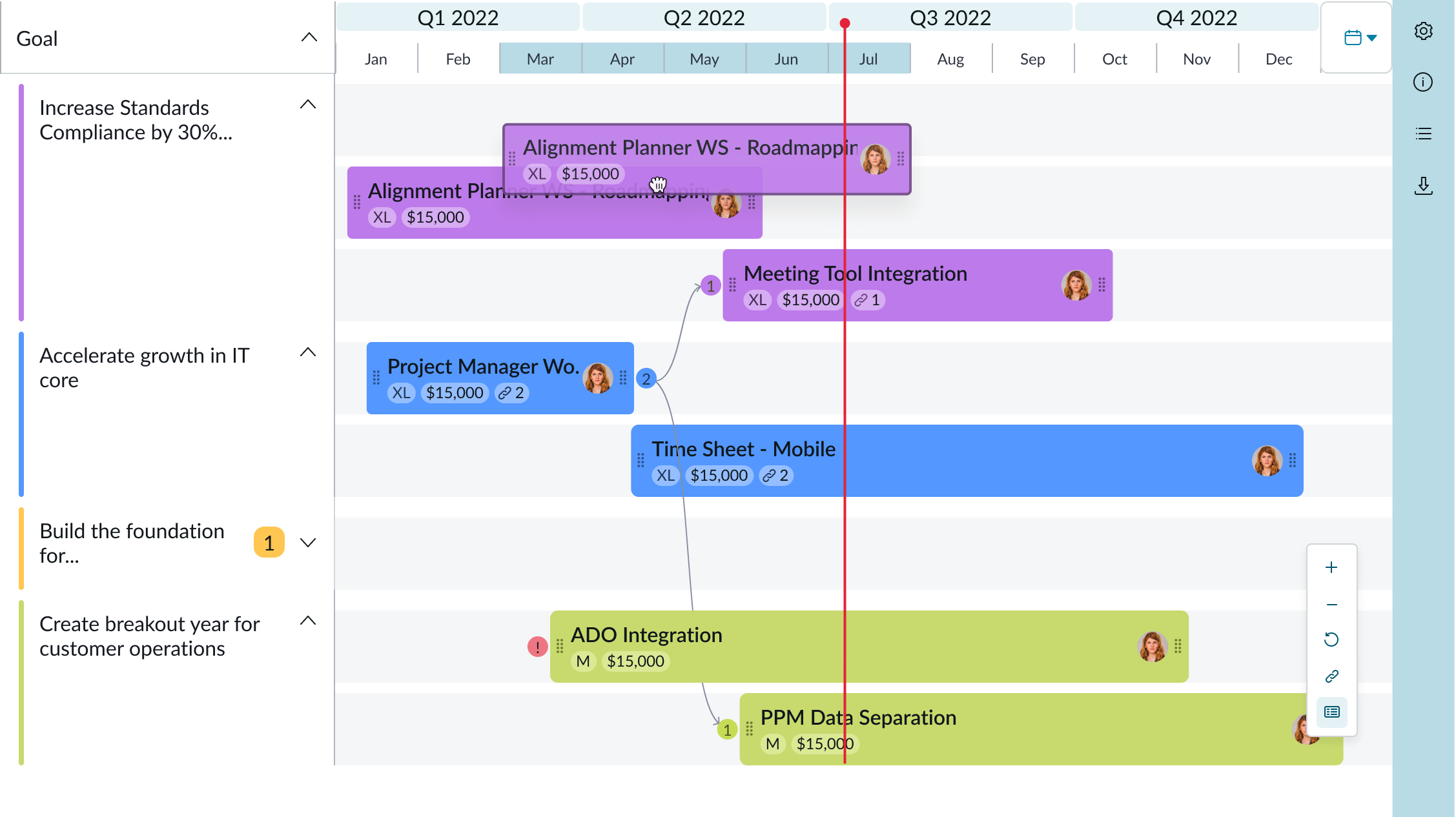
In the image above, the “Redesign Frontend” bar has been selected and can be dragged and dropped.
Resizing roadmap bars
The user can adjust the length of a roadmap bar by dragging the handles on either side of the bar until they achieve the desired length. Resizing can only be applied to bars that are within the planning window.

Responsive behaviors
Learn how roadmap responds to changes in a container or display.
Out of range milestone warning
When roadmap milestones are out of the item’s date range a warning indicator will appear in the bar.
| State | Example |
|---|---|
| Default | 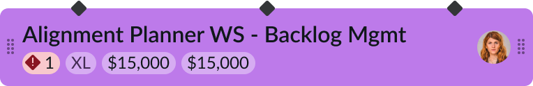 |
| Hover | 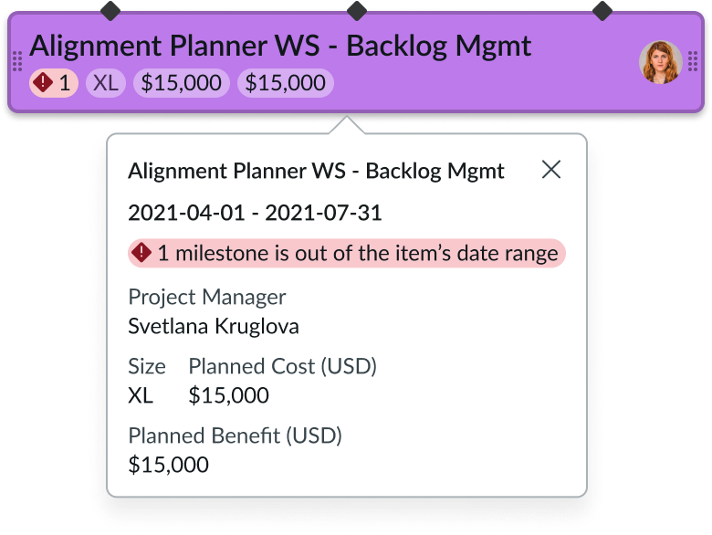 |
Scroll bar
The width of the roadmap resizes automatically to the size of the screen. If the width of the screen is less than the width of the timeline header, a scroll bar appears.
Truncation
When text in a roadmap bar exceeds the width of the content area, the text truncates with an ellipsis. Metrics will be hidden in order of priority, and a tooltip shows the full content on hover.
Usability
Roadmap complies with all internationalization and accessibility requirements.
Internationalization
When the display translates to a right-to-left (RTL) language, the roadmap flips its orientation and aligns on the right.
Accessibility
Learn how to access the actionable elements of roadmap through keyboard interactions and screen readers.
Keyboard interactions
- Tab: Navigates forward from one group to another group
- Shift + Tab: Navigates backwards from one group to another group
- Arrow left: Navigates between items in a group from left to right; there is a hard stop on the last item in the group and it does not circle back to the first item
- Arrow right: Navigates between items in a group from right to left; there is a hard stop on the last item in the group and it does not circle back to the first item
- Arrow up: Navigates to the next item up in a group
- Arrow down: Navigates down to the next item down in a group
- Enter: If an item is selectable and actionable, this activates a details mode, such as a details panel or an edit mode
- Esc: Cancels the action or returns to the prior state
When the focus is on a roadmap bar:
- Enter: Opens the item details side panel
- Esc: Closes the item details side panel
When the focus is on a side bar actionable icon:
- Enter: Opens side panel
- Esc: Closes side panel
Screen readers
When you apply ARIA labels to a component, screen readers announce the controls and content of roadmap in the prescribed tab order.
- Roadmap header
- Header buttons (UI action group)
- Roadmap timeline
- Side bar (UI action group)
- Roadmap bar
- Side bar icon