

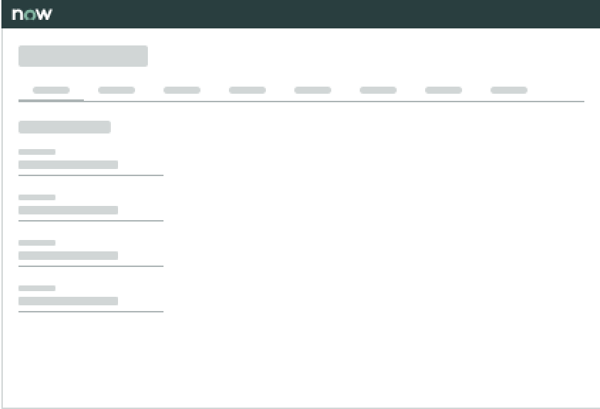
Anatomy
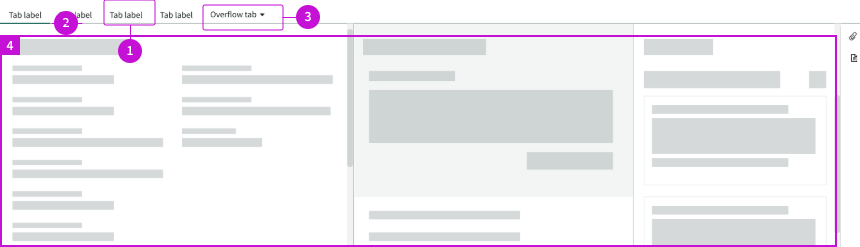
- Record tab: Selectable elements mapped to record-specific fields
- Active indicator: Identifies which record tab has been selected by the user
- Overflow tab: Contains additional record tabs that don't fit in the container
- Content area: Area under the form tabs that contains relevant components; the content and components change based on which record tab is active
Usage
Learn about record tabs and find out how to use them in your design.
Record tabs help organize and group information to prevent long lists of information on one record page.
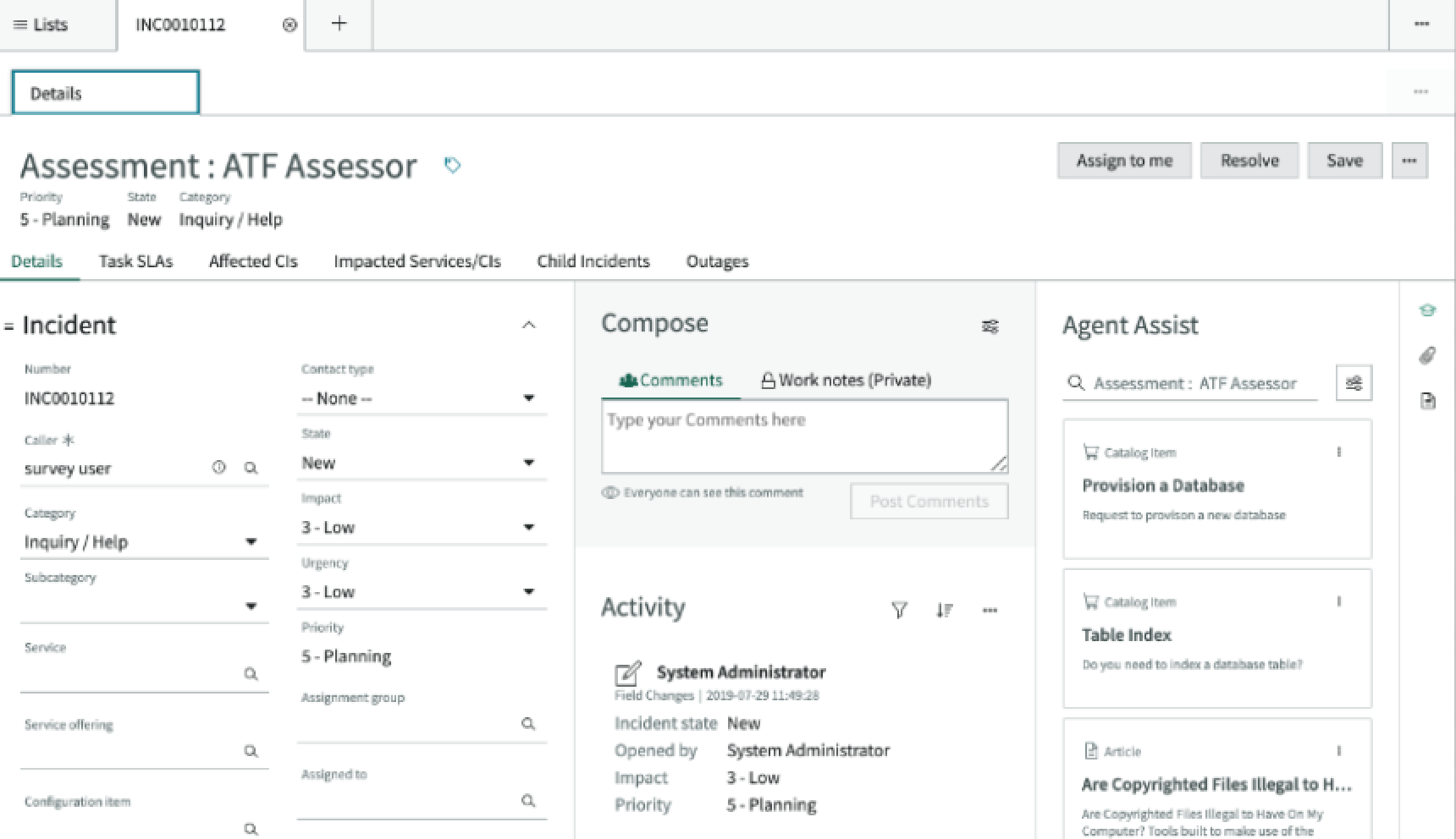
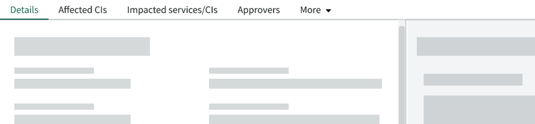
In this example, the record contains different record tabs. The 'Details' tab is currently selected to show information related to the incident.
Remember that record tabs can only exist within the context of a record.
Use the component to help the user switch between content associated with a record.
In this example, the user is viewing the 'Details' tab within an Incident record type.
You can create record tabs that are global (they show up anywhere the component appears) or page-specific (they appear only on a certain type of page). This depends on the experience you are creating for the user.
Avoid using record tabs if content within the record is sparse or if you can't group the content into tabs. If these apply to your use case, use the form component instead.
Variants
Learn about the variants of record tabs.
Types
Record tabs don't have any specific types.
This component is a variation of the tabs component.
Sizes
Record tabs don't have specific sizes. Record tabs adjust their size based on the label length and fill the width of their container.
Configurations
Learn how to customize record tabs by configuring the available properties.
Labels
Record tabs inherit the labels of the routes the tabs are associated with, whether these are built-in or custom.
Number and order
You can configure the total number of record tabs and the order in which the tabs appear. This depends on the type of record and the number of custom tabs you've added to that record type.
Design Recommendations
Learn how to apply record tabs in your design.
Use record tabs with sections in the content area to help separate related content.
Avoid dividing up related content from a single source across multiple tabs.]
Alignment and positioning
Record tabs should left align and appear above the page content.
UI text guidelines
These are some recommendations for using text within record tabs:
- Use sentence case for all titles, labels, and column headers
- Keep all text labels informative and short to increase readability and scanning
Behavior
Learn how record tabs behave when the display changes or a user interacts with the component.
States
Record tabs have 3 states: active, hover, and selected.
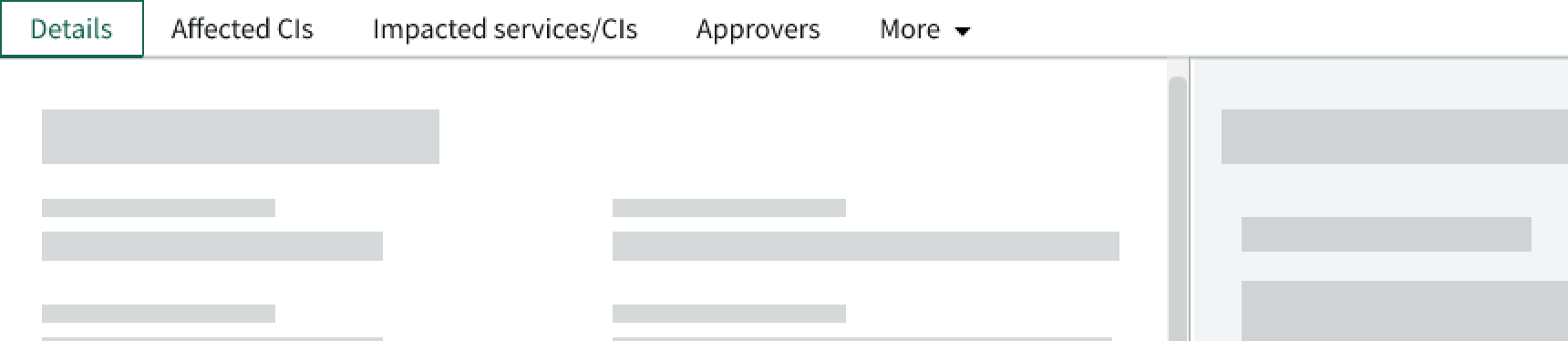
Active
The active state appears on a form tab when the user selects that tab.
Hover
The hover state appears on a form tab when the user hovers over a form tab with their cursor.
Selected
The selected state appears on a form tab when the user selects a form tab. It disappears when the user selects anything else on the page.
Note: The overflow tab appears differently than the other tabs in the selected state.
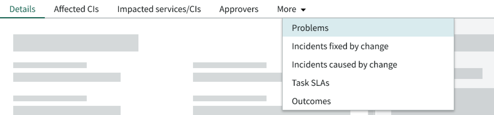
In this example, the user has selected the overflow tab to show additional record tabs.
Responsive behaviors
The record tabs adjust to fit the width of the display.

In this example, the record tabs all fit within the available space, so an overflow tab isn't needed.
If the record tabs don't fit within the available horizontal space, an overflow dropdown menu appears with a "more" label. The tabs always stay left aligned and never wrap to 2 rows.

In this example, the overflow menu appears because the record tabs don't fit within the available space. The user has selected the 'Incidents Fixed by Change' selection from the overflow menu.
Interactions
Learn how record tabs respond when a user interacts with them.
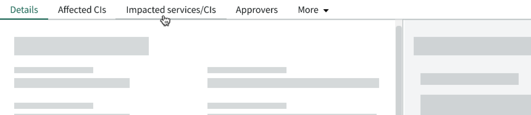
Selecting a tab
The user can select a form tab to change the content in the content area. The active indicator (if available) moves under the tab the user has selected.
Opening the overflow menu
The user can select the overflow menu to show additional record tabs that don't currently fit in the component container.
If the user selects an item from the panel, a checkmark appears next to the selection and the selection replaces the "more" label.
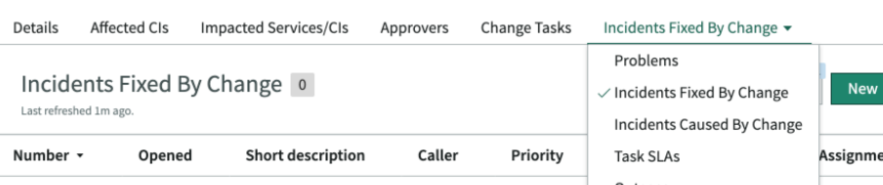
In this example, the user has selected the 'Incidents Fixed by Change' selection from the overflow menu.
The "more" label on the overflow menu only reappears if the user selects one of the record tabs outside of the overflow menu.
Truncation
Form tab text doesn't truncate. The record tabs always show the full label to increase readability and scannability.
Usability
Record tabs comply with all internationalization and accessibility requirements.
Internationalization
When the display translates to a right-to-left (RTL) language, the record tabs flip their orientation and align on the right. However, the form tab labels don't translate.

In this example, the record tabs show in a right-to-left language. Any proper nouns won't translate.
Accessibility
Learn how to access the actionable elements of record tabs through keyboard interactions and screen readers.
Keyboard interactions
You can access the actionable elements of record tabs with these keyboard keys:
- Tab: Moves focus to the first form tab in the tab order
- Tab + Shift: Moves focus to the previous element in the tab order
- Arrow Right or Left: Moves focus to the next or previous tab
If focus is on the overflow tab:
- Arrow Down: Opens the panel
If focus is on an item in the overflow tab panel:
- Arrow Right or Left: Moves through the panel items
- Enter: Selects the item in focus and changes the content in the content area
Screen readers
Record tabs have no specific screen reader considerations.