

Anatomy
- Container: A simple box with one or more slots to hold a component or another container; container and slots are not visible to the user.
Usage
Container is used to organize content by dividing the page into sections. Any component that is added to the page should be placed in a container slot. To add a container, select Flexbox or Grid in the toolbox advanced section.
Variants
Learn about container and find out how to use it in your design.
Sizes
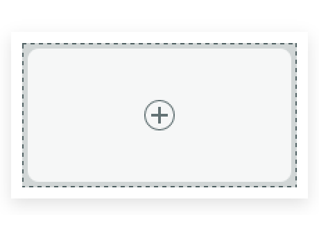
A container takes up no space when it's empty. As components are added to it, the container expands to the size necessary to fit that component.
Configurations
Learn how to customize container by configuring the available properties.
CSS layer styles
A container has separate inner and outer layers that work together to control the proportions of the components inside the container. The outer layer controls how the container responds to other elements on the page. The inner layer wraps the components and controls how they behave. For some uses cases, you must control how the inner layer relates to the outer layer. An example of this might be when a component in a container occupies all the height of the inner layer. If the height of the outer layer changes in response to other components on the page, the proportions of the inner component can be affected. If this creates a problem in your design, you can edit the CSS of each layer separately in the Styles panel. See Change the default appearance of components for more information.
Design recommendations
Learn how to apply container in your design.
Alignment and positioning
Learn how to place container and any elements in your design.
Nesting containers
You can nest containers inside containers, with no limit to the number of containers that a page can contain, nor how deeply they can be nested.
Adding container slots
Containers have layout properties applied to them. When a container is added to a page, it has a single slot by default. However, changing the layout can affect the number of slots, where they are positioned, and how they behave.
For more information on layout in UI Builder, see product documentation for working with layouts.
Usability
Container complies with all internationalization and accessibility requirements.
Internationalization
When the display translates to a right-to-left (RTL) language, each component used in container responds in accordance with its individual internationalization requirements.