

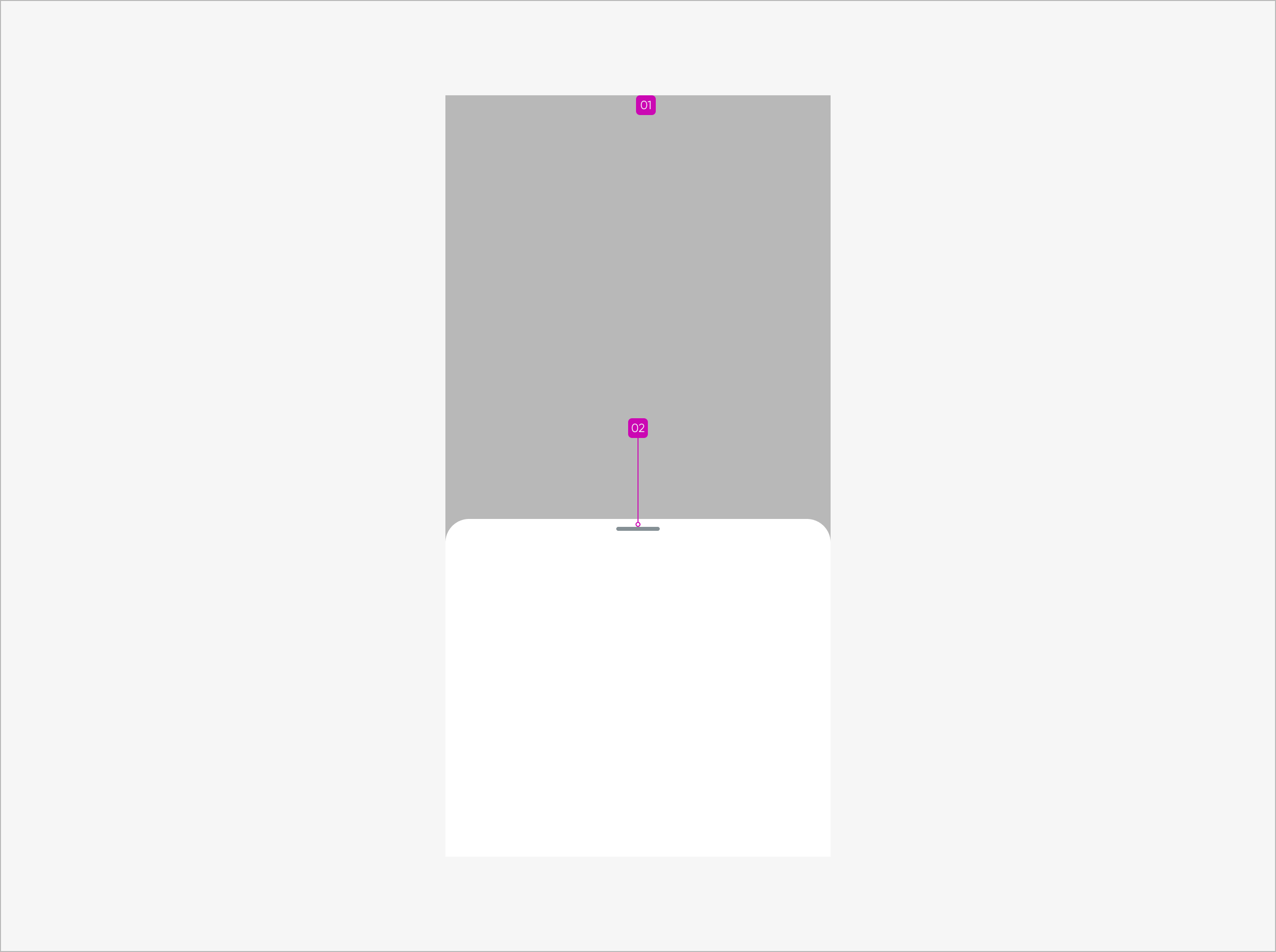
Anatomy
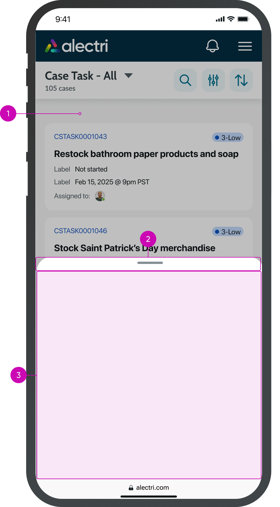
- Overlay: Covers the entire screen and follows the styling of the modal component.
- Handle area: Fixed to the top of the sheet; indicates that the sheet can be resized.
- Content slot: Configurable content slot.
Usage
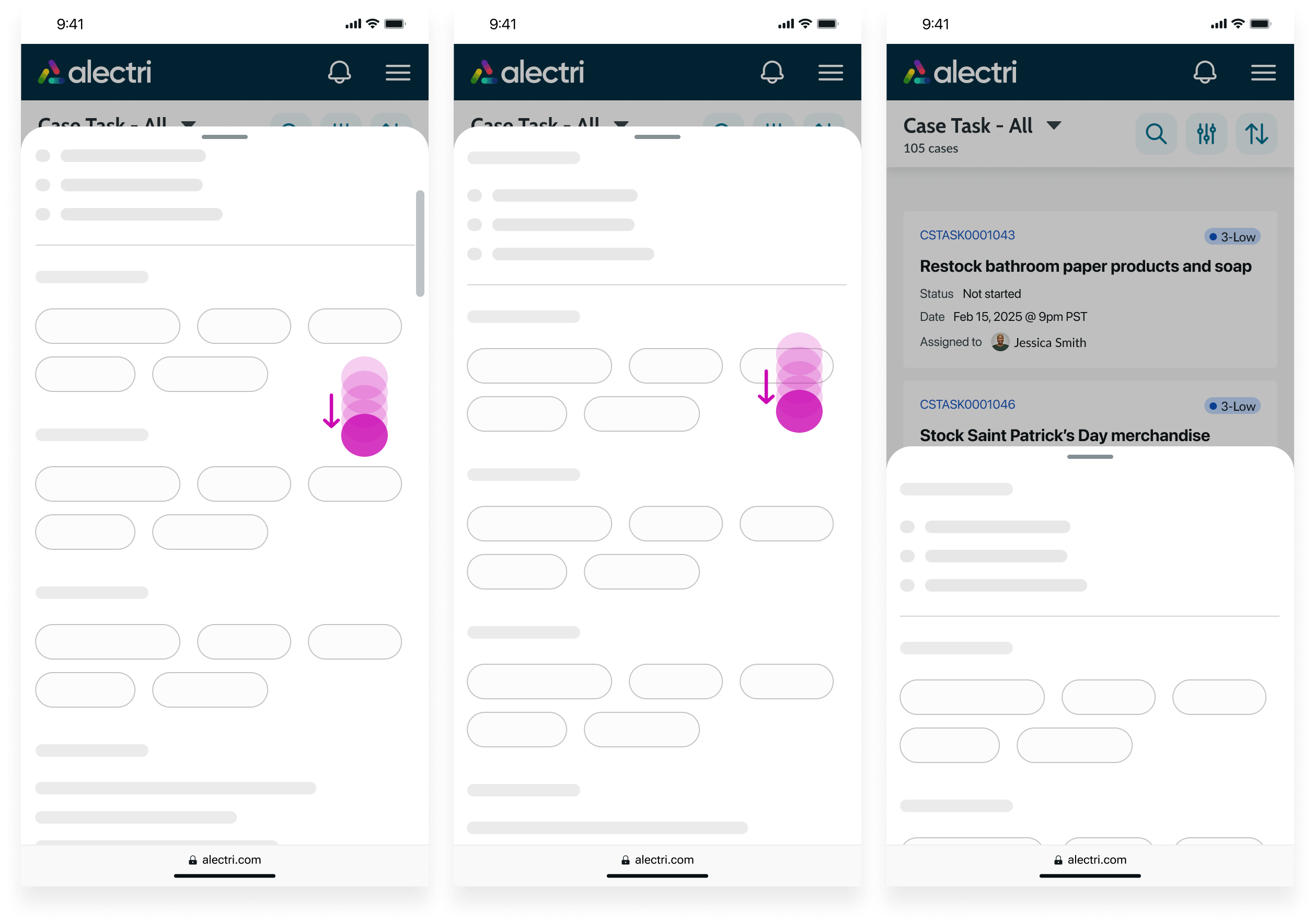
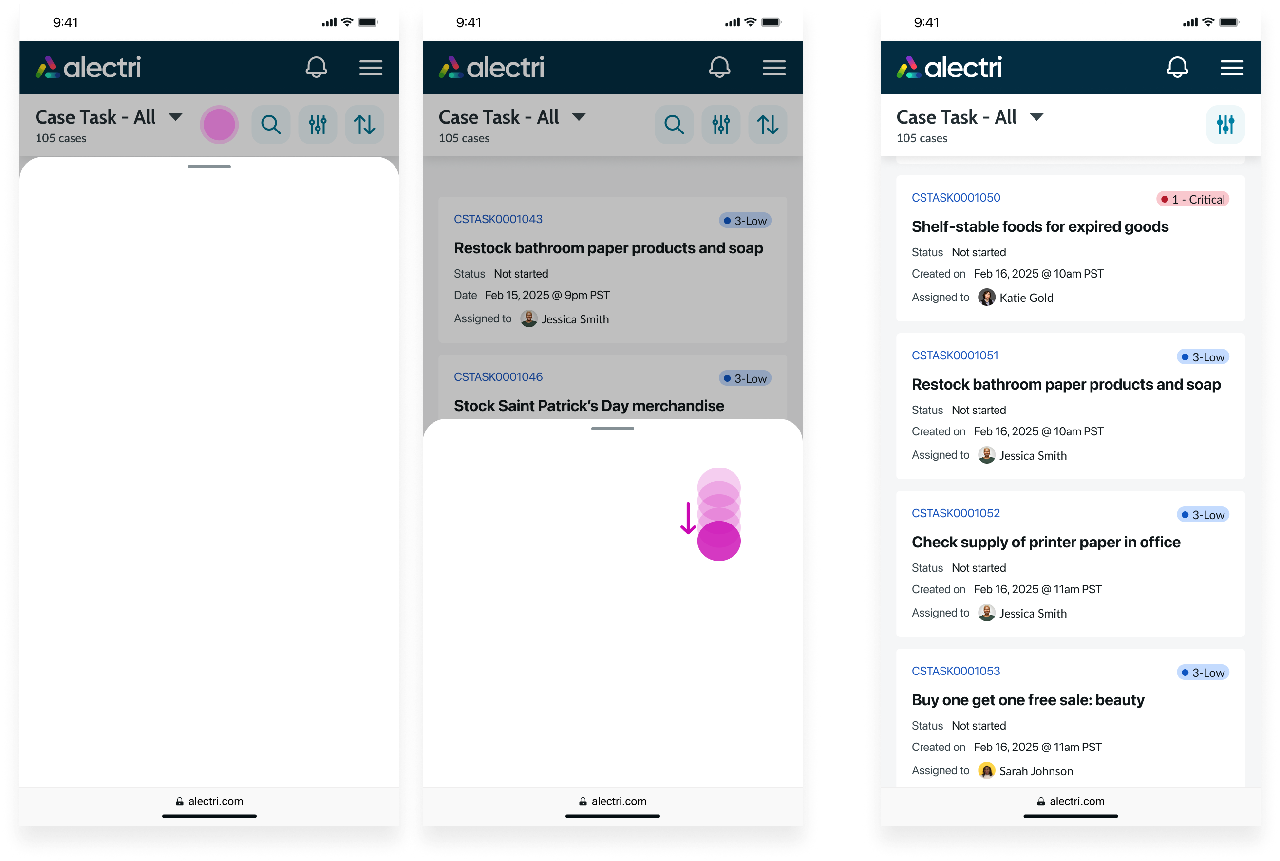
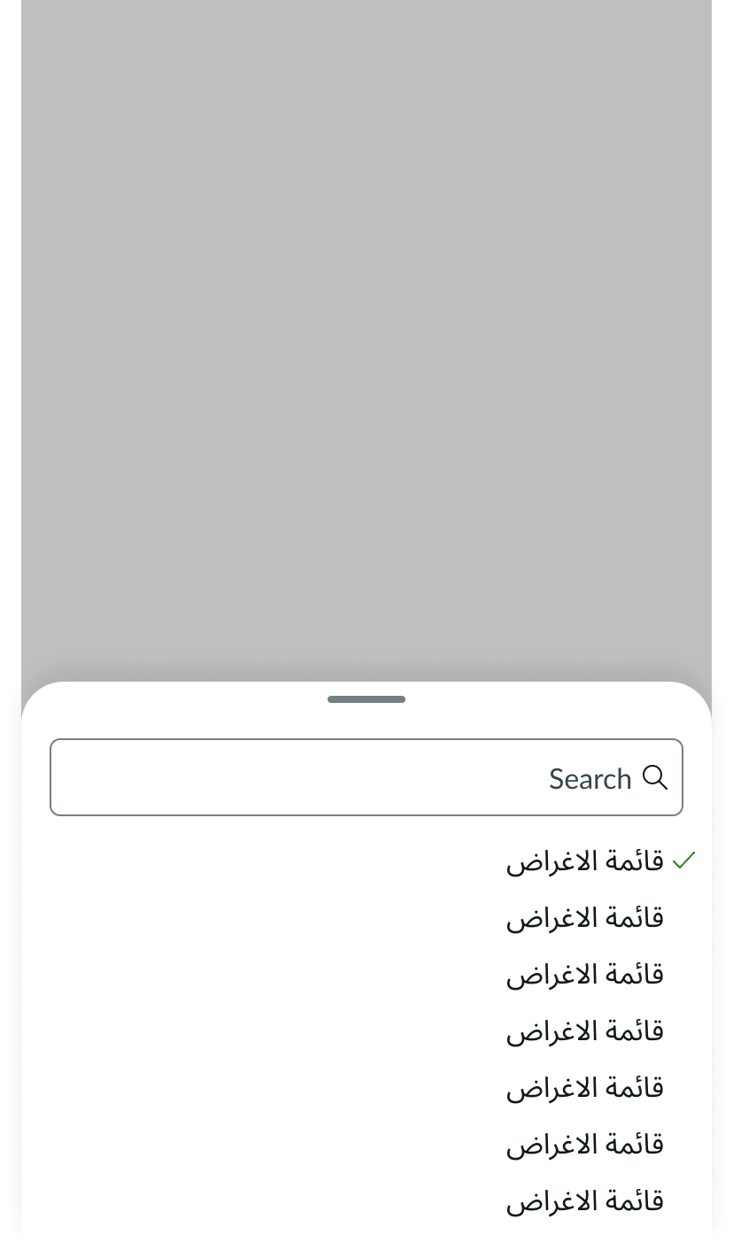
Use sheet to present related actions or content from another component in a mobile-friendly layout. For example, a dropdown list appears on mobile using a sheet, and the list items defined in the dropdown list populate the sheet’s content. Depending on the height of the content and the size you select, the sheet expands, collapses, or scrolls when you interact with it.
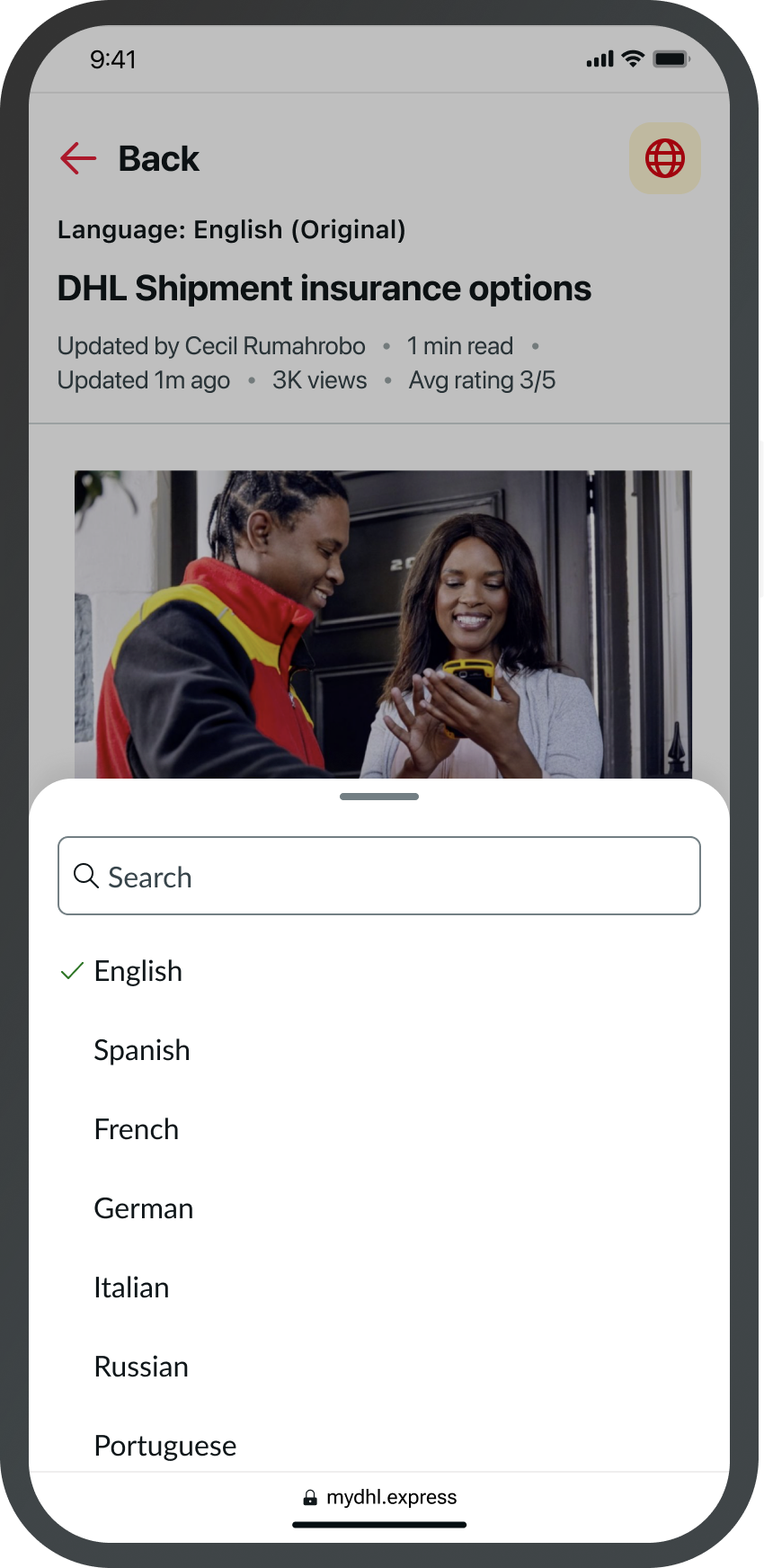
Example of a dropdown list using a sheet when appearing on mobile.
Variants
Learn about the variants of sheet.
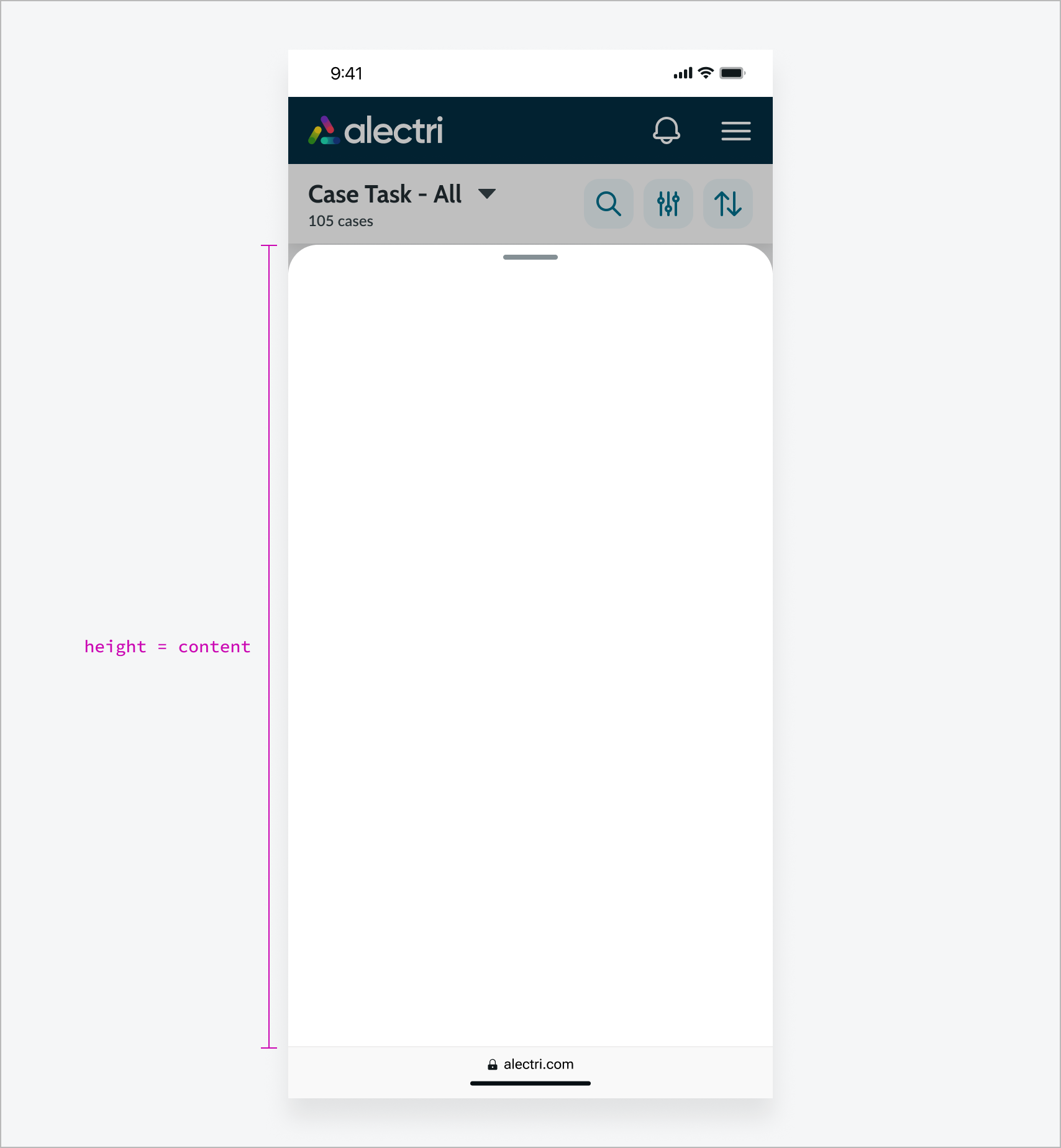
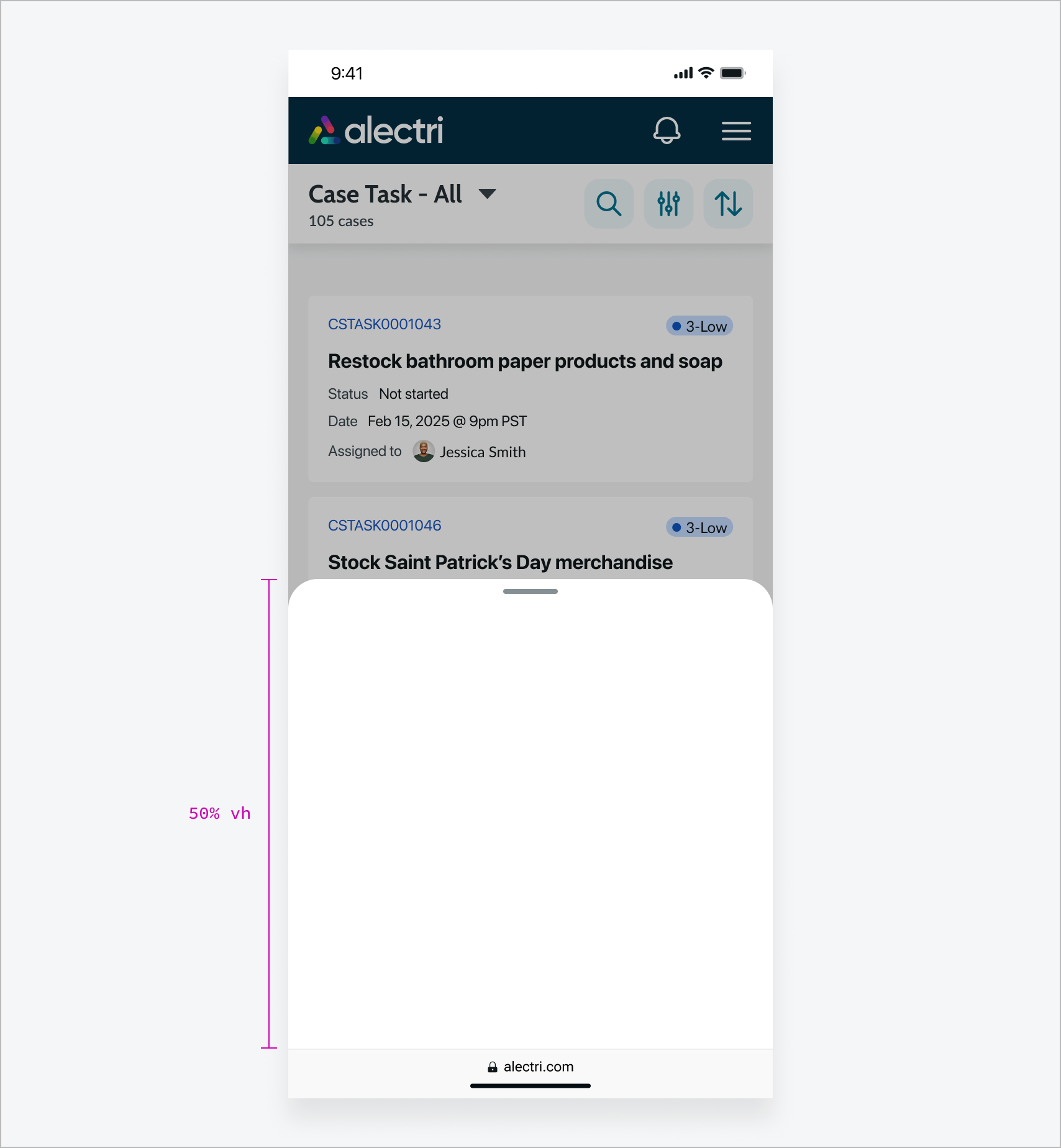
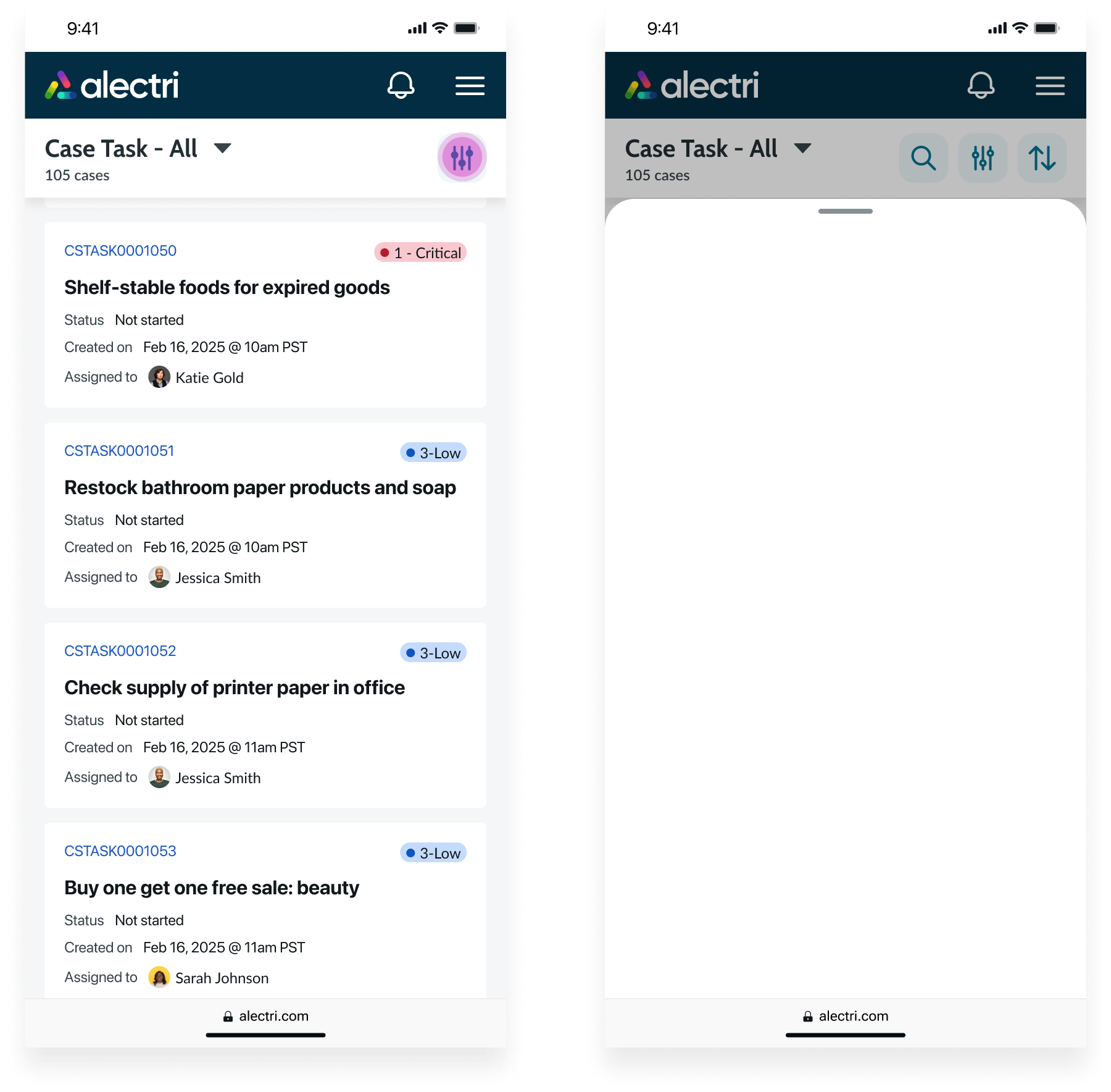
Sizes
Sheet has the following sizes: Auto, Half, Full, and Fixed. The default size is Auto.
Auto
Height is determined by the content, up to a maximum of 90% of the viewport.
Half
Sheet takes up 50% of the viewport when it opens.
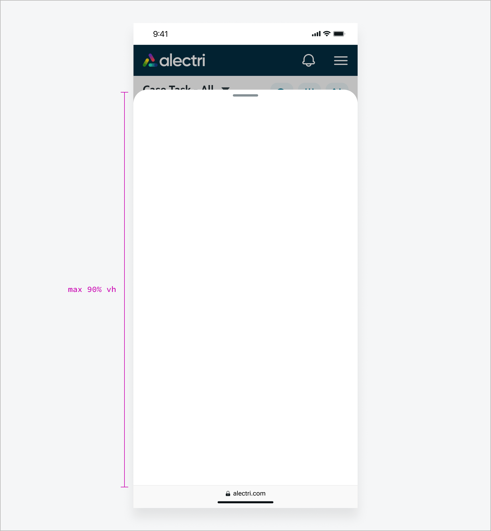
Full
Sheet takes up the maximum height of 90% of the viewport when it opens.
Fixed
Sheet takes up a fixed height of 50% of the viewport and is non-resizable.

Configurations
Learn how to customize sheet by configuring the available properties.
Disable close
You can disable the default behaviors that close Sheet, such as tapping outside of the sheet and swiping or dragging downward. When the user performs these actions, the sheet remains open.
Note: If you disable the default close behavior, you’ll need to provide your own custom close action to ensure the sheet remains accessible.
Disable overflow
You can disable the default scrolling behavior for overflowing content. This enables custom overflow behavior, such as setting a sticky header and footer.
Behavior
Learn how sheet behaves when the display changes or a user interacts with the component.
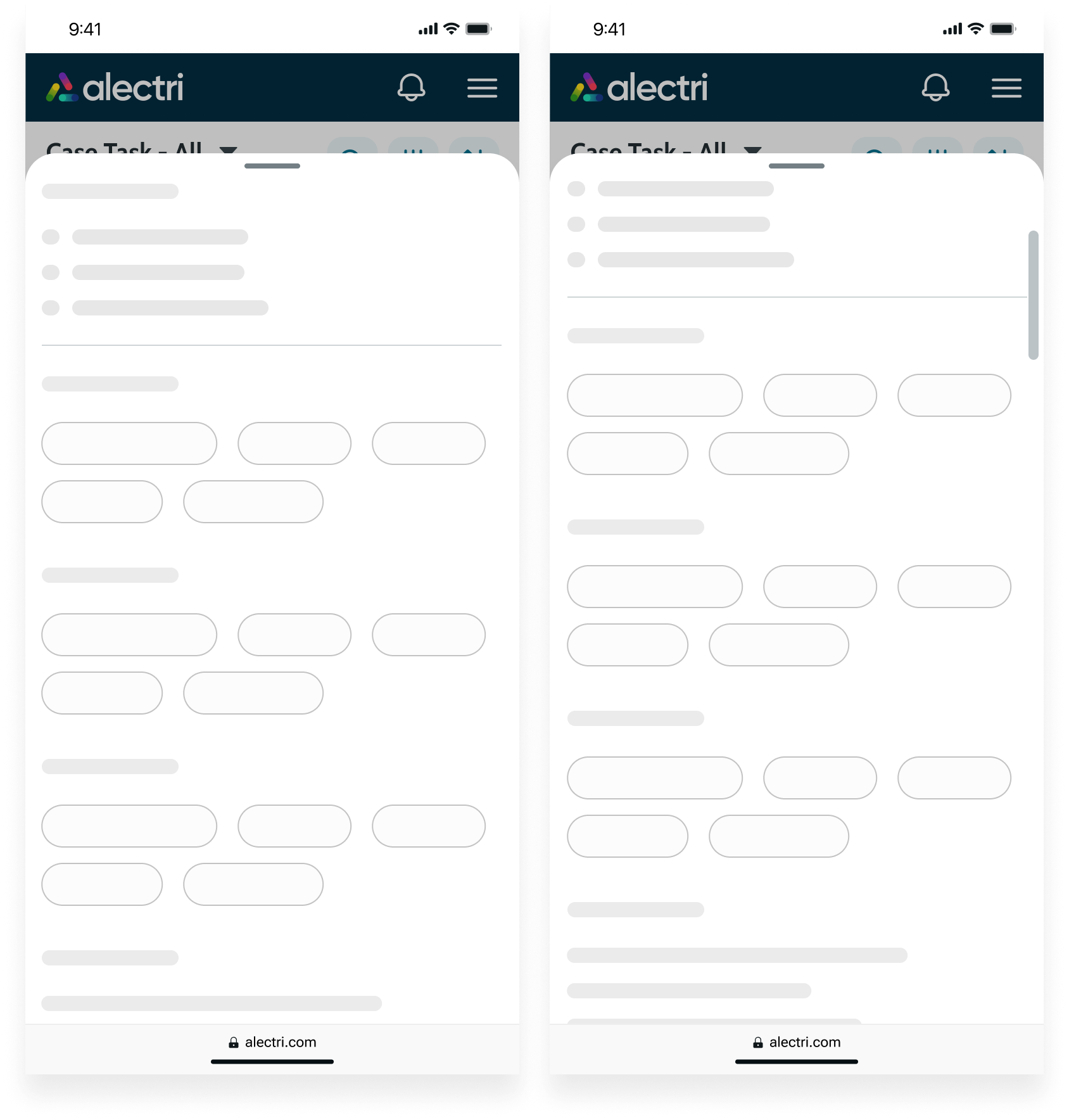
Overflow and scrolling
If the content exceeds the maximum or fixed height of the sheet, the content becomes scrollable.
Swipe to close
When the content exceeds the maximum or fixed height of the sheet, swiping down scrolls the content. Once there is no more scrollable content, swiping down collapses the sheet to 50% of the viewport.
Orientation
Sheet displays in both portrait and landscape. In both modes, it keeps the same size setting and the same minimum and maximum height limits.
Interactions
Learn how sheet responds when a user interacts with it.
Open
Tapping the trigger button opens the sheet to a preset height. The height depends on the size you select.
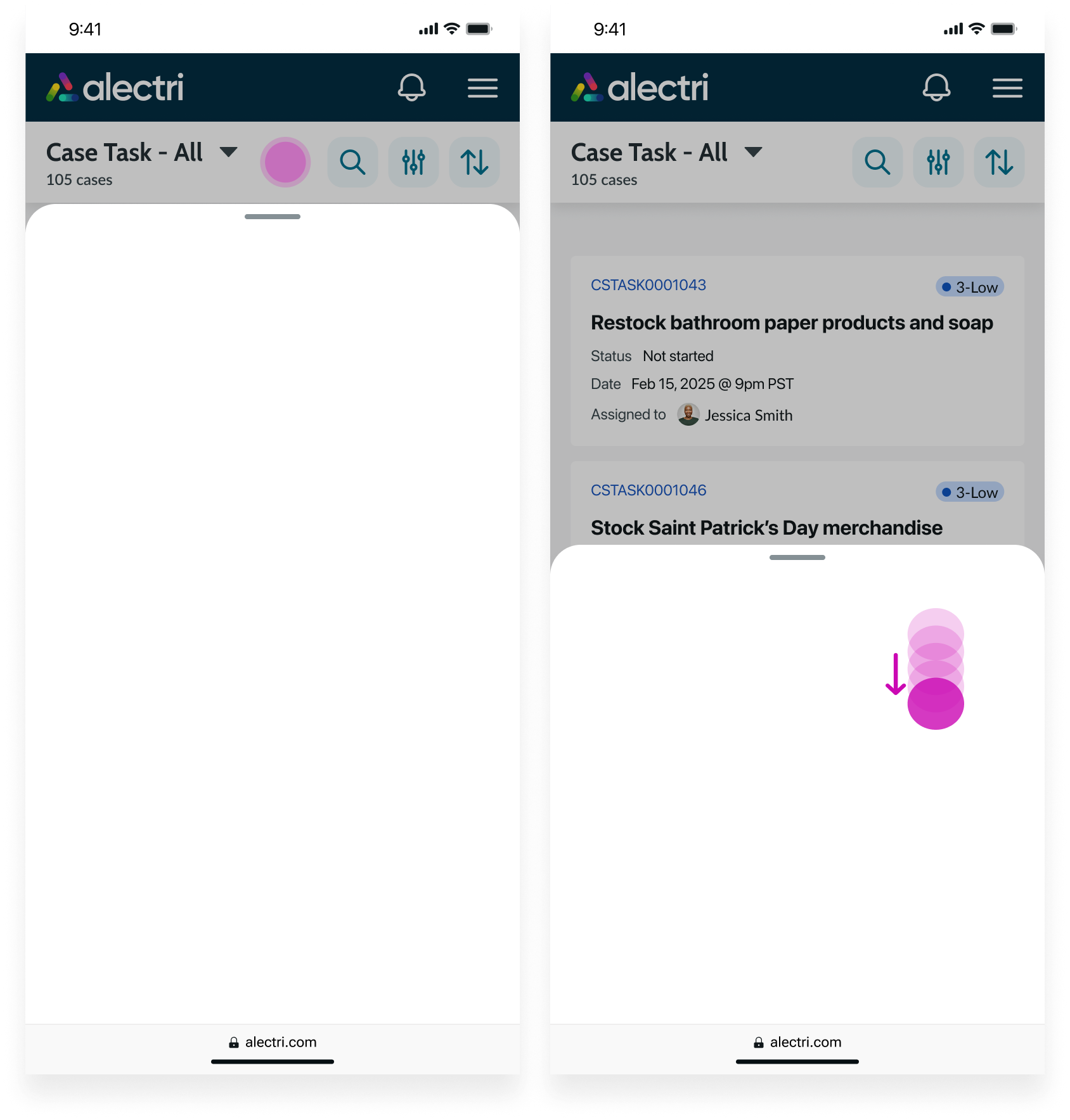
Expand
When the sheet is set to Half size and the content exceeds 50% of the viewport height, tapping the handle or swiping or dragging upward expands the sheet to show the full content.
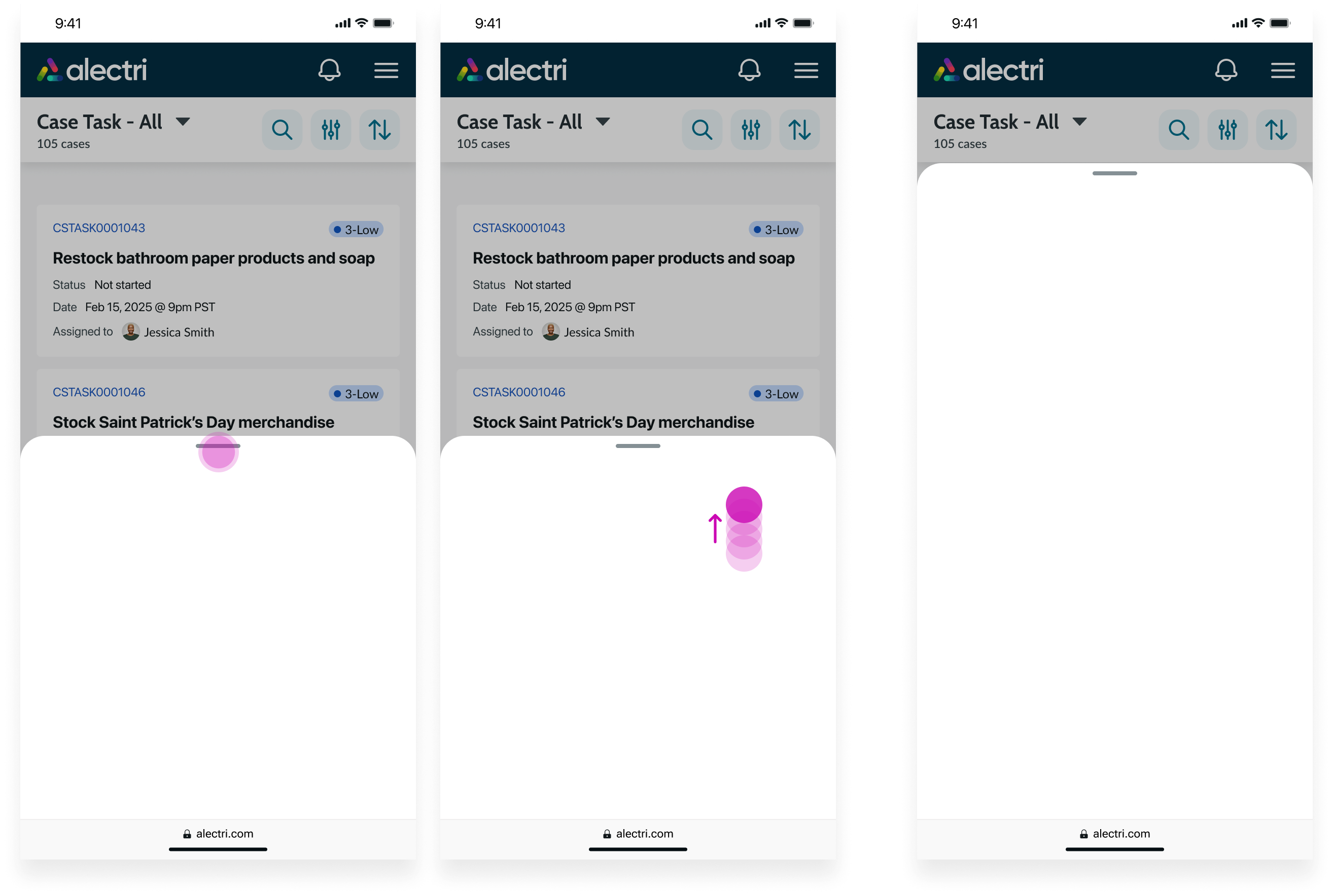
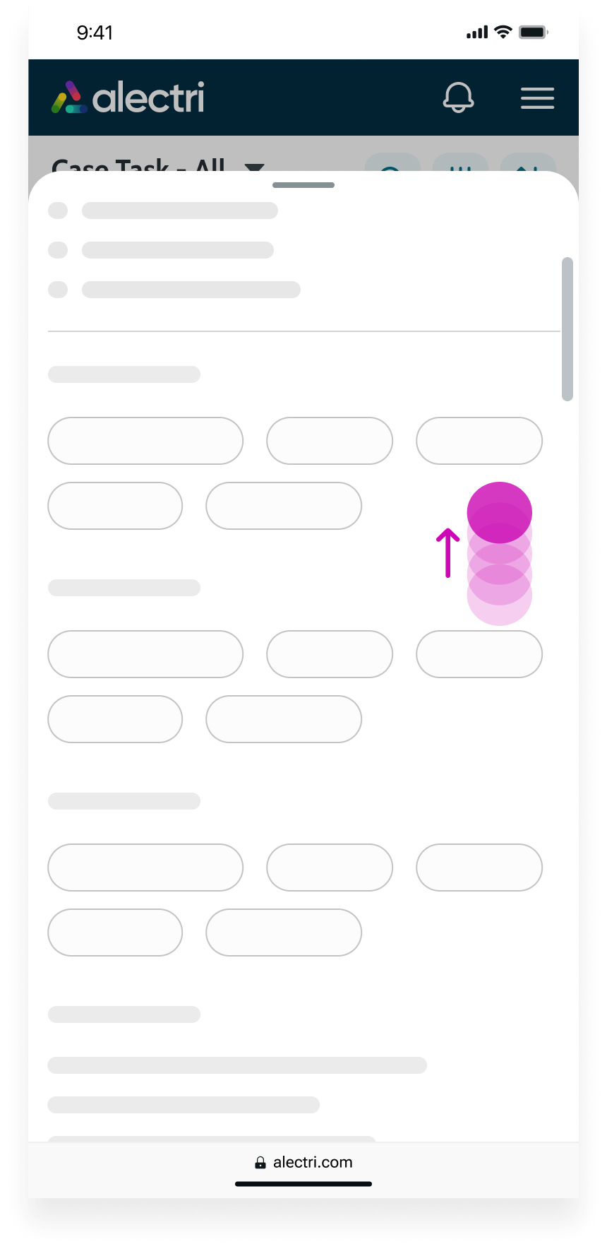
Collapse
When the sheet exceeds 50% of the viewport, tapping the handle and swiping or dragging downward collapses the sheet to 50%.
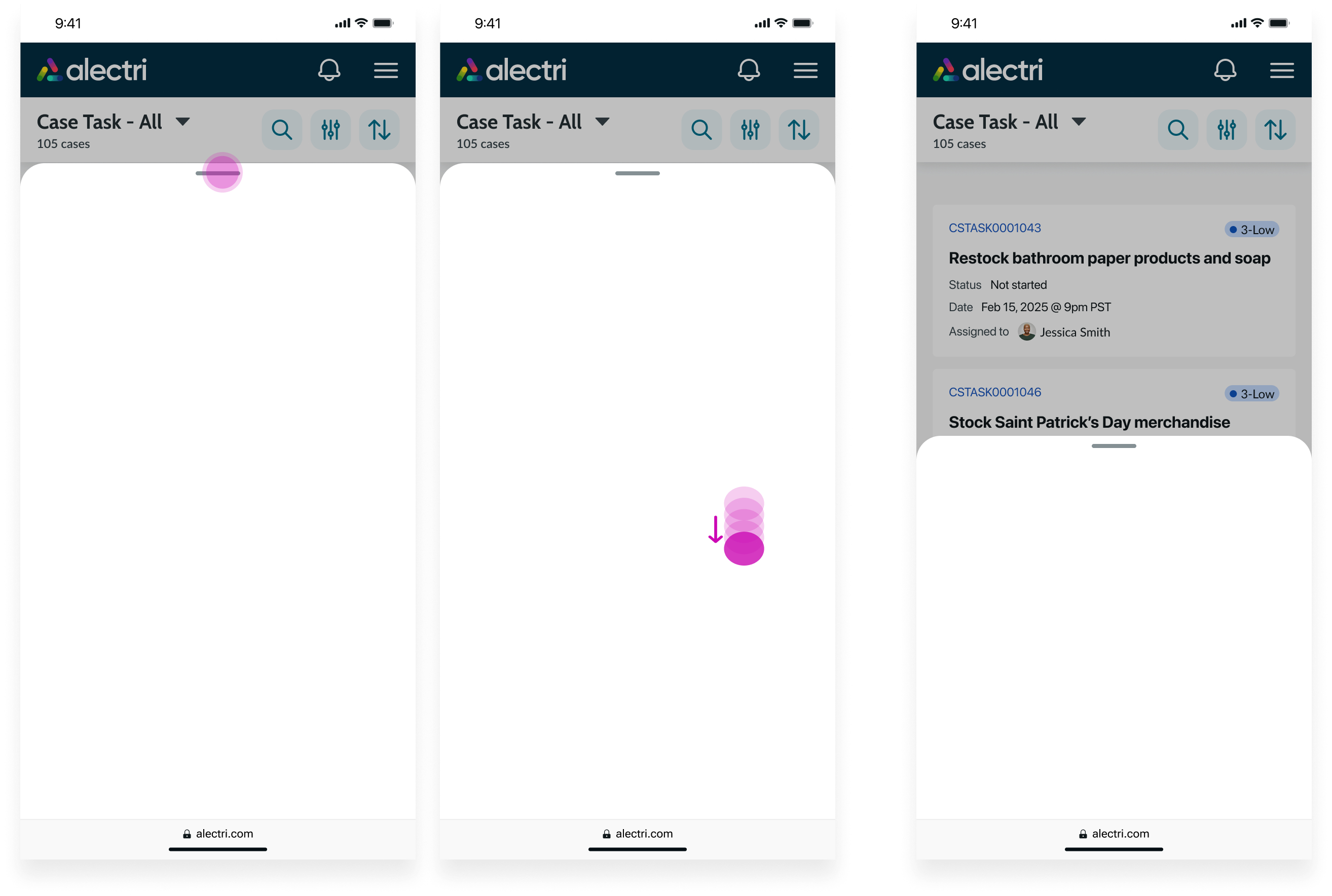
Close
Tap outside of the sheet to close it. When the sheet occupies 50% or less of the viewport height, tapping the handle and swiping or dragging downward also closes it.
Nested sheets
If a sheet triggers another sheet, the child sheet appears on top of the parent sheet, which stays open. The user must close the child sheet before they can interact with the parent sheet again.
Usability
Sheet complies with all internationalization and accessibility requirements.
Internationalization
When this component is used in a platform configured for a right-to-left (RTL) language, the sheet container appears unchanged, and content rendered in the content slot appears right-to-left.
Accessibility
Learn how to access the actionable elements of sheet through keyboard interactions and screen readers.
Sheet tab order
This is the tab order for sheet.
Keyboard interactions
Users can interact with the sheet using the keyboard.
When the focus is on the overlay:
- Enter or space: Closes the sheet
When the focus is on the drag handle:
- Enter or space: Collapses or expands the sheet, depending on the height of the content and the size you select
When the focus is on the sheet:
- Tab: Moves focus to the first actionable element
- Shift + Tab: Moves focus to the element that was previously in focus; if focus is on the first focusable element (handle), it moves to the last focusable element in the sheet
- Escape or space: Closes the sheet
Screen readers
When you apply ARIA labels to a component, screen readers announce the controls and content of the sheet in the prescribed tab order.