

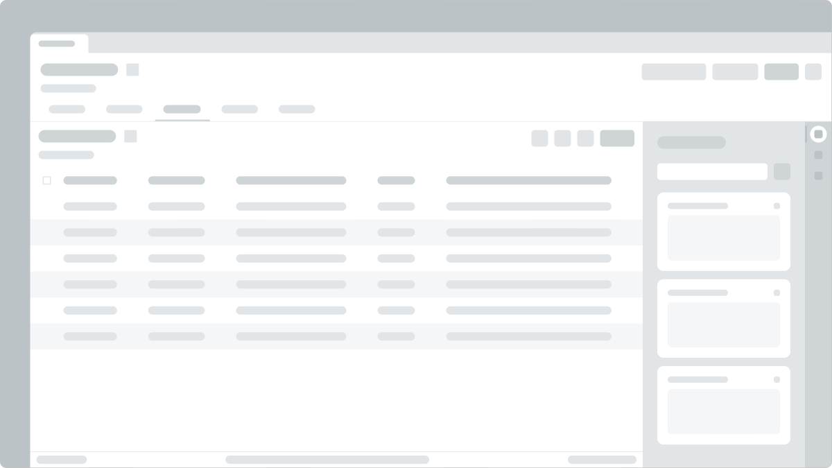
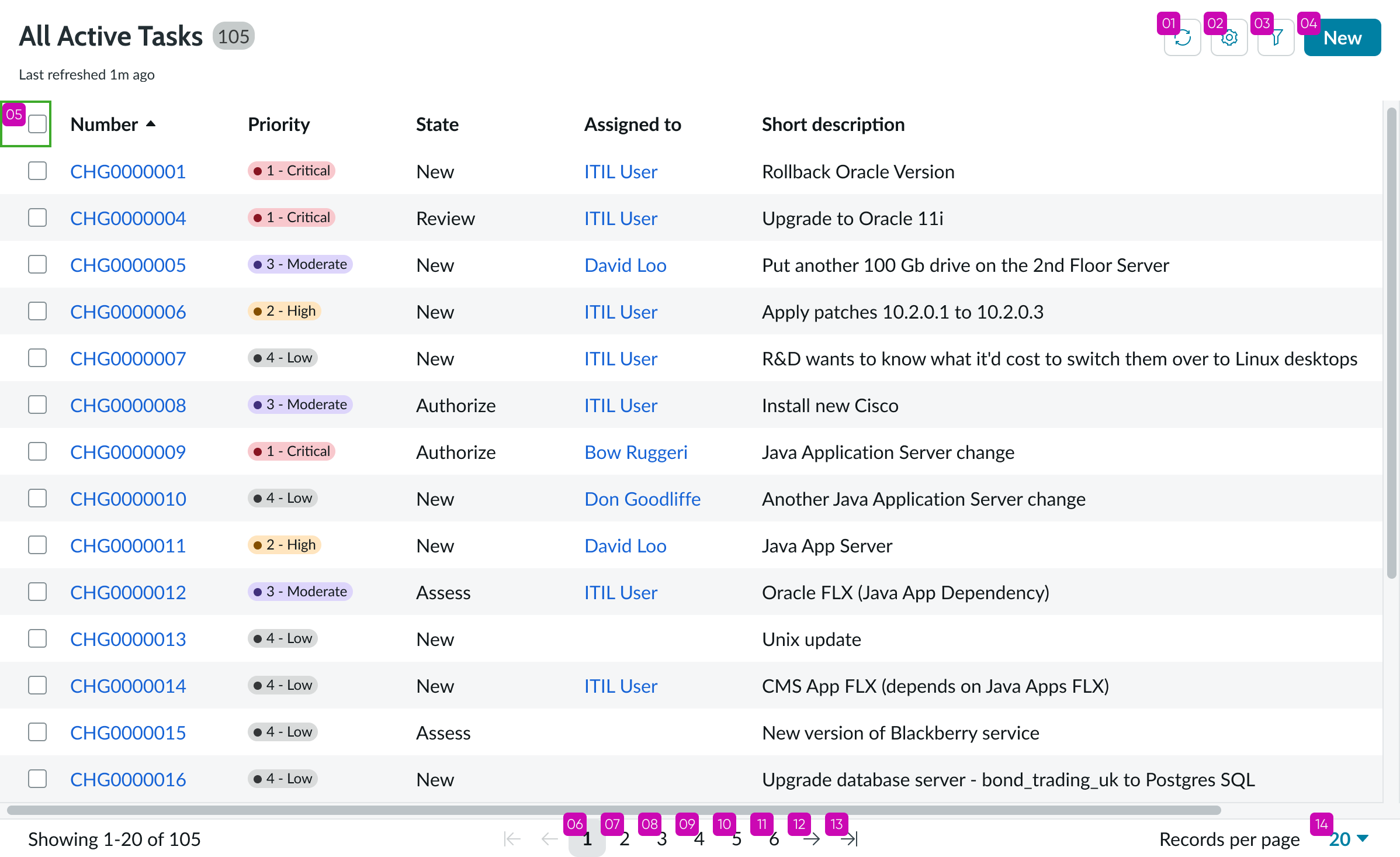
Anatomy
Learn about the individual parts of list-related.
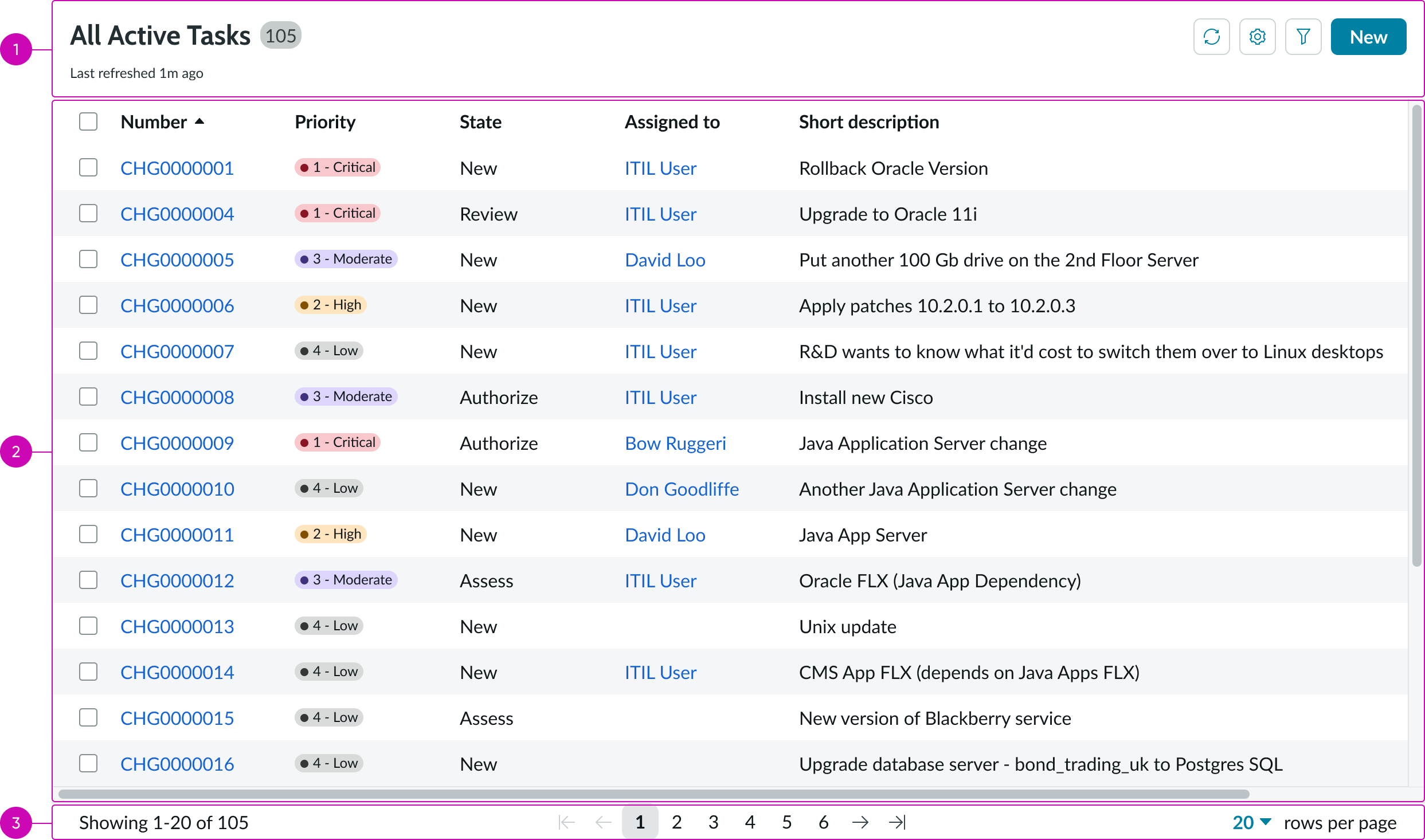
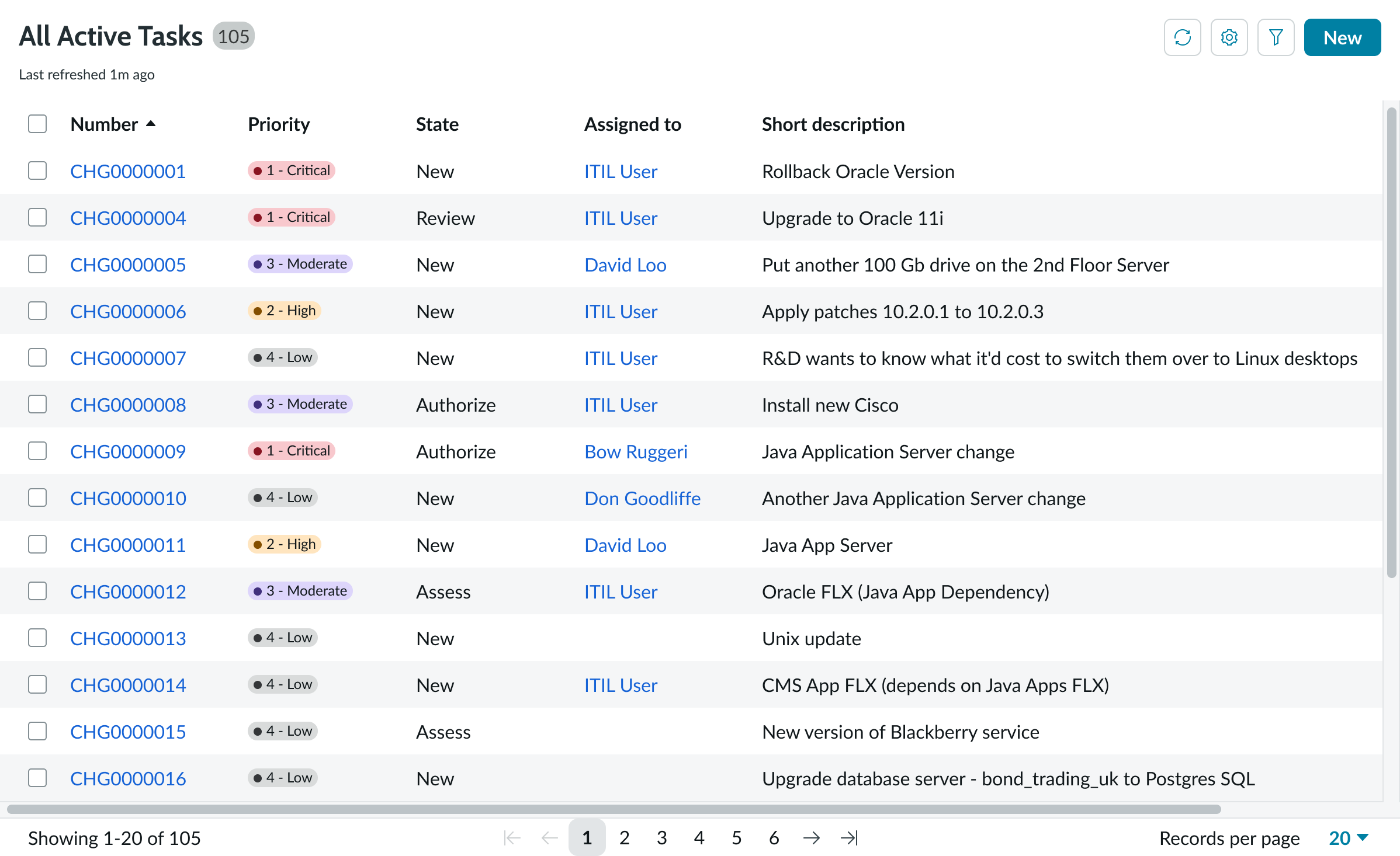
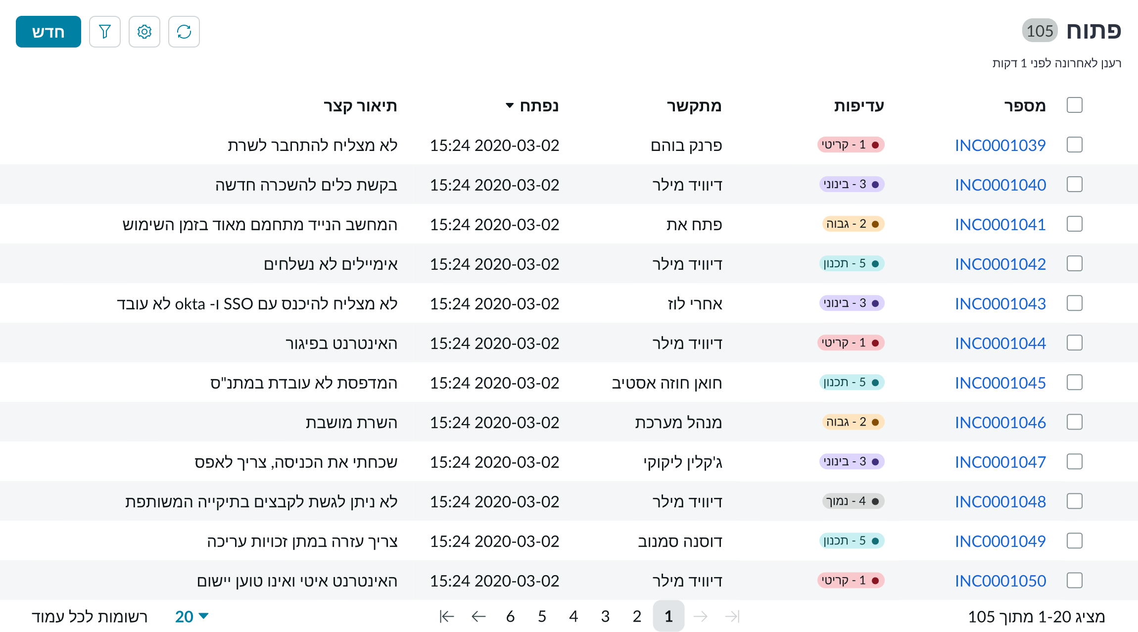
- Header: Area that contains a title that describes the contents of the list; the action buttons help the user interact with the list
- Body: Column headers and rows that organize the list item
- Footer: Area beneath the list that contains pagination controls or controls for viewing hidden content
Header
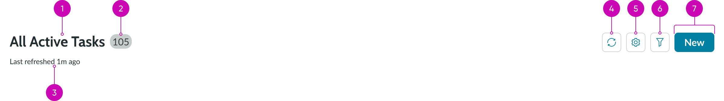
- Title: Title of the list; this can be hidden
- Badge: Displays the total number of records in the data result set
- Last refreshed time: Text that tells the user how long ago the list last refreshed; this can be hidden
- Refresh button: Pulls latest data from source; can be hidden
- Filter icon button: Is incremented as filters are added to the filter pane
- Declarative actions: Opens a list of filters that are added to the filter pane
Body
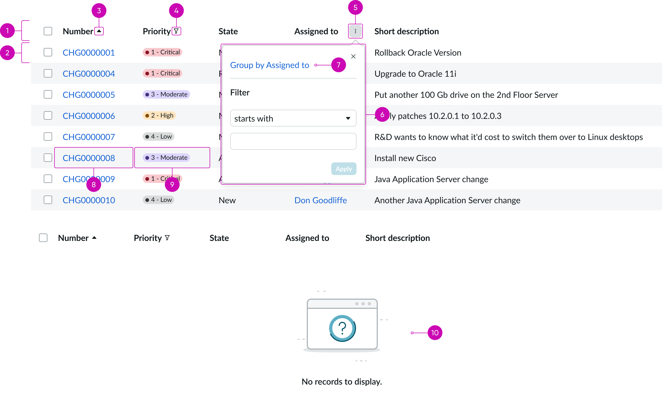
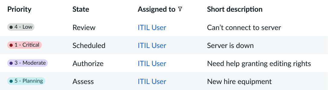
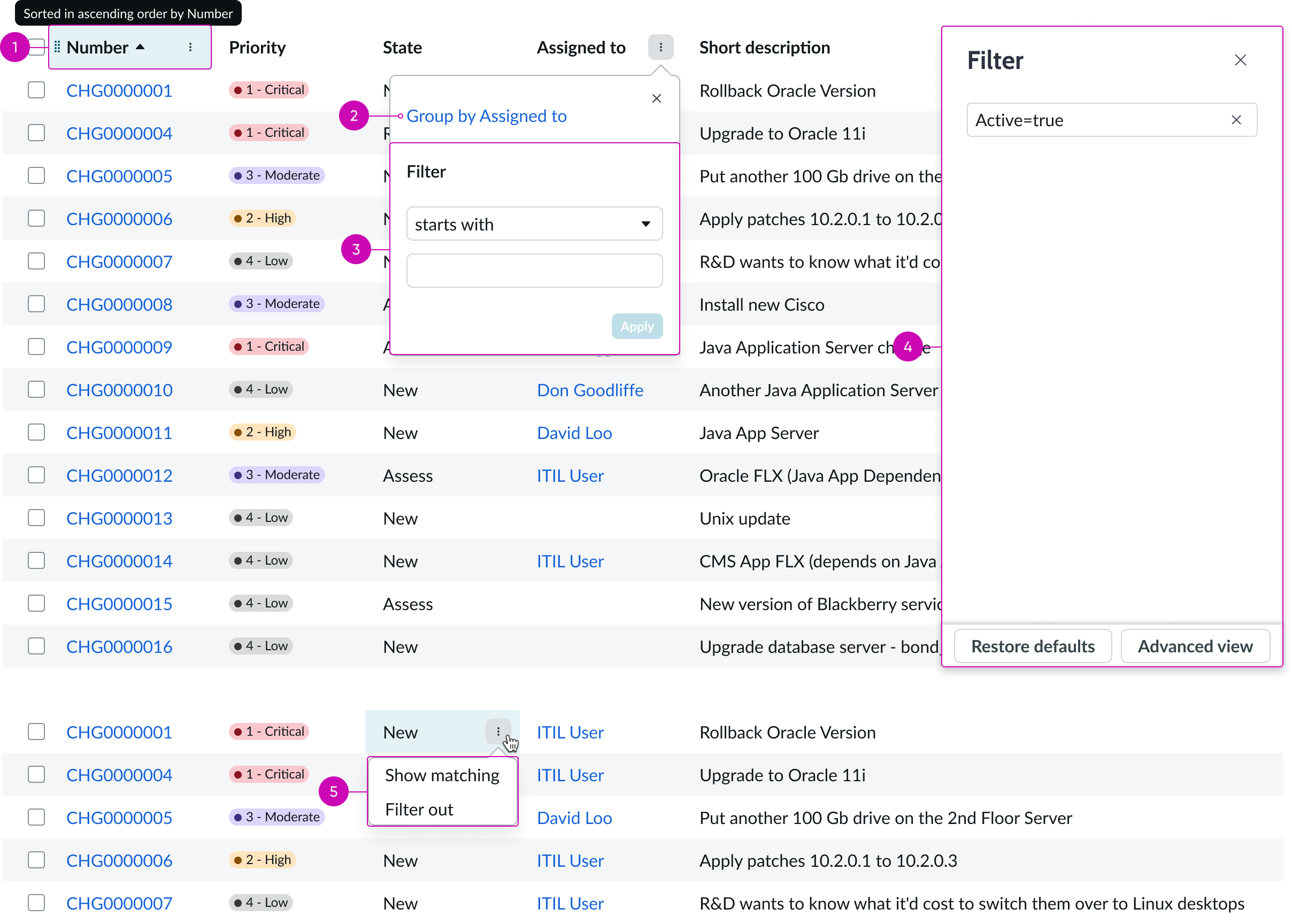
- Column headers: Identifies the contents of each column and provides sorting controls
- List item : Individual list item within the list body that contains filterable data
- Links: Links that open the records in the list in a new browser tab
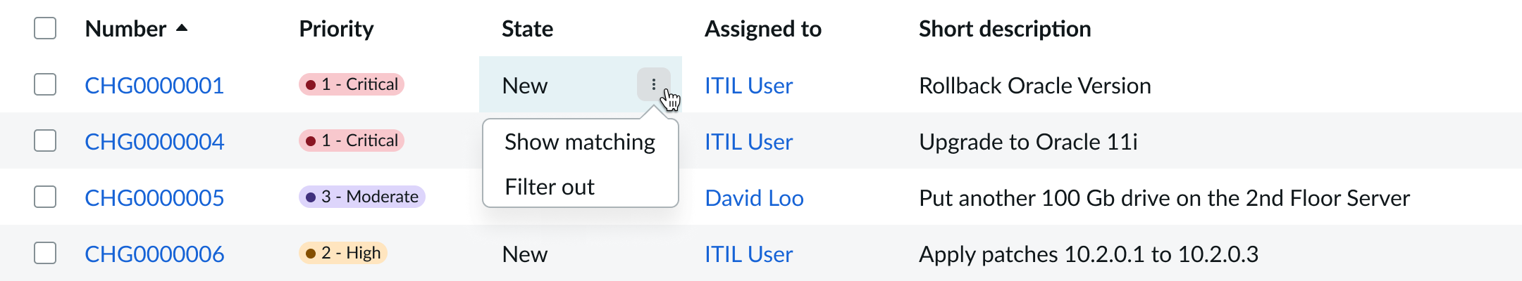
- Filter button: Icon button that displays a filter menu, enabling users to group items
- Group by: Menu selection to group the list based on the data in a specific column
- Empty state image: Image that displays when there is no data in the list
Footer
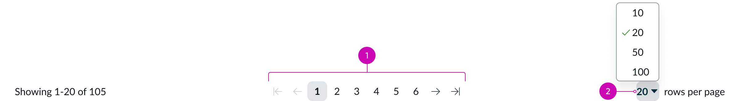
- Pagination: Shows page range for all records and provides navigation for selecting hidden records; see the pagination control usage guidelines for details
- Disclosure control: Control that enables users to select the number of records to display per page
Subcomponents
See usage guidance for button bare
See usage guidance for checkbox
See usage guidance for dropdown
See usage guidance for highlighted value
See usage guidance for split button
See usage guidance for text link
See usage guidance for pagination control
See usage guidance for popover
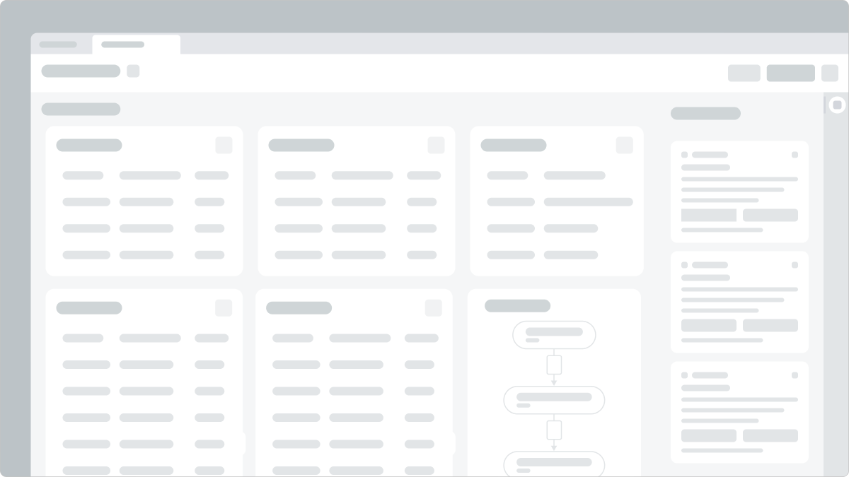
Usage
Learn about related list and find out how to use it in your design. Related lists are primarily used within the context of a form to analyze data, prioritize work, and view and navigate collections of records related to a parent record. Users can then take an action on those records using controls in the list.
Configurations
Learn how to customize a related list by configuring the available properties.
Header
You can show or hide every subcomponent or element within the header, including the header itself.
Badge
The badge shows the total number of records in the system. A plus sign (+) on the badge indicates that more records are available. The plus sign only displays If the configured table is very large and has been configured to omit the total record count for performance reasons. You can hide the badge.
Table data
Select the parent table for the relationship and the data source for the related list. Select the columns from this child table to display and create an initial filter for the data. You can configure the number of rows to display in the related list and the number of data columns.
Filters
Filters you create show up in the Filter panel. By default, the user can delete, edit, or create filters, unless you hide these capabilities. If you want to add a read-only filter to the related list, create a “fixed filter.”
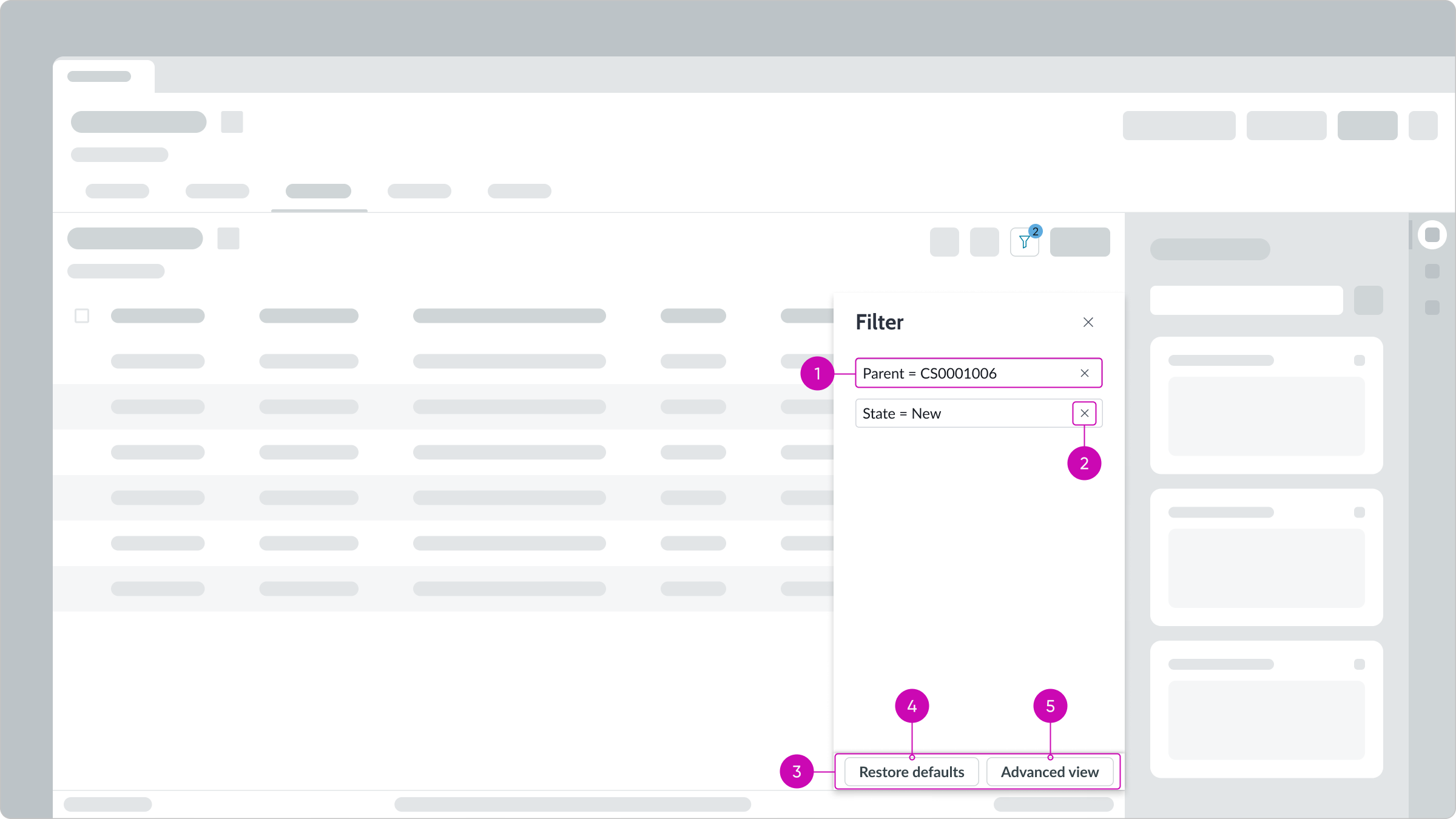
- Filter conditions: Conditions set for the filter in the advanced view
- Delete condition button: Deletes a filter condition
- Panel footer: Contains action buttons for managing filters
- Restore defaults button: Replaces user’s current list of filters with the filters you create
- Advanced view button: Accesses the condition builder, enabling users to create filters
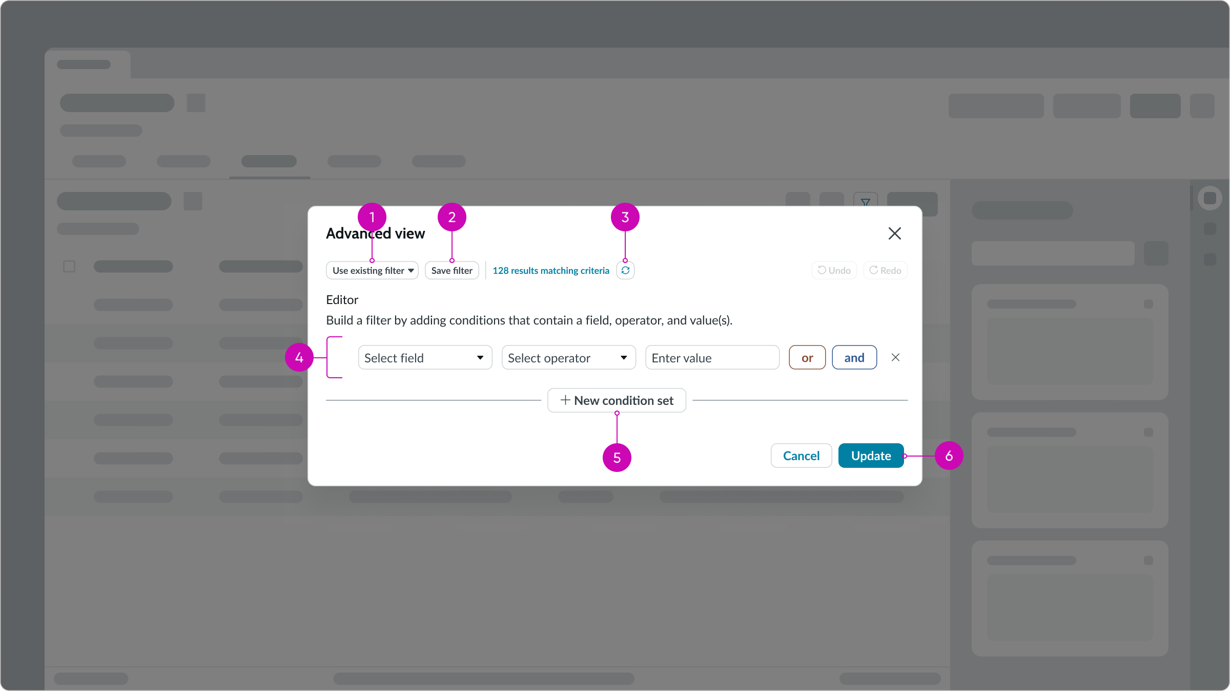
- Use existing filter dropdown: Displays a list of saved filters; users can save commonly used filters to reuse as is or as building blocks for new filters
- Save filter button: Saves a filter to the list of existing filters for reuse
- Refresh icon: Returns an accurate count of the number of records that match the filter conditions but doesn’t save a filter
- Condition set: Enables users to add or remove a filter condition from a set of conditions
- New condition set button: Adds an “or” condition group to the existing condition group
- Primary action button: Runs the filter with the current conditions
Creating filters
By default, users can filter a related list by creating new filters and updating existing ones. You can limit what users can do with filters by removing the abilty to access the condition builder, delete a filter, and restore the default filters.
Note: Fixed filters take precedence over regular filters; all fixed filters are resolved first. Then, any regular filters are run against the results.
Fixed filters
You can create fixed filters for specific lists that users can’t delete or modifiy. For example, for reporting and dashboards you want to show a concise record set for any number of tables and you want your users to see only those records.
List body
All related list body controls are configurable.
For example, you can:
- Enable your users to filter, sort, and group records
- Define the number of rows and columns and select the table data to display
- Permit inline record editing
- Show or hide links
- Manage the way check boxes function
Word wrap
You can enable word wrap for column entries. If word wrap is set to true, it's enabled on the related list, regardless of the user preferred setting.
Pagination
If you want to prevent users from moving list pages forward or backward, you can hide the previous or next page controls. For example, you may want to stop users from returning to previous pages in a wizard.
Design recommendations
Learn how to apply list-related in your design.
Use only 1 or 2 highlighted columns. This makes it easier for users to identify priorities.
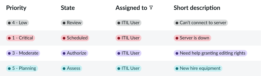
Avoid using more than 2 columns with highlighted values in them. Doing so causes cognitive overload for users and makes it difficult for them to prioritize information.
Use only a few lists on a single page for better comprehension.
Avoid using too many lists on a single page. This makes it difficult for users to view the data and understand how the lists are related.
UI text guidelines
These are some recommendations for using text within list - related:
- Use sentence case for all titles, labels, and column headers
- Keep all text labels informative and short to increase readability and scanning
Behavior
Learn how list - related behaves when the display changes or a user interacts with the component.
States
List – related has 2 states: hover and selected.
Hover
Hovering over a list item checkbox highlights the row.
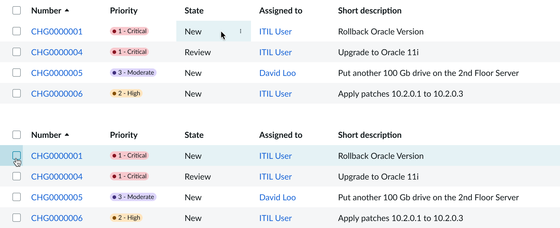
Selected
Selecting the list item checkbox highlights the list item in a slightly darker shade.
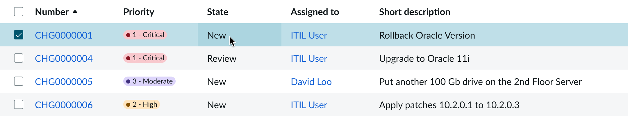
Selecting the cell filter highlights the cell entry and the focus option in the filter menu.
Responsive behaviors
Learn how list - related responds to changes in a container or display.
Scrolling
If the list has more vertical content than space, it displays a vertical scrollbar. If the list has more horizontal content than space, it displays a horizontal scroll bar. Both scroll bars can appear at the same time.
Interactions
Learn how list – related responds when a user interacts with it.
Filtering and sorting options
There are multiple options for the user to filter and sort the content within the body.
- Column filtering: Filters items by selected criteria or groups the list by that column
- Column sorting: Sorts a column by alphabetical or numerical order
- Cell filter: Filters results based on cell content
- Panel footer: Contains panel actions
- Restore defaults button: Restores filters to their default settings
- Advanced view button: Displays advanced functionality
- Condition delete: Deletes selected conditions from the filter
Truncation
If the short description within a list item doesn't fit within the column, it truncates with an ellipsis and shows the full text in a tooltip on hover.
If word wrap is set to true, the maximum character limit controls how many characters are shown in a cell before the content truncates with an ellipsis. The default character limit is 4,000.
Usability
List complies with all internationalization and accessibility requirements.
Internationalization
When the display translates to a right-to-left language, the list flips its orientation and aligns on the right.
Accessibility
Learn how to access the actionable elements of list-related through keyboard interactions and screen readers.
List-related tab order
This is the high-level tab order for the list-related component.
Keyboard interactions
You can access the actionable elements of list with these keyboard keys:
- Tab: Moves focus forward through list controls
- Shift + Tab: Moves focus backward through list controls
- Arrow left, Arrow right: Moves left or right through the cells
- Arrow up: Moves to the previous visible row, whether the focus is on the list item itself or within the list item on one of its actions
- Arrow down: Moves to the next visible row, whether the focus is on the list item itself or within the list item on one of its actions
If on a cell with interactive elements - Tab: Focuses on the first interactive element within the cell, trapping the focus within the cell; continued tabbing moves focus through each interactive element
- Enter: Selects the element in focus
- Esc: Releases the tab function from the cell
If on a cell with no interactive elements: - Tab: Does nothing
- Enter: Does nothing
If on a column resizer: - Arrow left and Arrow right: Adjusts the width of the column
Screen readers
Screen reader will use the built-in table functionality.