

Anatomy
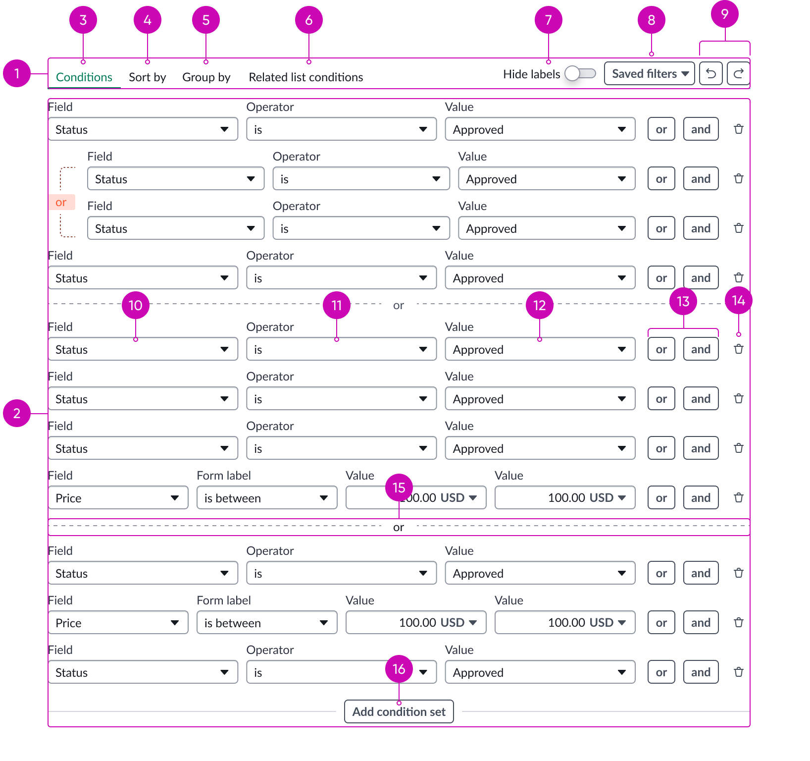
- Toolbar: The toolbar sits at the top of the condition builder and contains actions that are relevant to the editor.
- Editor: Main interactive component of the condition builder.
- Condition Editor tab: Gives the user access to the Editor.
- Sort By tab: Gives the user access to ascending and descending functions.
- Group By tab: The Group by tab sits within the toolbar and gives the user access to grouping functions.
- Related list conditions tab: Gives the user access to filtering with Related lists.
- Hide labels switch: Control to hide input labels in condition statements.
- Saved filters dropdown: Control to load a saved filter and/or save current query.
- Undo/Redo buttons: Deletes or restores the results of the last search.
- Field selector: Selected field from the current table to which this condition applies.
- Operator selector: Filtering condition for the selected field.
- Values: Filtering value for the selected field; the condition builder searches the current table for a matching field value.
- Conditions: Adds a condition with either an or or and relationship to all other conditions.
- Delete button: Removes the selected condition from the condition builder.
- Condition divider: Distinguish between the condition sets.
- Add Condition Set button: Adds a new condition set ot the condition builder.
Usage
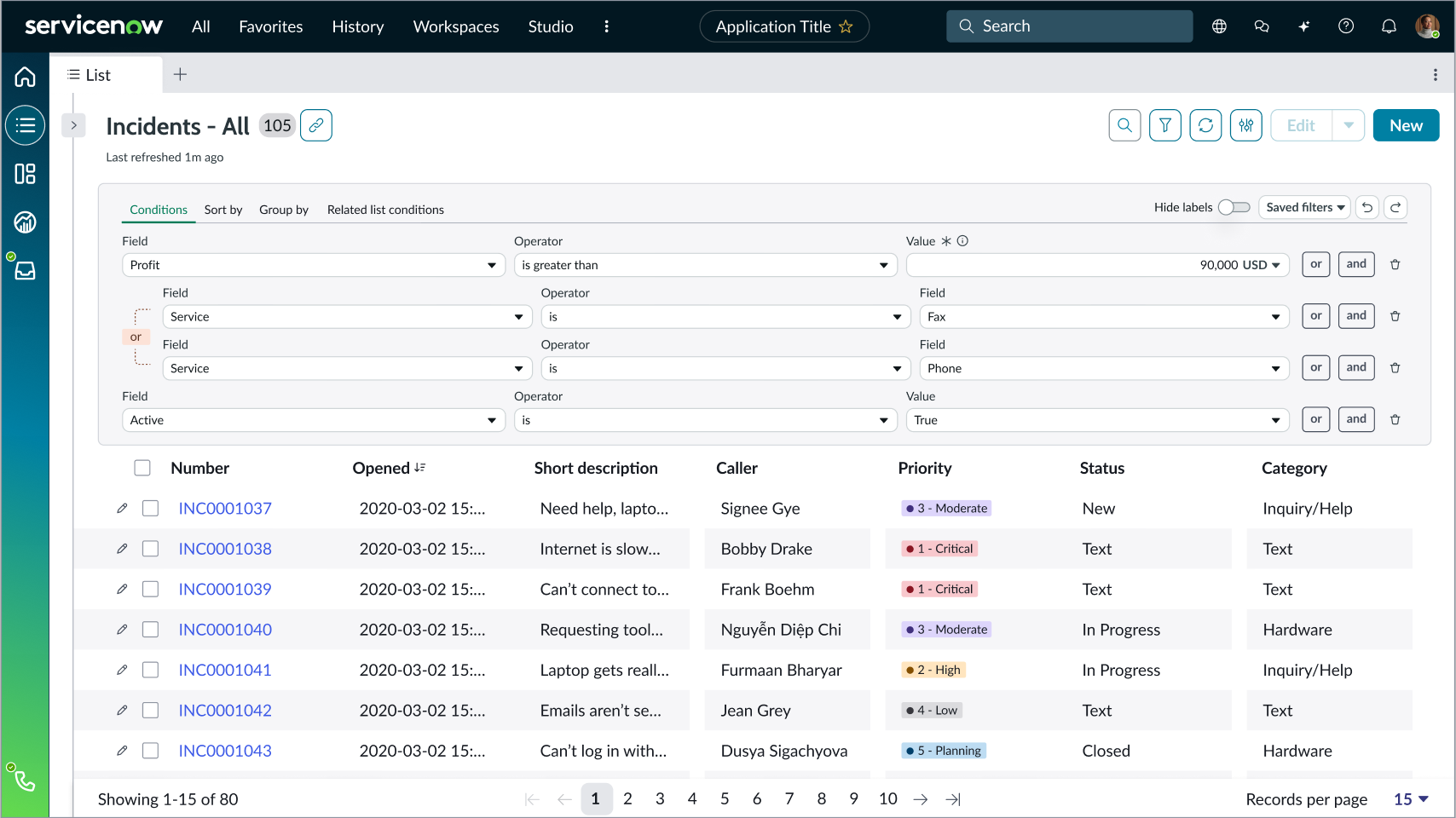
Predicate builder can be used with the Record list component where the filter button triggers the predicate builder to open above the list.
Configurations
Learn how to customize condition builder by configuring the available properties.
Presets and controllers
This component contains a preset configuration that automatically configures properties and event handlers for a component, making the component ready to work when you add it to a page. A preset is designed to suit a specific use case. However, you can override preset property values with a custom configuration if you find it necessary for your design. Preset values that you override aren’t upgraded when updates are available. If you don’t want to use the preset values provided, select the option to configure the component manually. You can apply one preset to a single instance of a component on a page. For more information, see Presets.
A preset is always associated with a controller, which acts as a data resource for the component. Controllers provide the configuration data and event bindings the component needs to function in your experience. By selecting a preset, the required controller is added to the page. By adding a controller to the page, any new applicable components will have that controller's preset. For more information about how controllers work, see Controllers. For instructions on using the data inspector to view the default presets for a component, see View properties and events in the Controller API.
Builder type
You can choose to use the original Condition builder style or the Predicate builder style.
Data
Set the source (table name) for the condition builder data.
Display
You can toggle the following conditions:
- Read only
- Show Sort by
- Show Group by
- Show Related List Conditions
- Show Saved Filter Sets
- Show Save Filter
- Show Reference Lookup
- Show Add Condition Set
Additionally, you can set the max content height and show or hide the field labels.
Data
Set the source (table name) for the condition builder data.
Behavior
Learn how condition builder behaves when the display changes or a user interacts with the component.
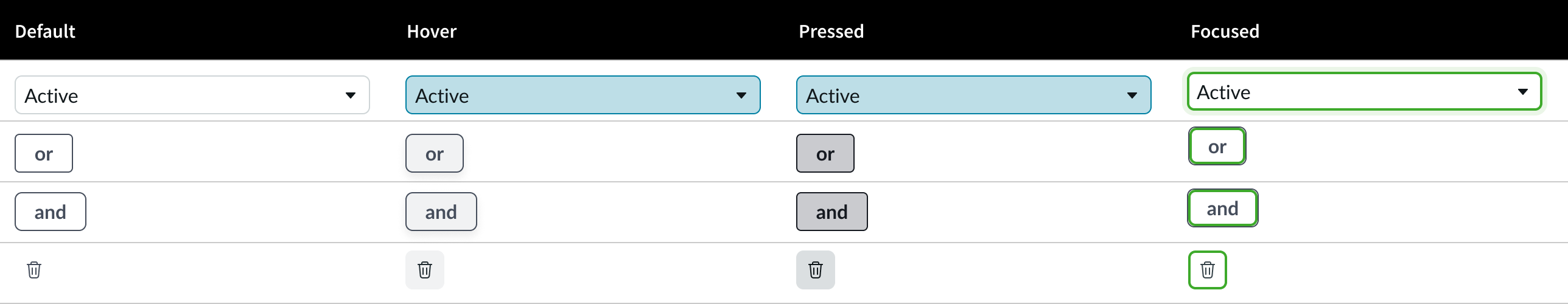
States
Condition builder has 4 states: default, hover, pressed, and focused.
Responsive behaviors
The width of the condition builder resizes automatically to the size of the container. For responsive behaviors of subcomponents, see the usage guidelines for those components.
Interactions
Users create and delete conditions using the dropdown panel and button subcomponents. Users can create multiple statements with AND or OR relationships and put condition statements into sets. To delete a condition, users select the delete icon next to the condition.
Truncation
The condition builder truncates any value entry wider than the dropdown panel allows. No tooltip is provided for truncated entries.
Usability
Condition builder complies with all internationalization and accessibility requirements.
Internationalization
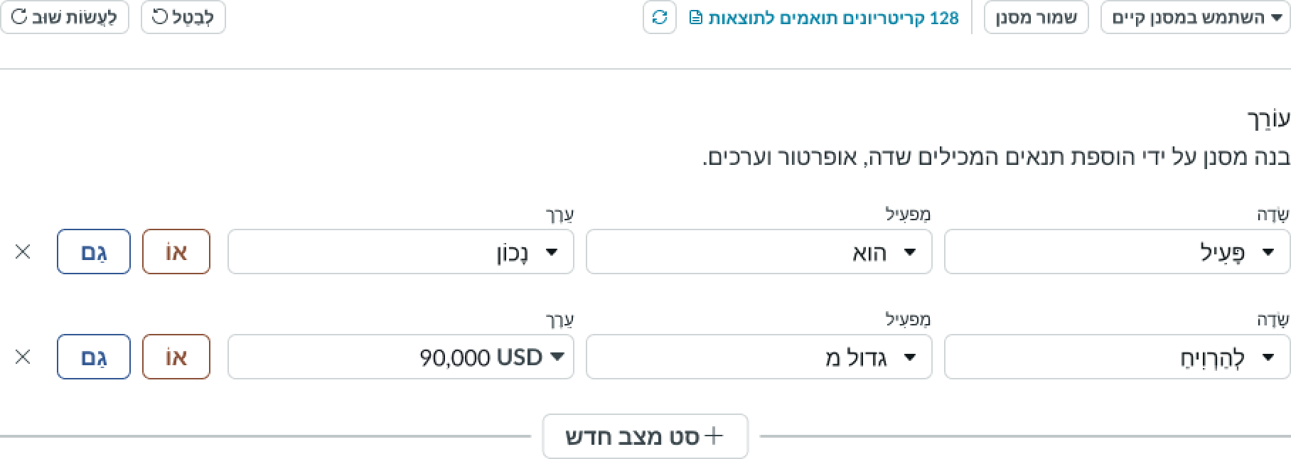
When this component is used in a platform configured for a right-to-left (RTL) language, the condition statements and control butons flip their orientation and align from the right. Search terms and operators appear in the right-to-left language, but system names and IDs can appear in a left to right language.
Accessibility
Learn how to access the actionable elements of condition builder through keyboard interactions and screen readers.
Keyboard interactions
You can access the actionable elements of condition builder with these keyboard keys:
- Tab: Advances through the fields and controls in a condition statement from left to right, and then advances to the next condition. The tab key also focuses on the delete action for value selections, when present.
With a dropdown in focus:
- Enter or Arrow down: Opens the dropdown panel and places the cursor in a search field or puts focus on the first item in the list
With a dropdown panel open:
- Arrow up, Arrow down: Moves focus up or down through the items
- Enter: Selects the item in focus from the dropdown panel
With a choice list in focus:
- Space, Arrow up or Arrow down: Opens the list
With a choice list open
- Arrow up or Arrow down: Moves focus up or down through items
- Enter or Space: Selects the item in focus from the choice list
Focus on an action button:
- Enter or Space: Executes the action
Screen readers
When you apply ARIA labels to the component, screen readers announce the controls and content of condition builder in the prescribed tab order.