

Anatomy
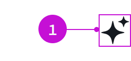
- Animated icon: The component has no separate elements; size is configurable
Usage
The only available icon for this component is the sparkle icon. You can use it to indicate an entry point for a Now Assist flow or event. It can also be used as part of a button.
For more information, see the usage guidelines for button, split button, button circular, button iconic, and button bare.
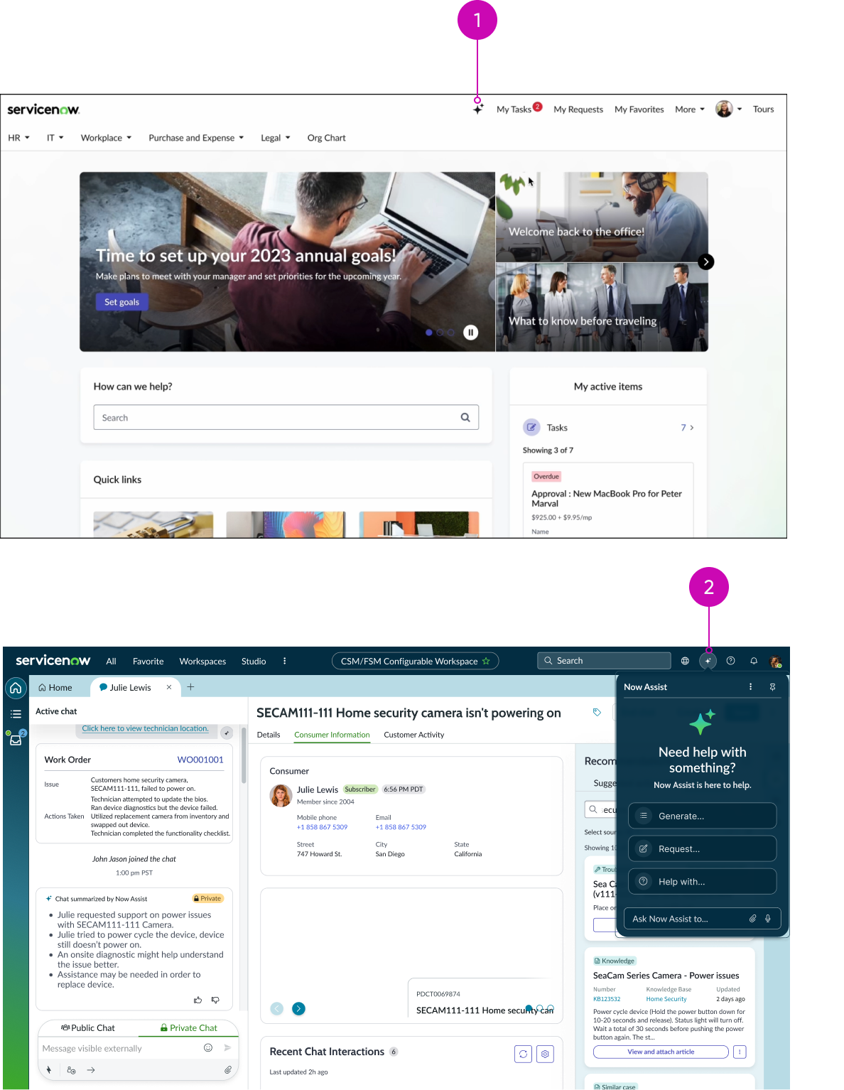
- Now Assist Self Service: Opens Now Assist from header
- Workspace header: Triggers the Now Assist chat panel
Variants
Learn about the variants of animated icon.
Sizes
Animated icon has 4 sizes: small, medium, large, and extra large. Medium is the default size.
Configurations
Learn how to customize the animated icon component by configuring the available properties.
Icon
The Ai-sparkle-fill icon is set by default.
Size
You can configure the size of the sparkle icon.
Behavior
Learn how the animated icon behaves when the display changes or a user interacts with the component.
Interactions
Learn how the animated icon responds when a user interacts with it.
Hover animation
The animated icon takes on the parent component’s behavior. For example, when configured in the button component, it enables the hover animation for GenAI sparkle use cases.
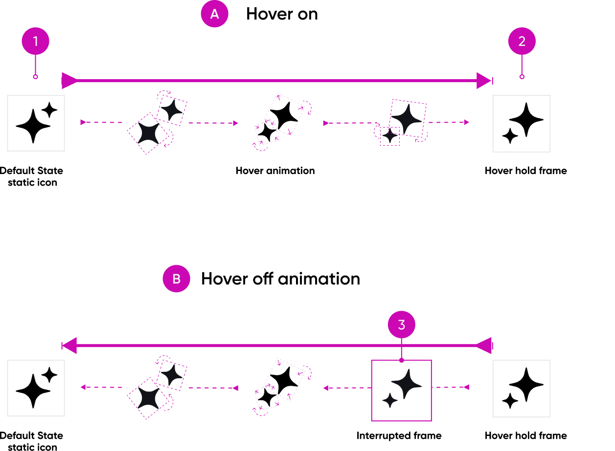
- Default static frame: The icon when it is not receiving interaction
- Hover: The icon holds this frame when the user hovers over it
- Interrupted state: If the user leaves hover state while the animation is activated, the animation will reverse from its current frame position back to default state
Usability
The animated icon complies with all internationalization and accessibility requirements.
Internationalization
The animated icon component doesn't change for right-to-left (RTL) languages.
Accessibility
Learn how to access the actionable elements of animated icon.
Keyboard interactions
Animated icon doesn’t have keyboard interactions.
Screen readers
The icon requires configuration of the aria-label attribute in the configAria property to be accessible using a screen reader.