

Anatomy
Learn about the individual parts of appointment calendar.
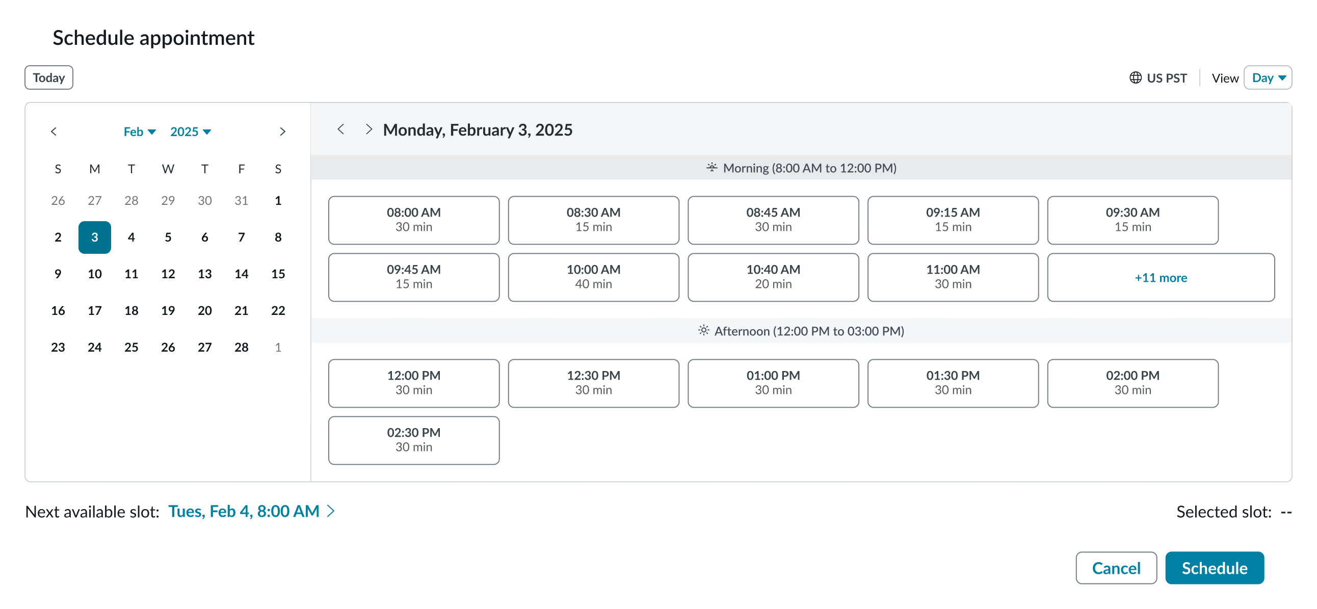
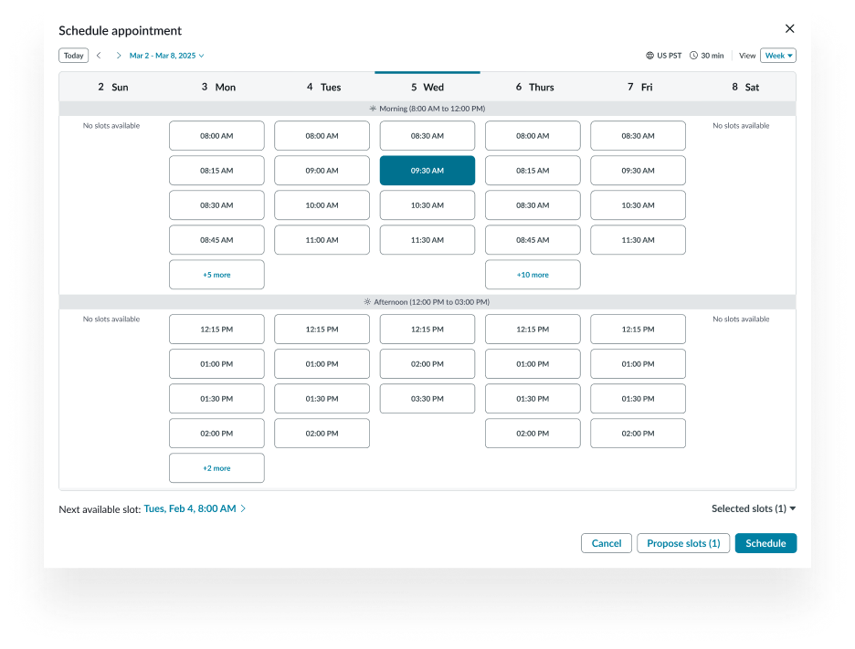
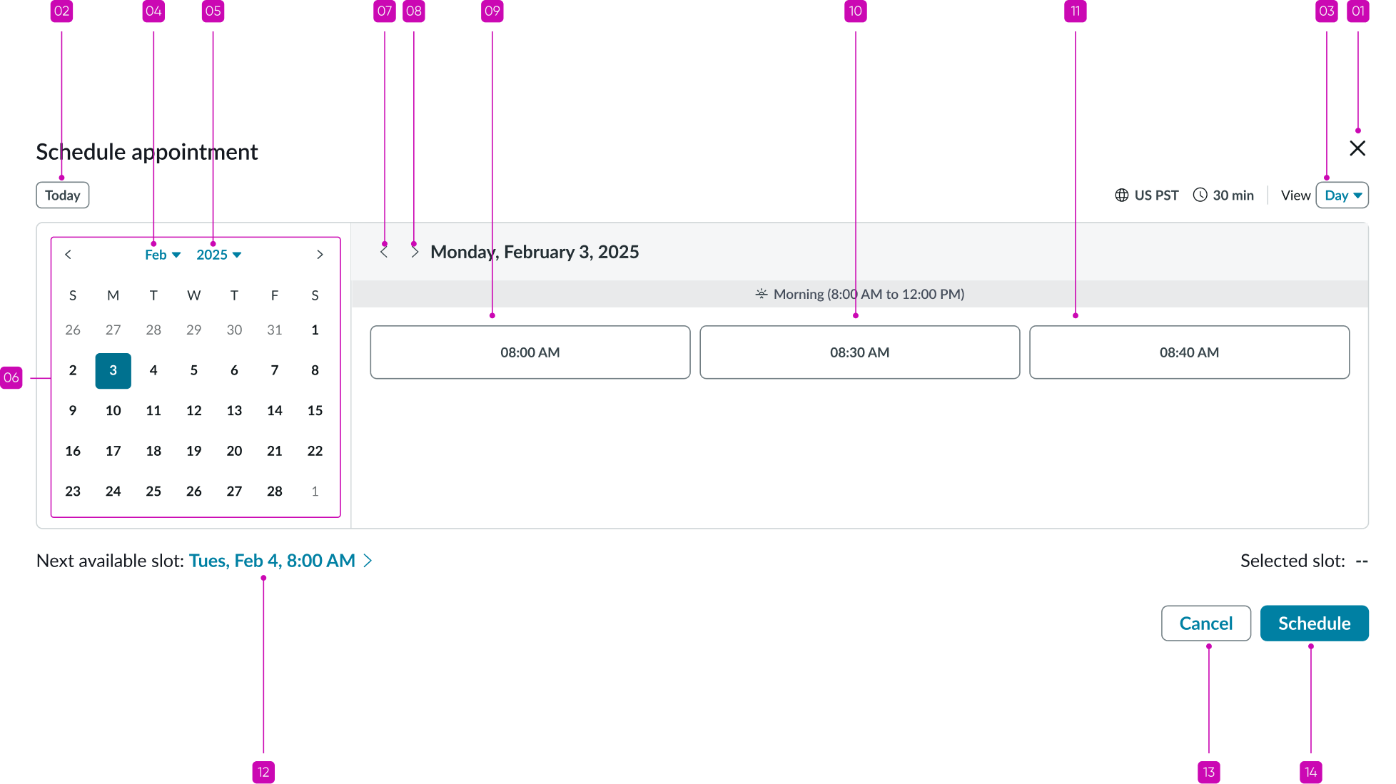
Appointment calendar
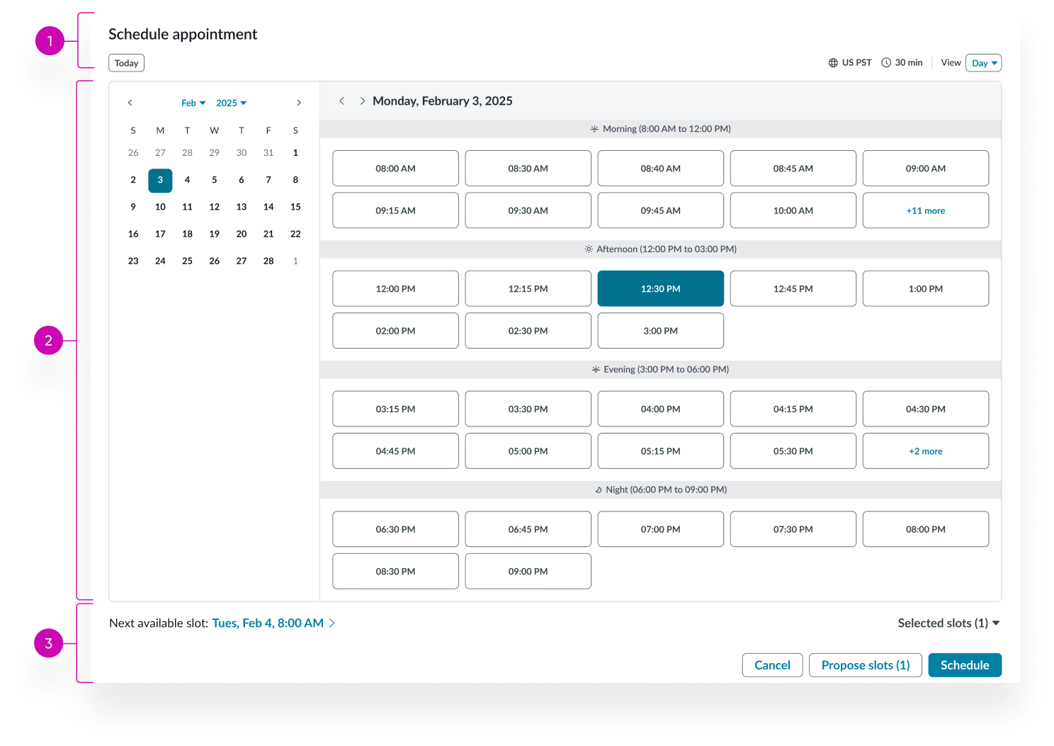
- Header: Displays calendar title, time zone, slot duration, and view selector
- Date picker and calendar grid: Displays the date-time picker and calendar grid with available and unavailable appointment slots
- Footer: Displays supplemental details and provides information about the selected appointment; optional buttons can be added to confirm or cancel the selection
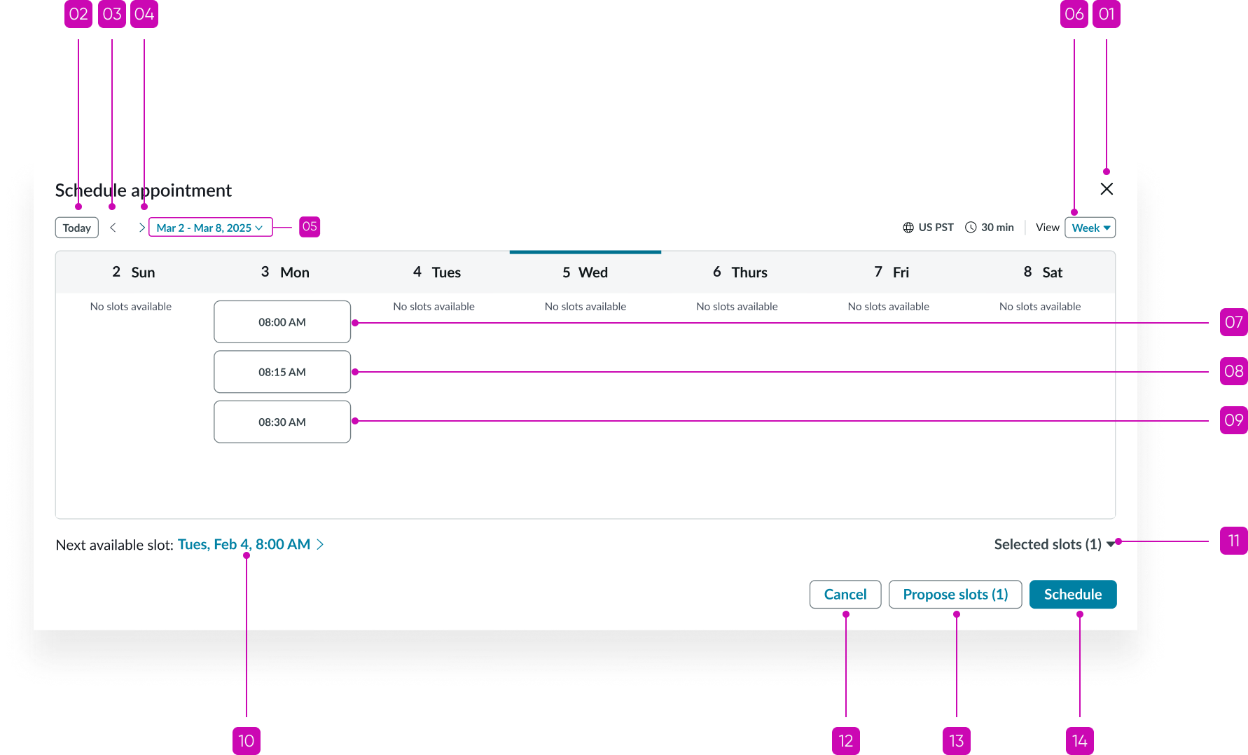
Appointment calendar header
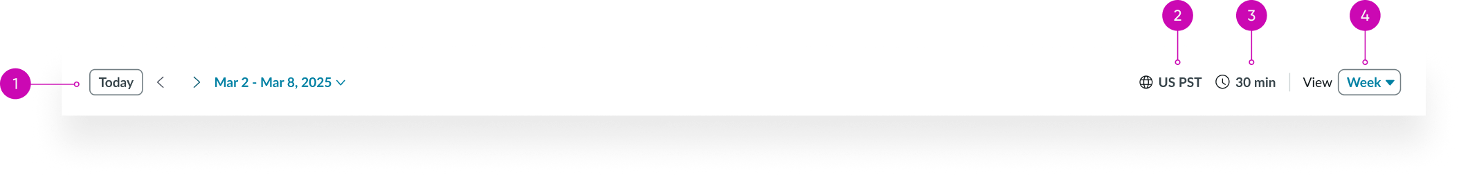
- Date selector: Provides navigation to the previous or next week; allows for quick selection of a specific date or the current date
- Time zone indicator: Displays the time zone
- Slot duration: Displays the slot duration
- View selector: Enables users to switch between Day and Week view
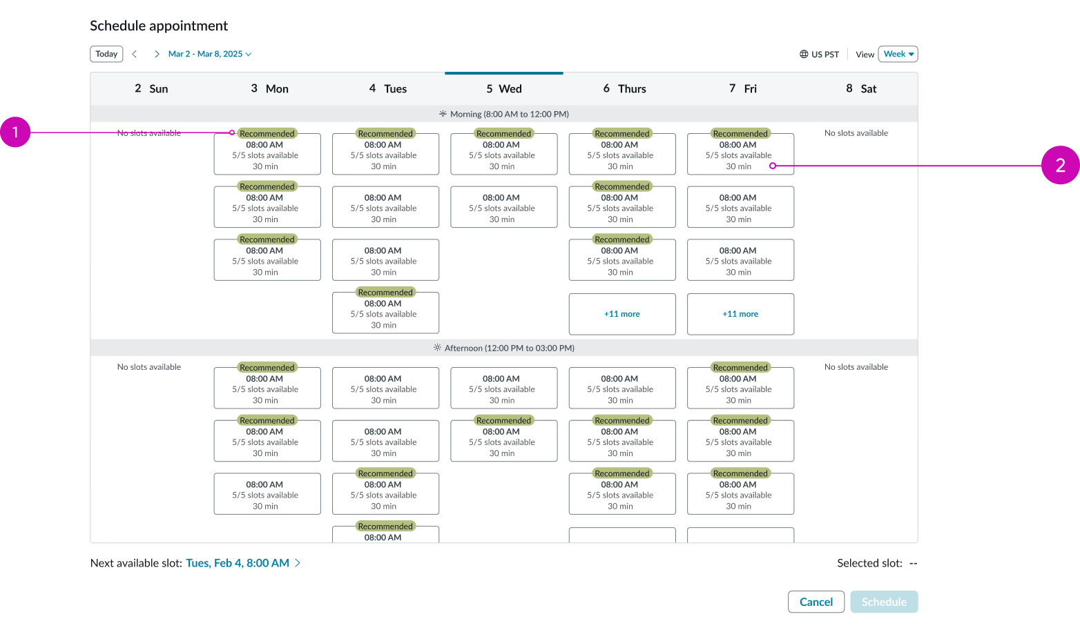
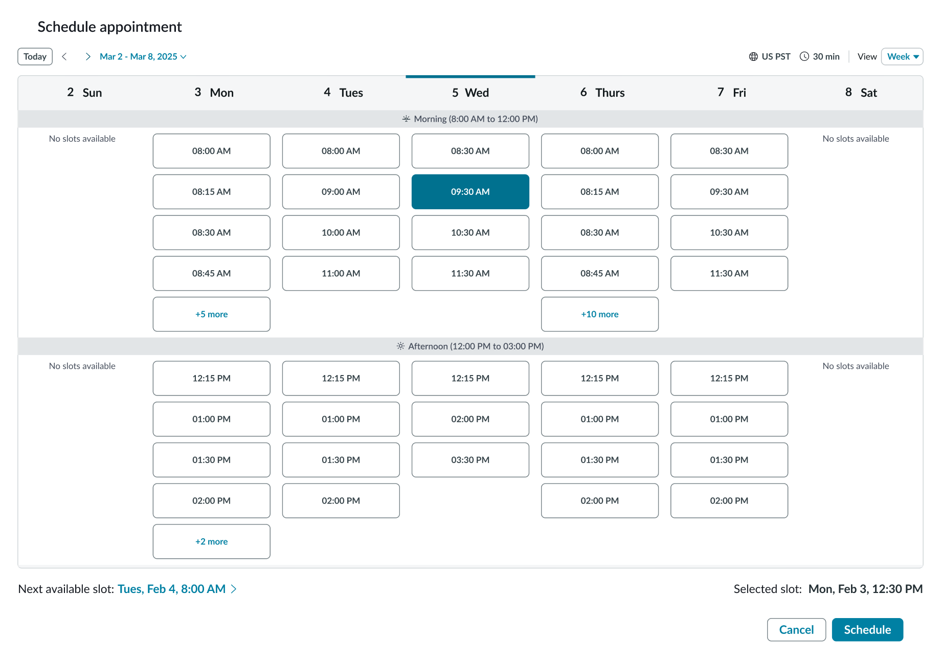
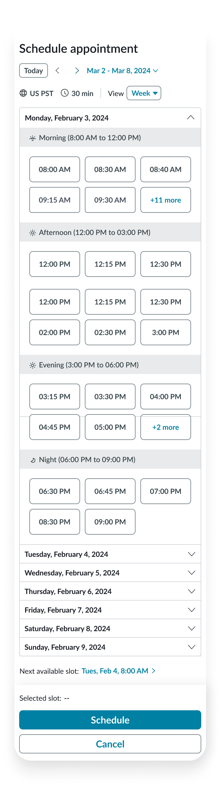
Appointment calendar week grid
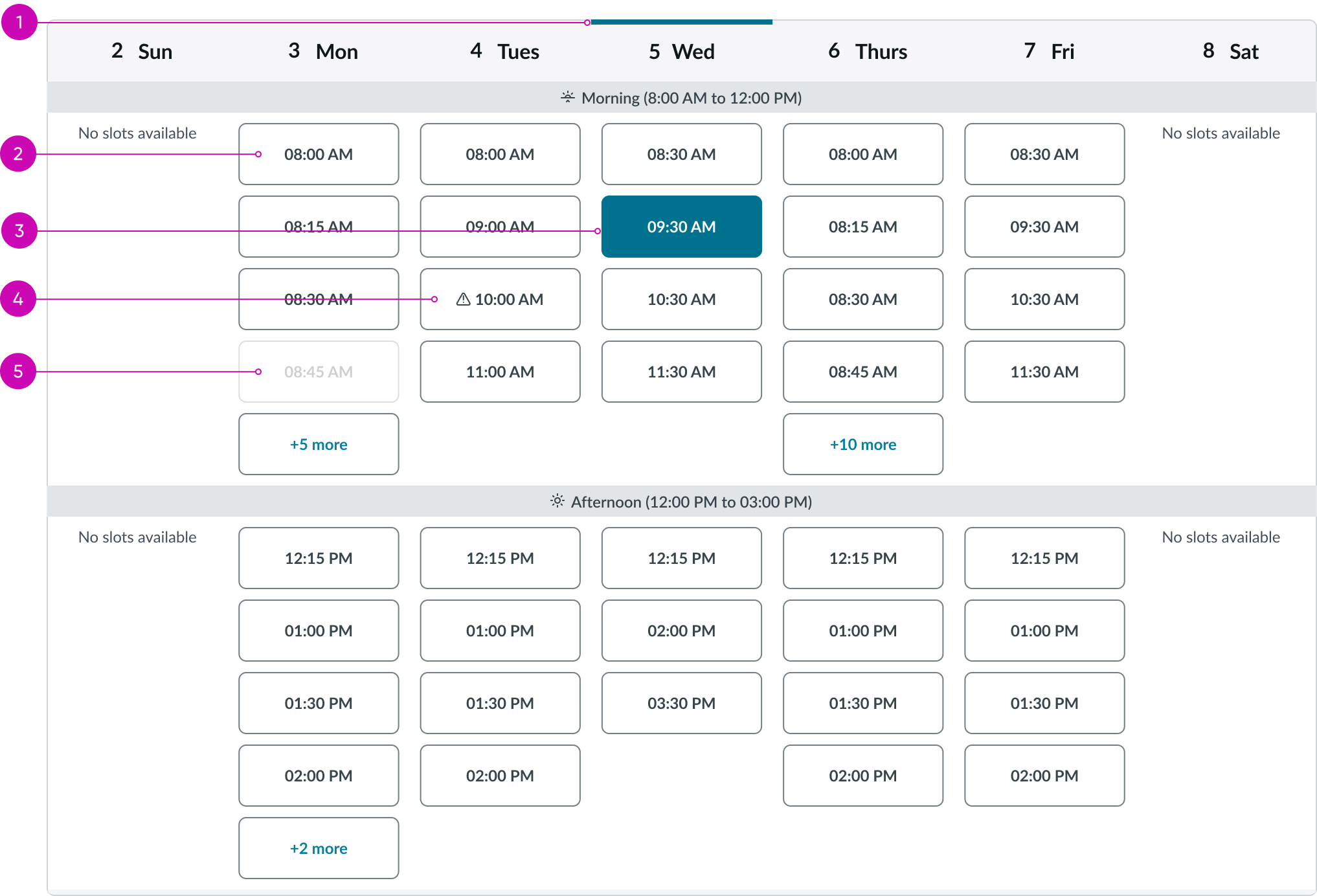
- Current day indicator: Indicates the current date
- Available slot: Slot that is available for a scheduled appointment
- Selected slot: A selected appointment slot that is available
- Slot with appointment conflict: An appointment slot that is available and has a conflict
- Unavailable slot: An appointment slot that is already filled and unavailable
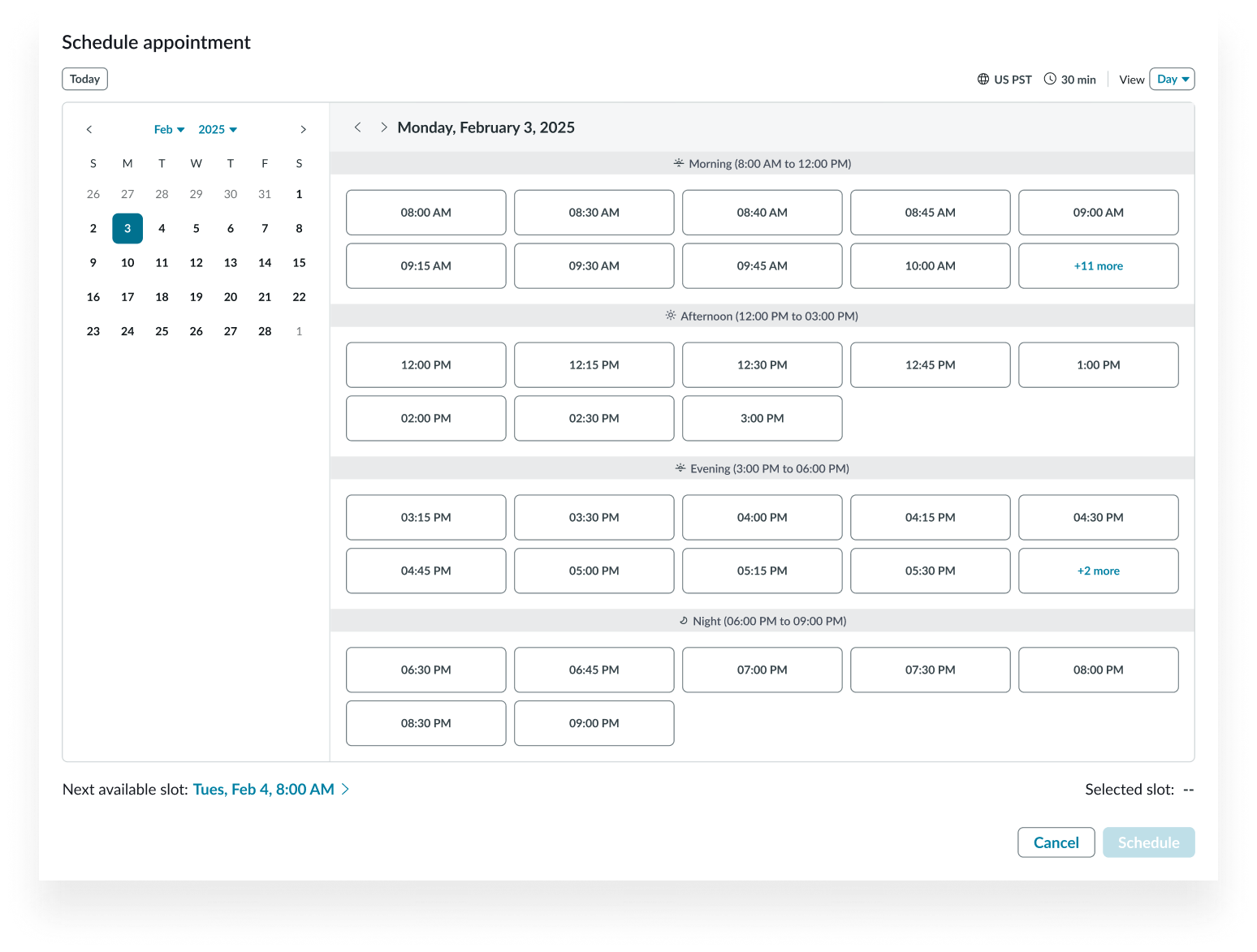
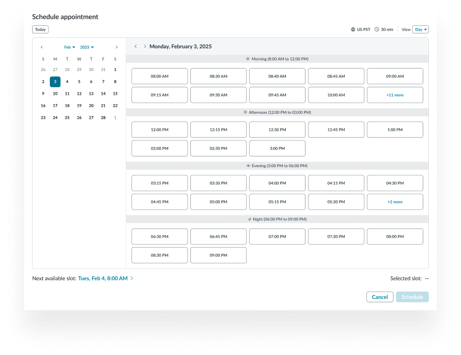
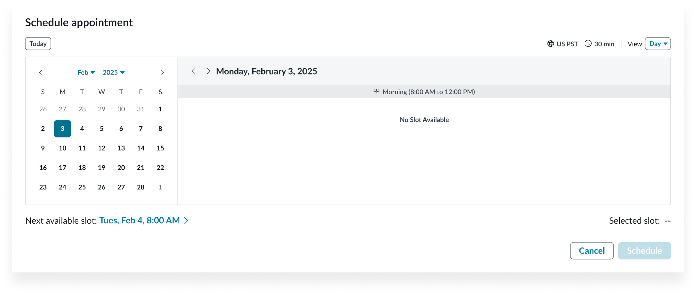
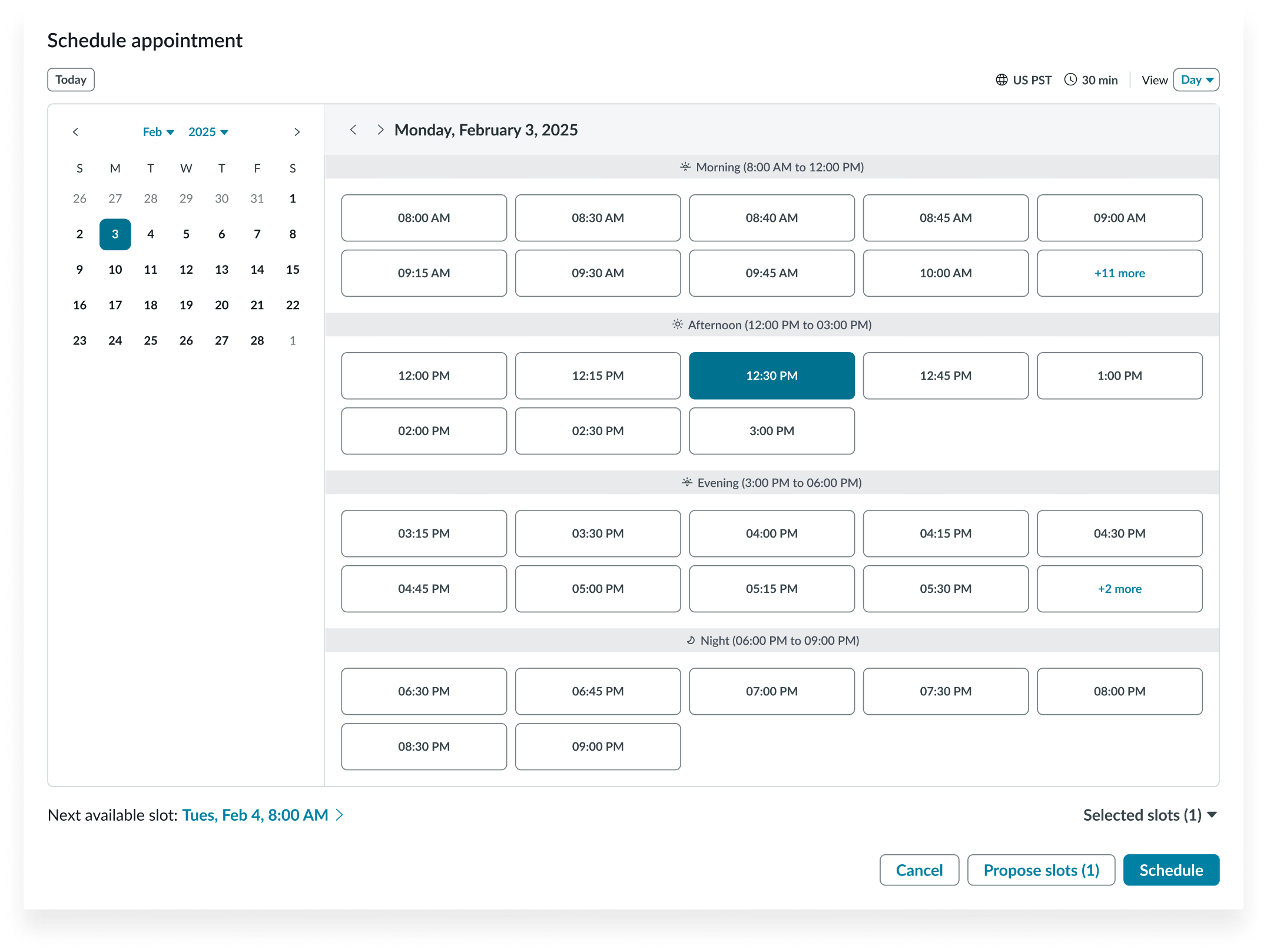
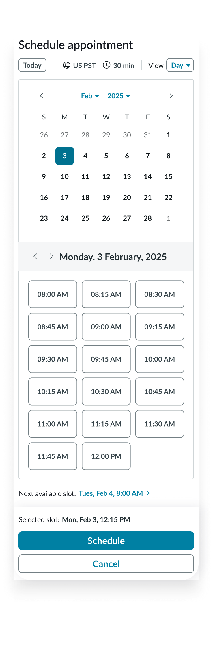
Appointment calendar day grid
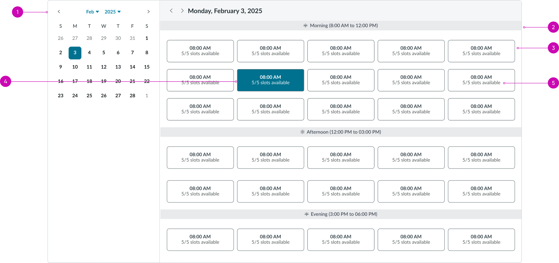
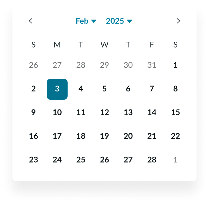
- Date-time picker: Displays the current month, year, and the current selected date; users can select other dates to view the appointment slots
- Categories: Appointment slot categories
- Available slot: An appointment slot that is available for selection
- Selected slot: A selected appointment slot
- Contextual information: Displays additional information; also shows slot duration if so configured
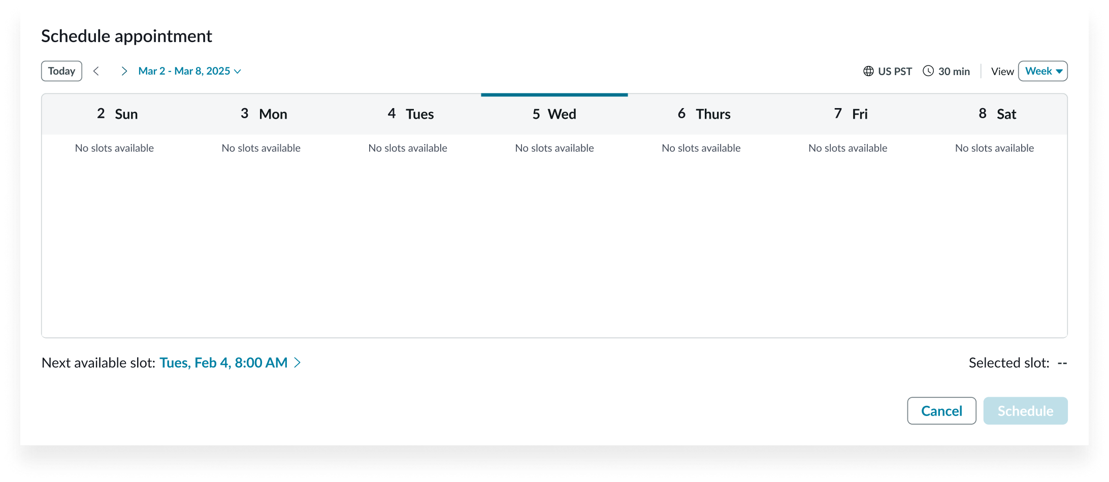
Appointment calendar footer
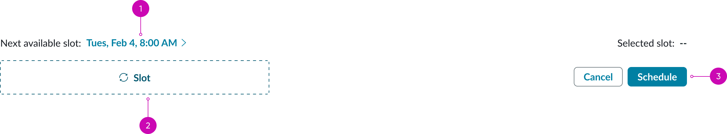
- Left footer (optional): Displays the time and date of the next available slot
- Slot (optional): Optional slot configurable with suitable components
- Right footer controls (optional): Allows the user to submit the selected appointment date
Appointment calendar with contextual information
- Tags (optional): Tag labels in event slot
- Contextual information (optional): Additional contextual information in the event pill
Subcomponents
See usage guidance for button bare
See usage guidance for dropdown
See usage guidance for button iconic
See usage guidance for mini calendar
Usage
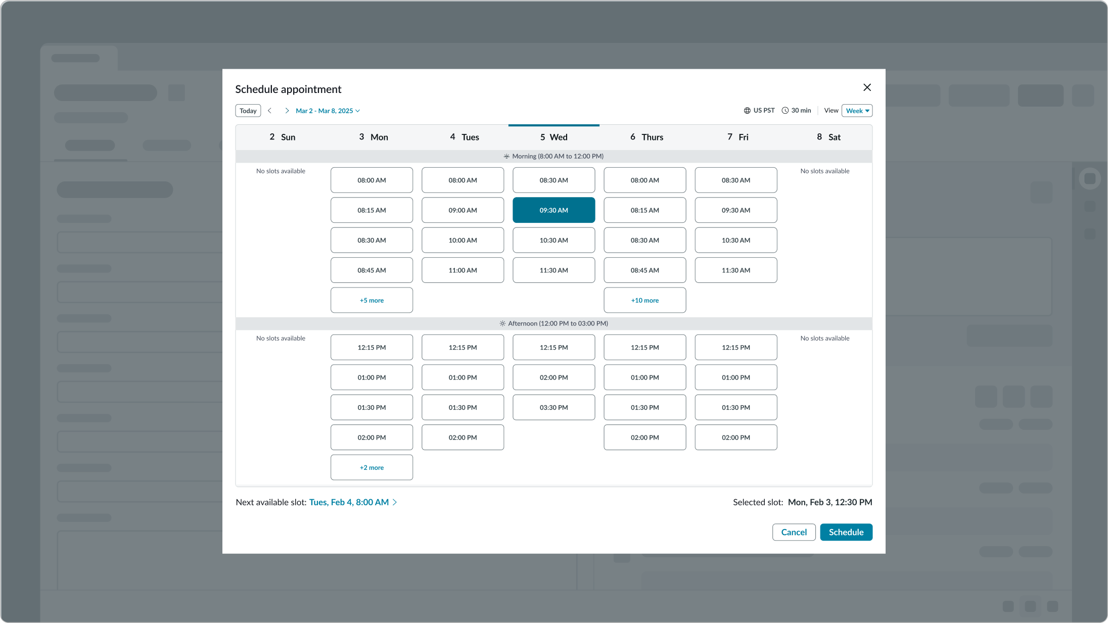
Use appointment calendar to view and manage appointments by day or week, depending on the amount of appointment slots. This component can either be used in a modal or embedded in context in a larger page.
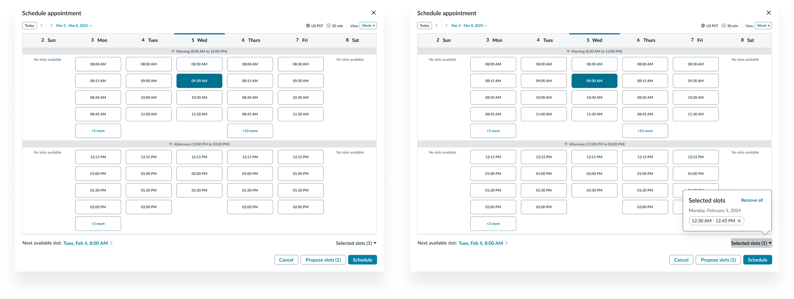
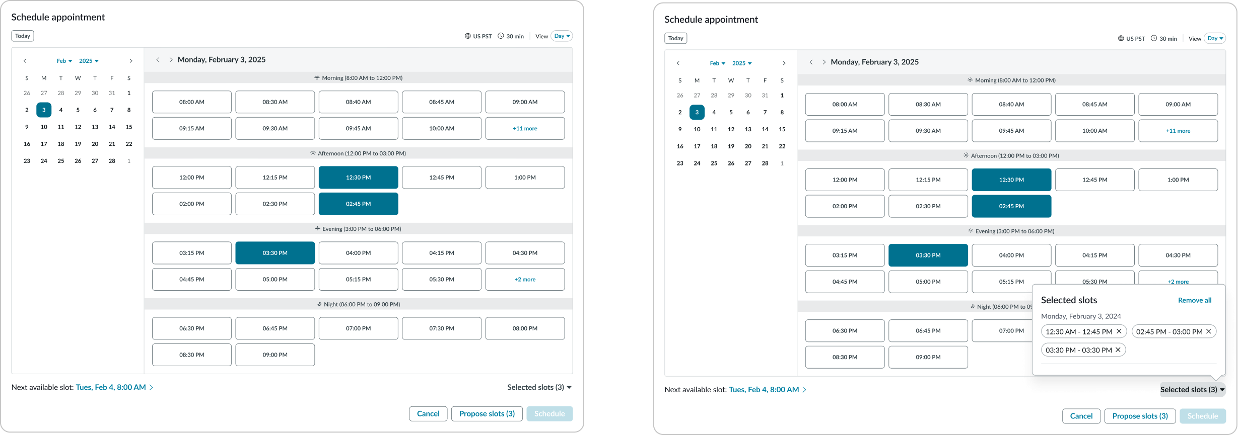
Propose slots
Propose slots by selecting multiple slots instead of scheduling an event with just one. The selected slots are temporarily blocked until one of the proposed slots is selected and scheduled. To propose slots, select the slots and select “Propose Slots”.
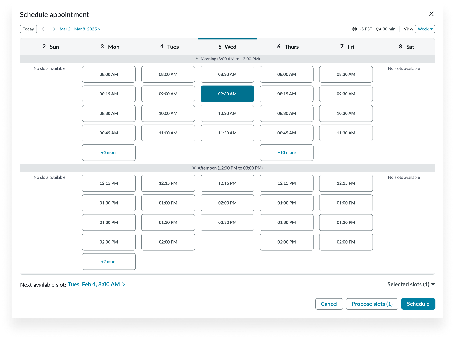
Week view
Day view
Categories
When there are several available slots, configure categories to group the event slots to better organize the calendar. For example: Morning, Afternoon, Evening, and Others.
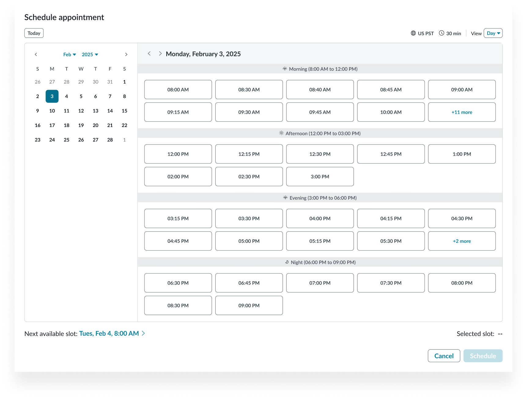
Week view
Day view
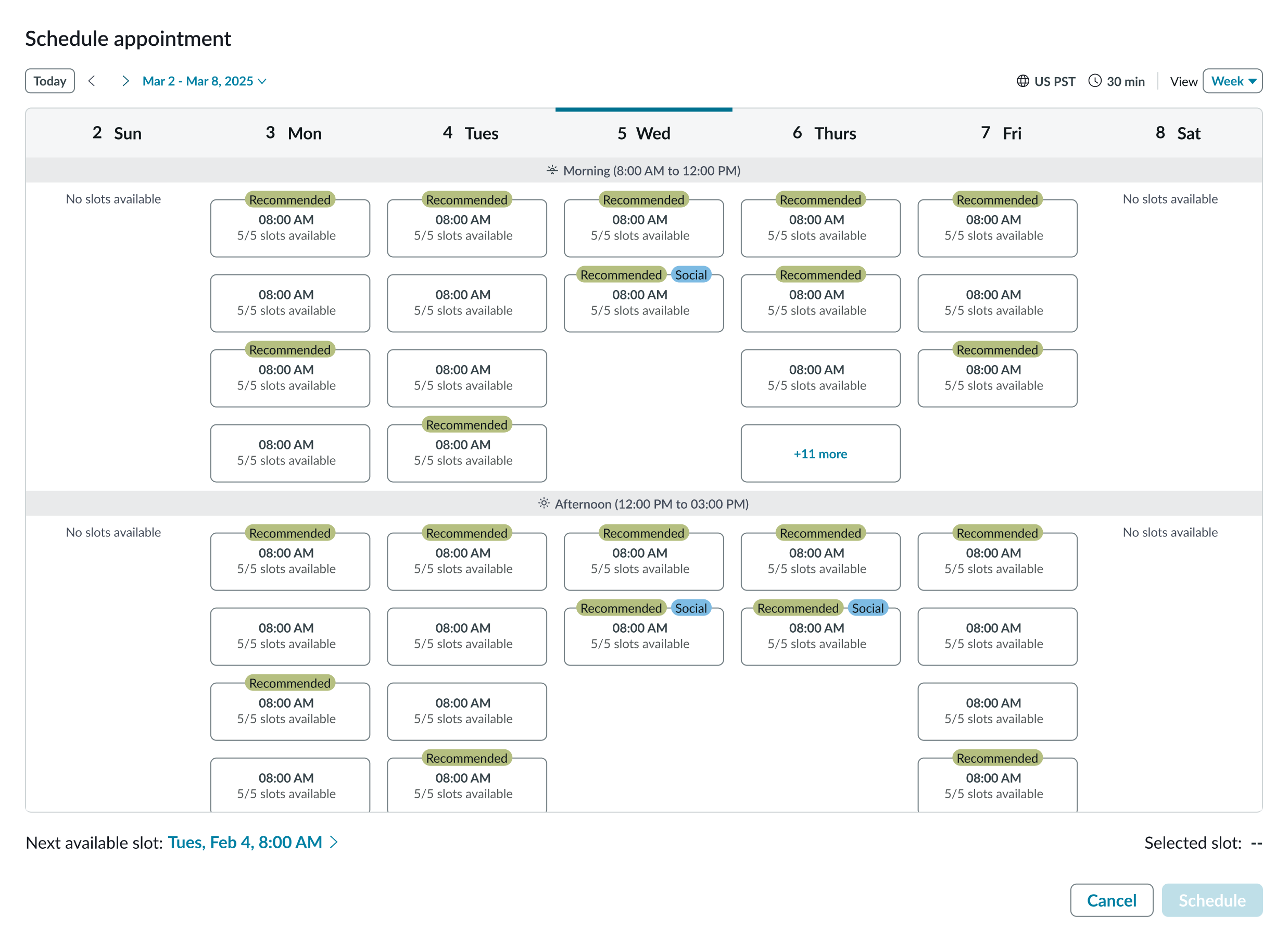
Contextual information and tags
Use tags (primary and secondary) and additional contextual information in the event slots to identify specific slots. For example, to mark recommended slots. In an event slot, tags display as labels and the contextual information displays in the event slot under the event title.
Appointment slot duration
Configure the appointment calendar to display the appointment slot duration in the header. If the appointment slots are of varying duration, then configure the appointment calendar to display each appointment’s slot duration under the slot pill.
Configurations
Views supported
Configure the calendar view to present to your users. The available views are Day and Week.
Week view
Day view
Locale
Select the language code for your calendar. The default is en (English).
Appointment grid columns
By default, the day view calendar grid displays the time slots in 3 columns (3 time slots per row.) You can change this value to 1 or 2 columns.
Calendar entry title
For the day view, you can edit the title of an entry using alphanumerics and symbols. If the title exceeds the width of the entry slot, the text truncates with an ellipsis, and a tooltip shows the full content on hover.
Design recommendations
Learn how to apply appointment calendar in your design.
Use the day view for applications that are likely to have many appointment slots.
Avoid using the week view configuration if there are likely to be many appointment slots. An overcrowded grid forces the user to scroll to see all available slots.
UI text guidelines
These are some recommendations for using text within calendar:
- Keep all text labels short and concise.
- Slot content should be descriptive and concise.
Behavior
Learn how appointment calendar behaves when the display changes or a user interacts with the component.
States
Appointment calendar has different states for the day and week views.
Day view
The day view has the following states: default, appointment hover, appointment selected, conflicting appointment hover, conflicting appointment selected, appointment booked and no appointments.
Default

Appointment hover

Appointment selected

Conflicting appointment hover

Conflicting appointment selected - day

Appointment booked

No appointments - week
No appointments - day
Responsive behaviors
Learn how appointment calendar responds to changes in a container or display.
Appointment grid
The appointment grid expands to fill the width of its container, but the appointment grid has a fixed height. The grid scrolls vertically as needed to accommodate appointments. If the width is constrained, the grid in the day view scrolls horizontally as well.
Interactions
Learn how appointment calendar responds when a user interacts with it.
Next available appointment
Selecting the Select Next Available button sets the date range to the current view that contains the selected appointment, sets the appointment button to the selected state, and enables the Schedule button.

Setting date range to today
Selecting the Today button sets the date range to the current view that contains today's date.

Date- Time calendar
Selecting the current date range opens the mini calendar, enabling the user to select a date. Selecting a date closes the mini calendar and sets the date range to the current view that contains the selected date.
Appointments
Selecting an appointment sets the appointment button to the selected state and enables the Schedule button.
Usability
Appointment calendar complies with all internationalization and accessibility requirements.
Internationalization
When the display translates to a right-to-left (RTL) language, the orientation of all elements within the component flips.
Translated week view
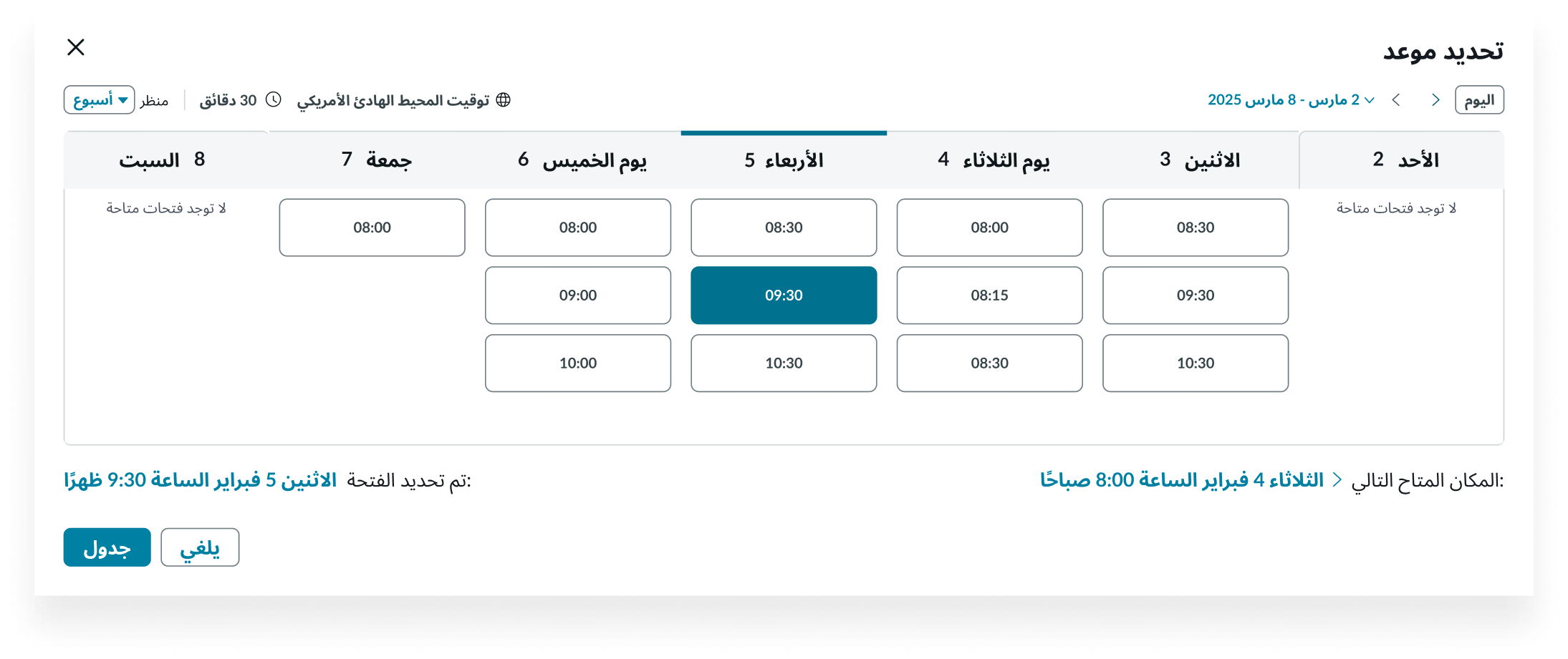
Translated day view
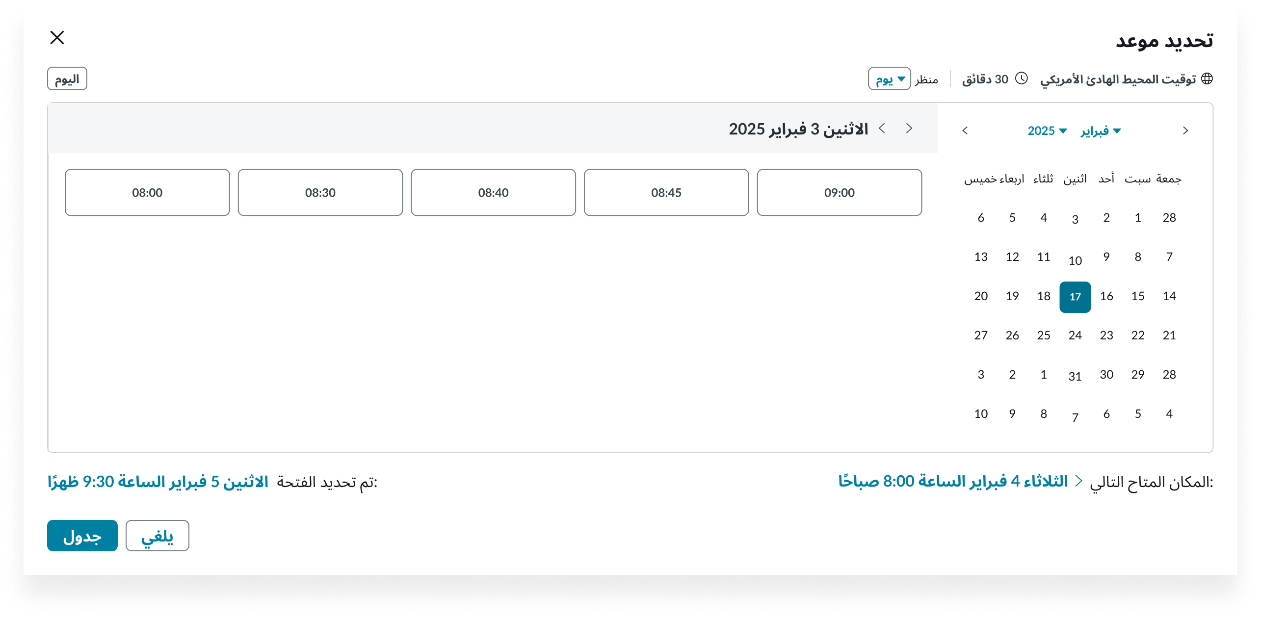
Accessibility
Learn how to access the actionable elements of appointment calendar through keyboard interactions and screen readers.
Appointment calendar tab order
This is the high-level tab order for appointment calendar.
Week view tab order
Day view tab order
Keyboard interactions
You can access the actionable elements of appointment calendar with these keyboard keys:
- Tab: Navigates through actionable items in the appointment calendar in the specified tab order
- Shift + Tab: Navigates through actionable items in reverse tab order
- Arrow up, down, right, left: Navigates the user in any direction in the mini calendar grid
- Enter: Interact with subcomponents, such as the date selector
Reflow
In the Day and Week views, when a user increases the browser zoom level, the component resizes and reflows automatically to fit the screen without losing information. The component supports zoom levels up to 400%.
Mobile screen compatibility
When the user views appointment calendar on a small screen like a mobile screen, the component resizes and reflows automatically to fit the screen without losing information.
Day view
In Week view, where the content cannot fit in the screen, the user can scroll to find the week of their choice. Each day is enclosed in a collapsed accordion with the current day’s accordion expanded. The footer is locked in position at the bottom of the screen and is not affected by the user’s scrolling to enable them to schedule or modify an appointment.
Week view