

Anatomy
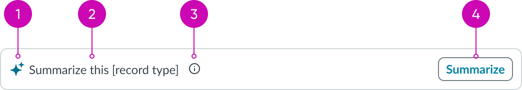
Trigger card
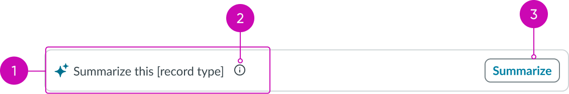
- Heading: Displays label for the trigger card
- Info icon: Triggers a tooltip for additional information
- Action button: Triggers the selected LLM action
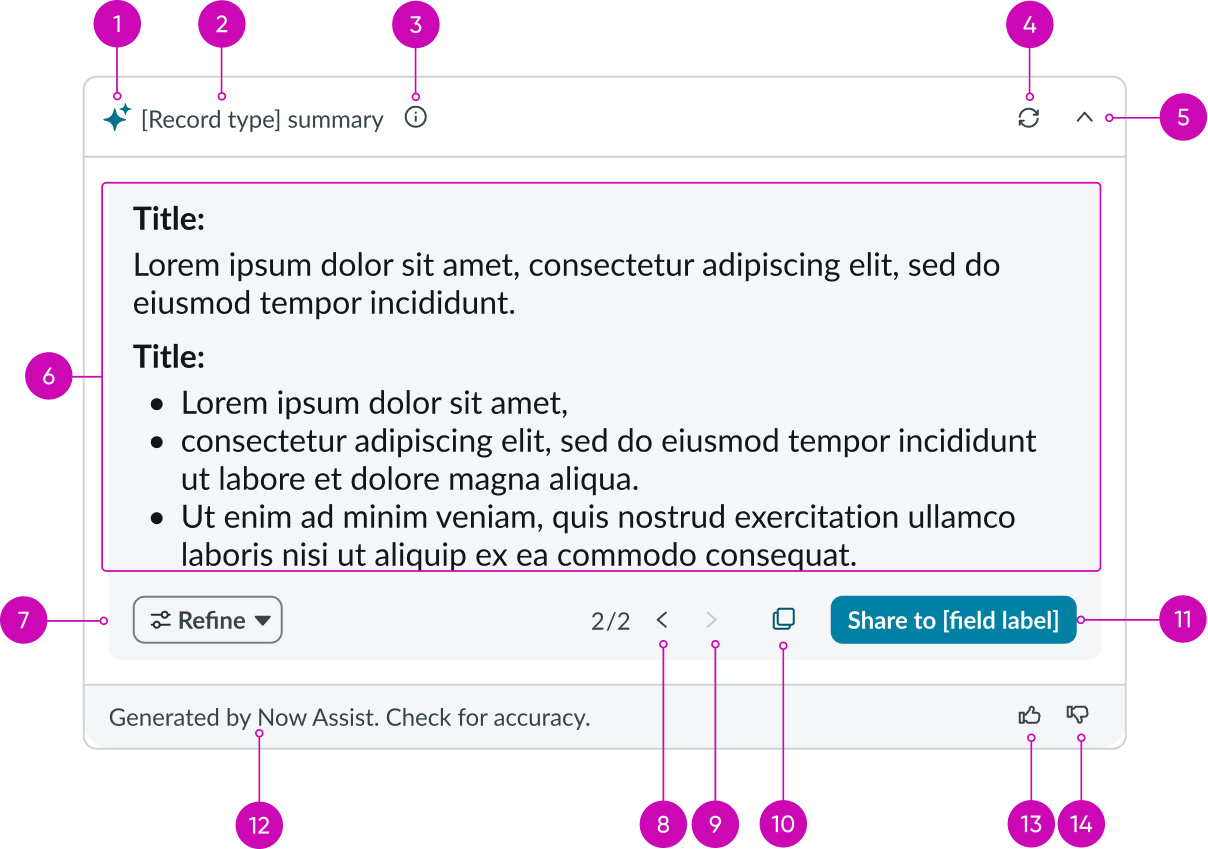
Recommendation dialog
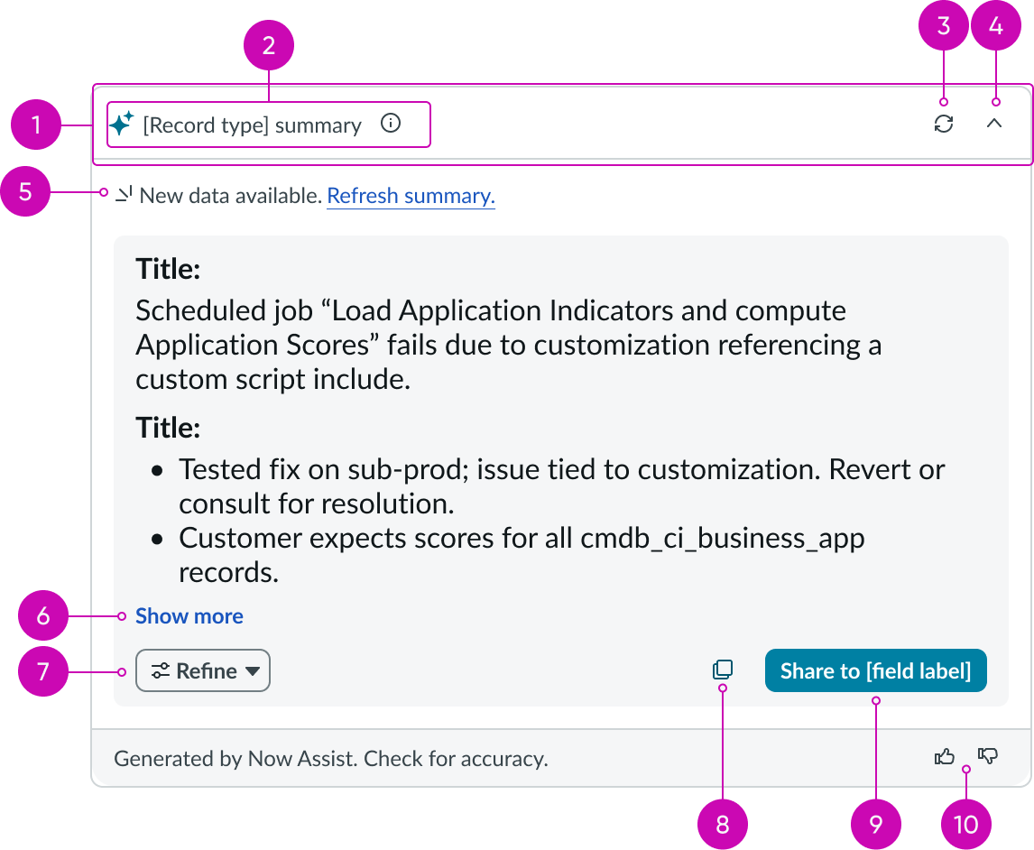
- Header: Header area of the recommendation dialog showing the header label, info icon, refresh button, and minimize view button
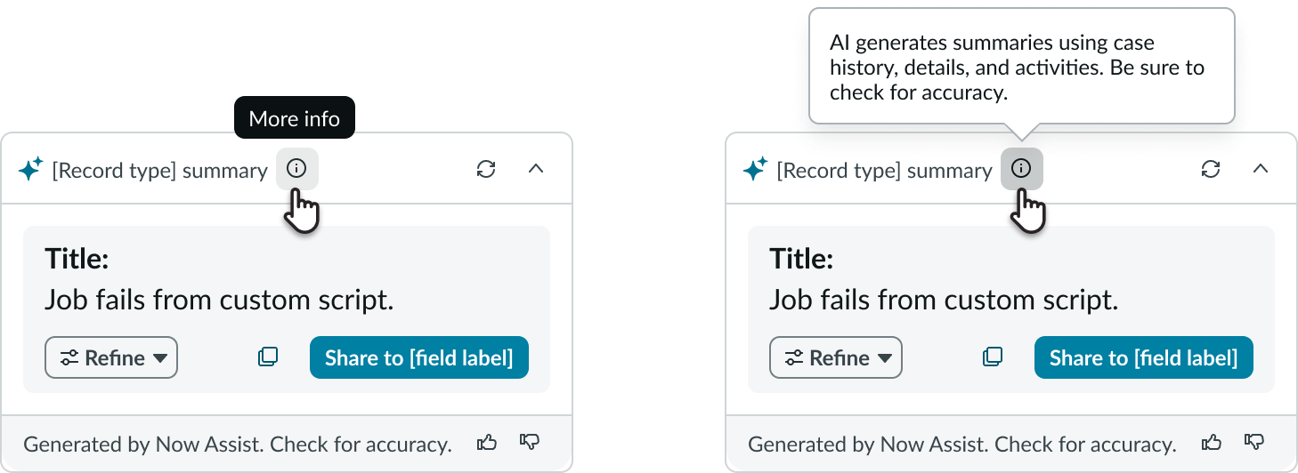
- Header label and info icon: Title label of the recommendation dialog header and info tip that explains the source of the summary
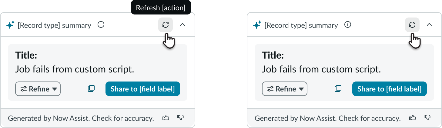
- Refresh button: Regenerates the summary from scratch, replaces the existing content without retaining the previous version
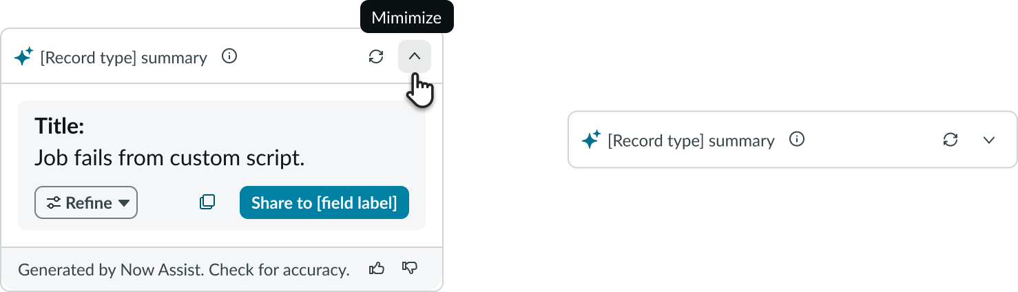
- Minimize view: Collapses the view to show only the header
- Notification: Displays a notification message with important information and provides an action link so the user can respond directly
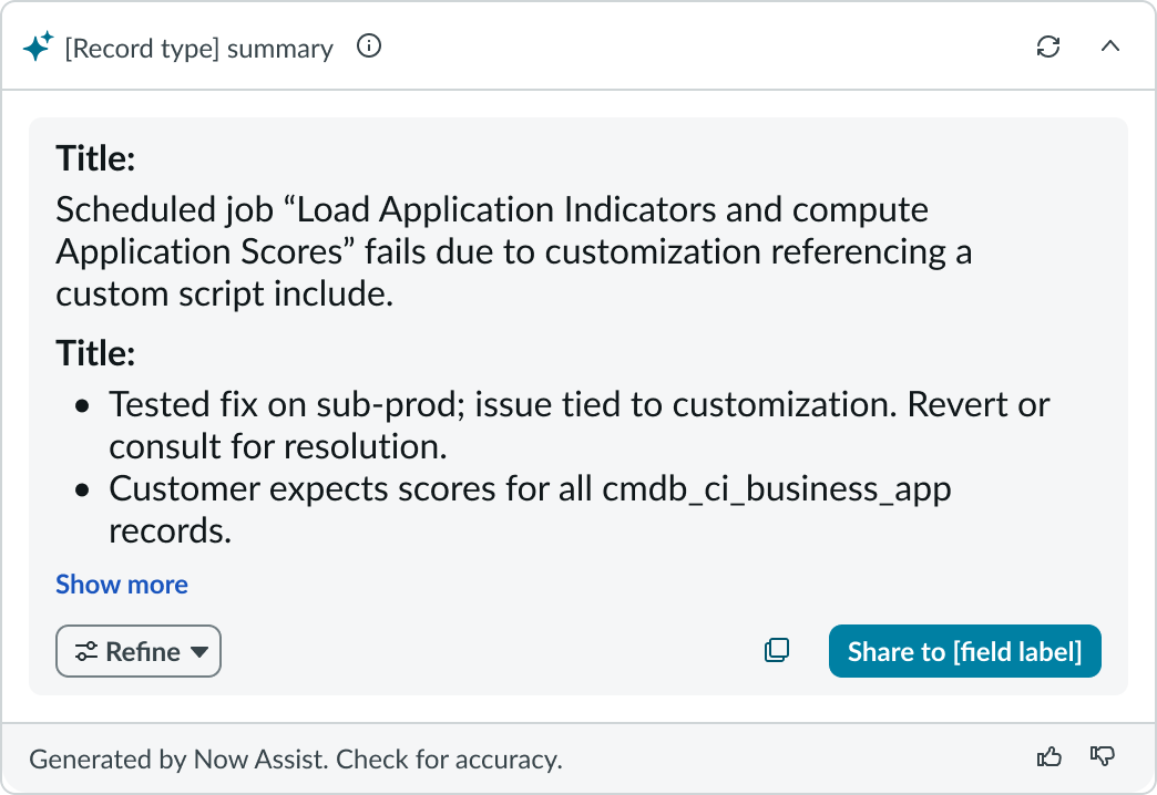
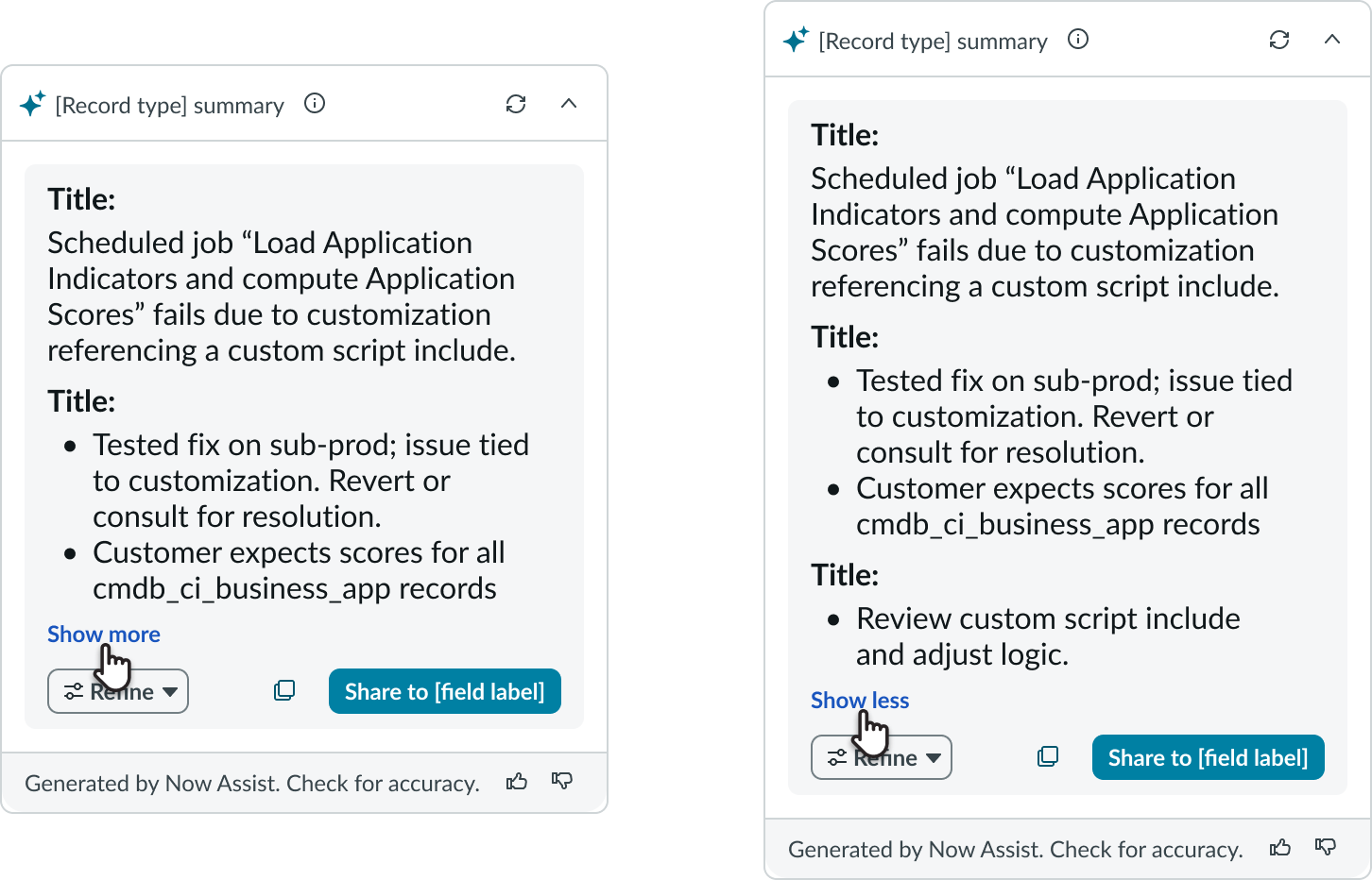
- Show more/less: When the content exceeds the component’s default height, it will be trimmed and a “Show more” button will appear; selecting this expands the content
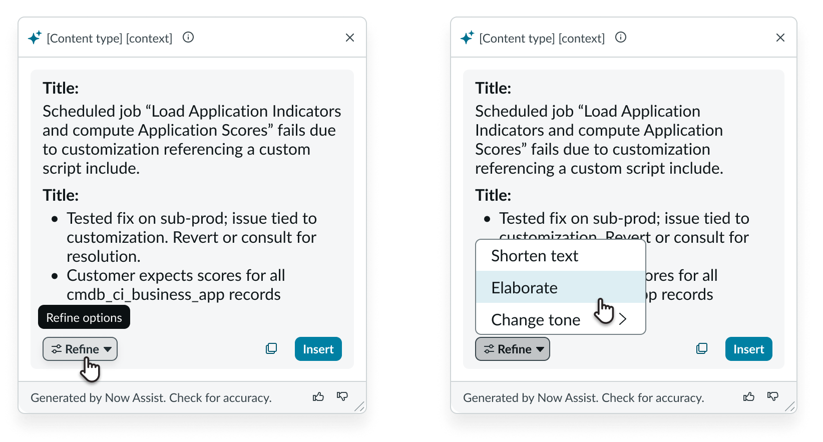
- Refine menu: Lists actions the AI can perform to edit or improve the generated text; hidden by default
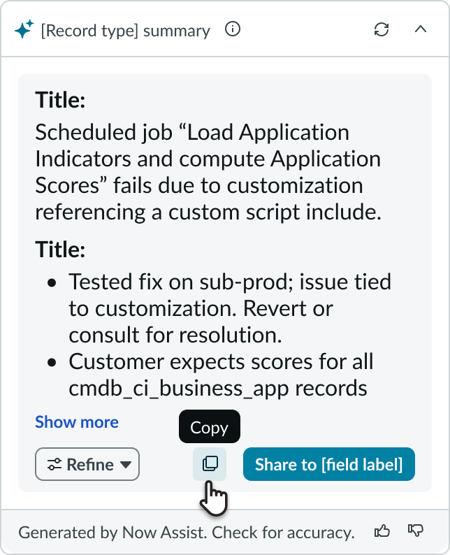
- Copy button: Copies the generated content
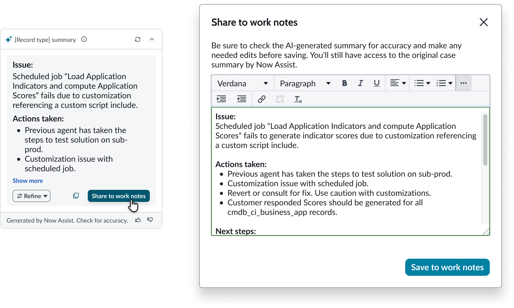
- Share button: Shares the generated content to the activity stream, work notes, or other elements based on configuration
- Feedback buttons: Capture user feedback
Subcomponents
See the usage guidelines for Now Assist context menu.
Usage
To use AI Summary Card, activate a Now Assist skill that provides the record summarization capability. For example, activating Incident Summarization displays AI Summary Card on the relevant record page. To use it in a custom workspace, add the component manually.
Configurations
AI Summary Card is designed for quick setup using a preset. Select the preset in UI Builder to apply all required properties and event handlers. Manual configuration is optional and should only be used for advanced scenarios or custom behavior.
Presets and controllers
This component has a preset configuration that sets properties and event handlers, making it ready for use. You can override preset values with a custom configuration if needed. Preset values won’t upgrade with updates. To avoid using presets, configure manually. One preset can apply to a single component instance. See presets for more info.
A preset is linked to a controller, which serves as a data resource. Controllers provide configuration data and event bindings for the component. Selecting a preset adds the required controller to the page, allowing new components to use its preset. For more on controllers, see controllers. For default presets, see view properties and events in the controller API.
Design recommendations
Learn how to apply AI Summary Card in your design.
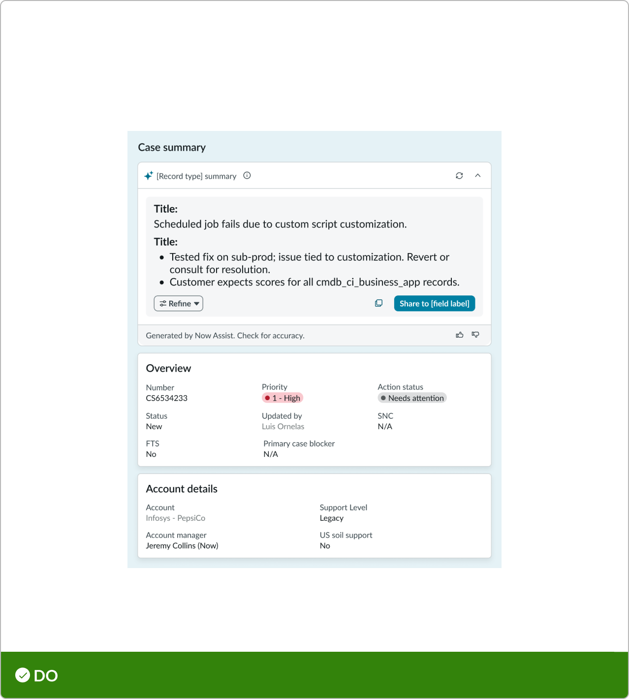
Use one card in a view.
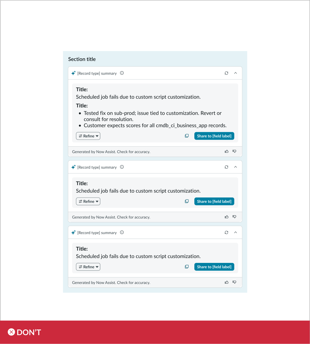
Don’t stack multiple summary cards in one view.
Behavior
Learn how AI Summary Card behaves when the display changes or a user interacts with the component.
States
AI Summary Card has the following states: default, generating, results, regenerating, minimized, and failure.
| State | Example |
|---|---|
| Default |  |
| Generating |  |
| Results | 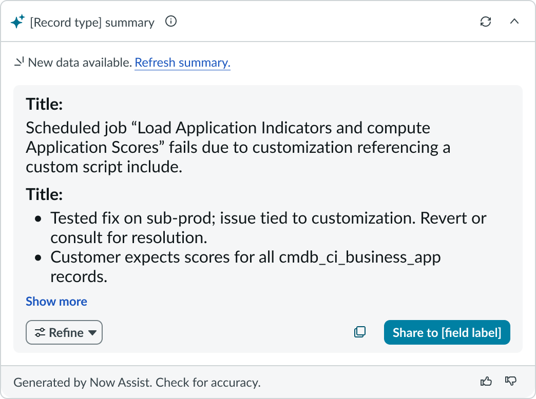 |
| Regenerating | 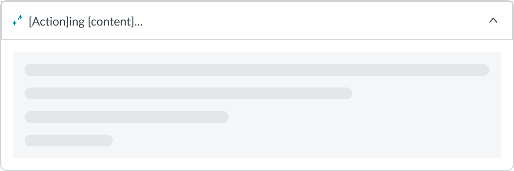 |
| Minimized |  |
| Failure | 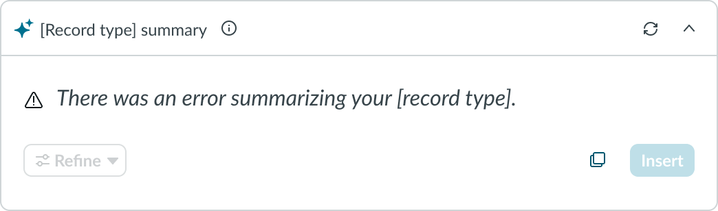 |
Truncation
When content in AI Summary card exceeds the maximum number of lines, it truncates and a “Show more” button appears.
Interactions
Learn how AI Summary Card responds when a user interacts with it.
Informational icon
Hovering over the info icon displays a tooltip. Selecting the icon opens a popover with high level details on the AI-generated content source.
Refresh
Selecting refresh regenerates the content from scratch and replaces the existing summary. Previous summaries are not saved or accessible.
Minimize
Selecting the minimize icon changes the card to its minimized state.
Show more/less
Selecting “Show more” expands the view to display the full generated text, and the button label changes to “Show less.” Selecting “Show less” collapses the view to its default state, and the button label reverts to “Show more.”
Refine
Selecting Refine displays a context menu with additional Now Assist actions. The button is hidden by default.
Copy
Selecting the Copy button copies the summary content to the clipboard.
Share to
The user can select the button to open a modal and edit the summary content before sharing to the specified location. For example, the content can be shared to the work notes of a record.
Usability
AI Summary Card complies with all internationalization and accessibility requirements.
Internationalization
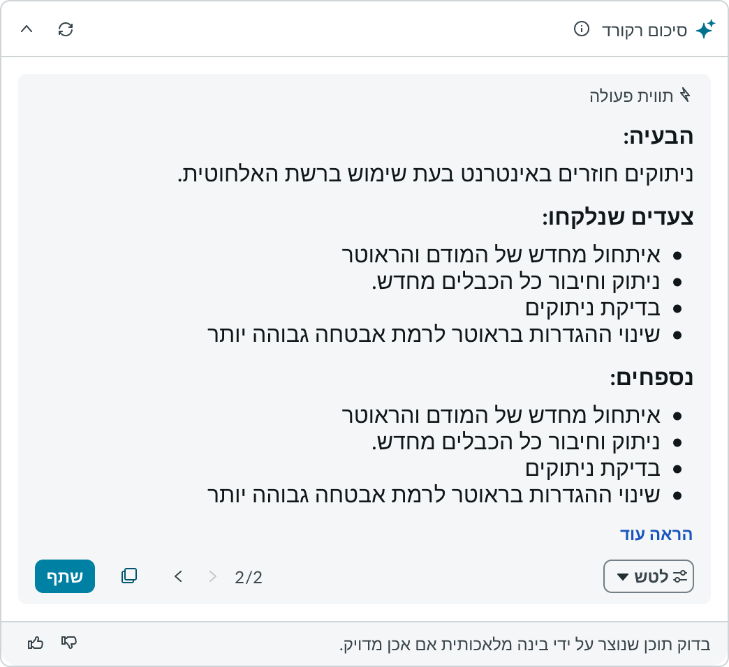
When this component is used in a platform configured for a right-to-left (RTL) language, all of the elements in the recommendation dialog align from right to left.
Accessibility
AI Summary Card doesn’t have any specific accessibility interactions.
AI Summary Card tab order
This is the tab order for AI Summary Card.
When the focus is on the summary card
When the recommendation dialog opens
Keyboard interactions
Users can interact with AI Summary Card using the keyboard.
You can access the actionable elements of AI Summary Card with these keyboard keys:
- Tab: Moves focus to the next element
- Shift + Tab: Moves focus to the previous element
- Enter/return: Triggers element action
When the focus is on the refine context menu:
- Up or down arrow: Moves focus among the actions
- Enter/return/spacebar: Triggers the highlighted action
Focus on the selectable elements like buttons, or version navigation arrows:
- Spacebar or Enter/return: Triggers the action for the element (opens context menu, copies content, closes the dialog, navigates between versions, etc.)
Focus on the recommendation dialog:
- Tab: Moves focus to the next element
- Esc: Closes the dialog
Focus on top-left corner of the recommendation dialog:
- Shift + any arrow: Drags the recommendation dialog in the direction of the arrow
Focus on drag-resize element of the recommendation dialog:
- Up or down arrow: Increases the height of the recommendation dialog
- Shift + Up or down arrow: Decreases the height of the recommendation dialog
- Left or right arrow: Increases the width of the recommendation dialog
- Shift + Left or right arrow: Decreases the width of the recommendation dialog
Screen readers
Screen readers follow the standard tab order. For left-to-right (LTR) and right-to-left (RTL) languages, tab order begins with the first element.