Anatomy
Learn about the individual parts of a catalog item.
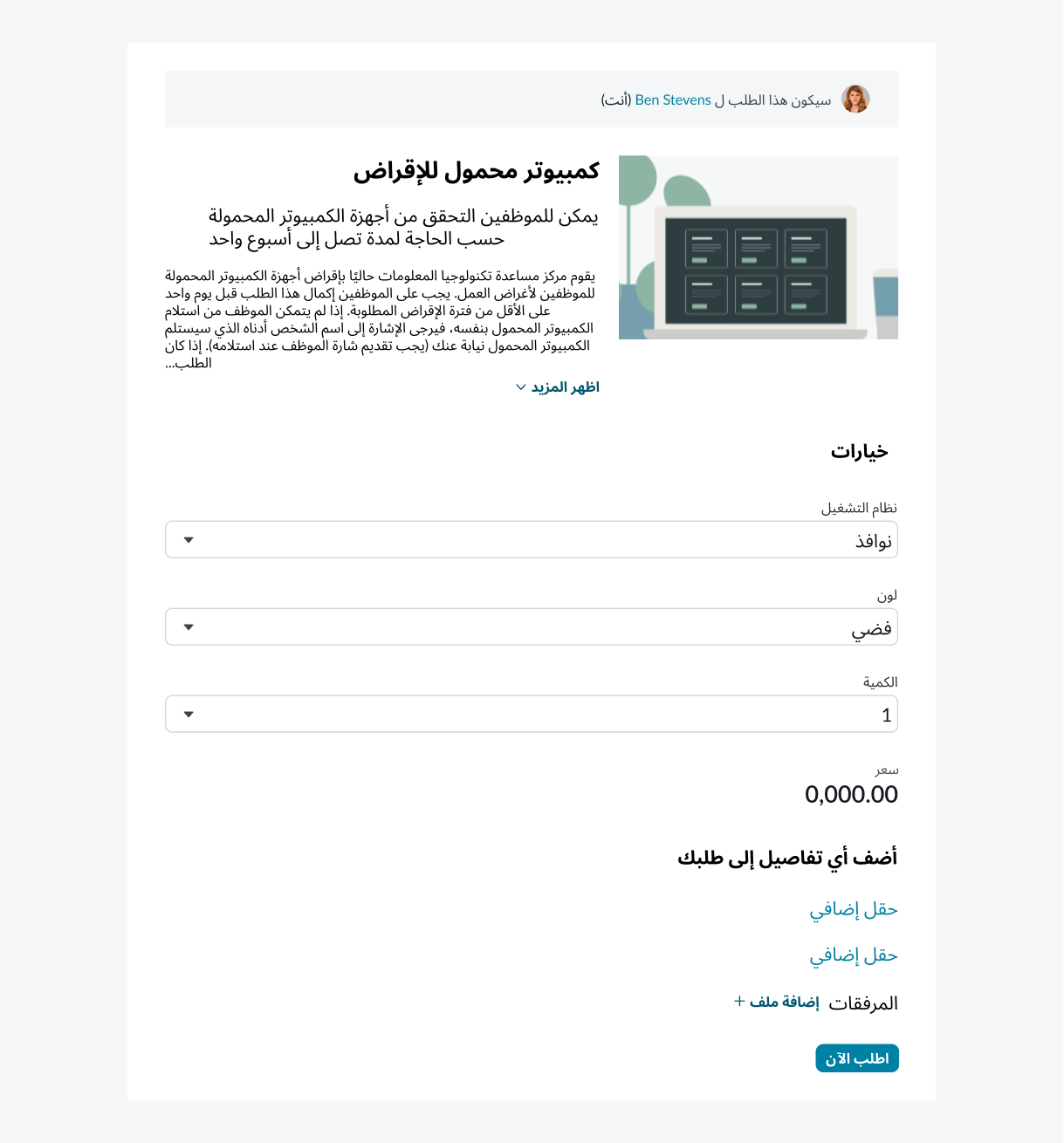
Catalog item
- Request for (optional): Name and avatar of the person this item is being requested for; only appears if the catalog item enables 'Requested For' variable type
- Catalog header: Information and supporting visual related to this item or service
- Catalog form (optional): Input fields based on configurable variables of the current item; supports one or two column layout
- Quantity selector (optional): Number of the requested catalog items
- Price (optional): Value associated with the catalog item; you can set the pricing to be dynamic depending on the selected options
- More details (optional): Text link options for adding more details to the request, such as delivery address or special instructions; this section is collapsed by default
- Attachments (optional): Button for adding attachments to the request; you can configure this option to be mandatory
- Catalog action: Button for submitting the catalog item request
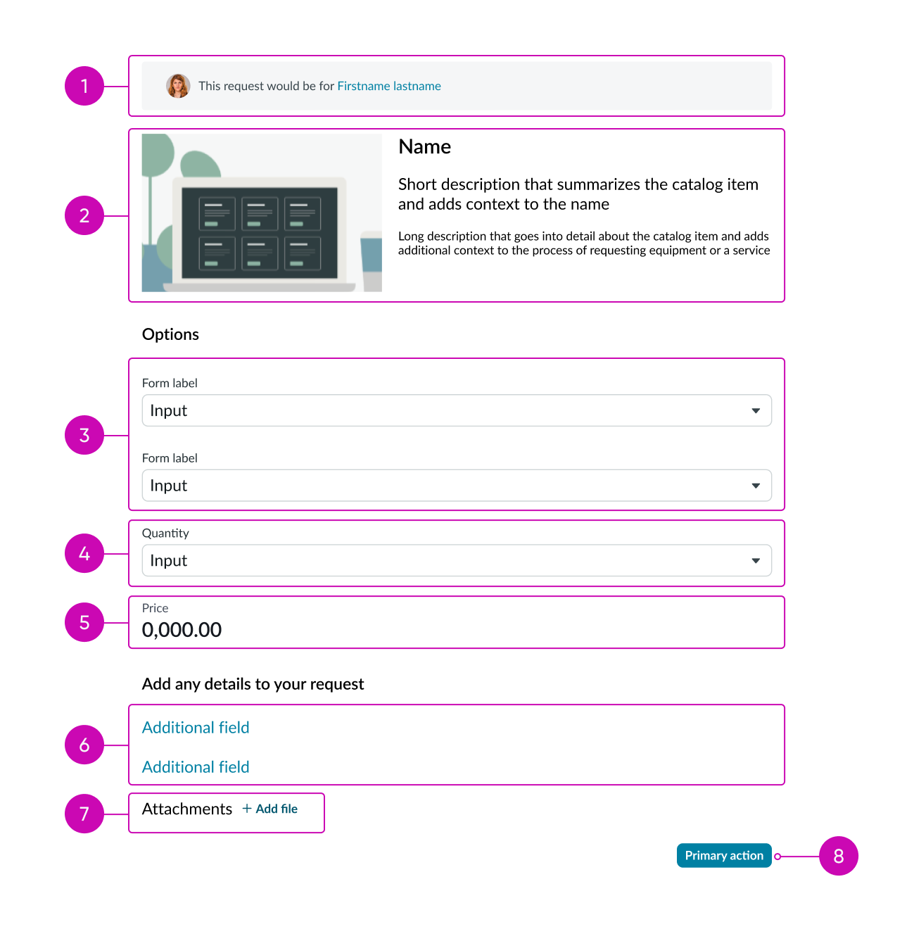
Catalog header
- Picture or icon (optional): Visual representation of the item or service; supports images
- Name: Text that describes the catalog item or service
- Short description (optional): Brief summary of the catalog item or service
- Long description (optional) Lengthy explanation of the catalog item or service; supports full rich text configurability and can collapse or expand with the disclosure control
Subcomponents
See usage guidance for heading
See usage guidance for text link
Usage
Learn how to use catalog item to help users request items and services for themselves or others.
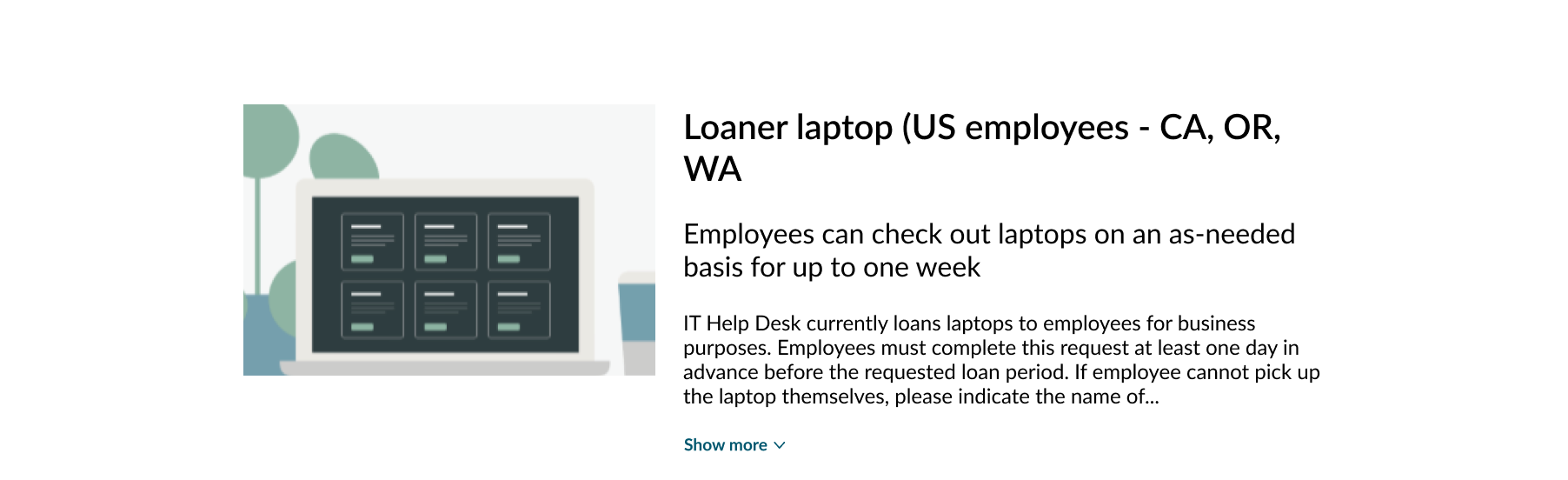
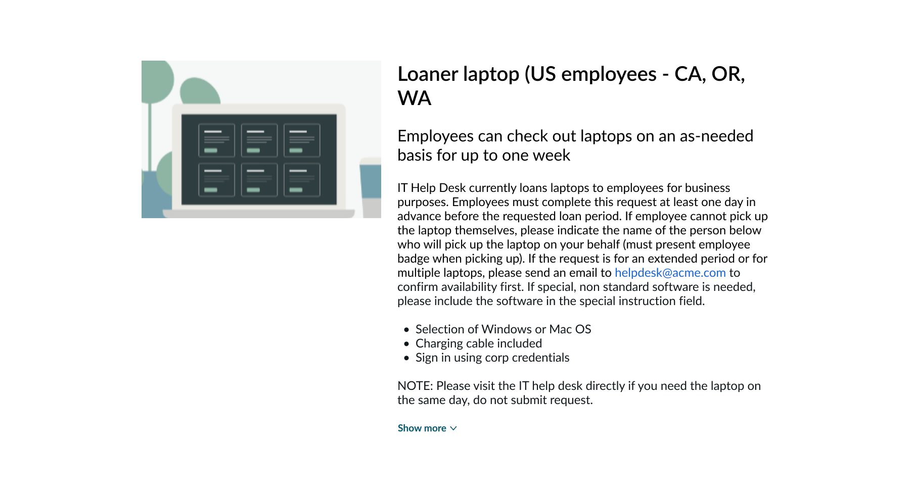
Requesting equipment
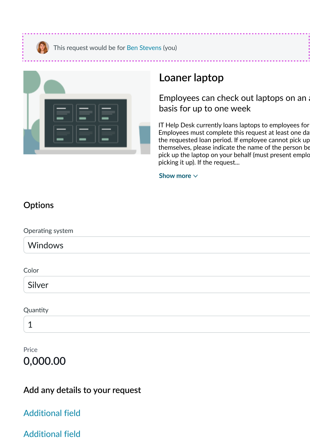
Use catalog item to request equipment, especially when the user can choose different equipment options.
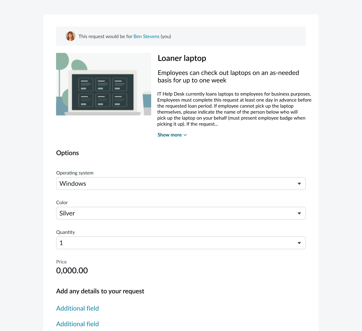
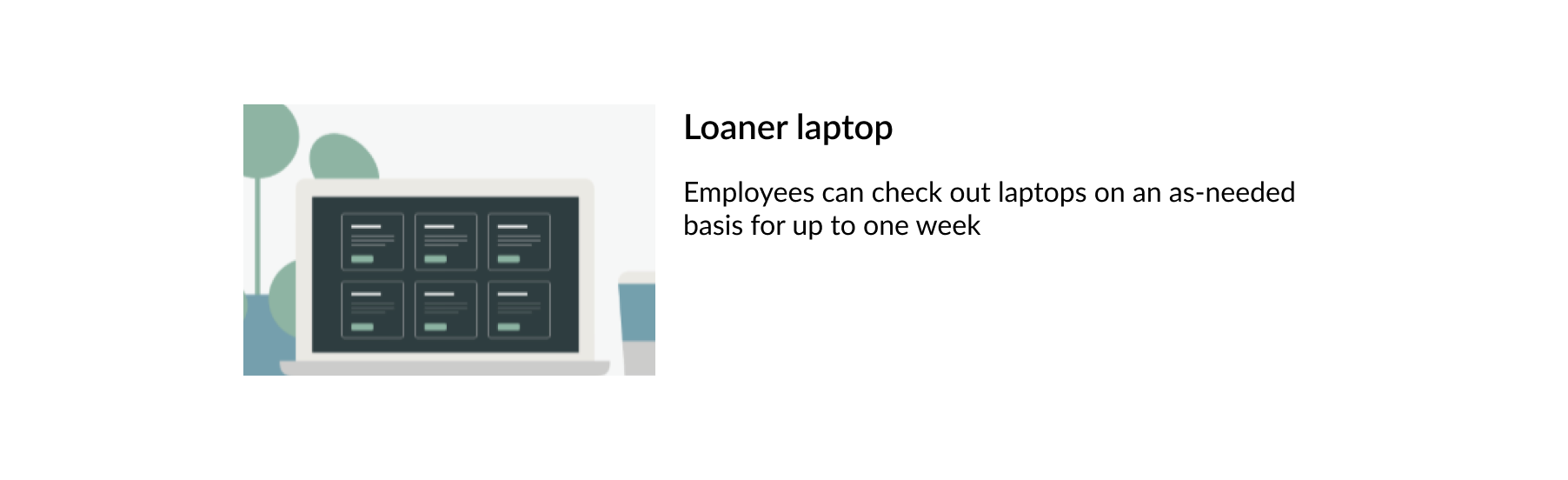
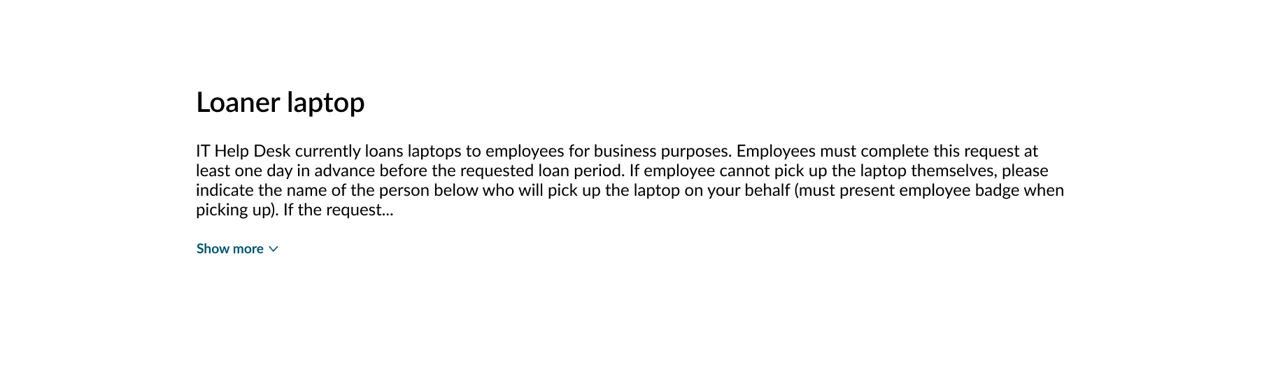
In this example, the user can request a loaner laptop and choose their preferences.
Requesting a service
Use catalog item to request a service, like getting help with an IT issue.
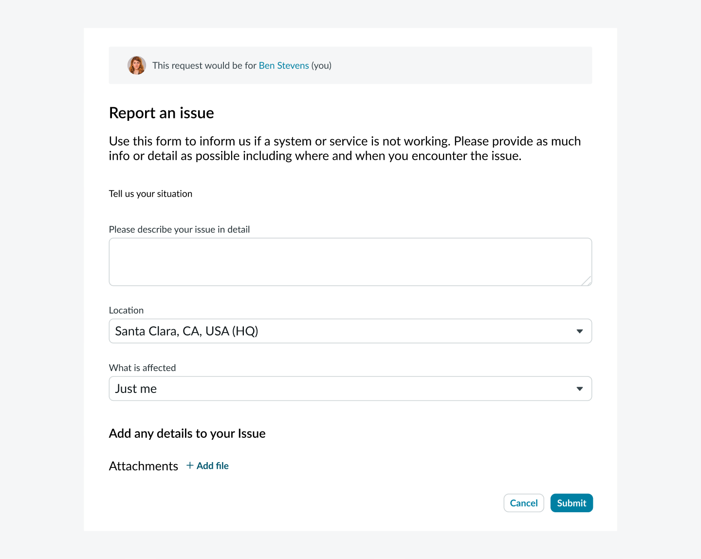
In this example, the user can fill out the catalog item to notify the correct department that they're having a work-related issue.
Configurations
Learn how to customize catalog item by configuring the available properties.
"Request for" bar
The "Request for" option can show as a bar at the top of the component or as a reference field in the catalog form section.
The user can select the current requestor name and choose a new requestor from a modal.
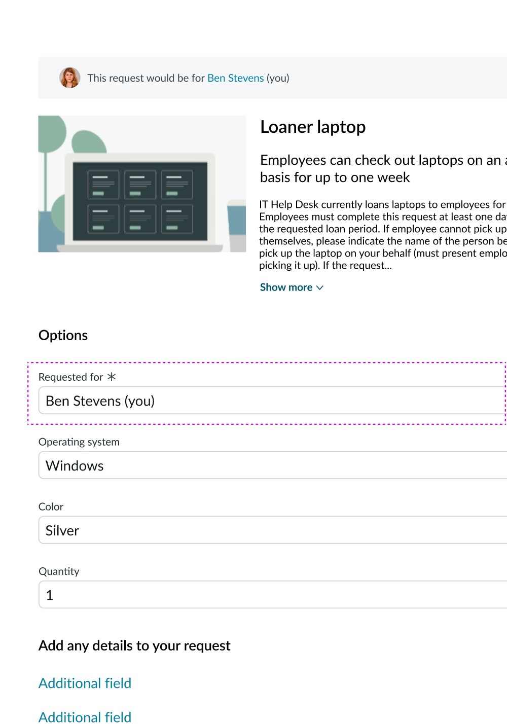
The user can select the "Request for" field to select a new requestor from a dropdown.
Catalog header
The catalog header includes an image, name, short description, and long description. You can turn the content inside the catalog header on or off depending on content availability and your individual use case.
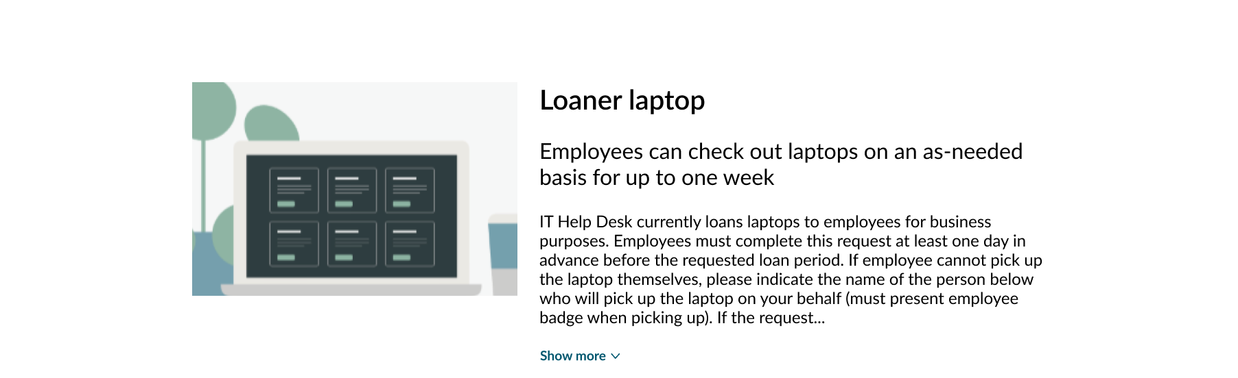
In this example, all parts of the catalog header are present.
In this example, only the name and short description appear in the catalog header.
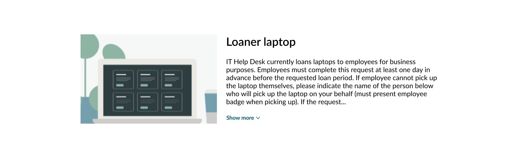
In this example, only the name and long description appear in the catalog header.
If you don't include an image or if an image is not available, the available text occupies the full width of the parent container.
In this example, the available text occupies the full width of the catalog header.
In this example, the name and short description occupy the full width of the catalog header.
In this example, the name and long description occupy the full width of the catalog header.
Catalog forms
You can use any input form fields in the catalog form and can display them in 1 or 2 columns.
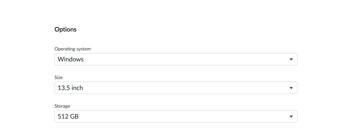
In this example, the catalog form fields appear in 1 column.
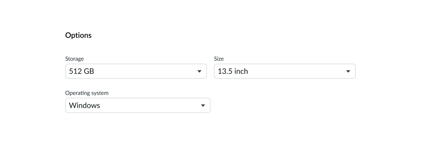
In this example, the catalog form fields appear in 2 columns.
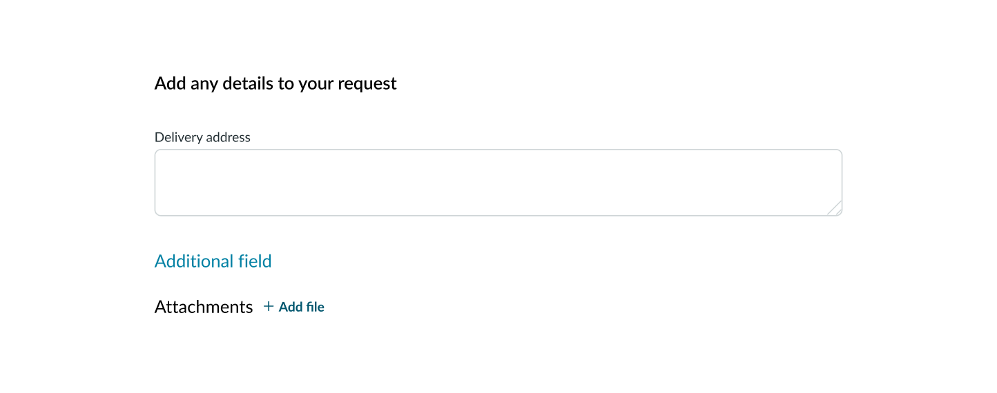
More details
You can add text links and buttons for the user to provide additional information related to their request. These can include a delivery address, special instructions, or a method for attaching a file (like a purchase order).
The default configuration is 2 optional fields (shown as text links). For more information, see the usage guidelines for text links.
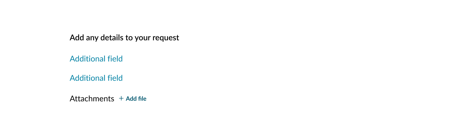
In this example, the 2 optional fields allow the user to add a delivery address or any special delivery instructions.
In this example, there is only 1 of the 2 optional fields is opened.
Catalog pricing
If you include catalog pricing in the catalog item, you can configure how the pricing displays. Pricing is based on whether the item has a fixed price or if there are recurring fees in addition to the fixed price.

In this example, this is the fixed price for the item regardless of selected options.

In this example, the recurring charge and occurrence will appear below the flat price.
Design recommendations
Learn how to apply catalog item in your design.
Alignment and positioning
Catalog item component stretches edge-to-edge of the parent container. Any subcomponents within catalog item align to the left, and action buttons align to the right by default.
UI text guidelines
These are some recommendations for using text within catalog item:
- Use sentence case for all titles and labels
- Keep the catalog item name succinct
- Explain the intent and purpose of the catalog item within the short description
- Button text should be concise, actionable, and clearly state what happens when a user makes the selection
Behavior
Learn how catalog item behaves when the display changes or a user interacts with the component.
States
Catalog item doesn't have any states. However, the form control subcomponents within catalog item has an error state.
Error state
Form controls show an error state if user input does not match the input criteria. For more information on the form control error state, see the component's usage guidance.
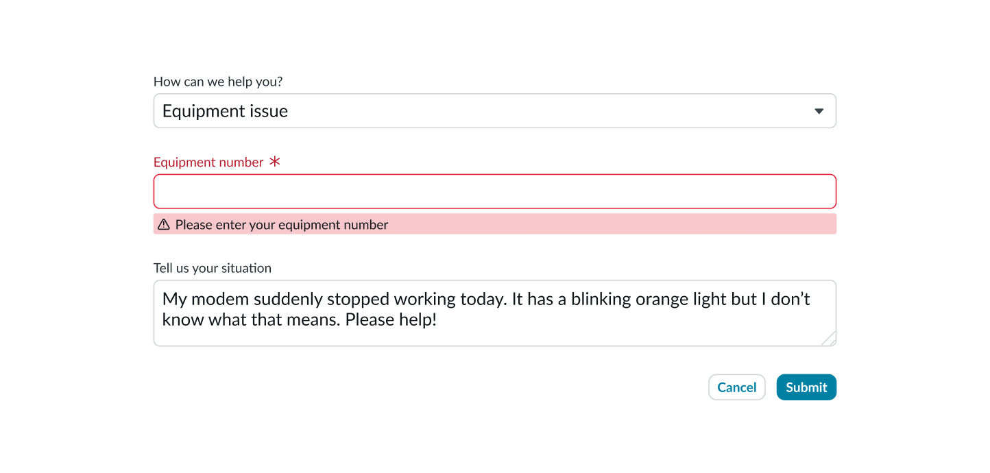
In this example, the "Equipment number" is required. Because the user did not complete the field, they are shown an error message.
Interactions
Learn how catalog item responds when a user interacts with it.
Requesting for yourself or someone else
The "Request for" bar remains visible at the top of the page. However, the avatar and name changes.

In this example, the user is requesting something for themselves, so their avatar and name appear in the "Request for" bar.

In this example, the user is requesting something for someone else. Therefore, the recipient avatar and name appear in the "Request for" bar.
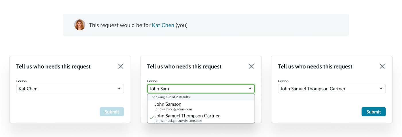
In this example, the user wants to change the request. Selecting "Kat Chen" opens a modal window, where the user can choose a new person for the request.
To change the request recipient, the user can select the recipient name. This opens a modal, where the user can then update the recipient by changing the "Person" field to someone else. The user must select the primary button to apply this change.
After the user changes the recipient, the updated person's name appears in the text link of the "Request for" bar and the avatar is updated with their profile image (if available). Additionally, a loader displays in the catalog item area while the catalog item details reset to the defaults.
Adding additional details
When the user selects a text link, an input field appears for entering text. This stays visible until user refreshes the page, even if they don't fill in the field.
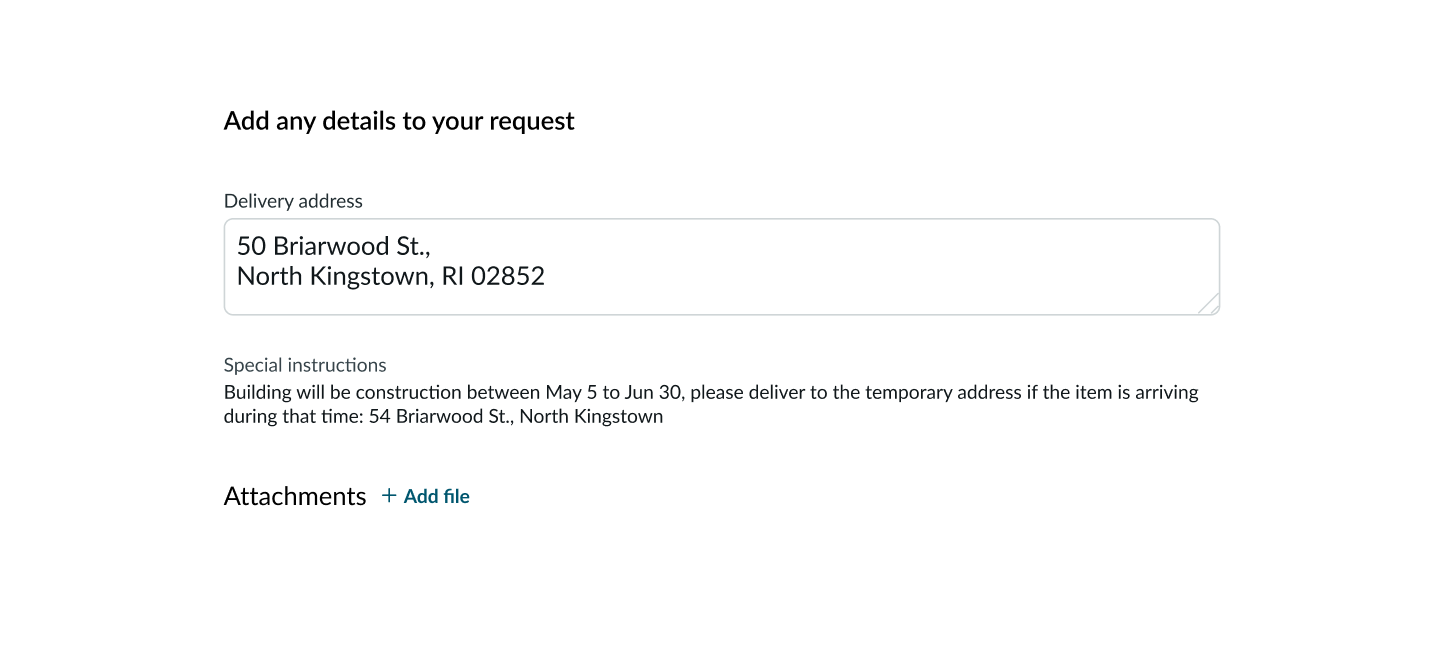
In this example, the fields were opened and completed by the user.
Truncation
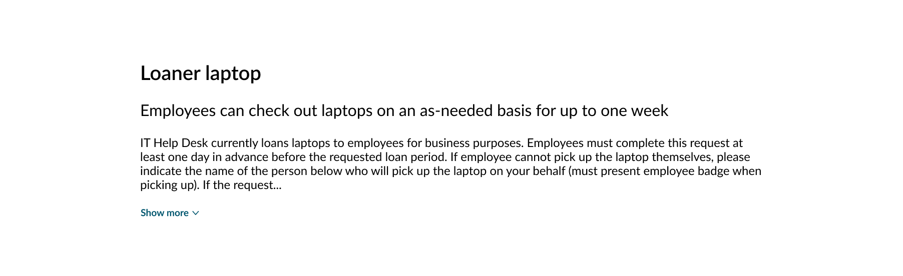
Only the long description truncates in the catalog item. All other text wraps to the next line. The long description truncates after 250 characters. After truncation with an ellipsis, a disclosure control appears to let the user expand and see the full description.
In this example, the long description is over 250 characters. Therefore, it truncates with an ellipsis and displays a disclosure control.
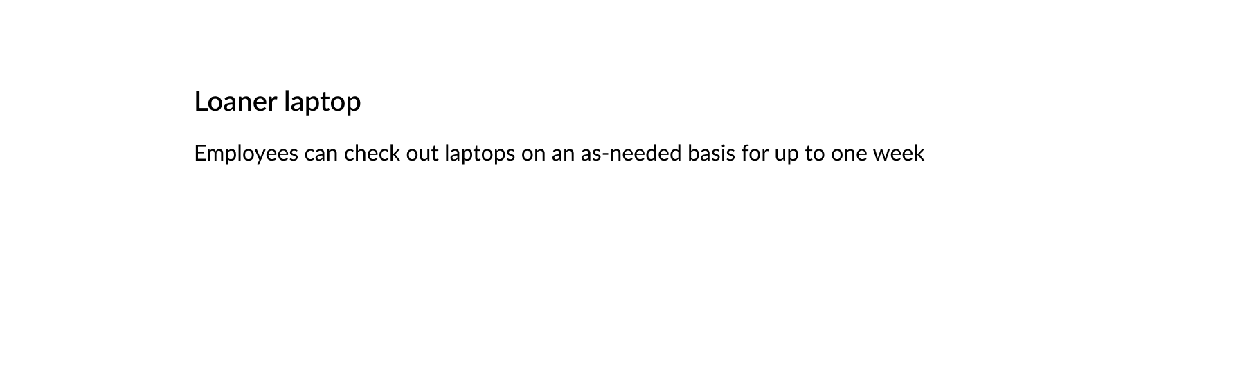
When expanded, the description field will push the subsequent subcomponents (like catalog form) and any additional details down the page. If you include an image in the long description, the image scales proportionately to the description container.
In this example, the user has selected the disclosure control to show the remainder of the long description.
Usability
Catalog item complies with all internationalization and accessibility requirements.
Internationalization
When the display translates to a right-to-left (RTL) language, the content and subcomponents flip and align on the right. Any names or proper nouns, however, display left-to-right (LTR).