iOS
Android
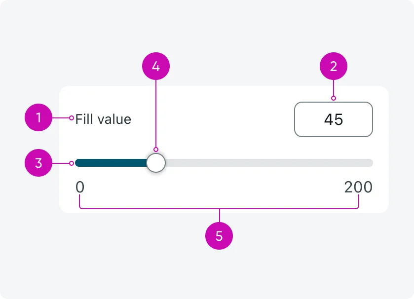
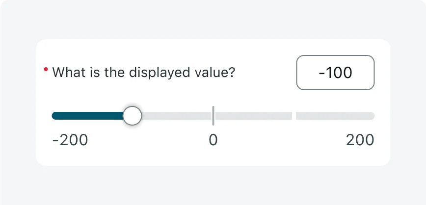
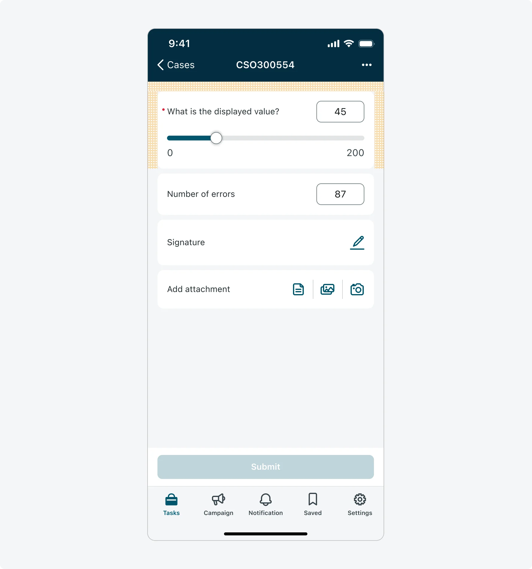
- Label - Displays the field name. If the text is long, it wraps and can span multiple lines.
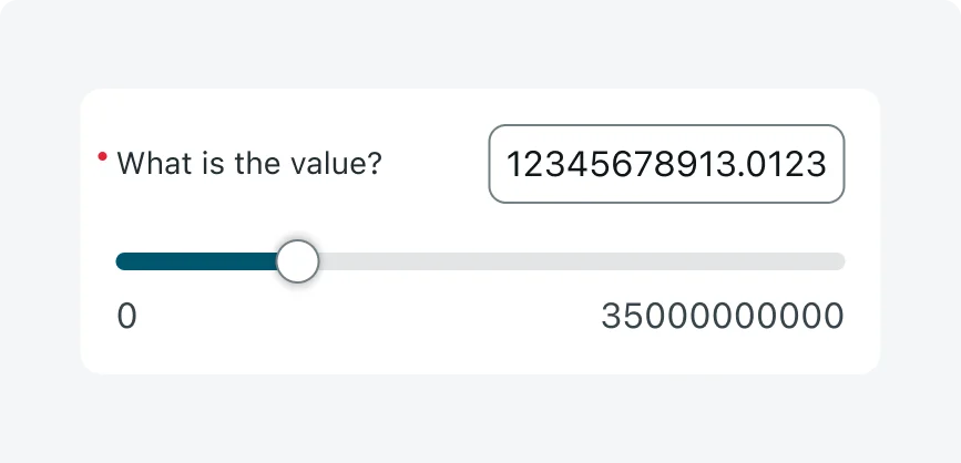
- Numeric input box - Allows manual entry of a value. Stretches to fit longer values (up to 15 characters), truncates and scrolls if needed.
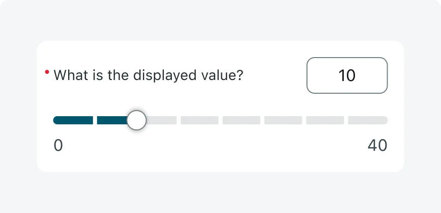
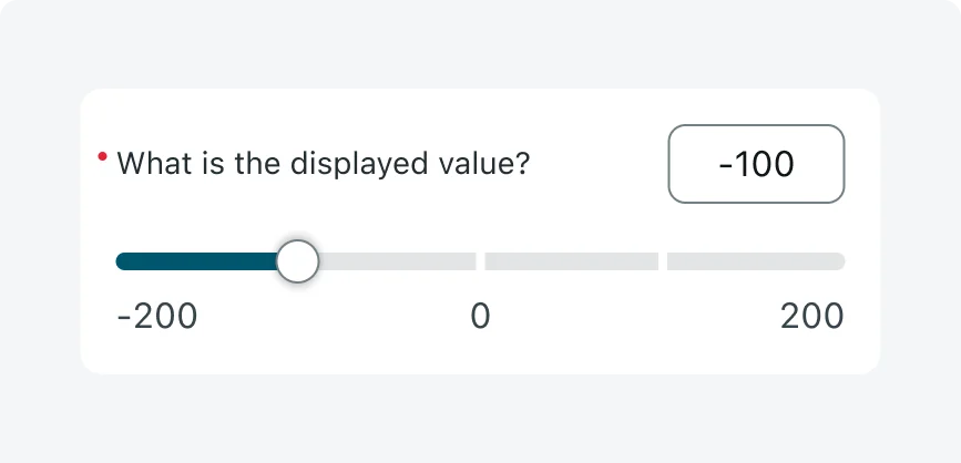
- Slider track - Horizontal track representing the numeric range. Used for dragging the slider handle. The portion from the start of the range up to the current value is visually colored to indicate progress.
- Slider handle - Draggable control for selecting a value.
- Min/Max value - Displayed at both ends of the track. Values truncate when space is limited.
Variants
The single slider input has 3 variants: Basic Slider, Visual Steps Slider and Color Ranges Slider
Basic Slider
A clean, flexible slider for selecting a value within a defined range. It supports both dragging the slider handle and typing a value into the input box manually, min/max values, decimal precision, and optional step configuration.

Visual Steps Slider
This variant builds on the Basic Slider by adding tick marks along the track to visually indicate the allowed step values. It helps users understand that only specific values can be selected (in equal intervals), guiding them toward valid inputs.

Visual steps are not compatible with color ranges.
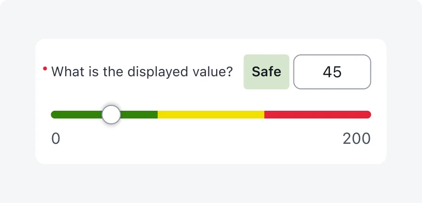
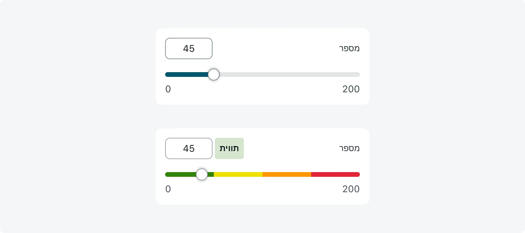
Color Ranges Slider
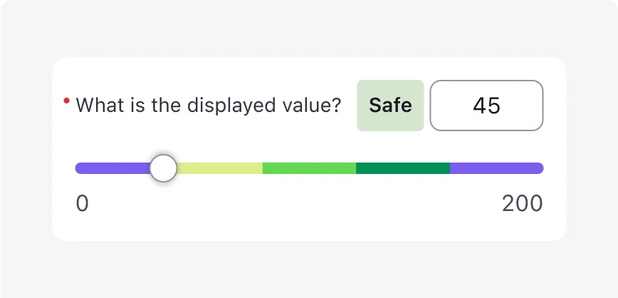
This variant divides the slider track into colored segments to visually convey the meaning of different value ranges. The meaning is communicated both through color on the track and through text - displayed in a range label tag that appears next to the numeric input box. This variant is ideal for representing status, severity levels, or thresholds.

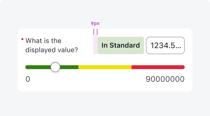
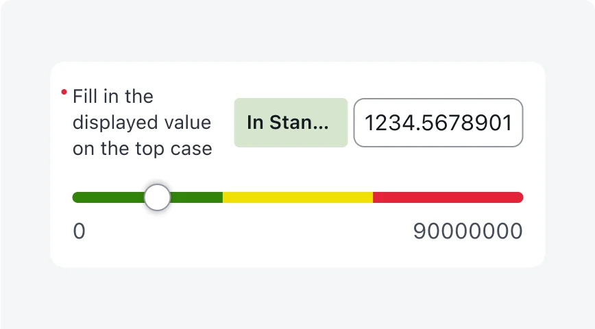
(1) Range label tag - textual label that appears to the left of the numeric input box when color ranges are enabled. It updates dynamically to describe the meaning of the selected value range, ensuring usability for users with low vision, contrast sensitivity, color blindness and visual impairments. Truncates when exceeding 120px width.
*Note: The range label tag is hidden when the slider is in empty state.
Configurations
Learn how to customize the Numeric single slider input by configuring the available properties.
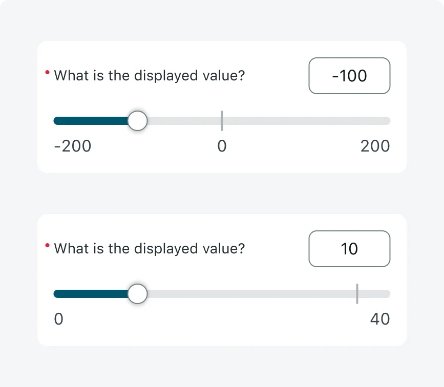
1. Mix and Max values
You must define a minimum and maximum value for every slider, these can be positive or negative. These values determine the numeric range users can select from and are always displayed at either end of the slider track. When space is limited, values may truncate, but spacing is preserved to avoid overlap - maintaining at least 12px between values.
2. Step size (incremental steps)
You must define the unit by which the value increases along the track (for example: 10, 1, 0.5, 0.01, 0.001). This determines how smoothly the slider moves and what values are considered valid when snapping or step enforcement is used. Without step enforcement, users can still type in values that fall between steps.
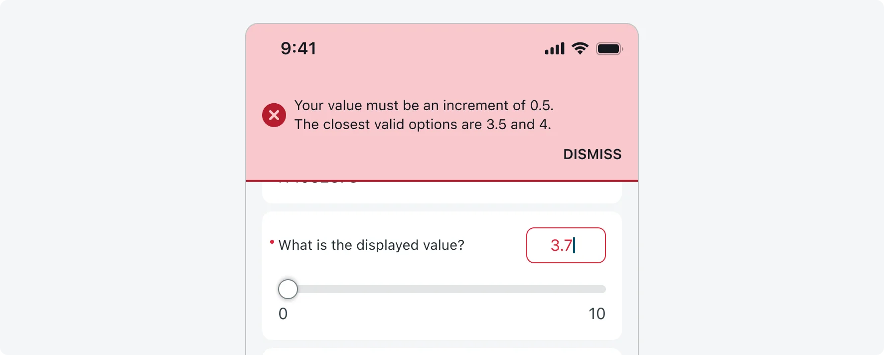
Enforce Step Size
Enable this option to restrict users to selecting or entering only values that match the defined step size. By default, users can enter any number in the input box, and only the slider track enforces the step size. If you want the input box to also enforce the step size, you can enable the "Enforce step size" mode. When Enforce Step Size is on, any manually entered value that doesn’t align with the defined step size will trigger an error toast (for example: “Your value must be an increment of 0.5. The closest valid options are 3.5 and 4.”). This setting applies to all slider variants and is strongly recommended when visual steps are used.
3. Visual steps
You can enable visual steps to show tick marks along the slider track at every valid step value. This helps users understand which values are selectable and makes it easier to drag the handle through clearly defined intervals.
The number of visual steps that can be displayed depends on the available screen width. Steps are only shown if there’s enough space to maintain a minimum of 12px between each tick (based on device’s width and amount of steps configured). If there isn’t enough space, the slider automatically falls back to the Basic Slider without tick marks.
Best Practice
Use visual steps when the incremental step size is large or when the number of valid values is small to improve usability. Avoid using it when the amount of steps is large and the step size is small.
Note
Visual steps are not supported when color ranges are enabled. If both are configured, only the color ranges will be shown.

4. Color ranges
To communicate the meaning of numeric values, you can divide the slider track into colored segments.
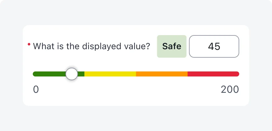
- You can define up to 8 ranges, each range supports only one color, though multiple ranges can share the same color.
- The best practice is to not use more than 4 colors on the same slider.
- When color ranges are enabled, a range label tag appears next to the numeric input box, updating dynamically to reflect the meaning of the current value (e.g., “Critical”, “Safe”). As an admin, you need to define textual meaning for each range you add, that text will be displayed in the label tag (this is not optional). This ensures accessibility for users with color blindness, low vision or visual impairments.
- Color ranges cannot be used in combination with visual steps. If both are configured, only the color ranges will be shown.
Color Theming
You can choose from 4 predefined theme colors: green, yellow, orange and red (serving as universal traffic-light colors) - mapped to the variables “Slider-0”, “Slider-1”, “Slider-2”, “Slider-3”. These defaults can be customized using the theming palette. If you select a color that’s not one of the recommended defaults, a warning message will appear in the builder, in that scenario - please ensure you maintain accessibility and visual consistency with the colors you select.
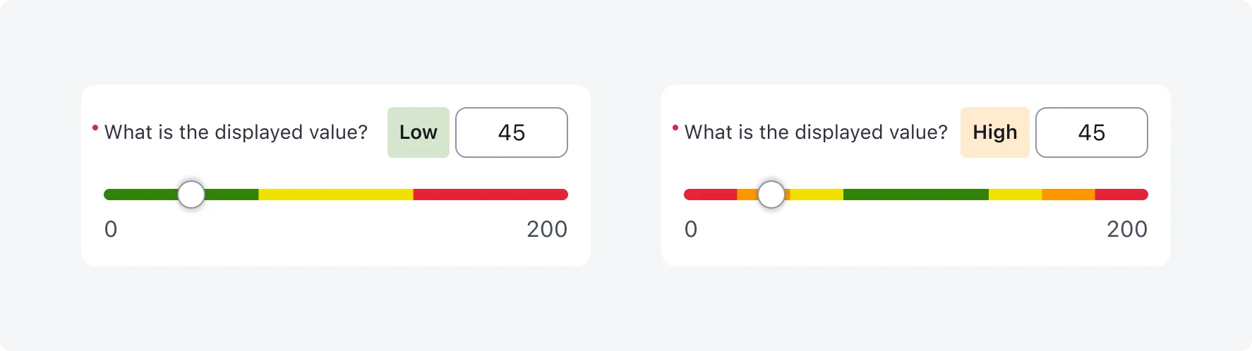

2 colors - 2 ranges

3 colors - 3 ranges

4 colors - 4 ranges
Multi ranges (5+)
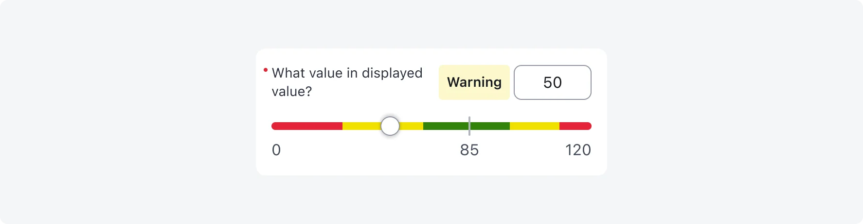
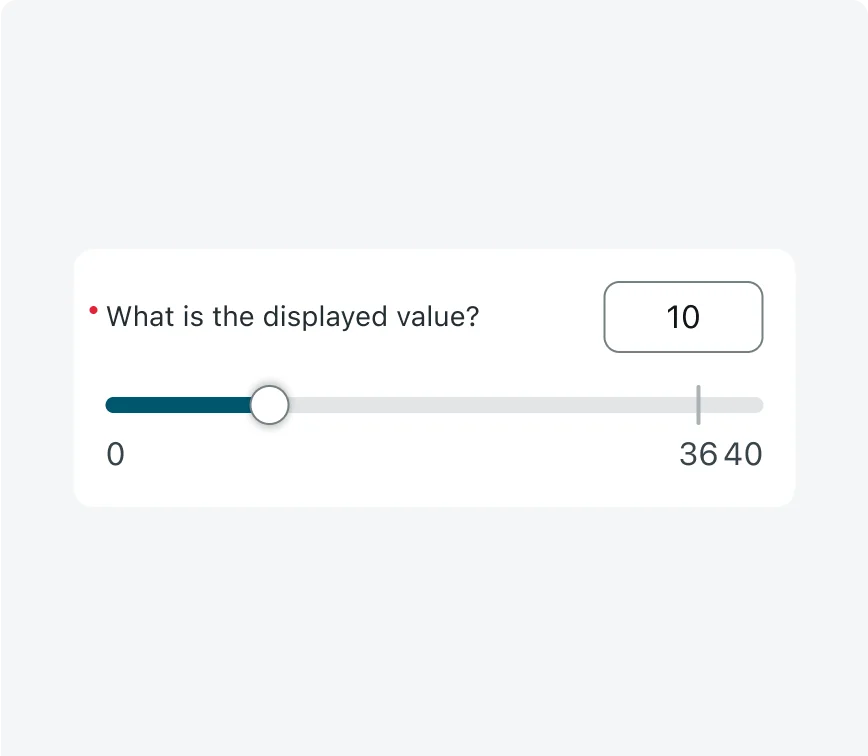
5. Reference point
You can configure an optional reference point to visually highlight a specific value on the slider, or serve as visual aid for the user. It appears as a number and a vertical indicator line, by default it is not displayed.
The admin can configure any number to be the reference point, and it doesn’t have to be centered. If visual steps are enabled, the indicator line is hidden and only the number is shown. When space is limited or the reference point is too close to the min or max value (less than 12px spacing), it may be truncated or hidden entirely - leaving only the vertical line as a visual marker.
Best Practice
When the minimum number is a negative and the maximum is a positive number, its recommended to display the reference point for “0” on the slider.

Best practice: reference point for “0” with negative minimum and positive maximum
Example: Reference point not centered

Example: Reference point with visual steps, the indicator line is hidden and only the number is shown.

Example: The reference point value is hidden, and only the indicator line is visible. This was done to prevent visual overlap that could occur if the reference point were placed too close to the slider value
6. Default value
You can optionally set a default value, which will be prefilled when the form loads. This can help guide users toward a commonly used or recommended value. If left empty, users will need to select or enter a value themselves.
7. Descriptive elements
Use descriptive elements combined with inputs to offer additional visual or textual guidance above an input. These can include plain text, rich text, or images. Learn more about Descriptive elements.
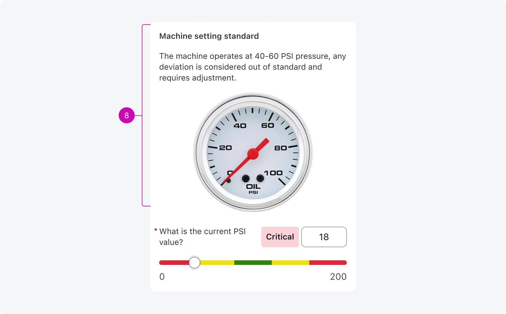
8. Description
Add a short description to any input type to provide users with helpful context or guidance. This is ideal for simple instructional text.
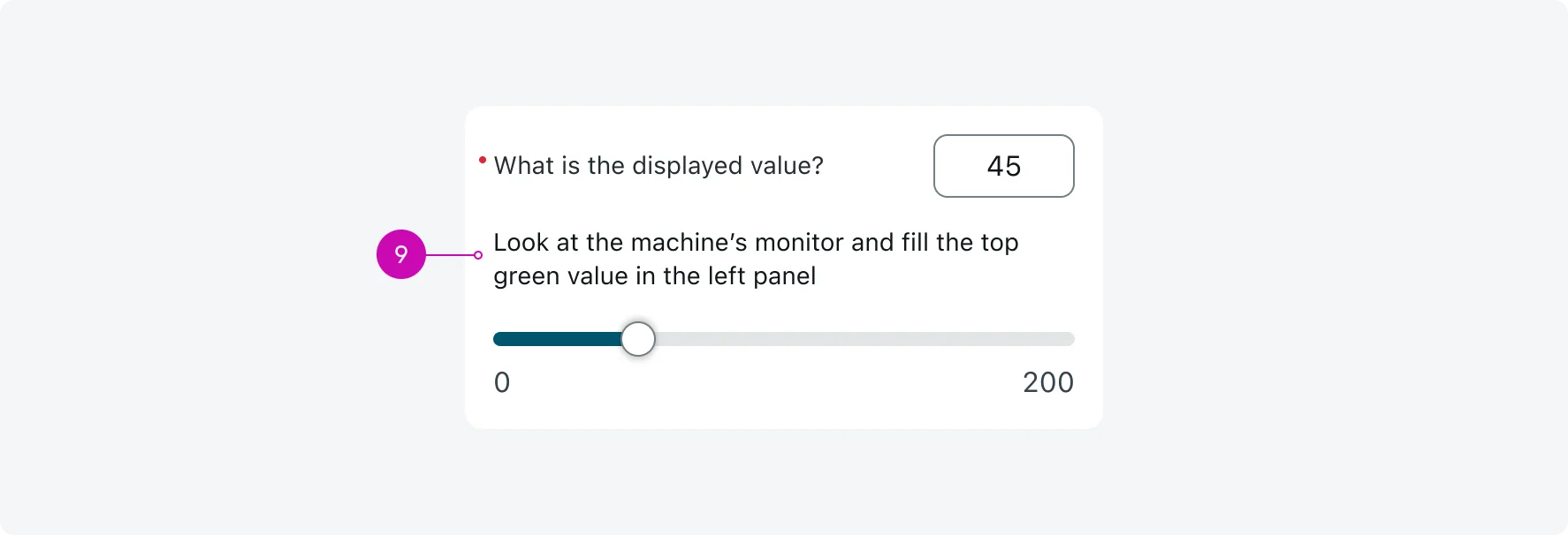
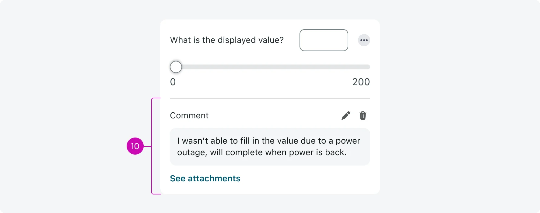
9. Input actions
Add an actions menu to any input to allow users to perform tasks like adding a comment, attaching multiple images, or navigating to other screens. Input actions are only available when the form is configured as a screen (not modal). Learn more about Input actions.
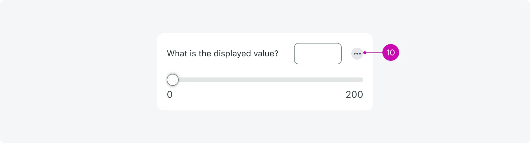
Here's an example of an input where a user added a comment and multiple attachments:
- Use a reference point when you want to guide users toward a meaningful value, such as “0” in a scale with both negative and positive numbers.
- For designers: If you must place a reference point closer than 12px distance from the min or max value, hide the number by selecting the reference point component and toggling “Show number” off in the properties panel.
- Don’t place the reference point too close to the min or max values.
- For designers: If there's less than 12px spacing between the reference point and the min or max value - the number of the reference point must be hidden, otherwise it might hinder usability (follow the instructions under the “DO” frame to adjust your component).
2. Visual steps usage
Enable visual steps when the step size is large or the number of valid values is limited. This improves clarity and helps users drag the handle through predefined intervals.
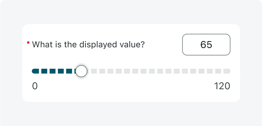
Avoid using visual steps when the number of steps is very large and the step size is small. This can result in a cluttered, unreadable track and reduced usability.
3. Reference Point with Visual Steps (for designers only)
Hide the reference point’s vertical indicator line when visual steps are enabled - only the number is displayed to reduce visual clutter and avoid overlap with step marks. In your design, select the reference point component and toggle “With steps” on in the properties panel.
Don’t display the reference line alongside visual steps. The combination can cause visual clutter and appear misaligned with the step marks (follow the instructions under the “DO” frame to adjust your component).
4. Color ranges
- Define a meaningful range label tag for each color segment. This ensures accessibility for users with color blindness or low vision by providing text-based meaning.
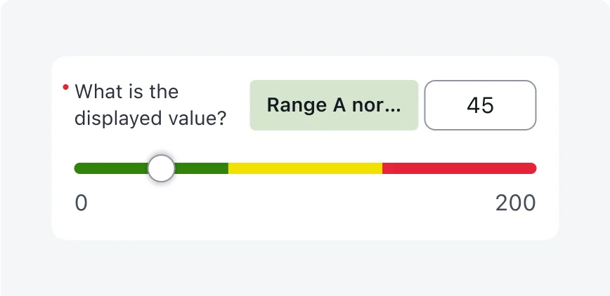
- Keep the label short, concise and clear, to avoid truncation and information loss.
- Don’t rely on color alone to convey the meaning. The range label tag is essential for accessibility and clarity. Avoid using vague or unclear labels that don’t clearly communicate the purpose of the value range.
- Don’t use too long labels - they will truncate above 120px width.
- Use the default out-of-the-box colors: Green (slider.0), Yellow (slider.1), Orange (slider.2), and Red (slider.3). These follow the universal “traffic light” convention and are optimized for contrast and accessibility.
- Use up to 4 different colors on the same slider.
- Keep ranges reasonable so the slider feels smooth and intuitive, not overly segmented.
- You can select from a few pre-defined color range variants in the properties panel, or detach and adjust the ranges manually.
- Don’t replace the default colors with custom ones unless necessary. Non-standard colors can be harder to interpret and may lose their intended meaning - reducing the effectiveness of the color-coded feedback. They can also create accessibility issues related to contrast, especially in dark mode.
- If you choose to use different colors, always test in both light and dark themes to ensure readability, usability and accessibility.
- Don’t use more than 4 different colors on a single slider.
5. Numeric input box expansion (for designers only)
- Allow the numeric input box to stretch for long values - up to 15 characters - if space allows.
- Maintain 8px spacing between the numeric input box and the label (this is already defined in the component).
- On iOS: expansion is limited to 15 characters, truncate if longer.

- Don’t prioritize the numeric input box over the label, ensure that the numeric input box doesn’t increase beyond it’s minimum width (80px) if the label is long and requires the space (truncate the number).
- Avoid overlap between the input box and other elements.
6. Input Label and Value - long text edge cases (for designers only)
- Allow long labels to wrap to 2 lines.
- Always prioritize fitting the range label tag (up to 120px width), maintaining 8px spacing, and ensuring 80px minimum width for the the numeric value with truncation.
- Don’t prioritize the numeric value visibility over the label or range label tag.
7. Spacing with long values - edge cases (for designers only)
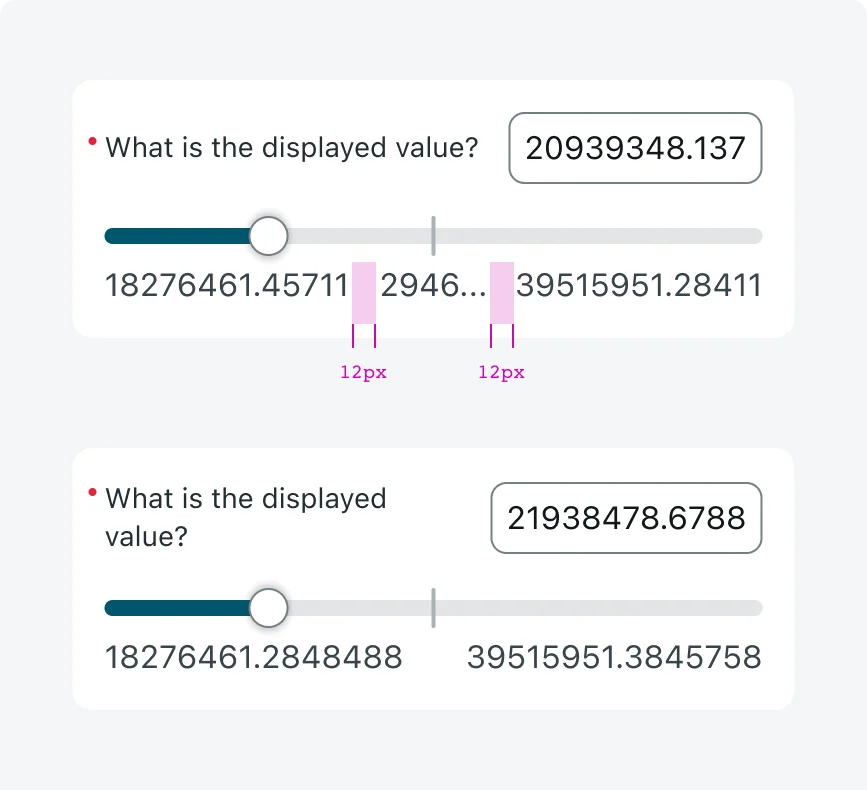
- Maintain at least 12px spacing between min, max, and reference values. If needed, truncate values to preserve spacing.
- In case 12px spacing is not possible to maintain even with truncation (scenarios with reference point) - hide the number of the reference point by toggling “Show number” off.
- Don’t allow numeric labels or the reference point to overlap. Prioritize min and max values first, then the reference point.
- Avoid using slider inputs when the values are very long, they are not best suited for it and may create edge cases.
Alignment and positioning
Align the slider input to the center of the screen, maintaining a 16 px margin from the screen edges and the Nav Bar.
UI text guidelines
When configuring the Single Slider Input, clear and meaningful labels are essential for helping users understand numeric values, especially when visual aids like color or steps are used.
Range Label Tags (Color Ranges Slider)
- Use descriptive and accessible labels that clearly communicate the meaning of each range (e.g., “Critical”, “Safe”, “Needs Attention”). Don’t rely on vague or generic labels like “OK”, “Option 1” or “Red”, these do not convey context or meaning.
- Keep the label short, concise and clear, to avoid truncation and information loss.
Input Labels
- Use concise labels that reflect the purpose of the input (e.g., “Target Pressure (PSI)”, “Risk Level”).
- Avoid using too long text for the labels, keep it concise and clear.
- Don’t truncate labels. If a label is long, allow it to wrap to a second line.
States
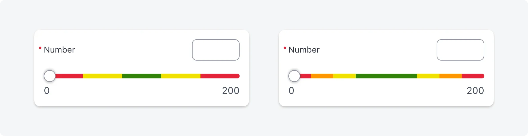
Numeric slider input has 7 states: Default, empty state, editing, read-only, shimmering, error, reference point.
| State | Slider input |
|---|---|
| Default | 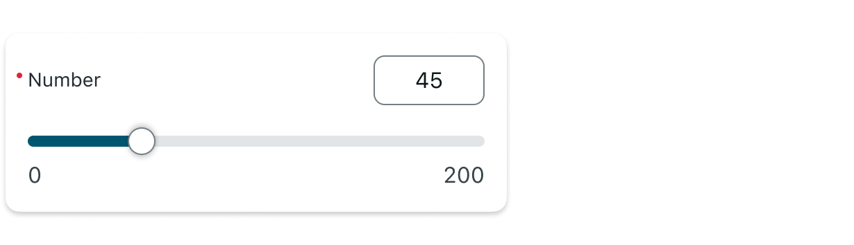 |
| Empty state | 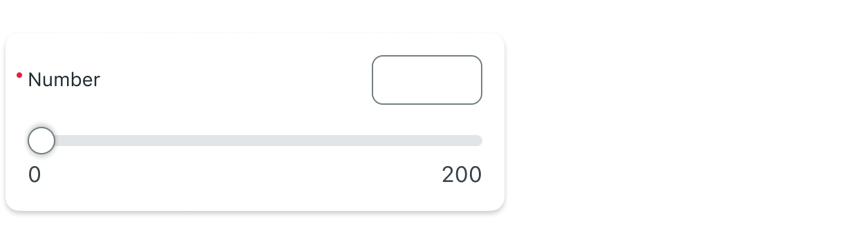 |
| Editing (typing) | 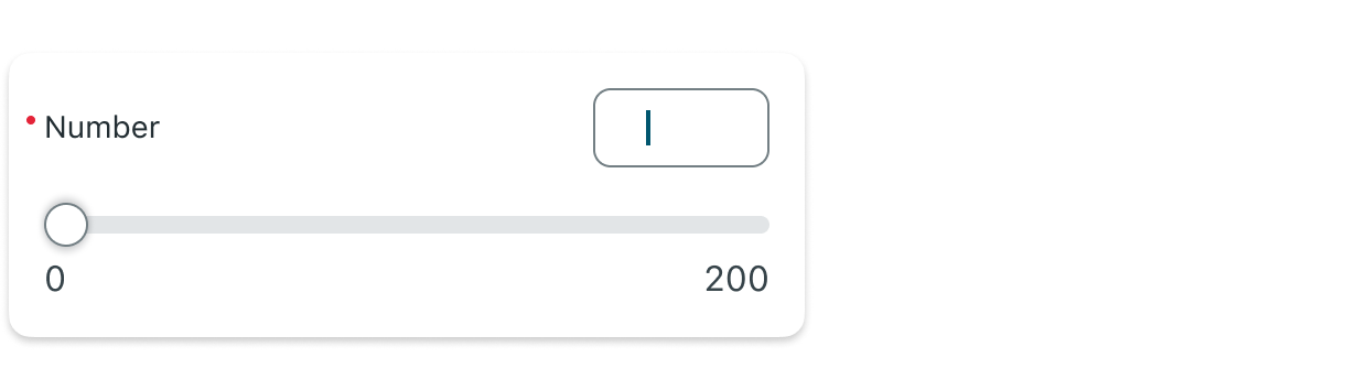 |
| Read-only (Disabled) | 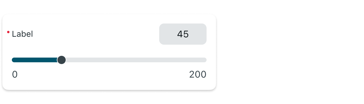 |
| Shimmering |  |
| Error | 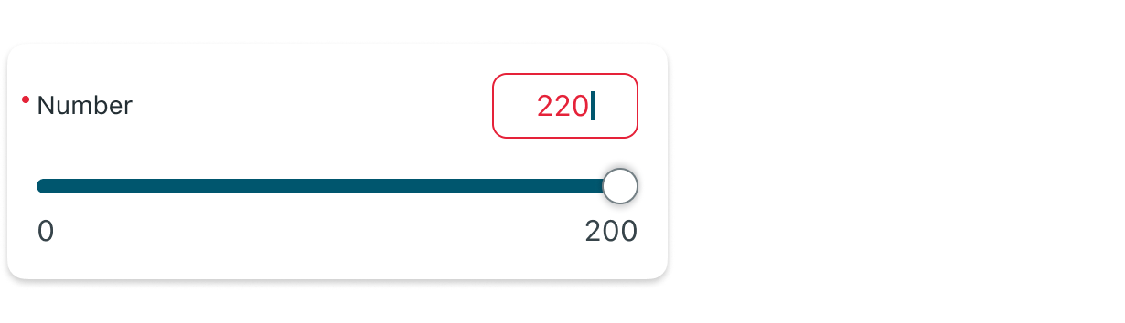 |
| Reference Point | 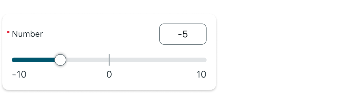 |
Color ranges slider input has 7 states: Default, empty state, editing, read-only, shimmering, error, reference point.
| State | Color ranges slider input |
|---|---|
| Default | 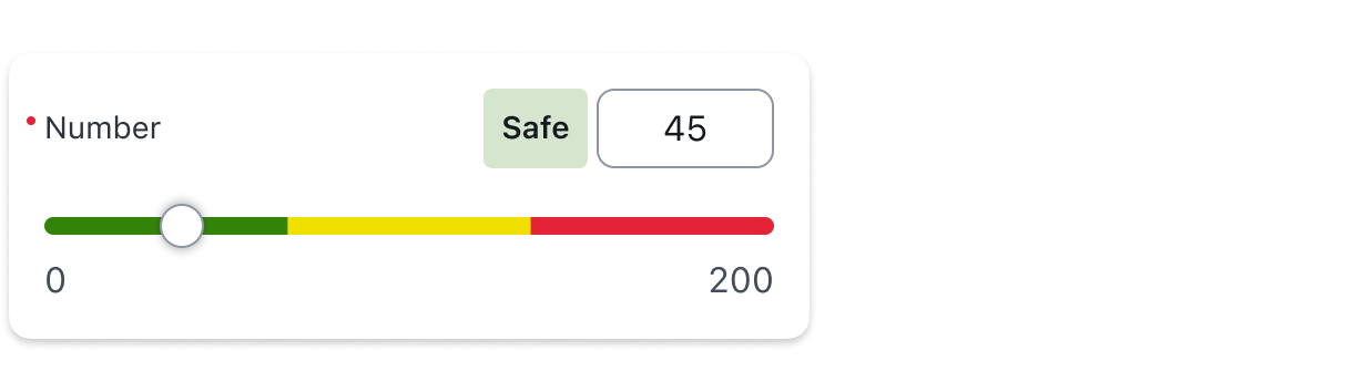 |
| Empty state | 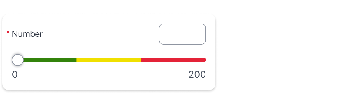 |
| Editing (typing) | 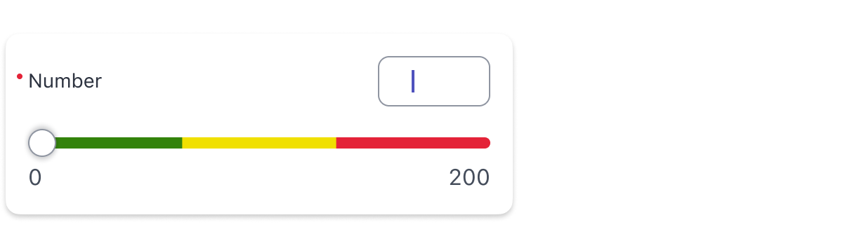 |
| Read-only (Disabled) | 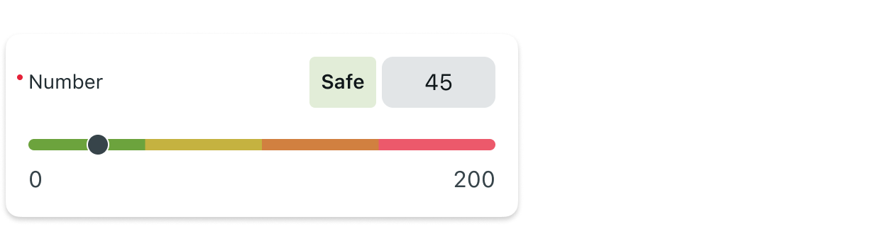 |
| Shimmering | 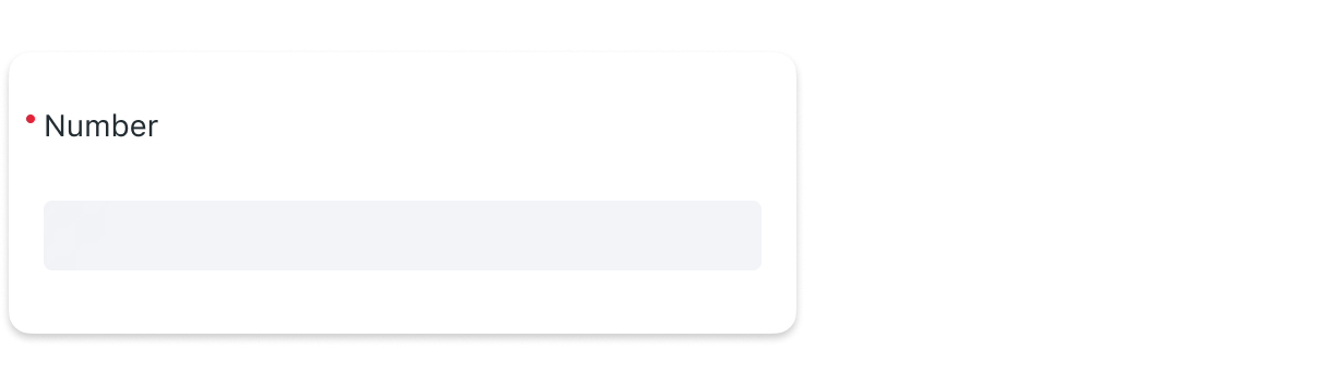 |
| Error | 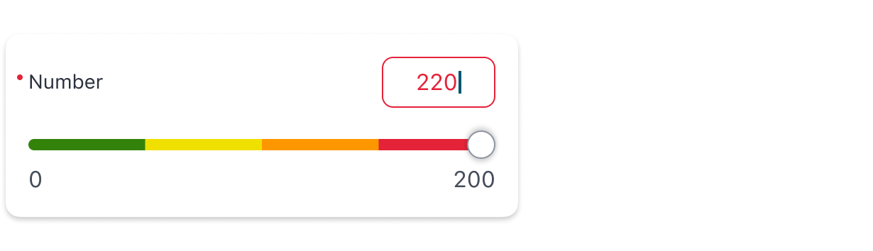 |
| Reference Point | 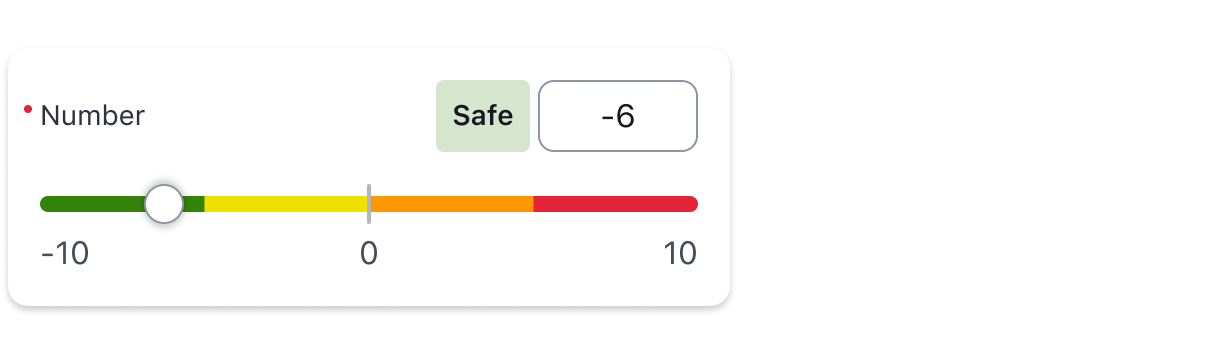 |
Internationalization
The Single Slider Input supports RTL layouts, with the following behavior:
- The slider track remains left-to-right, even in RTL languages. Universally numeric values always increase from left to right, regardless of language direction. This ensures consistent numeric progression and avoids confusion in value interpretation.
- Input label, numeric input box, and range label tag are mirrored appropriately and align to the right in RTL.
- Input and range labels are translatable - users who have changed the language of their instance will see the labels translated to their preferred language.
- Reference point, color ranges, and visual steps follow the same logic as LTR (consistent with the slider)- positioned by value, not by reading direction.
--
Responsive behaviors
The Single Slider Input adapts to different screen sizes and orientations:
- The slider stretches to fit the available width while maintaining spacing rules.
- On smaller screens, long values or labels may truncate, visual steps and the reference point may be hidden if space is limited.
- On tablets and larger devices, features like visual steps and reference points are more likely to appear fully.
Interactions
Learn how Numeric slider input responds when a user interacts with it.
1. Dragging the slider
Users can drag the handle horizontally to select a value:
- If a step size is configured, the slider snaps to the nearest valid value.
- When visual steps are enabled, tick marks help guide precise selection.
- The value in the numeric input box updates in real time to reflect the slider handle position.
2. Typing a value manually
Users can enter a value manually in the numeric input box.
- If Enforce Step Size is enabled, entering an unsupported value highlights the input in red and displays an error message. If it’s not enabled, the user can manually enter any value, even if it is unsupported by the slider step size.
- If space allows, the input box will expand dynamically with the value.
- The slider updates in real time to reflect the value entered in the input box.
3. Color Range Feedback (Color Ranges Slider)
In color range slider, an additional range label tag is displayed.
- As the user adjusts the value, the range label tag updates in real time to reflect the meaning of the current range.
- If the user enters an invalid value, the range label tag temporarily disappears until a valid value is restored.

4. Read-Only Mode
In read-only mode, the slider track and numeric input become non-interactive, but all configured information remains visible - including the value, reference point, visual steps, and color ranges.
The following visual changes apply:
- Input box: Stroke is removed and the background color changes to “background-tertiary”.
- Track handle: Resized to 16×16px, with background set to “background-tertiary-actionable” and stroke color set to “background-primary”.
- This styling applies consistently across all slider variants, including those with color ranges and visual steps.
- The actions menu icon (if configured) remains active and tappable in read-only mode.