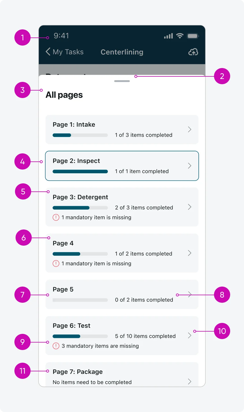
iOS
Android
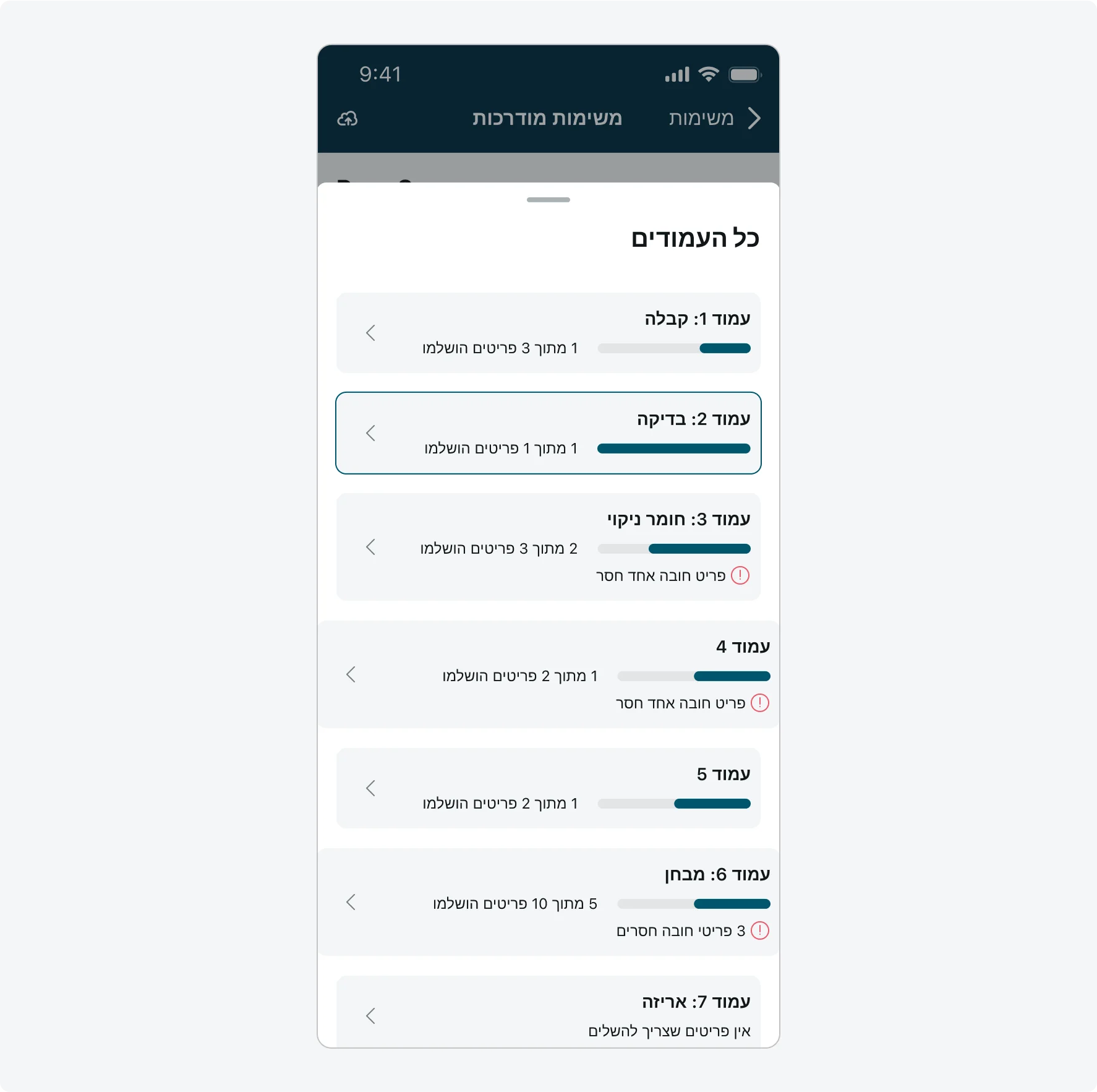
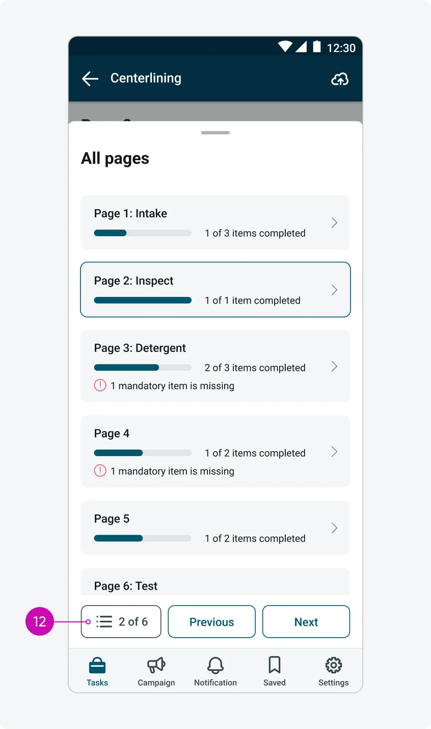
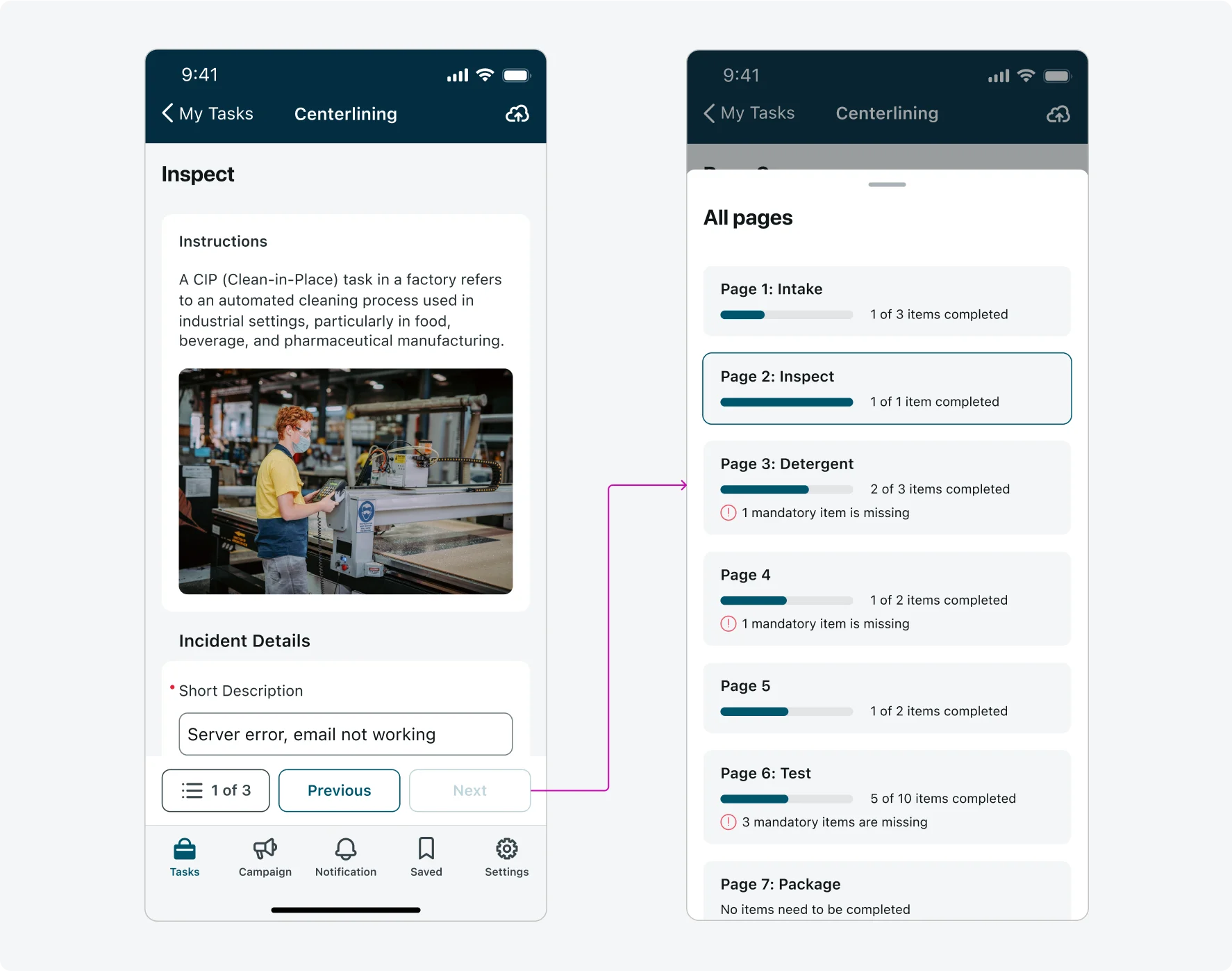
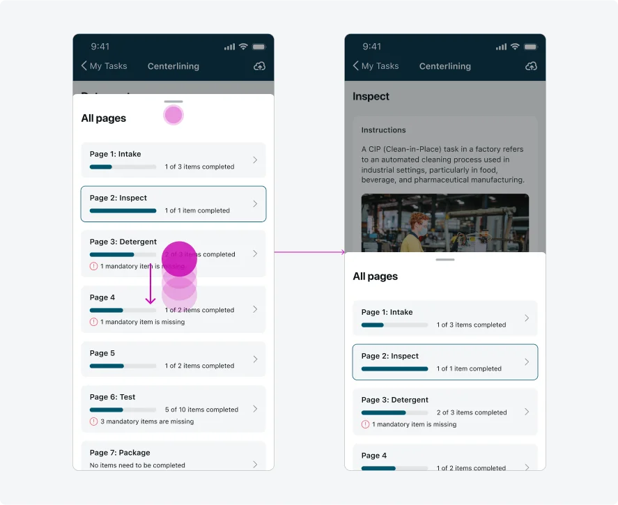
- Overlay: A semi-transparent layer that appears above the input form screen to draw focus and block interaction with the form content.
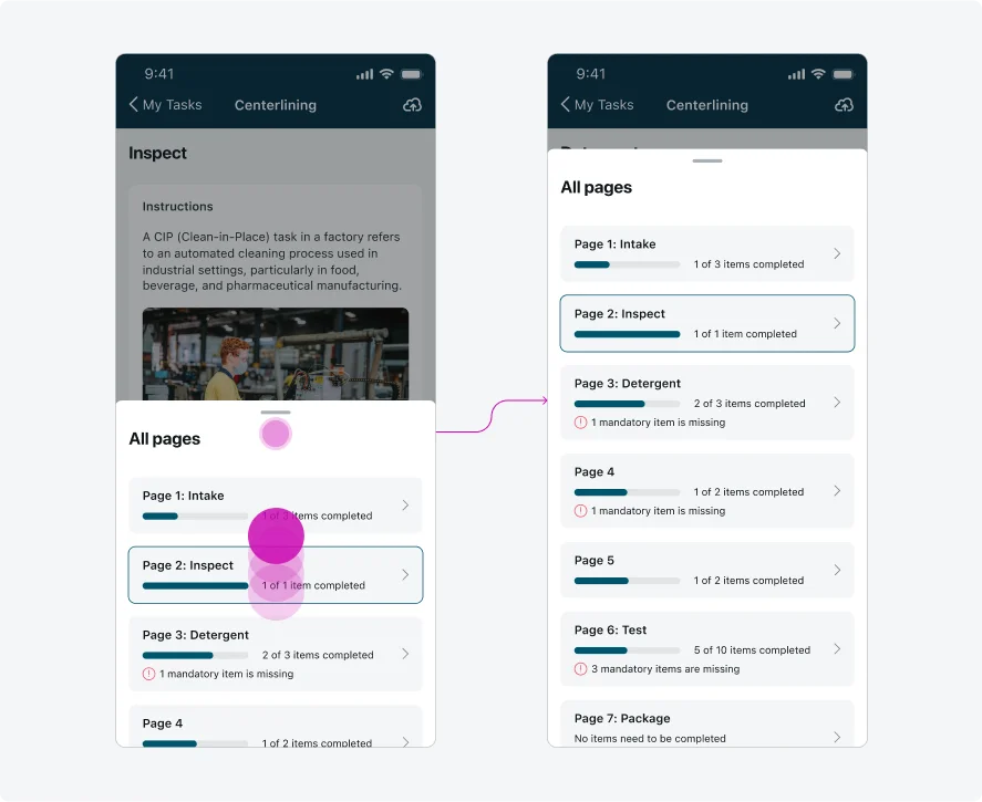
- Pull bar: A handle that can be dragged or swiped to expand, collapse, or dismiss the Navigation menu component.
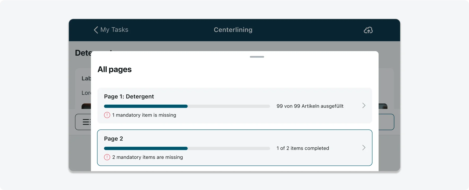
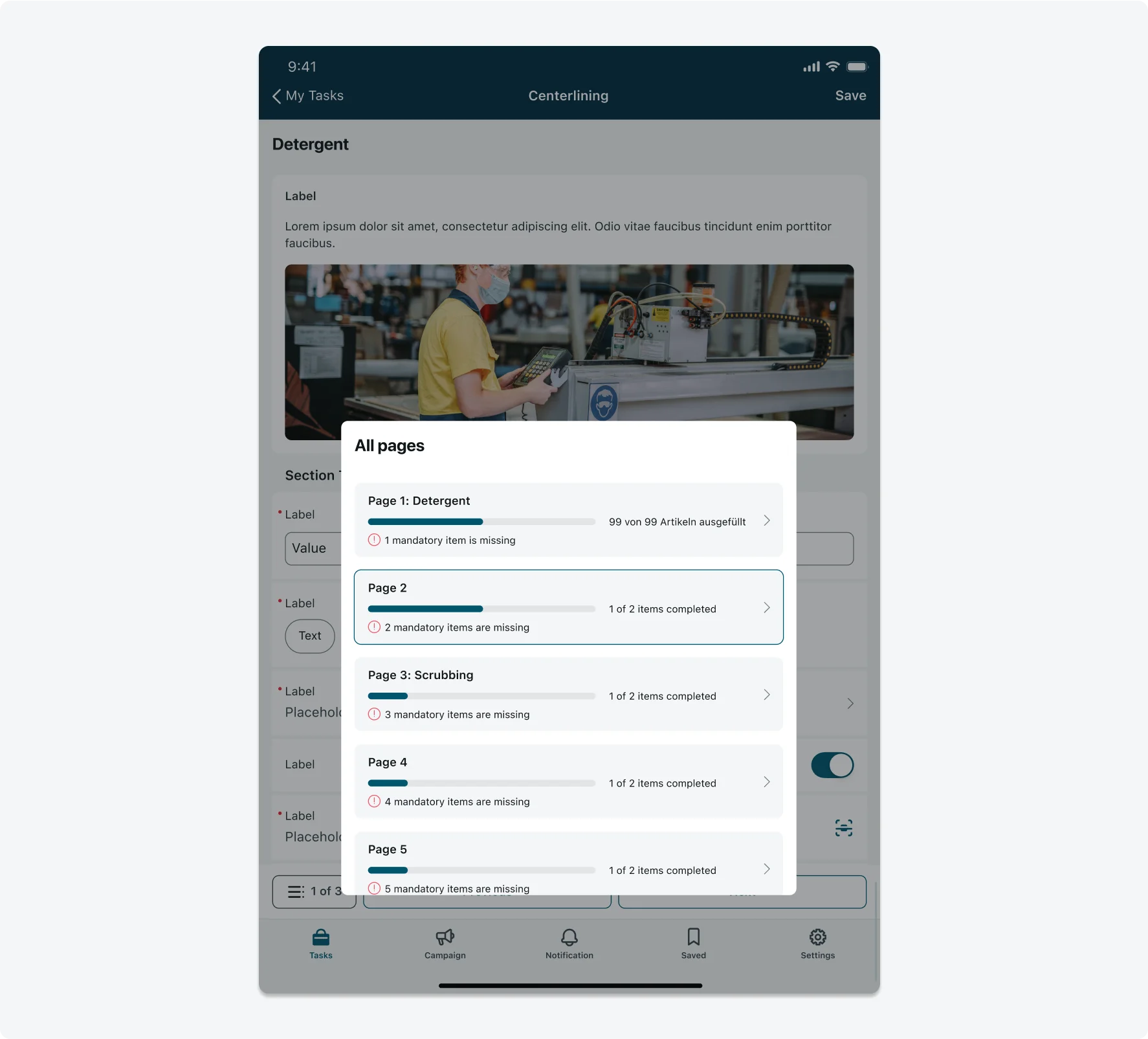
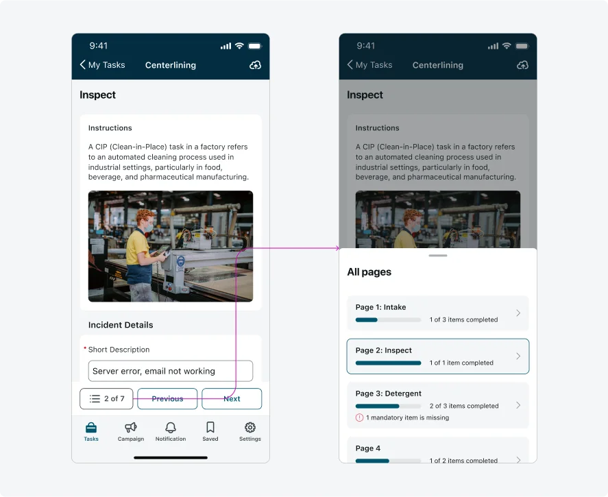
- “All pages”: The title of the Navigation menu component.
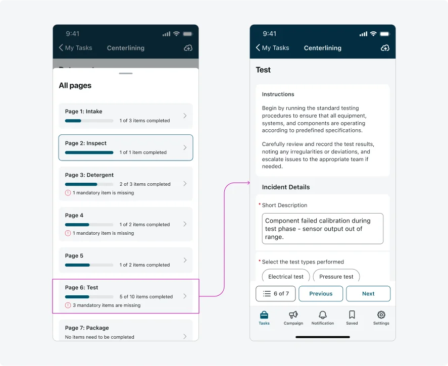
- Current page: The user’s current page within the form is indicated by the stroke around the page card. This page is typically shown near the center of the Navigation menu - unless it is the first page of the form, which appears at the top of the sheet. If the current page is one of the last pages, it will appear at the bottom of the sheet (on Android, these pages might only be visible when the sheet is fully expanded).
- Card page title: The page title displays the page’s sequence number, followed by a colon and the page name (if provided).
- Card page title – sequence number only: If a page name isn’t provided, only the sequence number will be displayed.
- Progress bar: Visually indicates how many items on the page have been filled, excluding hidden or read-only items from the total count. The progress bar updates dynamically as users fill out fields and spans one-third of the screen width. If no items on the page are completed, the progress bar remains empty.
- Progress label: Indicates how many items are on the page have been filled, excluding hidden or read-only items from the total count. The progress label updates dynamically as users complete fields on the page.
- Mandatory items Indication: Shows how many mandatory items on the page still need to be filled. If all mandatory items are completed, or if there are no mandatory items on the page, this indication will not be displayed.
- Navigation chevron: Allows the user to navigate directly to the page specified in the card.
- Page card with no fields: If a page contains no fields, the progress bar and label will not be displayed. Instead, the text “No items need to be completed” will appear.
- Menu button, Footer actions, and Navigation bar (tab bar): On Android, the Menu button, Footer actions, and Navigation bar remain visible while the Navigation menu is open. In general, on both Android and iOS, the Menu button displays the user’s current page and the total number of pages in the form. (Pages that contain only hidden fields are excluded from the menu and are not counted.) The maximum width of the Menu button is 140 px. If the text exceeds this width, it will be truncated.
Variants
The Navigation menu has 2 variants: Fully Open Sheet which is displayed in the Anatomy section and Half-open Sheet.
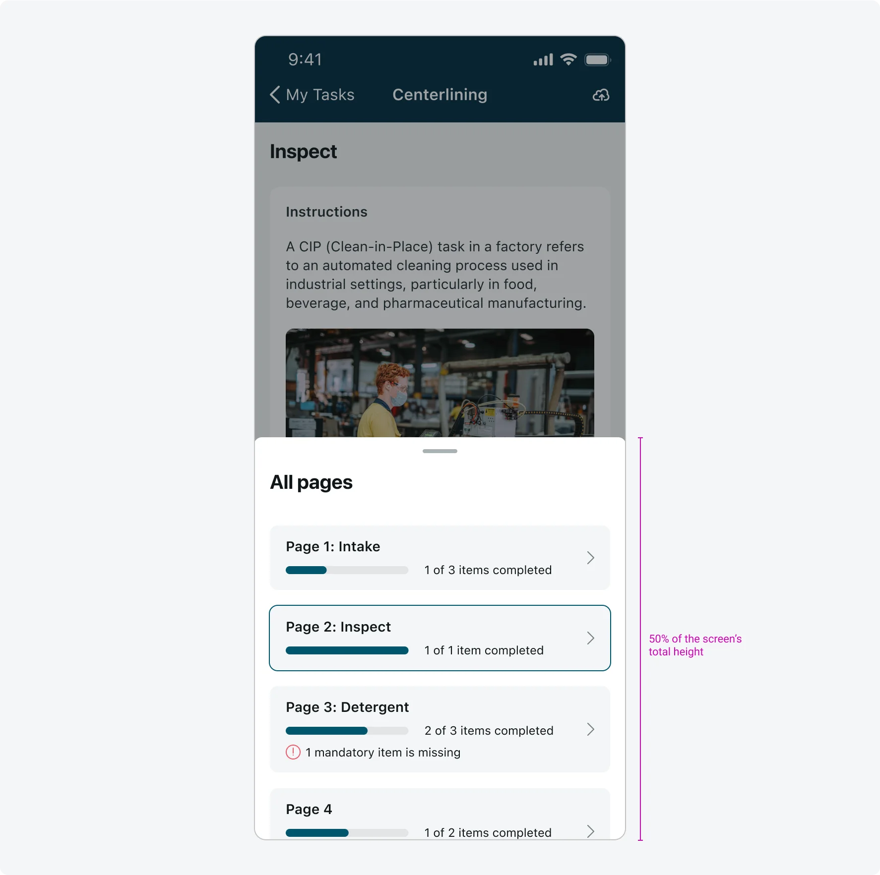
Half-open Sheet
The Navigation menu is by default a half-open sheet. It allows users to view the Navigation menu while keeping the input form screen visible in the background, providing context. When expanded, the Half-open Sheet becomes fully open, revealing more of the Navigation menu content.
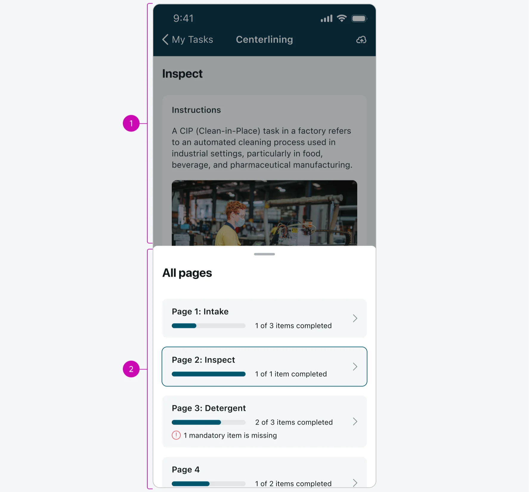
- Overlay: A semi-transparent layer that appears above the input form screen to draw focus and block interaction with the form content.
- Navigation menu’s content (Identical to the content shown in the Fully Open Sheet variant)..
Alignment and positioning
The height of the fully open sheet is the screen's total height minus the Navigation Bar height (88 px), with a 24px spacing between the sheet and the Navigation Bar.
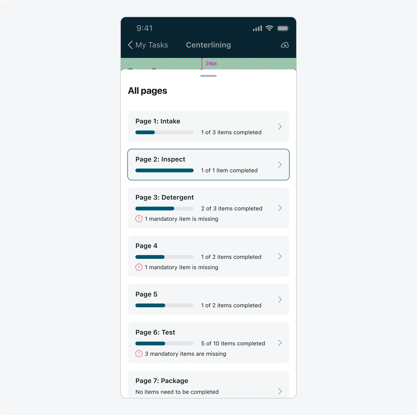
The height of the half-open sheet is half of the screen's total height.
When the cards do not exceed the sheet height, they should be aligned to the top of the sheet.
Subcomponents states
The Card page title within the Navigation menu supports a long value state: If the title exceeds three lines within the Navigation menu, the text will be truncated.
| State | Card page title |
|---|---|
| Long value | 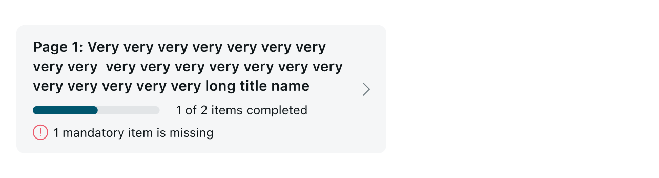 |
The Progress label within the Navigation menu supports a long value state: if the label exceeds one line, the text will be truncated.
| State | Card page Progress label |
|---|---|
| Long value | 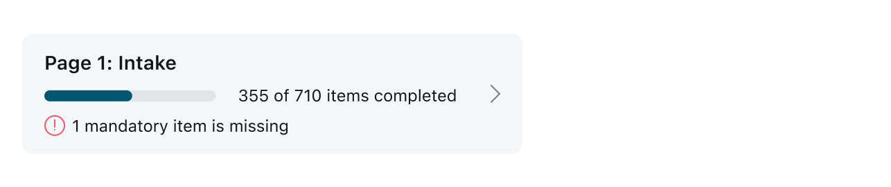 |
Responsive behaviors
Learn how Navigation menu responds to changes in screen size or orientation.
Landscape mode
This is what the Navigation menu looks on Landscape mode:
On landscape mode the progress bar width is set to be half of the overall screen width.
Interactions
Learn how Navigation menu responds when a user interacts with it.
1. Opening the Navigation menu Sheet
When the user taps the Menu button, the Half-open Navigation menu Sheet slides up from the bottom of the screen.
2. Navigating through the input form pages
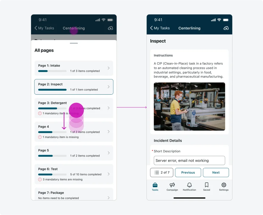
When a user taps anywhere on a page card (not just the navigation chevron), the Navigation menu directs the user to the page specified in the card.
3. Expanding the Navigation menu Sheet
When a user taps on the title area or the pull bar area, or drags the sheet upward, the Half-open Sheet expands to the Fully Open Sheet.
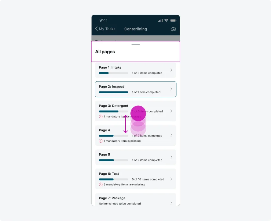
4. Browsing Navigation menu Content
When a user scrolls up or down in the Fully Open Sheet, the Navigation menu component’s title remains fixed in place, while additional page cards (if available) appear as they scroll.
5. Minimizing the Navigation menu Sheet
The Fully Open Sheet minimizes to the Half-open Sheet when a user:
- Taps or scrolls down on the title area and/or the pull bar area
- Scrolls the sheet downward (when there are no more page cards to reveal upward)
6. Closing the Navigation menu Sheet
The Sheet closes when a user:
- Taps outside the sheet
- Scrolls the sheet downward (when there are no more page cards to reveal upward). On the Fully Open Sheet, the user must continuously drag the sheet itself downward until it reaches the bottom edge of the screen to close it.
7. Resuming the app
When the user opens the sheet, exits the app, and then returns, the sheet retains its previous state - whether half-open or fully open.
--
Internationalization
This is what the Navigation menu looks like when configured for a right-to-left (RTL) language: