iOS
Android
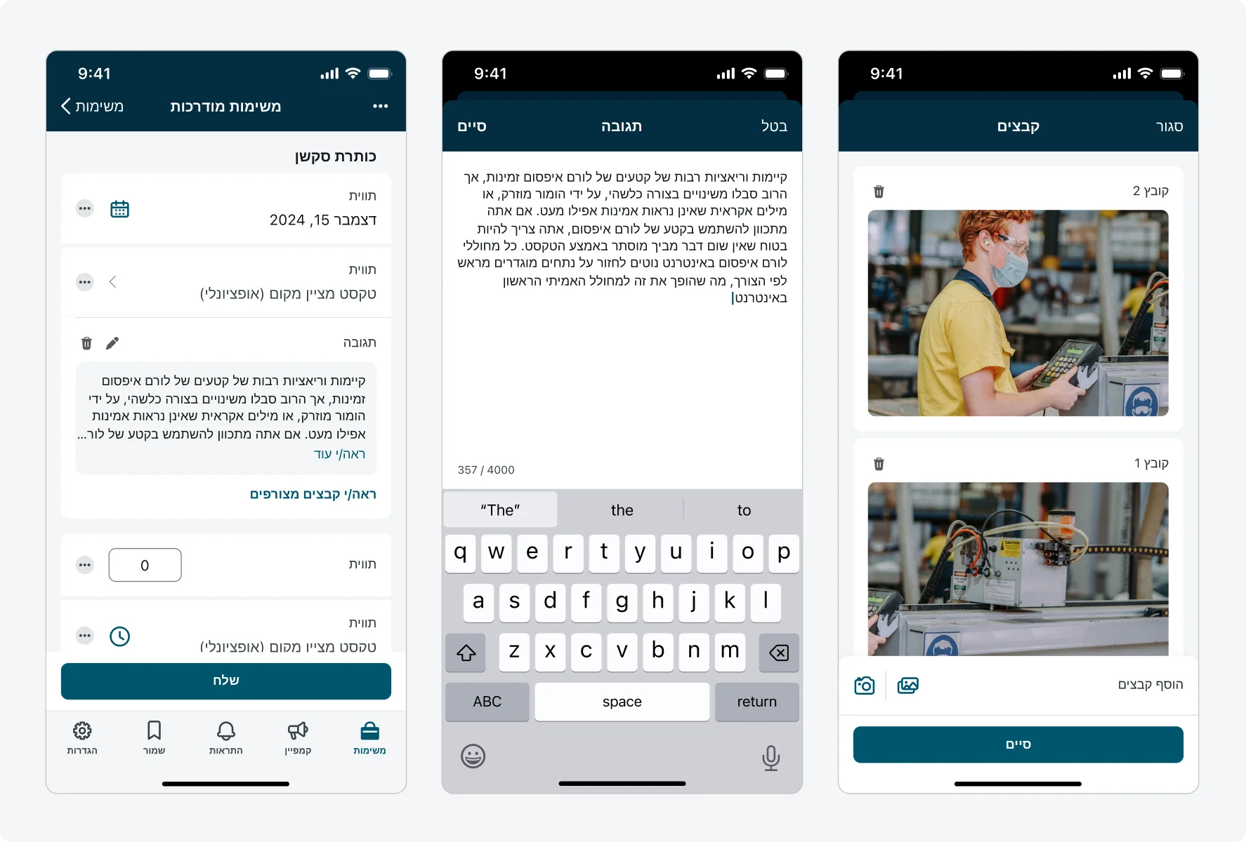
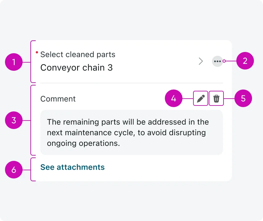
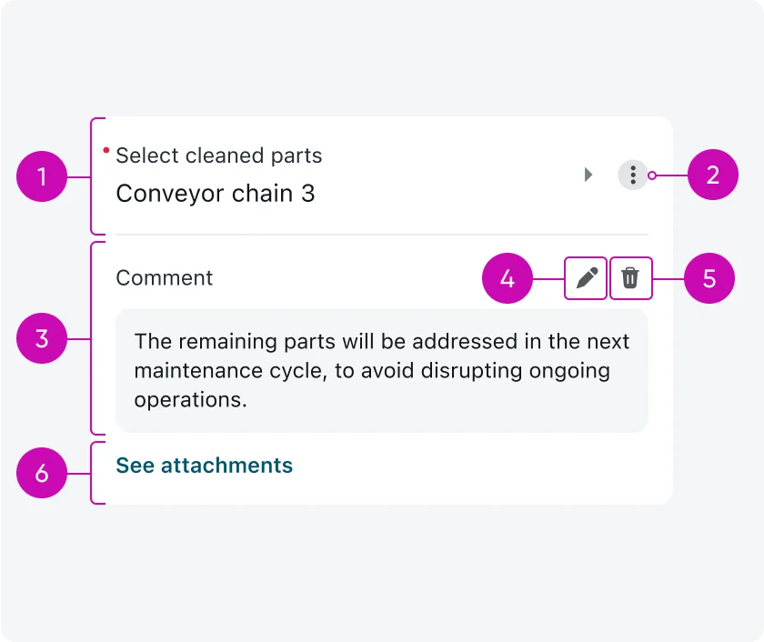
- Input type: The input where actions can be configured to. Input actions are applied at the individual input level and are not shared across the form.
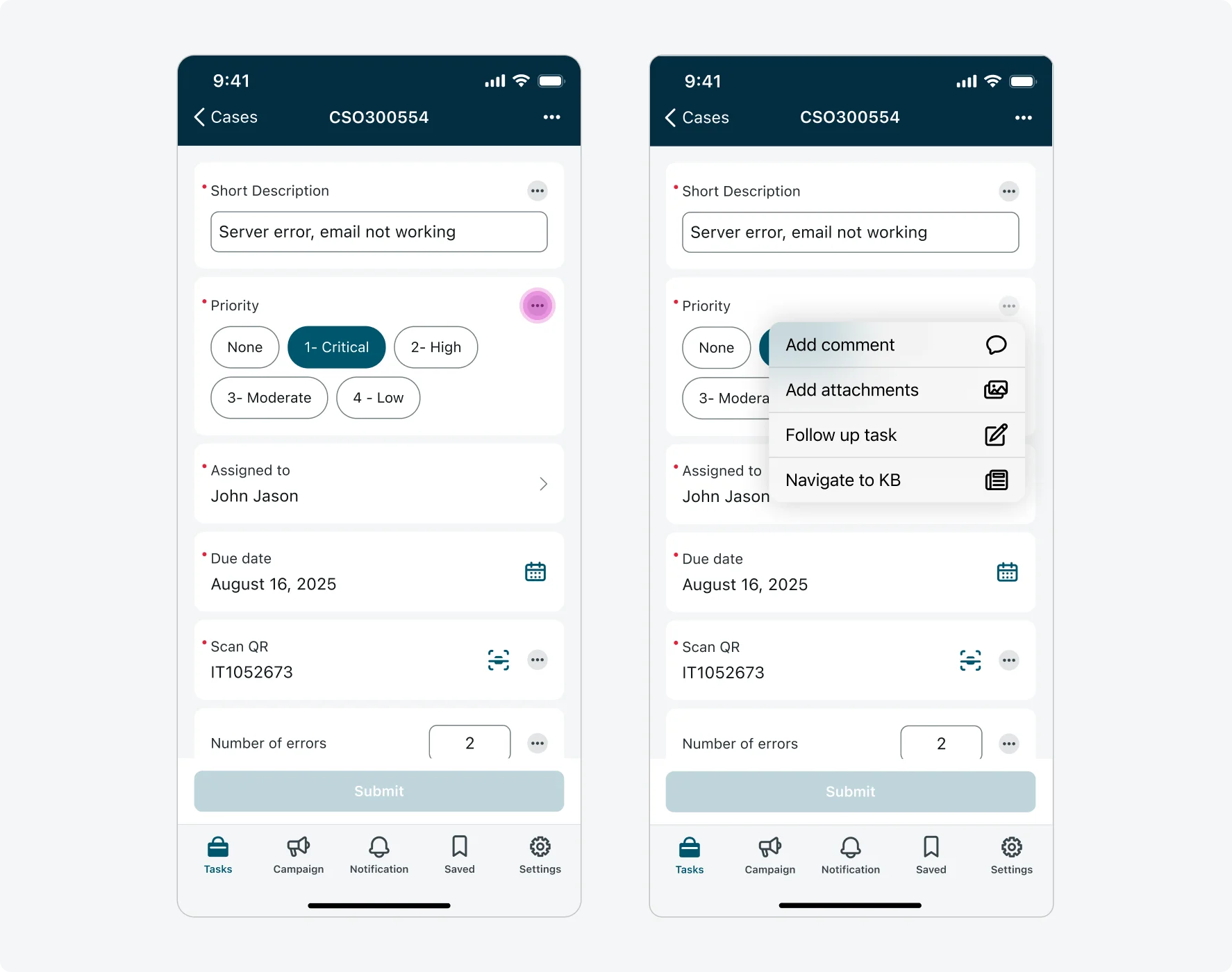
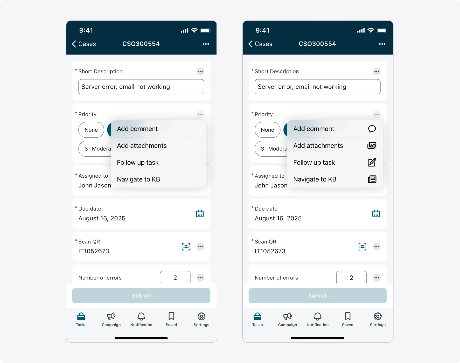
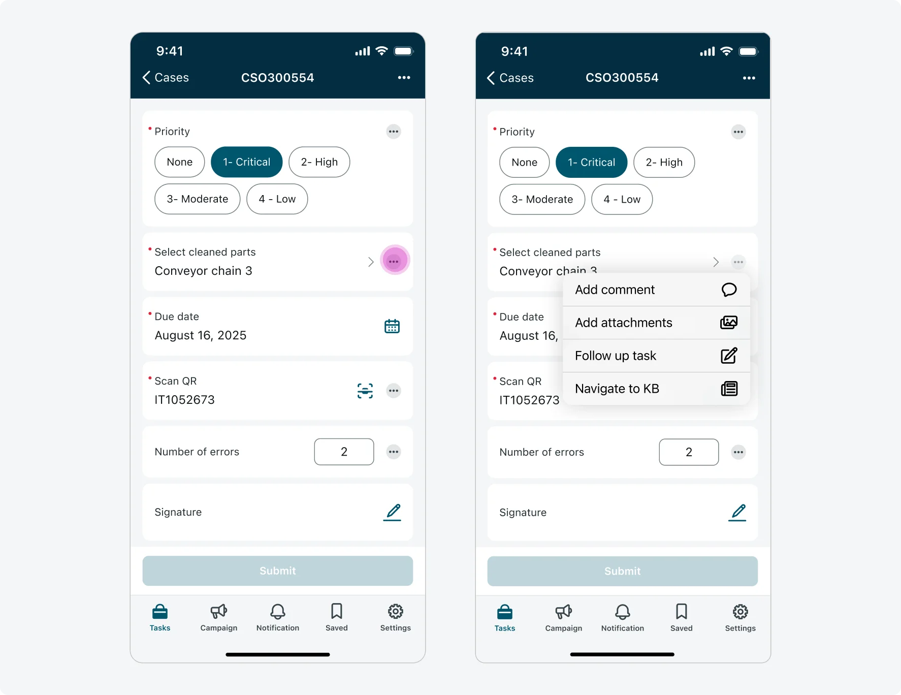
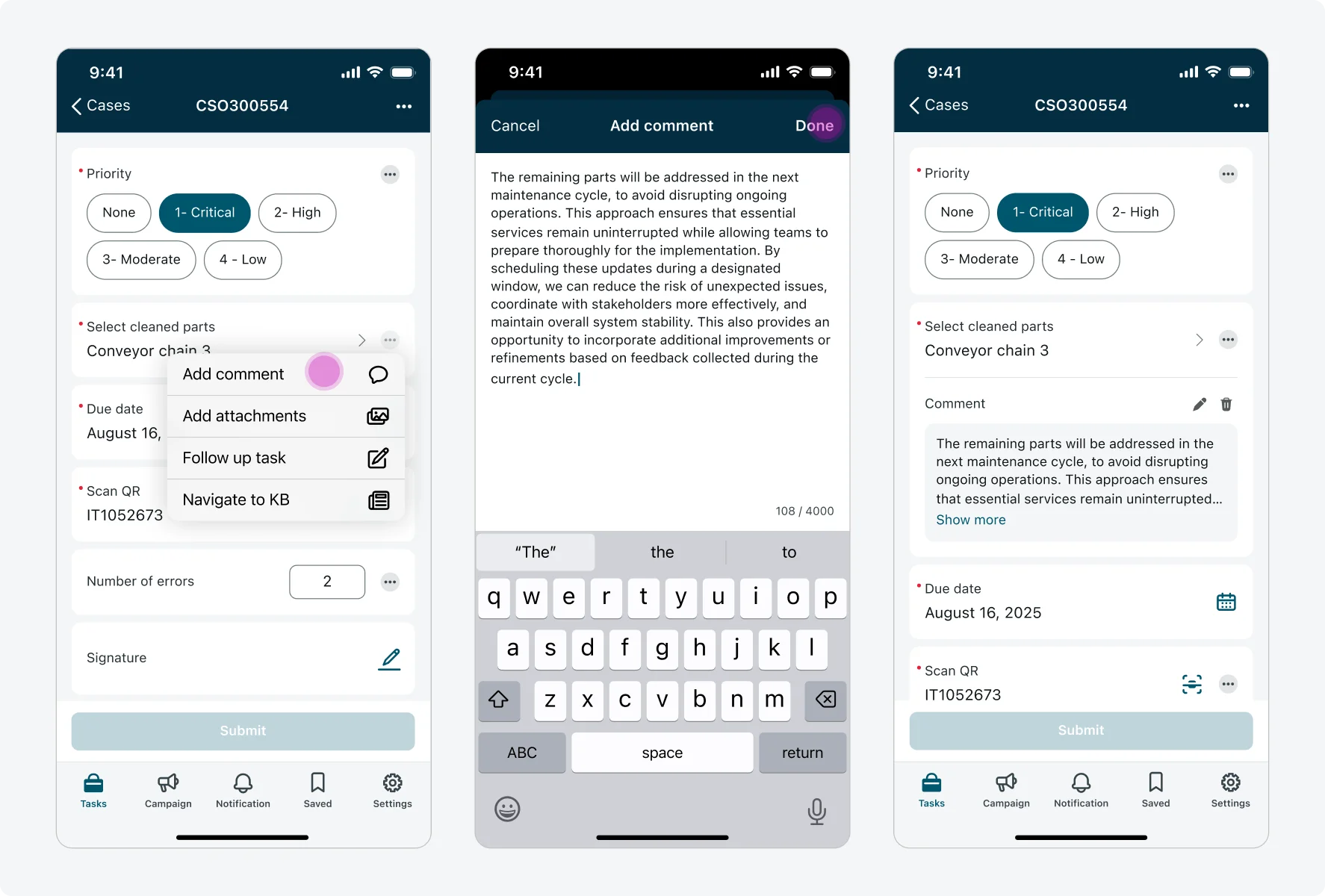
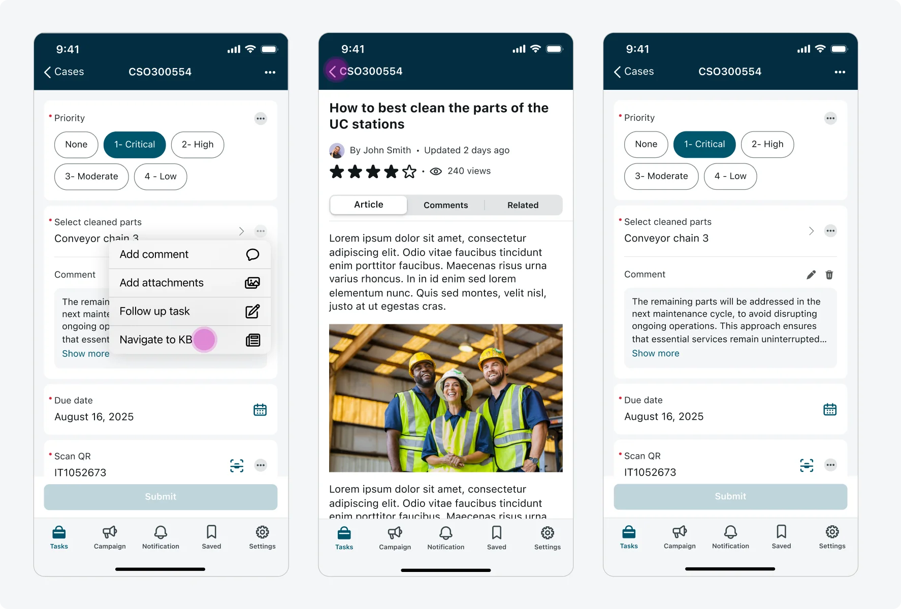
- Actions menu icon: The 3-dot ellipsis button opens an action menu (context menu) with the available input actions. These actions are configured by the admin and vary by use case.
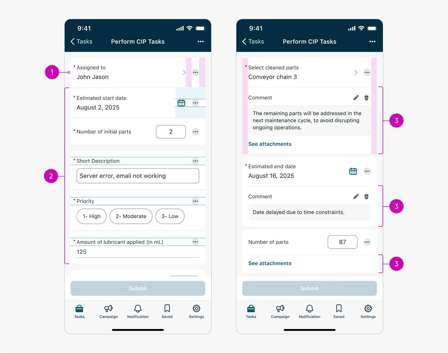
- Comment: Using the “Add comment” action, users can add a comment to the input. The comment will appear directly below the input, each input supports up to 1 comment, which is displayed inline. Comments are added through a modal, but displayed inline to maintain context.
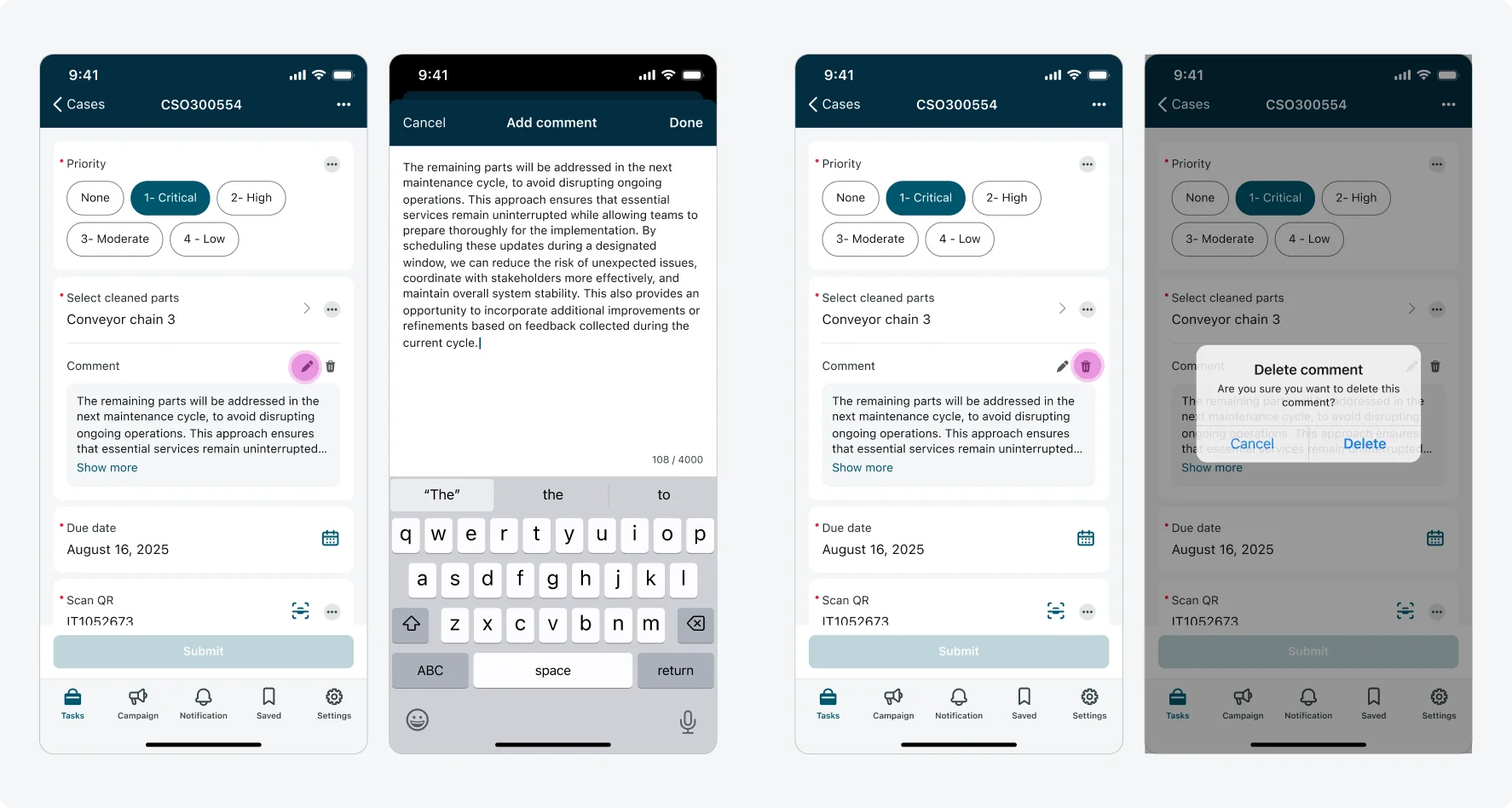
- Edit comment: Allows the user to edit the comment. Tapping opens a modal with the full comment view and option to edit it’s content.
- Delete comment: Removes the comment from the input permanently.
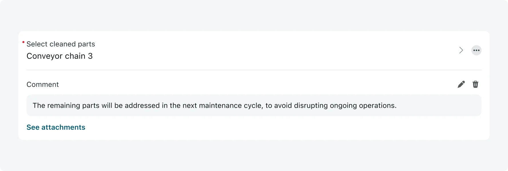
- Attachments link: When image attachments are added using the “Add attachments” action, a link button labeled “See attachments” appears below the input. Attachments are not shown inline, tapping the link button opens a modal where users can view or manage the attached images. Inputs support multiple attachments, but only of the image file type.
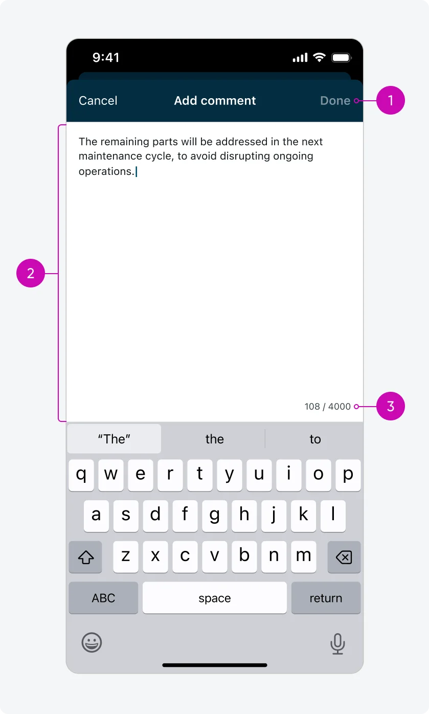
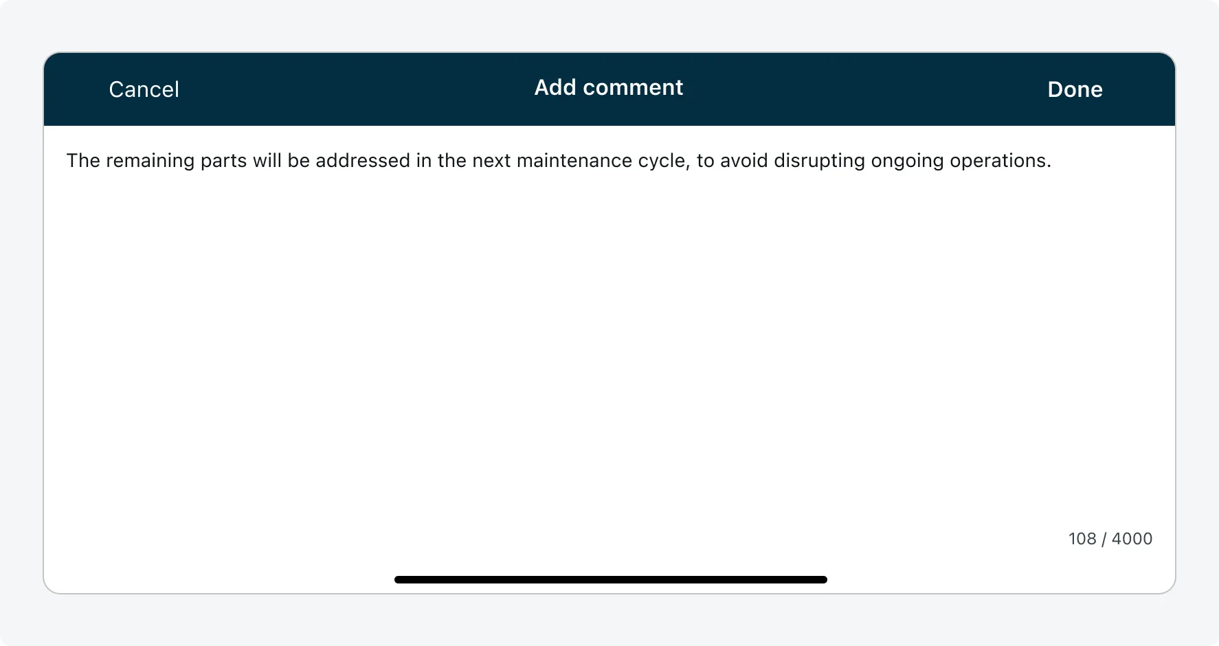
Add comment modal
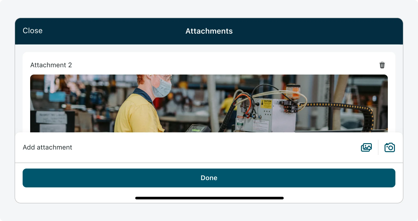
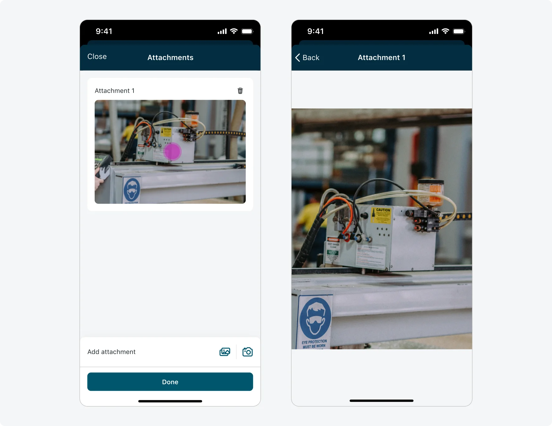
Attachments modal
Add comment modal
- Top navigation - ״Done״ button: The top navigation bar includes a ״Done״ button for confirming and adding the changes to the comment. This button only becomes enabled when the user makes changes to the text.
- Comment field: Users can view and edit the full comment in this field. If the comment length exceeds the height users can view the whole comment by scrolling.
- Character counter: Displays the number of characters used out of the 4,000-character limit, helping users stay within the maximum allowed length.
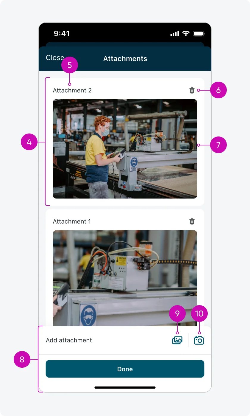
Attachments modal
- Attachment card: Each image is displayed in its own container, which includes a large preview, an attachment label, and a delete icon. Attachments appear in a list, ordered from newest to oldest - newly added attachments appear at the top.
- Attachment label: Labels follow a consistent format: “Attachment [N]” (e.g., Attachment 1, Attachment 2). The most recently added attachments are numbered highest and shown first.
- Delete attachment: Removes the selected attachment from the input permanently.
- Image preview: A large thumbnail representing the attached image. Tapping the image opens a full-screen view.
- Add attachments bar: Appears at the bottom of the modal and provides controls for adding images and confirming changes. Tapping “Done” saves the attachments and returns the user to the form. “Done” is only enabled when changes are made in the attachments modal.
- Add from gallery: Allows users to select images from their device’s photo library.
- Add from camera: Opens the device’s camera, allowing users to take a photo and directly attach it.
Configurations
- Input actions are available only when the input form’s presentation style is set to "Screen", which includes access to navigation tabs.
- An actions menu can be configured individually for each input on the input form screen.
- Each input action can be configured independently, allowing one or more actions to be associated with a single input.
- Admins can add multiple navigation actions and customize each action by setting a label and assigning an icon.
Context menu configuration best practice:
- The admin can configure an icon to appear next to each action label.
- It’s recommended to use either a label with an icon for all actions or labels only - avoid mixing styles.
Alignment and positioning
- The actions menu icon always appears on the right side of the input, positioned to the right of the input’s main action icon. It maintains 16px spacing from the right edge of the input container and 16px spacing from adjacent elements.
- In most input types, the actions menu icon is vertically center-aligned with the input’s container and the main action icon. For Text, Choice, and Number inputs (only for number input of RenderType = Line), the icon is vertically center-aligned with the label instead.
- When added, the comment and the “see attachments” link are always placed directly below the input, separated from it by a single separator. If both elements are present, they are stacked - comment first, followed by the attachments link - with one separator under the input and above the comment with no additional separator between the comment and attachments link.
States - Actions menu
Inputs have 3 states that effect the appearance of the actions menu: Default, Read-only, Loading/shimmering.
| State | Actions menu |
|---|---|
| Default |  |
| Read-only (Disabled): Actions menu is enabled, input is diabled and 80% opacity | 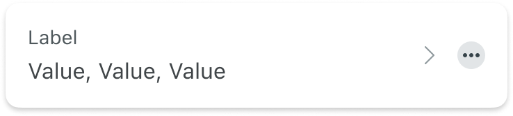 |
| Loading/Shimmering | 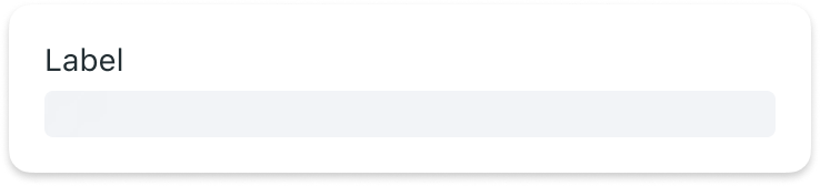 |
Inputs with comments and attachments have 3 states: Input + comment, Input + attachments, Input + comment + attachments.
| State | Input actions |
|---|---|
| Input + comment | 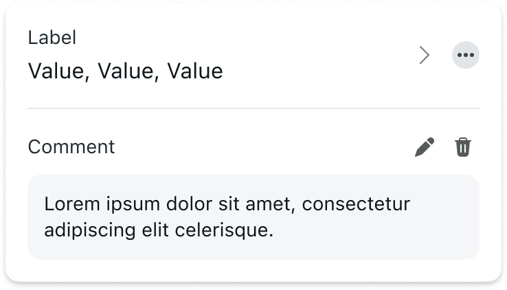 |
| Input + attachments | 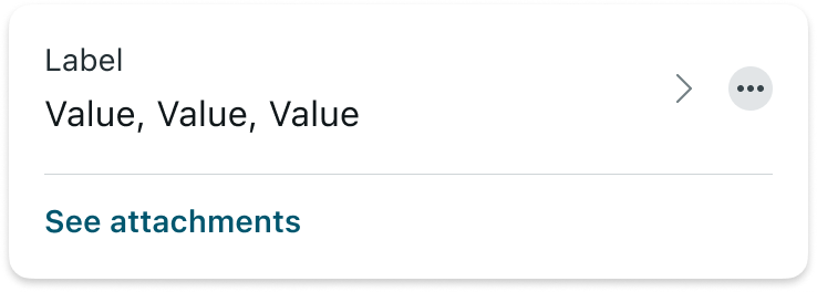 |
| Input + comment + attachments | 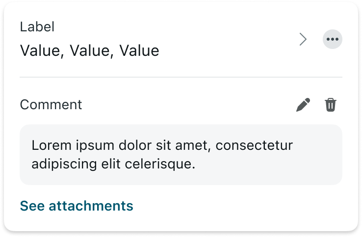 |
A comment has 3 states: Default, Long text - collapsed, Long text - expanded.
| State | Comment |
|---|---|
| Default |  |
| Long text - collapsed | 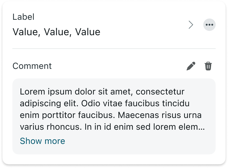 |
| Long text - expanded | 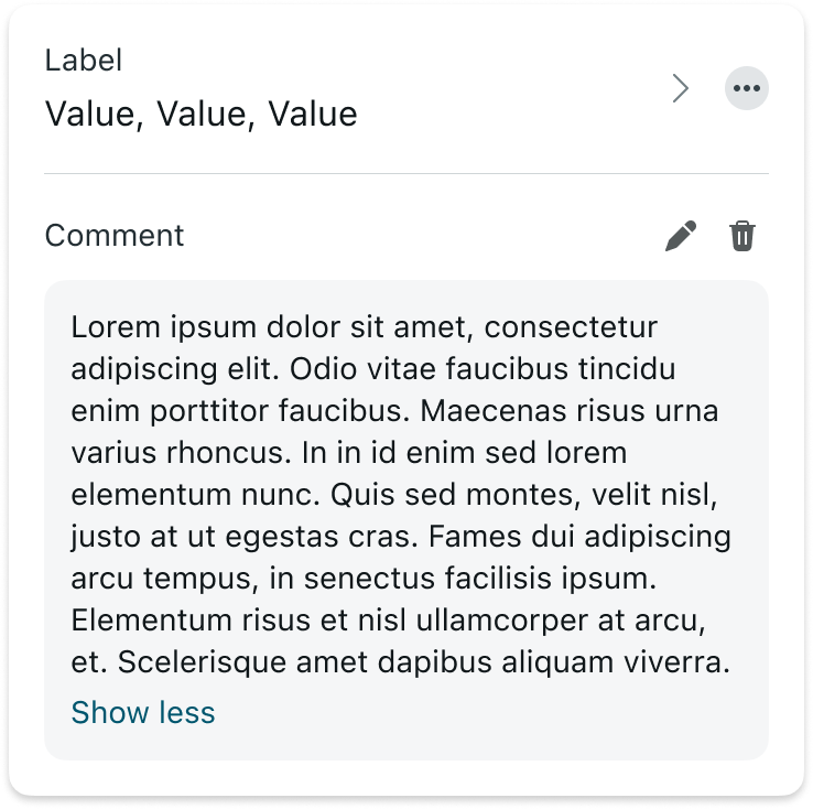 |
States - Add comment modal
| State | Add comment modal |
|---|---|
| Default (typing) | 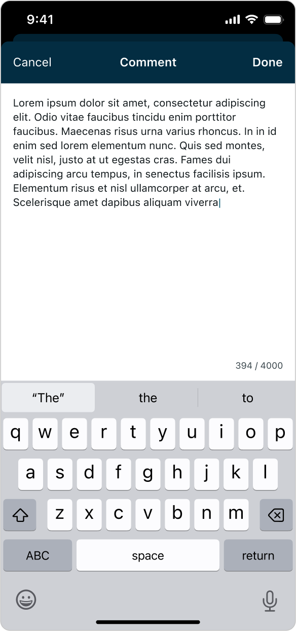 |
| Empty state (placeholder) | 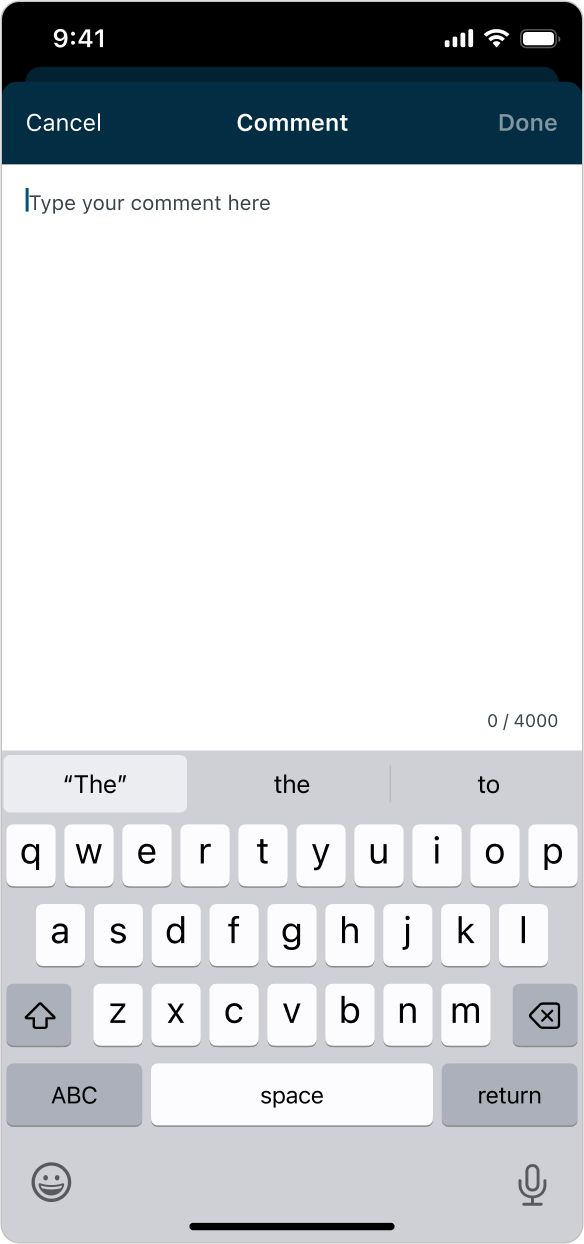 |
| Error | 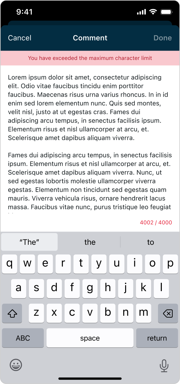 |
States - Attachments modal
| State | Attachments modal |
|---|---|
| Default | 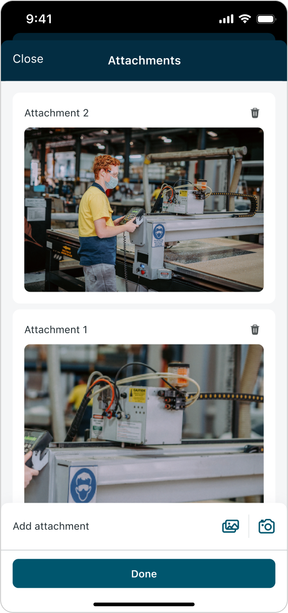 |
| Empty state | 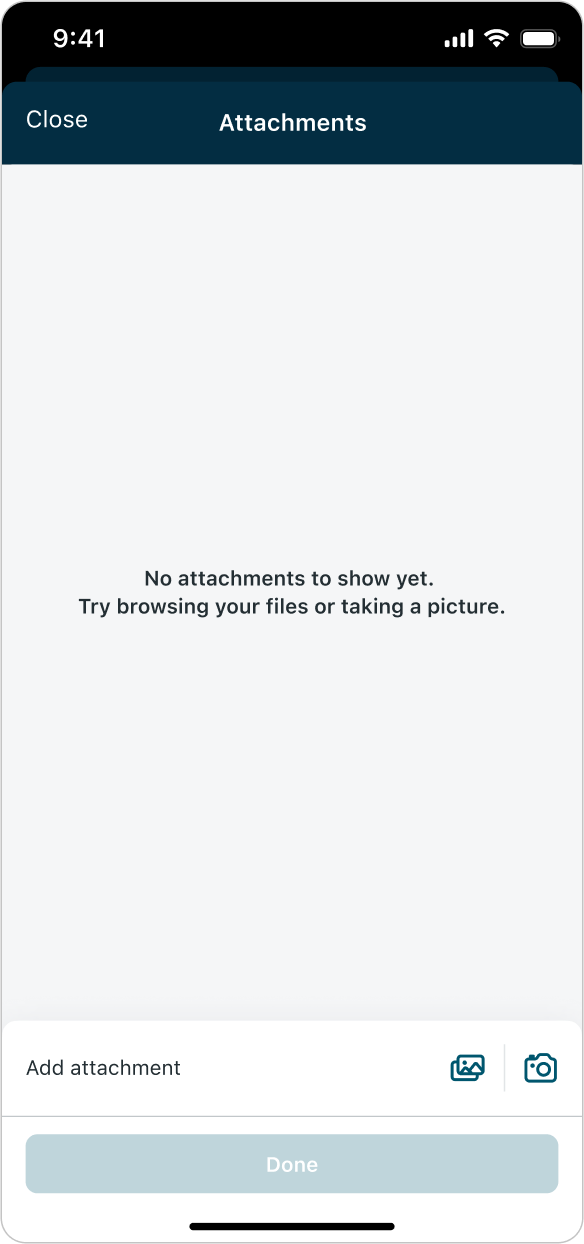 |
| Loading (shimmering) | 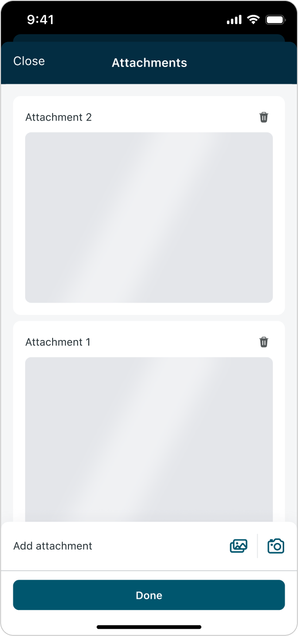 |
| Error (Image loading failed) | 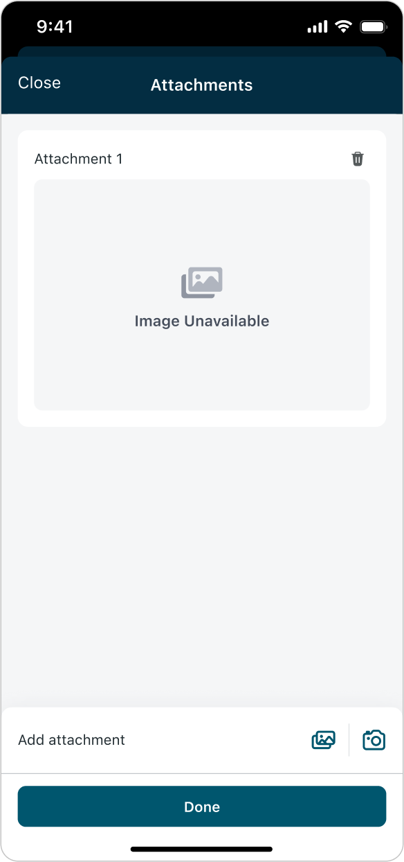 |
--
Responsive behaviors
Input actions adapt seamlessly to different screen sizes and orientations. The actions menu, inline comment, attachments link, and associated modals (Add comment, Attachments) all stretch to fit the full width of the device. This ensures a consistent and accessible experience across phones and tablets, in both portrait and landscape modes.
Input with added comment and attachments
Add comment modal
Attachments modal
Tablets
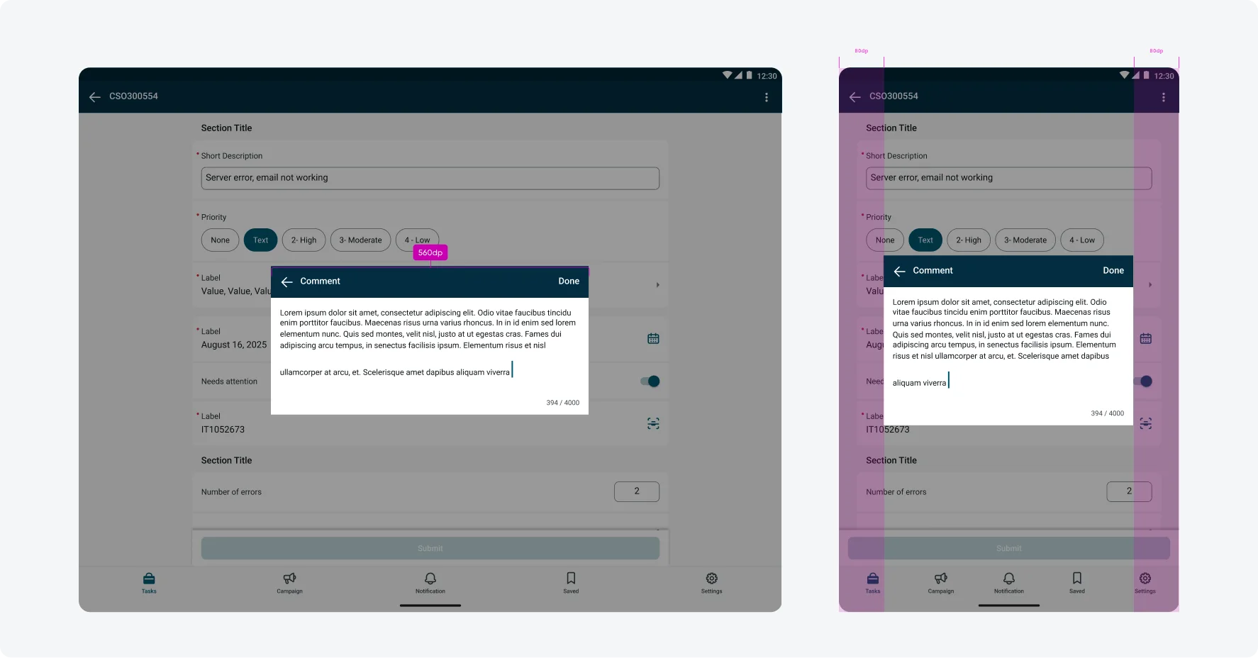
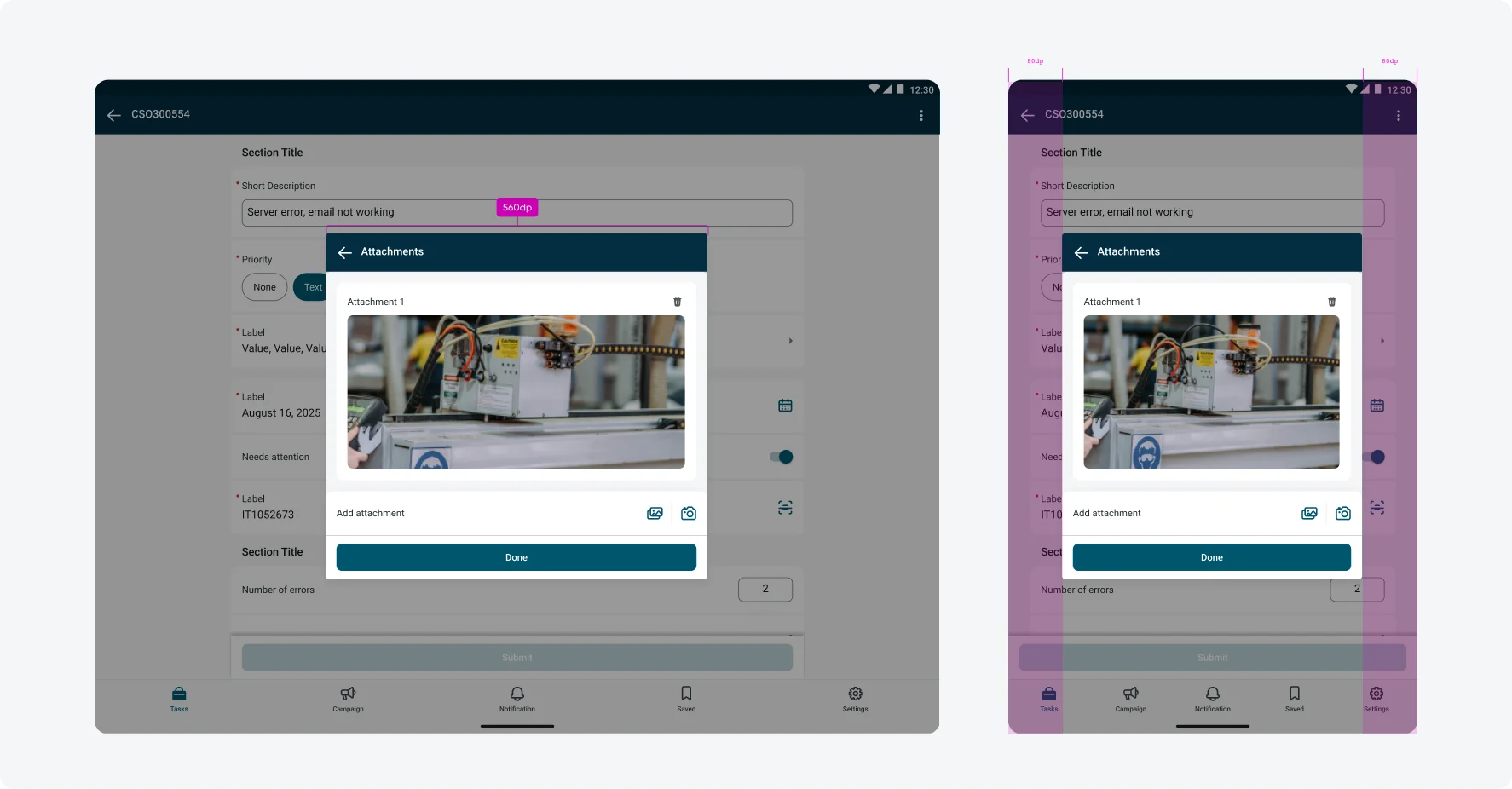
Input actions such as Add comment and Add attachments open in modal dialogs. On iOS, these modals follow native system behavior and are automatically centered and constrained to a readable width on iPad. On Android, modal behavior is custom defined to ensure input action dialogs remain readable and usable on larger screens.
On compact window sizes (< 600 dp), input action modals open in a “Full-screen dialog” (this is including mobile landscape).
On medium and large window sizes (≥ 600 dp), input action modals open in a “Basic/simple dialog”, which is a centered dialog with a constrained width, ensuring readability and usability across tablet sizes and orientations.
Size specs
On Android tablets, dialogs follow Material guidelines for readable dialog sizing. The dialog container is constrained to a maximum readable width of 560 dp, maintains minimum 80 dp margins on the left and right, and uses a dynamic height that grows based on content. A minimum 80 dp spacing from the top and bottom edges of the screen is preserved, with 24 dp clearance from the on-screen keyboard when active. Scrolling is enabled when content exceeds the available viewport to ensure all actions remain accessible (these constraints follow M2 dialog guidance, as M3 does not currently define top and bottom margin behavior for tablet dialogs).
Add Comment Modal
Minimum height is 200 dp in the empty state, maximum width is always 560 dp. The dialog expands as content grows, up to 80 dp from the top and bottom edges of the screen, and maintains 24 dp clearance from the on-screen keyboard when active.
Add Attachments Modal
Minimum height is 400 dp in the empty state, maximum width is always 560 dp. The modal expands dynamically based on content, up to 80 dp from the top and bottom edges of the screen.
On mobile phone devices in landscape orientation all modals are still displayed full screen
Interactions
Context menu
Tapping the context menu opens an action sheet displaying all actions configured for that specific input.
Adding and editing comments
Users can add a comment from the actions menu - this option is available only if no comment has been added yet. Once a comment is added, it appears directly below the input and can be edited or deleted at any time.
Add comment flow
Edit comment flow; Delete comment flow
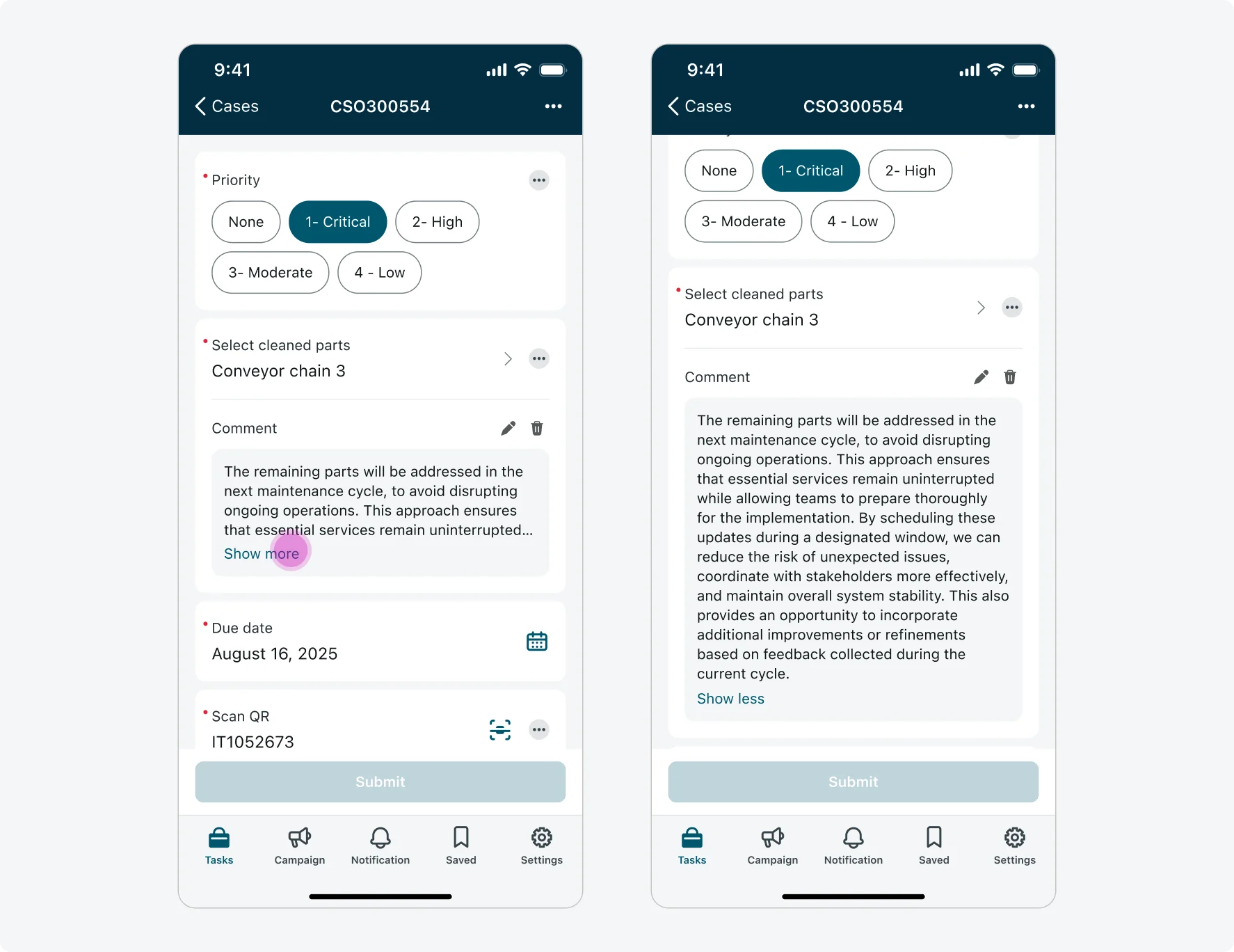
If a comment exceeds 4 lines, it will be truncated with a “Show more” button. Tapping the comment content or the “Show more” button expands the comment to display the full text inline. Users can tap again the comment content or the “Show less” button to collapse it back.
Adding and viewing attachments
Users can add one or more image attachments to an input. Attachments are added through an overlay modal and are not shown inline. When at least one attachment is added, a “See attachments” link button appears below the input. Tapping the link opens the attachments modal to view or edit the current attachments.
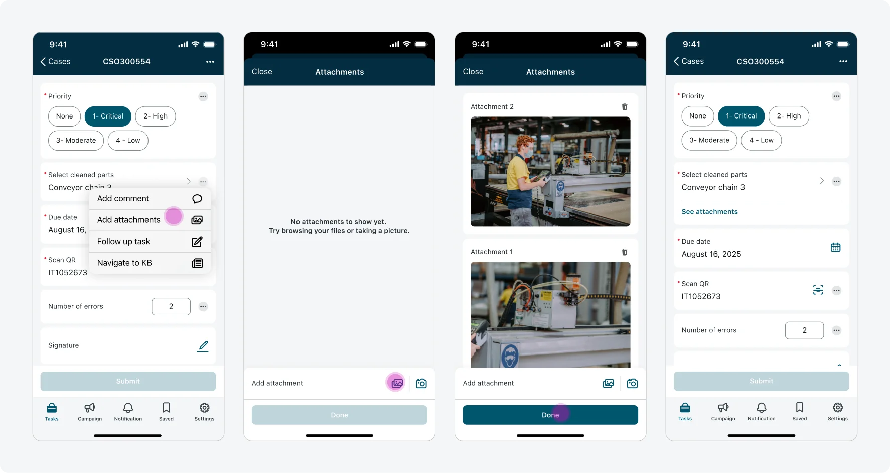
Users can tap any attachment to view it in full screen, and delete existing attachments one by one by tapping the trash icon.
View attachment in full-screen flow
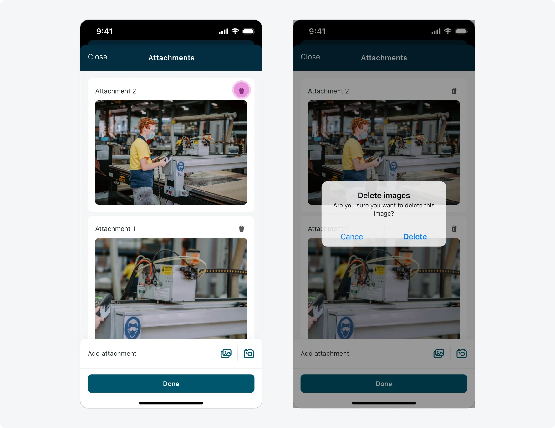
Delete attachment flow
Navigating to other screens
The user can navigate to a screen or a launcher screen from within the context of an input. After navigating away, tapping the Back button returns the user to the input form—restoring the same page and exact scroll position where the navigation was triggered.
Internationalization
This is how the actions menu, comment modal and attachments modal look like when configured for a right-to-left (RTL) language: