

iOS
Android
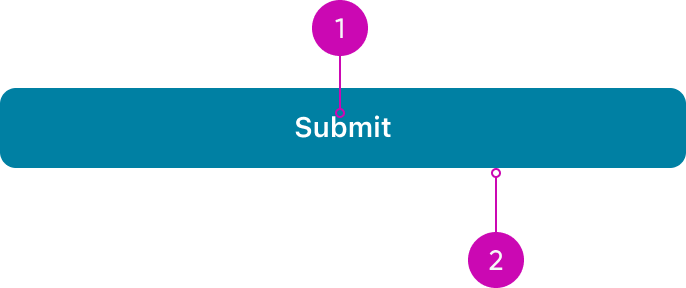
- Label: Describes the action of the button
- Container: Frame containing the button
Types
- Footer actions: - Use footer actions for important, easily accessible tasks on the record screen.
- Text button: Text buttons are used for low-priority actions, particularly when presenting multiple options. They are often found in components like cards, dialogs, and notifications.
- Swipe actions: Use swipe actions for quick, common tasks directly from the list view.
- Floating action Button (FAB): Also known as ‘Quick actions,’ it provides quick access to frequently used tasks or items. This button is specific to Android apps.
- New update: Use this for manually reloading screens that do not reload automatically.
- Card button: This type of buttons are used only on Cards components.
Variants
The Button has 4 variants: Primary, secondary, destructive and positive. Use different button variants and button types to guide the user through your design or workflow. Buttons can also help express the hierarchy of actions with variant styles. Choose the appropriate button style based on the importance of each action. Be sure to also consider the button type and configuration for each action.
Primary
Use style to visually distinguish between primary and secondary options. To highlight the preferred or most likely action, assign a more prominent style to the primary button and a less prominent style to the secondary button or other alternative actions. A primary button is designed to grab the user's attention and stand out from other buttons. Use one primary button per display in a workflow.

Primary button
Secondary
A secondary button is outlined, featuring a stroke around the button container and, by default, has no fill. Use the secondary variant when the action is supplemental to completing a workflow. The secondary variant is the default for button. The secondary variant has a recognizable appearance with a style that keeps it from standing out in the display.

Secondary button
Destructive
Use the destructive variant for critical or irreversible actions, such as permanently deleting something. The destructive button’s style clearly communicates the seriousness of the action, signaling the potential negative consequences.

Destructive button
Positive
Use the positive variant for confirming an action or approving an object. However, the positive variant should never stand alone—always pair it with an alternative action that does not use a positive color, ensuring users have a clear distinction between the two options.

Positive button


UI text guidelines
The base button component is composed from a label in a container, and it can have different styles based on the variant you choose. Text buttons can clearly communicate all available actions in a display.
Consider these recommendations for labeling a button:
- Start with a verb to describe a specific action. This sets the expectation of what happens next.
- Use short labels. Two words is ideal. Three is OK. If needed for clarity, four is acceptable.
- Avoid commas, periods, and other punctuation
- Add an object to the verb if additional context or clarity is needed. For example, “Add table"
- Add an article (like “a” or “an”) to add a more human, conversational tone. For example, “Add a person”
- Use the same verb tense if there are multiple buttons. For example, two buttons could be “Apply” and “Close,” both of which are present tense
Responsive behaviors
The button container width can be adjusted based on the responsive layout grid.
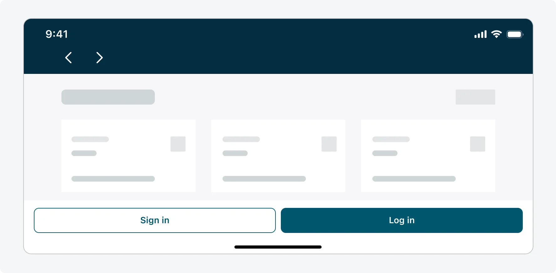
Responsive button behavior