

Anatomy
Learn about the individual parts of list selector.
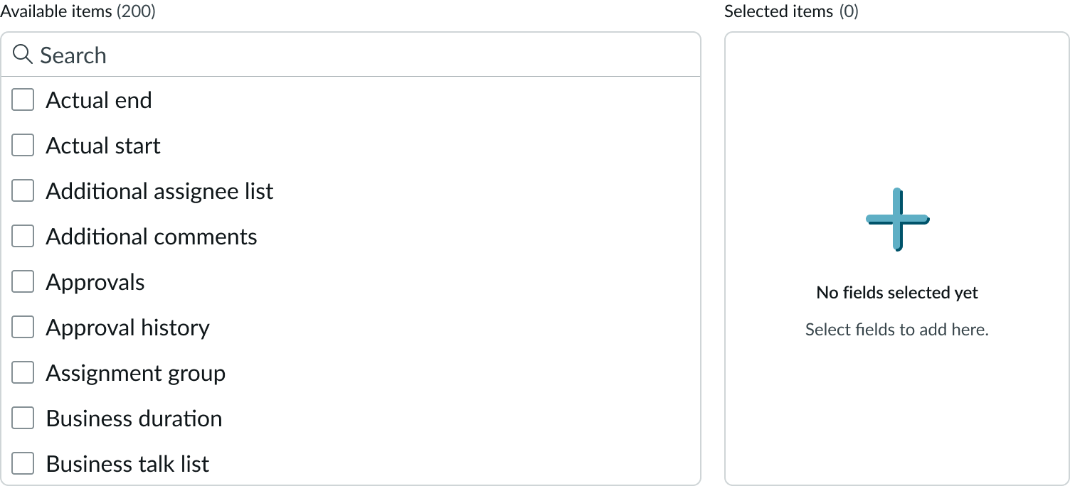
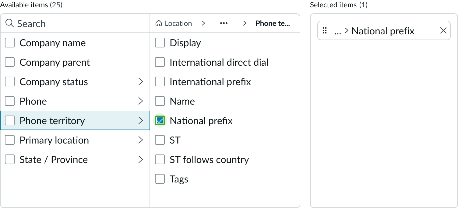
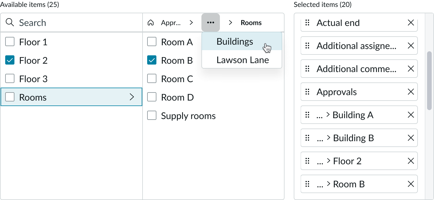
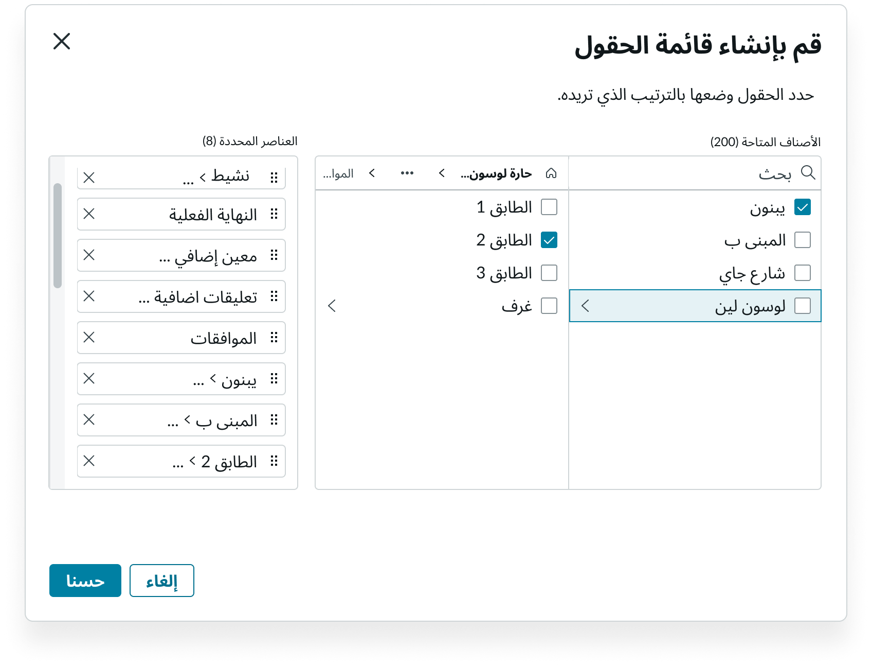
Lists
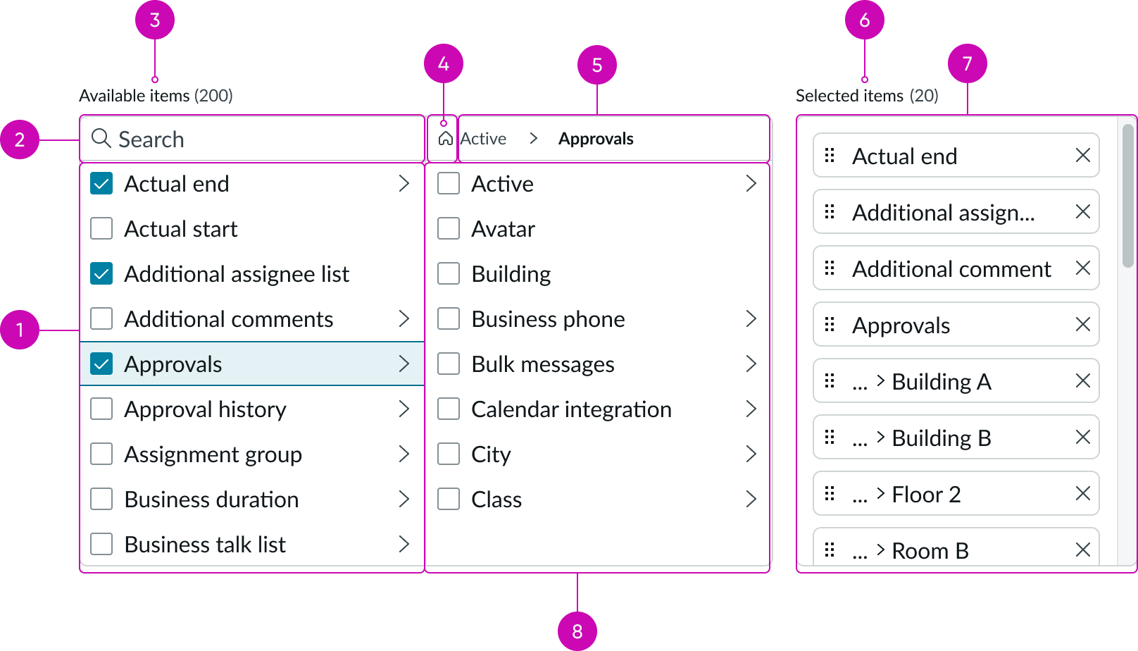
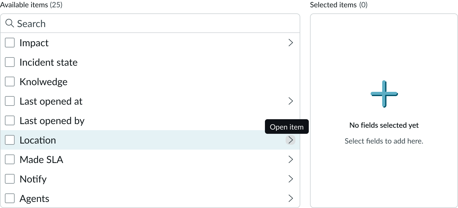
- Available items container: Items available for selection; nodes are shows with a caret that users click to dotwalk to referenced items
- Search field: Input field for searching for specific entries in the available items list
- Counter (available items): Configurable label for the available items list that shows the count of items available for selection
- Return icon: Moves focus to base items in the first container and closes the second container; selected items are not affected
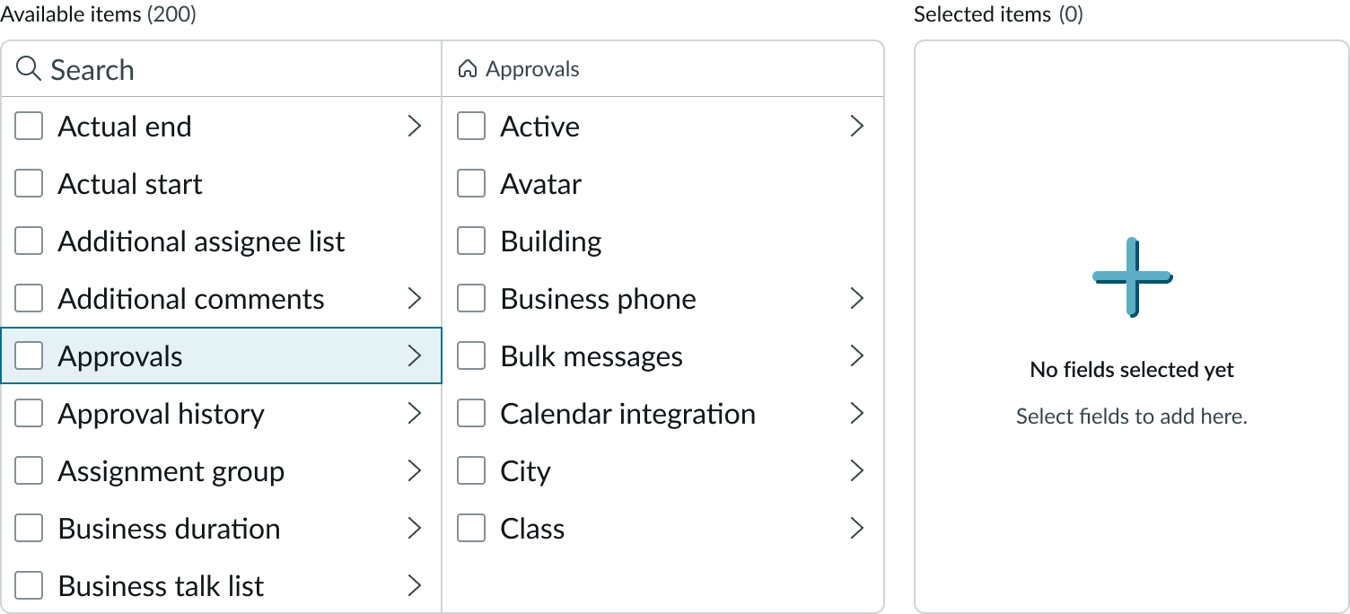
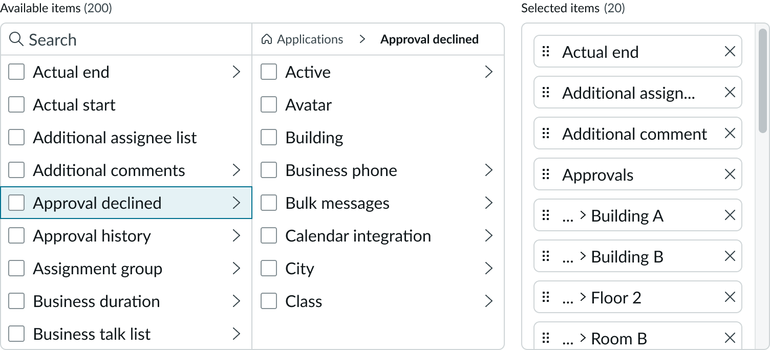
- Dotwalk path: Shows the reference path for the items selected; the path expands as additional items are added and displays an overflow menu
- Counter (selected items): Configurable label for the selected items list that shows the count of currently selected items
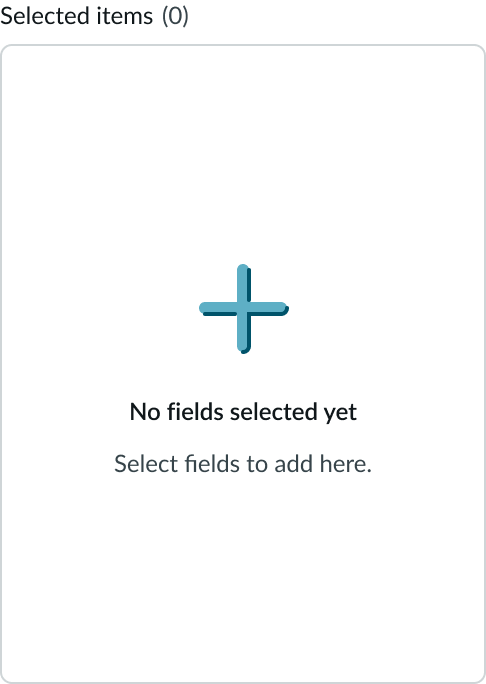
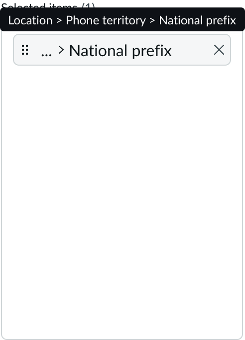
- Selected items container: Container for selected field items for the form or list; items in this list can be removed or reordered
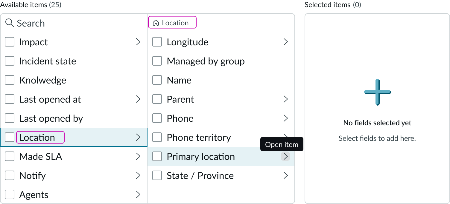
- Secondary items container: Container displaying items in a dotwalking path that are available for selection; this container appears when the user expands a node in the available items container
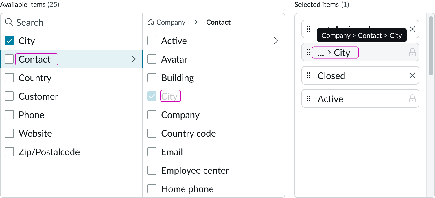
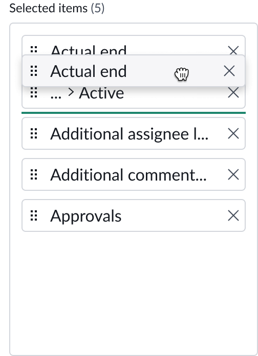
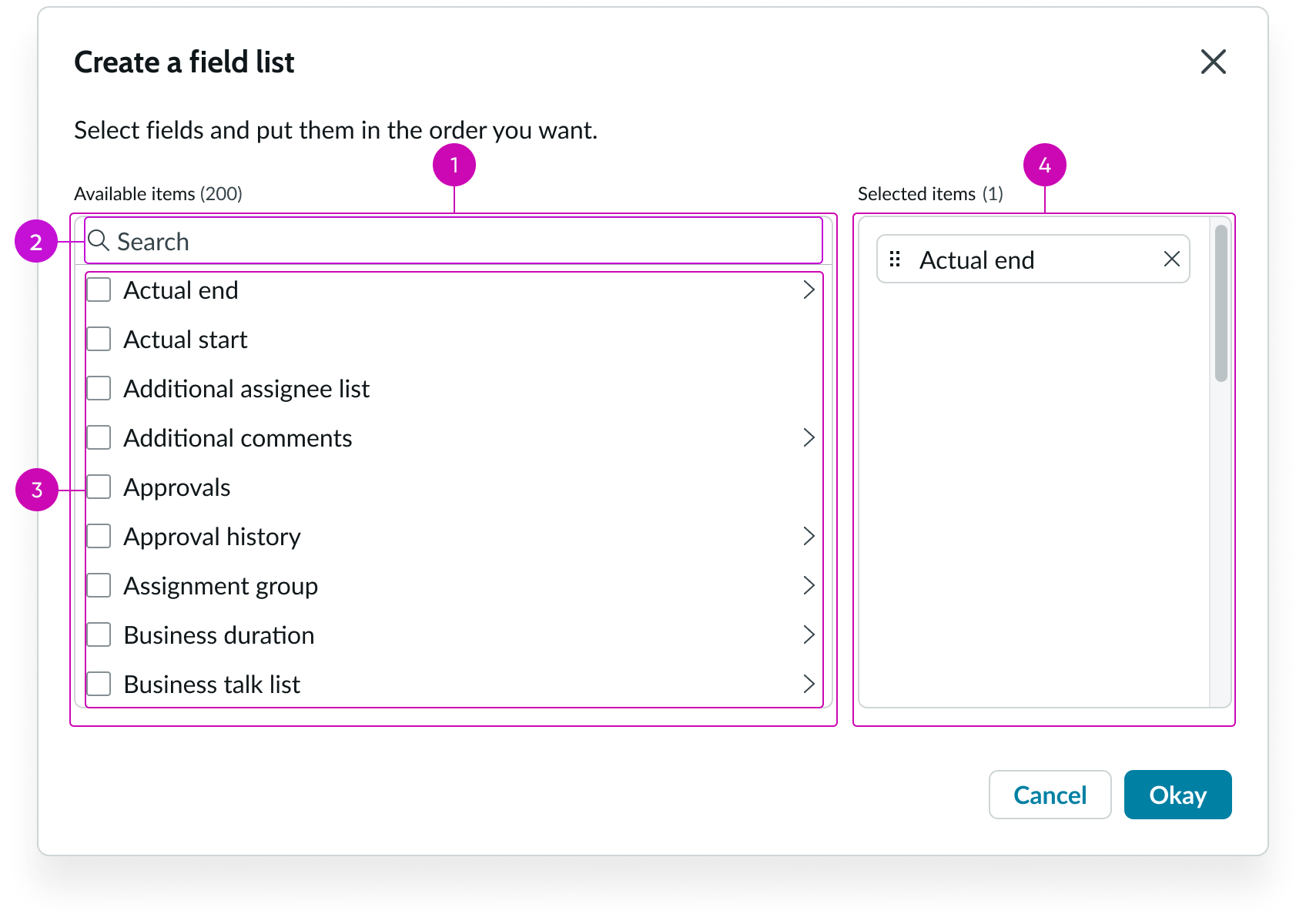
Selected field items
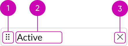
- Drag handle: Allows the user to drag and drop the selected item to change the order in the list
- Label: Indicates the name of the item
- Delete icon: Iconic button for removing the item from the list of selected items
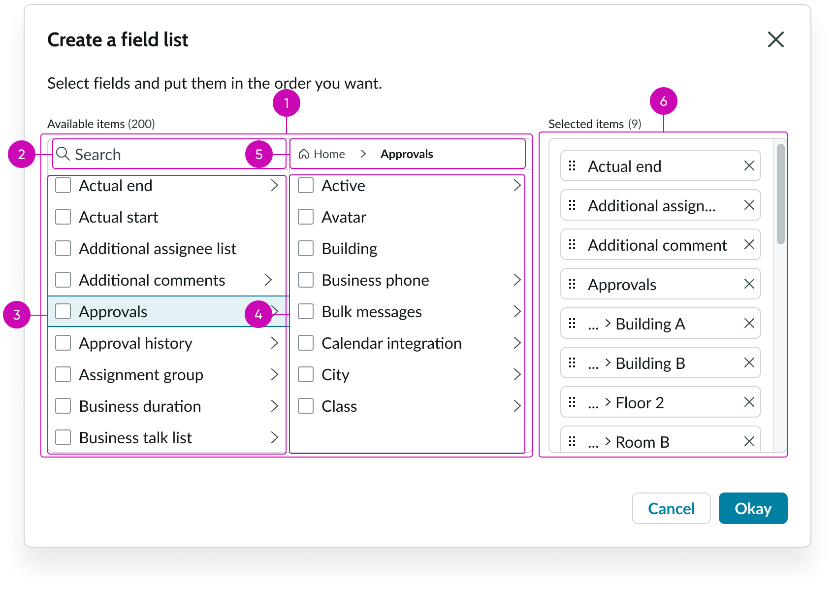
Selected item indicators
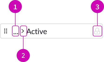
- Dotwalk indicator: Icon that indicates the presence of hidden elements in a dotwalk path
- Breadcrumbs indicator: Caret indicating that the selected item is at the end of a dotwalk path
- Lock icon: Indicates that the selected item is locked and can't be deleted from the list; locked items can still be moved
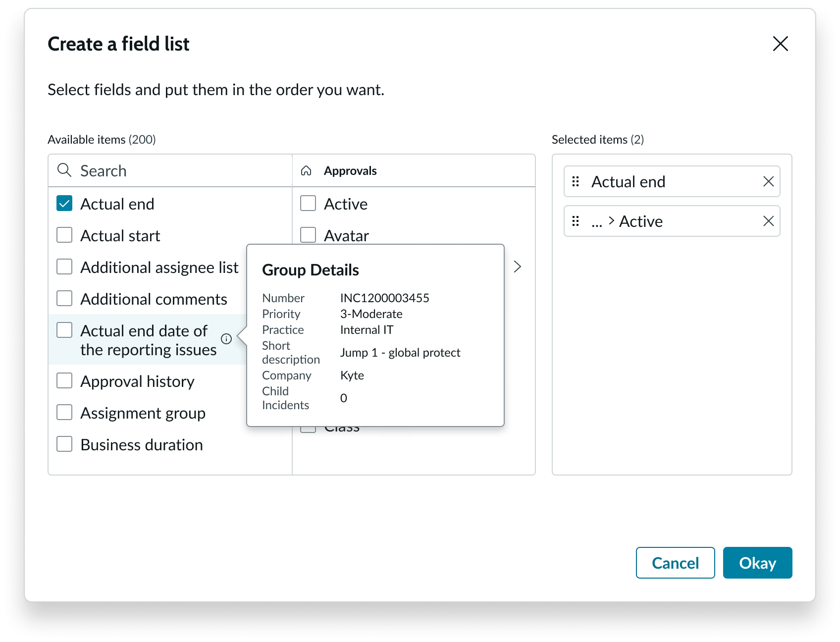
Data preview popover
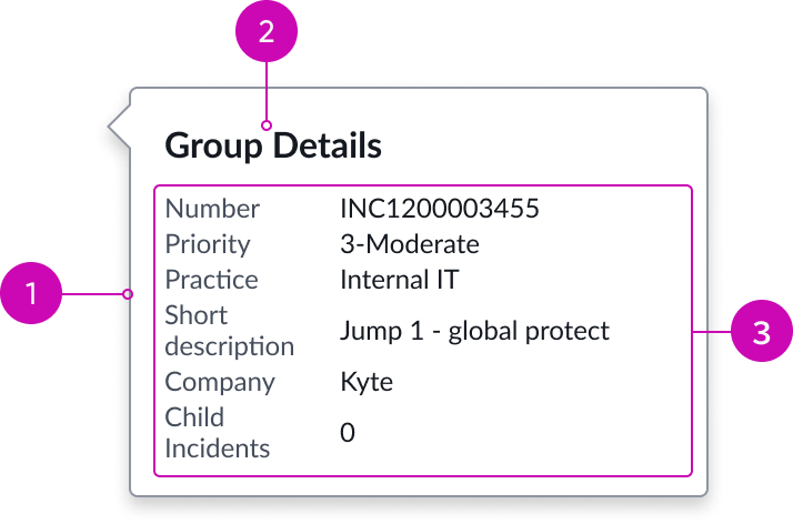
- Popover panel: Container for the additional field data; the popover for the list of available items displays to the right of the trigger icon, and the popover for the list of selected items displays to the left
- Label: Label identifying the data displayed in the popover
- Field data: Detailed data about the field expressed as label value pairs
Subcomponents
See the usage guidelines for button iconic.
See the usage guidelines for dropdown list.
See the usage guidelines for checkbox.
See the usage guidelines for input.
See the usage guidelines for breadcrumbs.
See the usage guidelines for popover.
Usage
Use the list selector in a page to enable users to select, remove, or reorder one or more fields from a form or a list. Users can view metadata about the current record displayed in popovers triggered from items in the lists. For complex and hierarchical data, list selector allows users to dotwalk a node to its children. There is no limit to the depth of the drill-down capability.
Configurations
Learn how to customize list selector by configuring the available properties.
Mode selection
You can configure list selector to connect to a ServiceNow table of available items or assemble the list manually from items in a root table.
Connected mode
The connected mode displays all the fields available in the specified table. When you select this mode, you can enable dot walking to select fields referenced in other tables.
Manual mode
When you select the manual mode, you must select a root table and manually define the fields from that table to display in the available items list. Dotwalking is supported in manual mode only if the item has references defined.
View type
You can configure list selector to display the component in one of the these views: compact, two-panel, or dot walk.
The compact view shows the Available items in a single panel.
The two-panel view shows the Available and Selected items lists in separate panels.
The dot walk view splits the Available list into two panels and displays the dot walked path in the second panel. This is the default view.
The compact view shows Available and Selected items in a single view.
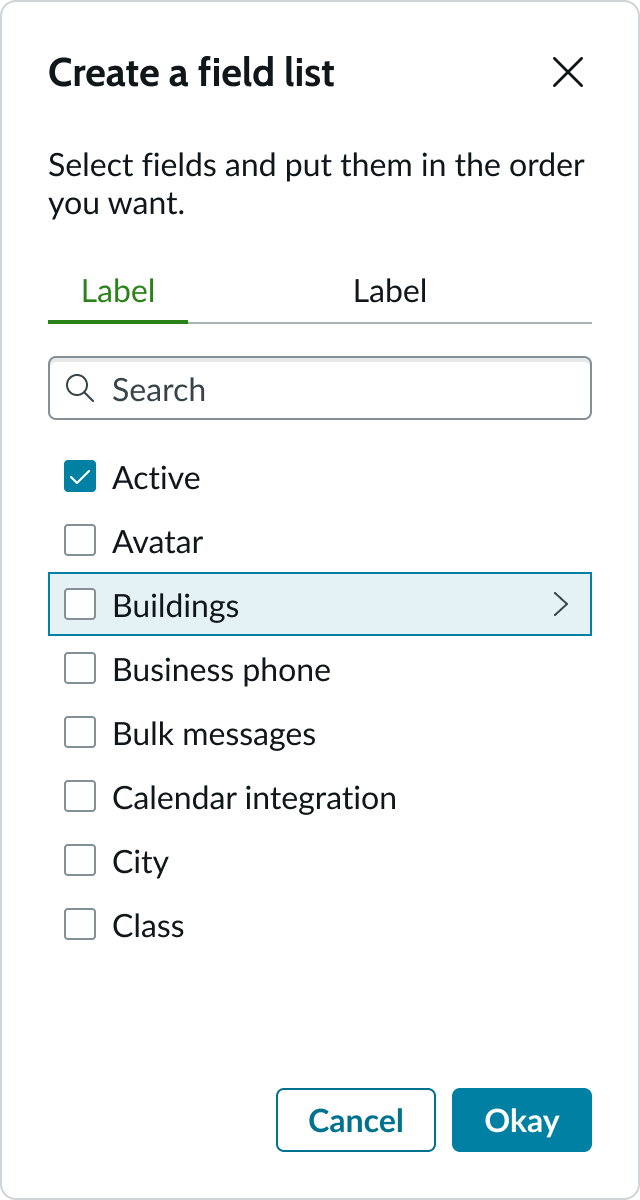
Table name
Connected mode only. Name of the source table for available fields.
Items root
Manual mode only. Name of the root panel to open when the component opens.
Allow dot walking
Connected mode only. If selected, a tree displays for the user to select from, that includes reference fields so they can dot-walk. Default is unselected.
Show variables
Connected mode only. If selected, list selector displays variables and questions in available items. Default is unselected.
Show extended fields
Connected mode only. If selected, list selector displays extended fields in available items. To align list selector with legacy dot-walking components showExtendedFields value should be bound to glide.ui.list.allow_extended_fields. Default is unselected.
Include system ID
Connected mode only. If selected, includes SYSID in the list of fields shown. Default is unselected.
Items
Manual mode only. Items object for the manual population of available items.
Selected items
Items in the selected items list have the following states: default, hover, dragging, and locked.
| State | Example |
|---|---|
| Default | 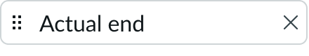 |
| Hover | 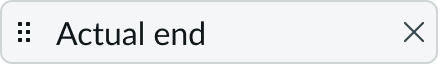 |
| Dragging | 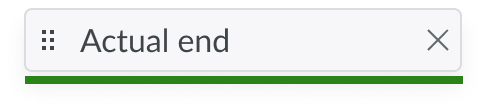 |
| Locked | 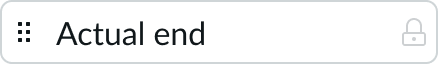 |
Unselectable items
List of items that can't be selected. By default, no items exist in this list.
User interactions
Settings that affect user interactions.
Search behavior
Controls how to filter the list items as the user types into the integrated search input:
- The initial search type filters from the beginning of a word as the user types. Initial is the default.
- The contains type filters based on whether the word contains the letters in the order typed.
- Connected mode only. When the "Show Variables" setting is selected, the search field searches across both parent table columns and catalog variable labels (the variable's Question text).
Show count
Optionally, you can configure both the available and selected items lists to show or hide a counter of their contents. As the user dot-walks through the reference fields, the list shifts from the second panel to the first and becomes the new list of available columns. The counter changes to show the number of columns in that list. Default is selected.
Reordering items
By default, users can reorder items in the Selected columns list by dragging and dropping them. However, you can configure the component to disable this feature.
Show selected item path
Manual mode only. When the user clicks an item in the Selected items list, the path to the item opens. Unselected by default.
Revealing hidden controls
By default, some controls are hidden until the user hovers over them or moves focus to them. A property in UI Builder lets you reveal all hidden controls, whether focused or not. This includes the iconic buttons that act as triggers for the informational popovers.
Placeholder states
Additional settings that affect the display.
Available bucket label
Label for the Available columns panel.
Selected bucket label
Label for the Selected columns panel.
Headers level
The heading level for the Available and Selected bucket labels. Available levels are 1-6 with 6 being the default. This setting doesn't affect the title size.
Reset warning message
You can hide the reset warning message that appears by default when the list selector data resets after the table name or the items root panel changes. Default is false.
Behavior
Learn how list selector behaves when the display changes or a user interacts with the component.
States
The available items and the selected items have their own states.
List items
Items in the available items list have the following states: default, hover, and selected.
| State | Example |
|---|---|
| Default |  |
| Hover |  |
| Selected |  |
| Disabled |  |
Empty state
If no items are selected, the selected items list displays an empty state message.
Responsive behaviors
Learn how list selector behaves when the display changes or a user interacts with the component.
Scrolling
When the number of items in a list exceeds the height of the container, vertical scroll bars appear to allow the user to navigate the list.
Interactions
Learn how list selector responds when a user interacts with it.
Dotwalking
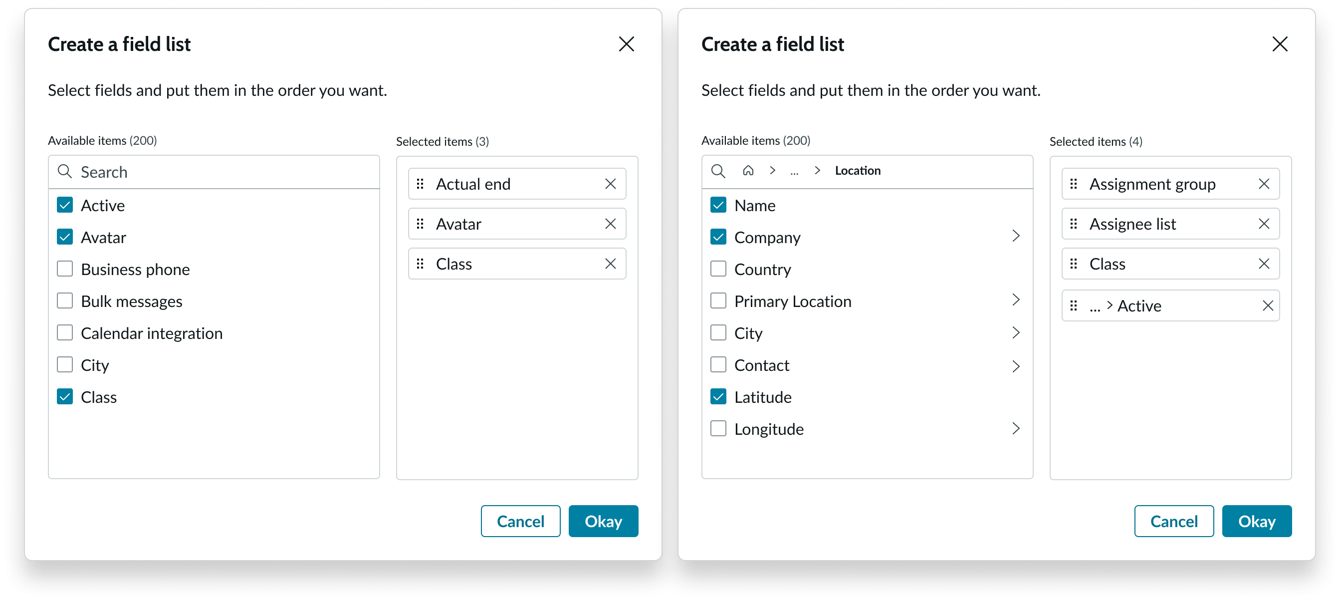
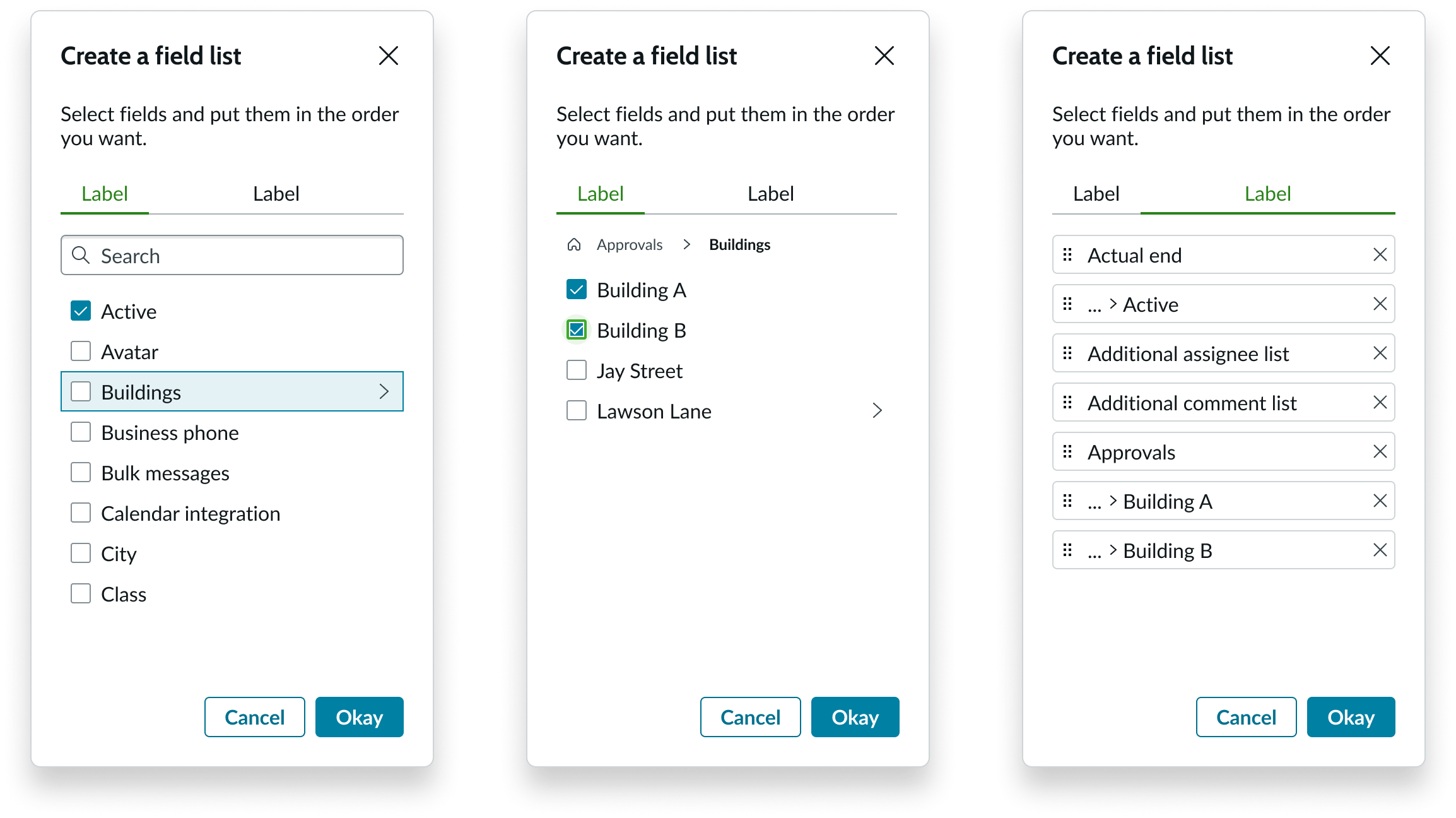
List selector enables users to drill down into a node to select its children. Users click the chevron icon next to a node in the first panel to start dotwalking.
The second panel appears, displaying all the child fields at the second level. The breadcrumbs start building at the top of the second panel, indicating the location in the hierarchy the user is viewing. The breadcrumbs are interactive and can be used to navigate to any level in the hierarchy. The user can select the checkbox of the field they want to add to their list or continue dotwalking.
To dotwalk to the next level, the user clicks a chevron icon in the second panel.
The next level of the hierarchy appears in the second panel and displays in the breadcrumbs. If the user wants to return to the top node, they click on the return icon to the left of the breadcrumb path.
To continue dotwalking to the next level in the hierarchy, the user clicks the chevron next to a field name in the second panel.
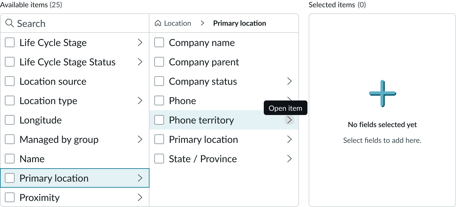
The next level appears in the second panel, and the breadcrumbs show the overflow in the path, marked with ellipses. The user can select a field at this level or continue dotwalking.
When a user hovers over an item in the selected item list, a tooltip displays the complete breadcrumb of the dotwalk path.
When configured, users can click a dotwalked item in the selected items list to display its path from the node in the available items list. This feature is only available for the manual mode.
Removing selected items
To remove a selected item from the list, the user clicks the delete icon in the item.
Overflow
To view the hidden items in a breadcrumbs path, users click on the ellipses. A dropdown list displays the overflow items in the path. Clicking an item in the list navigates to that level of the hierarchy in the second panel.
Dragging and dropping
The user can move an item in the selected items list by using the drag handle. Items being dragged appear in the dragging state and are accompanied with a drag area indicator. The indicator line moves with the item, marking its changing position in the list.
Viewing record metadata
Users can view details of the current record in popovers accessed from items in the available and selected items lists. To open the popover, the user selects the iconic button that appears after an item in the list. The content of the popover is informational only and doesn't contain any actionable items. The data to display is configurable as is the trigger icon on selected fields.
Truncation
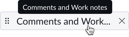
When labels for available and selected items exceed the width of the list container, the label truncates with an ellipsis, and a tooltip shows the full content on hover.
Usability
List selector complies with all internationalization and accessibility requirements.
Internationalization
When this component is used in a platform configured for a right-to-left (RTL) language, the heading, control buttons, and list containers flip and orient on the right.
Accessibility
Learn how to access the actionable elements of list selector through keyboard interactions and screen readers.
List selector tab order
This is the tab order for a single panel list selector component.
This is the tab order for a two panel list selector component.
Keyboard interactions
Use the tab key to access the containers in each list selector view.
You can access the actionable elements of list selector with these keyboard keys:
When focus is on an available or selected list:
- Arrow up or Arrow down navigates through the list.
When focus is on an item in the available items list: - Arrow left or Arrow right and Space moves focus between the control elements in the item. The space bar selects the checkbox or enters dotwalk for a parent field.
When focus is on an item in the selected items list: - Arrow right and Enter moves focus between the control elements in the item. Enter selects the action.
When focus is on the breadcrumbs: - Tab moves focus through actionable items in the breadcrumbs
- Enter selects the action
When focus in is the overflow dropdown list: - Arrow up or Arrow down moves focus between items in the dropdown
- Enter selects an item in the dropdown
When focus in on a selected item for reordering: - Arrow up and Arrow down moves focus between items in the list
- Space selects the item to be moved and places the indicator line under the item. The item appears grayed out when in a moving state.
- Arrow up and Arrow down when an item is selected for reordering moves the indicator line up or down in the list.
- Enter moves the item to the new location.
Forced colors
The elements of list selector support forced colors, including non-interactive text, links, button borders, and the highlight colors for states.
Reflow
The list selector component supports reflow to eliminate horizontal scrolling. When magnified by 200%, the component is reduced to two panels: one for available items and another for selected items. If the user has dot-walked their selections, the path appear at the top of the available items list.
When magnified by 400%, the component appears in a single panel, without losing any content or functionality.
The panel on the left shows how reflow affects the Available items panel. The panel in the middle shows how reflow displays the dot walk path usually seen in the normal two-panel view. The panel on the right shows how reflow displays the Selected items list.
Screen readers
When you apply ARIA labels to a component, screen readers announce the controls and content of list selector in the prescribed tab order.