

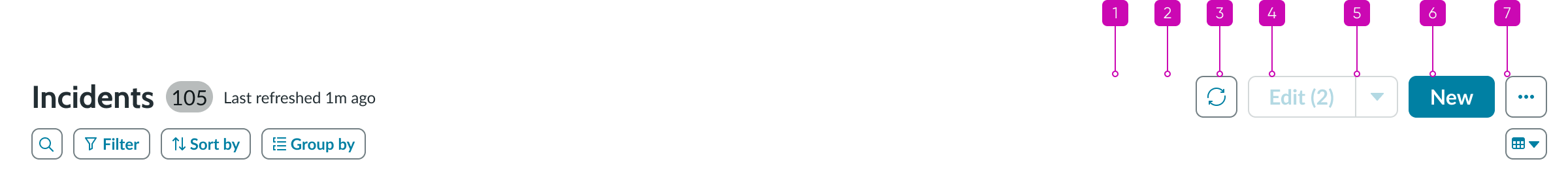
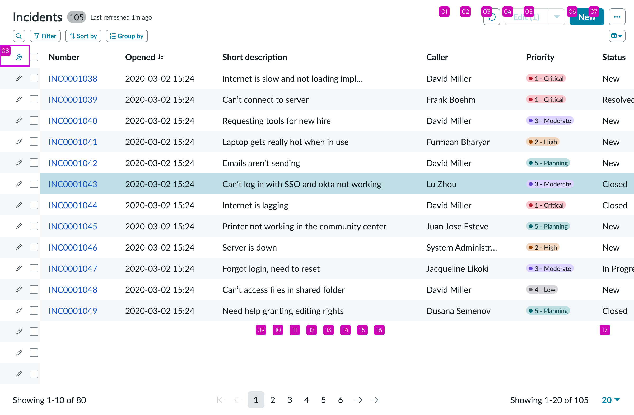
- Record list header: Heading component that contains the title, actions a user can take on the list, and a button to create new records.
- Presentational list: List component with columns and rows; users are able to sort, filter, and edit items.
- Pagination control: Pagination control component that enables users to navigate pages of records and set the number of records displayed per page.
Usage
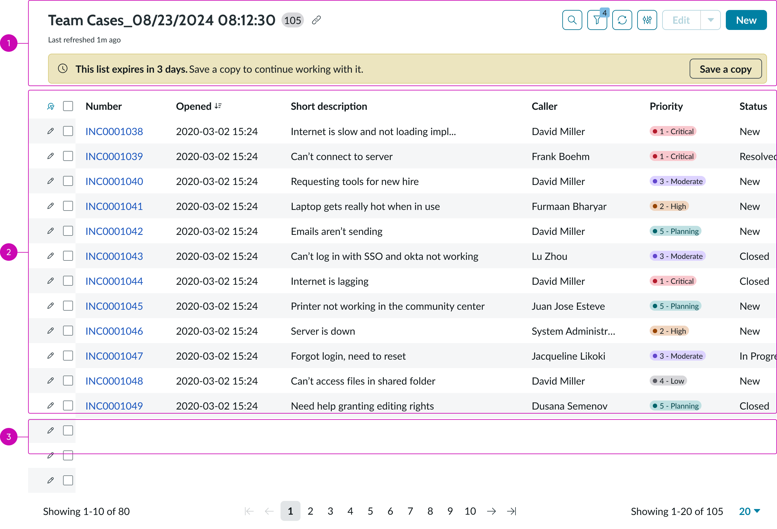
You can use the record list bundle in any design that requires a full-featured data list. The list controller provides all cell types and list actions, such as sorting, grouping and reordering row items using drag and drop functionality. In addition, the list controller allows you to display Glide record data in your list. The record list includes a header with actions you can take on list items and a pagination control for navigating the list.
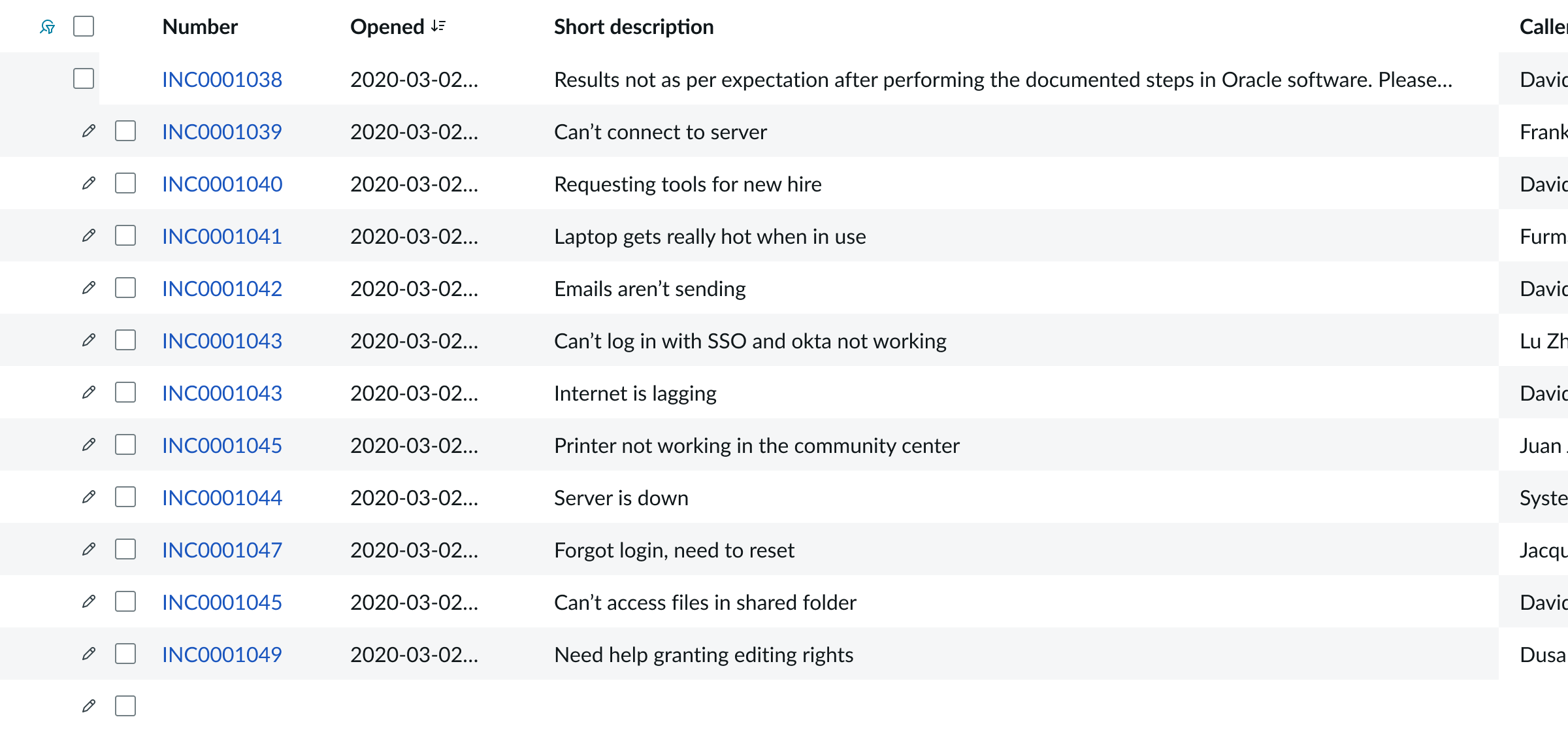
This example of a record list of incidents contains a header with action buttons and declarative actions and a footer with a pagination control.
Presets and controllers
This component has a preset configuration that sets properties and event handlers, making it ready for use. You can override preset values with a custom configuration if needed. Preset values won’t upgrade with updates. To avoid using presets, configure manually. One preset can apply to a single component instance. See presets for more info.
A preset is linked to a controller, which serves as a data resource. Controllers provide configuration data and event bindings for the component. Selecting a preset adds the required controller to the page, allowing new components to use its preset. For more on controllers, see controllers. For default presets, see view properties and events in the controller API.
Record list header
Learn how the record list header component is configured and behaves in the record list bundle.
Anatomy
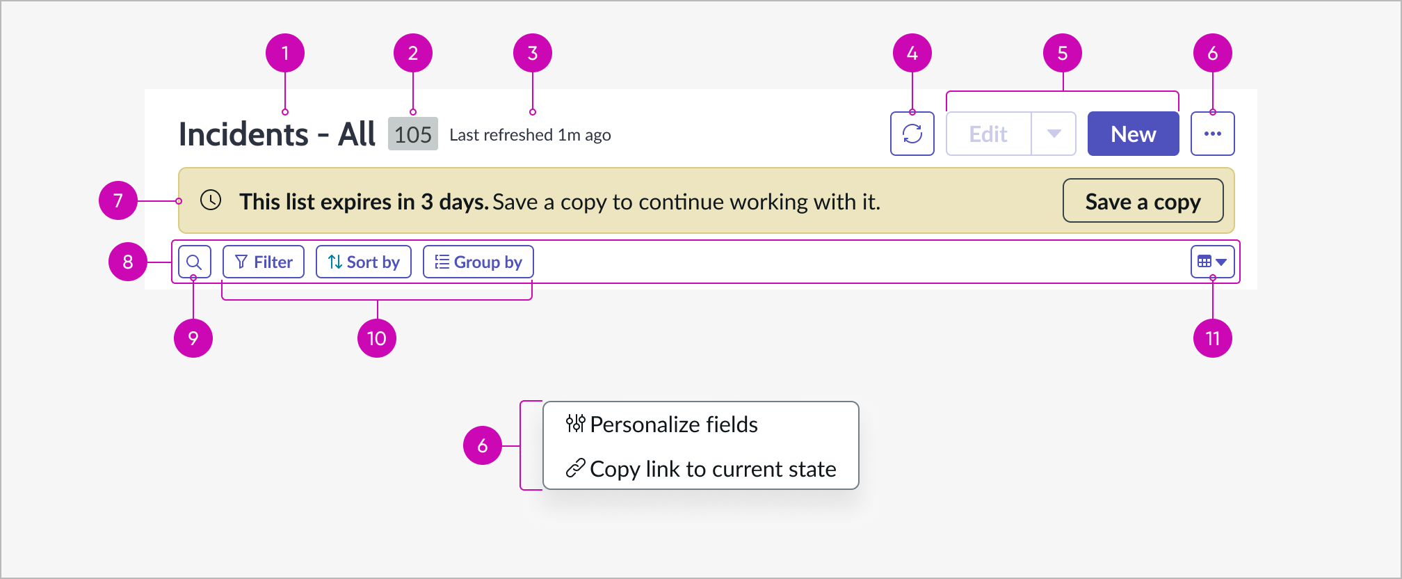
- Title: Title of the list
- Record count (optional): Badge for the number of items in the list
- Subtitle: Content displaying the elapsed time from the last list refresh
- Refresh button (optional): Refreshes the list on demand with the latest data from the data source
- Declarative actions (optional): Actions configured on the instance for the workspace being used; button types could be anything
- More actions: More actions button and menu containing other standard list actions and any overflow actions
- Alert message: Slot for an optional message
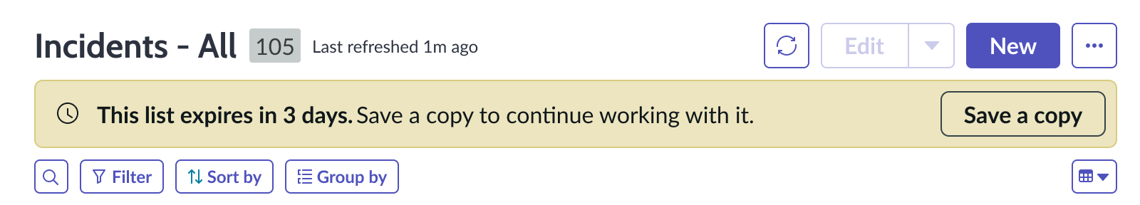
- Data and layout bar: A bar for secondary list actions related to data and layout; when only one or no button on the left is configured to show, the bar will be hidden and any remaining button will move ot the top
- Search button (optional): Action that opens the search input field for searching items in the list
- Filter, sort and group (optional): Condition builder actions that allow users to filter, sort and group the list
- Layout switcher: When more than one layout is available in the list, this option enables users to switch between them
Configuration
The record list header component provides preset property values that are intended to satisfy most use cases. You can override any preset value to suit your needs, but overridden properties aren’t updated during an upgrade. The only configurable property that is upgrade-safe for the record list header in a record list is the toggle that enables you to show or hide the component in the page.
Behavior
Learn how the record list header behaves when the display changes or a user interacts with the component.
States
The record list header buttons inherit the states of the button component.
See usage guidelines for button
Responsive behaviors
Depending on your use case, you might have multiple button types configured for declarative actions. When the record list header shrinks to fit a smaller container, the actions overflow into a form menu and are organized according to their button type. For details, see the usage guidelines for action bar.
Interactions
Learn how record list header responds when a user interacts with it.
Editing columns
Users can add, delete, and reorder the columns that appear in the list by using the options in the record list header.
Edit columns modal
Declarative actions
User interaction with the declarative actions depends on the types of buttons present. In this example, the user opens a dropdown from a split button to select an action on records selected in the list.

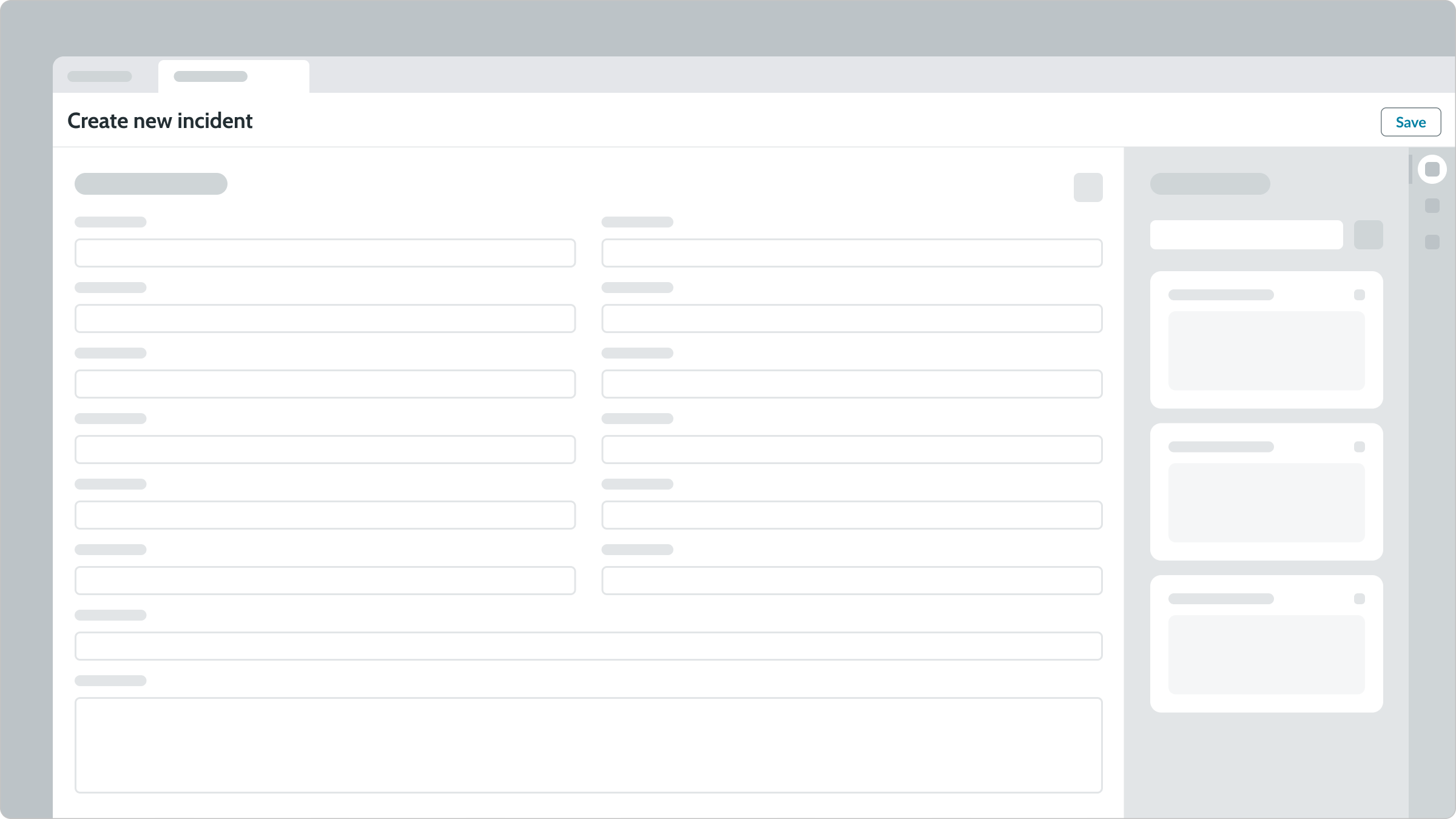
Users select the “New” button in the header to create a new record in the current list. A new tab appears containing a blank record form and a contextual sidebar component, allowing the user to attach a file or select a template for the new record. When the user completes the form, they select Save to save the new record.
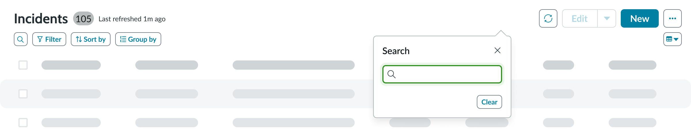
Search
Users can search for keywords to filter records in a list. Selecting the search button opens a popover where they can enter a keyword and press the "Enter" key to execute the search. The original list will be replaced with a filtered version. To clear the search, users can select the “Clear” button in the popover.
Refresh
Users can refresh the list by selecting the refresh button in the record list header. Once the list is refreshed, the subtitle in the header will be updated.
Usability
Record list header complies with all internationalization and accessibility requirements.
Internationalization
When the display translates to a right-to-left (RTL) language, the iconic buttons and list label flip their orientation.

Accessibility
Learn how to access the actionable elements of the record list header through keyboard interactions and screen readers.
Keyboard interactions
You can access the actionable elements of record list header with these keyboard keys:
- Tab: Moves focus from the first iconic button to the last declarative action in the prescribed tab order, skipping any disabled actions
- Shift + Tab: Moves focus backward in the reverse tab order.
- Enter: Activates the action in focus
In this example, the tab order includes the split button declarative action, which is enabled. Tabbing skips any declarative action that is disabled and goes to the next active action.
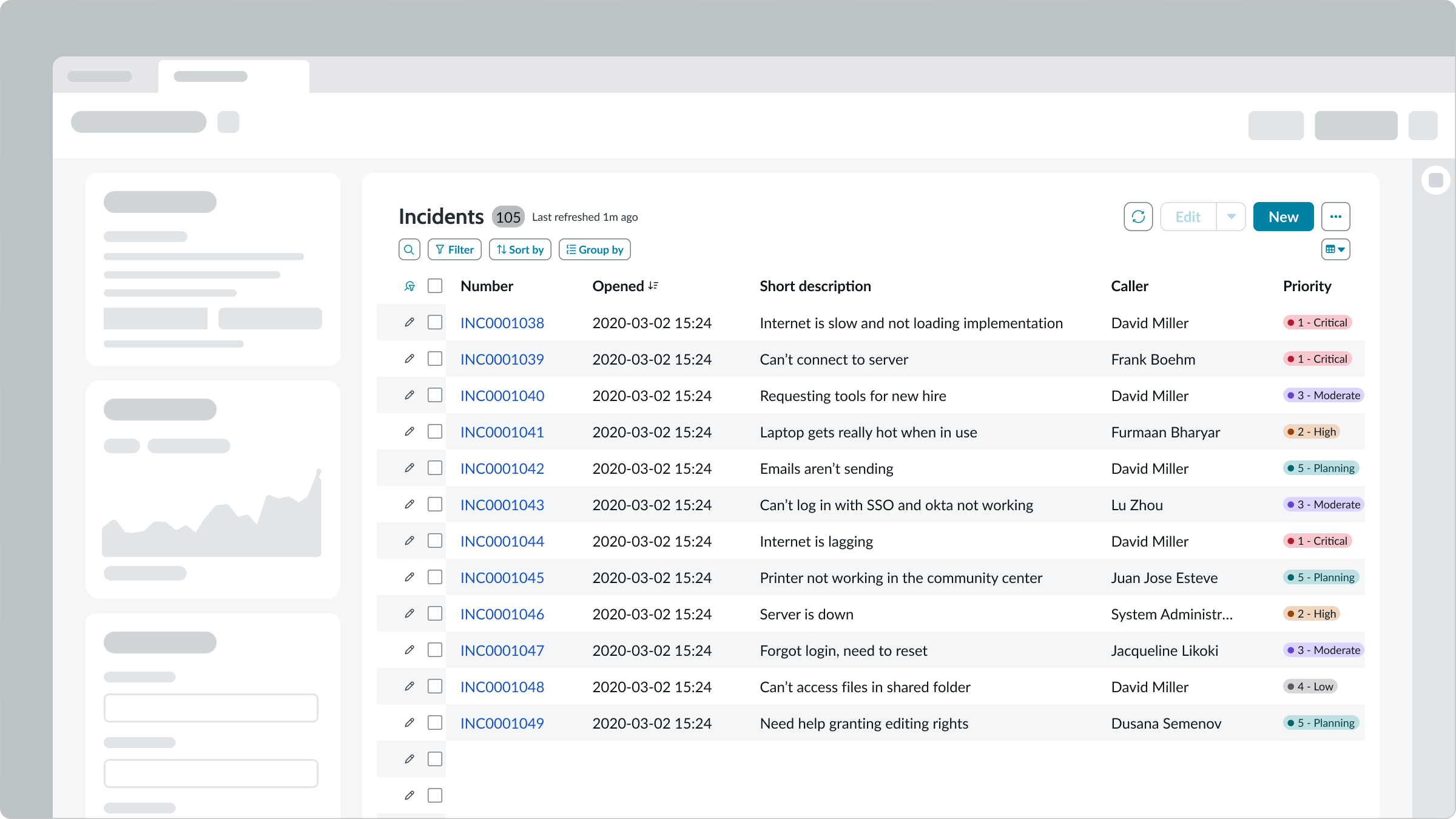
Presentational list
Learn how the presentational list component is configured and behaves in the record list bundle.
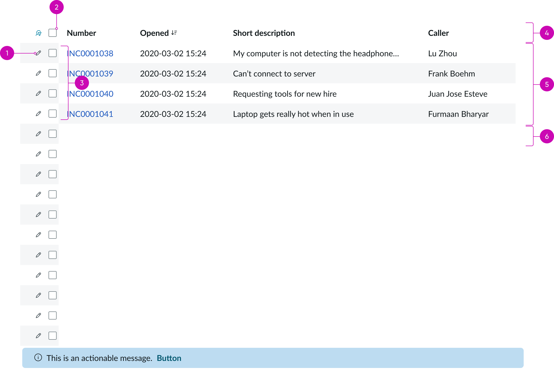
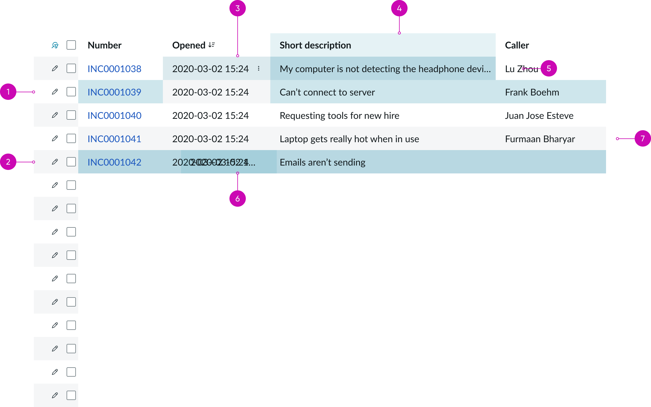
Main anatomy
Presentational list (default view)
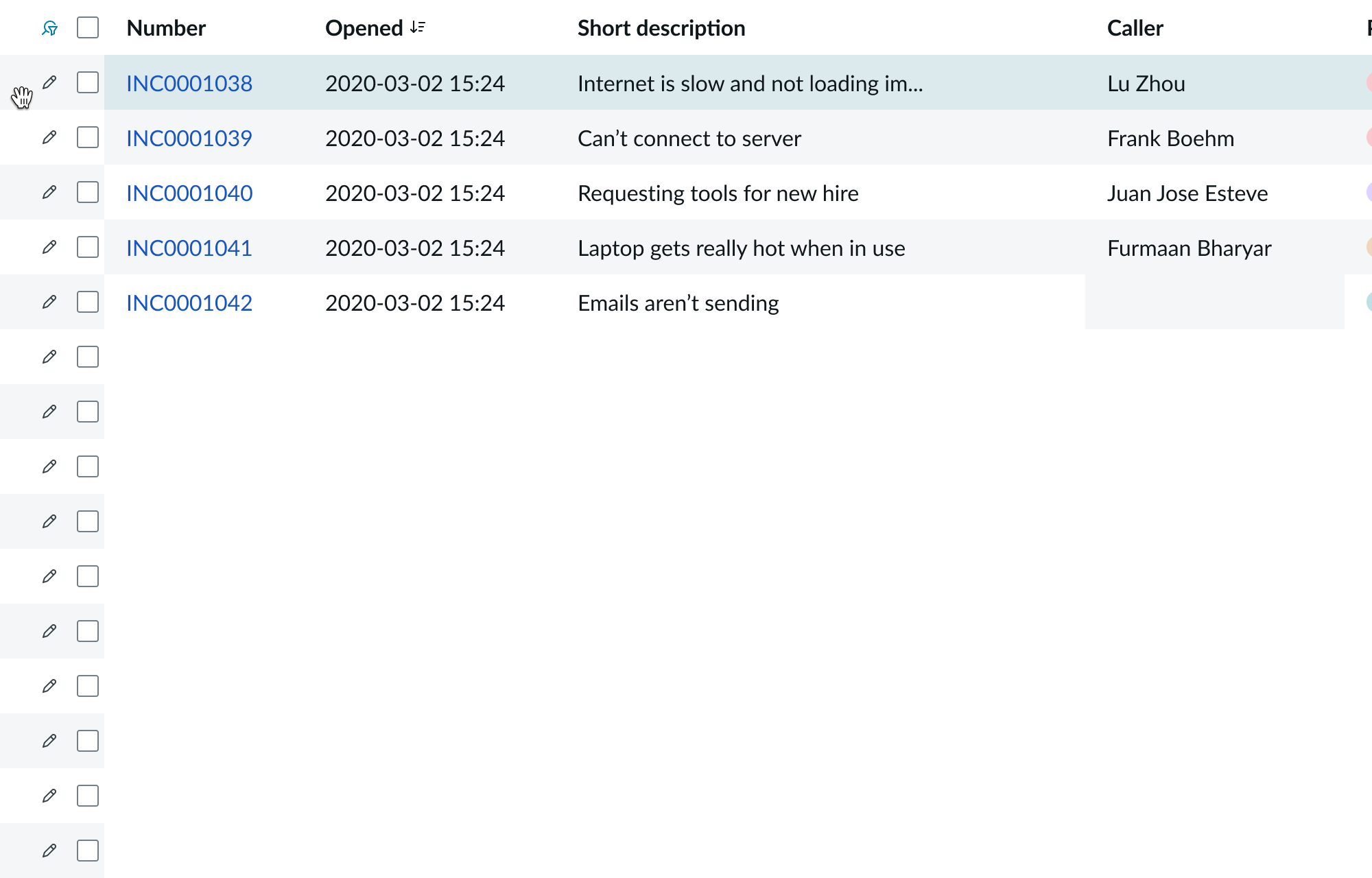
- Row actions (optional): Iconic buttons that enable users to perform actions on the record; up to 10 actions can be configured. Default action is quick edit, which opens an editable form for the record on a side panel.
- Select all: Checkbox for selecting all the records in the list
- Select row: Checkbox for selecting an individual row
- List column headers: Each column header contains a drag handle button, a label that describes the data in the column, default icons to indicate sort, filter, and group, optional custom icons, and an actions button.
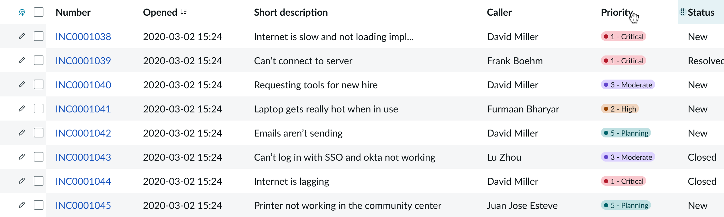
- List cells: Cells that allows users to view and interact with the data. Cell types include actionable link, boolean, choice, currency, custom, date/time, empty, error, highlighted value, icon, loading, number, person, pill, string and URL.
- Actionable message (optional): Inline message with an action button which can appear on top of the list or at the bottom.
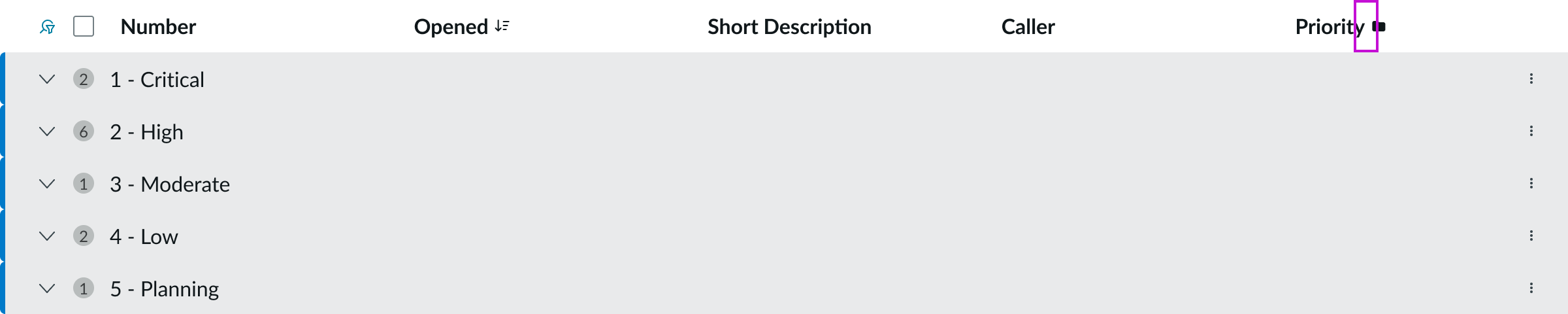
Grouped rows anatomy
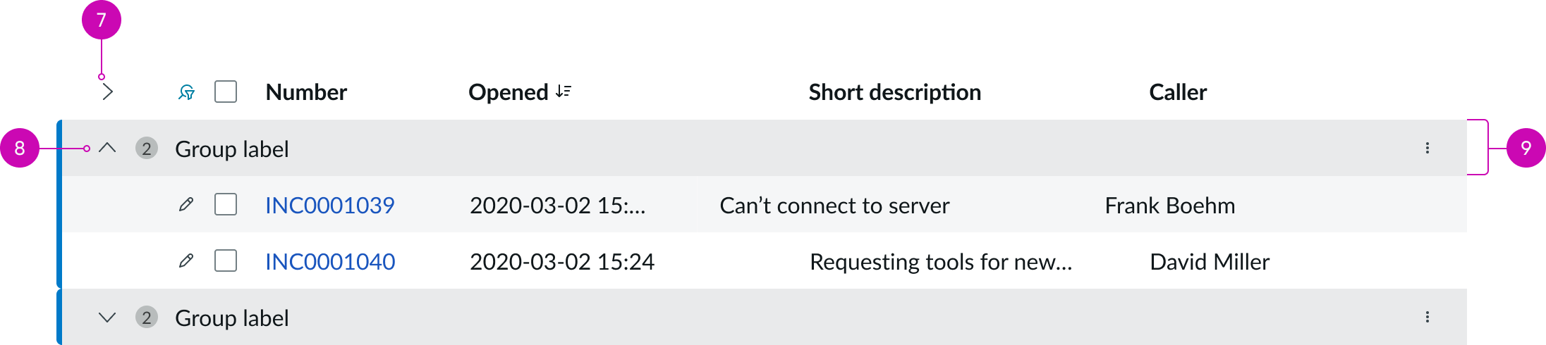
Presentational list (grouped view)
- Expand or collapse all groups: Iconic button to expand or collapse all groups.
- Expand or collapse group: Iconic button to expand or collapse a single group.
- Group header row: A special row that contains an expand/collapse button for the group, an optional badge count for the number of records within the group, and an optional action button that can either be a single action or trigger a dropdown menu of actions.
Row anatomy
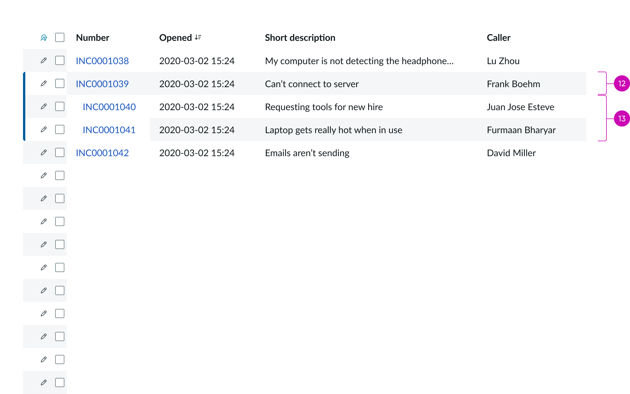
Presentational list (parent and child rows)
12: Parent row: Record that has child records associated with it.** 13: Child rows:** Child records that belong to a parent record.
Configuration
The presentational list component provides preset property values that are intended to satisfy most use cases. You can override any preset value to suit your needs, but overridden properties aren’t updated during an upgrade. The configuration panel includes some configurable properties that you might want to set in your page.
Type and layout
You can select the type and layout of your list to best fit your use case. Types include default, simple, and related. Default is a list with a full feature set. Simple works for small spaces within dashboards. Use Related to display records related to a parent record in the context of a form.
You can also configure the layout to be Lists only, Gallery only, or Both list and gallery.
List interactions
You can enable or disable the following list interactions:
- Clickable text: Interact with all clickable cell content, such as URLs. When disabled, clickable text is rendered as plain text.
- Inline cell editing: Edit values directly in a cell without having to open the record.
- Column width: Adjust column width with drag handles.
- Live list: Display a toggle for live updates in the list header. By default, if live list is enabled, infinite scroll is as well.
- Infinite scroll: Continuously load content at the bottom of the list.
Text wrapping
You can configure text wrapping for entries that overflow the cell. By default, text wrapping is disabled.
Behavior
Learn how the presentational list behaves when the display changes or a user interacts with the component.
States
The presentational list has 3 states: hover, focus, and selected.
- Row hover
- Row selected
- Cell hover
- Column heading hover
- Cell selected
- Cell selected-hovered
- Cell focused
Responsive behaviors
By default column width in a presentational list adjusts automatically to accommodate the longest entry in the column.
Interactions
Learn how the presentational list responds when a user interacts with it.
Column drag and drop
Column drag and drop in enabled by the preset. To drag and drop a list column, the user selects the drag handle in the column header and drags the column left or right in the list.
An indicator line appears as the column moves to show its current location. The column’s previous location appears in a disabled state. The user releases the drag handle when the column is in the desired position.
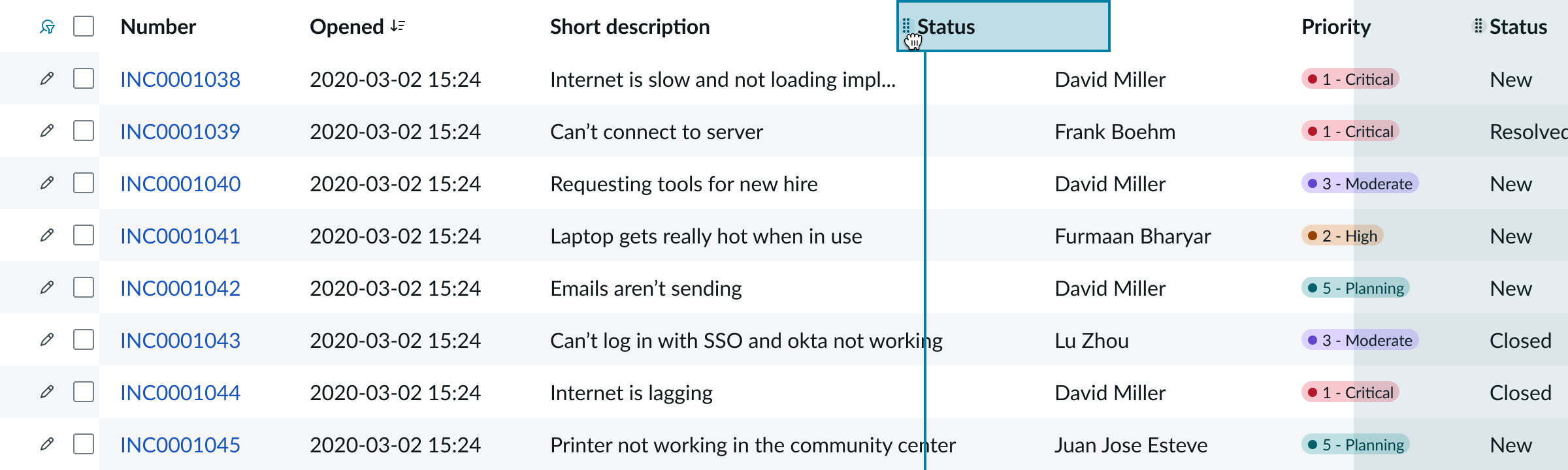
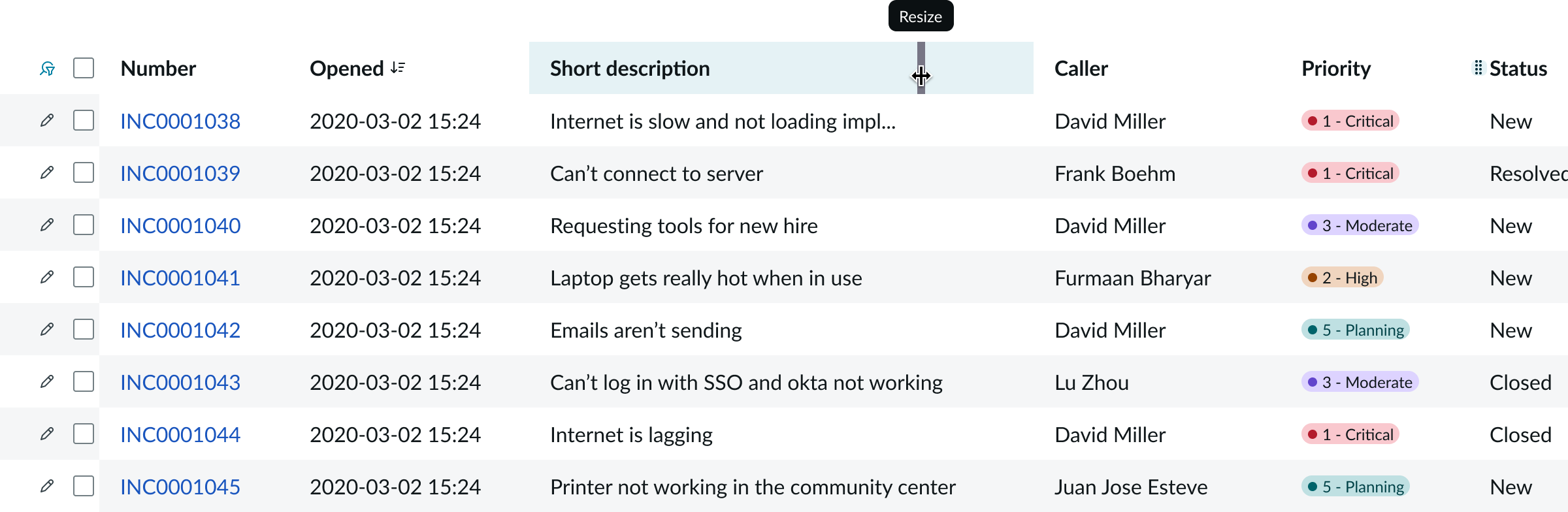
Column resizing
This feature is enabled by the preset. Users can adjust the width of a column by dragging the vertical bar that appears on the right side of the column heading when the cursor points to that area.
Column grouping
When column grouping is configured to be displayed in the column heading popover, users can group list rows in a list by any column. To do that, users point to the column heading cell to see the column actions button. Selecting it will open a popover containing a button to group list rows by this column.
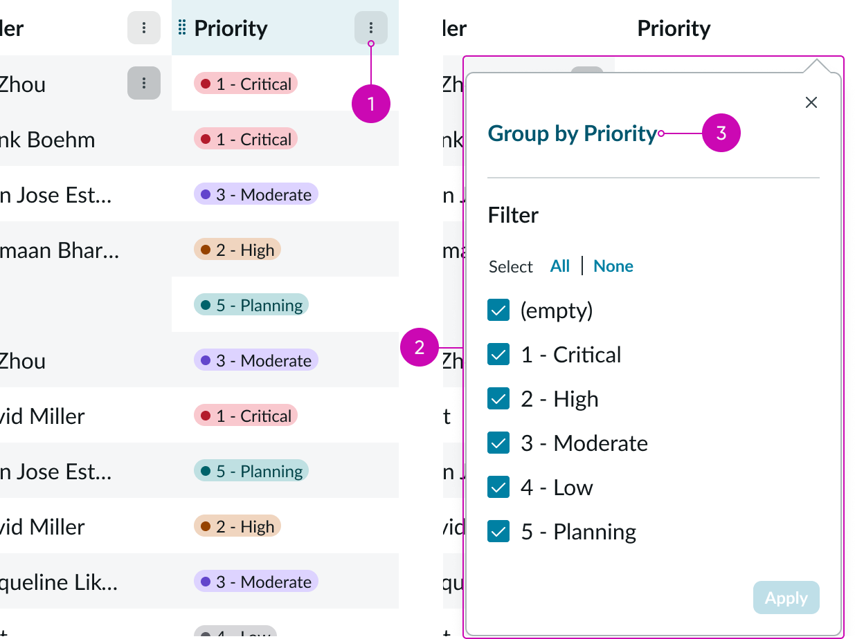
A folder icon in the column heading indicates that the list has been grouped by the column.
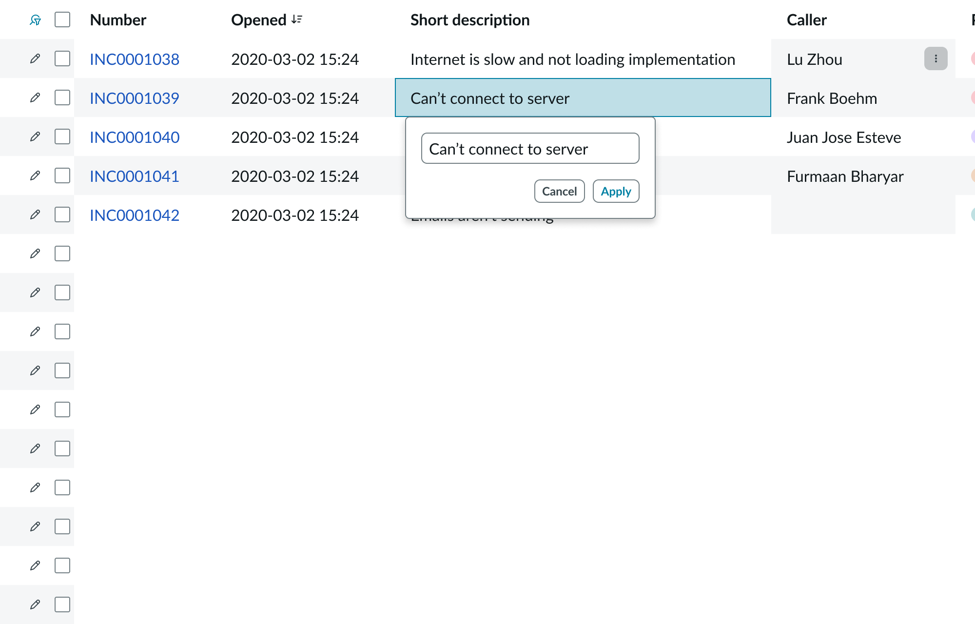
Inline cell editing
This feature is turned on by the preset. Users can double select a cell to reveal a popover where they can edit the value of the cell.
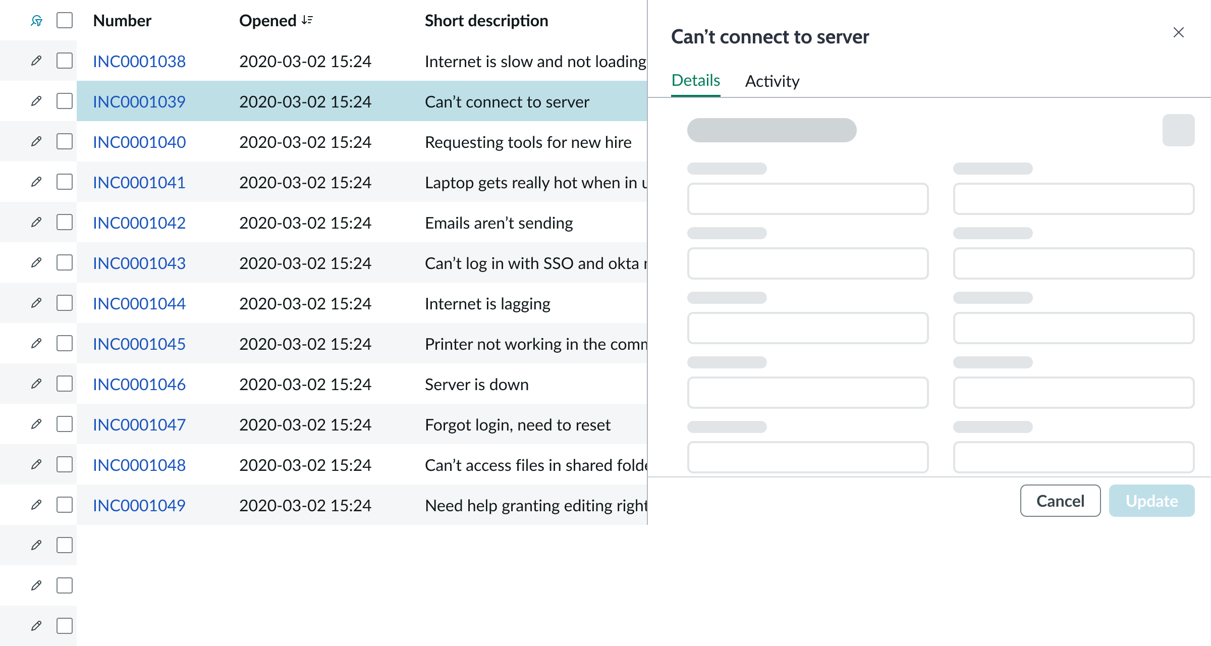
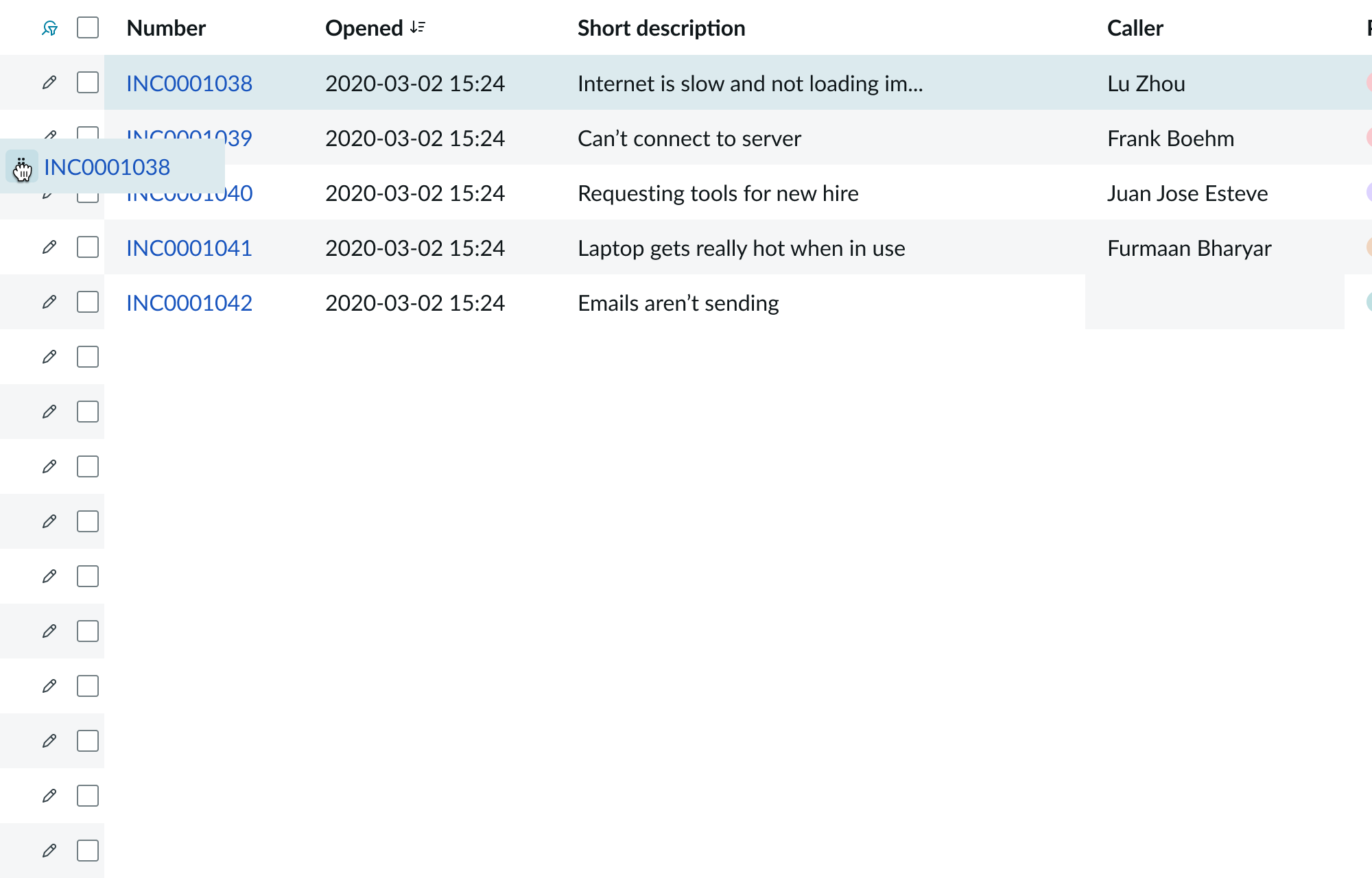
Quick edit
When the quick edit feature is turned on, users can edit the associated record of each row on a resizable pane by selecting the pencil button in the row actions cell. This cell is by default located at the start of each row but can be customized to be at the end. Quick edit opens a panel to the right of the list showing an editable record form.
Row drag and drop
This feature is turned off by the preset. When turned on, it allows users to reorder list rows by dragging and dropping. Users can select the drag handle at the beginning of a row and drag the row up or down in the list.
The row’s previous location appears in a disabled state. The user releases the drag handle when the row is in the desired position.
Usability
The presentational list complies with all internationalization and accessibility requirements.
Internationalization
When this component is used in a platform configured for a right-to-left language (RTL), the list flips its orientation and aligns on the right.
Accessibility
Learn how to access the actionable elements of presentational list through keyboard interactions and screen readers.
Keyboard interactions
You can access the actionable elements of presentational list with these keyboard keys:
- Tab: Moves focus from the last active declarative action in the record list header to the top corner of the list.
- Shift + Tab: Moves focus backward. If focus is in the list, focus moves to the last active declarative action in the record list header. Focus moves into the list if focus is on the first actionable item in the pagination control.
- Arrow up and Arrow down: Moves focus up and down between rows from the selected cell.
- Arrow left and Arrow right: Moves focus between columns and row actions in the selected row.
- Enter: Activates the action or link in the cell in focus.
This example shows the tab order for the presentational list. Focus moves from the last active declarative action in the record list header to the top corner of the list and then to the first active item in the pagination control. Navigation within the list is done with arrow keys.
Screen readers
Screen readers use the built-in table functionality.
Pagination control
The record list bundle uses the pagination control component to navigate pages in the list and set the number of rows per page.
For more information, see usage guidelines for pagination control