

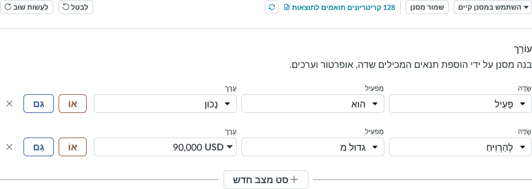
Anatomy
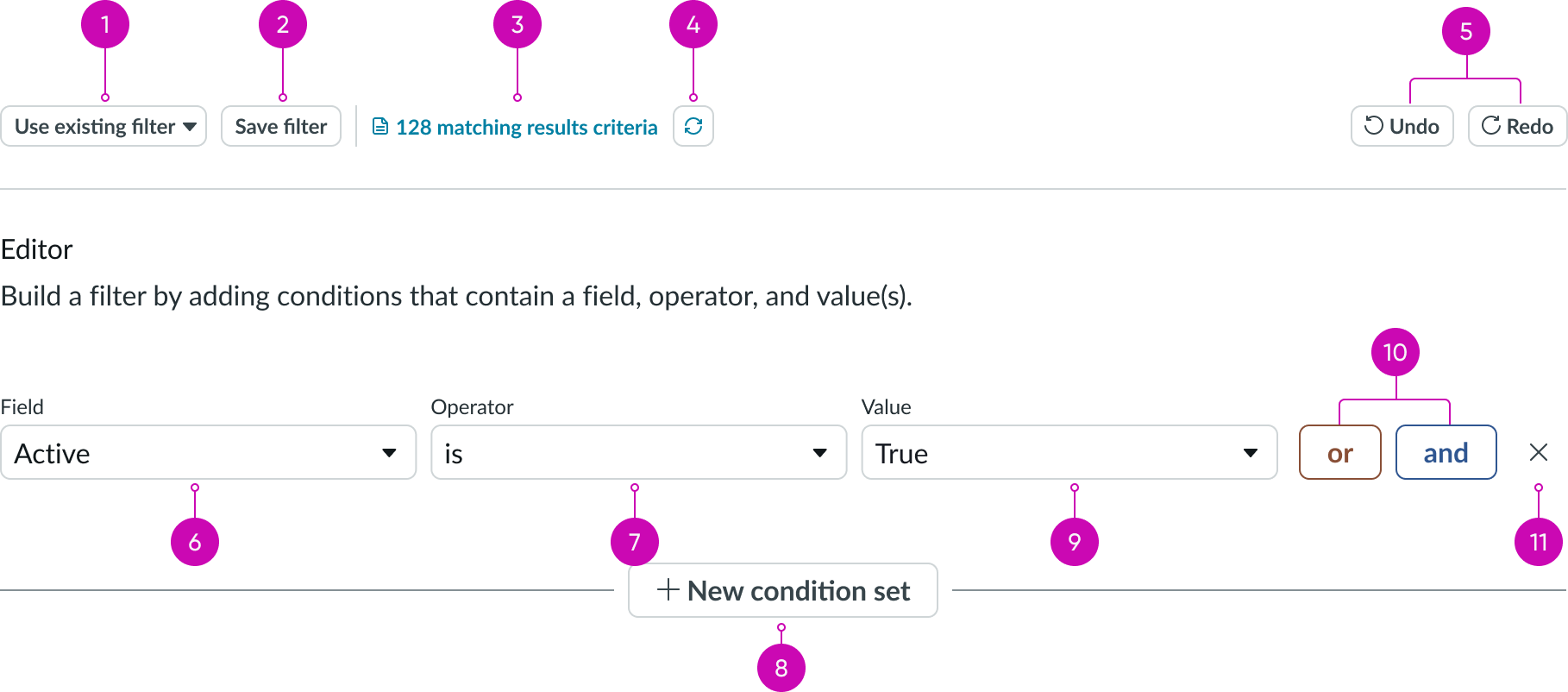
- Filter dropdown: List of saved filters the user can select
- Save filter button: Control to save a filter the user has created
- Results counter: Shows the number of results returned from the last search
- Refresh: Control for refreshing the results counter
- Undo/Redo buttons: Deletes or restores the results of the last search
- Field selector dropdown: Selected field from the current table to which this condition applies
- Operator choice list: Filtering condition for the selected field; choices offered depend on the field type
- Add condition set button: Adds a new condition set to the condition builder
- Value: Filtering value for the selected field; the condition builder searches the current table for a matching field value
- Condition: Adds a condition with either an or or and relationship to all other conditions
- Delete control: Removes the selected condition from the condition builder
Subcomponents
See the usage guidelines for dropdown
See the usage guidelines for button
See the usage guidelines for button iconic
Usage
Create conditional queries from generated fields to filter lists and to create reports.
Configurations
Learn how to customize condition builder by configuring the available properties.
Stacked conditions
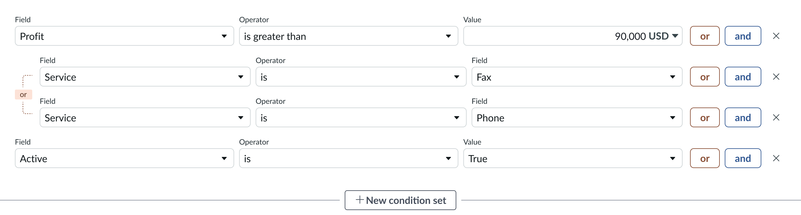
You can add as many and or or conditions as necessary to refine the query.
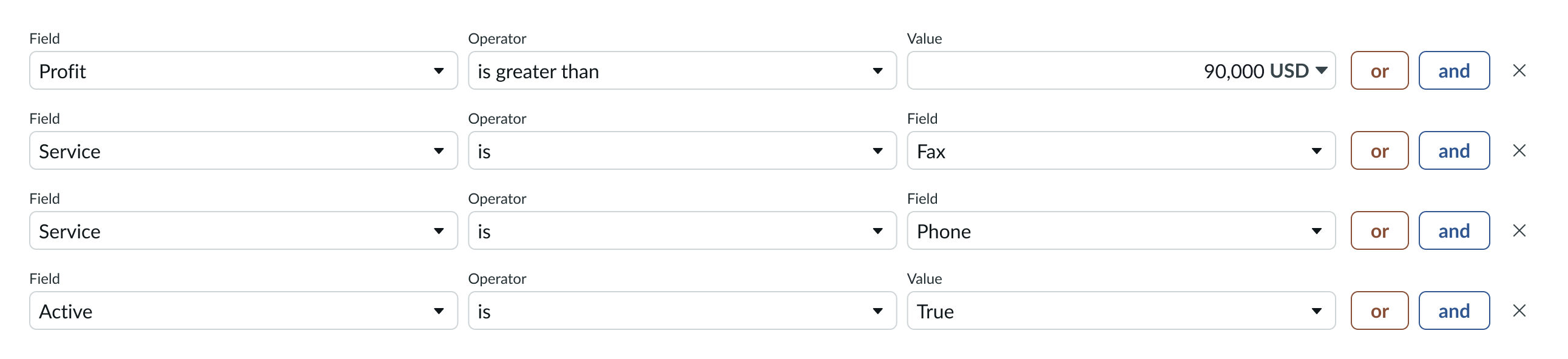
Condition sets
Select the New Criteria button to create sets of conditions. The instance evaluates each set separately and then together, using an OR relationship.
Behavior
Learn how condition builder behaves when the display changes or a user interacts with the component.
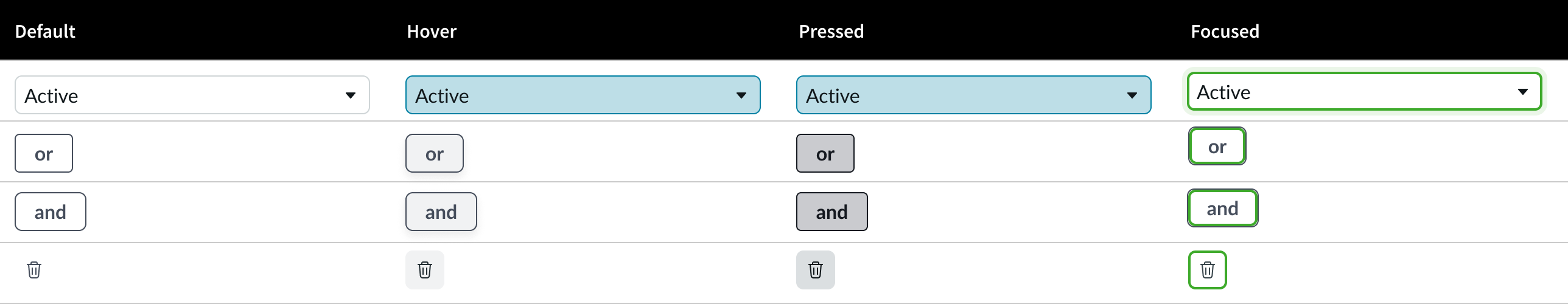
States
Condition builder has 4 states: default, hover, pressed, and focused.
Responsive behaviors
The width of the condition builder resizes automatically to the size of the container. For responsive behaviors of subcomponents, see the usage guidelines for those components.
Interactions
Users create and delete conditions using the dropdown panel and button subcomponents. Users can create multiple statements with AND or OR relationships and put condition statements into sets. To delete a condition, users select the delete icon next to the condition.
Truncation
The condition builder truncates any value entry wider than the dropdown panel allows. No tooltip is provided for truncated entries.
Usability
Condition builder complies with all internationalization and accessibility requirements.
Internationalization
When this component is used in a platform configured for a right-to-left (RTL) language, the condition statements and control butons flip their orientation and align from the right. Search terms and operators appear in the right-to-left language, but system names and IDs can appear in a left to right language.
Accessibility
Learn how to access the actionable elements of condition builder through keyboard interactions and screen readers.
Keyboard interactions
You can access the actionable elements of condition builder with these keyboard keys:
- Tab: Advances through the fields and controls in a condition statement from left to right, and then advances to the next condition. The tab key also focuses on the delete action for value selections, when present.
With a dropdown in focus:
- Enter or Arrow down: Opens the dropdown panel and places the cursor in a search field or puts focus on the first item in the list
With a dropdown panel open:
- Arrow up, Arrow down: Moves focus up or down through the items
- Enter: Selects the item in focus from the dropdown panel
With a choice list in focus:
- Space, Arrow up or Arrow down: Opens the list
With a choice list open
- Arrow up or Arrow down: Moves focus up or down through items
- Enter or Space: Selects the item in focus from the choice list
Focus on an action button:
- Enter or Space: Executes the action
Screen readers
When you apply ARIA labels to the component, screen readers announce the controls and content of condition builder in the prescribed tab order.