

Anatomy
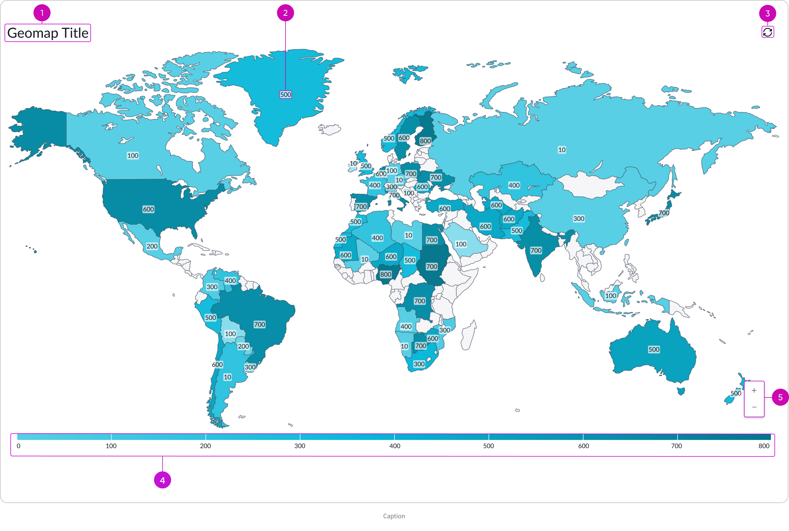
- Title (Optional): Title of geomap which can be wrapped or hidden
- Label: Numerical or logical value that determines the map location color based on a given color palette
- Refresh button: Manually refreshes data
- Legend: Shows the values for each color in the chart; by default the legend is hidden
- Zoom in and Zoom out buttons: Controls geomap magnification
Subcomponents
See the usage guidelines for button iconic.
See the usage guidelines for heading.
See the usage guidelines for button stateful.
See the usage guidelines for label value.
See the usage guidelines for breadcrumbs.
Usage
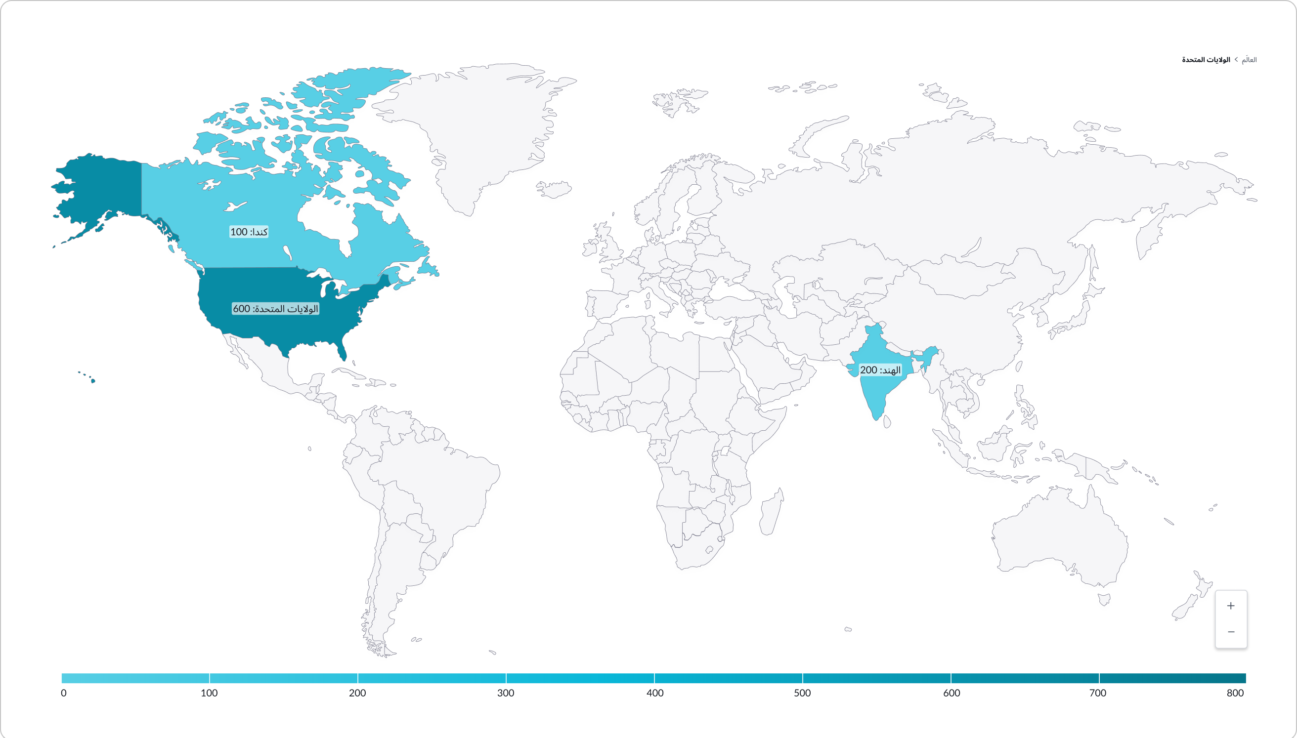
Use a geomap to present data in a geographical chart. Geomap currently has only the heatmap type. Heat maps display aggregated data for that map region as its shown by the map region borders.
Variants
Learn about the variants of geomap.
Colors
By default, the theme based colors (a range of blues) are applied to the background in the geomap chart. You can set the color type to “Color range” and use the controls to set the “Low color value” and and “High color value.”
Configurations
Learn how to customize geomap by configuring the available properties.
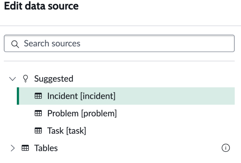
Data source
You select a data source for your visualization from system data tables. If you are changing your data source, the option list provides suggestions based on previous selections and items that match your search.
Tables
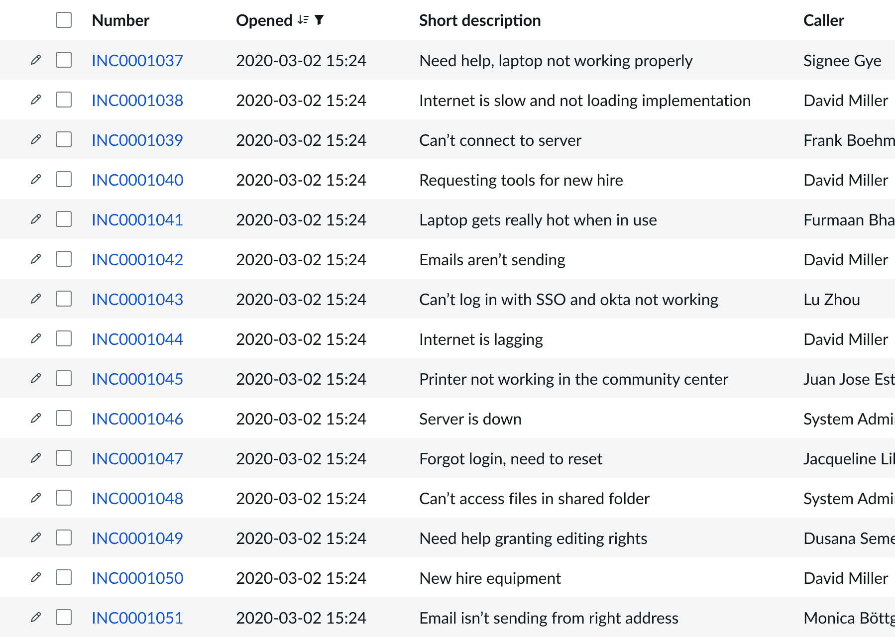
You can select any table from the system to use in your visualization and filter that data. When you apply a table as the data source, a preview list appears showing all available records in that table.
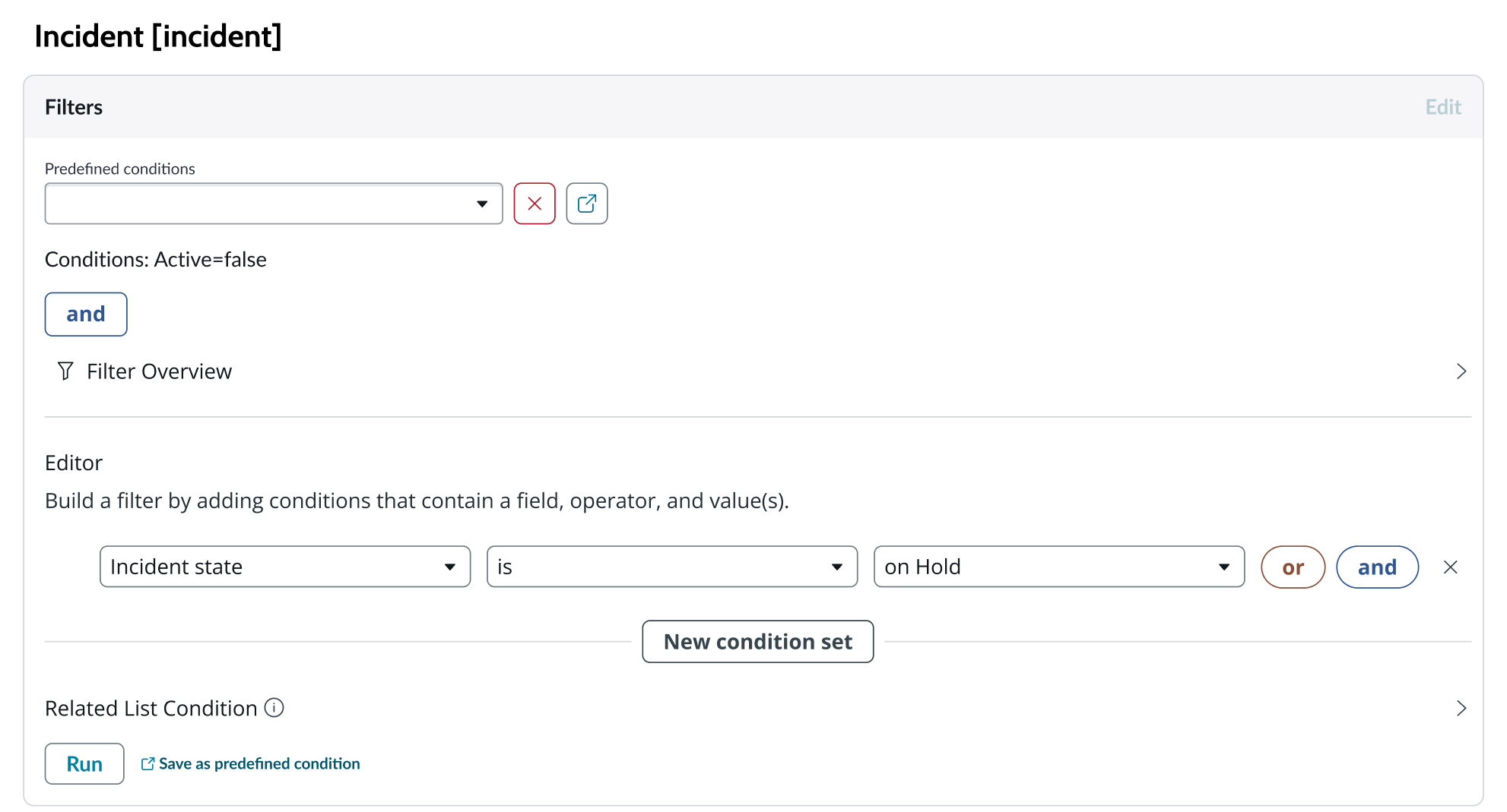
A condition builder above the list enables you to set filter conditions on the data before using it in your visualization. This is useful for limiting the data shown in the chart to only the data you need.
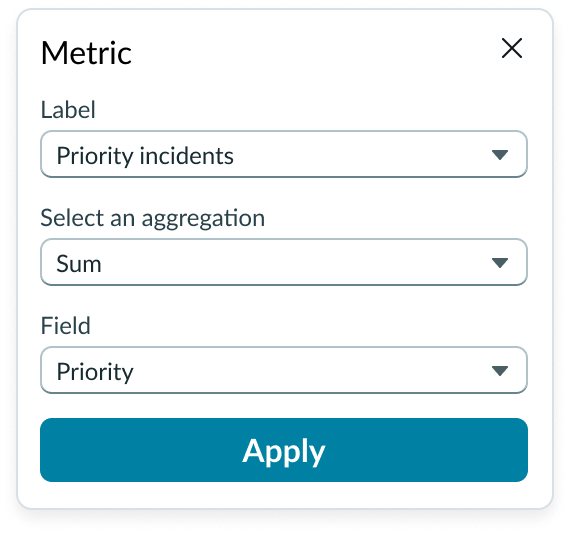
Metric selection
Select the specific data from the data source to display in the geomap and the label that identifies it. Select an aggregation type from the dropdown list. You can select a specific field from the data source table to display. If you leave the field empty, all fields are used, depending on any filtering conditions you applied when you selected the data source.
Grouping data
To build a geomap, you must select how you want the data broken down and grouped. If you don’t specify a “grouped by” value, your geomap visualization won’t work.
Grouping values are determined by the field data that you choose to map to the chart. The grouping happens as the geomap is built.
Data properties
Use the data properties to select and organize the data you want your users to see from the source. Select the chevron icon to expand a section and display the properties in each category.
Header and border
The component header displays along the top and contains the title you give the visualization. By default, the header is configured to show, but the content is empty.
Visualization border
By default, a border around the chart. Unselect the “Show border” option to remove it.
Header separator
You can add a separator line between the header and the visualization. Disabled by default.
Chart title
By default, the chart title is blank, but you can add a title. When you add a title for your chart, you’re able to customize the color and make it wrap.
Header level
By default, text in the header is set to heading level 2 (H2). Heading levels H1 through H6 are also available.
Title alignment
By default, the title is aligned to the Start side. The start size can be the left or right depending on the language you use. Other options available from the dropdown are “Center” and “End”.
Title wrap
By default, long titles truncate with an ellipsis, and a tooltip showing the full title on hover, but you can set the title to wrap instead.
Title truncation
By default, the title text truncates at the end of the first line of text, but you can set the line of truncation to 2 or 3 lines instead. This option becomes available when the title truncates.
Refresh option
By default, refresh is available to the user in the “More options” menu, but you can hide it. This gives you more control over how refresh options are exposed on dashboards so you can align refresh behavior with your intended usage.
Header background color
By default, the color of the header background is neutral-0 (white). You can specify a different color (including a custom color) for the background.
Select a color for the visualization header background that aligns with your dashboard theme, branding, or design preferences. The color you choose applies only to the visualization header background.
For better accessibility, make sure a good color contrast exists between the header background and title text. The minimum contrast requirement for normal text is 4.5:1, and for large text is 3:1. To verify, check the contrast ratio in the color picker.
Note: Theming is not supported when you select a custom color.
Title color
By default, the title text is neutral-21 (black). You can select a different color (including a custom color) for the title text.
You should select a color for the chart title that aligns with your dashboard theme, branding, or design preferences. The color you choose applies only to the chart title.
For better accessibility, make sure a good color contrast exists between the header background and title text. The minimum contrast requirement for normal text is 4.5:1, and for large text is 3:1. To verify, check the contrast ratio in the color picker.
Note: Theming is not supported when you select a custom color.
Data update
By default, users can add individual chart filters, and use the filters set on that workspace page. You can also configure your chart to update automatically in real time or on a defined refresh schedule.
Follow filters
By default, any filters set on the workspace page and those set on the data source are applied. You can use the “Follow filters” property to prevent any filter input from the workspace page. Filters set on the data source always run on the component.
Filter icon
The filter icon and the number of filters impacting the visualization display by default. To hide them, unselect the “Show filter icon.”
Drill down
By default, users can drill down into data or launch a URL directly from a chart by selecting data points, slices, categories, or scores. This lets users view data such as records and record lists from data tables or KPI data from indicators or go to a URL that you specify.
Refresh after being away
You can configure your chart to update automatically or on a defined refresh schedule.
Refresh requested
When the new value of this property is different from the previous one, you can trigger refresh by setting up a string that can be passed down.
Use data cache
You can cache user queries to shorten the load time for the data visualization. Unselected by default.
Info messages
Displays generic error messages by default.
Extended error messages
You can choose to show extended error messages which contain more details that can be helpful to admins. Unselected by default.
Custom no data message
By default, when a data source doesn’t return any info, the “no data available” message displays with generic content. However, you can set a custom message by changing the title, illustration, and message content.
Presentation
The presentation properties control the physical appearance of the chart. Use these properties to control how your users consume the data. Select the chevron icon to expand the section and display the properties in each category.
Display settings
You can use the following to modify the display of the data visualization.
Data table
You can use this setting to show a table with chart and graph data under the chart for easier screen reader access.
% of total tooltip
By default, when the user hovers over a data point such as a bar, the percentage of the total Y-axis value is displayed in a tooltip. This can be hidden.
Map settings
You can use the following to modify the display of the data visualization.
Map view
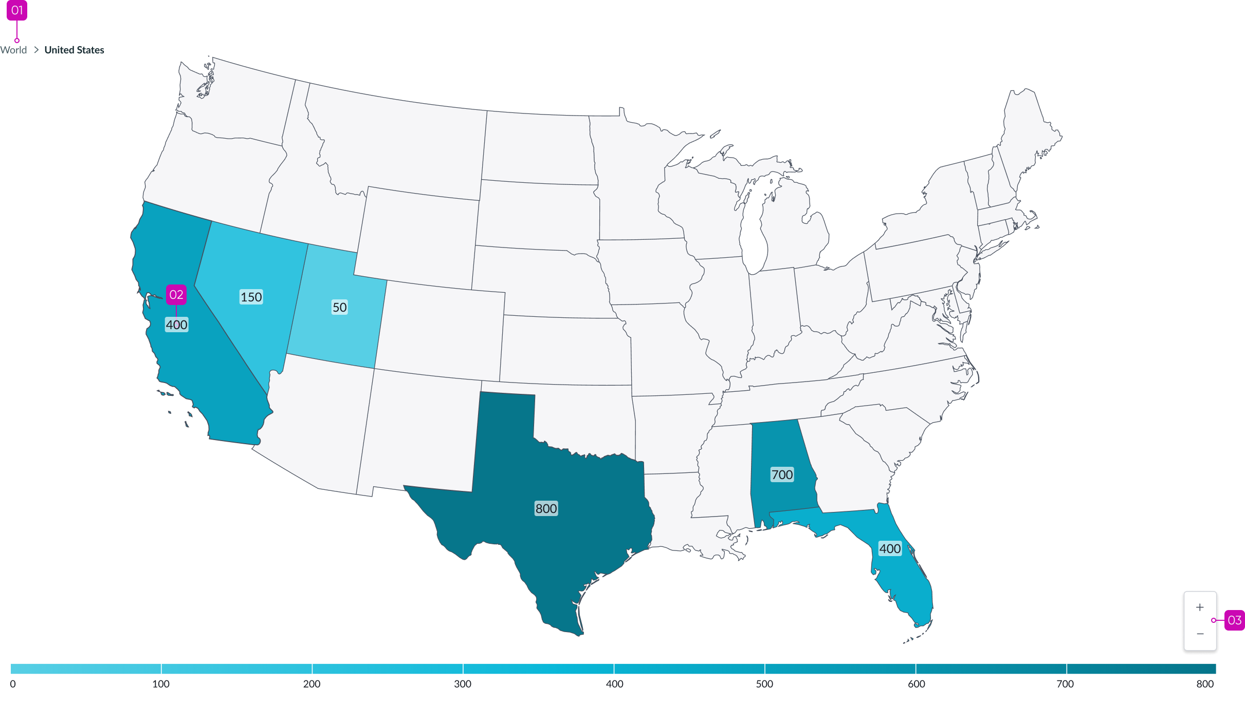
By default, the geomap displays a “World” map view, but you can specify what is shown as the default map on the chart, such as a specific geographical region, country, and so on.
Data label
You can use the following to modify the display of the visualization labels.
Labels
You can hide the geomap chart labels that are shown by default.
Legend
You can use the following to modify the display of the visualization labels.
Legend and legend position
The legend is shown by default, but you can use the “Show legend” toggle to disable it. If you choose to show the legend, it appears below the geomap chart. You can change the location to above, to the right, or to the left of the chart.
Colors
Choose a single color or use the color selector to define the color of a bar. Color selection options differ slightly, depending on the visualization selected. A color picker provides a list of predefined colors in a dropdown list with a search field.
Design recommendations
Learn how to apply geomap in your design.
Alignment and positioning
Geomap is always centered within the container and retains a fixed height/width ratio. It can’t be manually adjusted.
Behavior
Learn how geomap behaves when the display changes or a user interacts with the component.
Chart positioning
The height and width of the chart is responsive to the data visualization container size.
Responsive behaviors
Geomap is responsive to the width and height of the container.
Interactions
By default, three levels are defined for geomap visualizations (world, country, and state.) Users can navigated between map levels by selecting an area. For example, a user can select a country on world view and see the country view mapped by state, and then select a state and see the state mapped by city.
When the enable drill down property is active, users who navigate to the lowest data entry level see a list of records associated with it (city by default). You can define this interaction in any way you want from the last level based on event configuration.
Hover
In geomap, when the user places their pointer over a location, the color of the region brightens.
Usability
Geomap complies with all internationalization and accessibility requirements.
Internationalization
When this component is used in a platform configured for a right-to-left (RTL) language, all elements flip, and the text aligns to the right.
Accessibility
Learn how to access the actionable elements of geomap through keyboard interactions and screen readers.
Geomap tab order
Keyboard interactions
You can access the actionable elements of geomap with these keyboard keys:
- Tab: Moves to the next series region
- Shift + tab: Moves back to the previous series region
- Enter or space bar: Triggers a drill down action associated with bottom-level region when in focus, such as opening a list of records associated with the series region
- + and - : Zoom in and zoom out a series region level
Screen readers
When you apply ARIA labels to a component, screen readers announce the controls and content of geomap in the prescribed tab order.